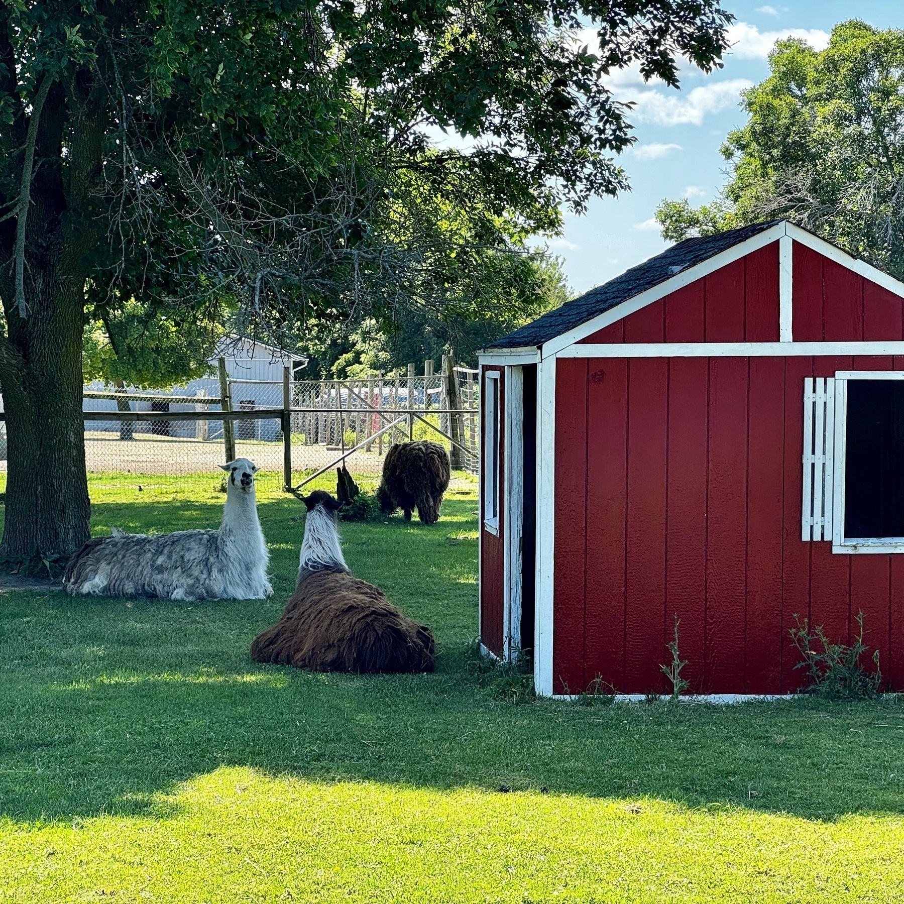
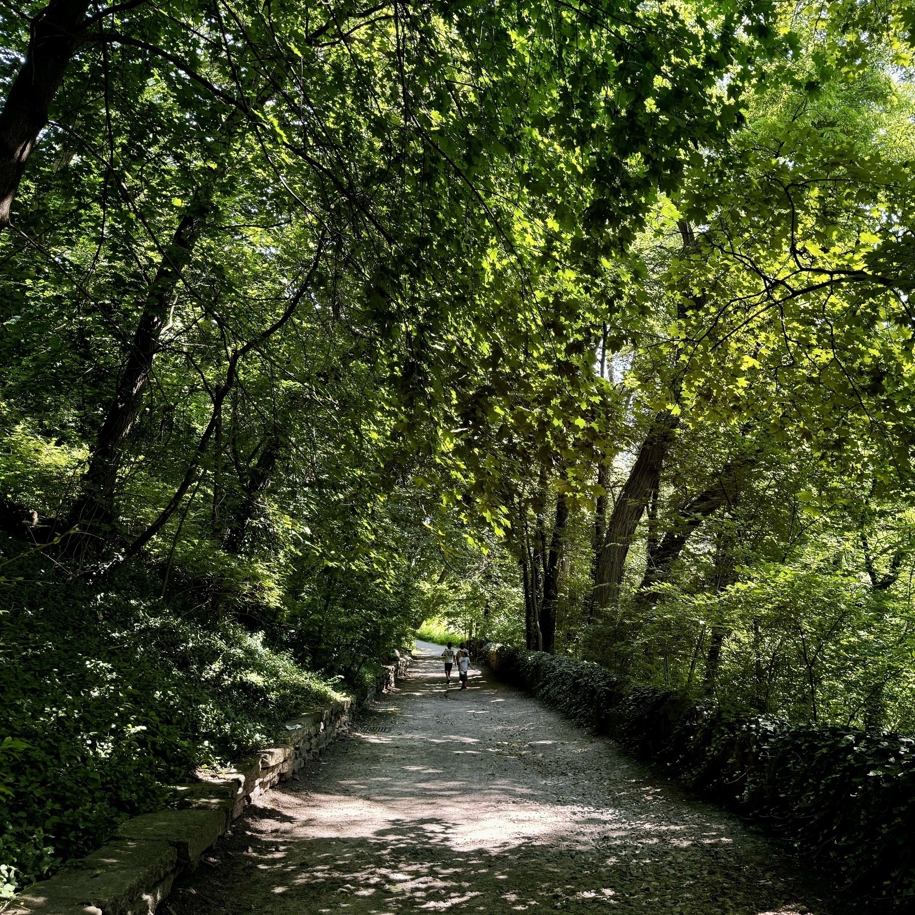
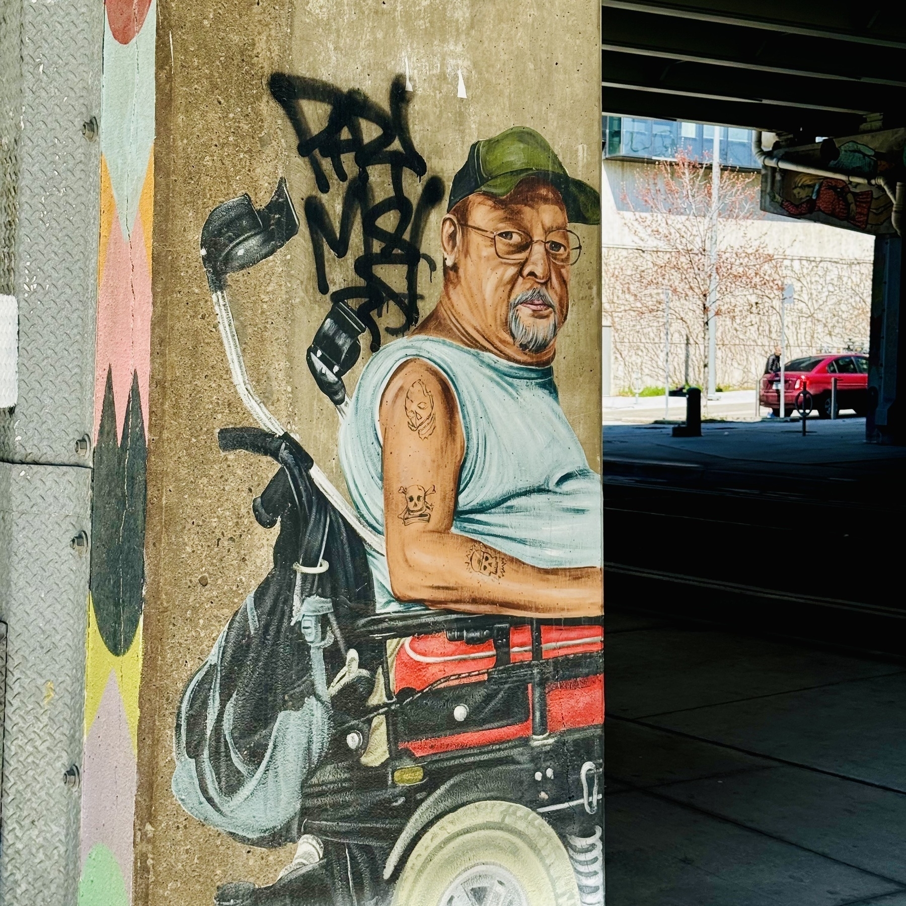
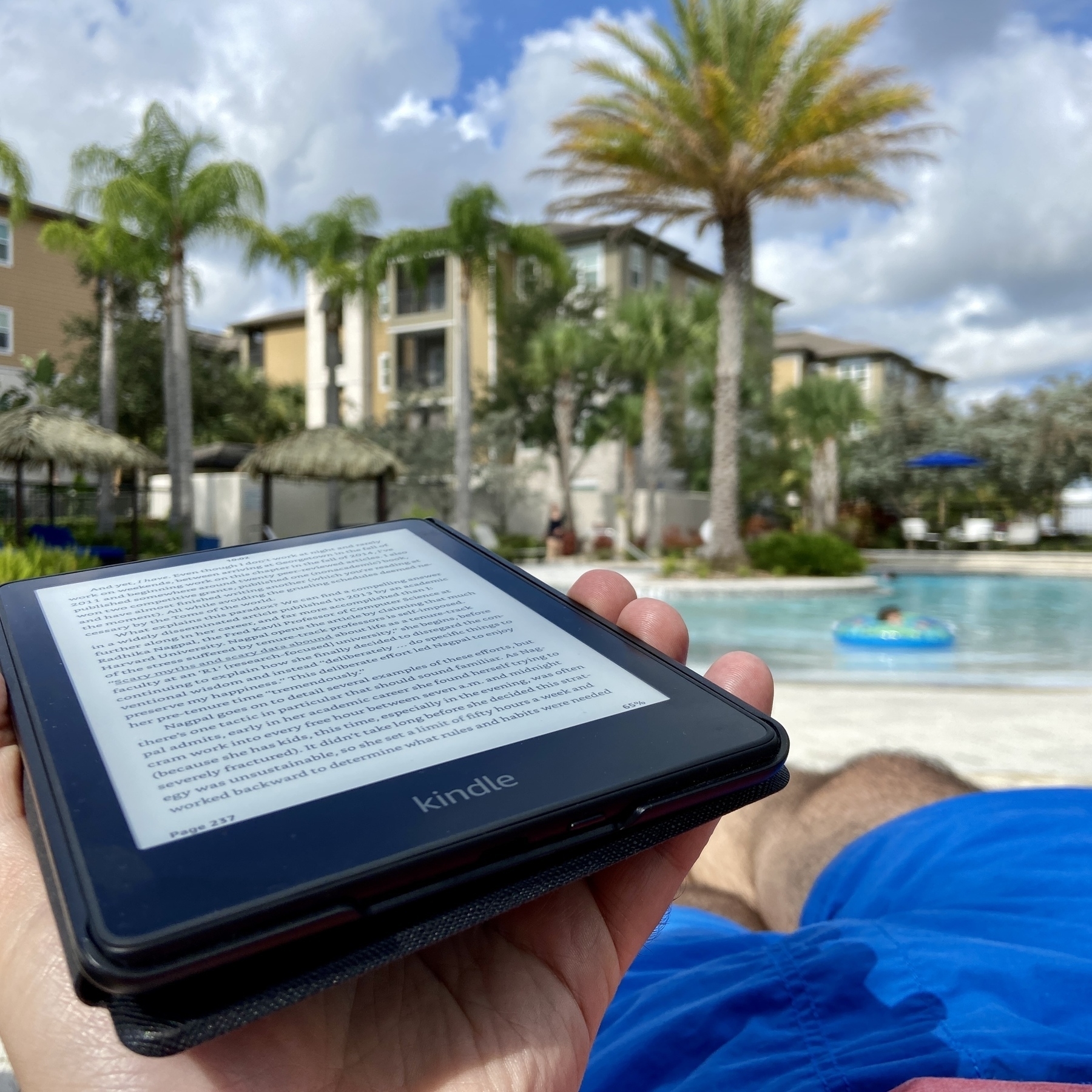
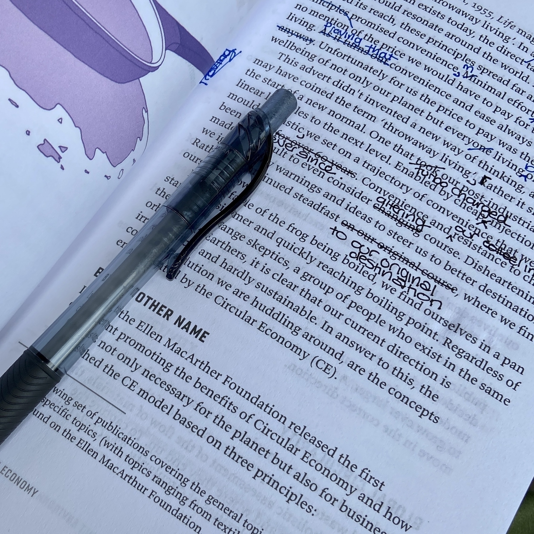
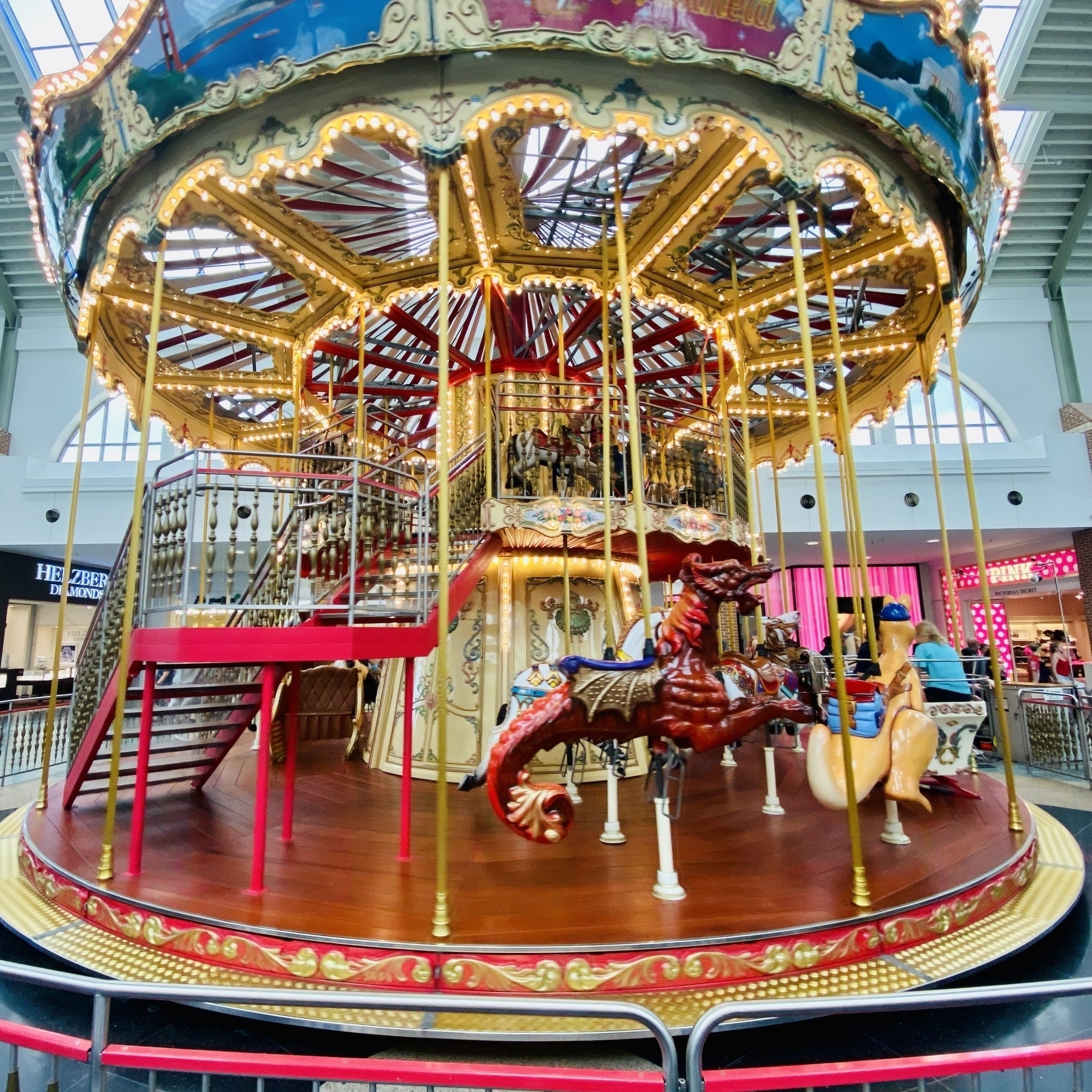
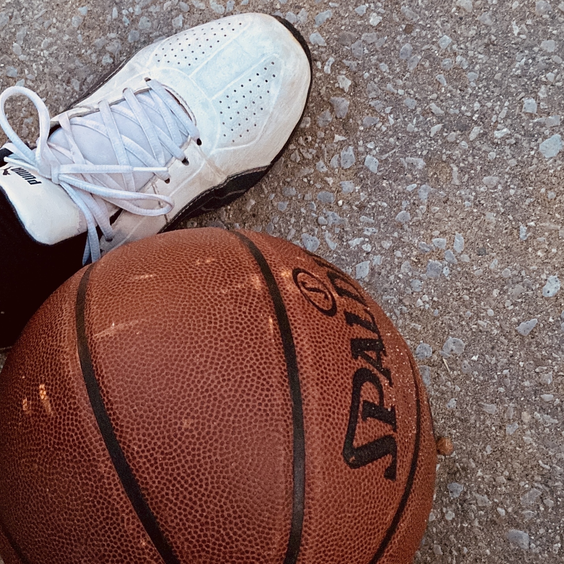
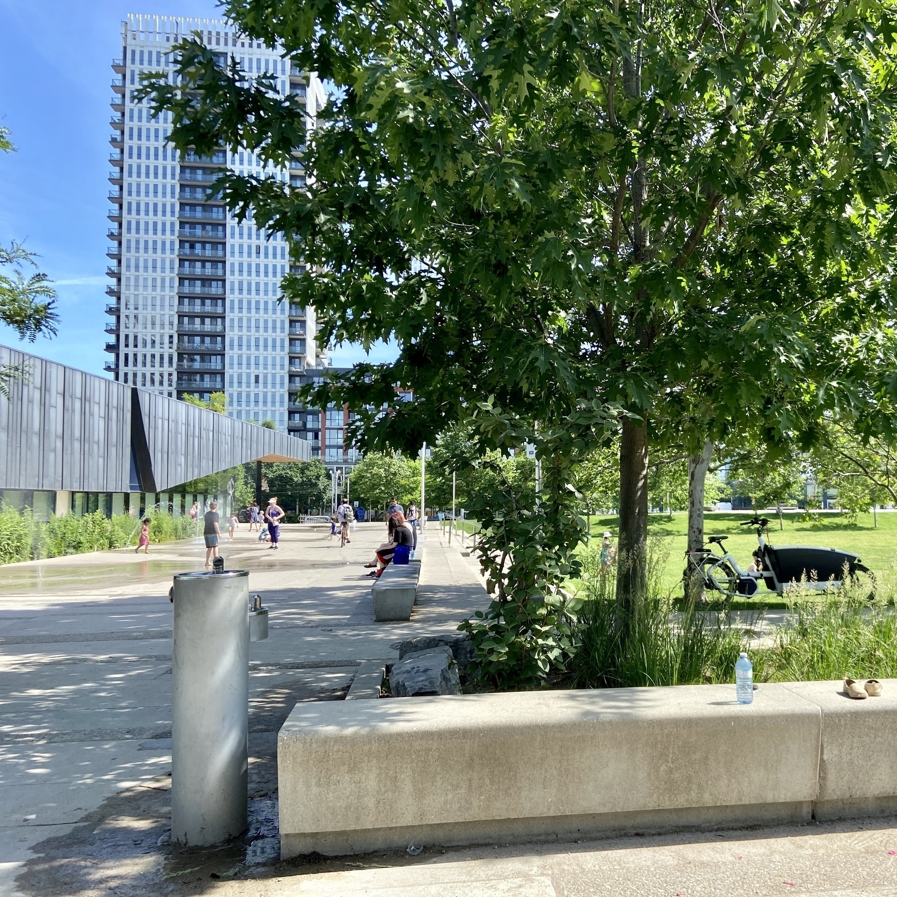
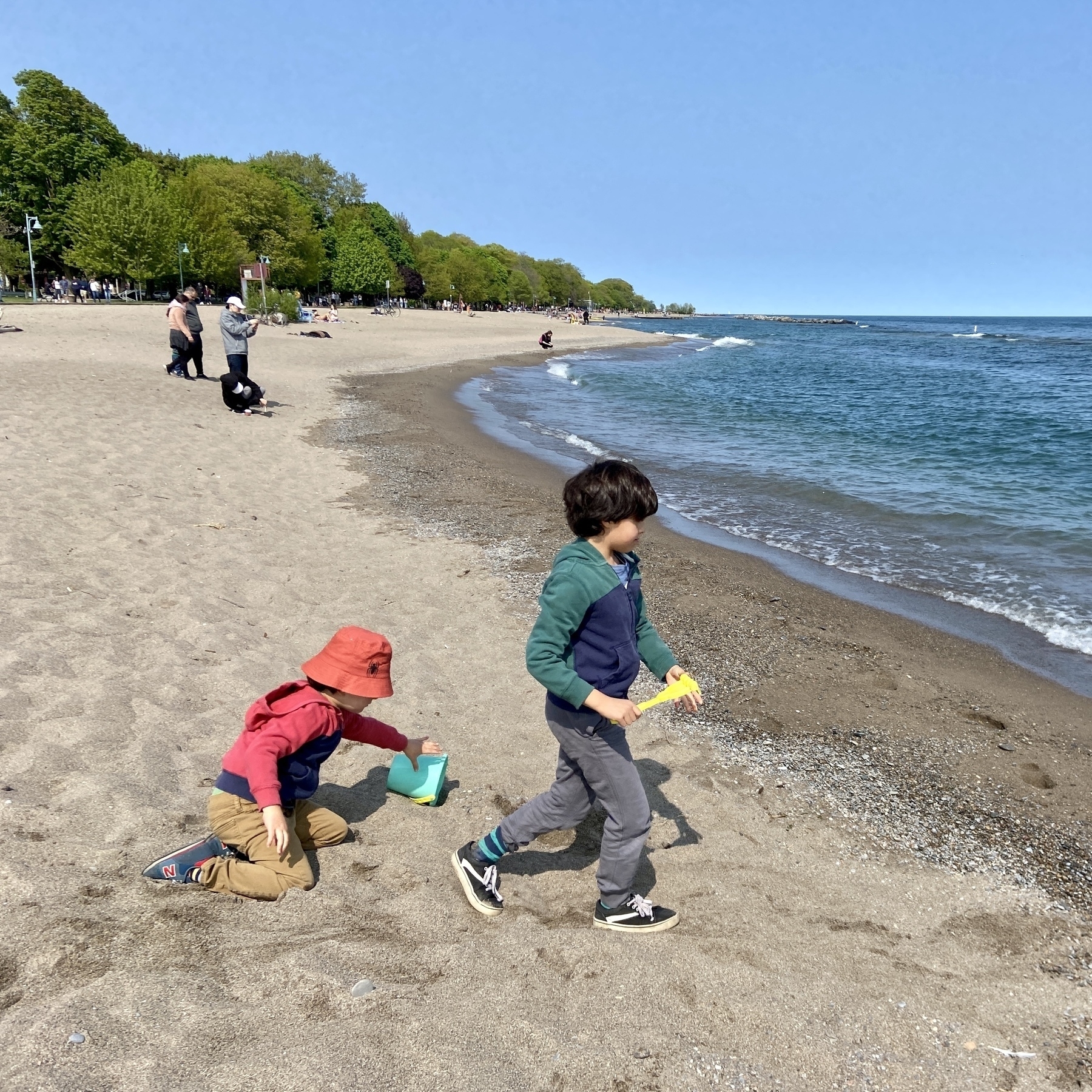
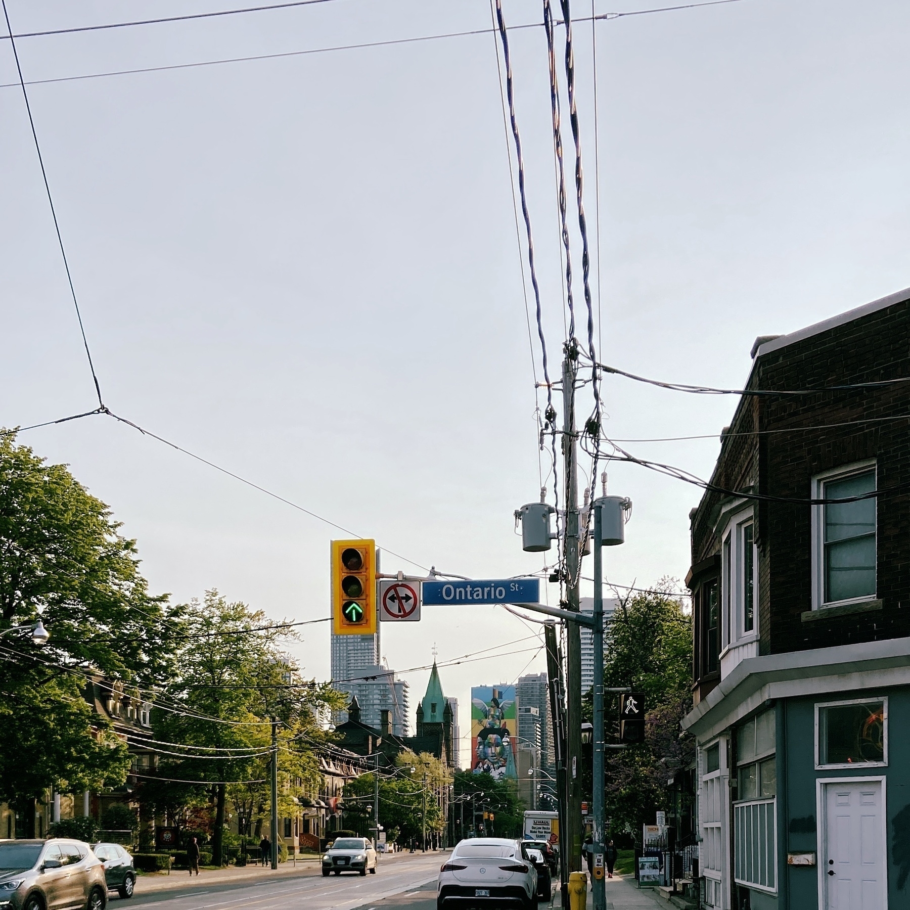
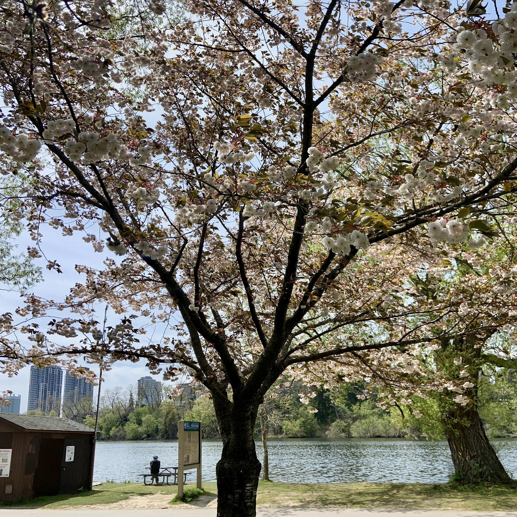
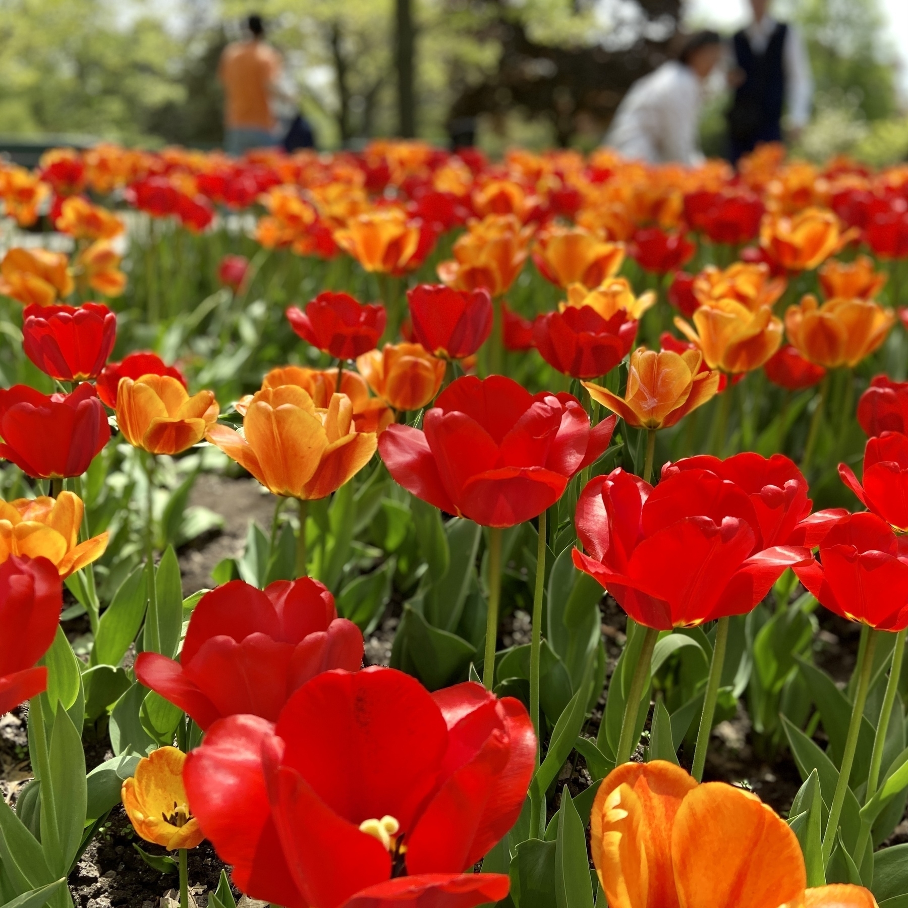
Photos
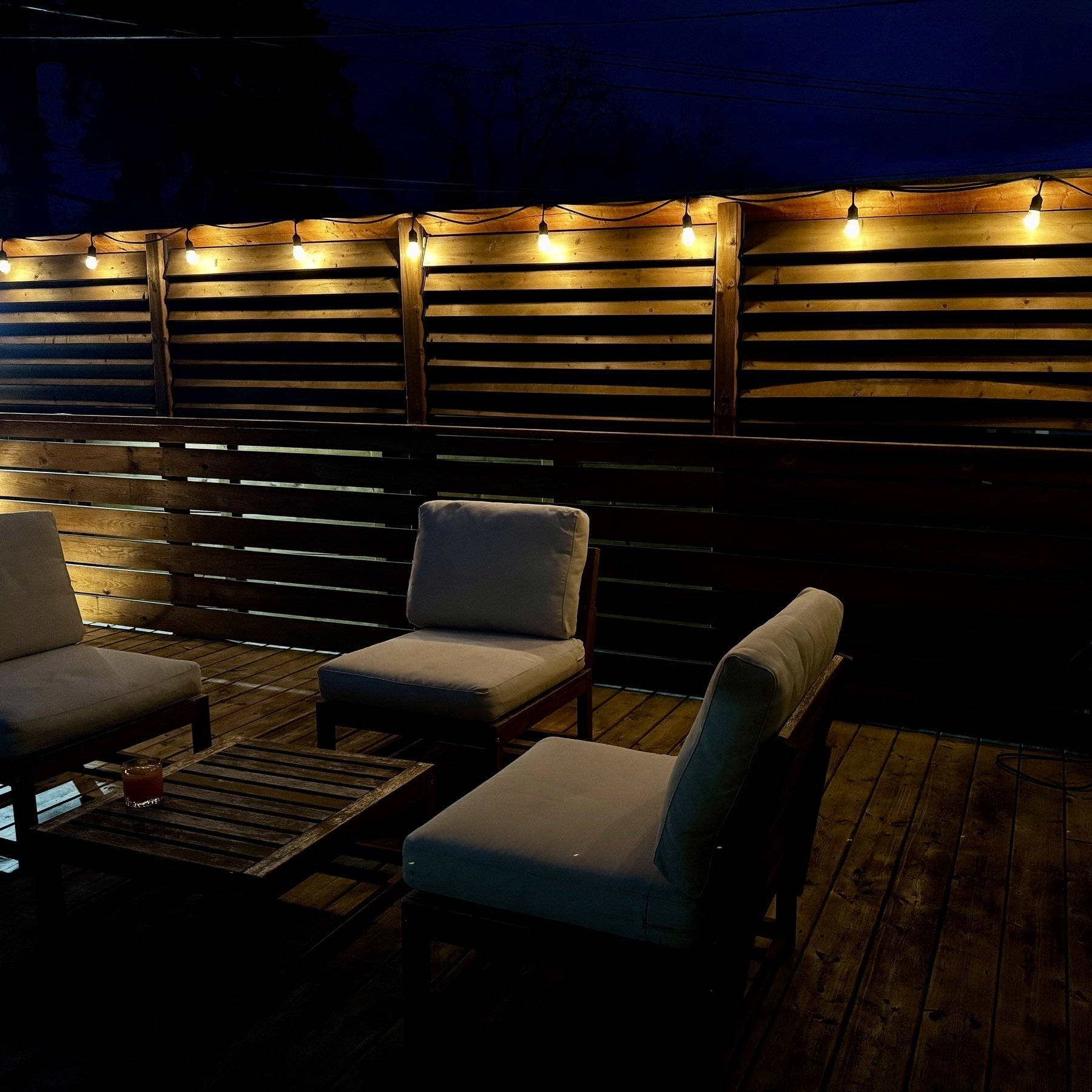
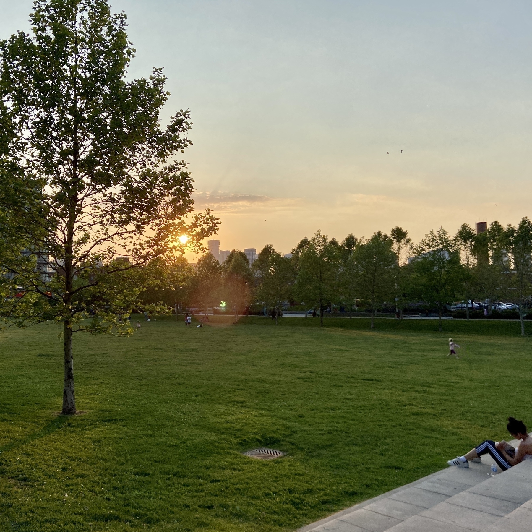
It’s good to be able to enjoy some outside space again. Took me hours to clean the mess the kids had made over the winter.

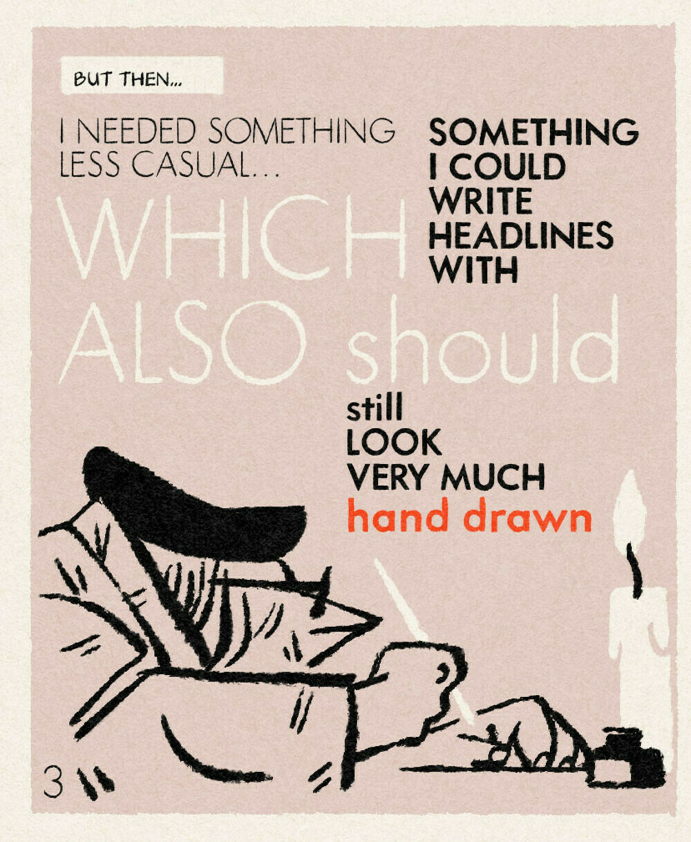
Its taken a while, but new look index page is sorted.
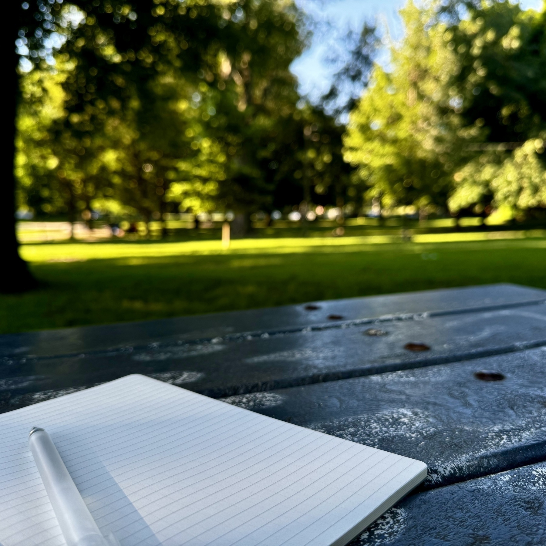
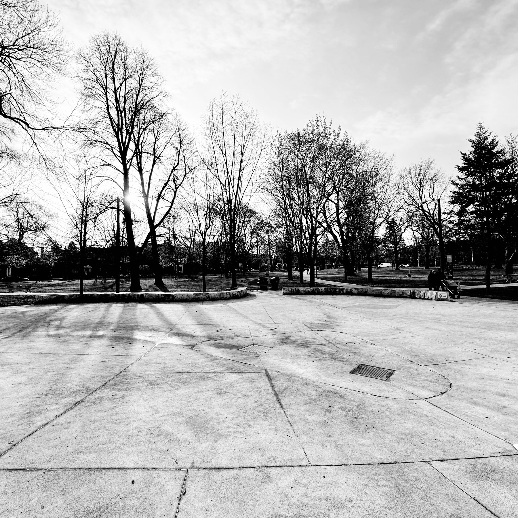
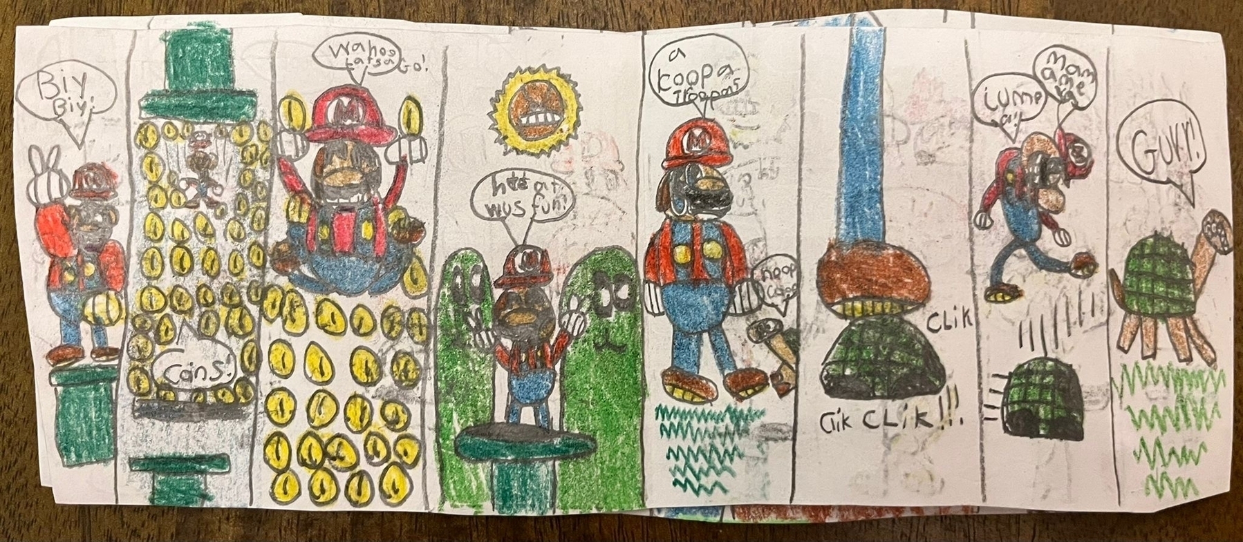
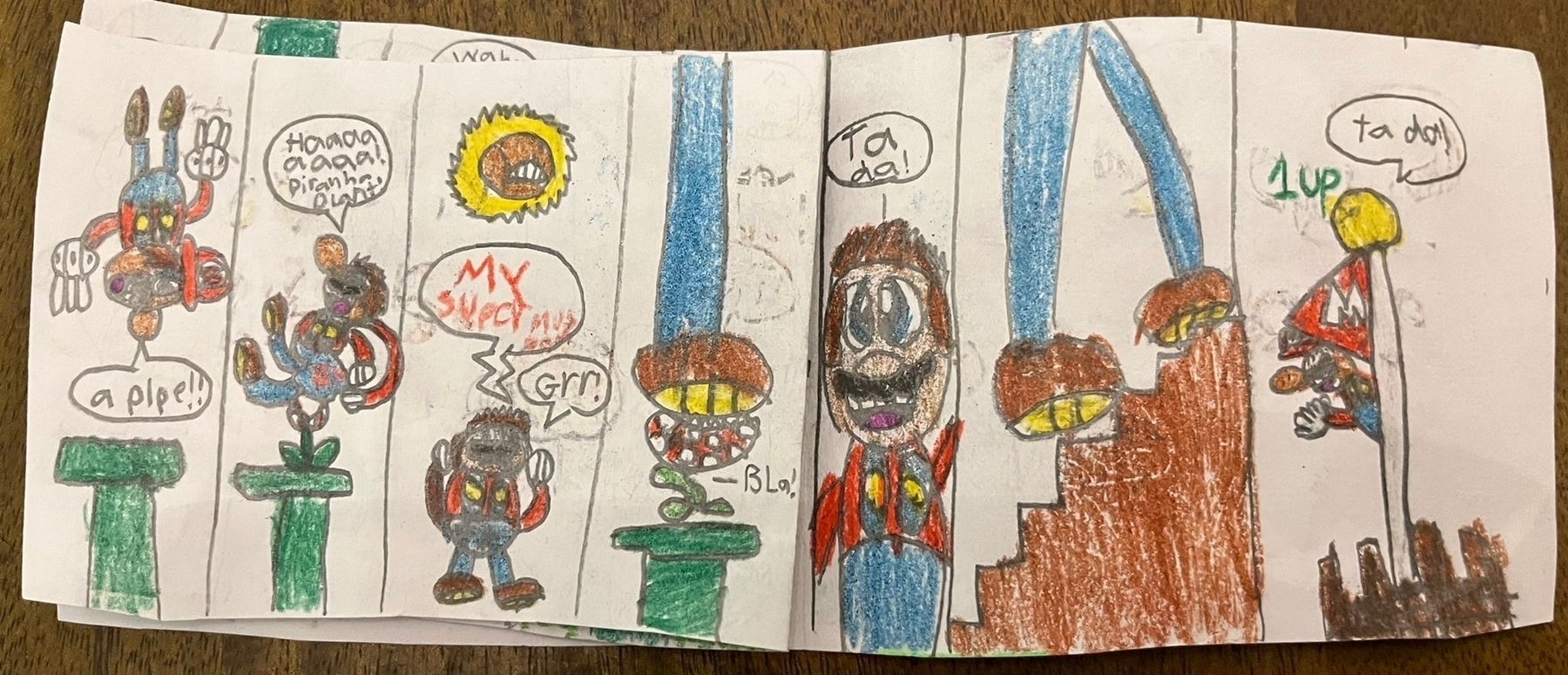
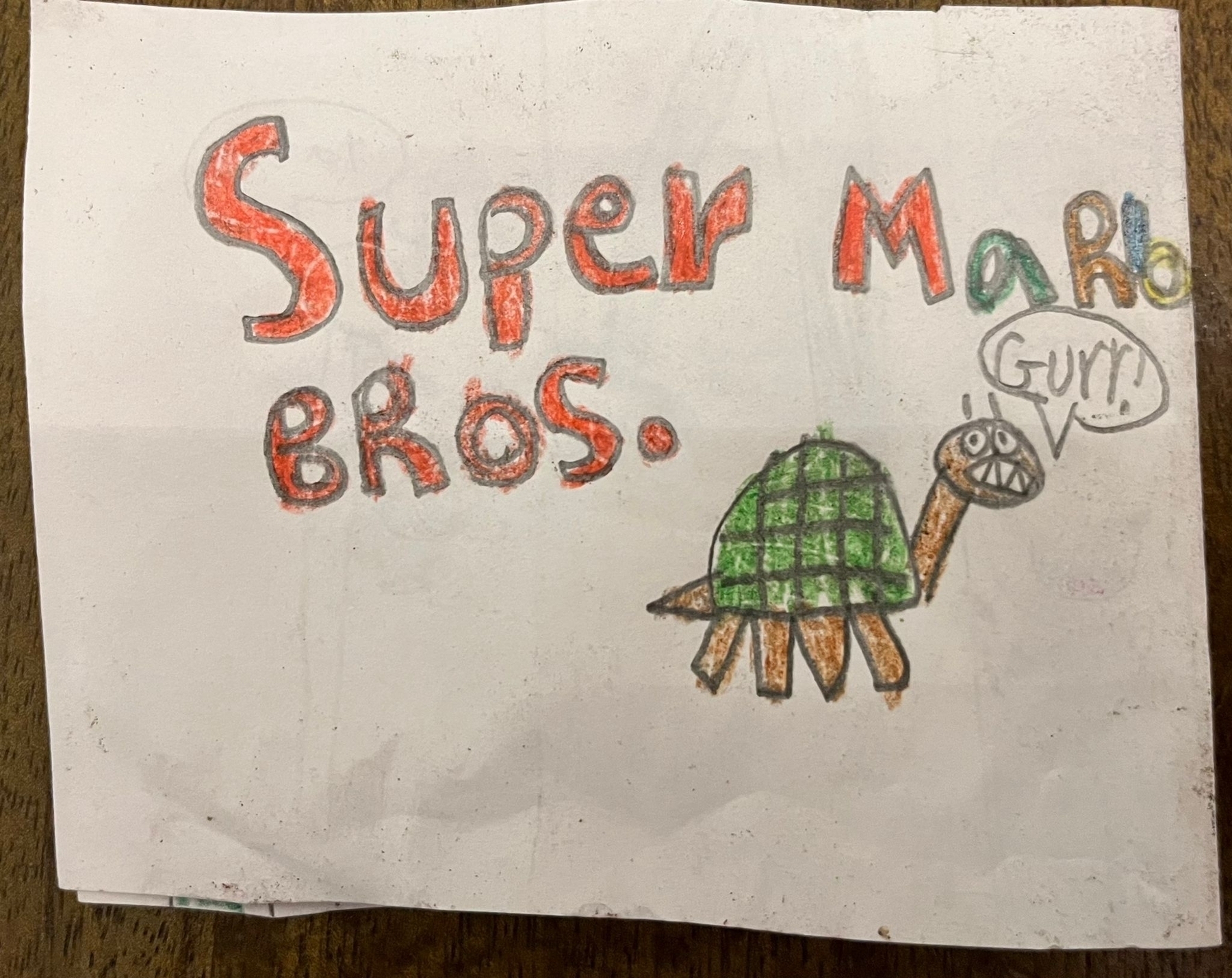
Daily #007

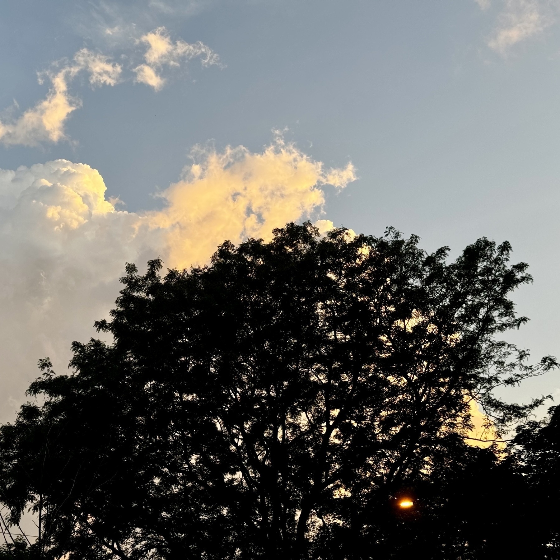
Daily #006

Daily #005
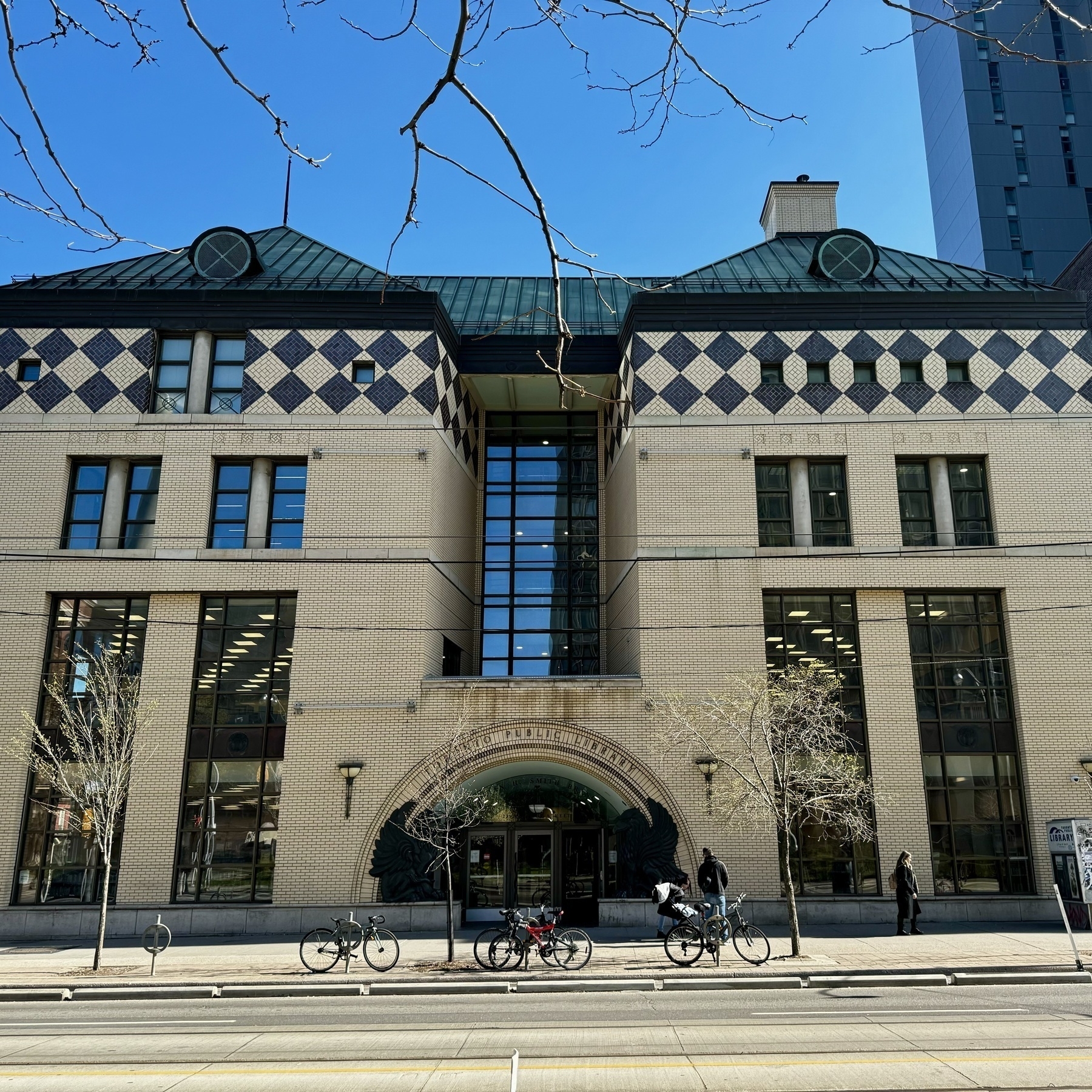
Daily #004
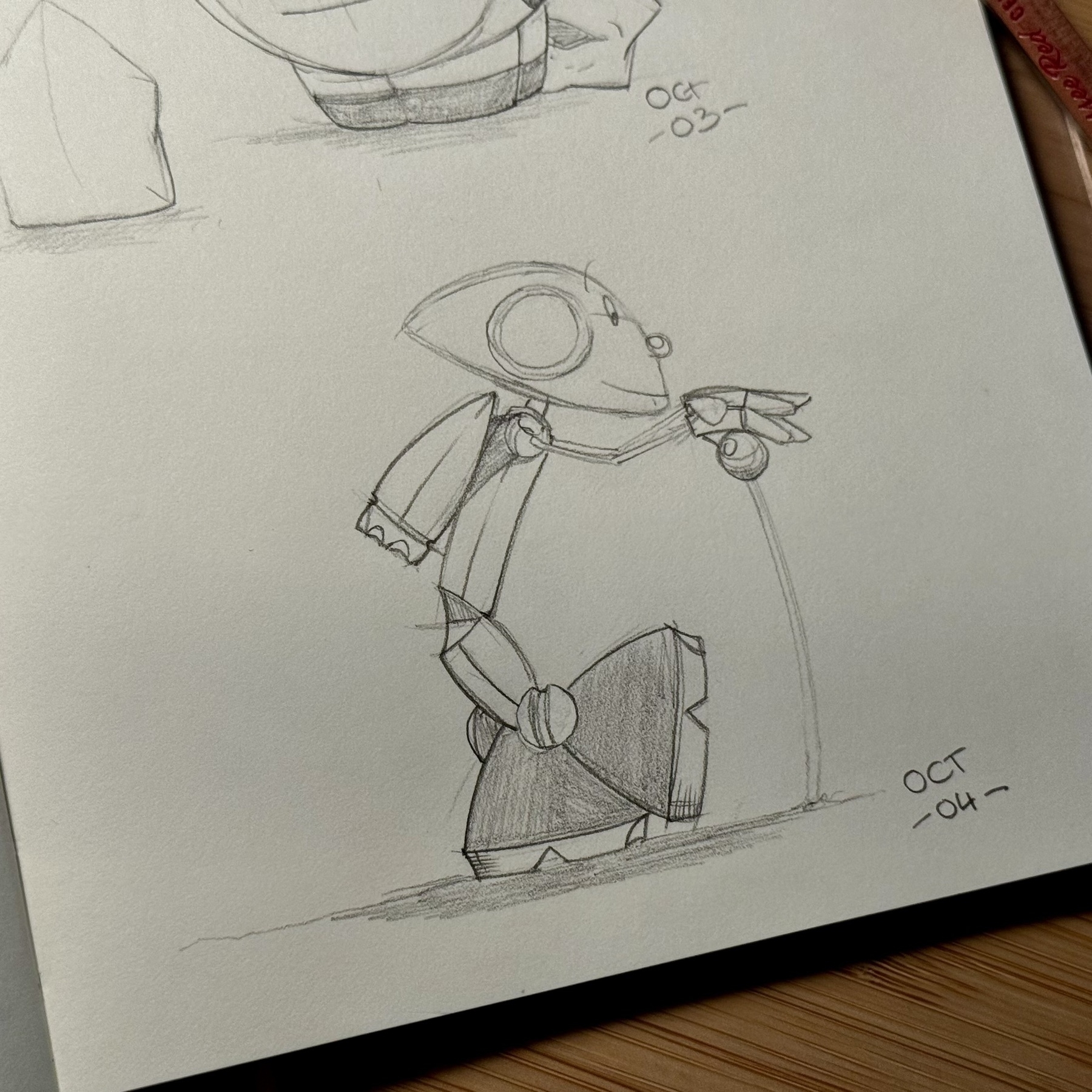
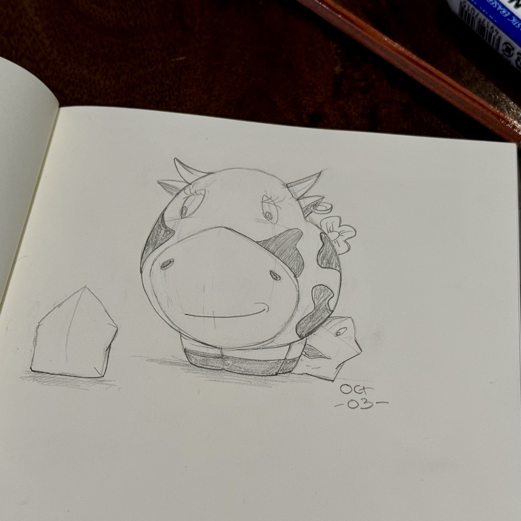
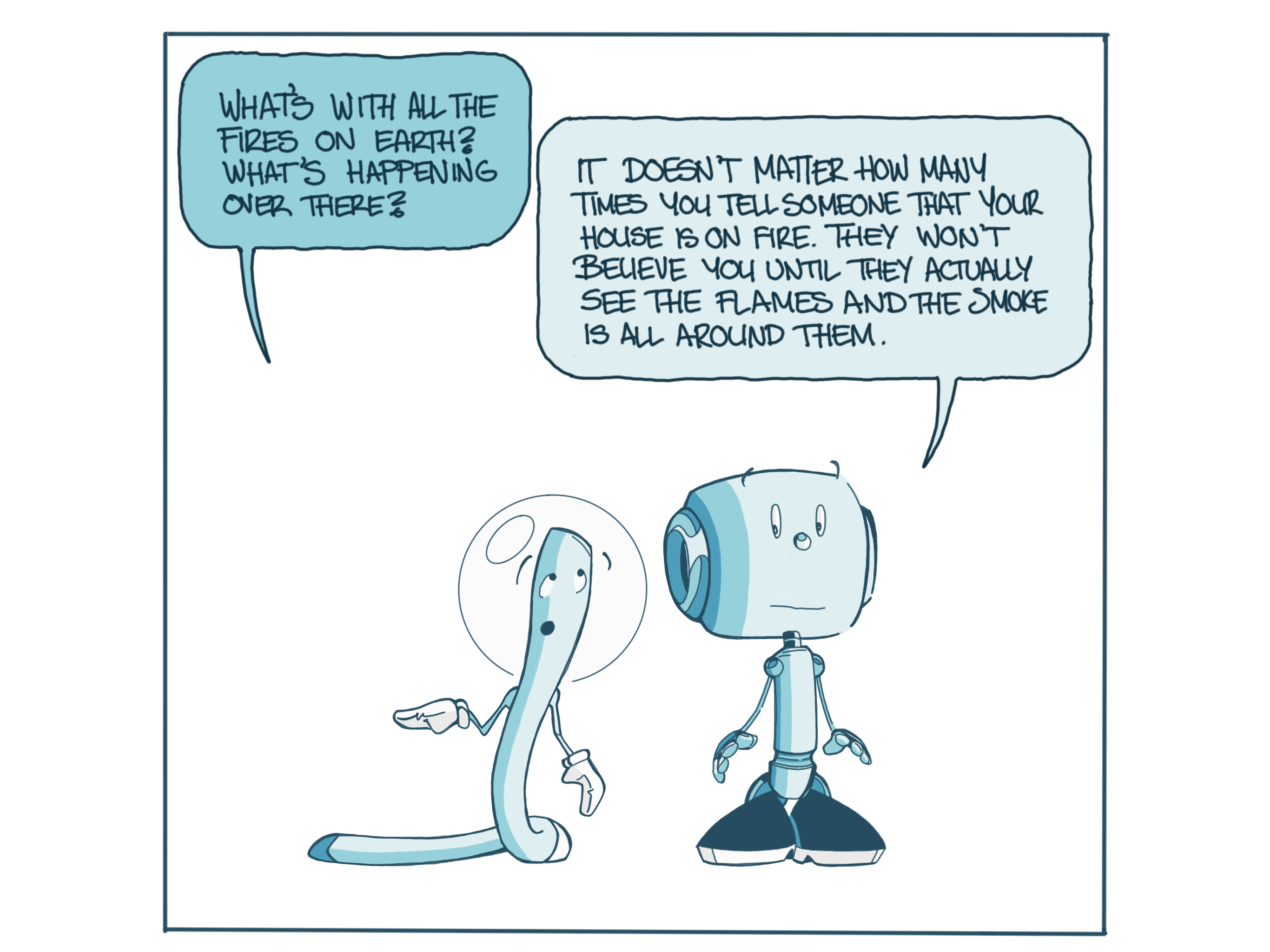
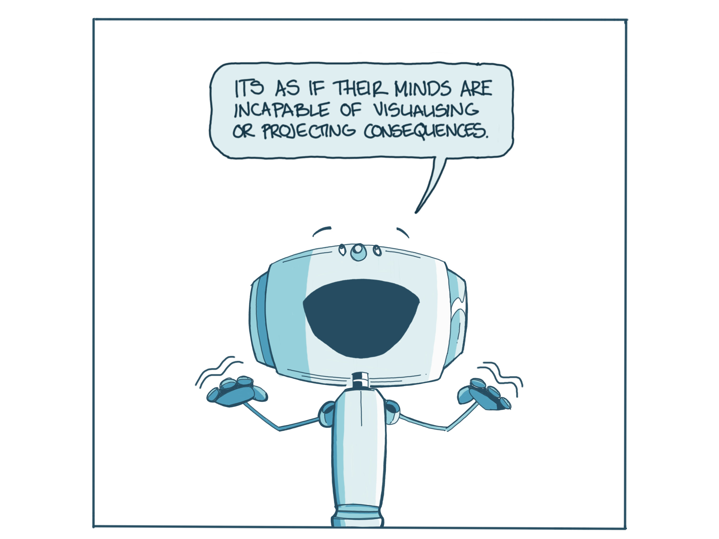
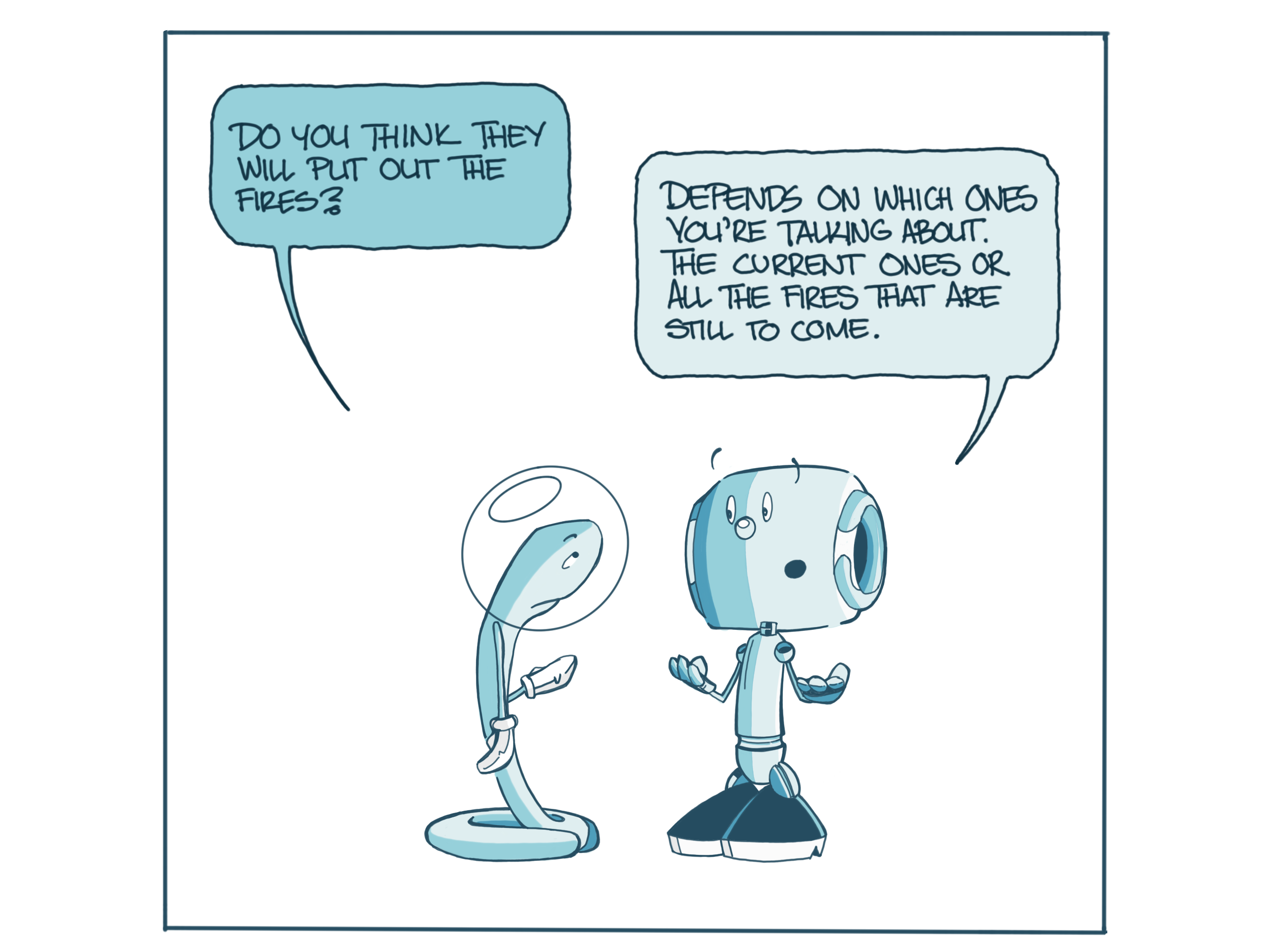
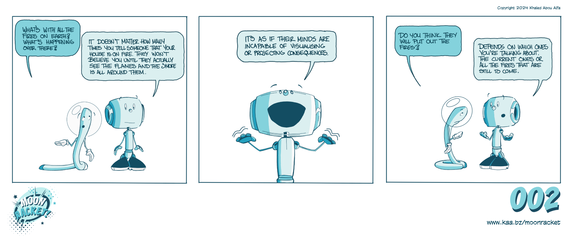
Daily #003
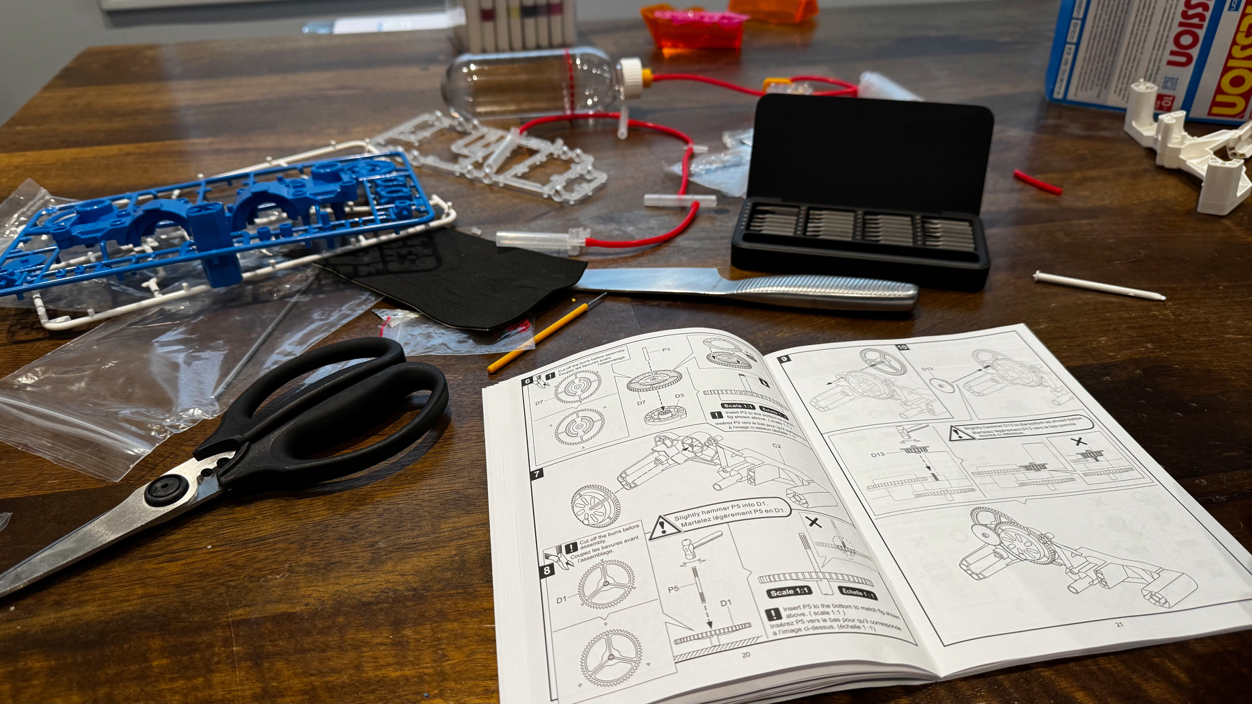
Spent the weekend working on an air powered car with Ryan. Sooo fiddly but it was fun working on it with him and getting tools out. I would have preferred a chunky Lego set but for my engineer-in-training it was great.
Daily #002
Daily #001
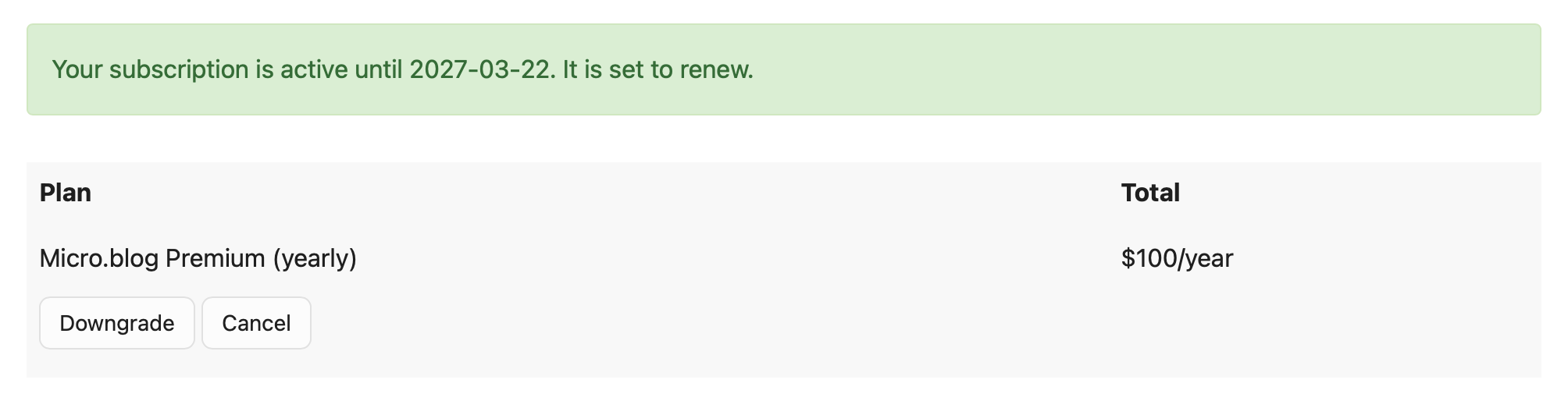
One of the best $100 I spend every year.
Thanks @manton for continuing the fight for a better internet.
Took the kids to Activate. Best way to describe it is a bunch of rooms that make you feel as though you are living inside a video game, except in a physical setting.
It’s not every day you see your uncle’s house (that you used to play in as a kid) on the news with flames in front of it…
Made a lemon pound cake because I really felt like one yesterday. Mentally exhausted and feeling under the weather.

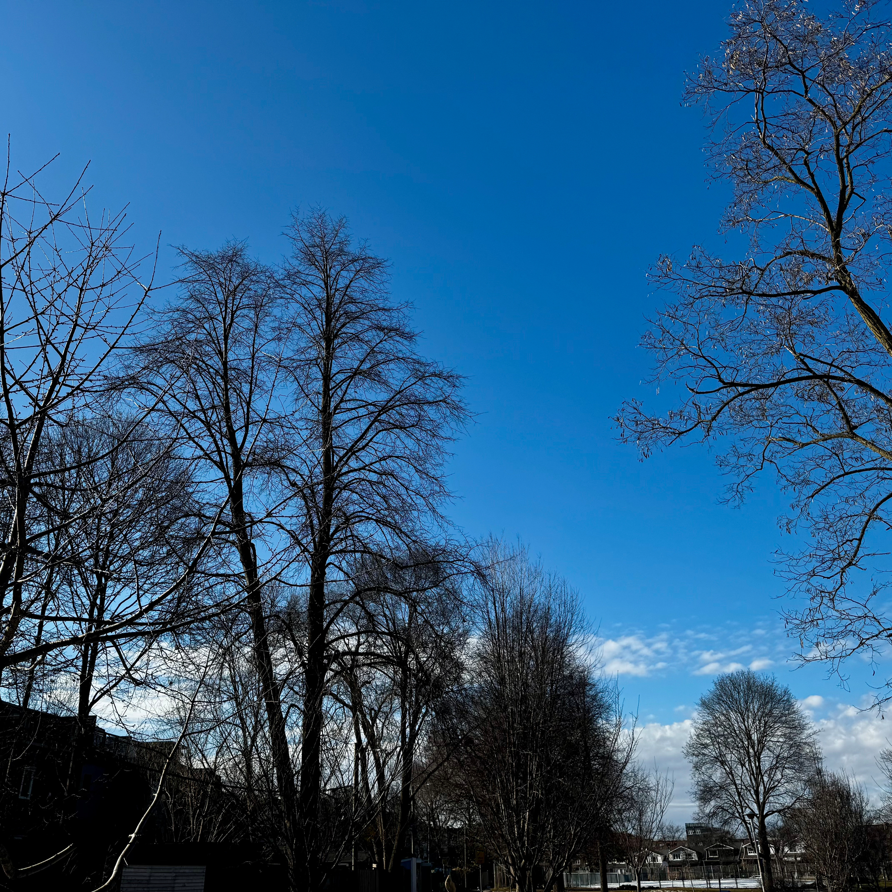
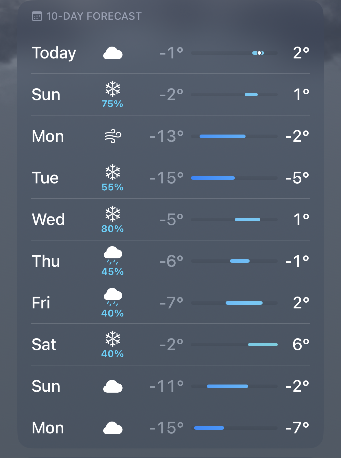
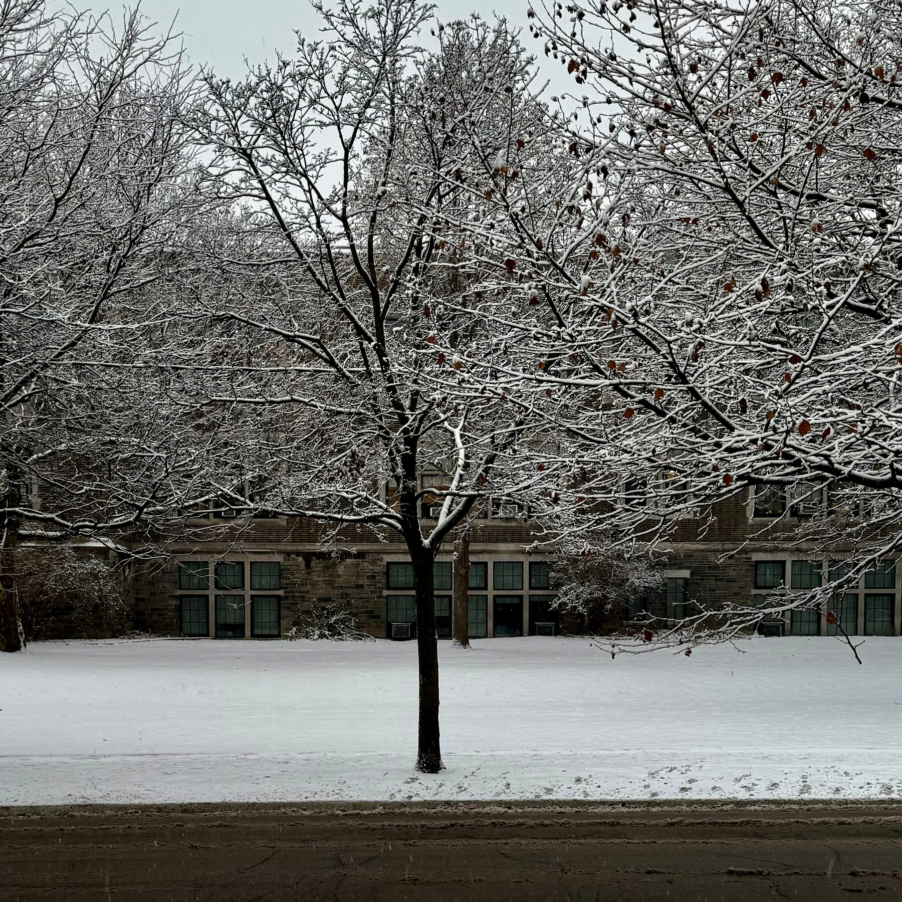
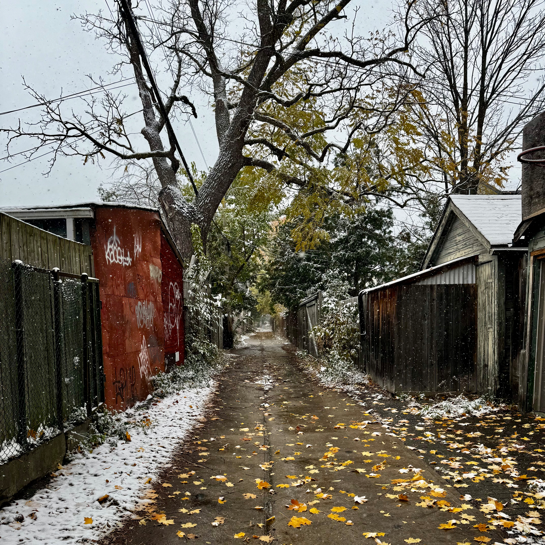
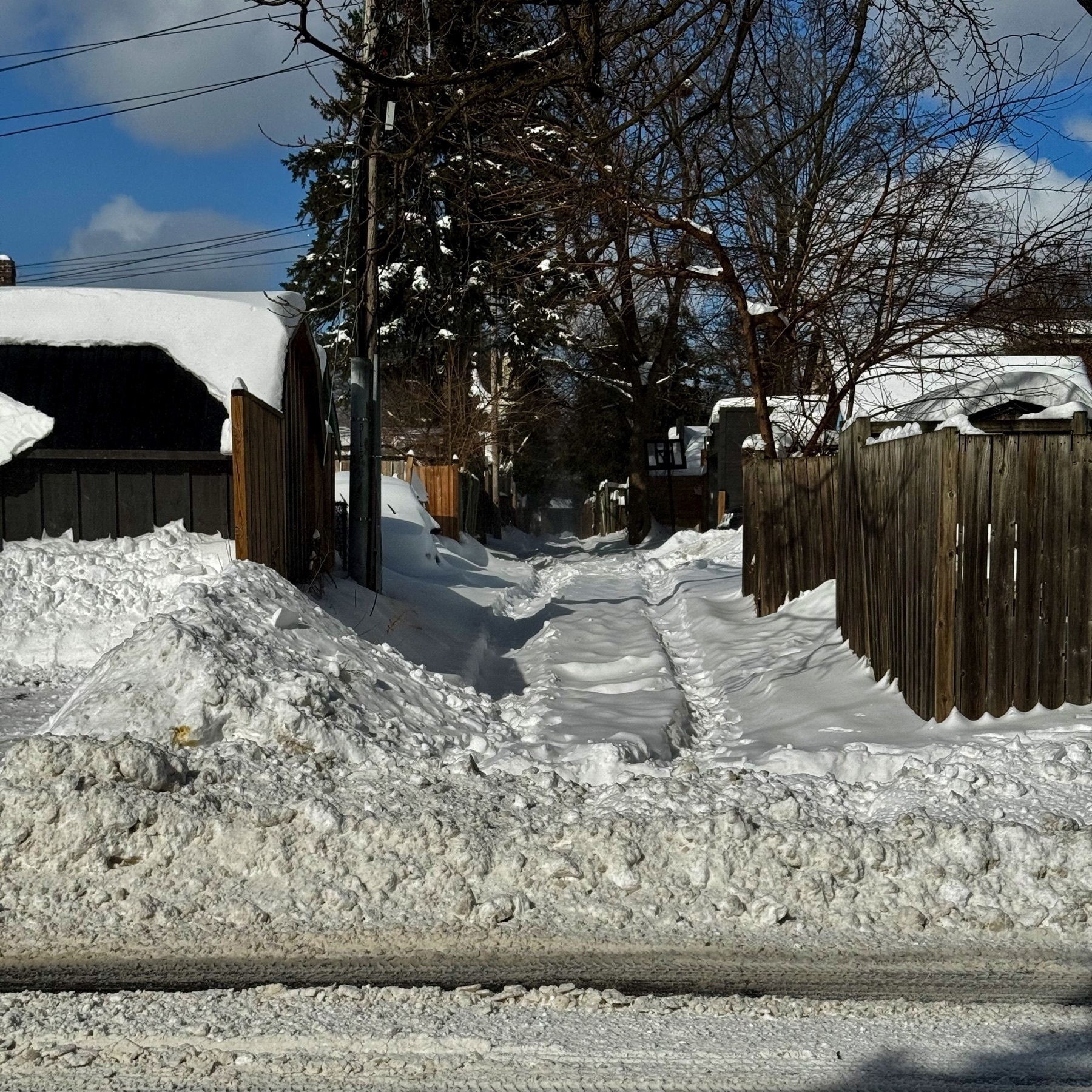
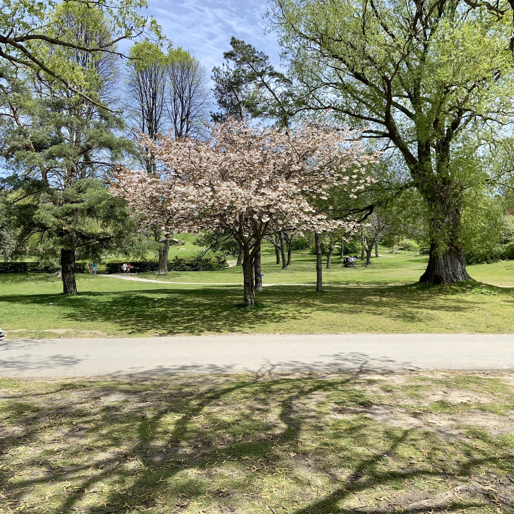
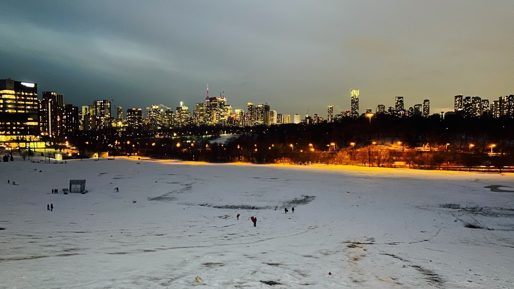
Perfect unlocking weather. Will be enjoying new snowfall next week I think.
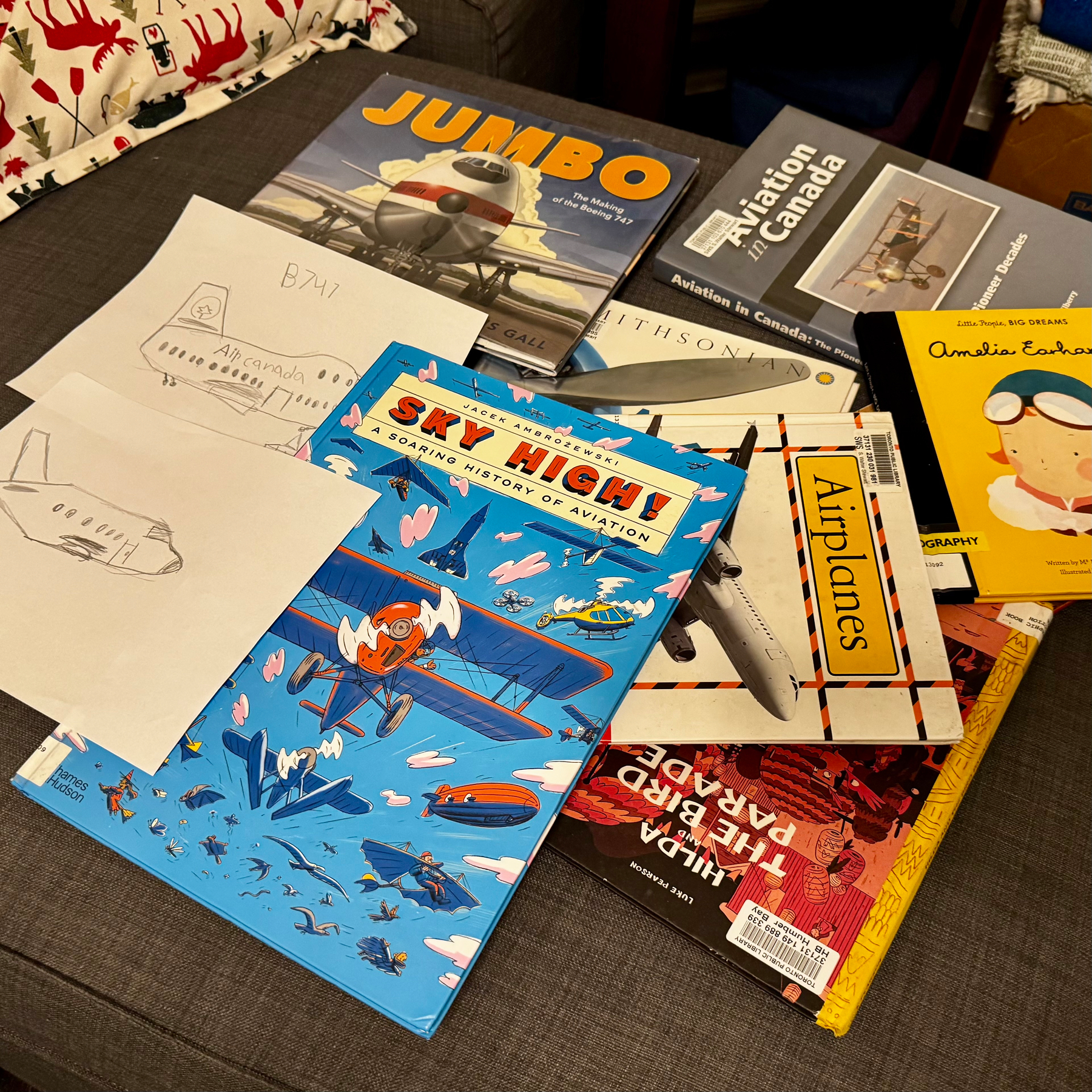
It’s aeroplane season in my house and Ryan is all over it.
The push and pull of Mother Nature trying to get to spring (or unlocking) is really annoying this year.
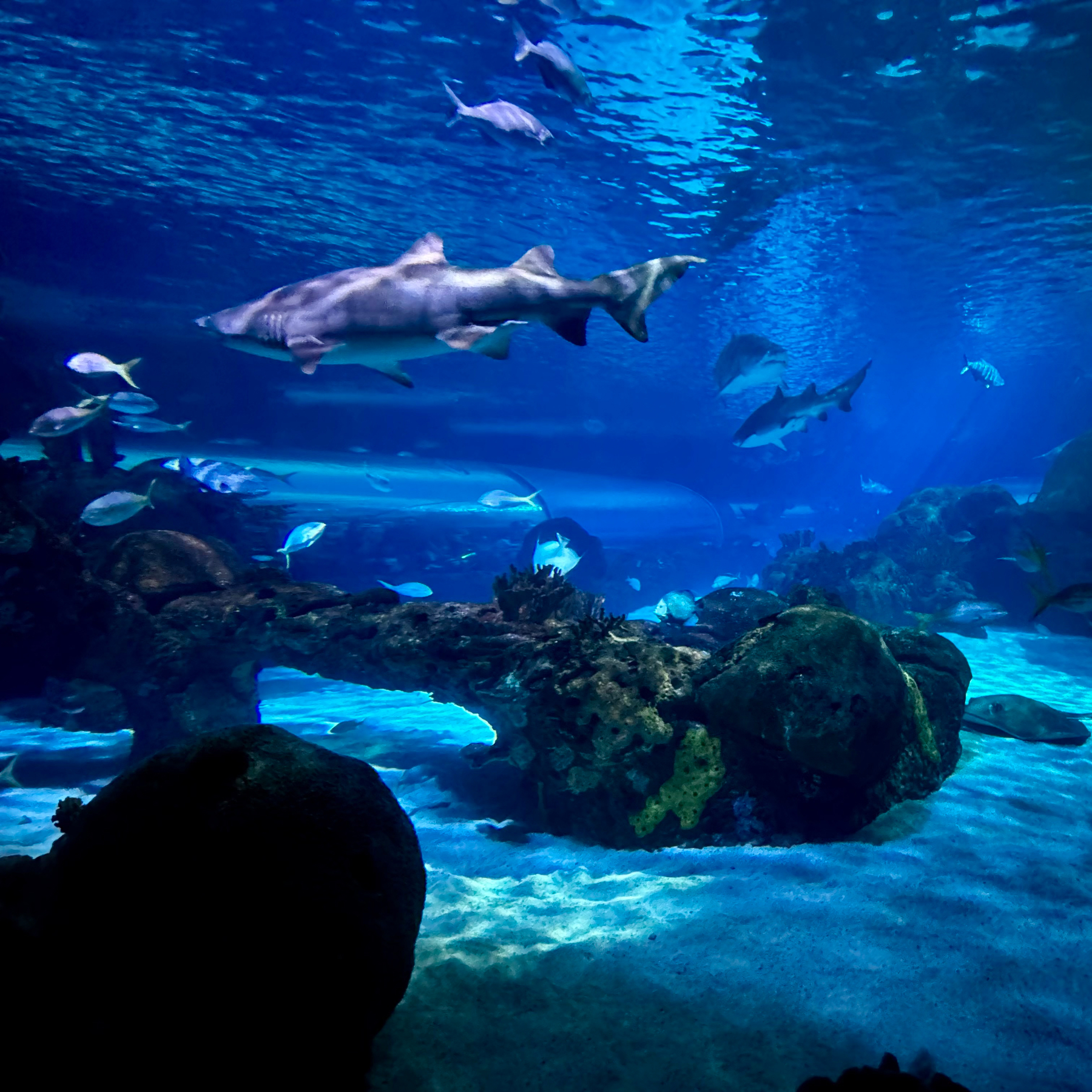
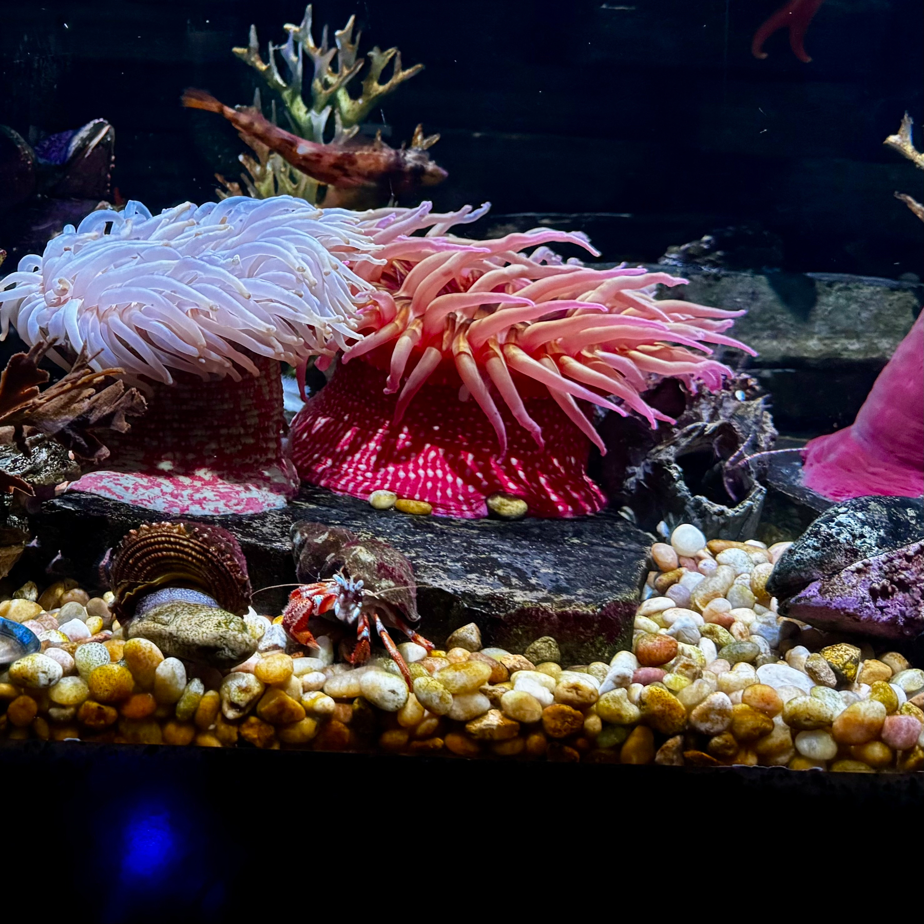
At the aquarium for family day.
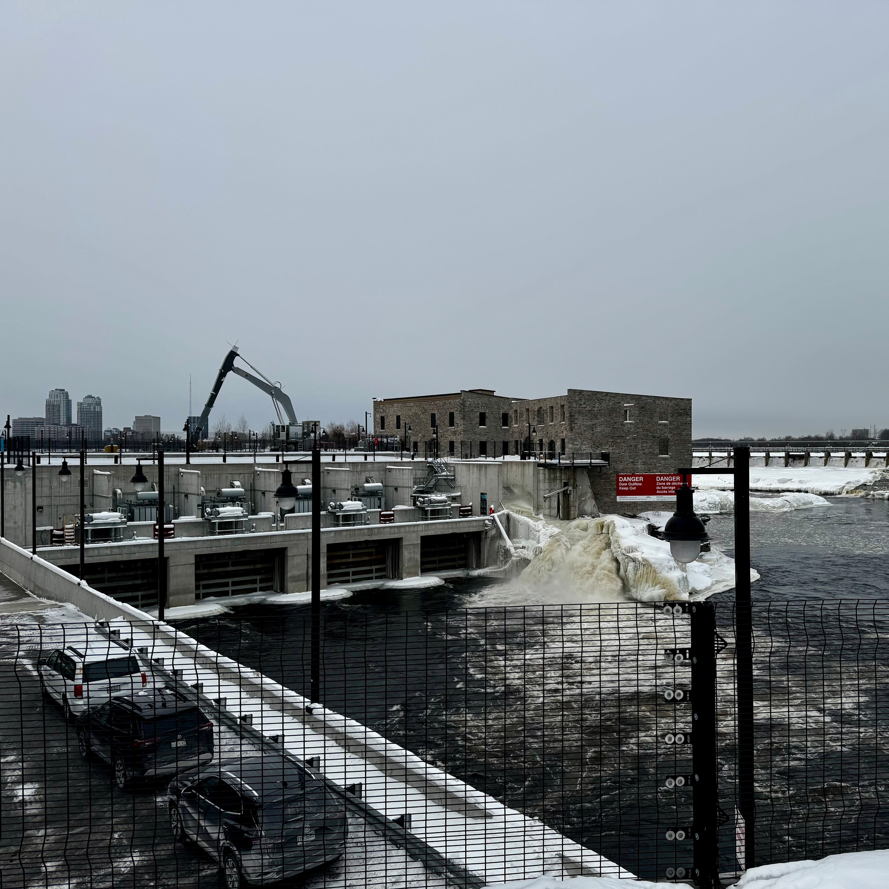
Hydro Ottawa.
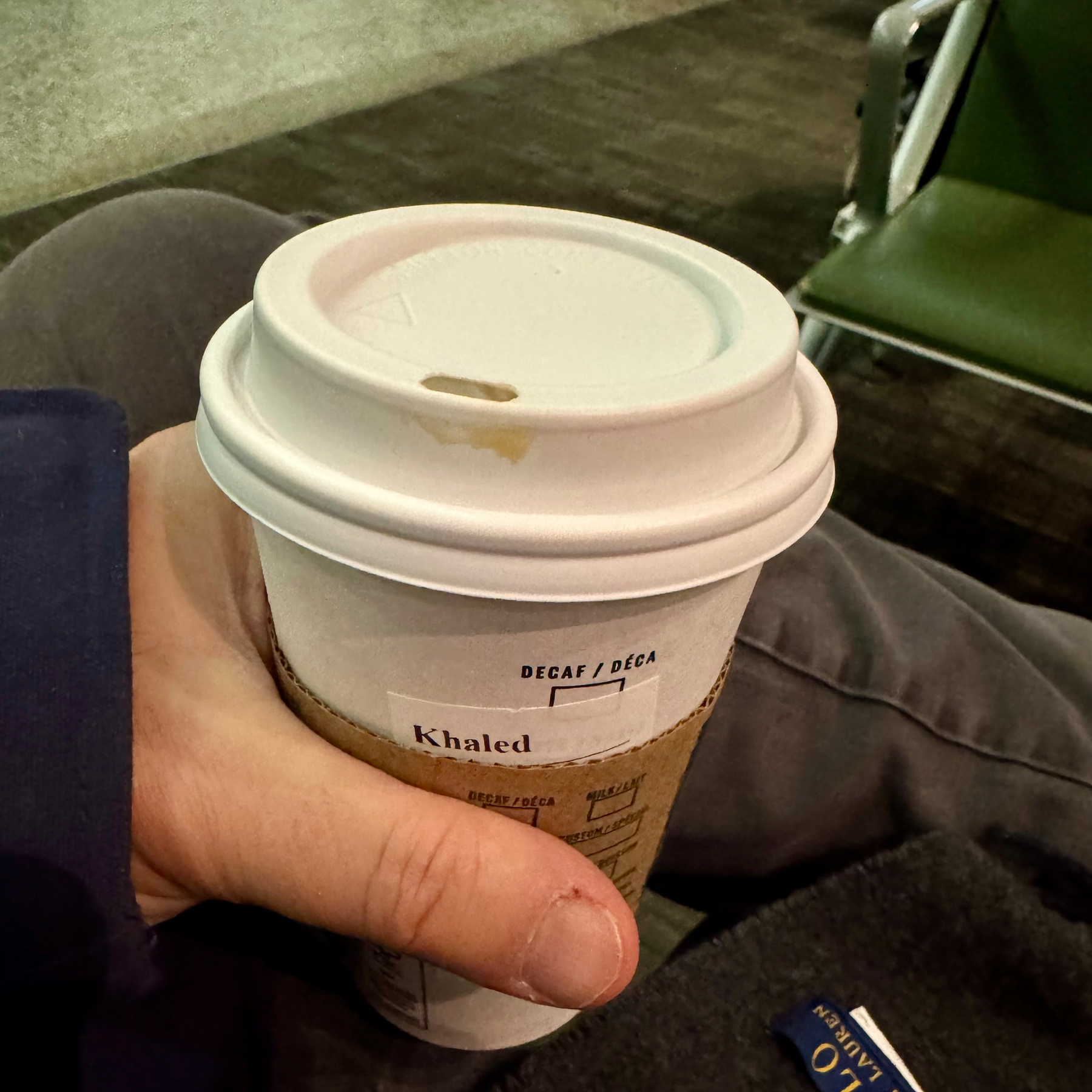
Thought this was significant, ordered, got asked my name, which I actually gave correctly for the first time ever. Didn’t get milk in my coffee (like I asked) but got my name printed correctly!
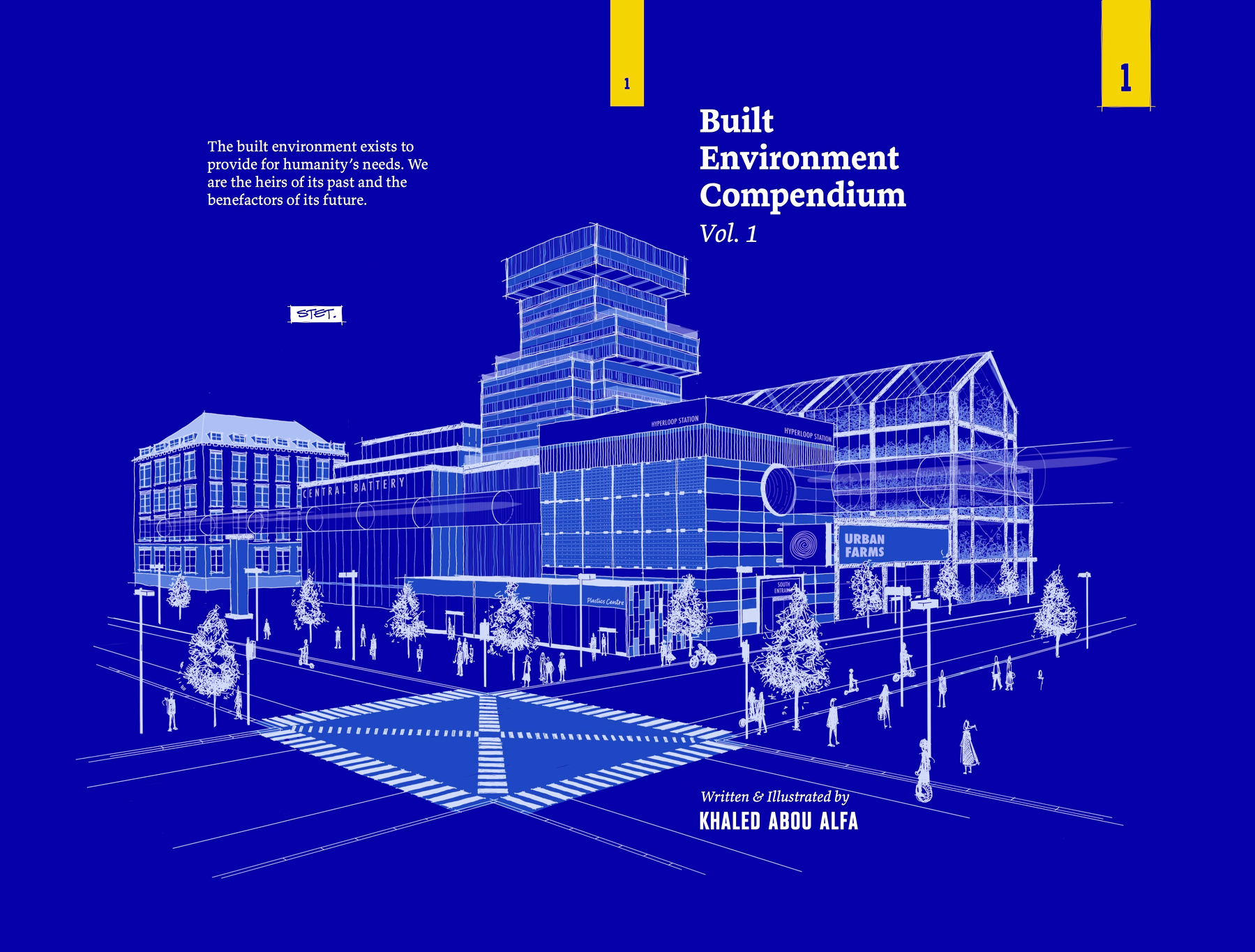
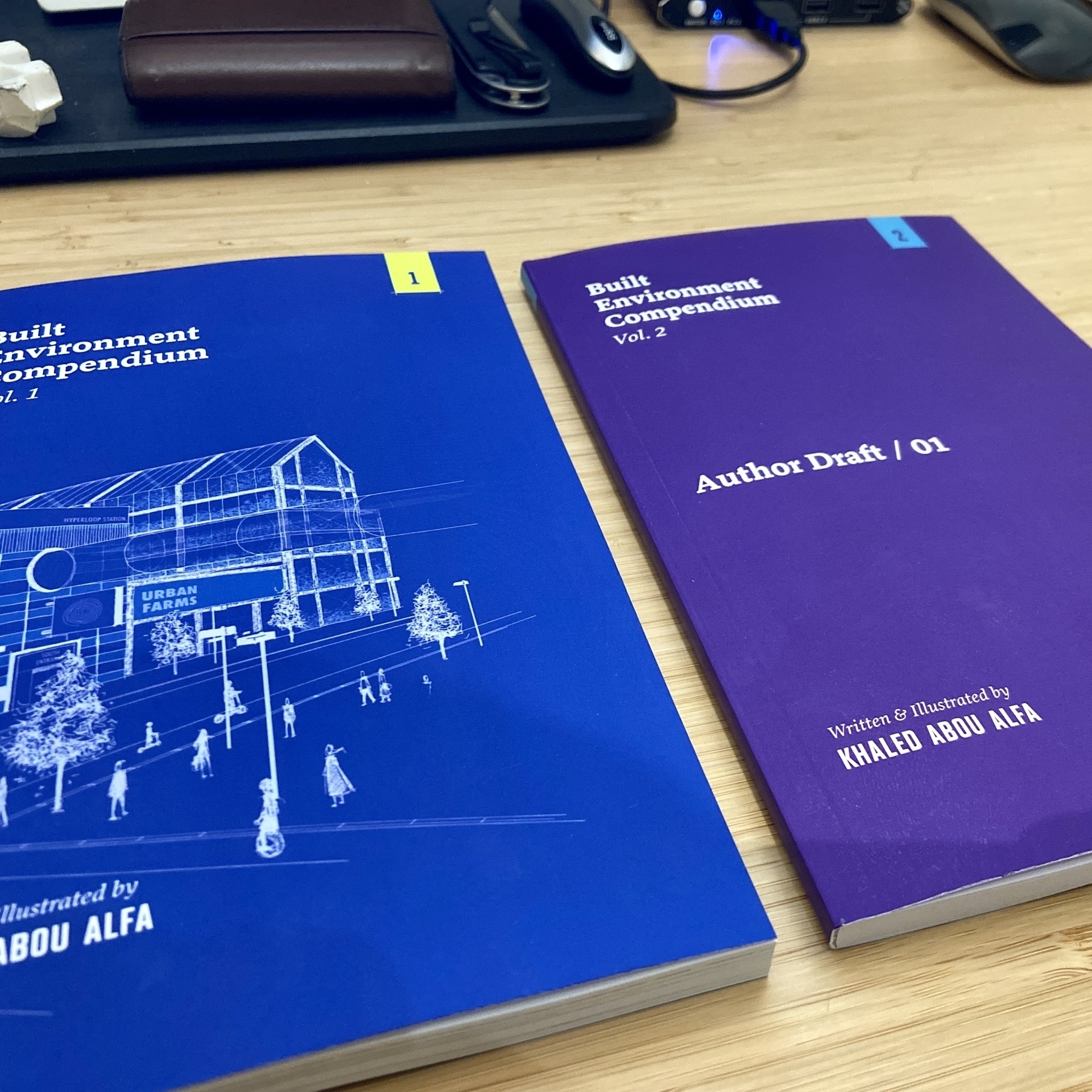
My book, Built Environment Compendium Vol.1 is now available for free.
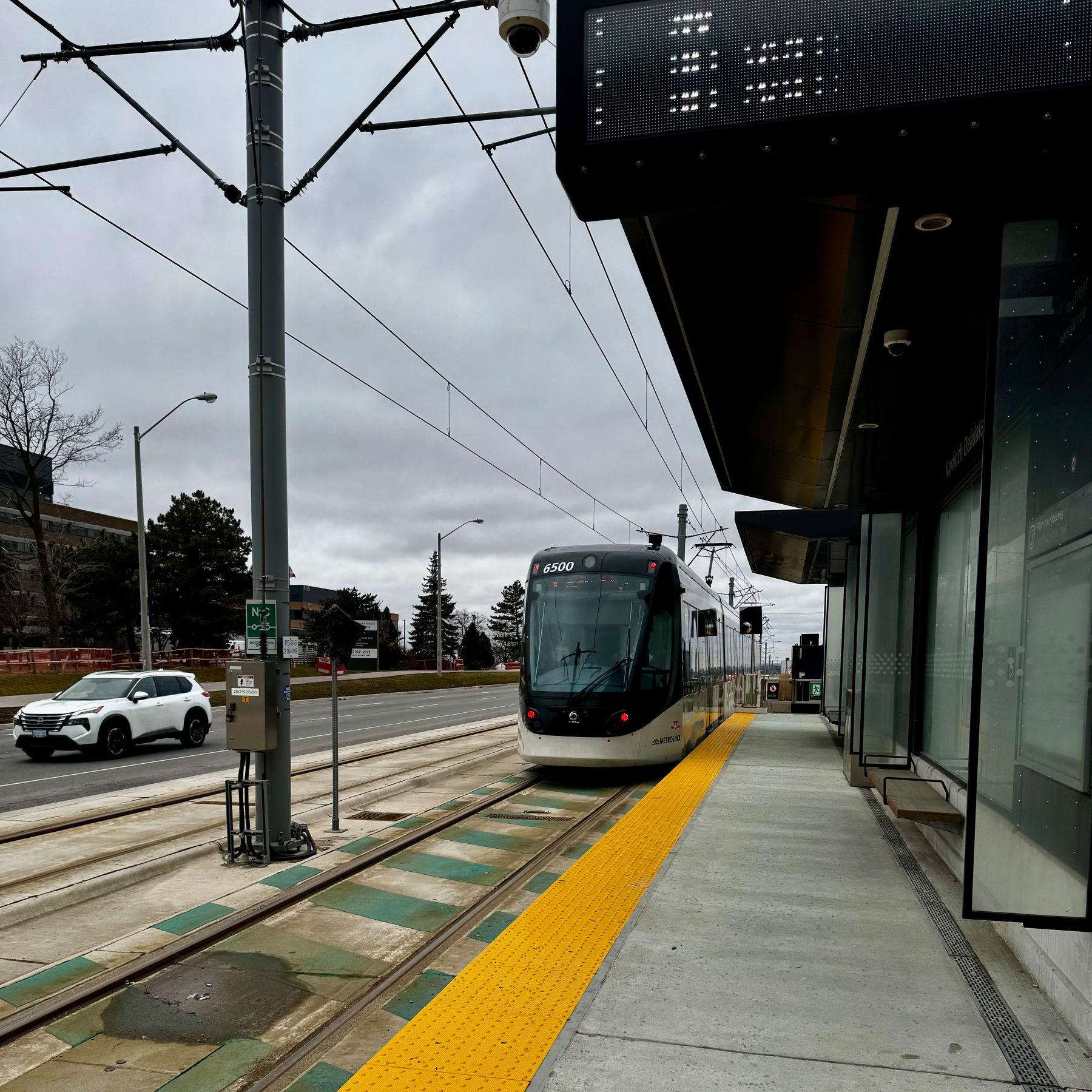
Finch West LRT. Spent a considerable number of hours these last few years on this one. Plenty of anguish but glad Ryan made me make the pilgrimage to this line.
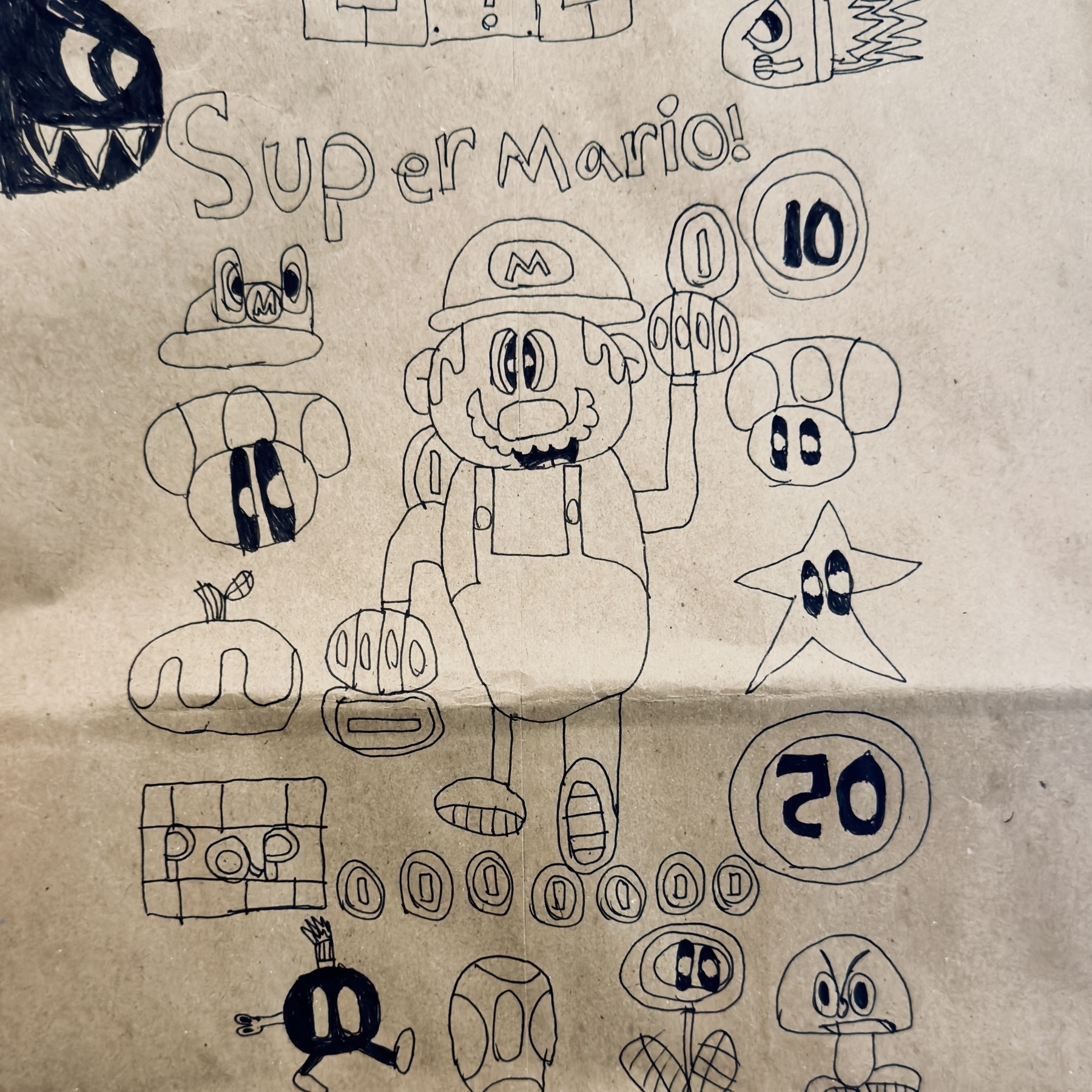
I just sat there with Zane to do a simple art session. I said I was going to draw a face and he was going to draw a blob face. We just ran from there and kept going.
Inspiration exists, it just needs to find you working.
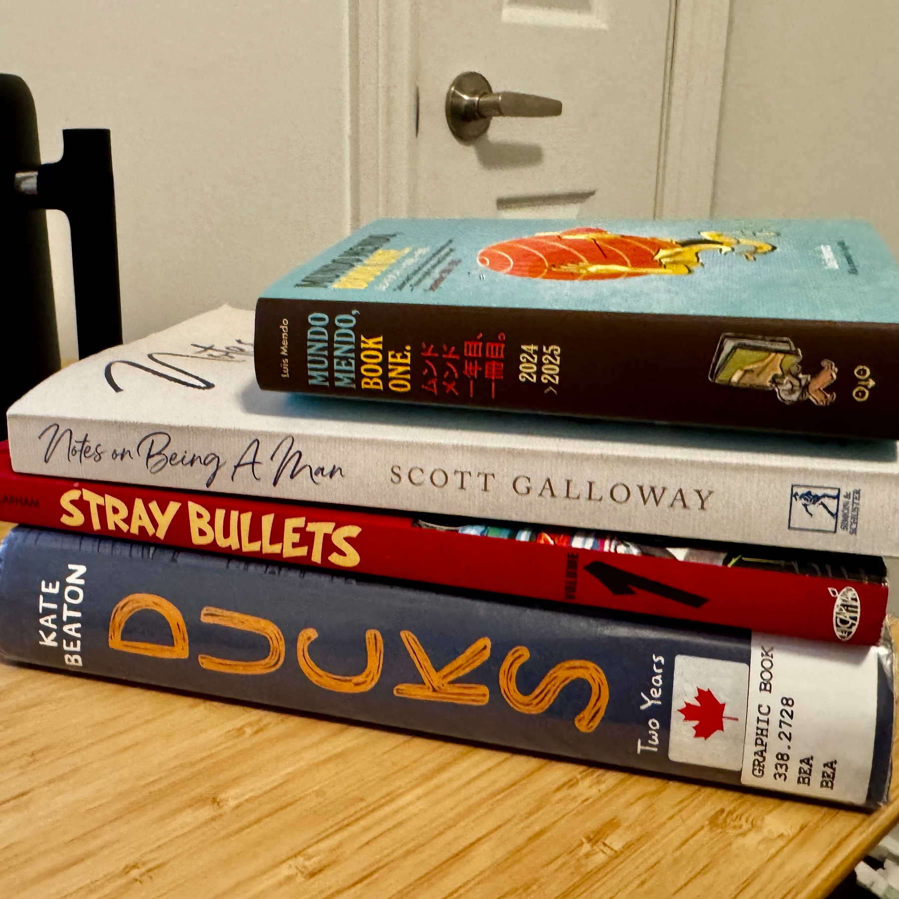
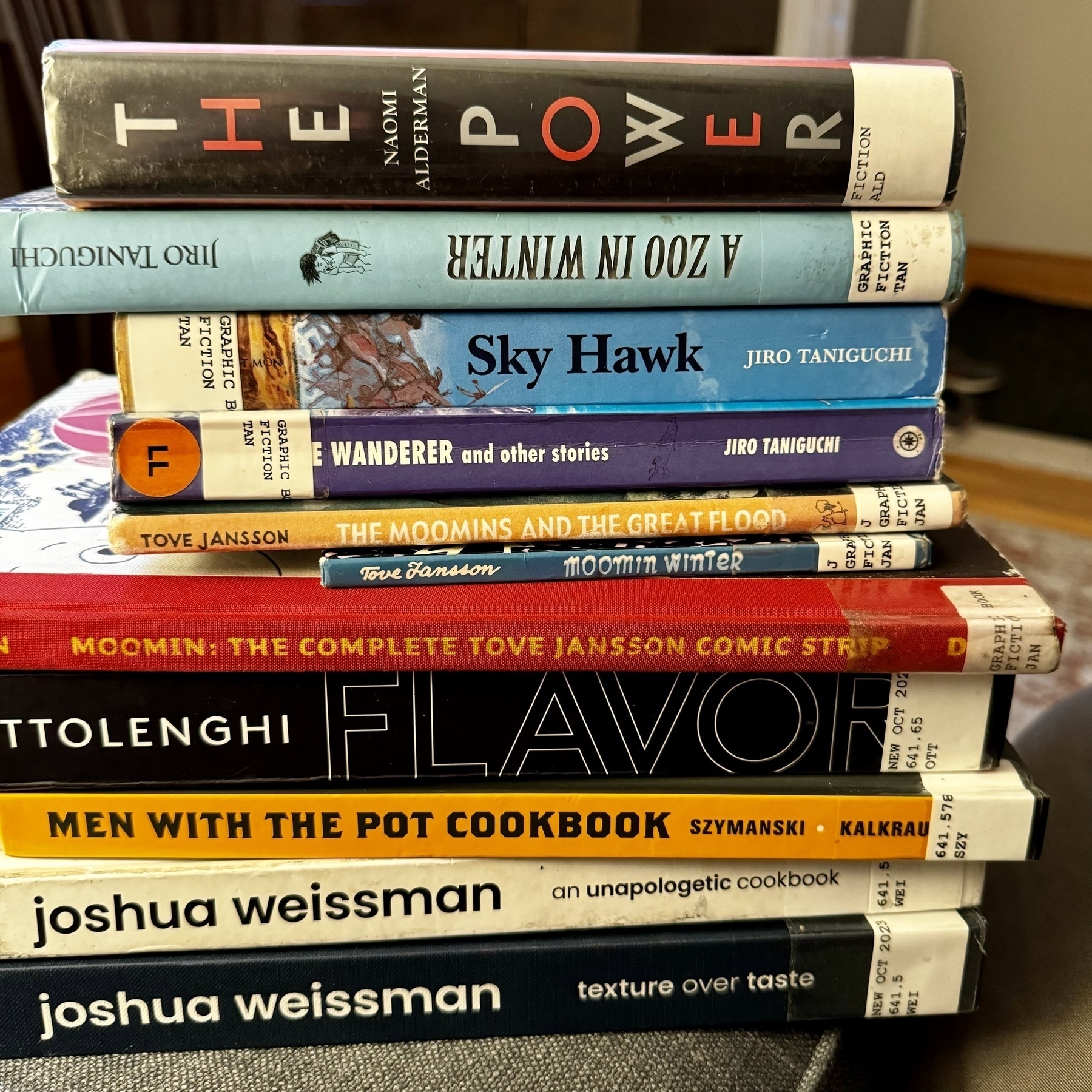
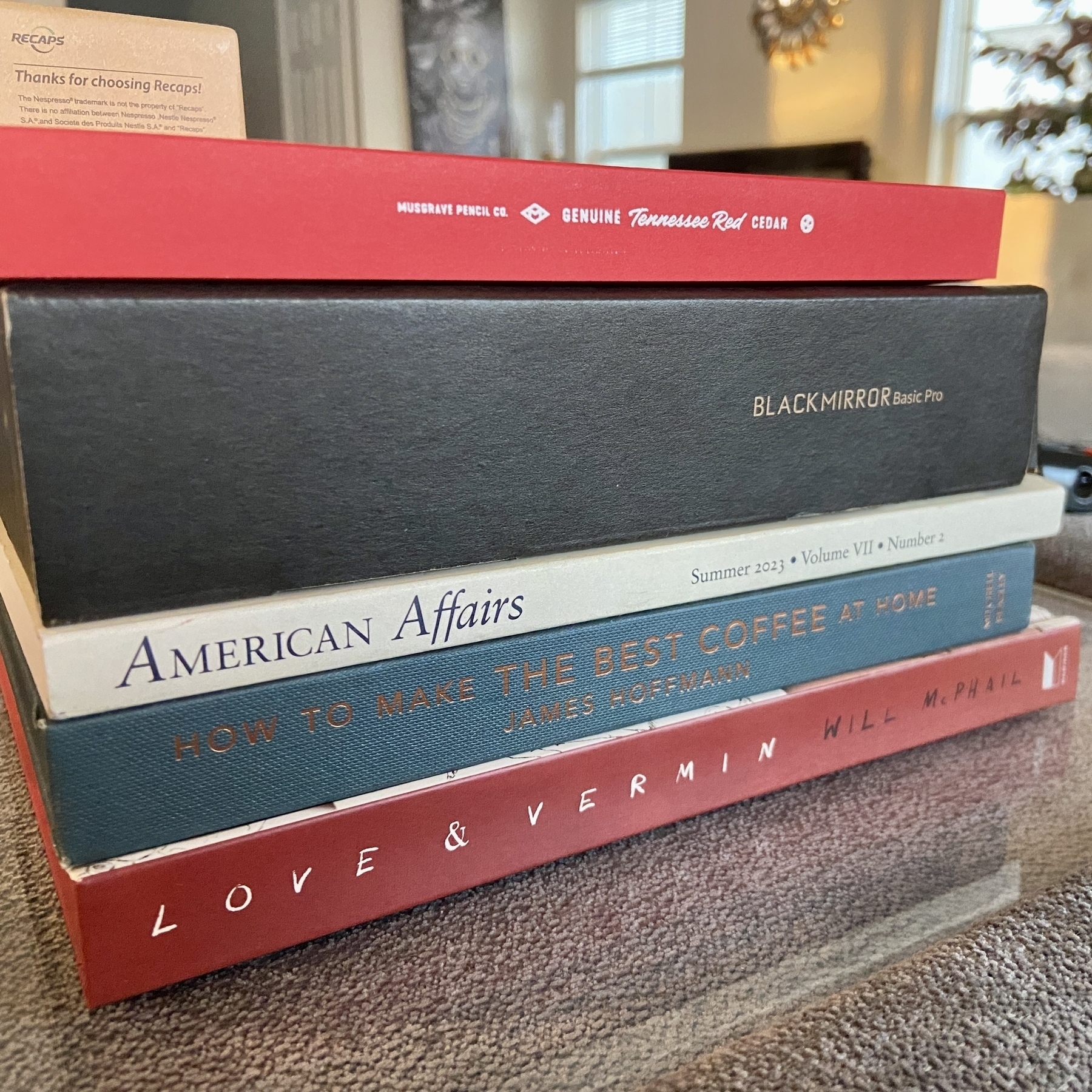
January reading pile.
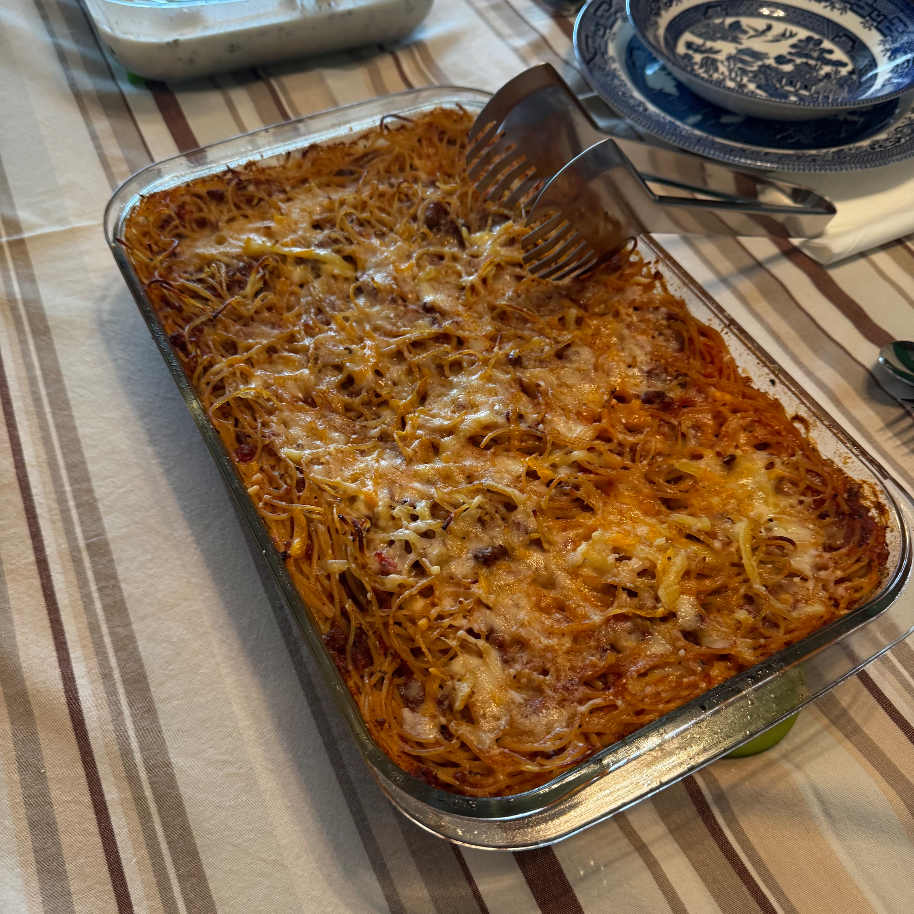
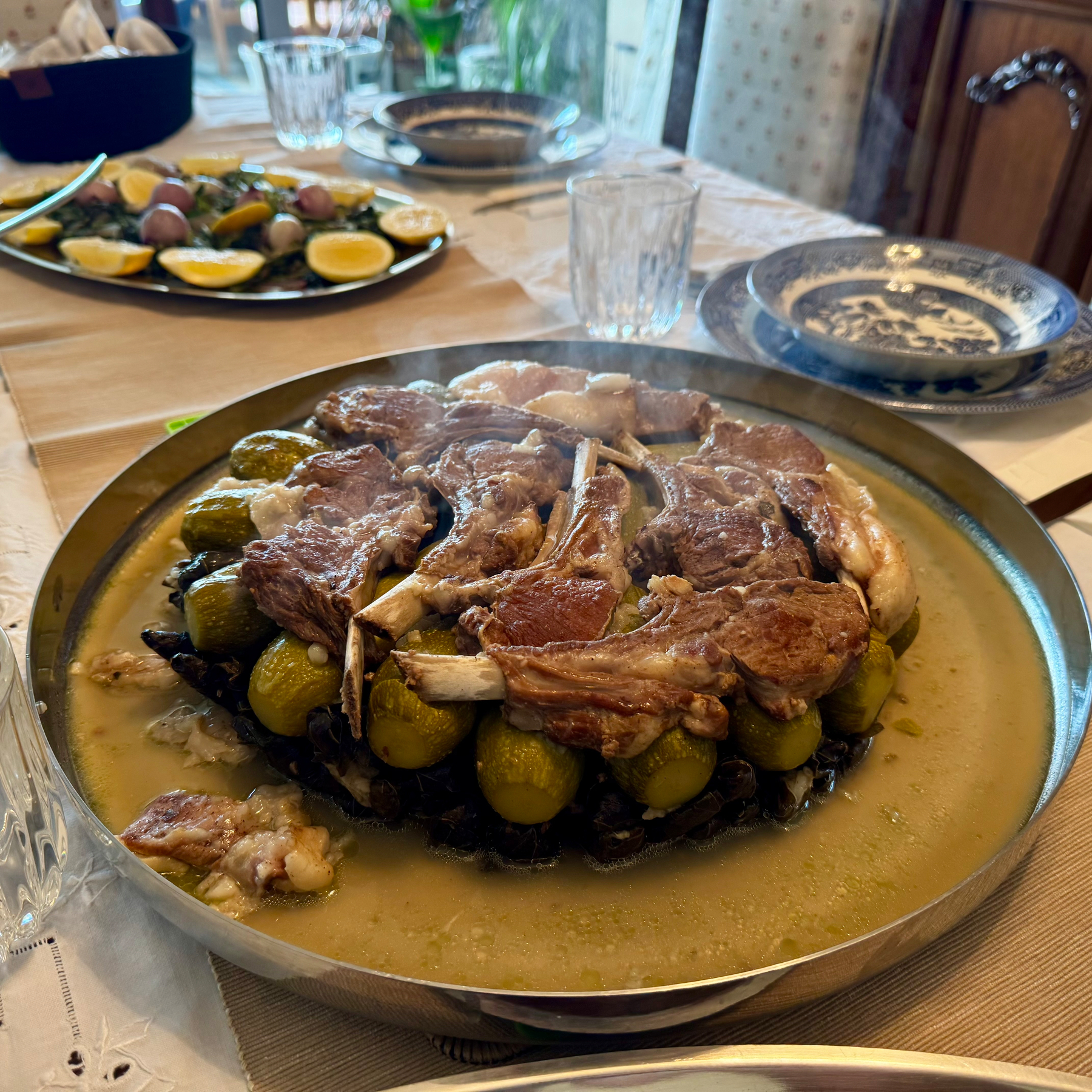
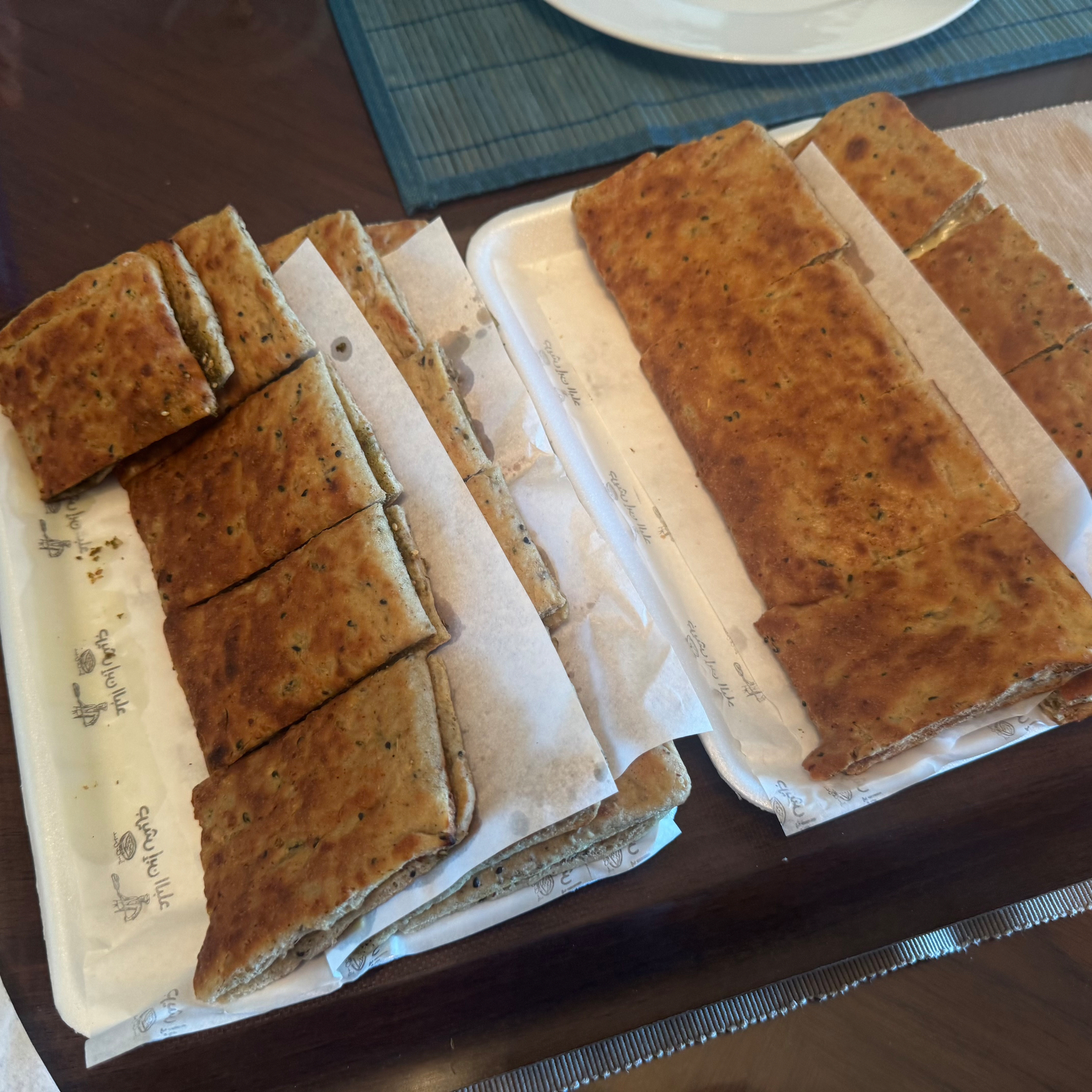
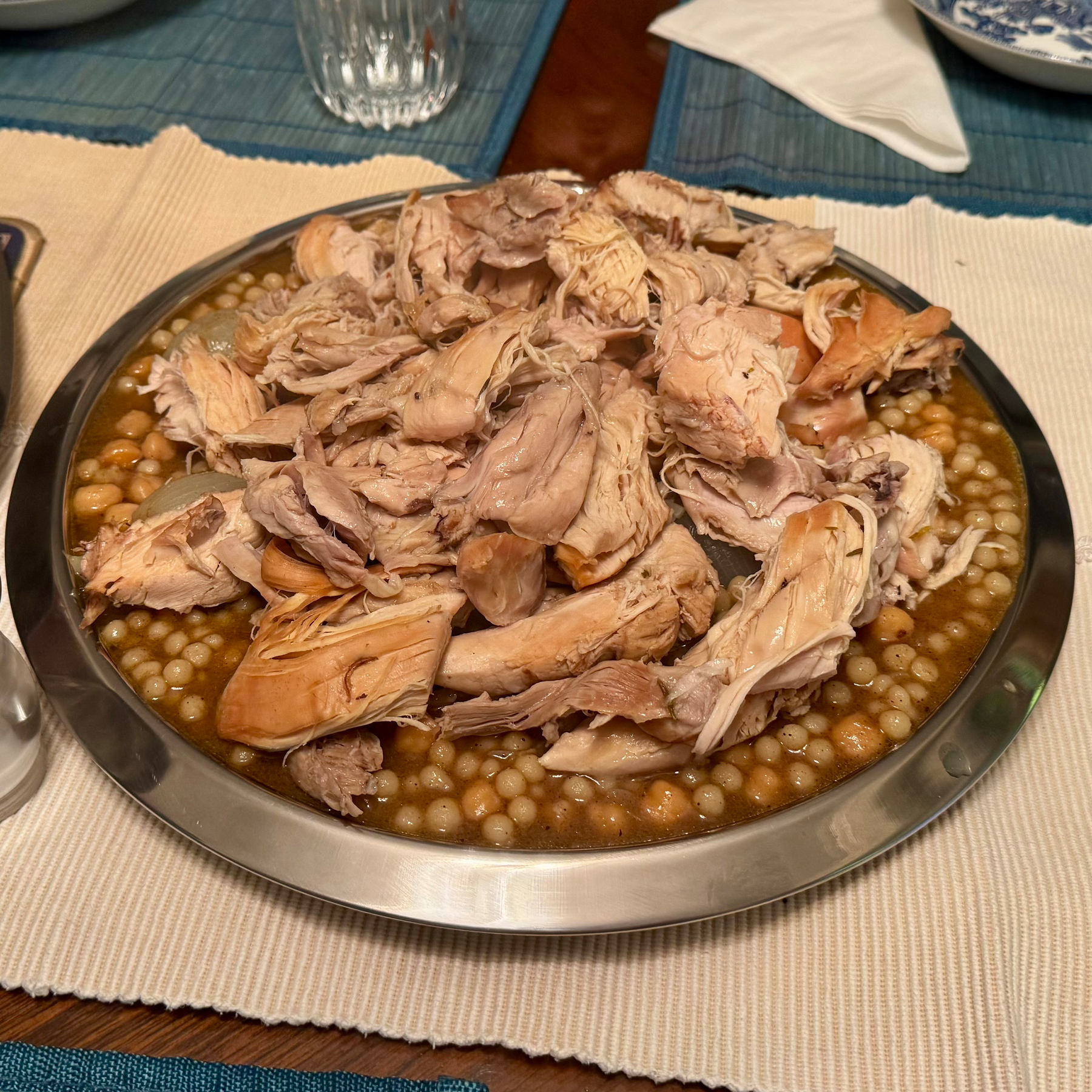
Last of these photos sadly. This is Lebanese spaghetti - usually comes with pine nuts which my mother forgot this time. Instantly took me and my brother back to our home in Athens.
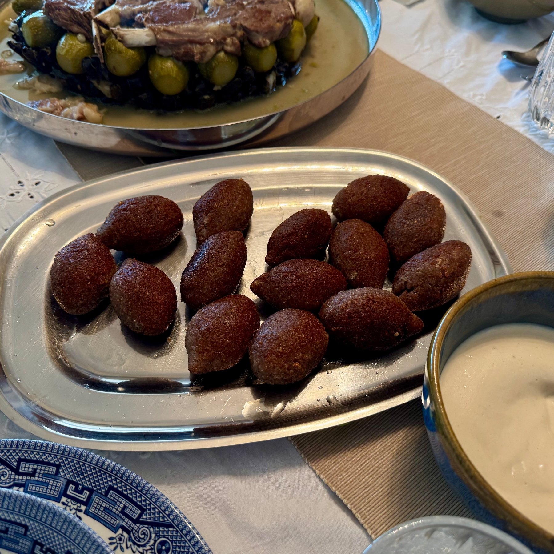
Kibeh Bil Labban. Haven’t had this in nearly a decade..who knows, maybe more?
🇱🇧 Kibeh and Tarator. I could eat these at every meal.
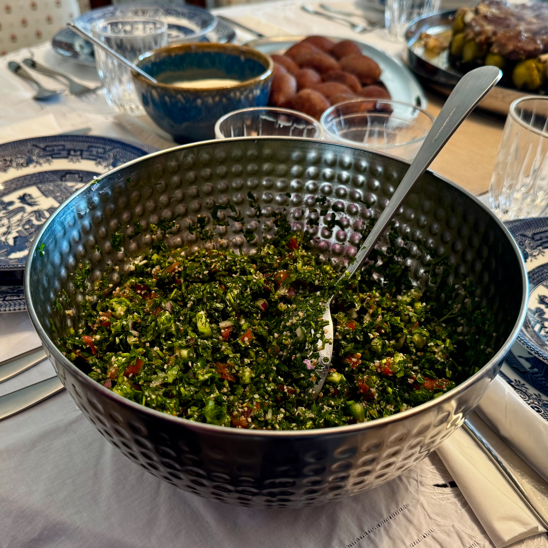
Tabouleh (Saida style). Every region does it slightly differently. The little twist here is the inclusion of cucumbers.
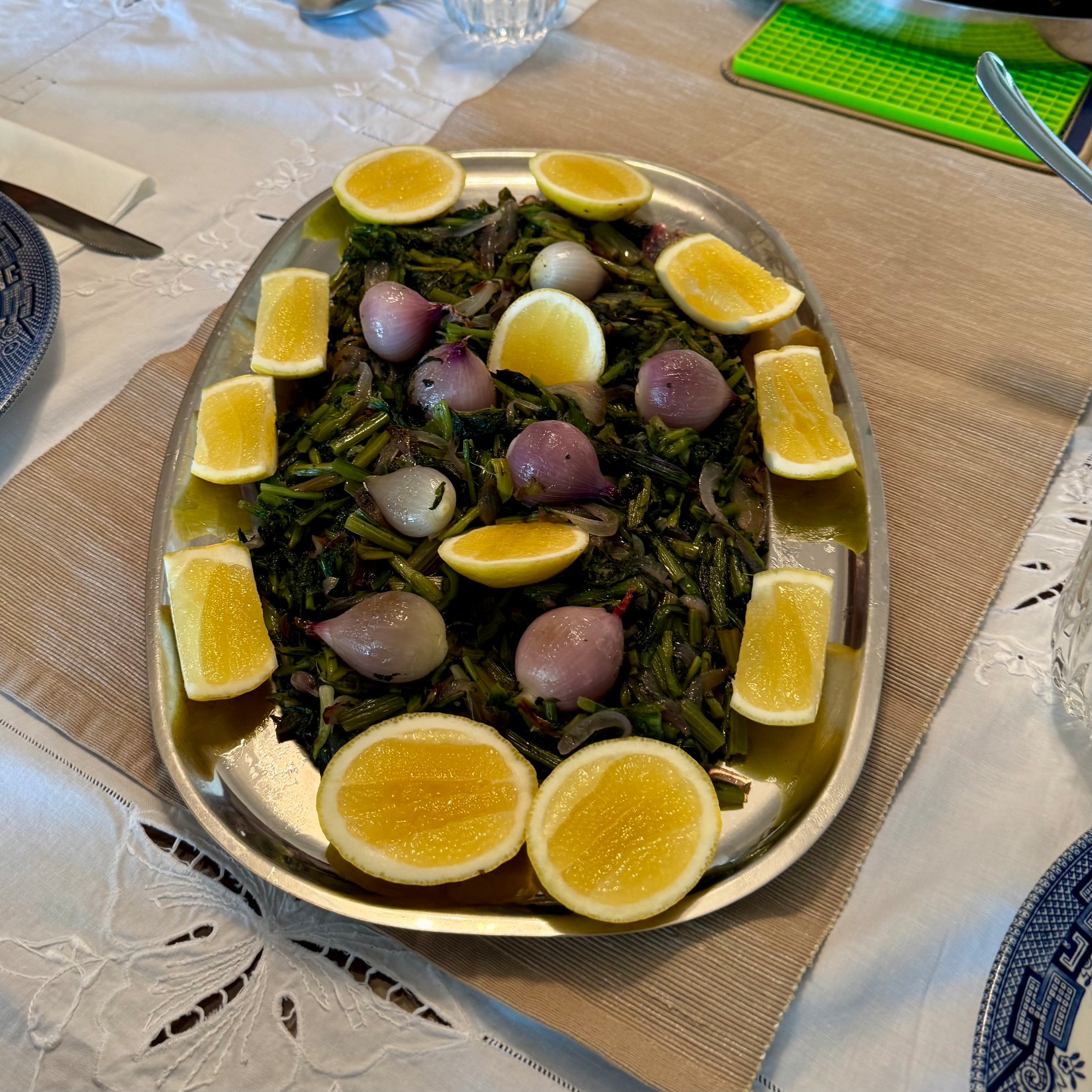
🇱🇧 Hindbeh (dandelion greens). A-May-Zing.
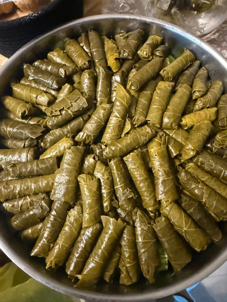
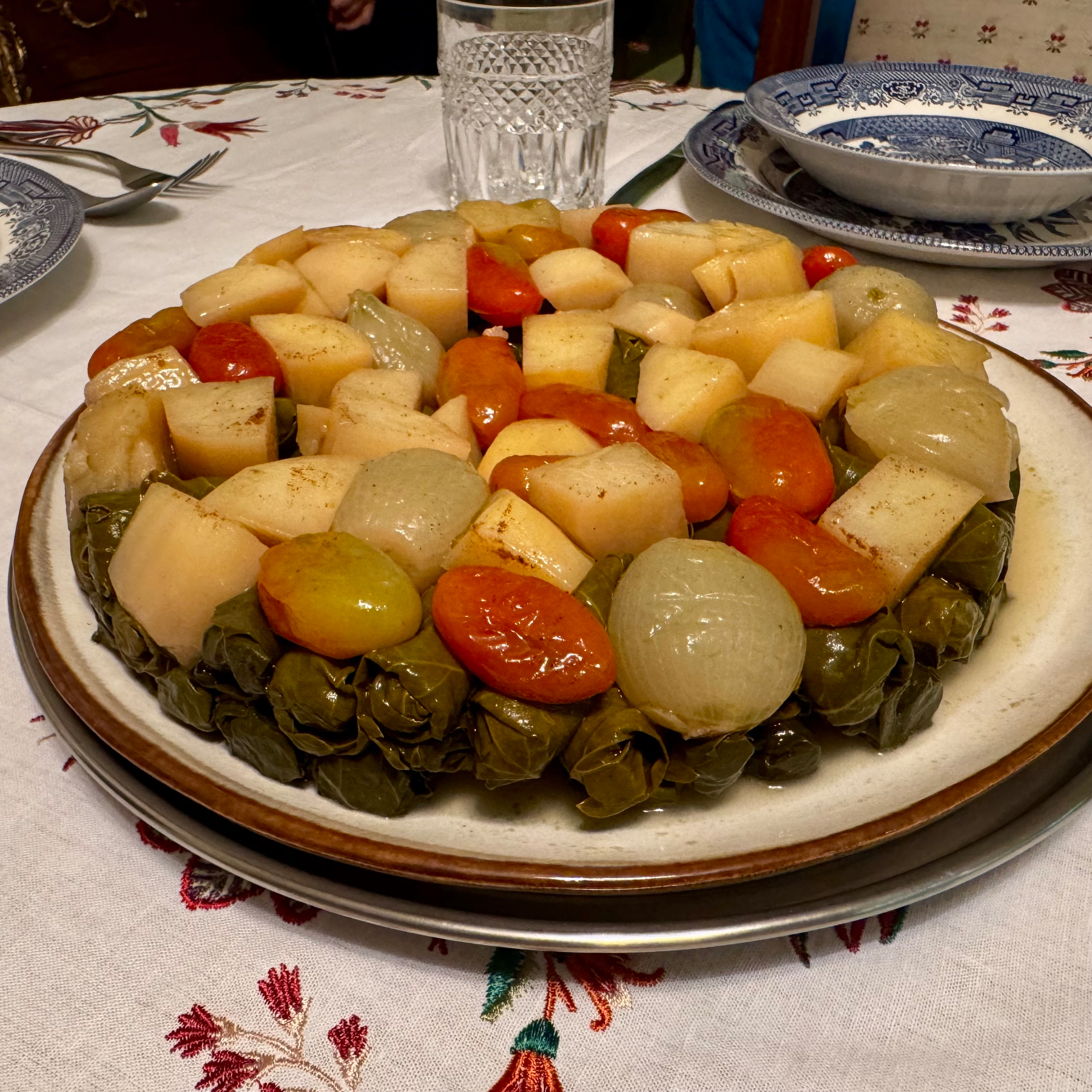
The dish fully cooked. Warak Inab.
My absolute favourite dish in the entire world. A triumph of any cuisine.
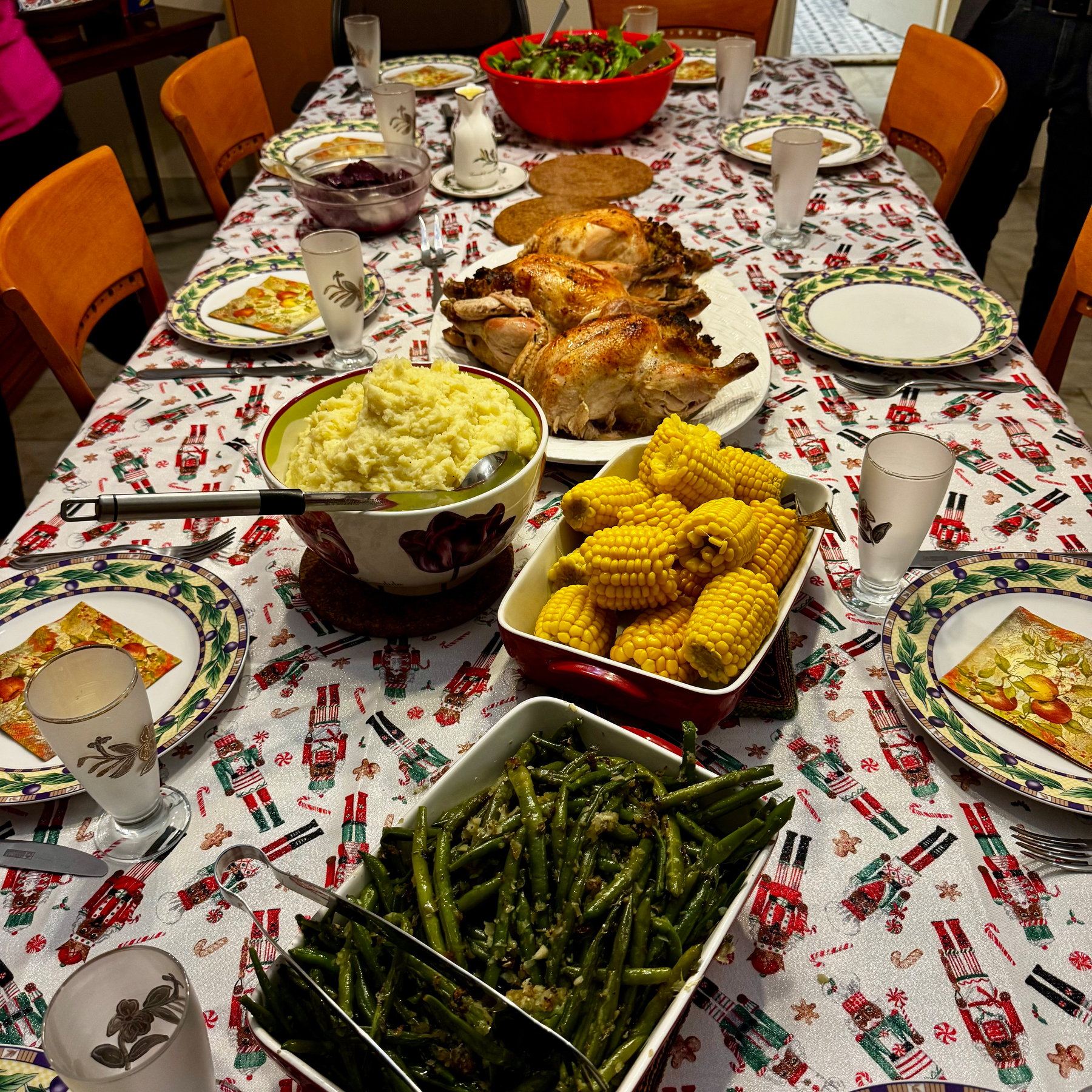
🎄 Merry Christmas everyone!
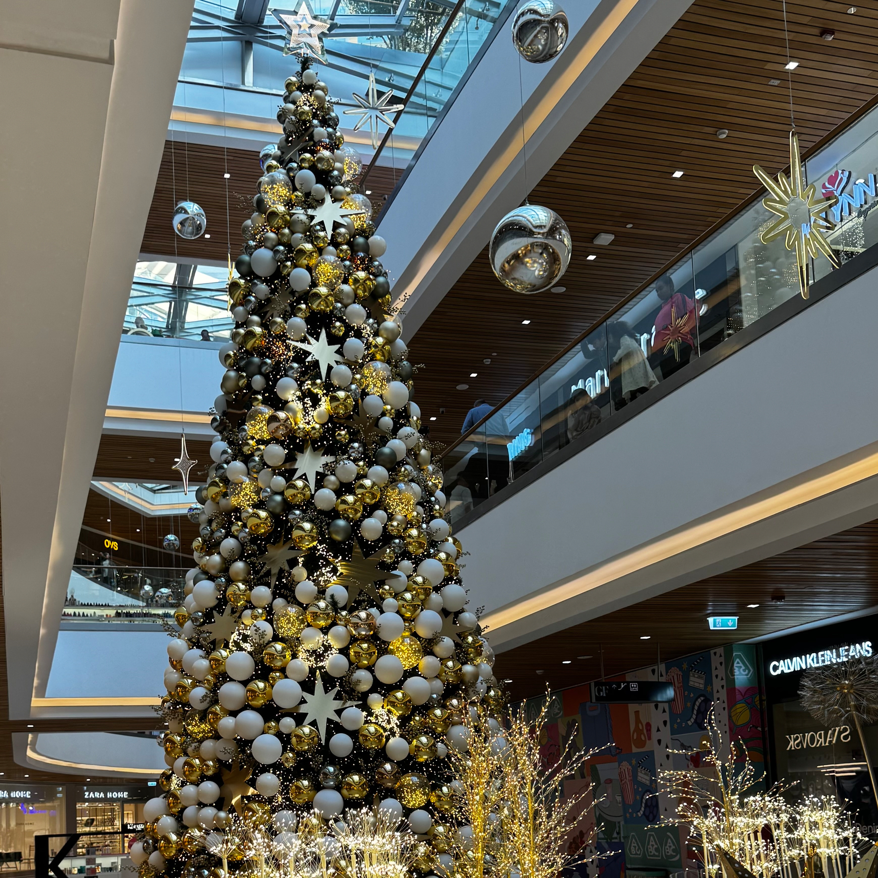
A pretty elegant Christmas tree.
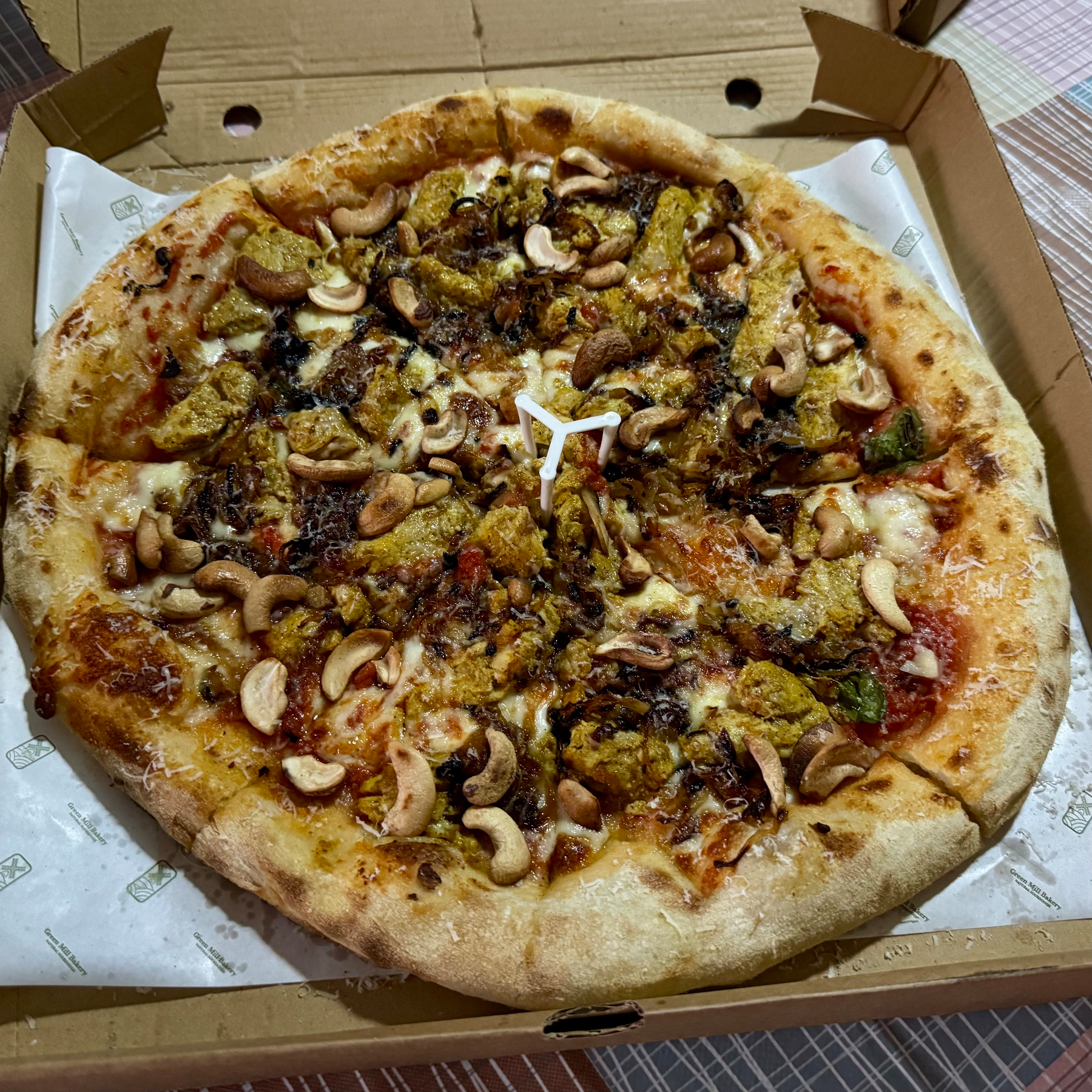
🇱🇧 Chicken Masala pizza. The kinda thing you will only find here - at my brother-in-law’s sourdough bakery.
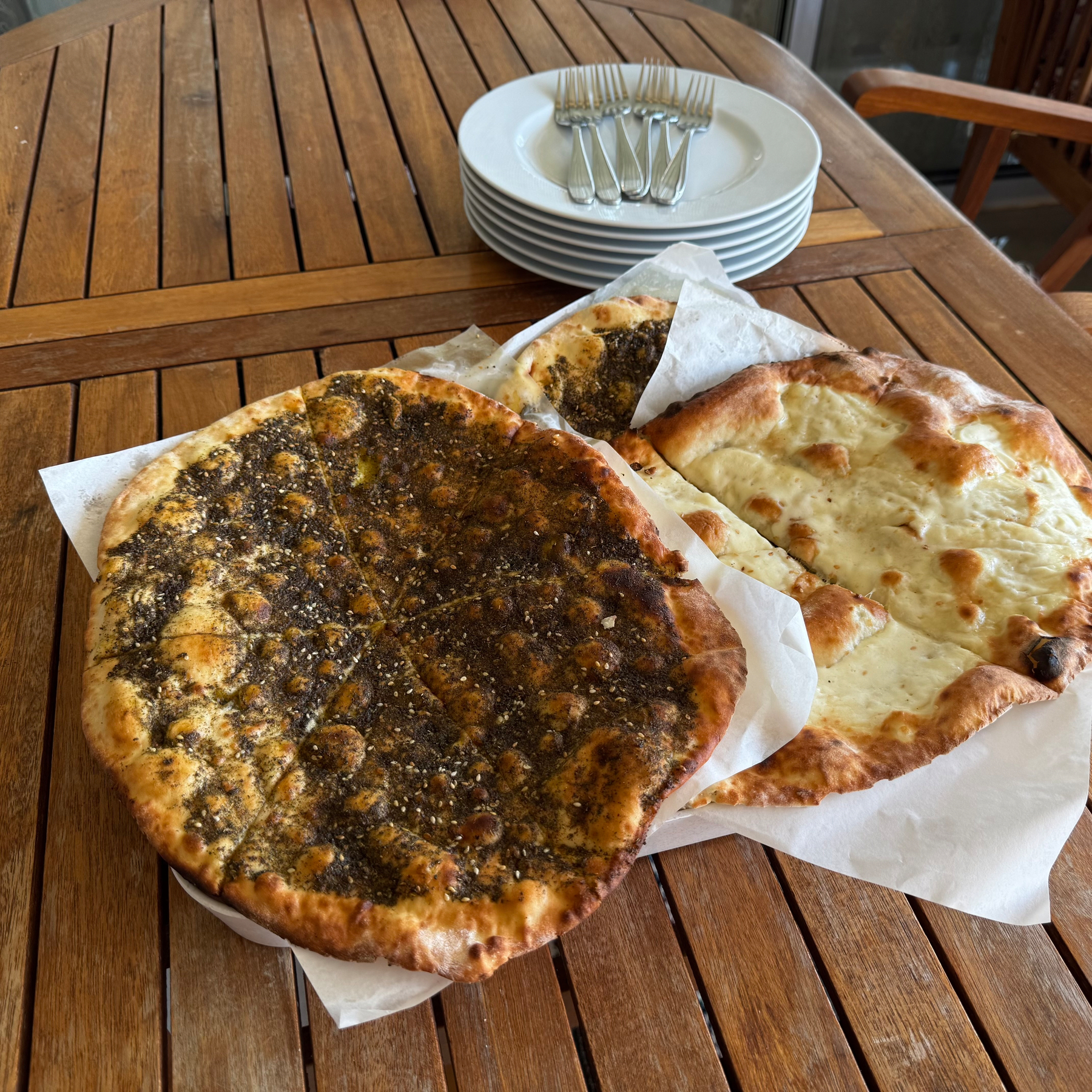
🇱🇧 A new variation on Manaeesh that I’ve never tried before. Grish Ebn Albalad.
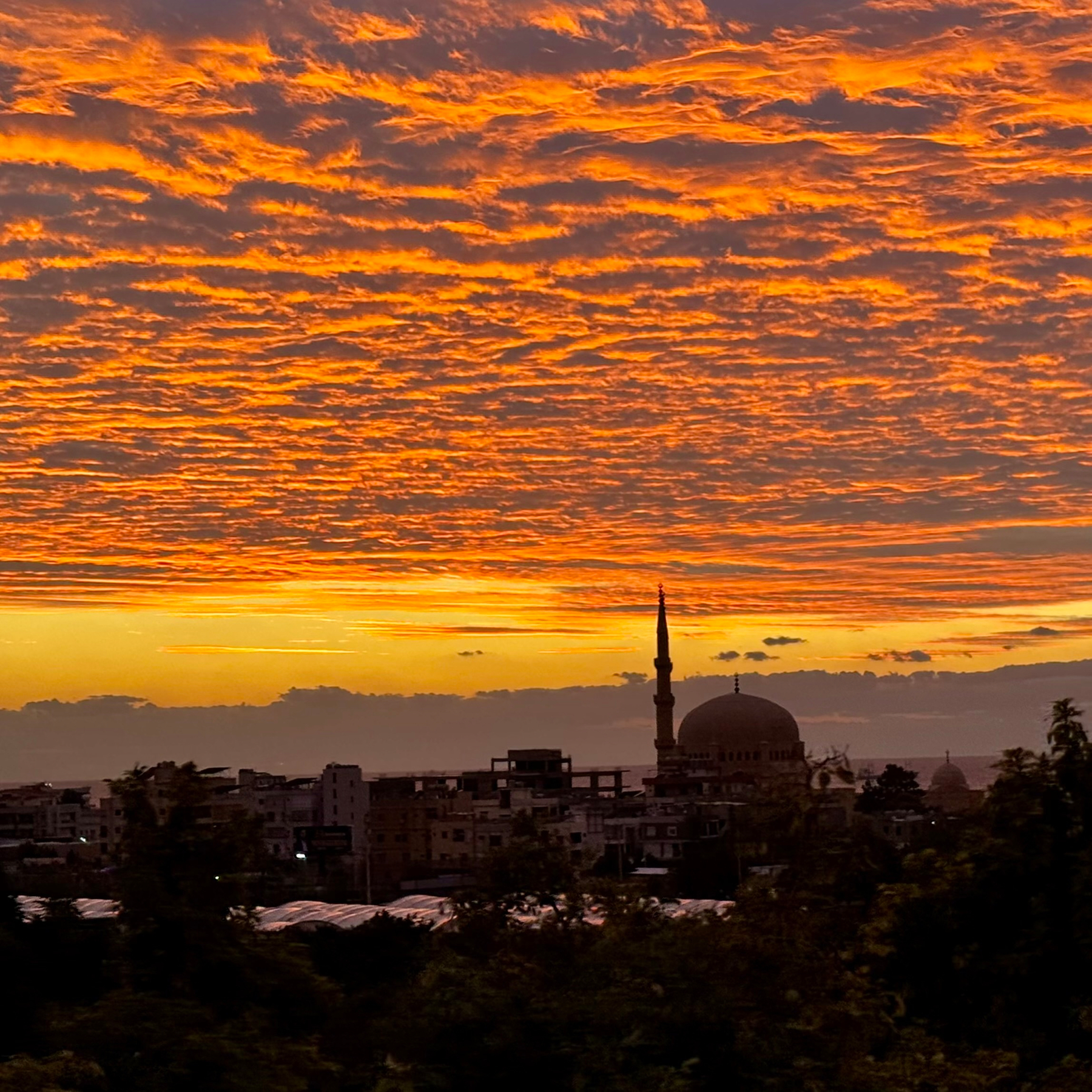
🇱🇧 Mediterranean skies.
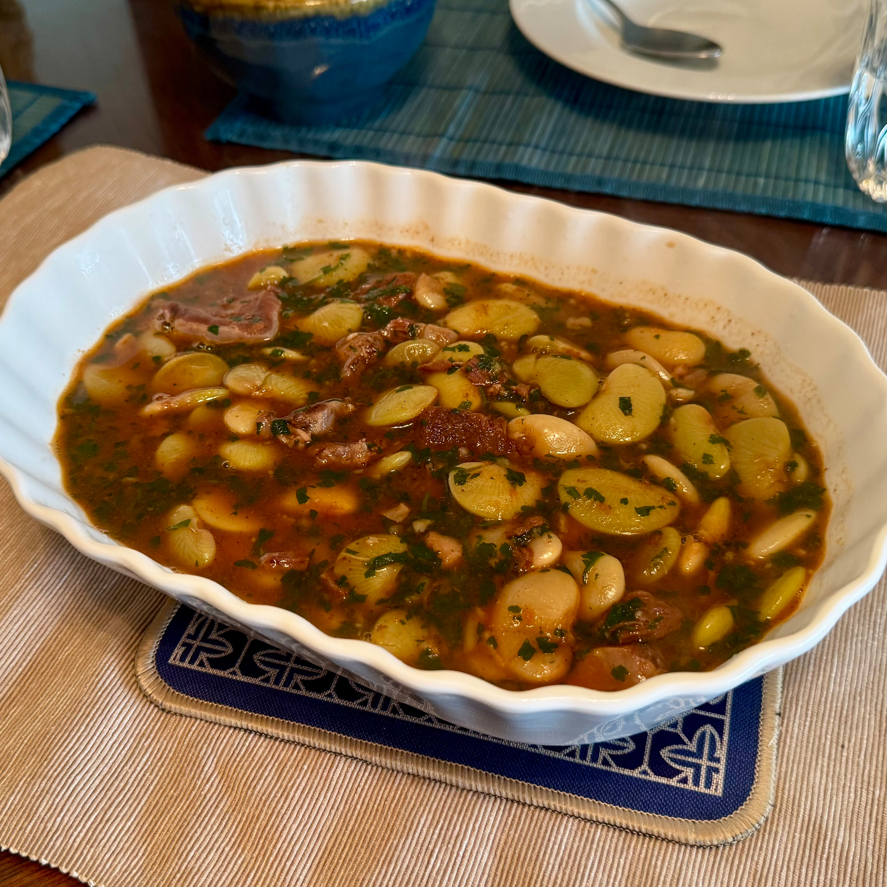
🇱🇧 Fasoulia.
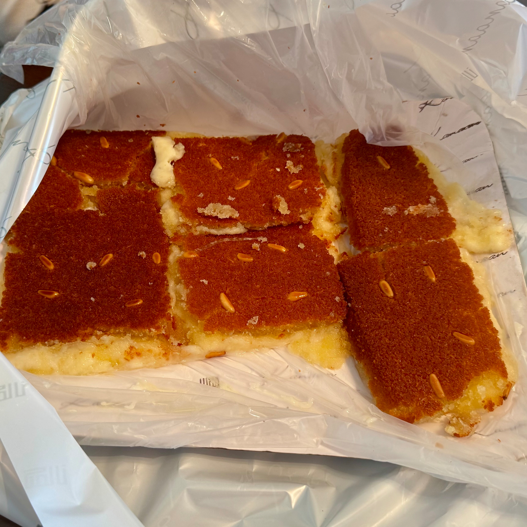
🇱🇧 Kunafeh.
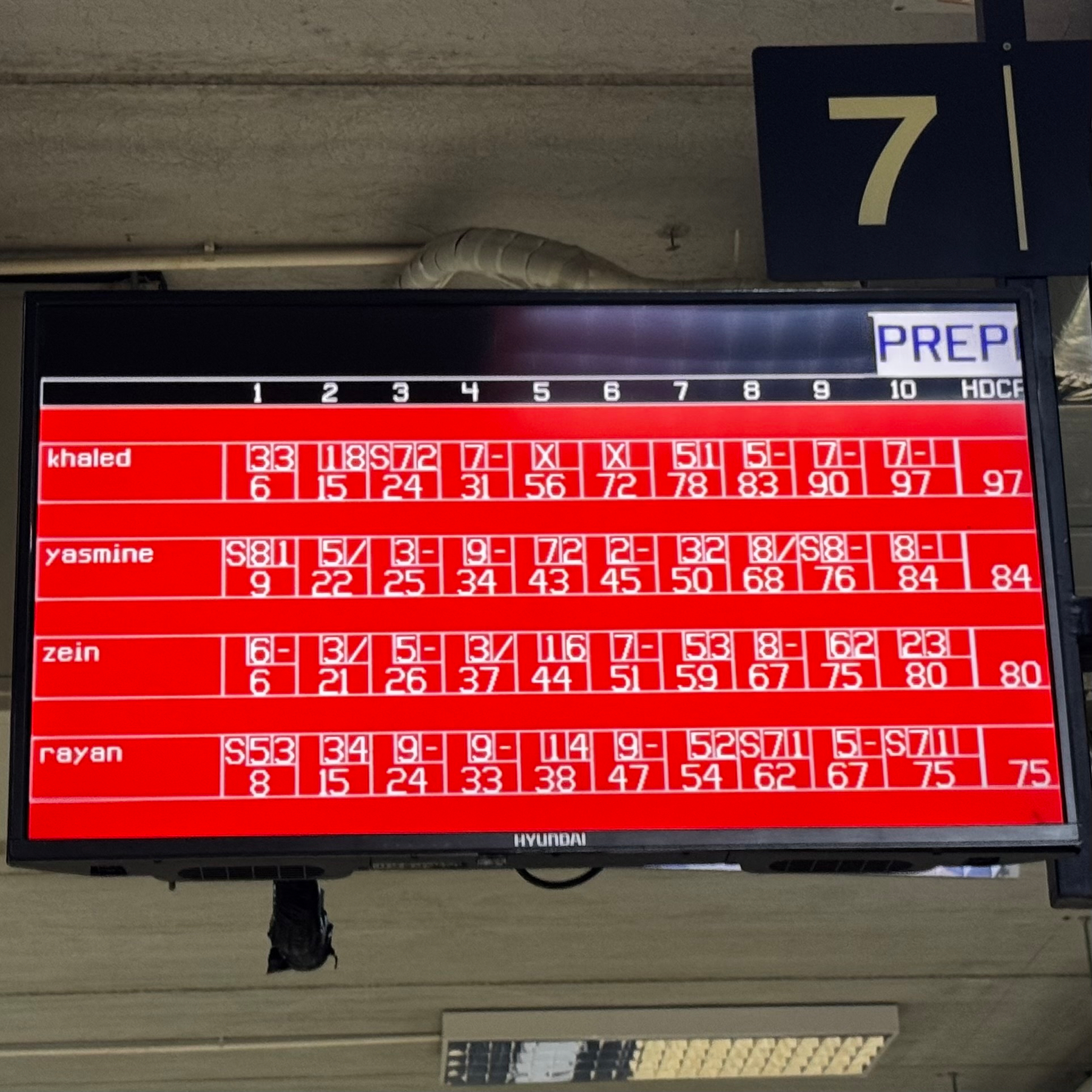
We went bowling today for the first time. They made me play with a handicap (using the smallest bowling ball) after my two strikes.
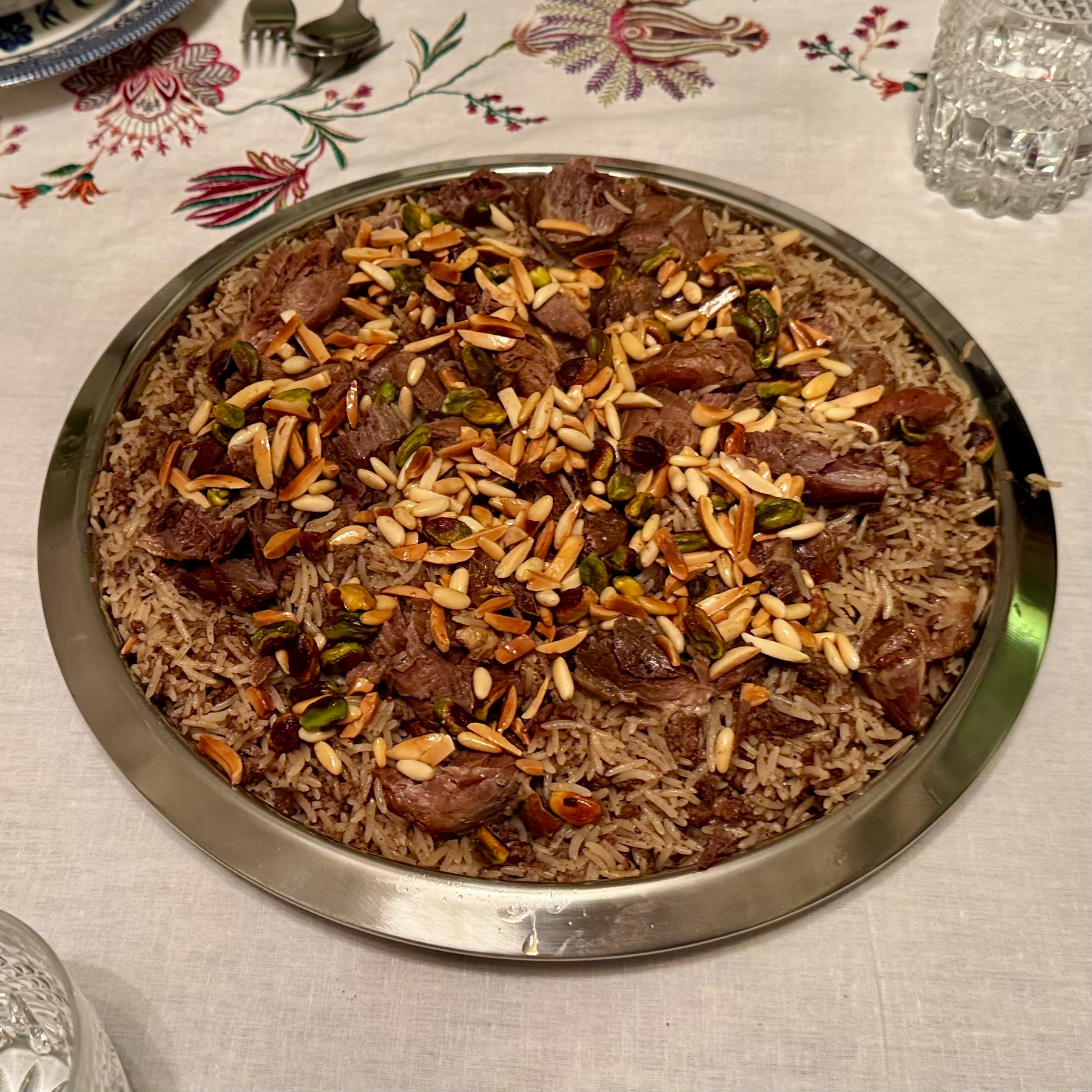
🇱🇧 Mougrabieh.
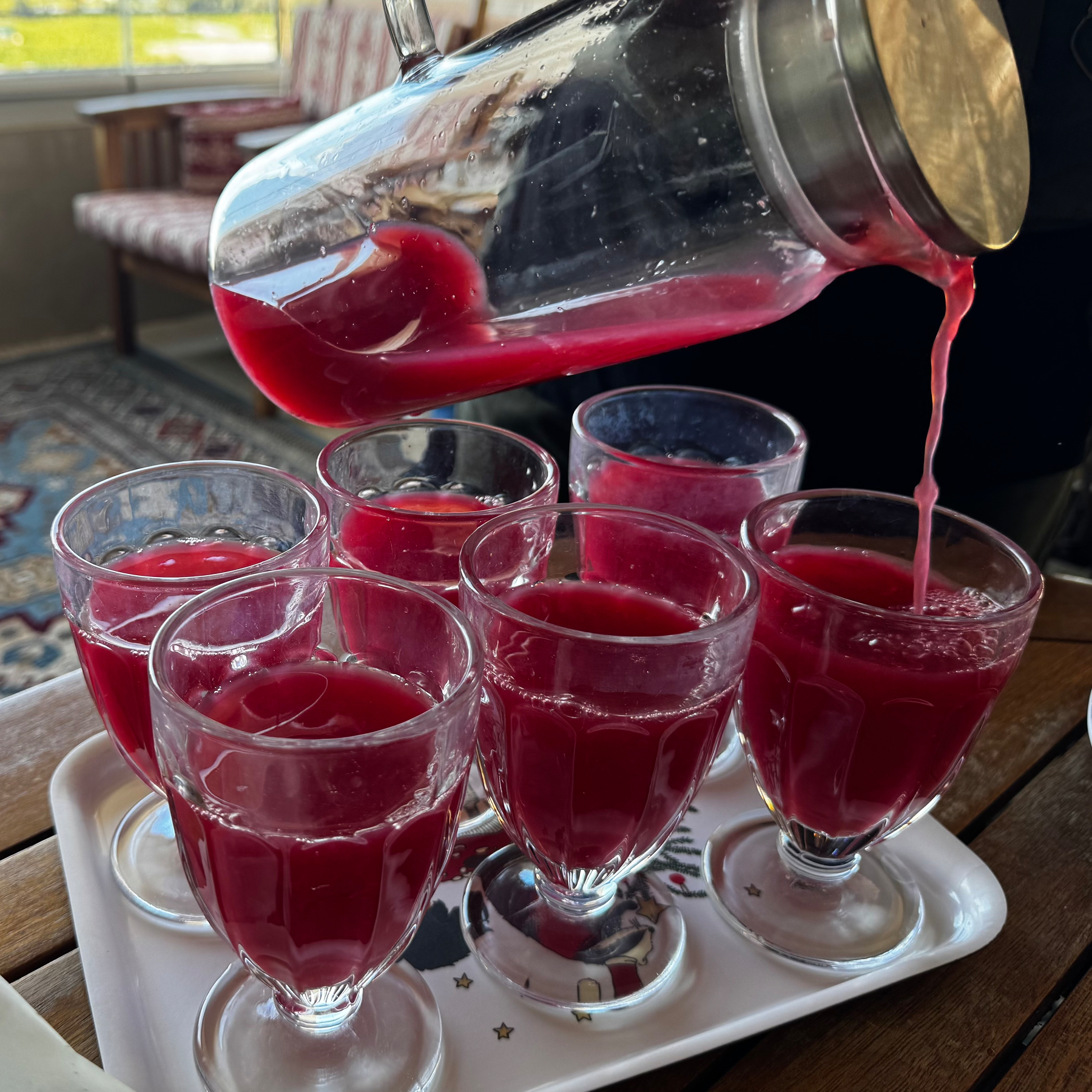
🇱🇧 Pomegranate, rose water, clementines and lemons.
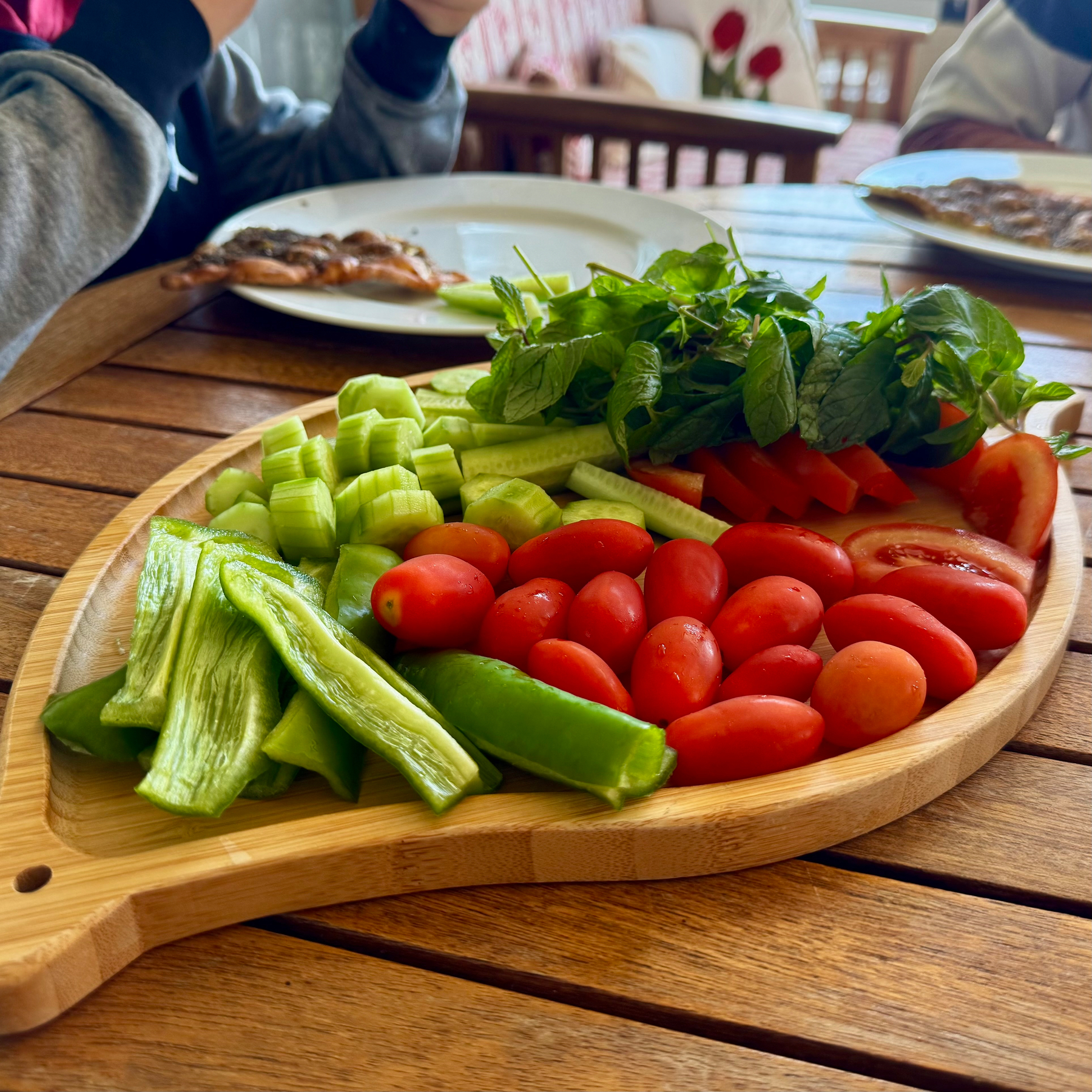
🇱🇧 Even the veggies taste more vibrant.
🇱🇧 Manoushi.
🇱🇧🍳
This site will turn into a bit of a food blog over the coming few weeks. Warak Inab Bil Zeit.
Let the holiday season begin.
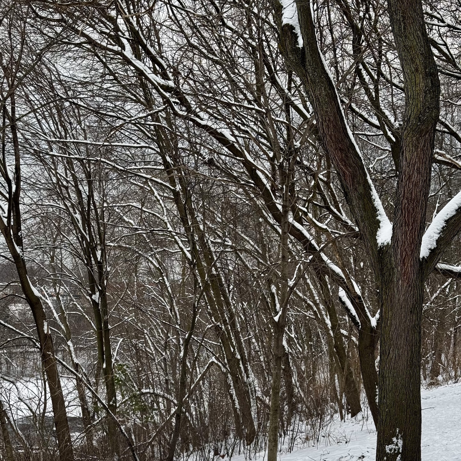
Wake up to everything white.
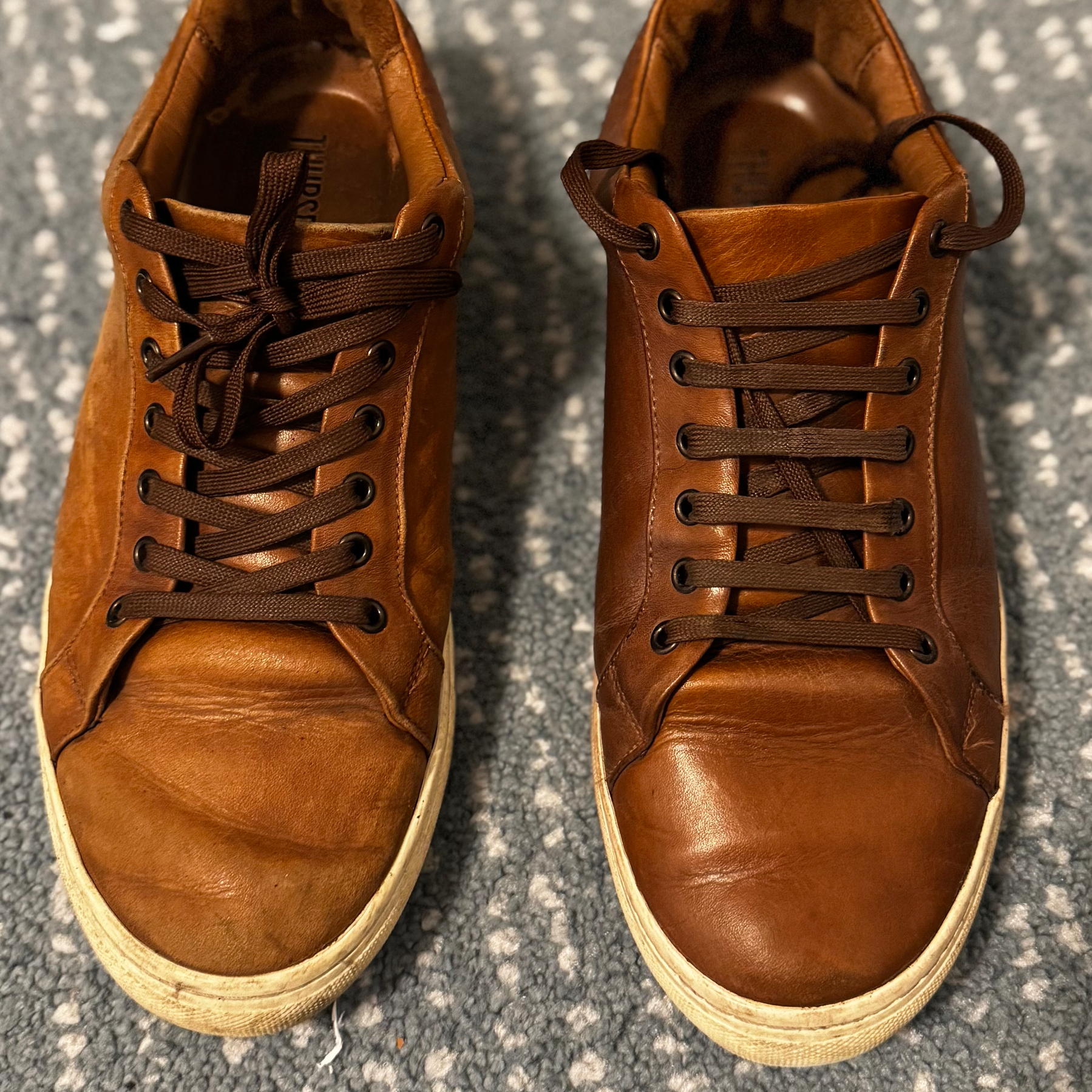
I don’t tend to take care of my shoes very often. The whole process takes me back when I was a kid and my dad would clean all his shoes on a Sunday. I loved the buffing process. Still do. The transformation is always like a magic trick.
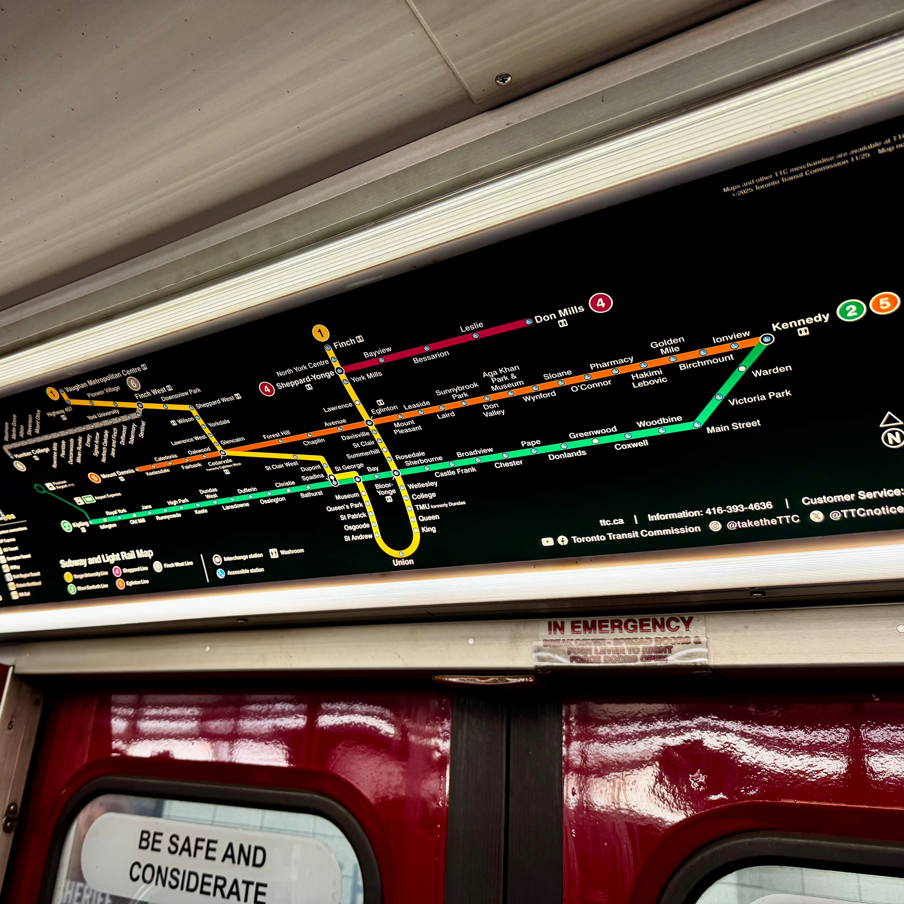
First time I see the two new lines on the subway map. Of course, I spent a decent amount of my life working on line 6 these last few years.
First snowfall of the season. It’s a warning sign to get those snow tires installed.
So pretty.
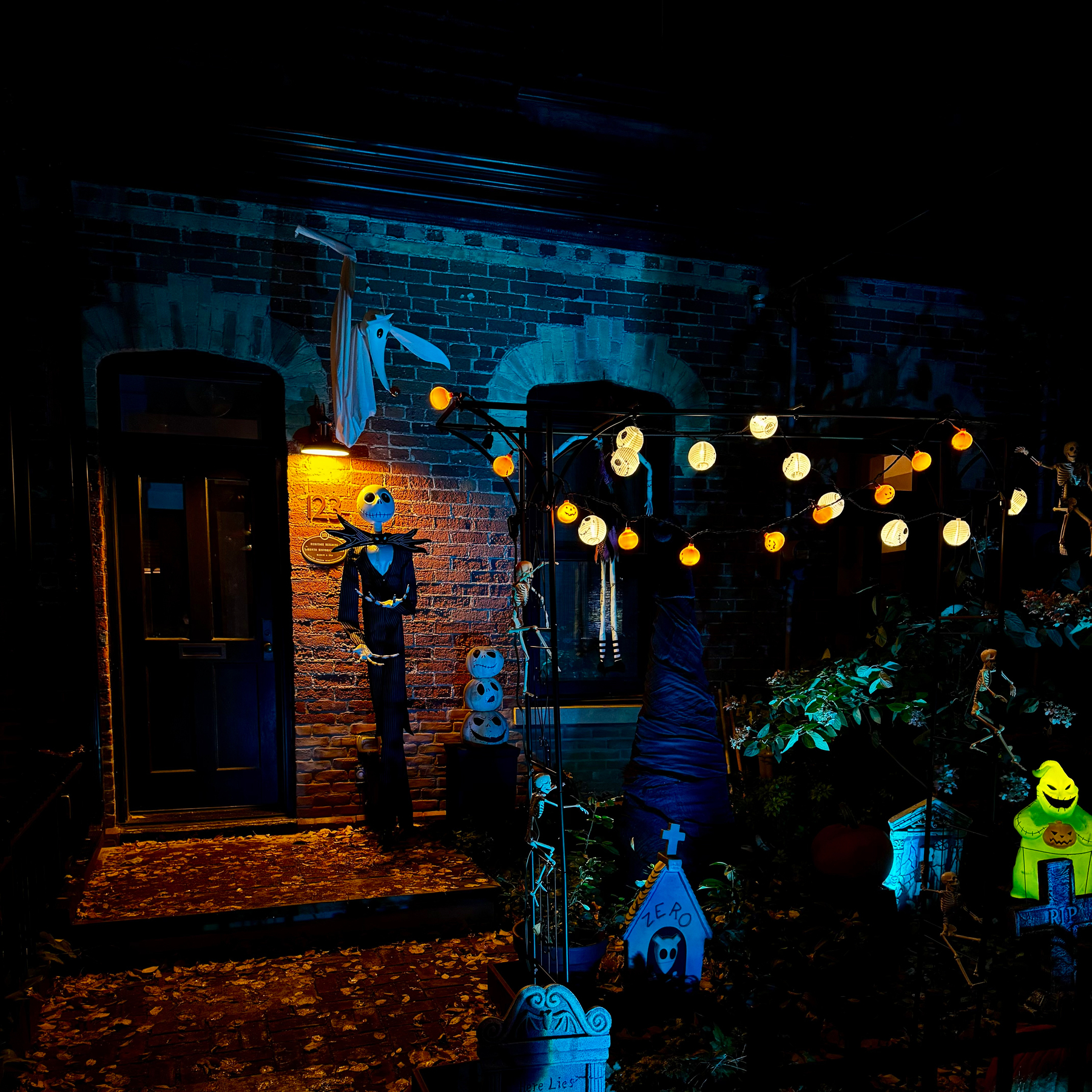
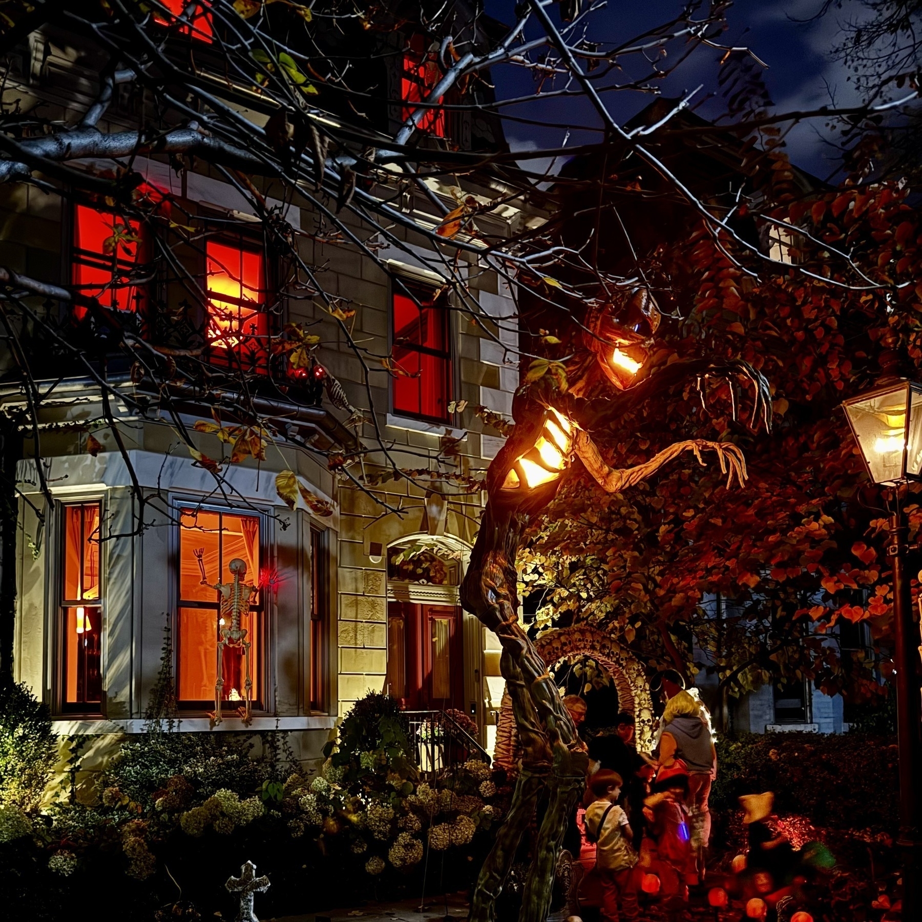
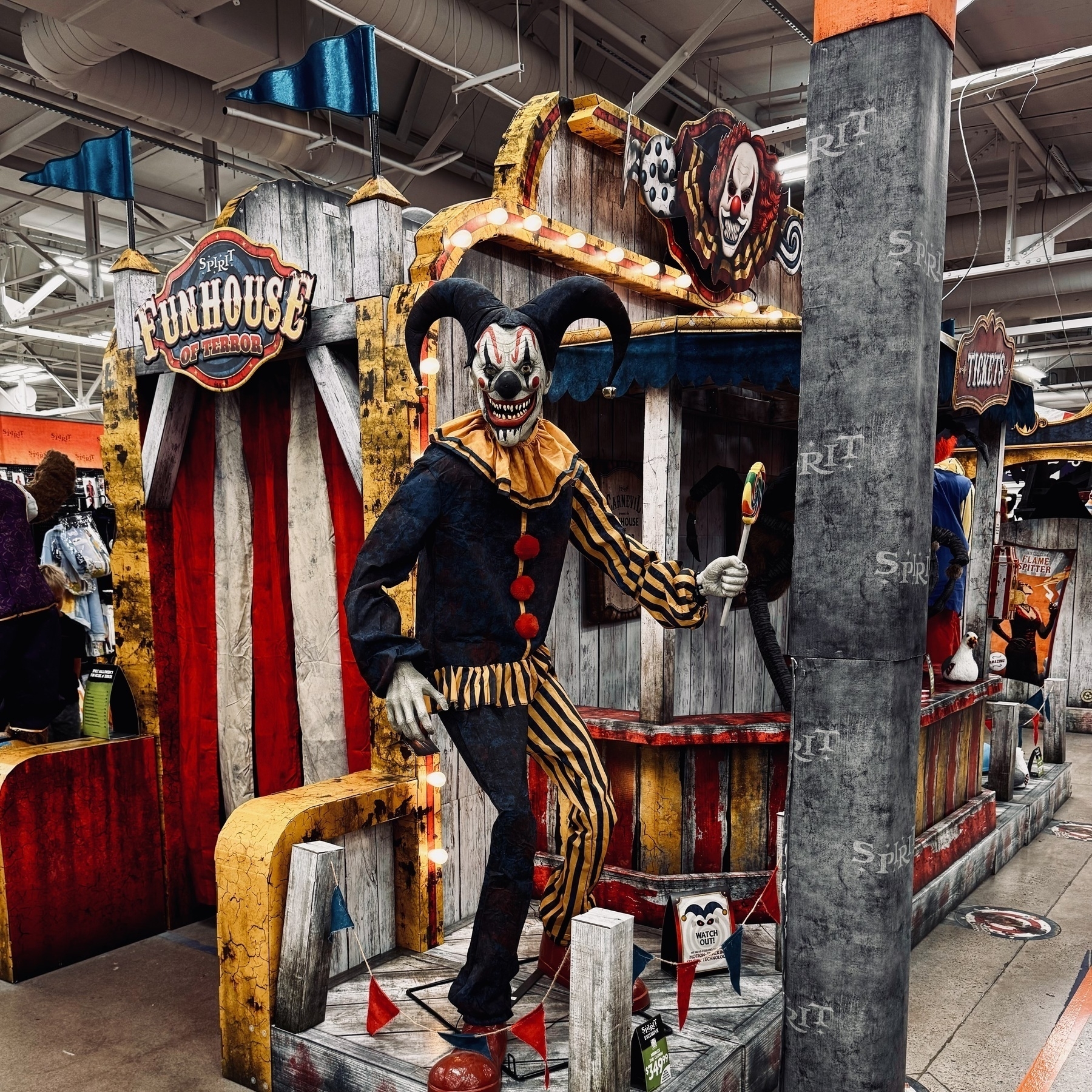
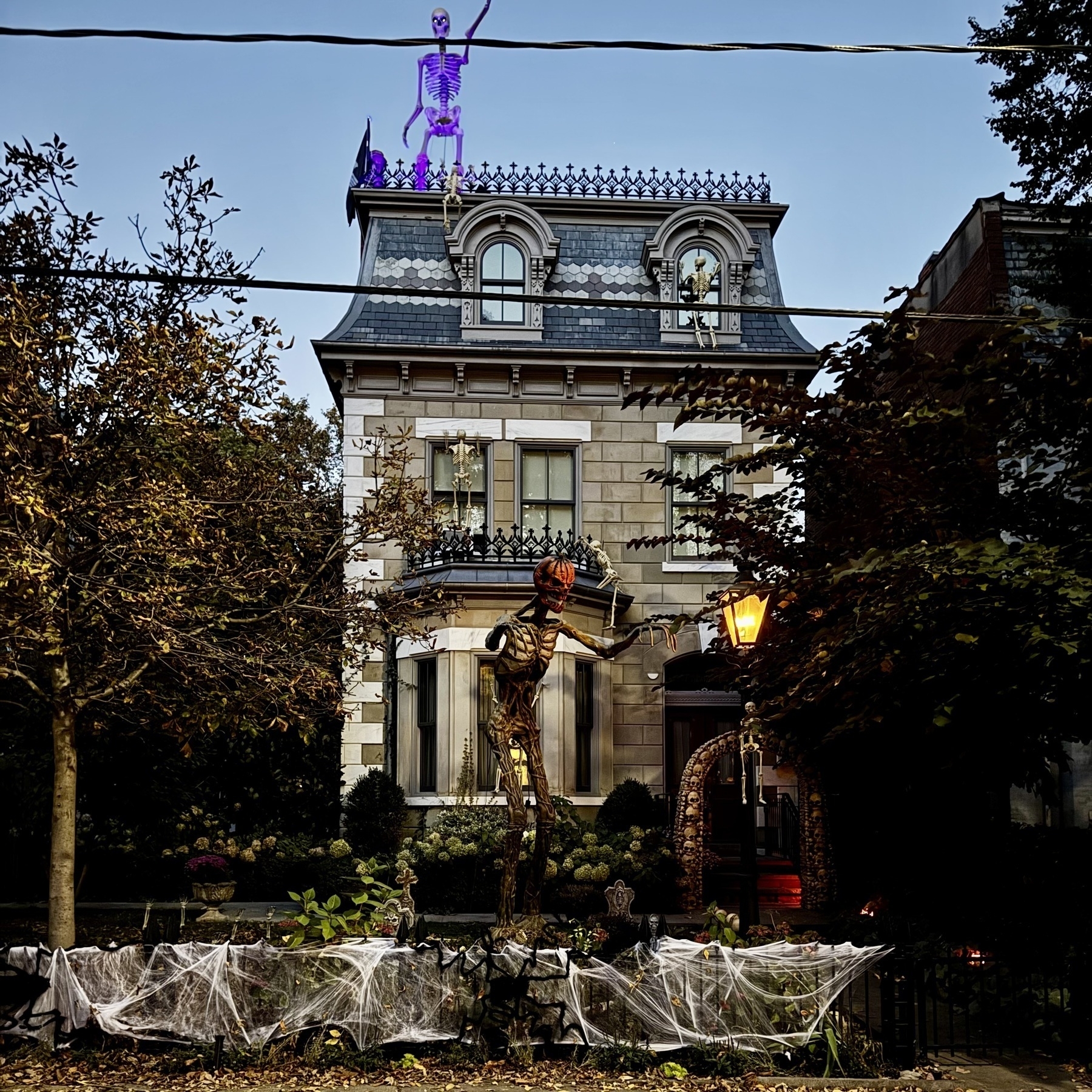
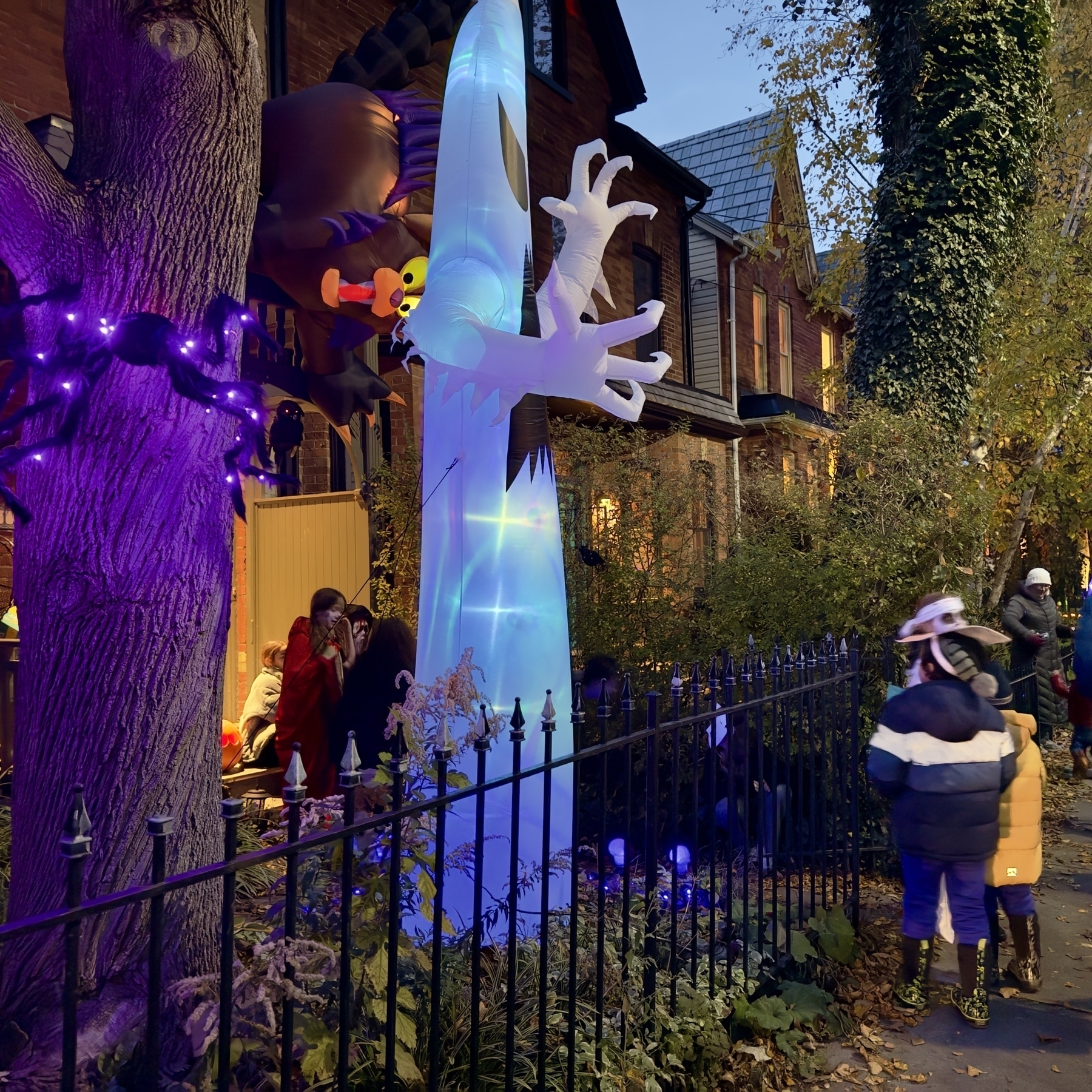
Happy Halloween everyone!
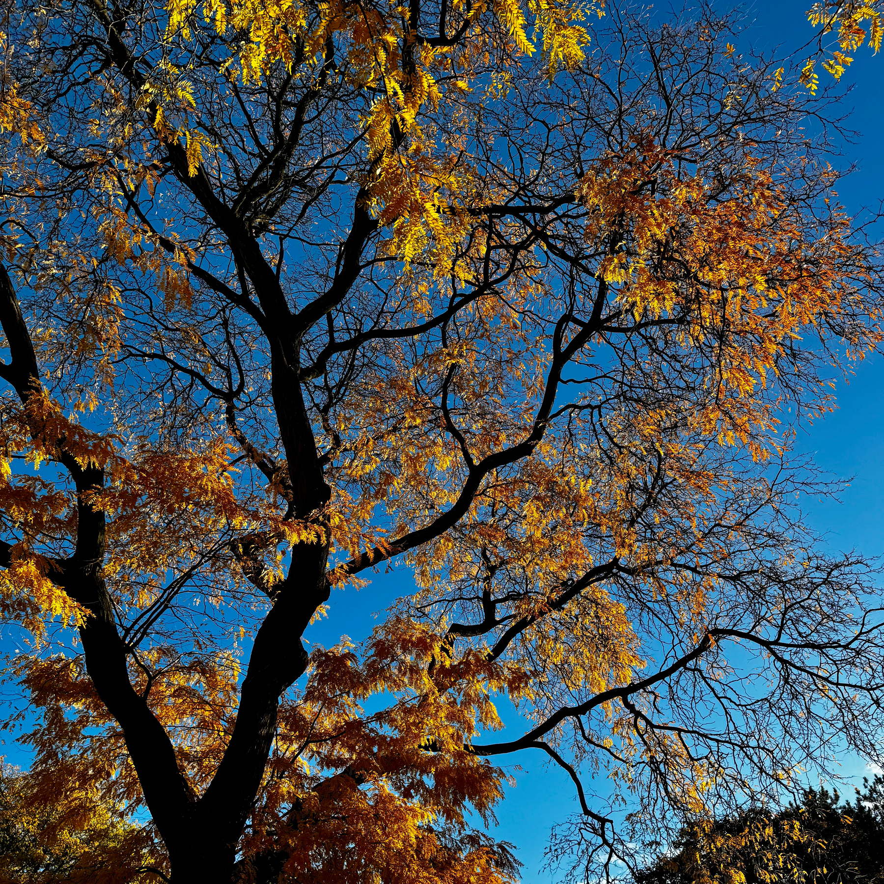
By tomorrow these colours are gone.
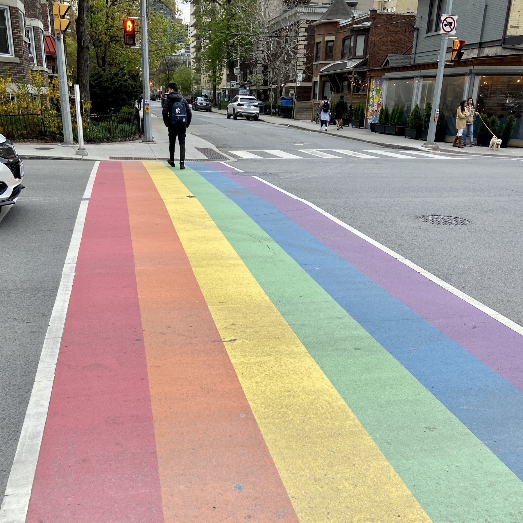
Toronto pride is in full swing. Everyone in the city is wearing some Blue Jays merch of some description. I’m not there yet, considering I love baseball movies, but really feel underwhelmed by baseball games, but I love the city wide sentiment — something extremely North American about this.

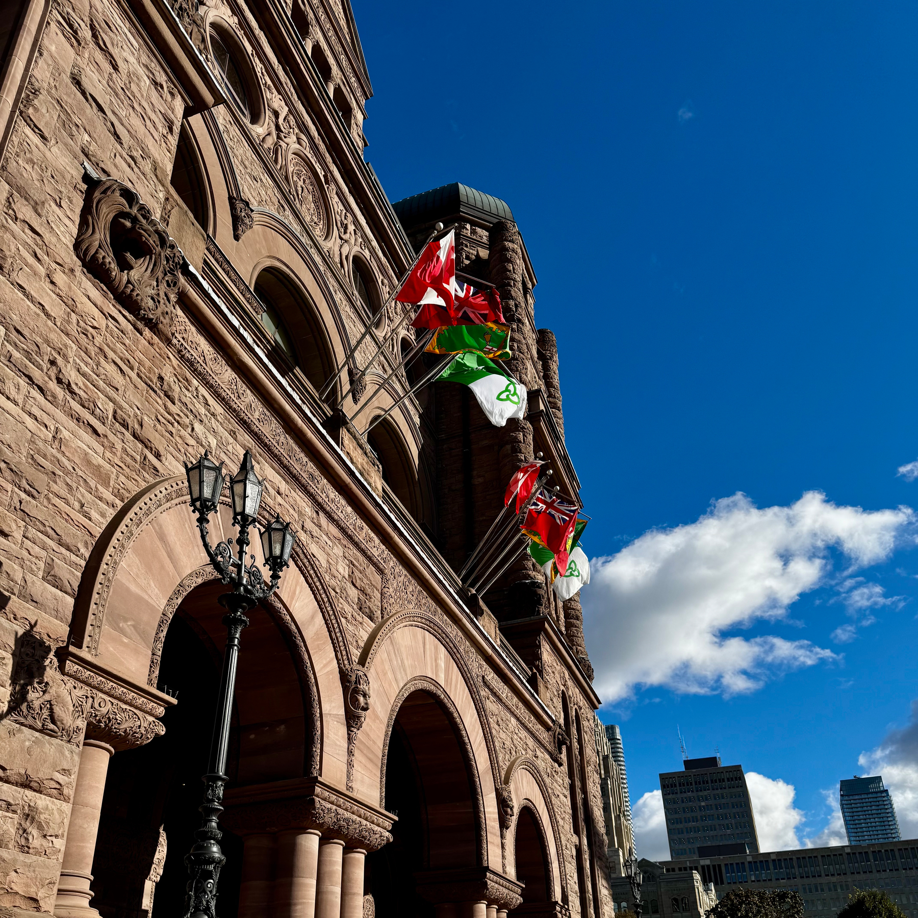
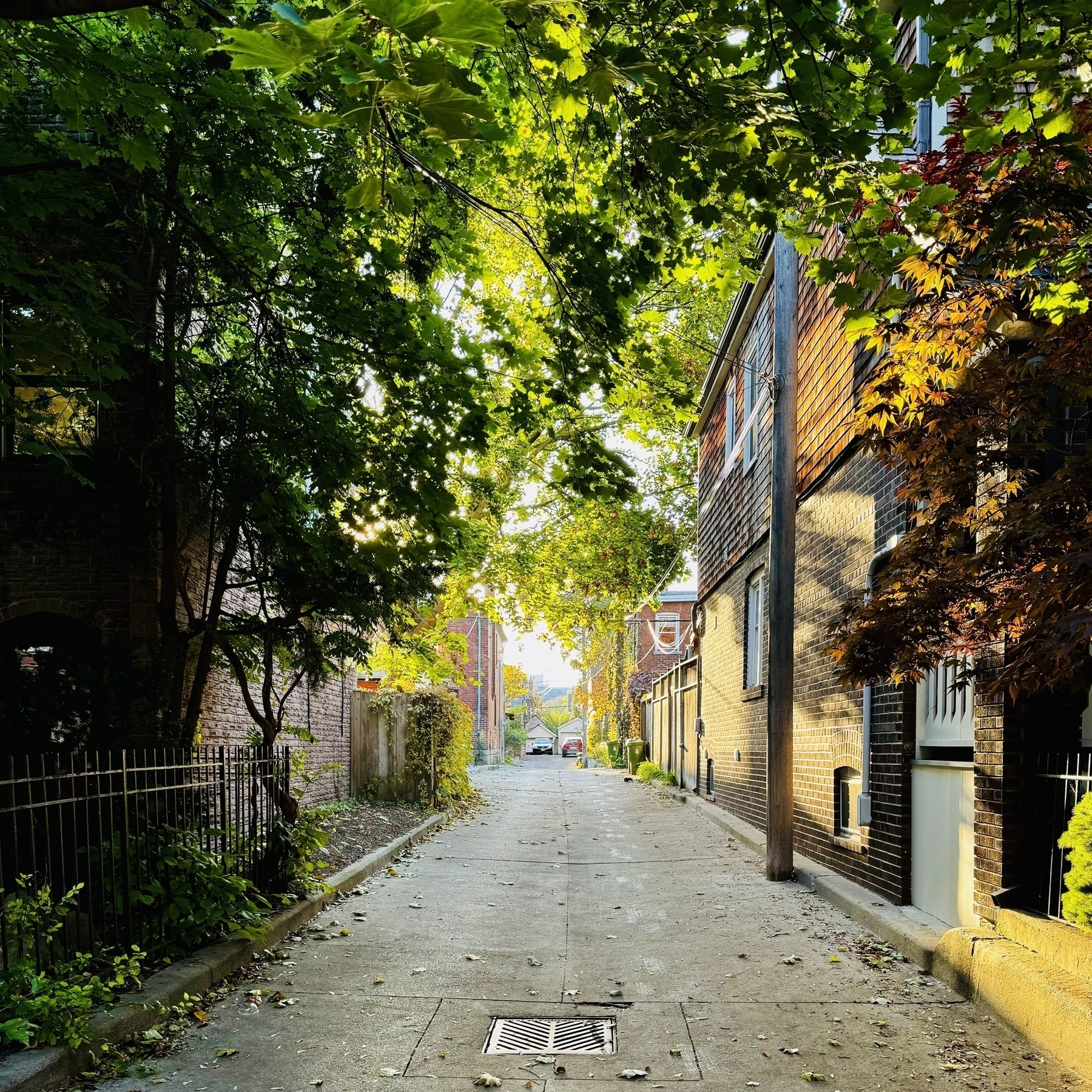
At the LAO, on an amazingly crisp autumn day.
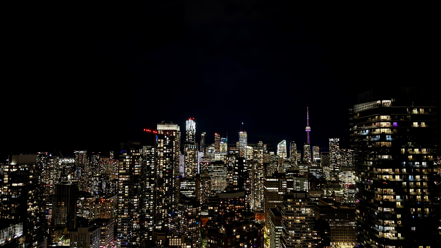
Goodnight Toronto!
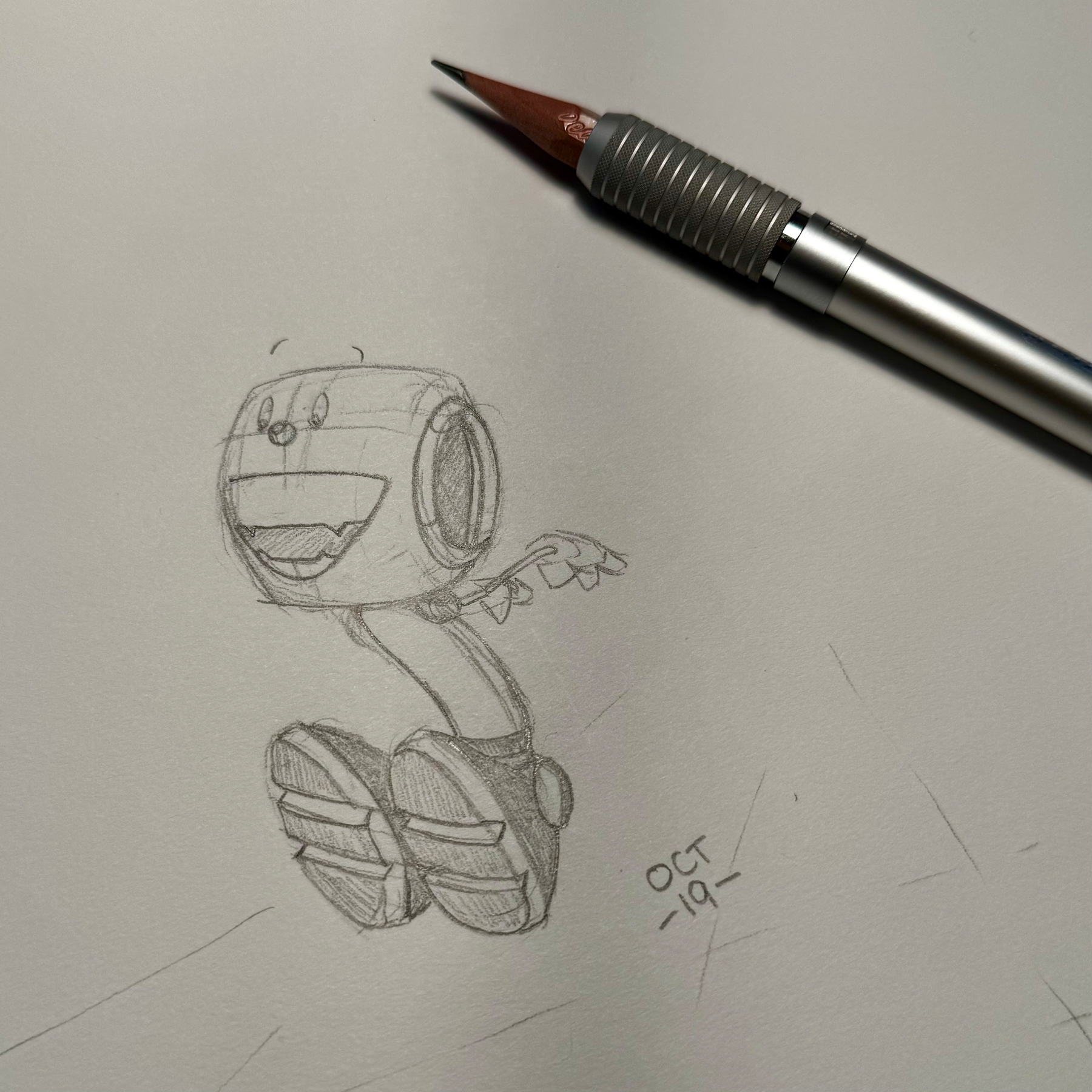
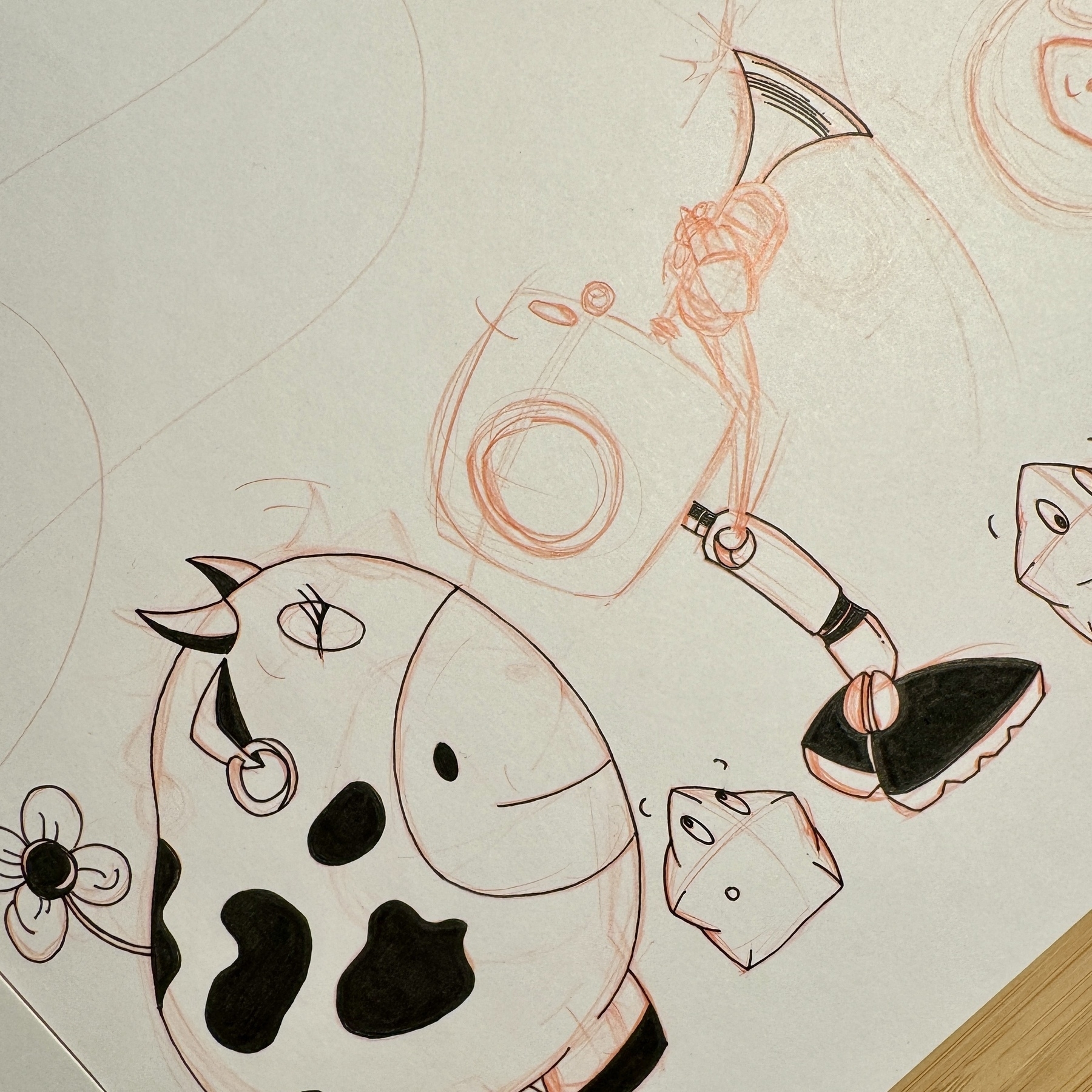
Inktober 2025/19.
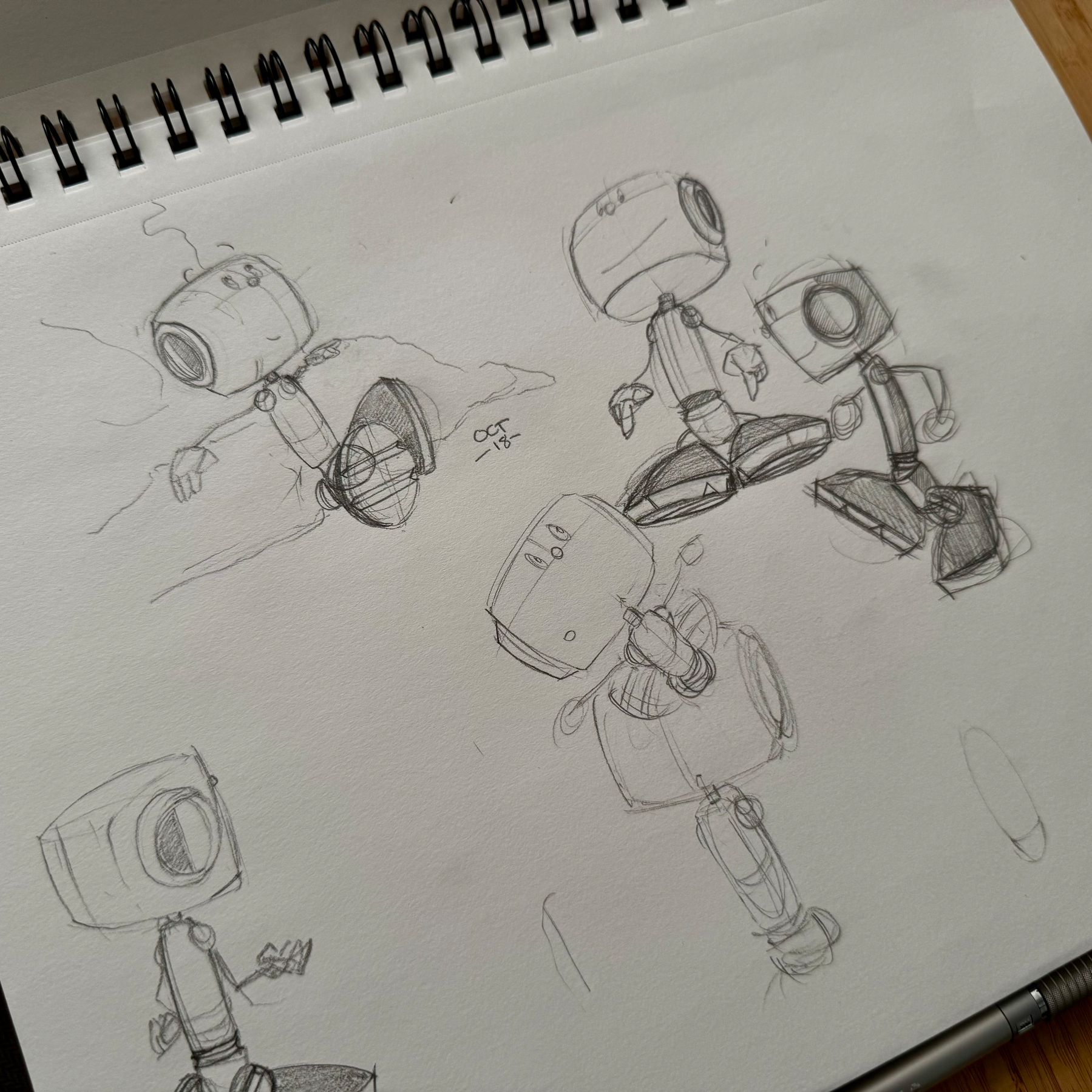
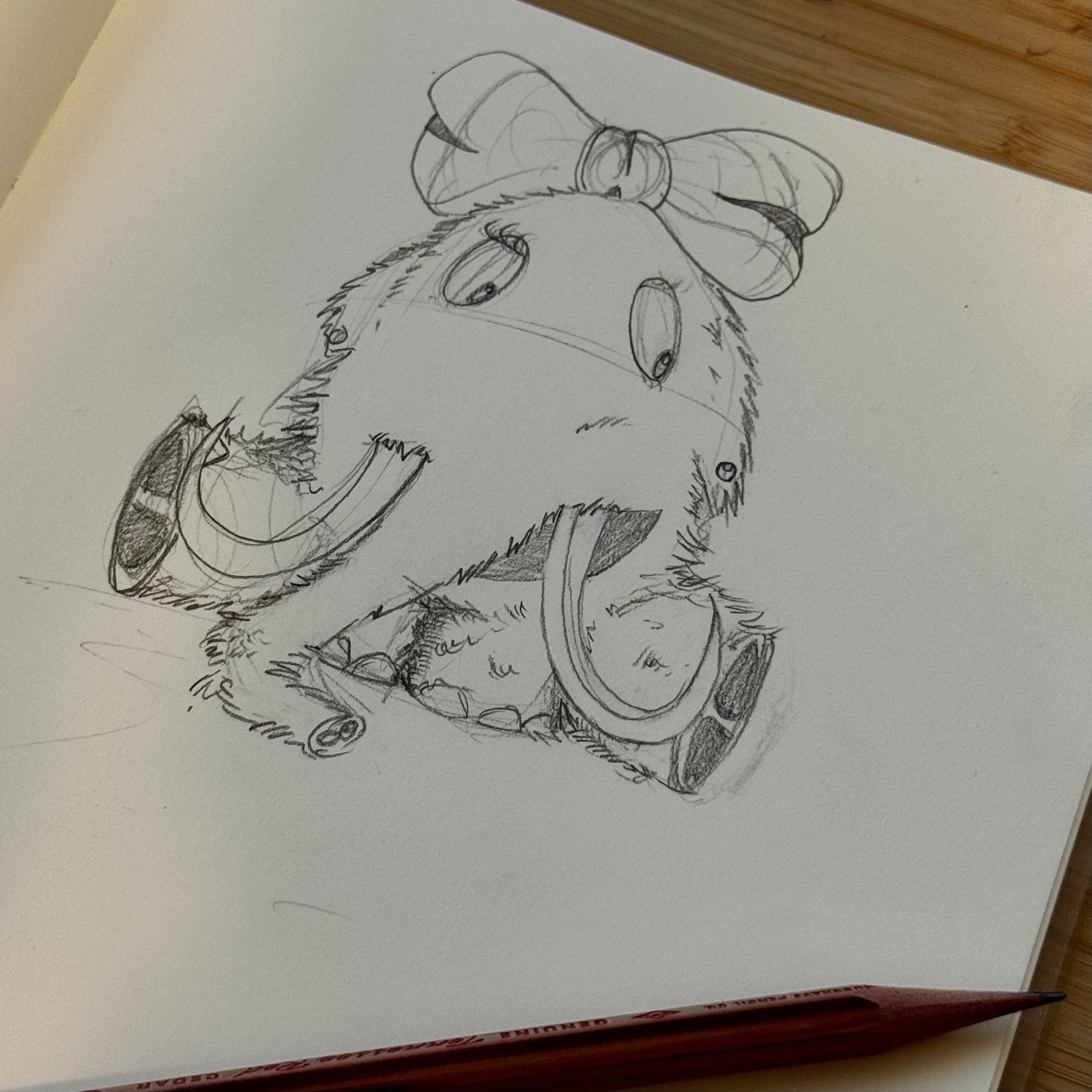
Inktober 2025/18. I am seriously enjoying the absolute freedom of drawing Corgan from any angle.
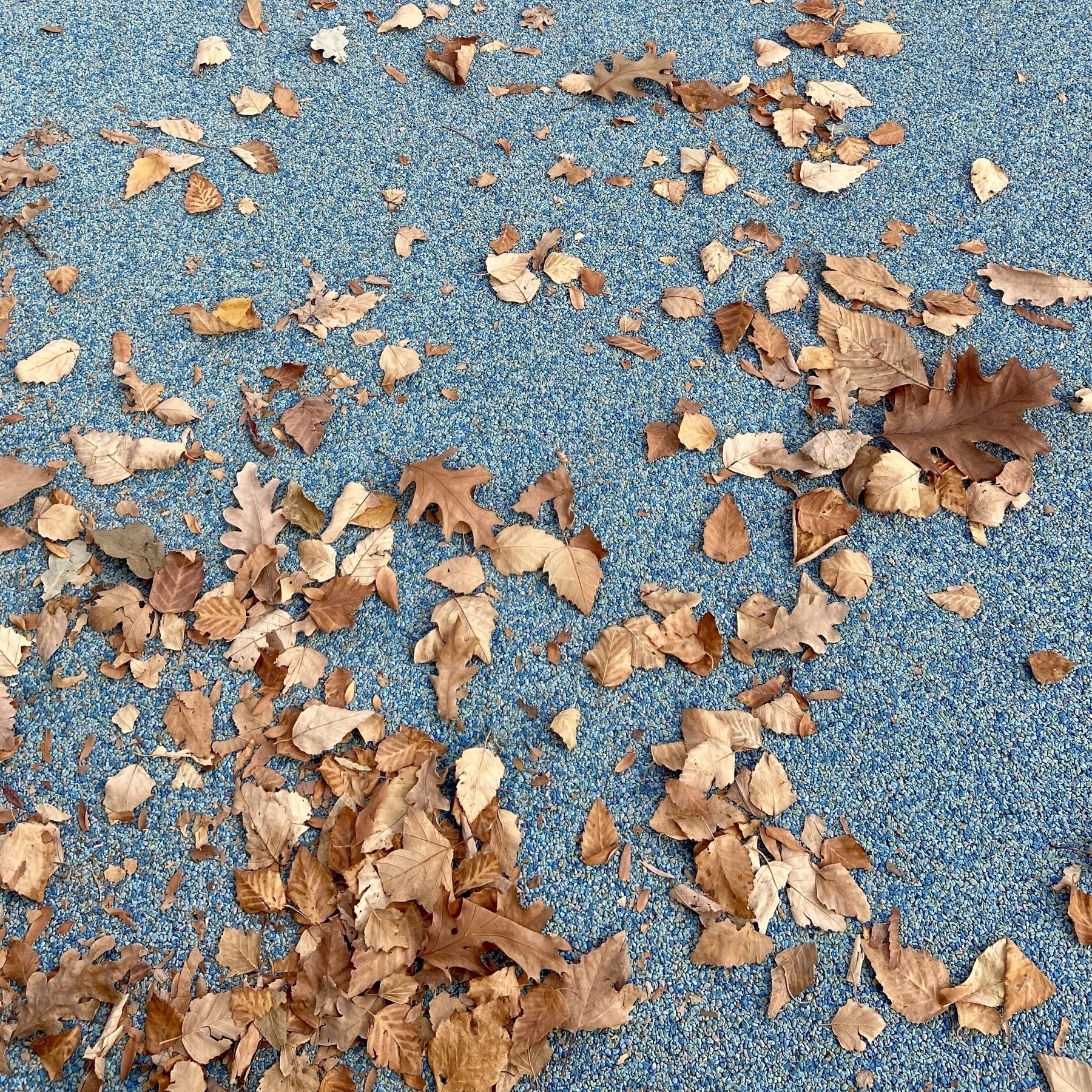
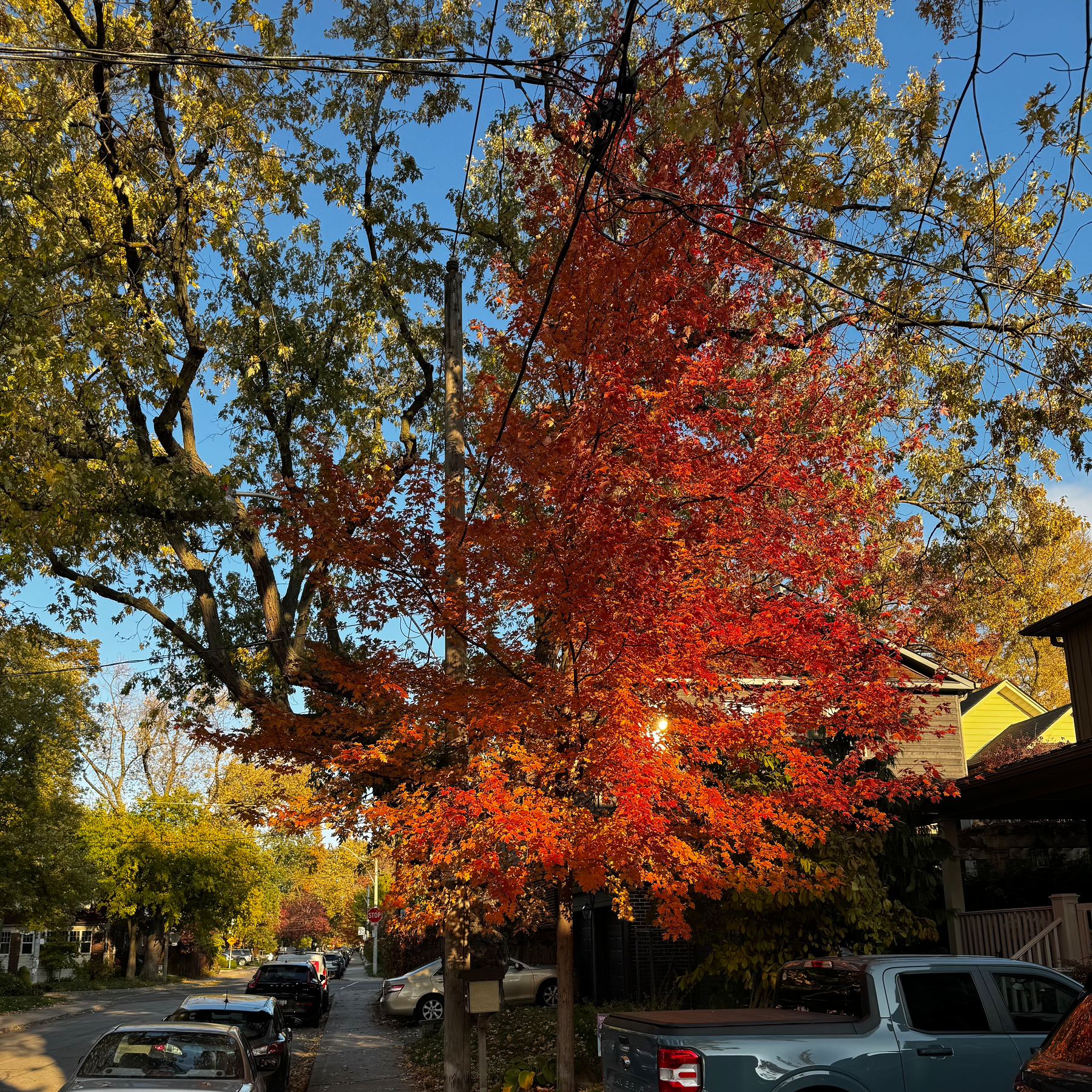
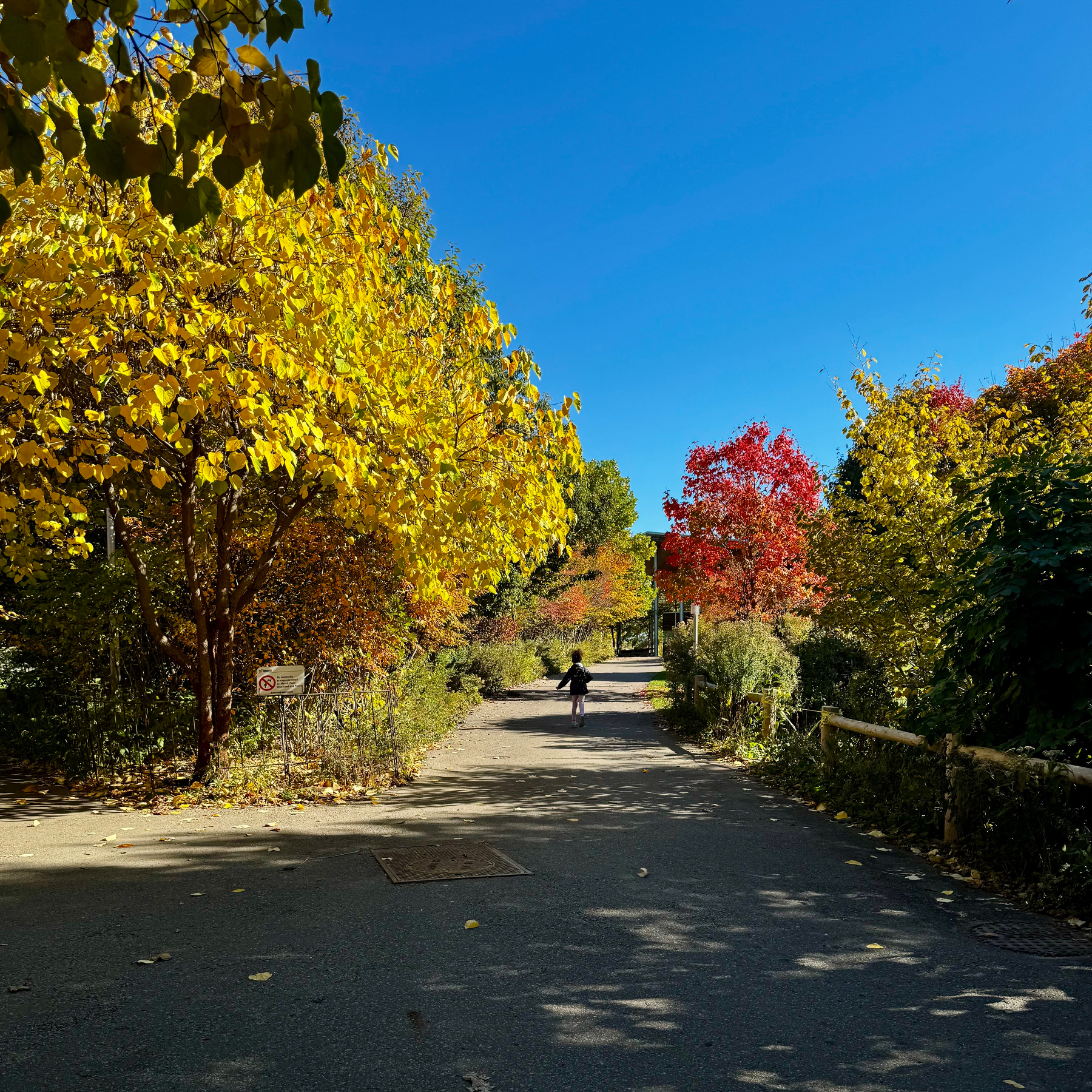
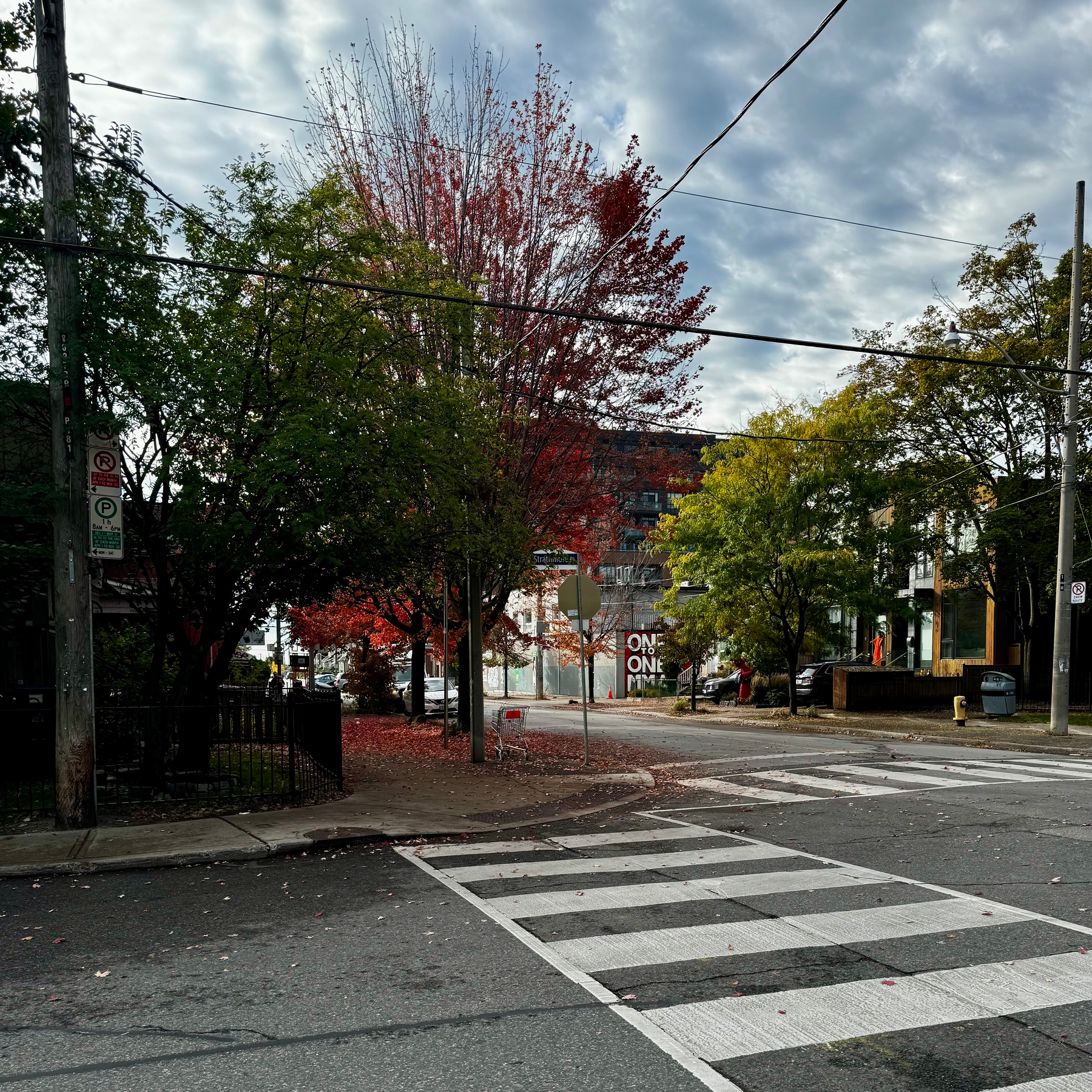
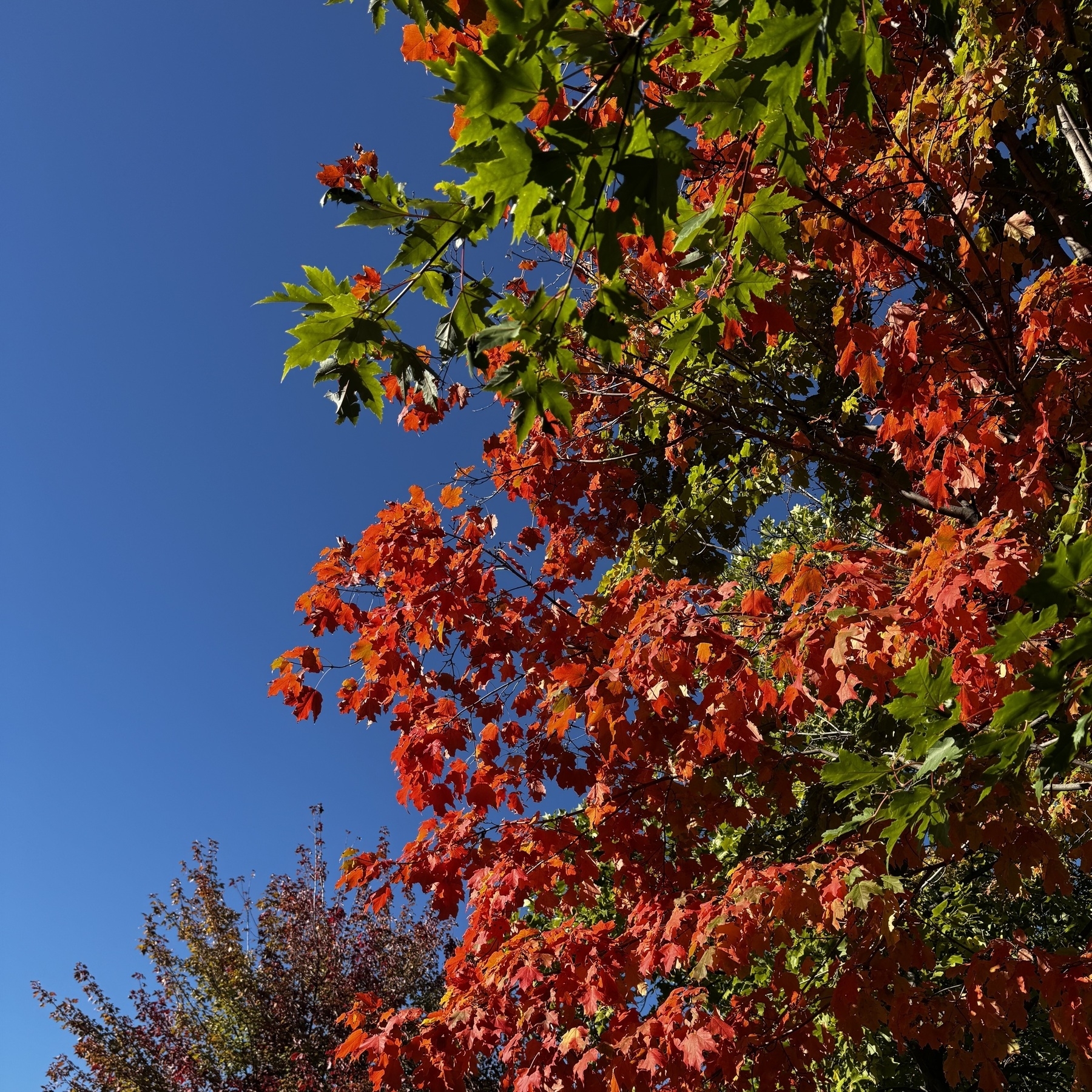
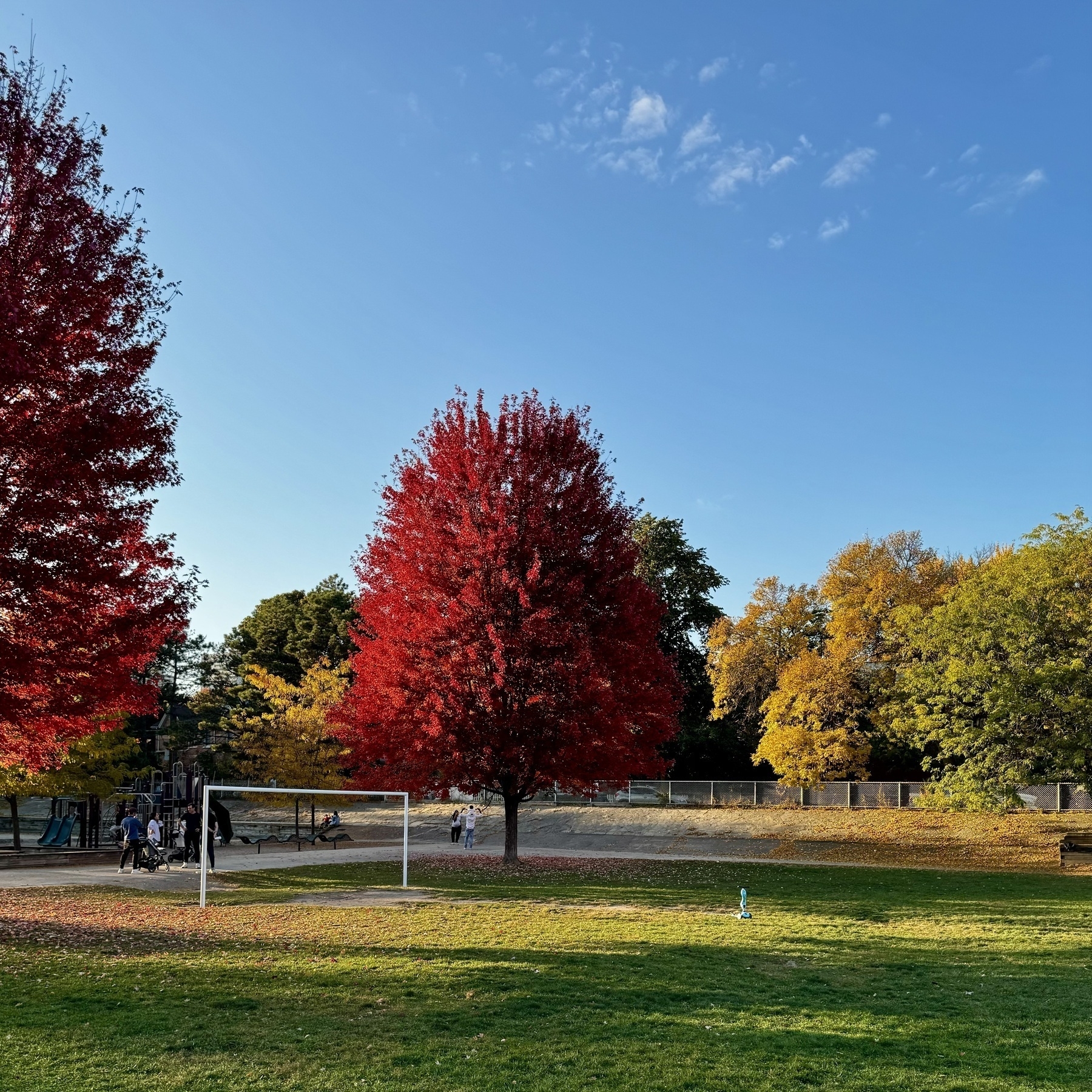
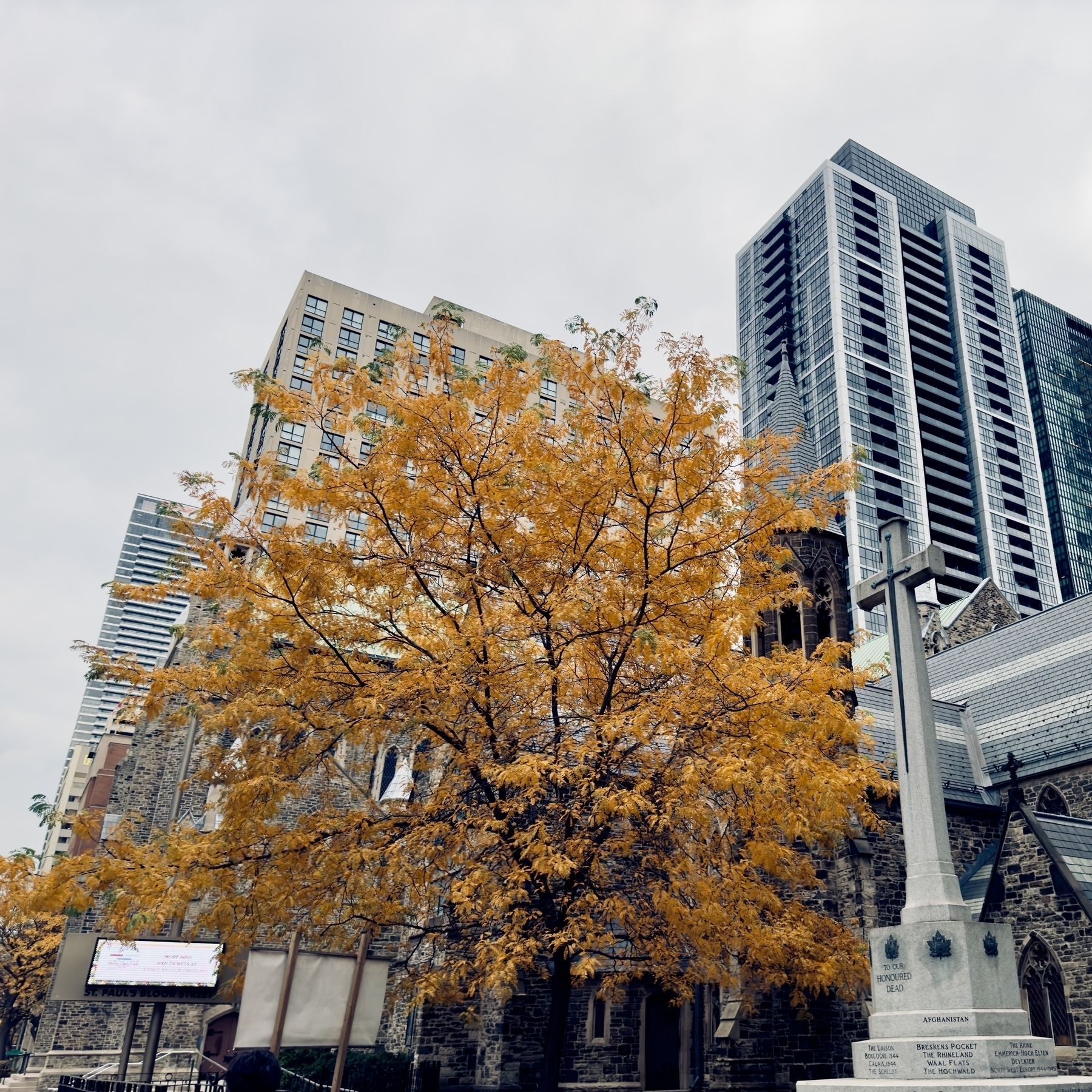
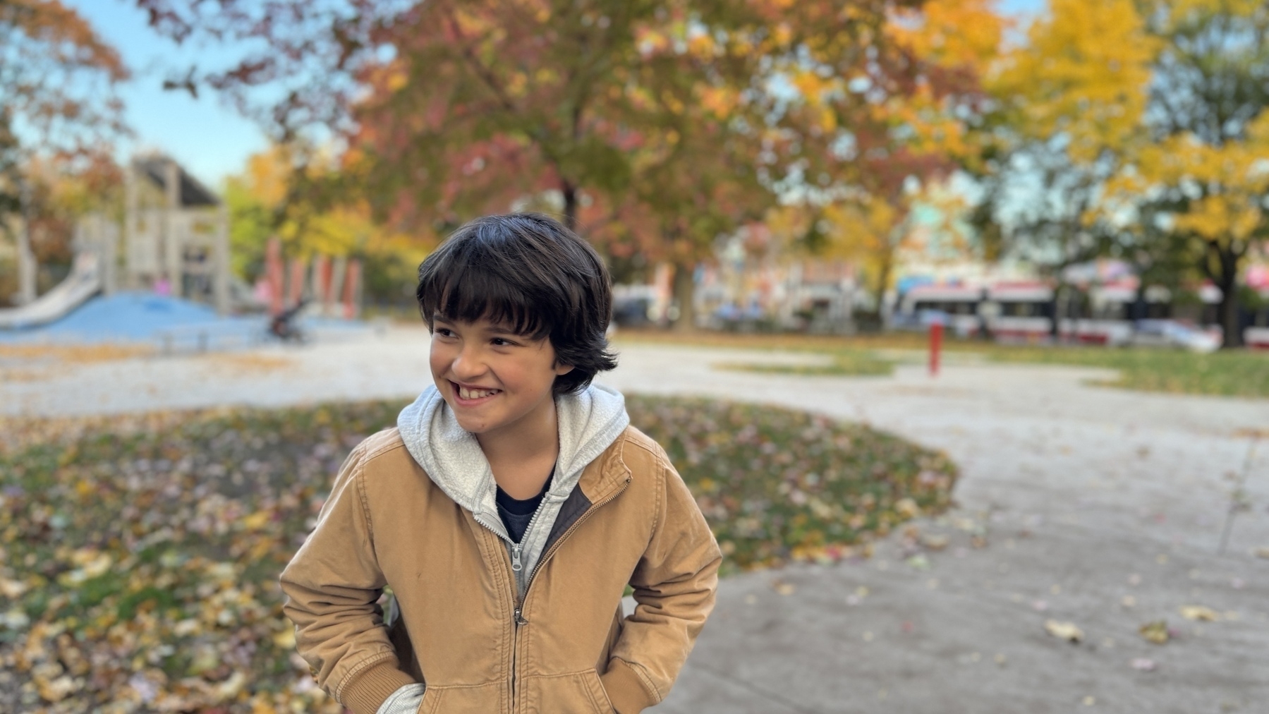
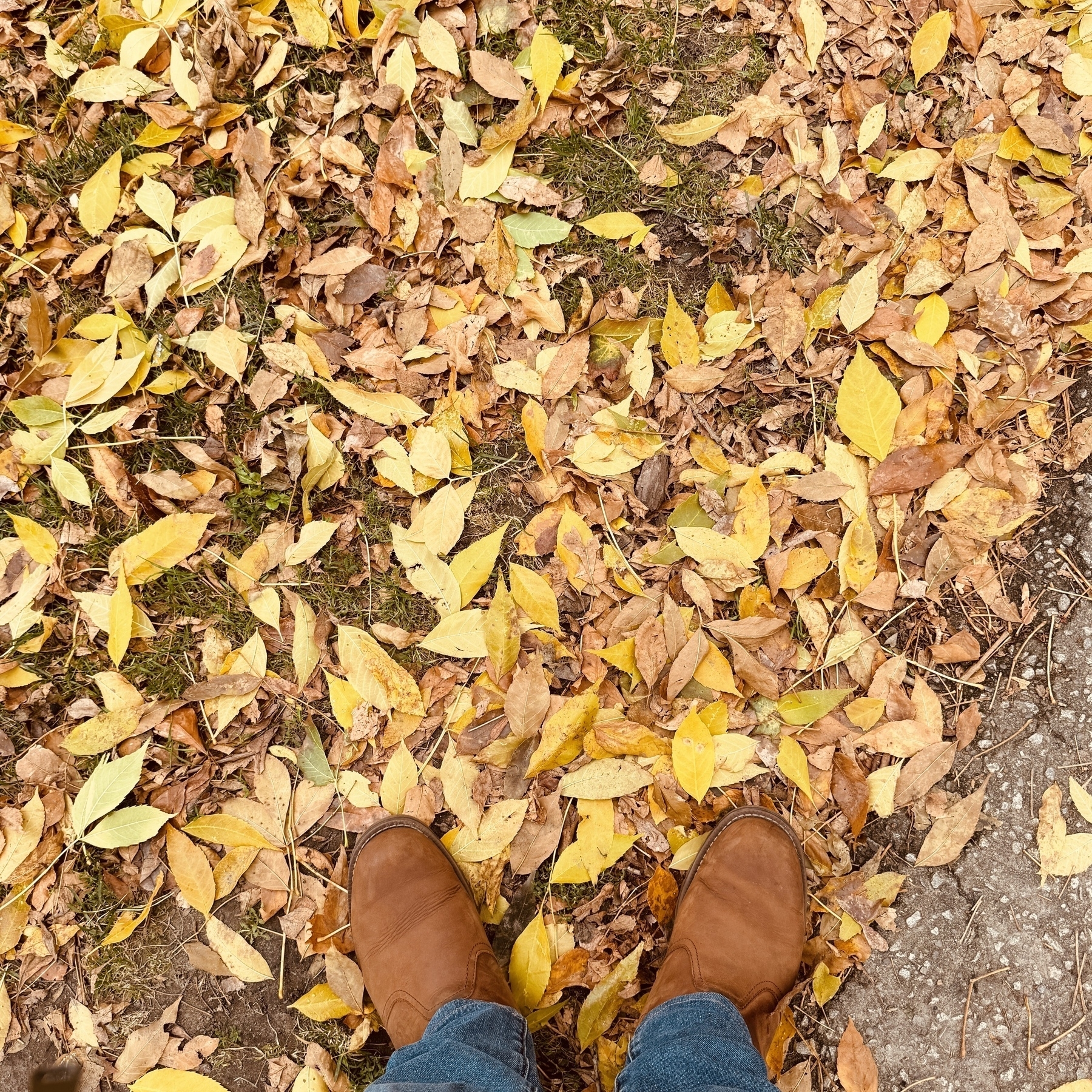
Wonderful autumn day. Filled with so much colour.
Inktober 2025/17.
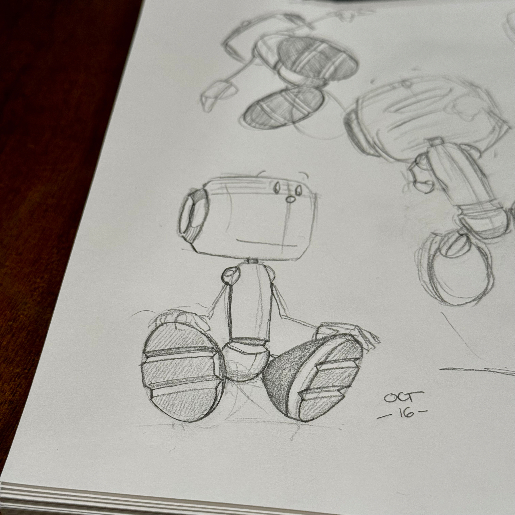
Inktober 2025/16.
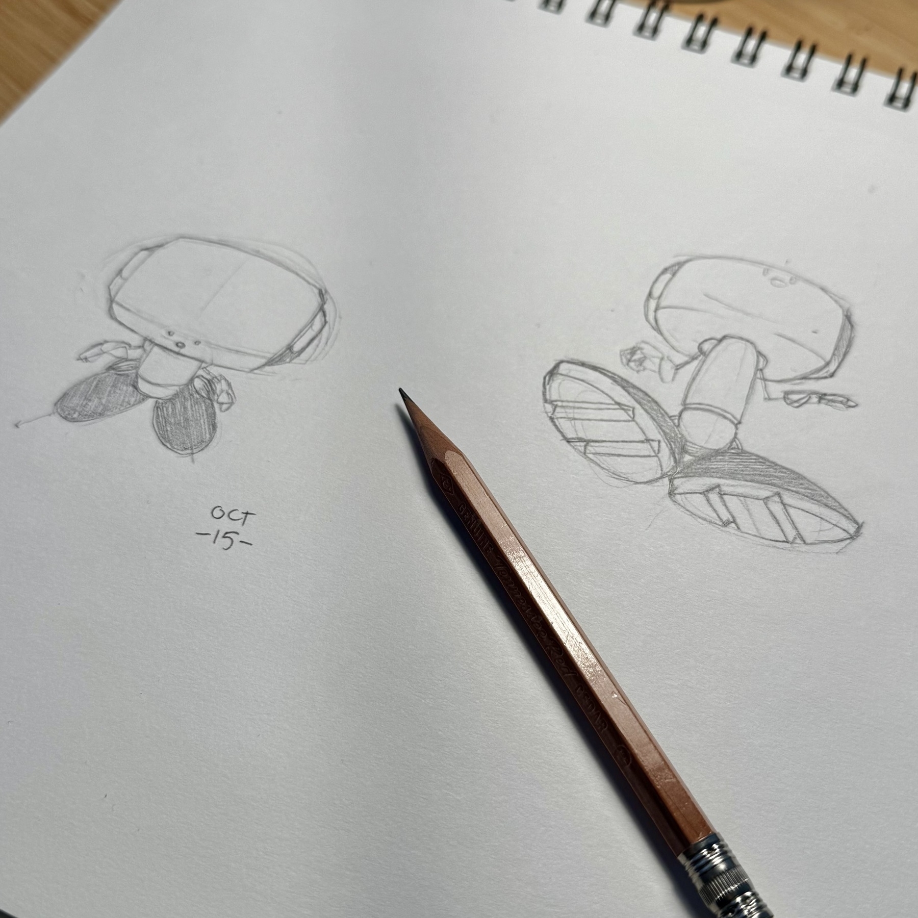
Inktober 2025/15.
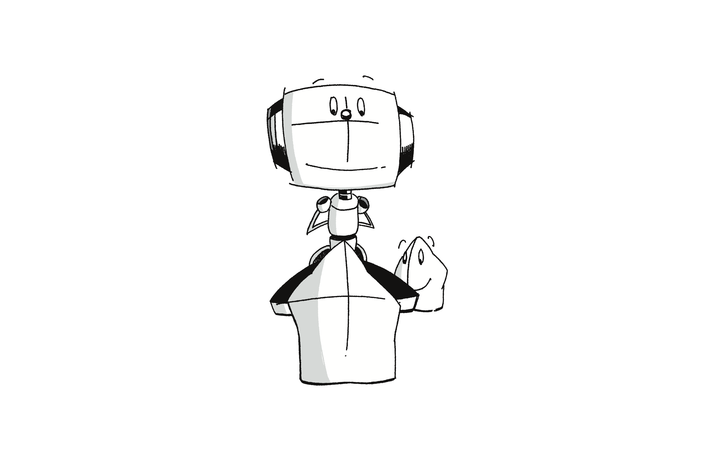
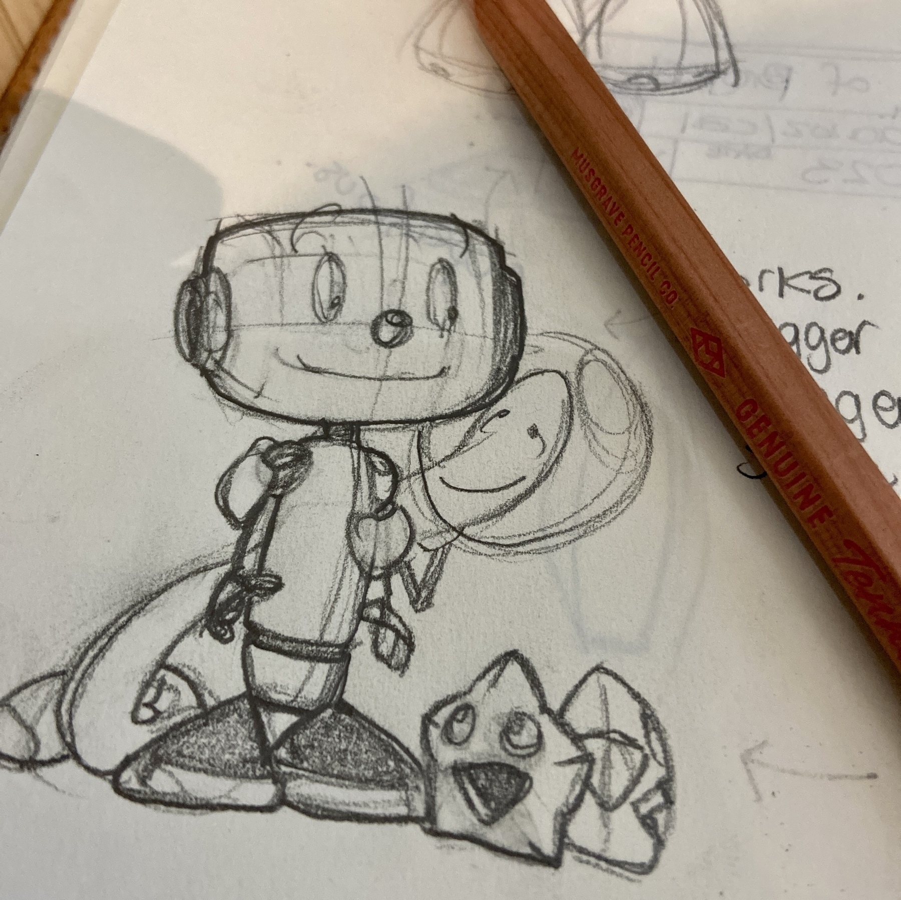
Be still my beating heart, I get to draw my characters from below or above without breaking into sweats!
Inktober 2025/14. My characters in actual perspective - where I kinda know what I’m trying to do. Long way to go, but first steps and all that.
Inktober 2025/13.
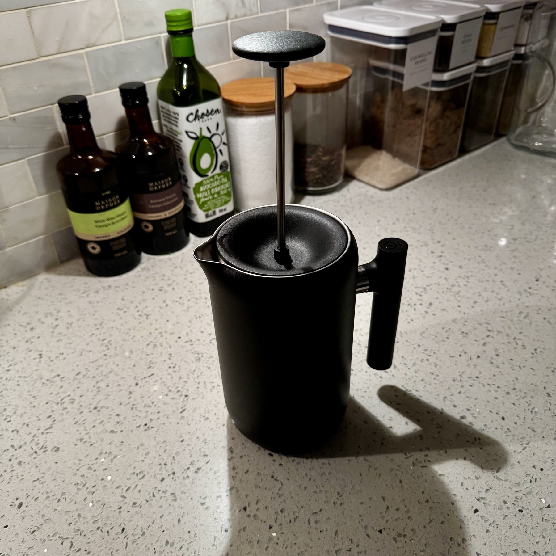
New brewer, ready for action. Sir!
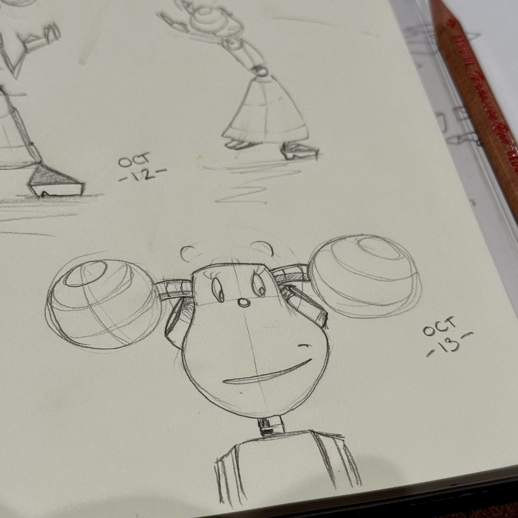
Inktober 2025/12.
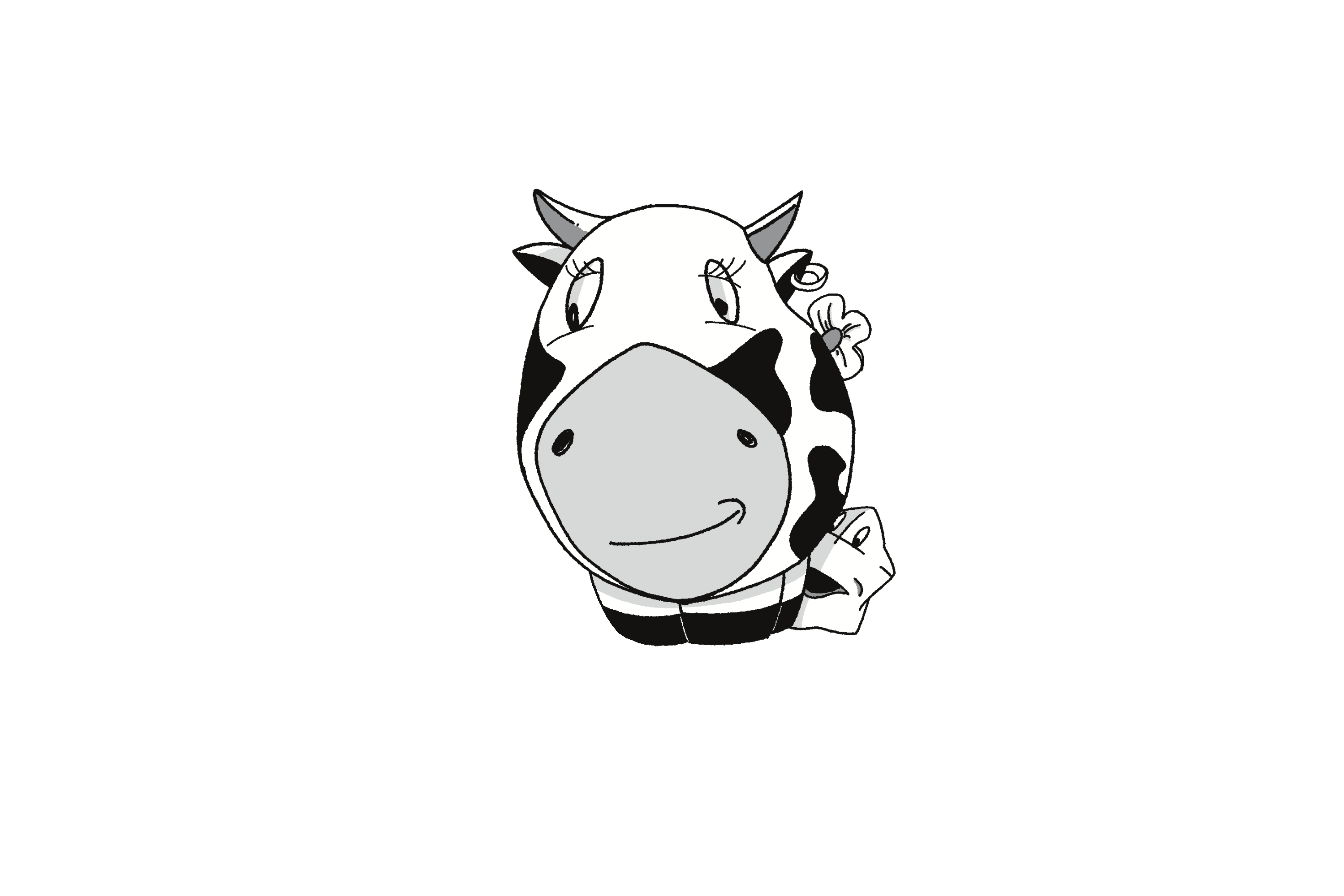
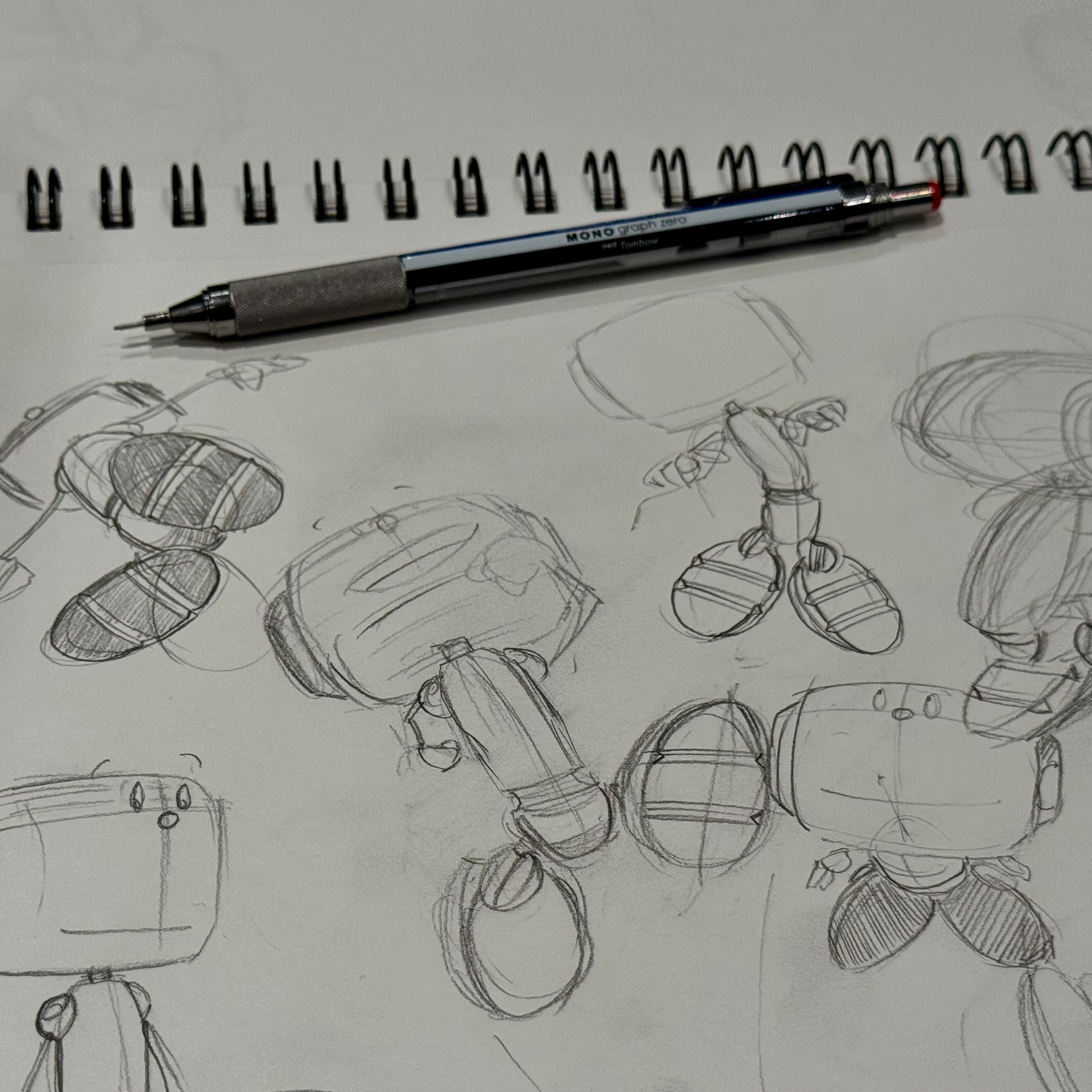
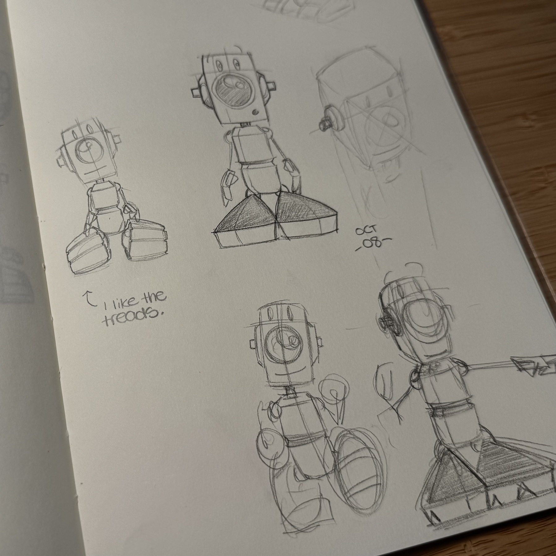
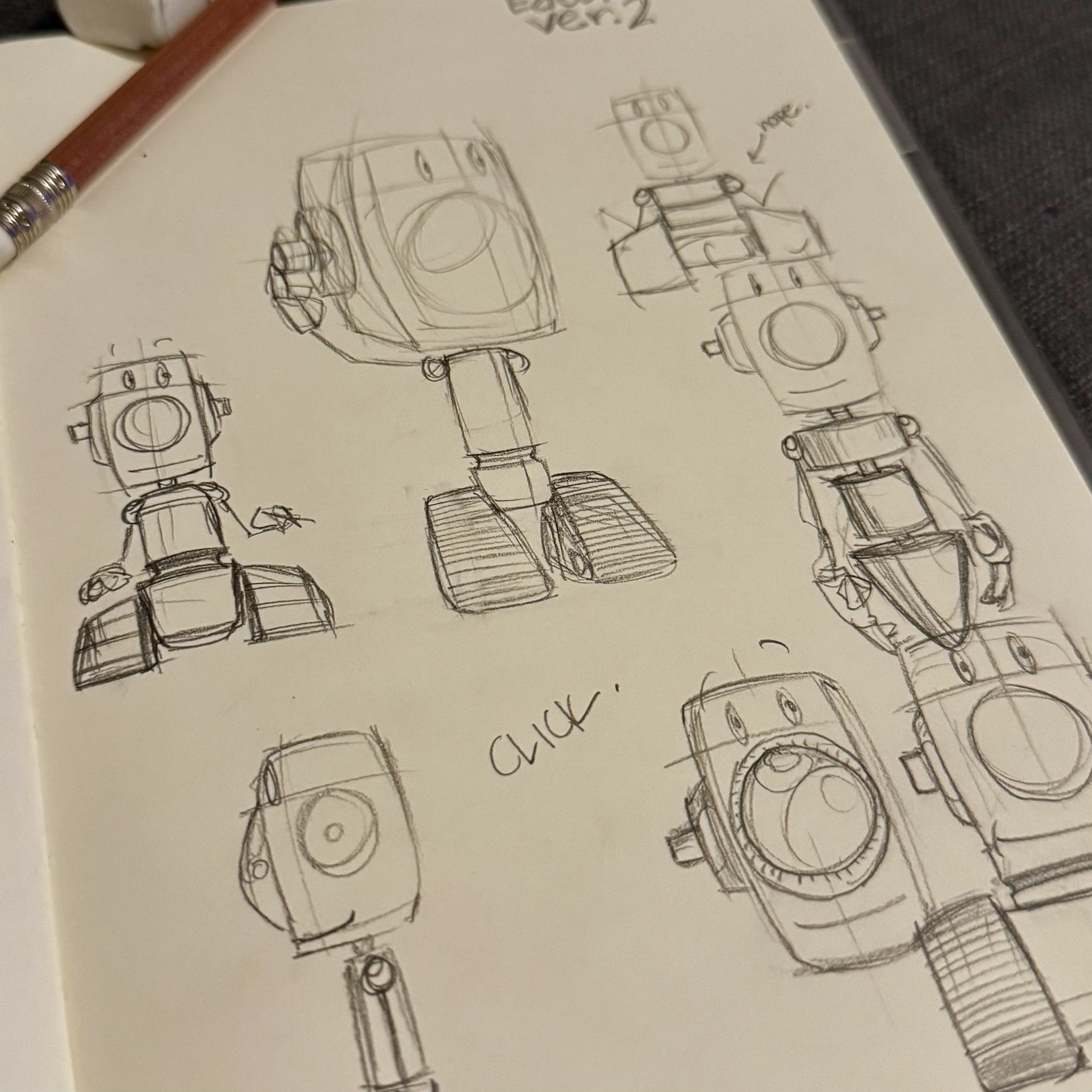
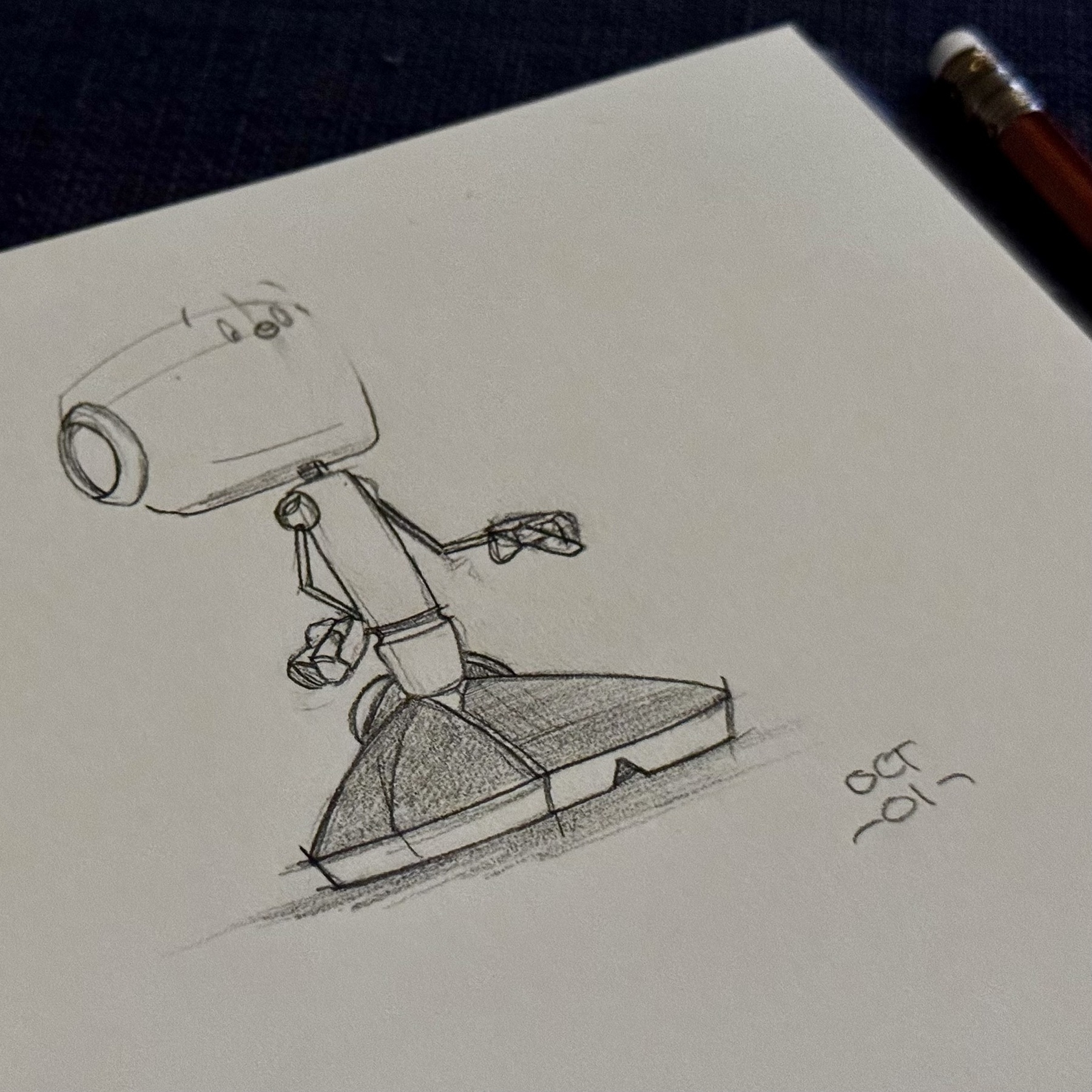
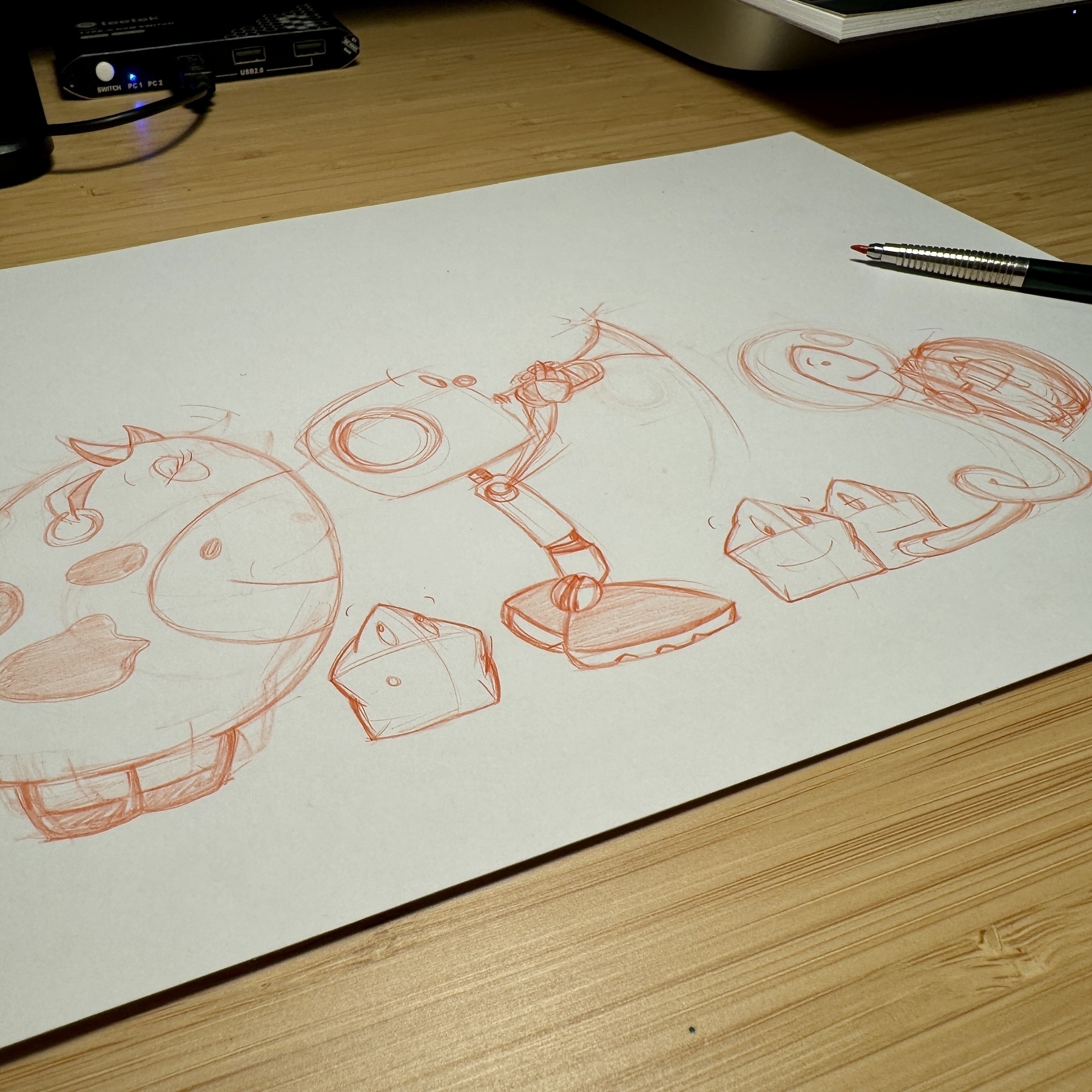
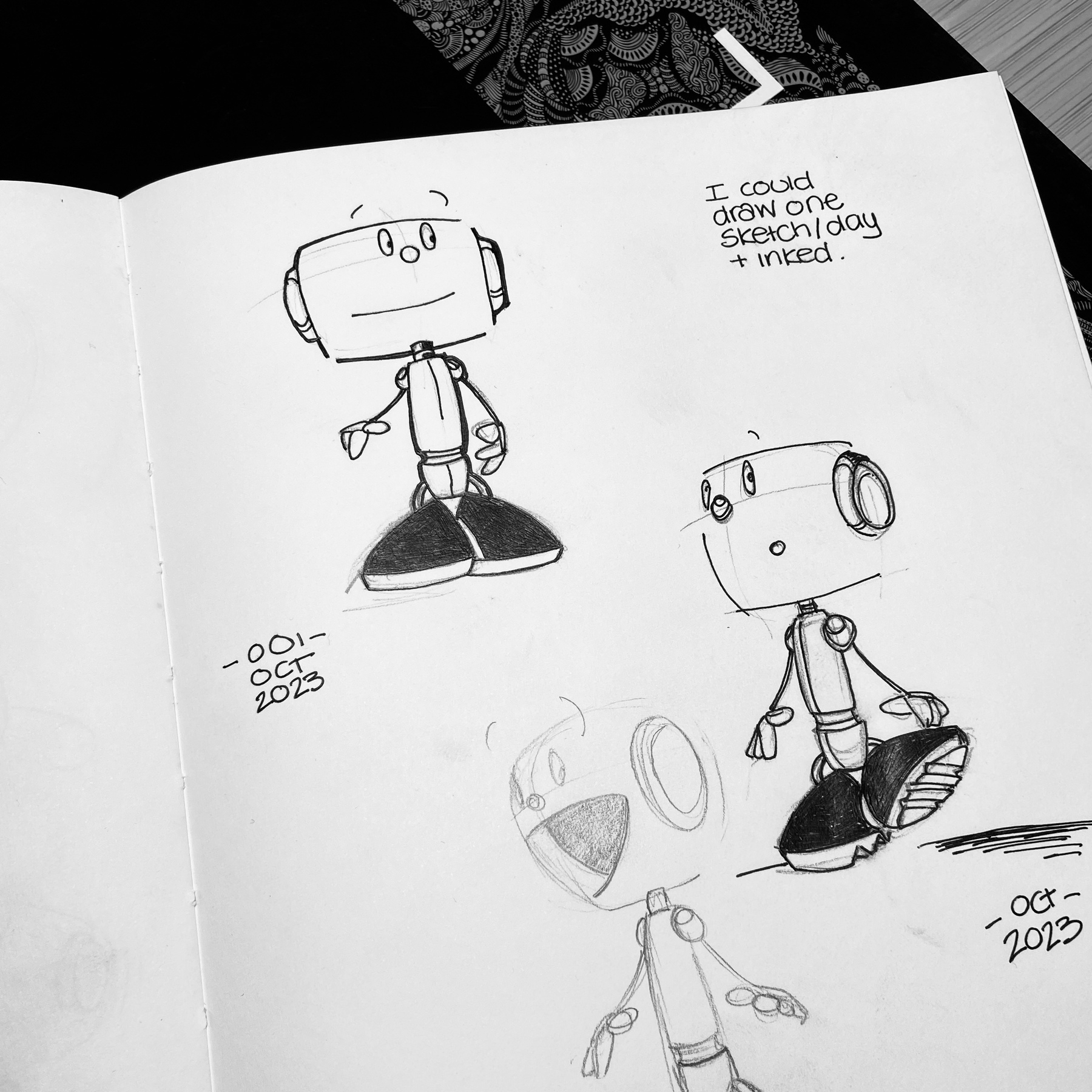
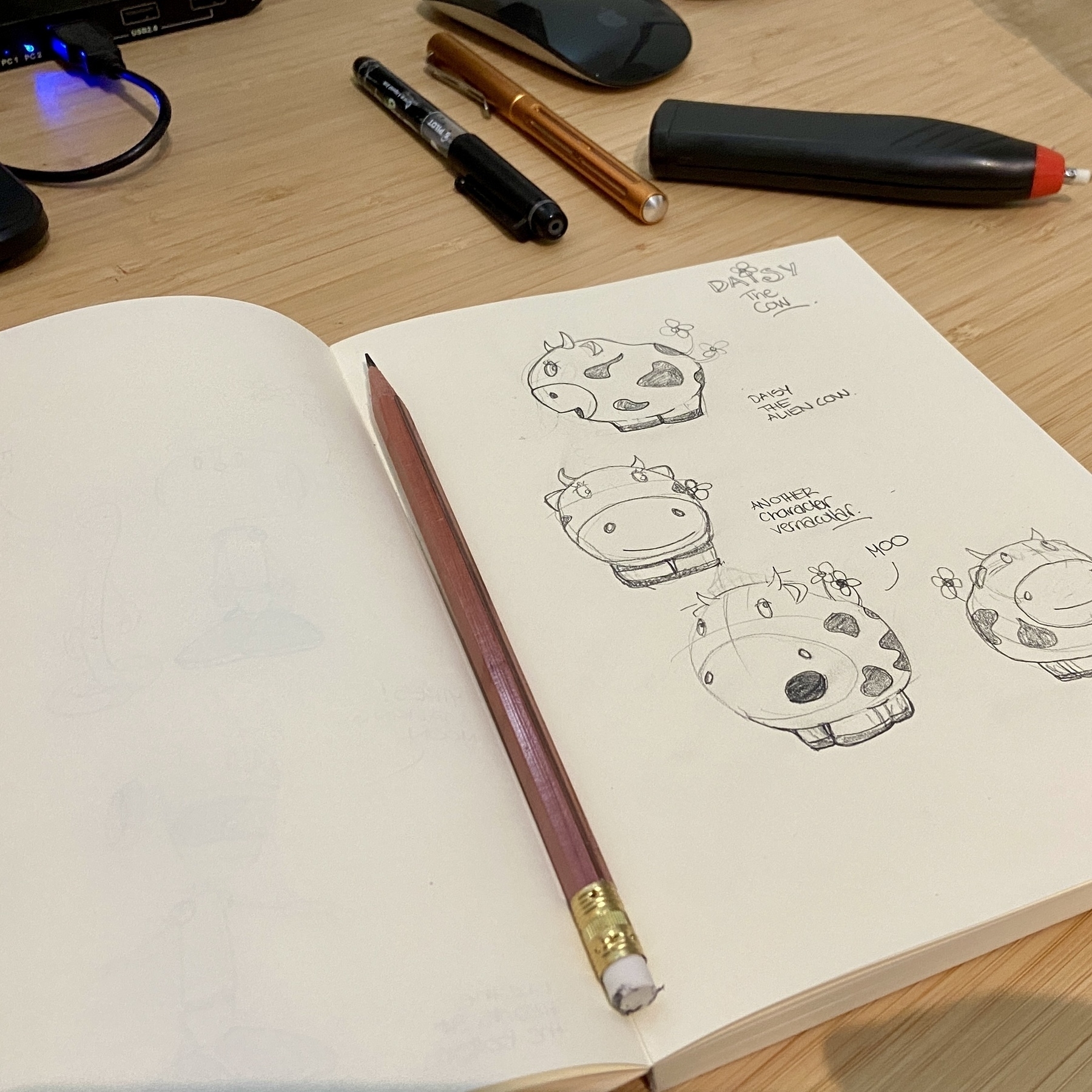
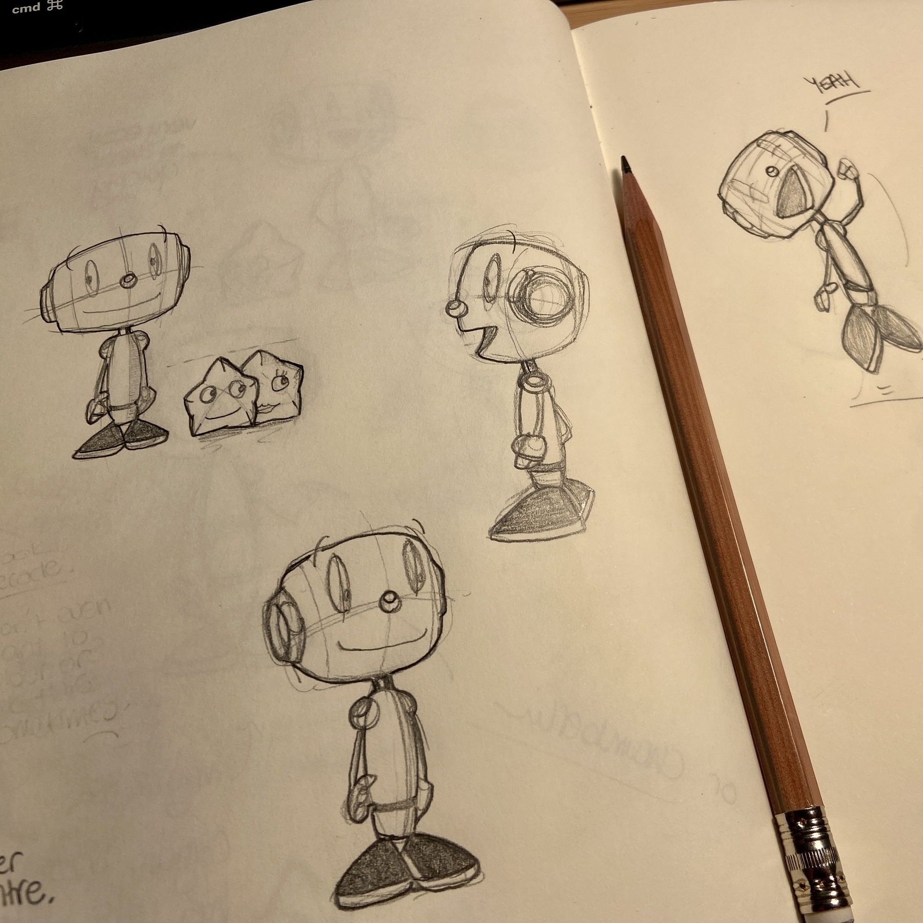
Not every day I create a new character but there is momentum with sketching something (anything!) every day.

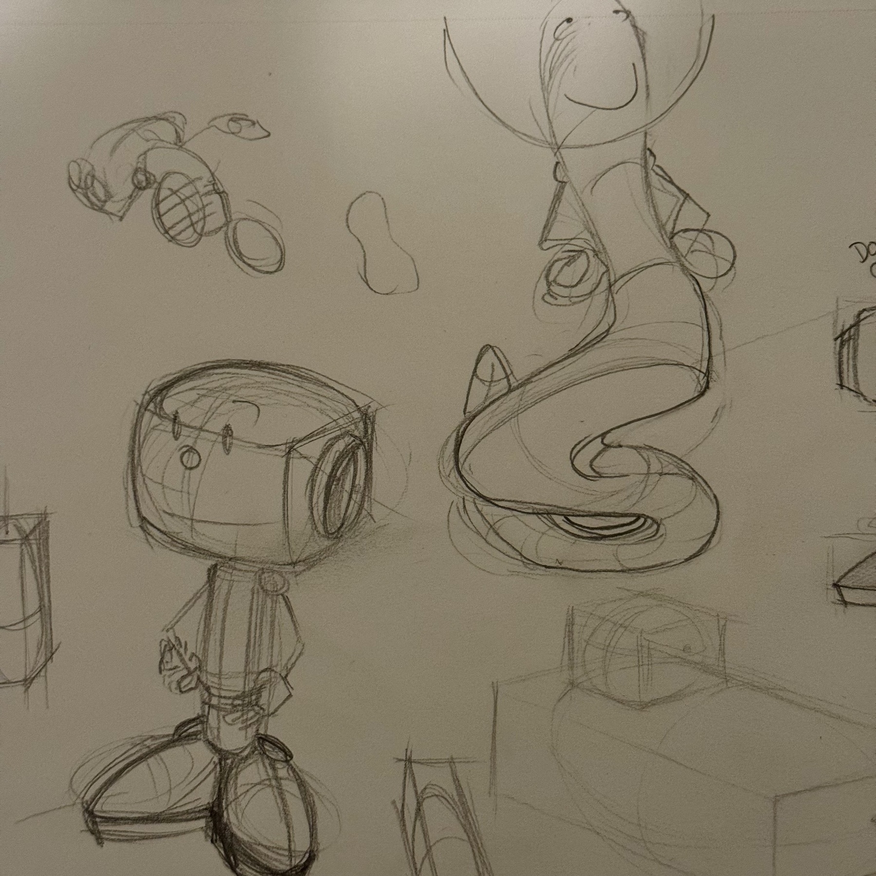
Inktober 2025/11. Creating a new character is only fun after progress has been made.
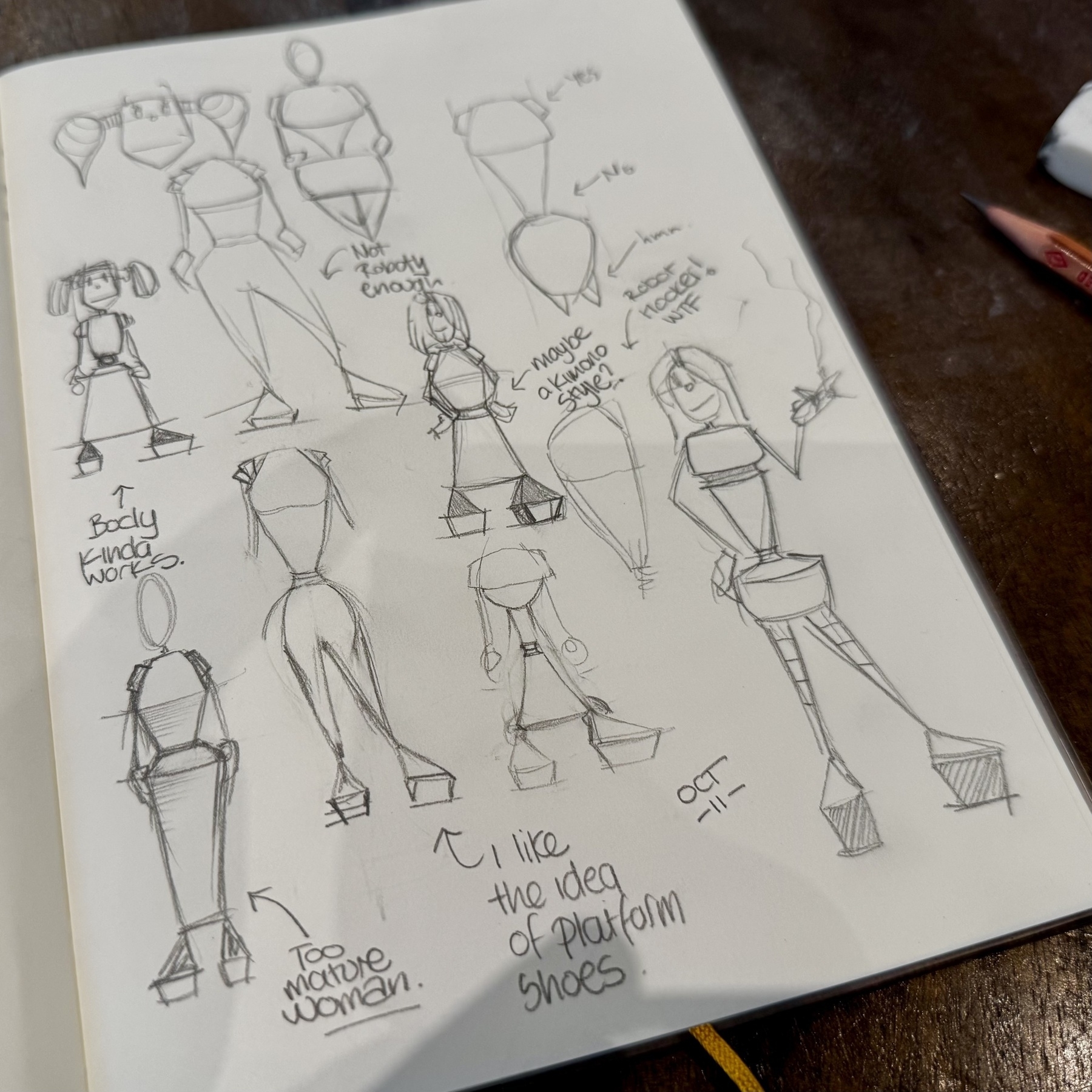
Inktober 2025/11.
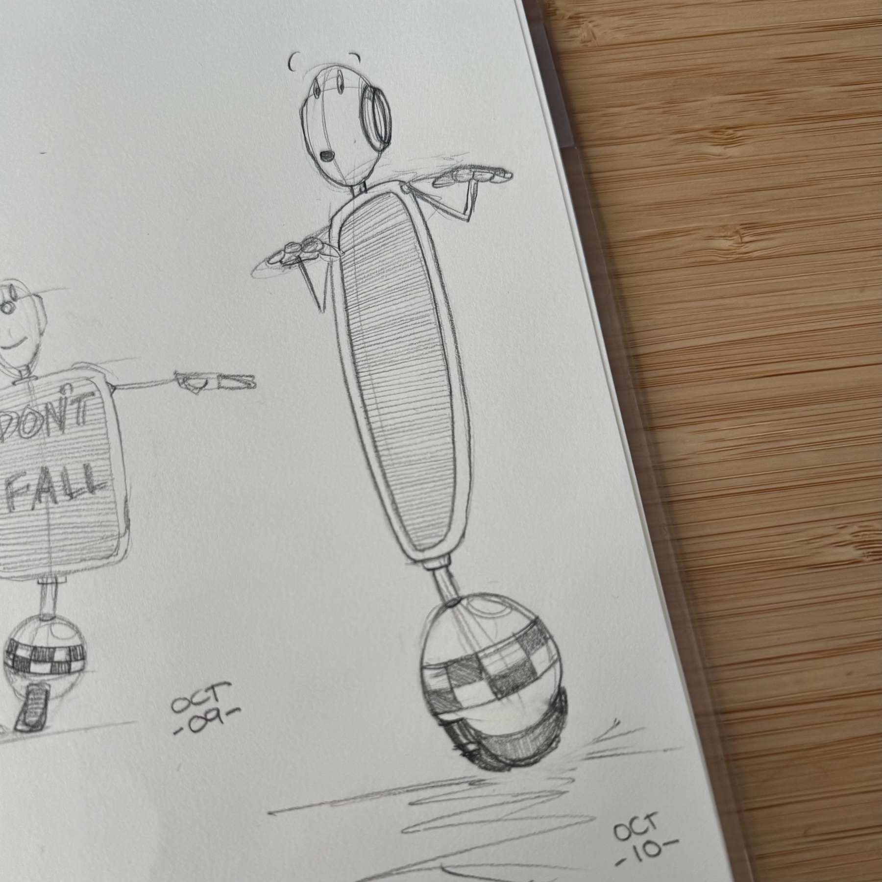
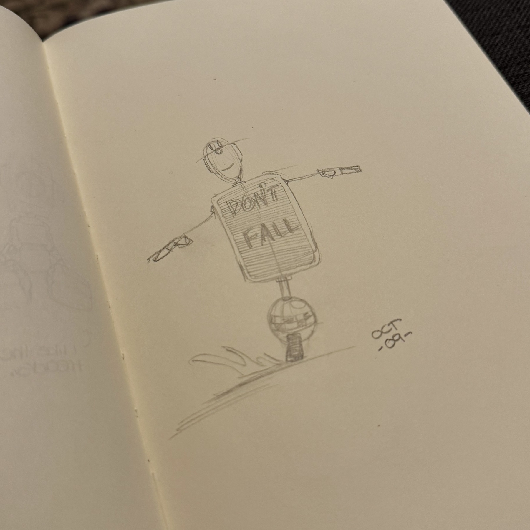
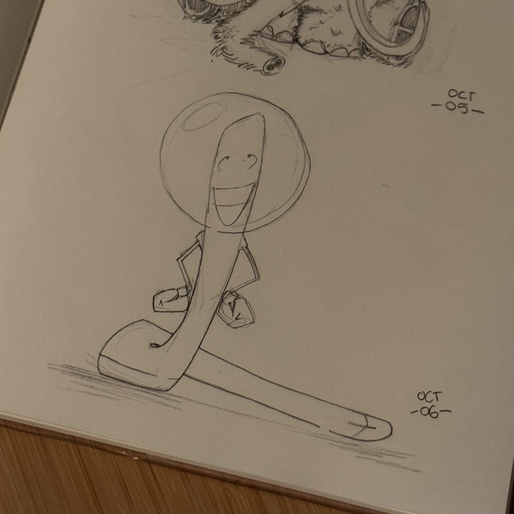
Inktober 2025/09.
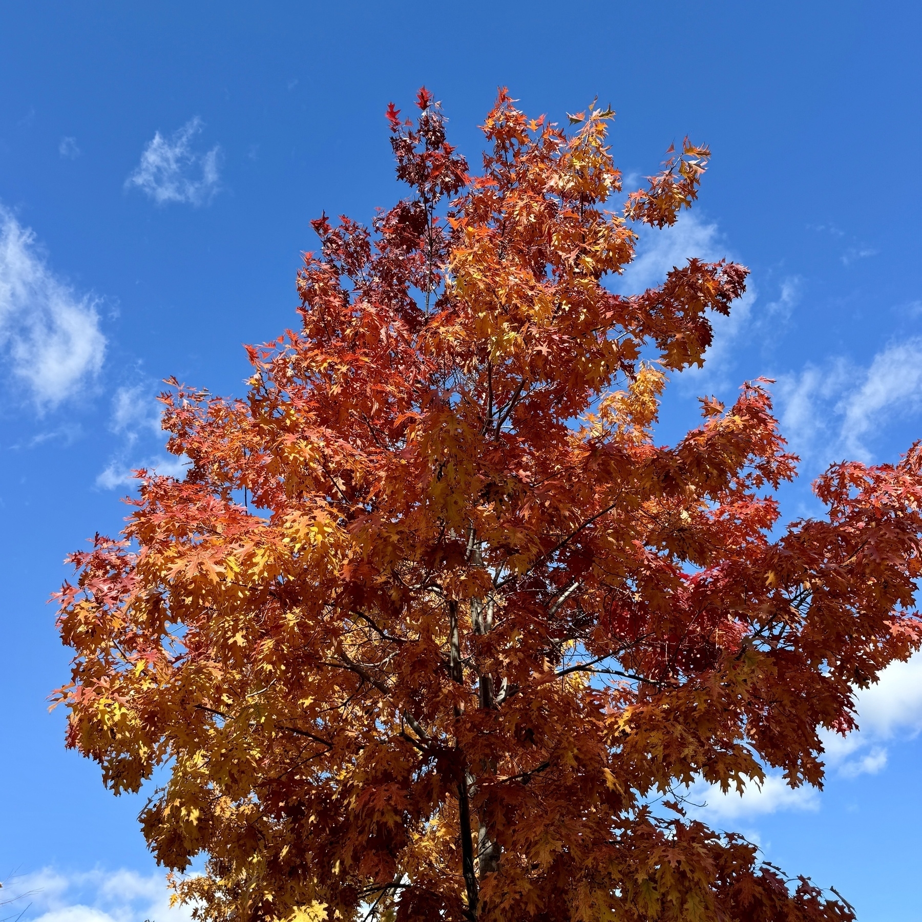
It’s that time of the year and colours they are popping. I wonder if one’s life mirrors that of a tree and you get moments of brilliance after middle age.
Inktober 2025/08.
Inktober 2025/07.
Inktober 2025/06.
Inktober 2025/05
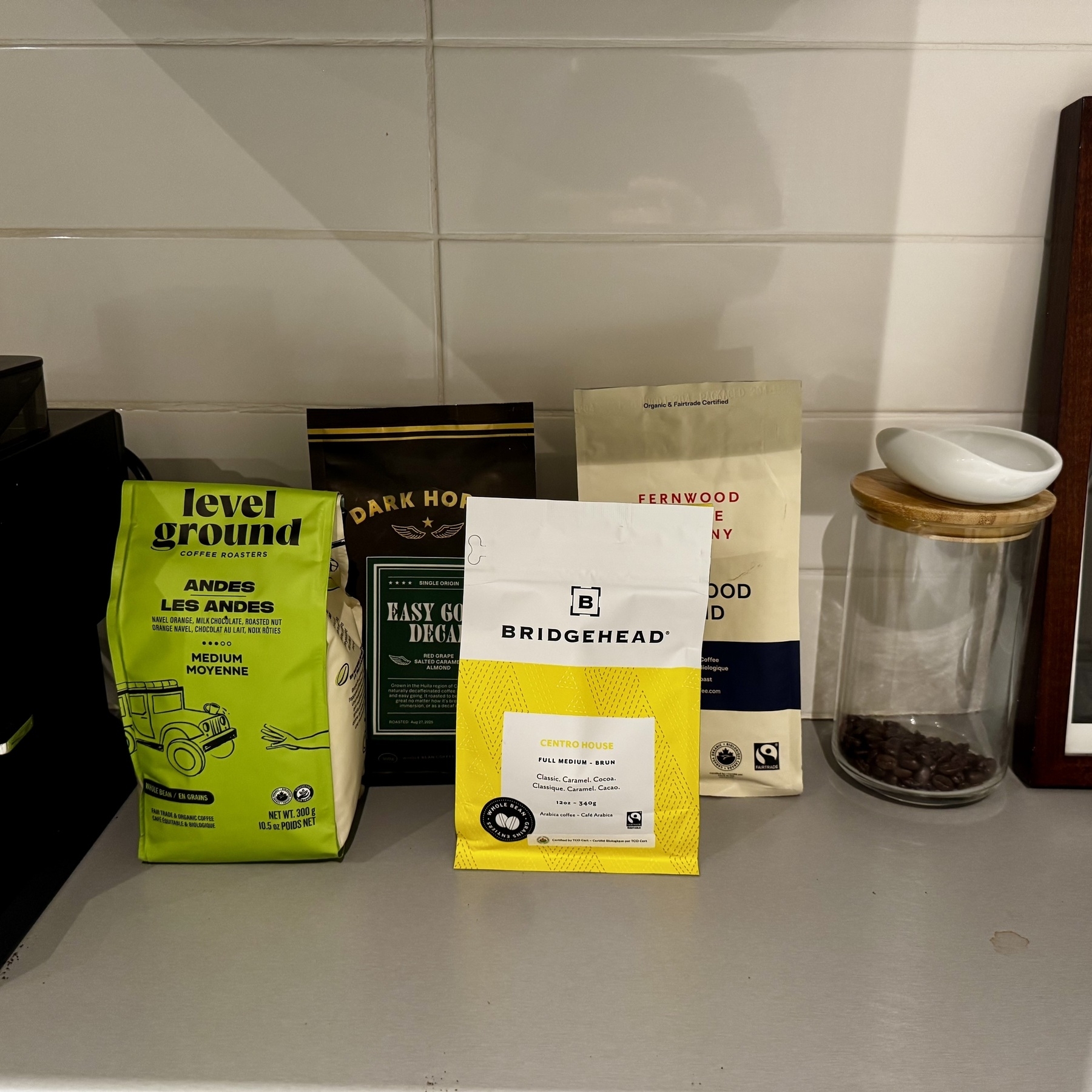
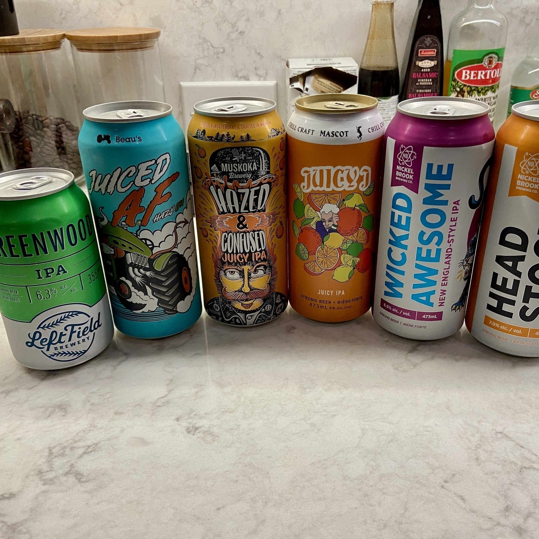
I may have overdone the coffee selection this month.
Inktober 2025/04
Inktober 2025/03
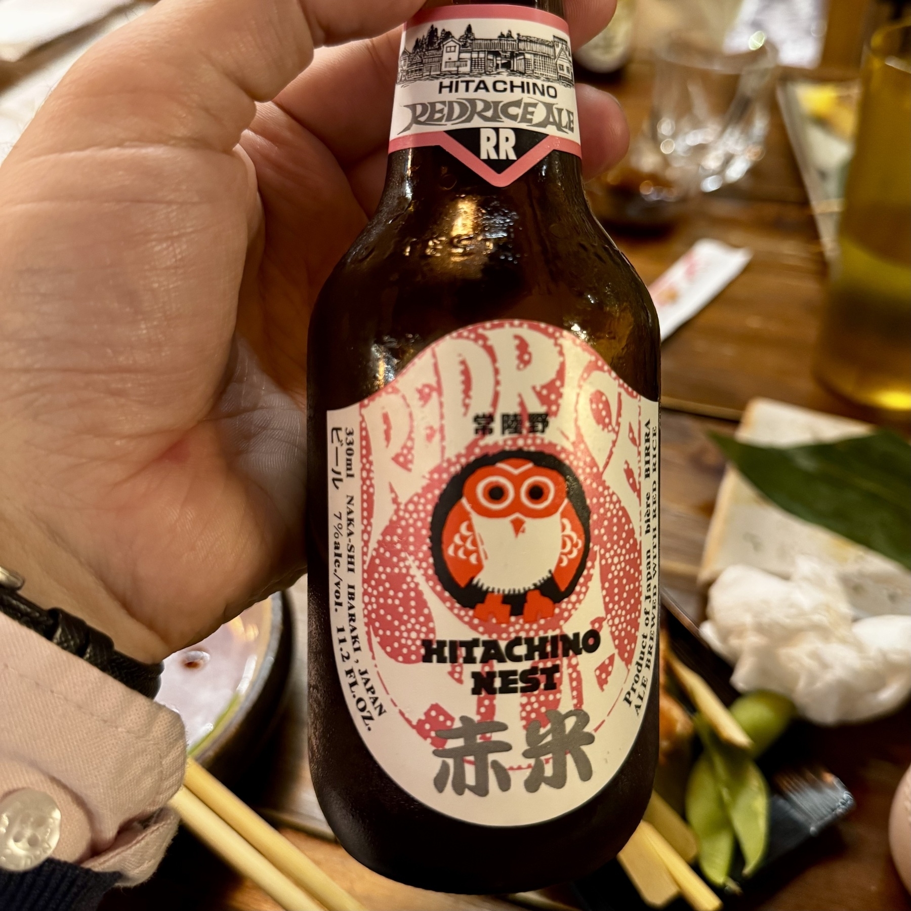
One of my first Japanese beers that isn’t a Sapporo Super Dry.
Inktober 2025/02
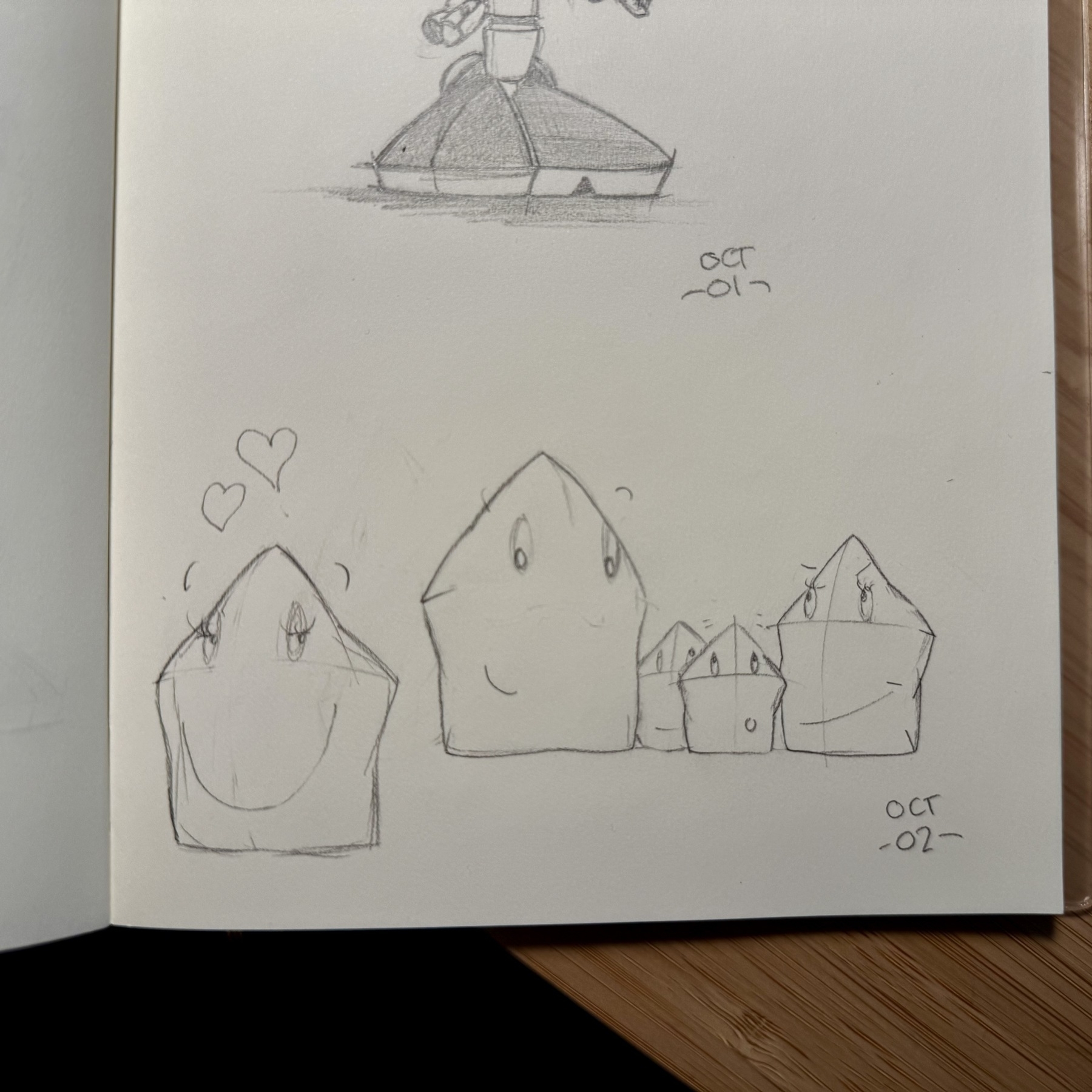
Inktober 2025/01
The internet and social media is hopefully meant to enrich you in ways you might have been completely oblivious to. @manton’s sent me down the Richard Williams rabbit hole. Interestingly his book The Animator’s Survival Kit is available on the Internet Archive. Not sure if that’s a legit thing.
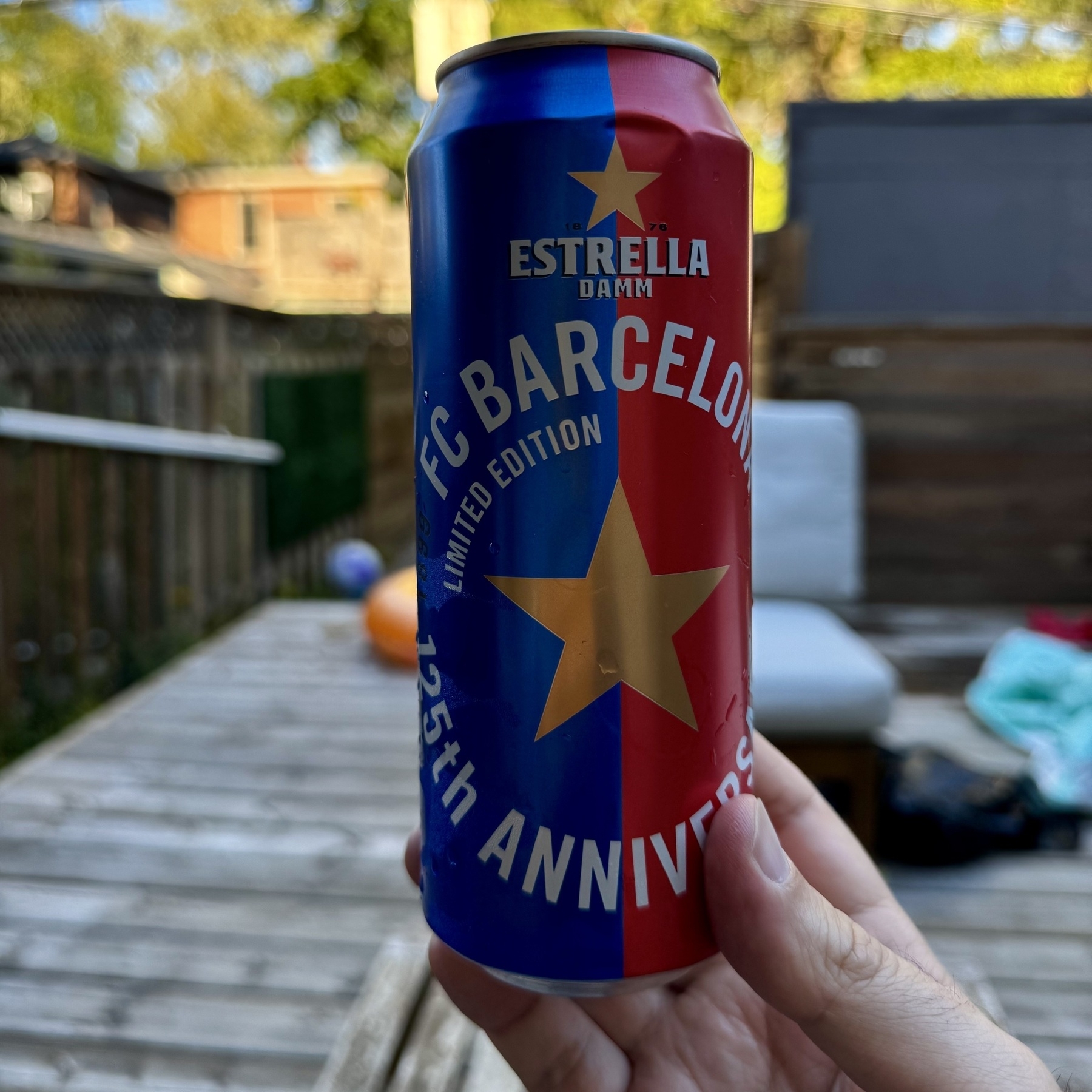
One of my favourite international beers has a new ‘livery’.
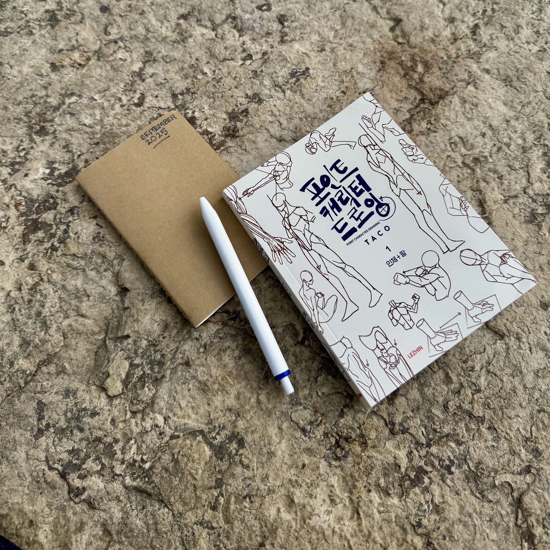
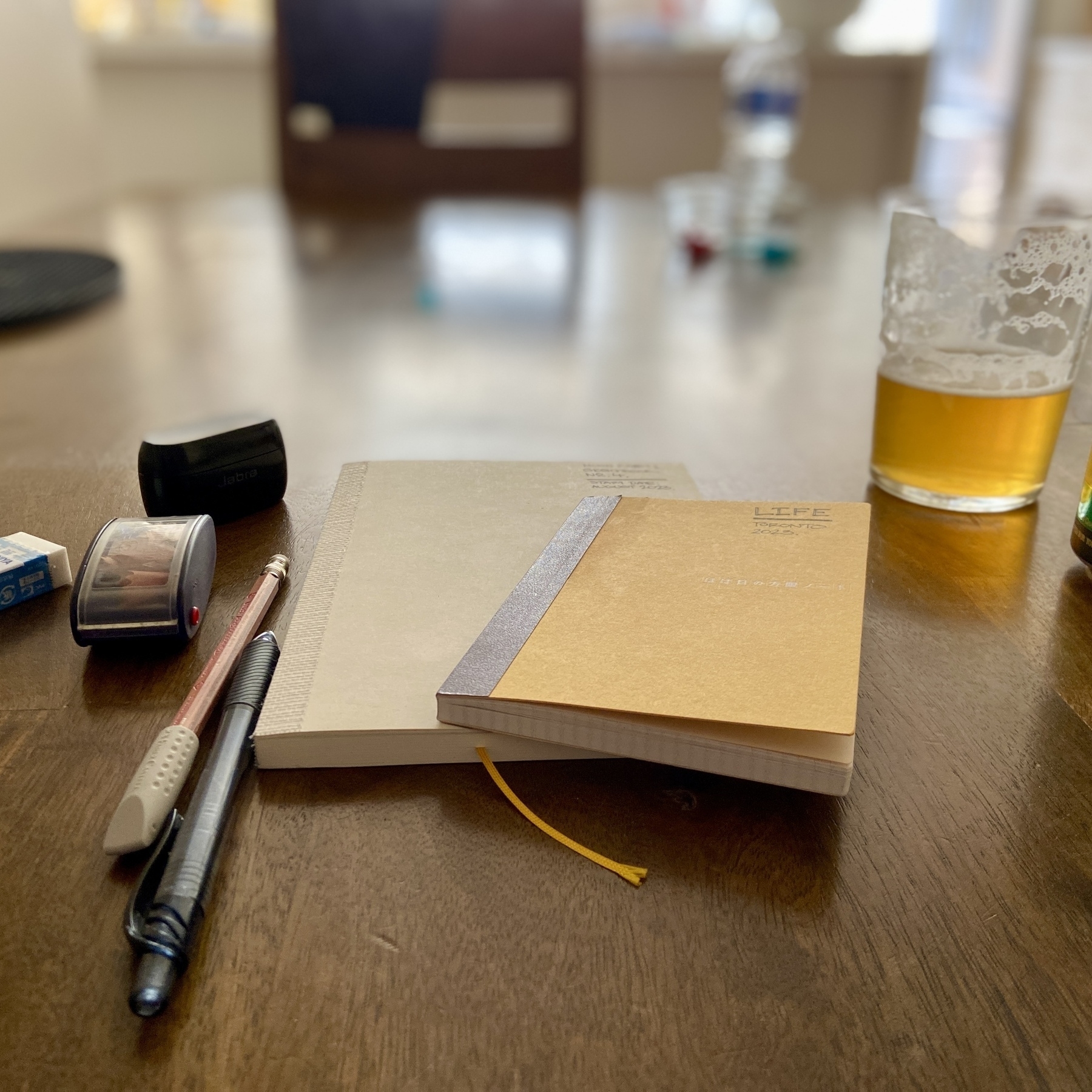
New book. New pocket notebook. Been a while since I used a Moleskine. Love the fact I customise the cover to whatever I want.
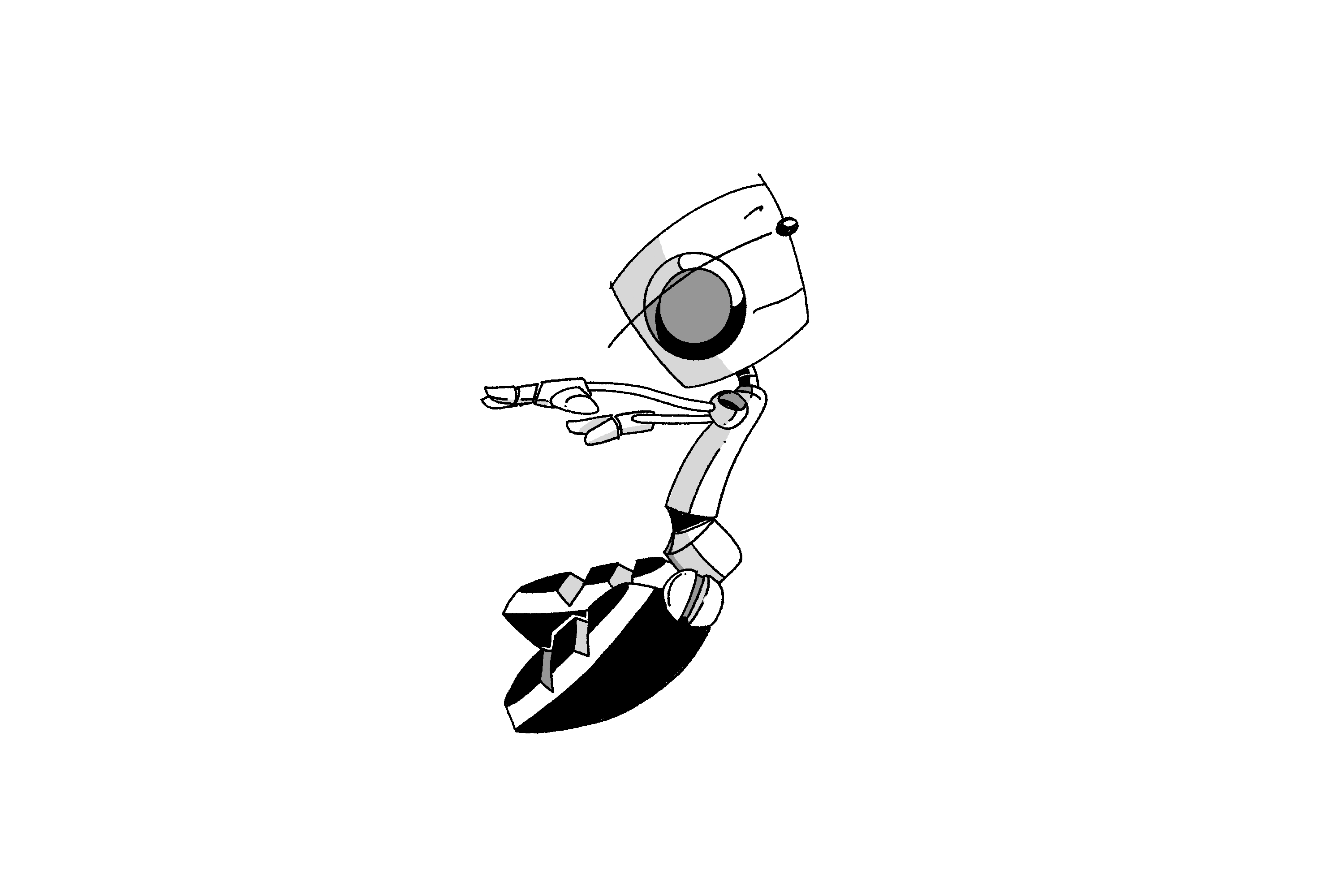
Finally capturing some movement in the lines.
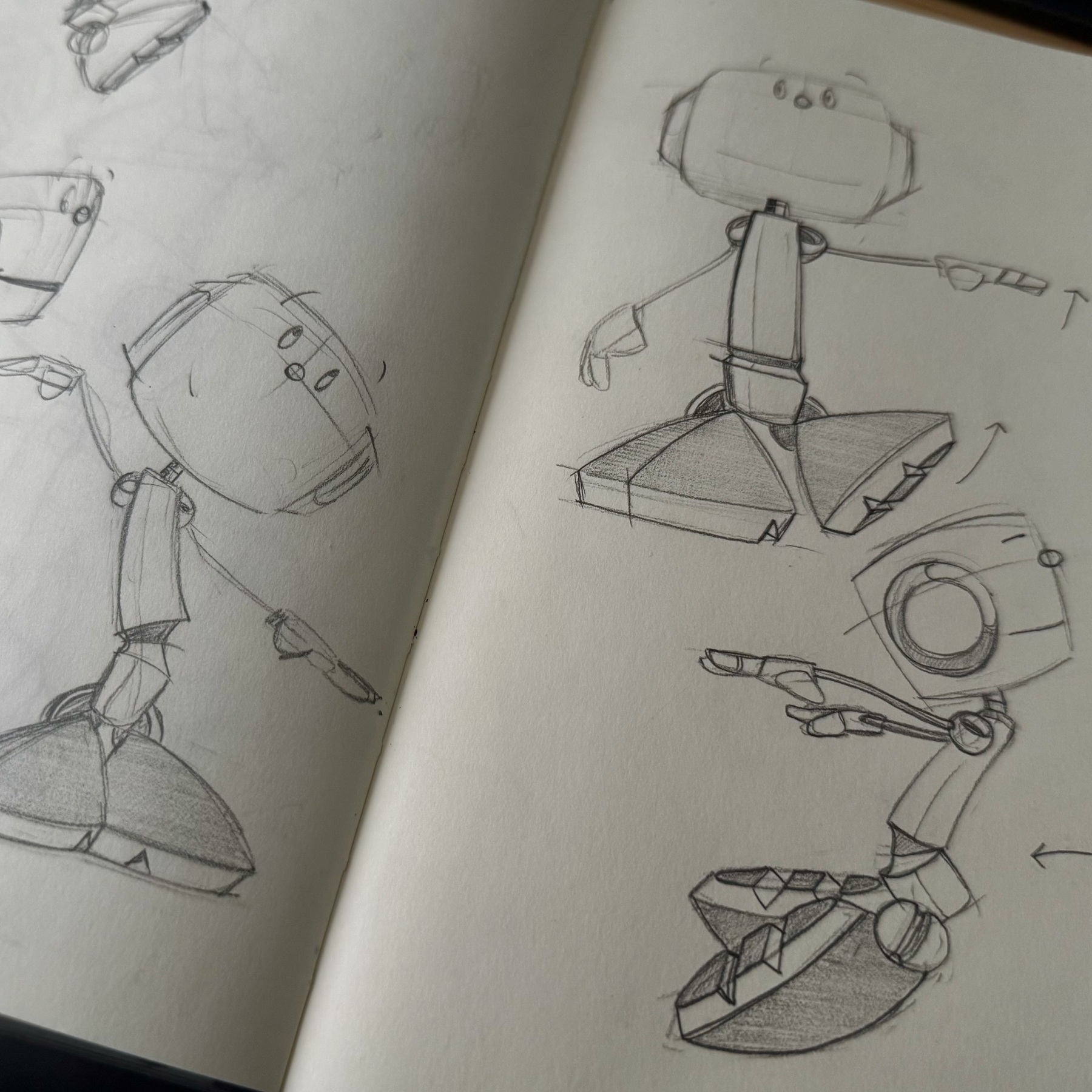
I have been slowly building my drawing muscle again. Drawing a character from every angle for a few months until I can draw them with my eyes closed.
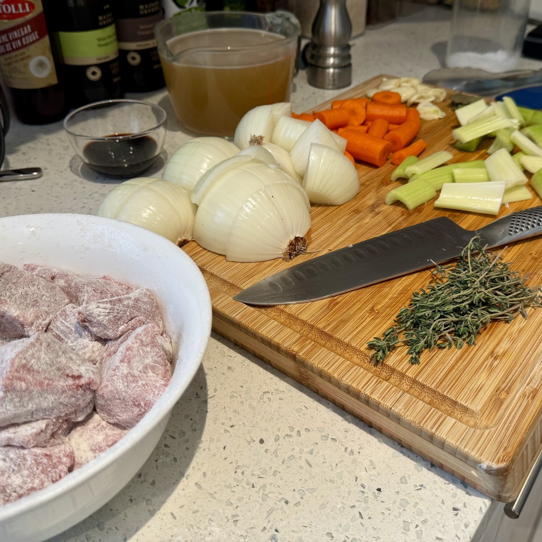
🍳 Mise en place.
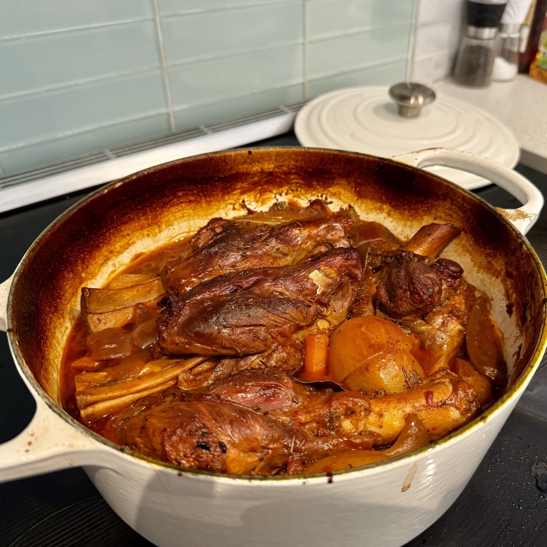
🍳 Greek Lamb Shanks. Auto pilot. Great meal to come back home to after a second from final trip to the pool.
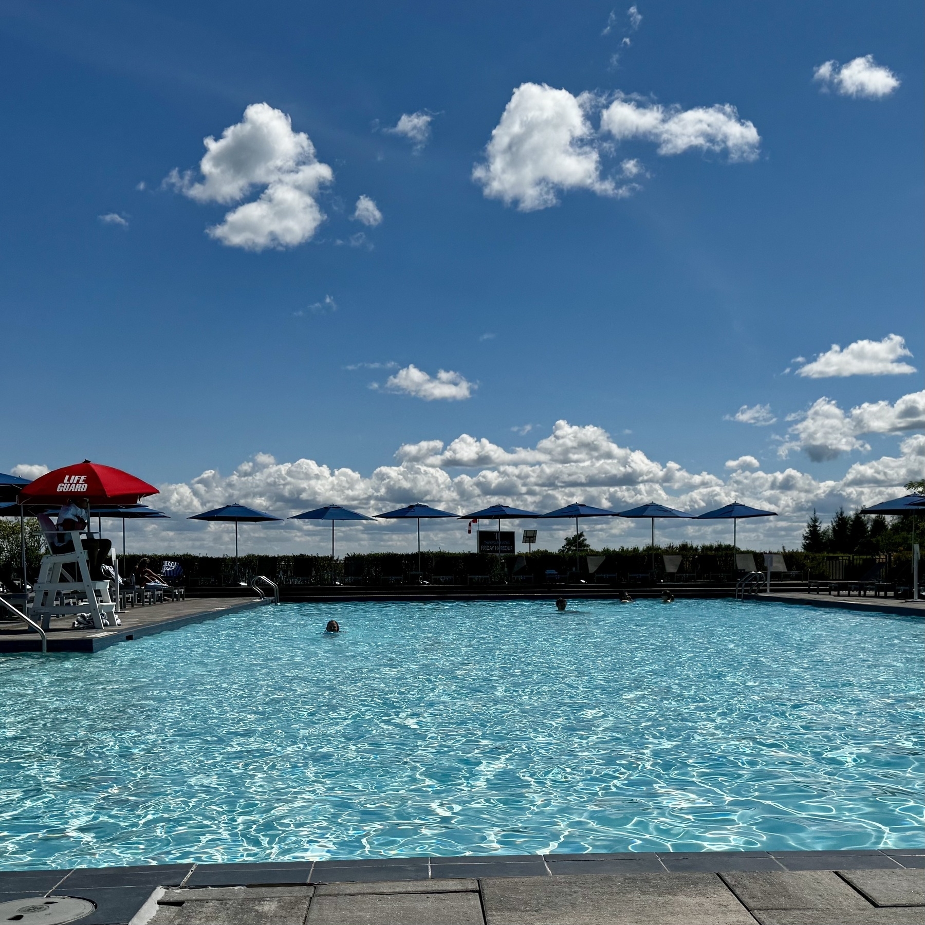
Last pool day of the summer.
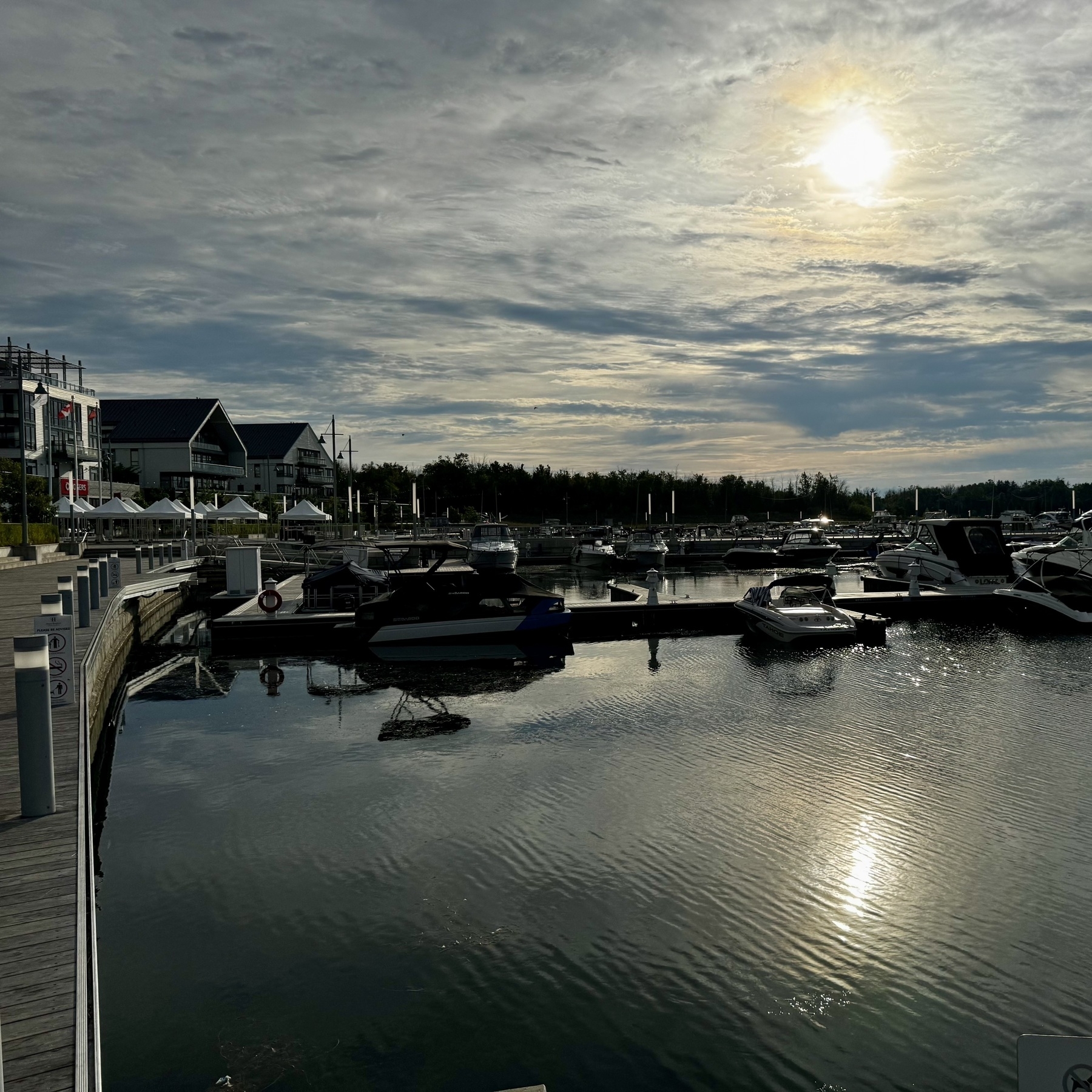
Morning light.
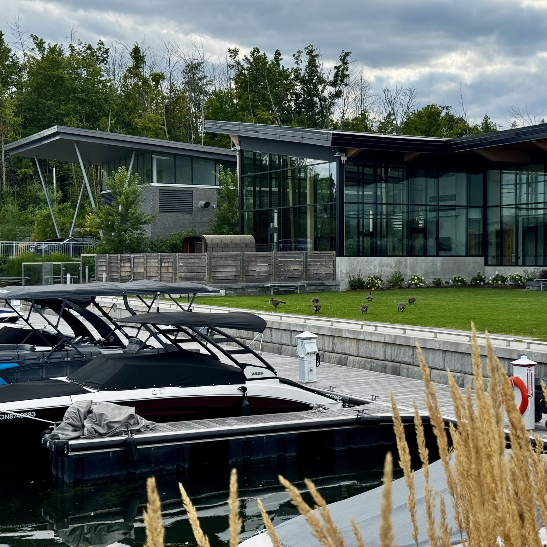
Canadian geese just be chillin’.
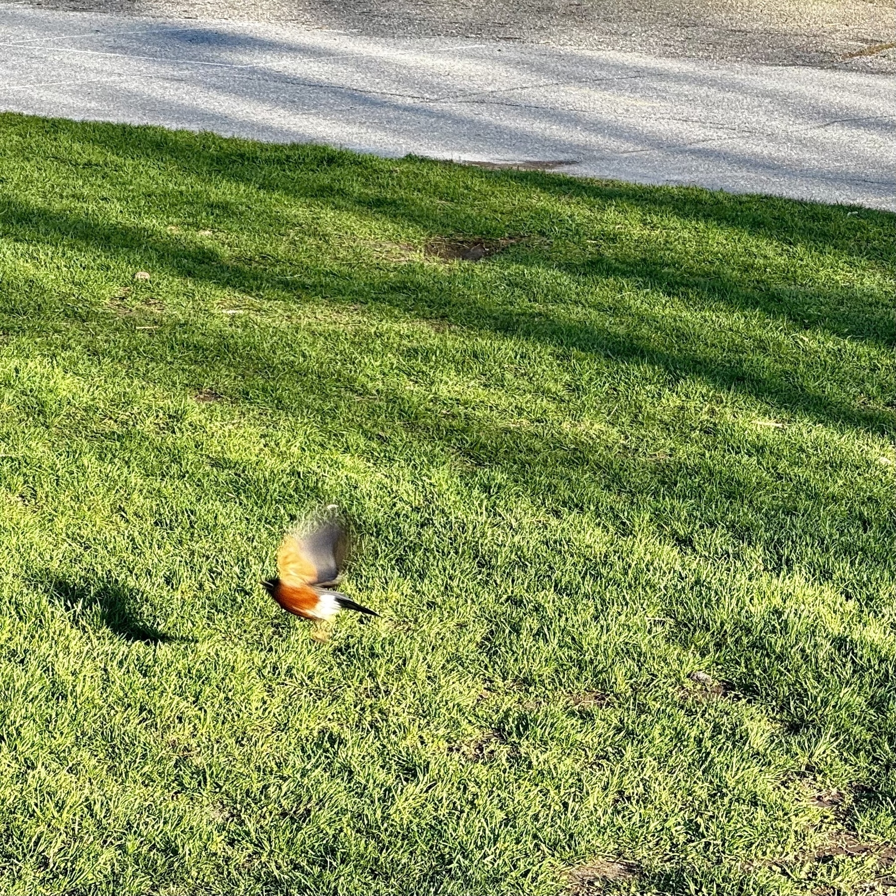
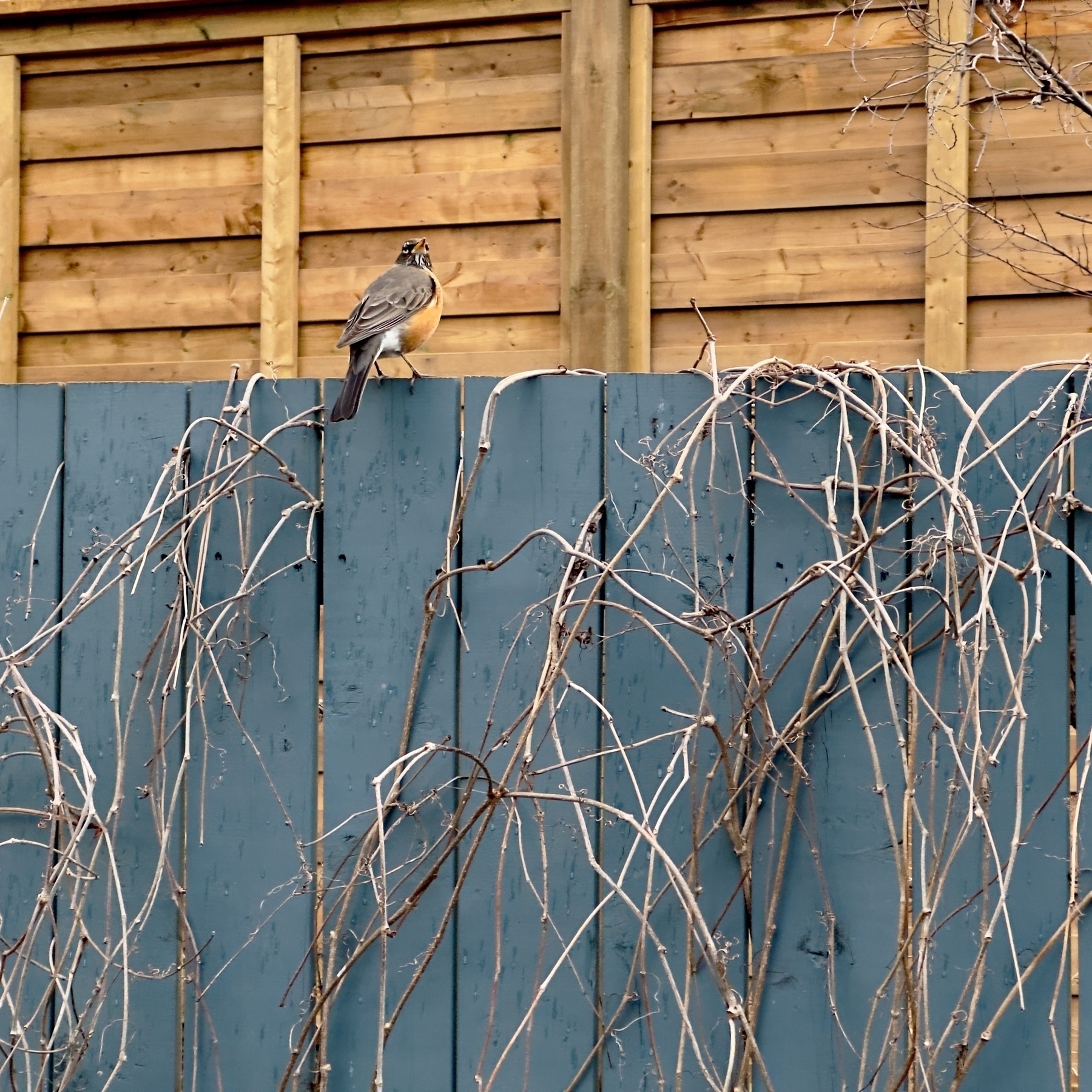
We had a visitor this evening on our patch of grass.

It’s becoming a family tradition. Have a meal at the Beach Club.

Mine!

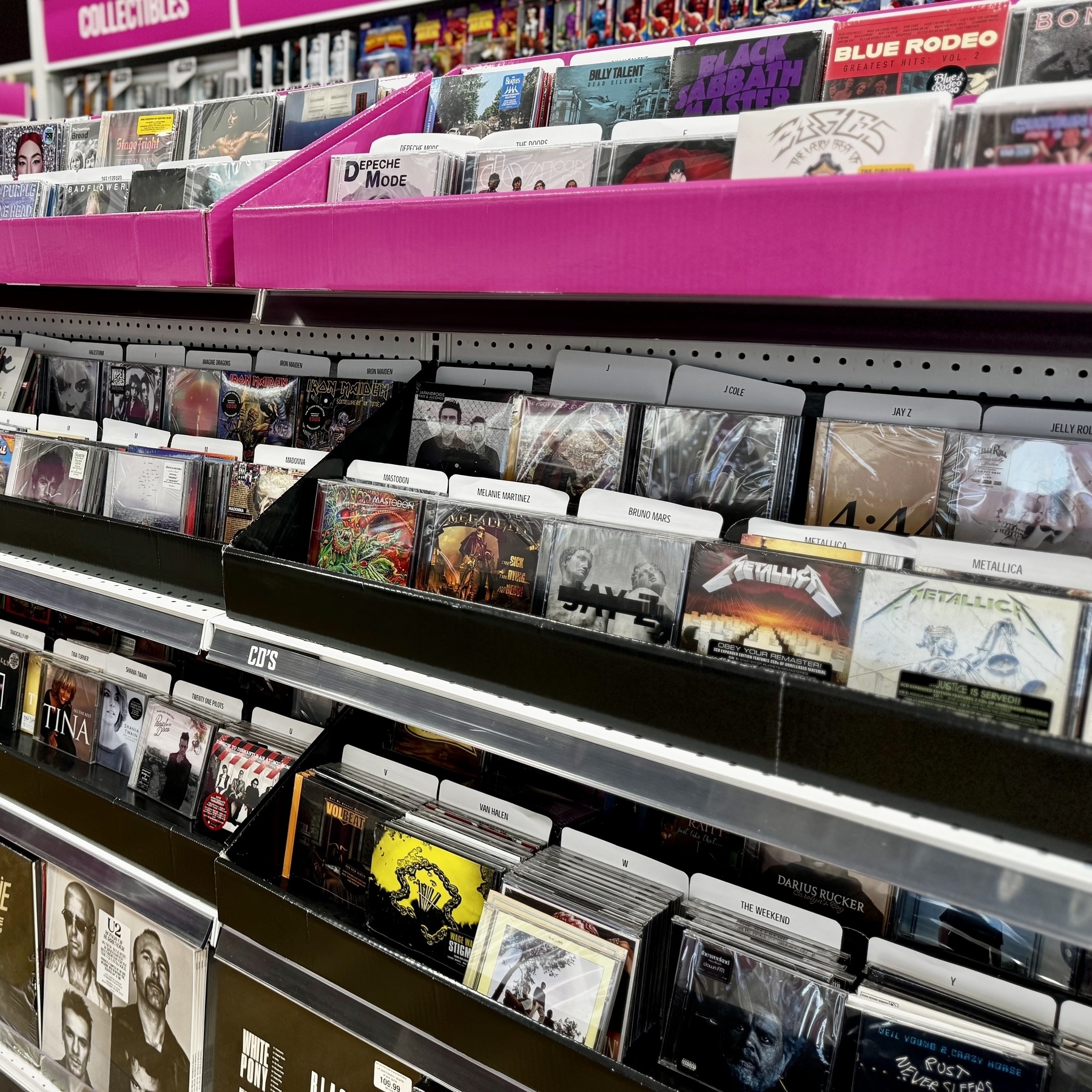
Seeing CDs being sold just takes me back to when music was a physical object that somehow enhanced the listening experience.
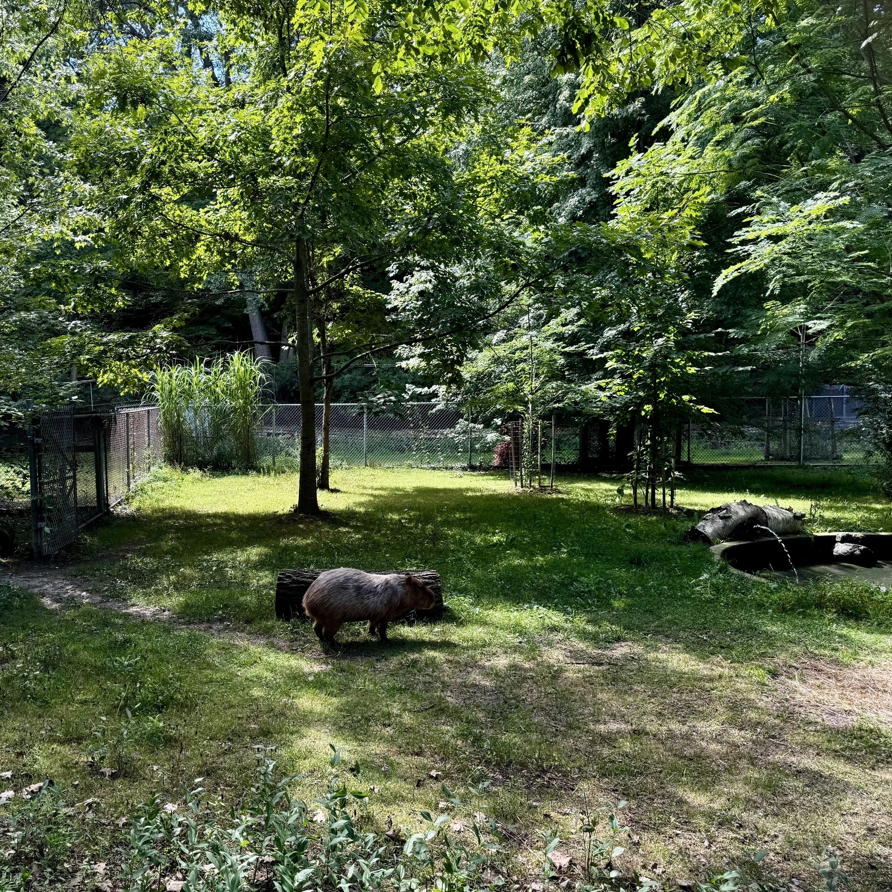
The kids finally saw a real live Capybara. They’ve been talking about these things all winter (and singing about them).
First pic.
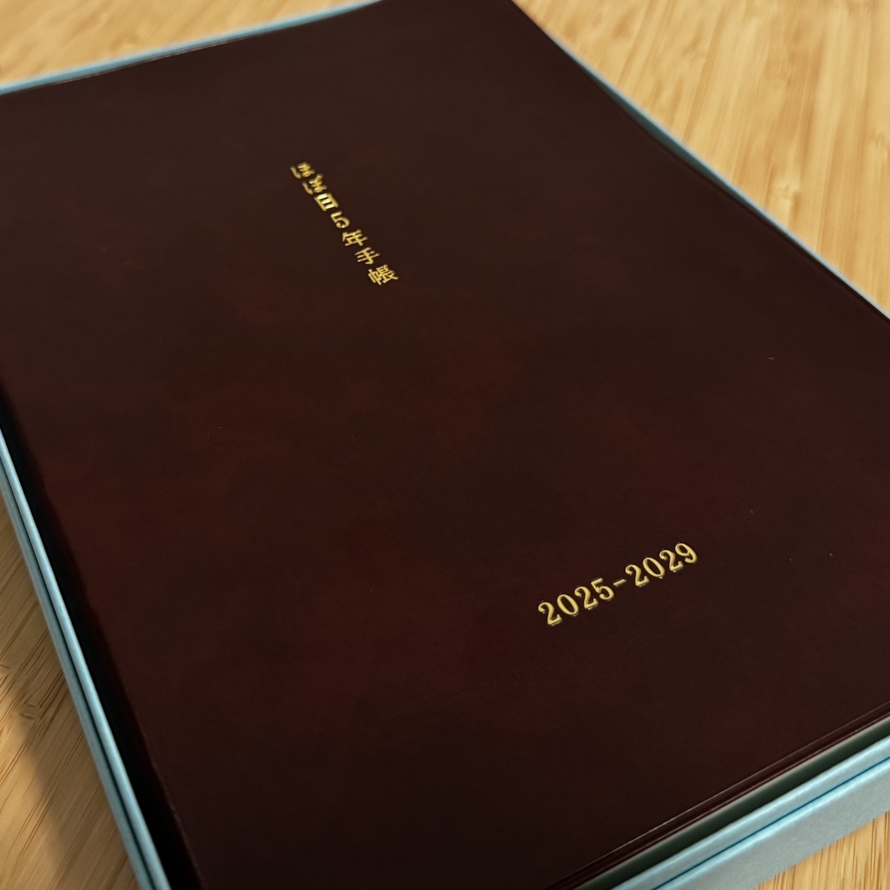
Part of an early birthday present to myself, finally got another Hobonichi product, this time one that will hopefully last me 5 years and be a place to pile in my short missives.
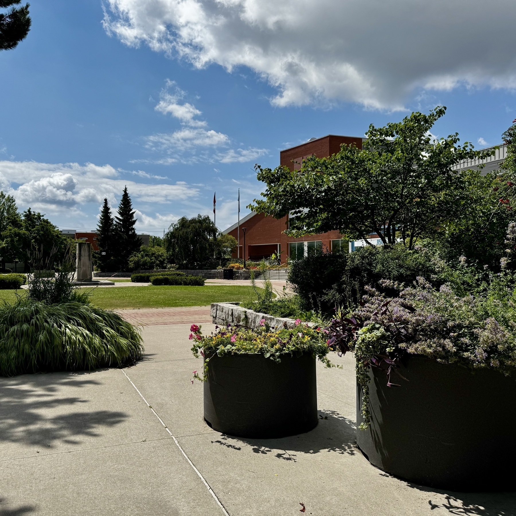
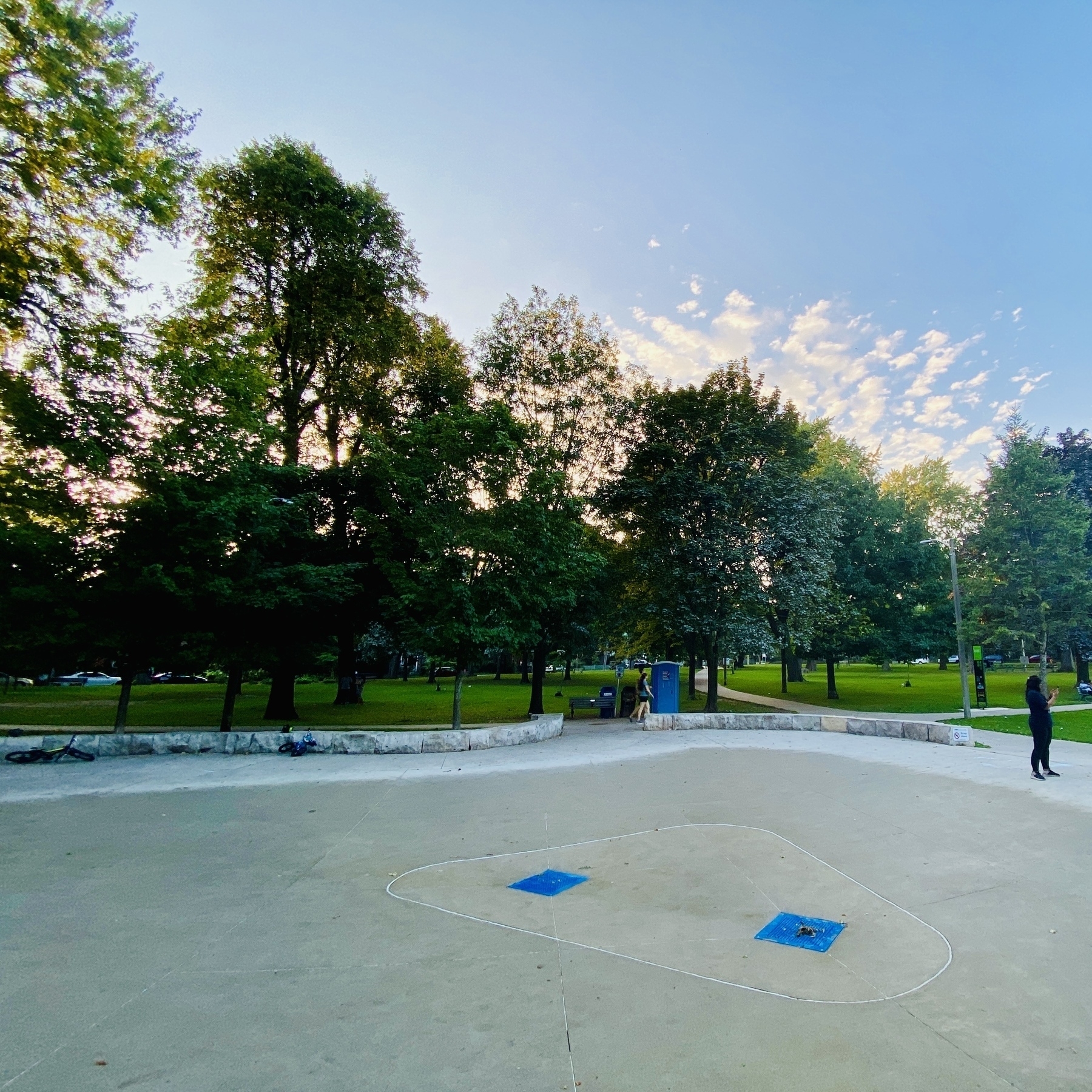
Short walk around the East York Civic Center.
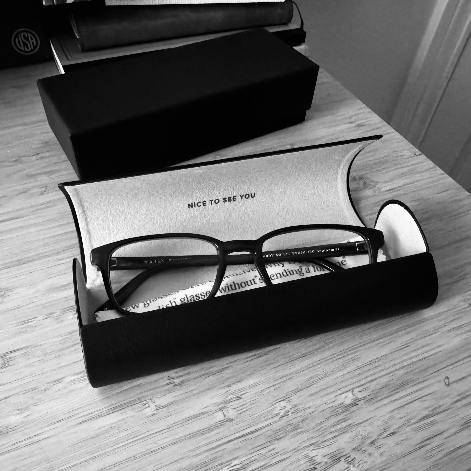
First pair of reading glasses. Another clear signal of age.
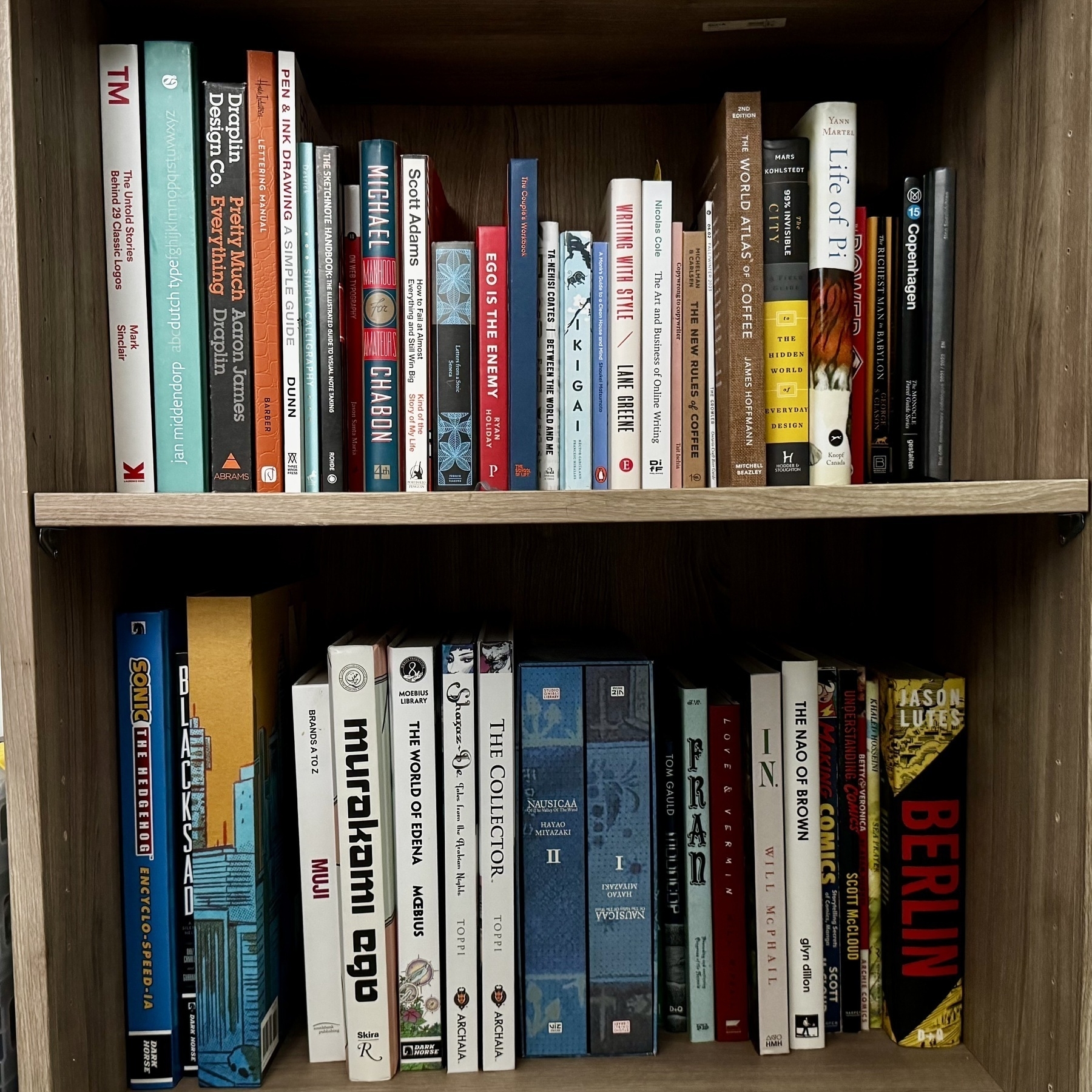
My Canonical library
One of my many vices is that I do enjoy collecting books. Most of the times I read them. Sadly sometimes I do not. I might remember how important a book was to me as it provided something very specific to me that has lasted me many years after I read it. The book changed the way I think. Sometimes the story haunts me years, even decades after I read it. This is the very best stuff. The canonical stuff.
Amongst a wide range of ‘adulting’ activities carried out this week, I have managed to review my personal collection to try and pair it down to only the very best. One idea that I am considering is a single book, the best work by any individual artist, writer, designer, philosopher. There will be the occasional writer that gets an additional book here or there, but there is always one that stands above the rest. Of course I have a range of digital books. These I feel infinitely less pressured to culling. Being able to look at a shelf of books and know ho much they mean to you because they helped you grow as a human.
All the summer colours.
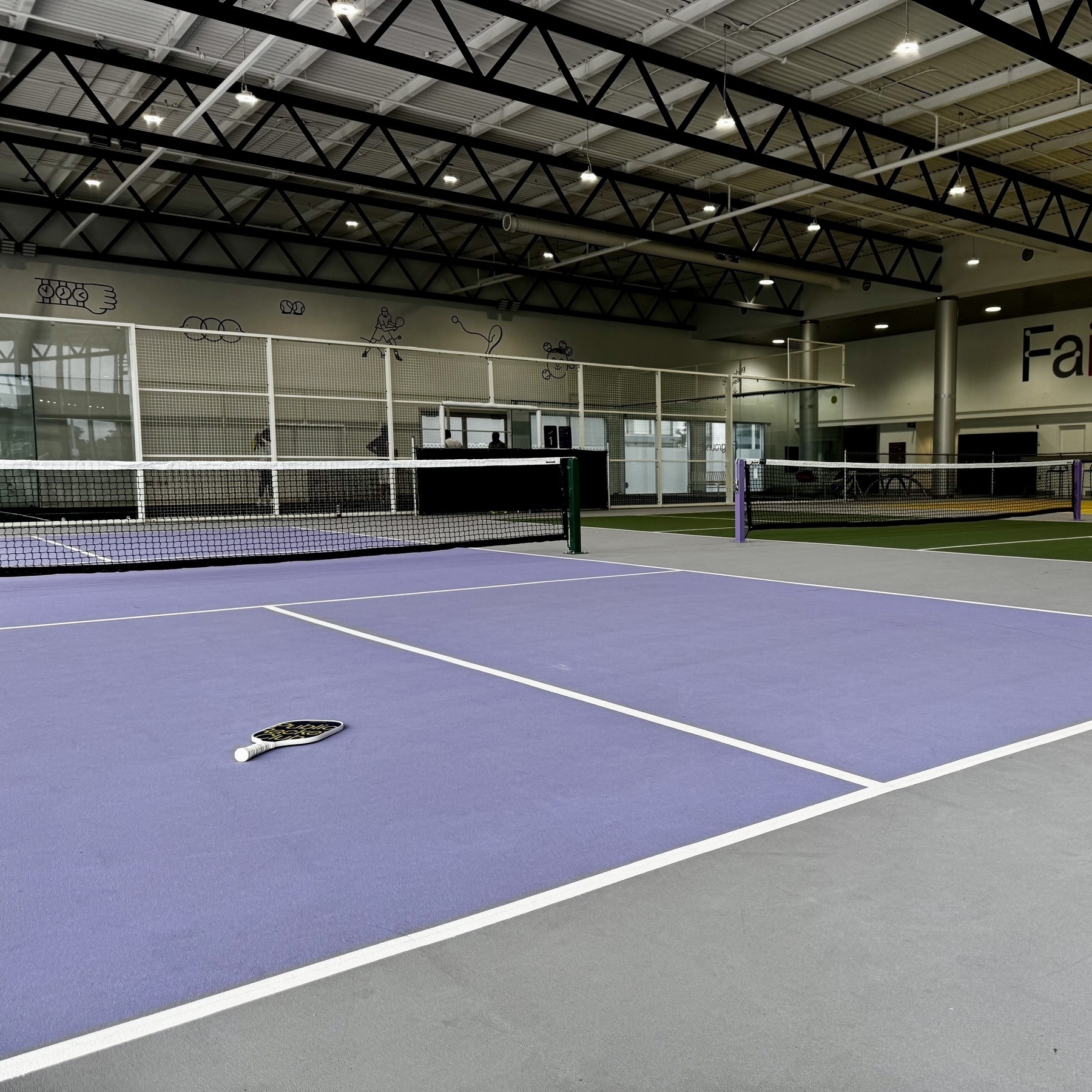
First time playing pickleball.
Who’s ready for summer? This guy.
Setting things up for the spring and summer.
An nod to the classic Field Notes edition, Grass Stain Green, my spring colour edition.
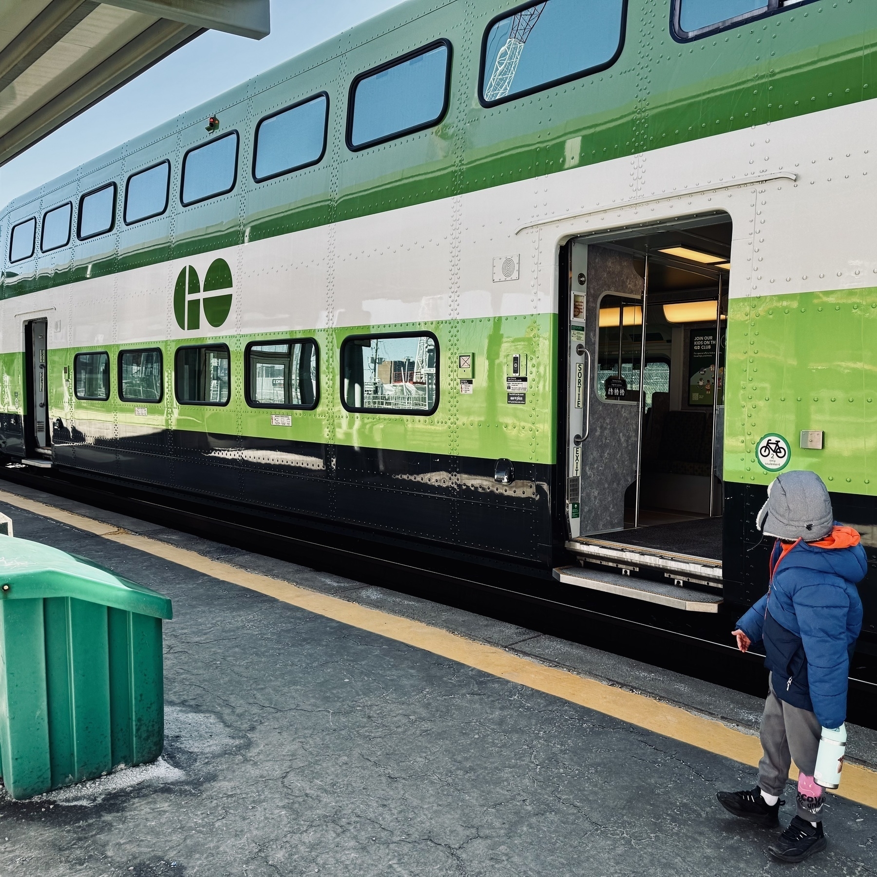
This morning was another train adventure with Ryan. Go train out to Rouge Hill.
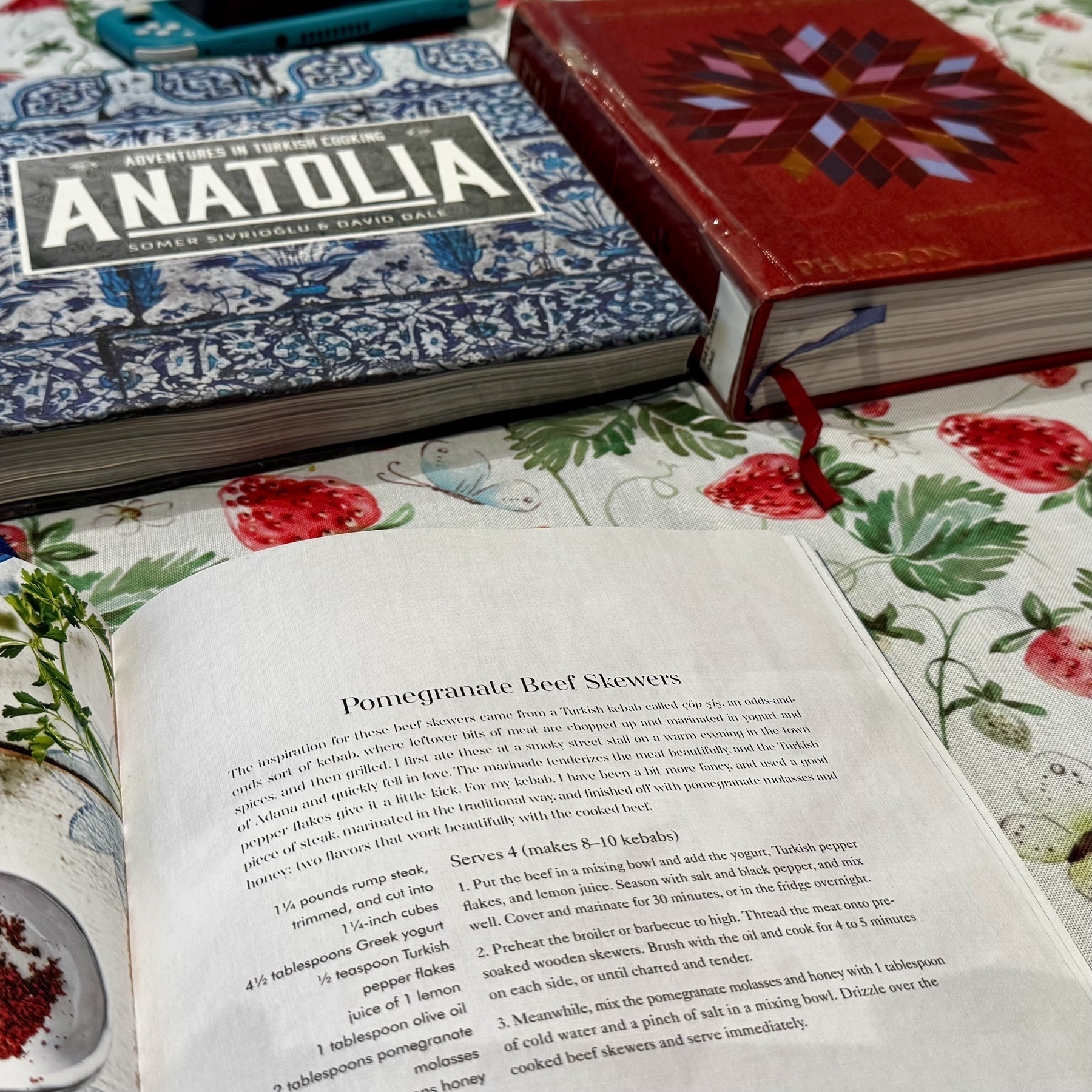
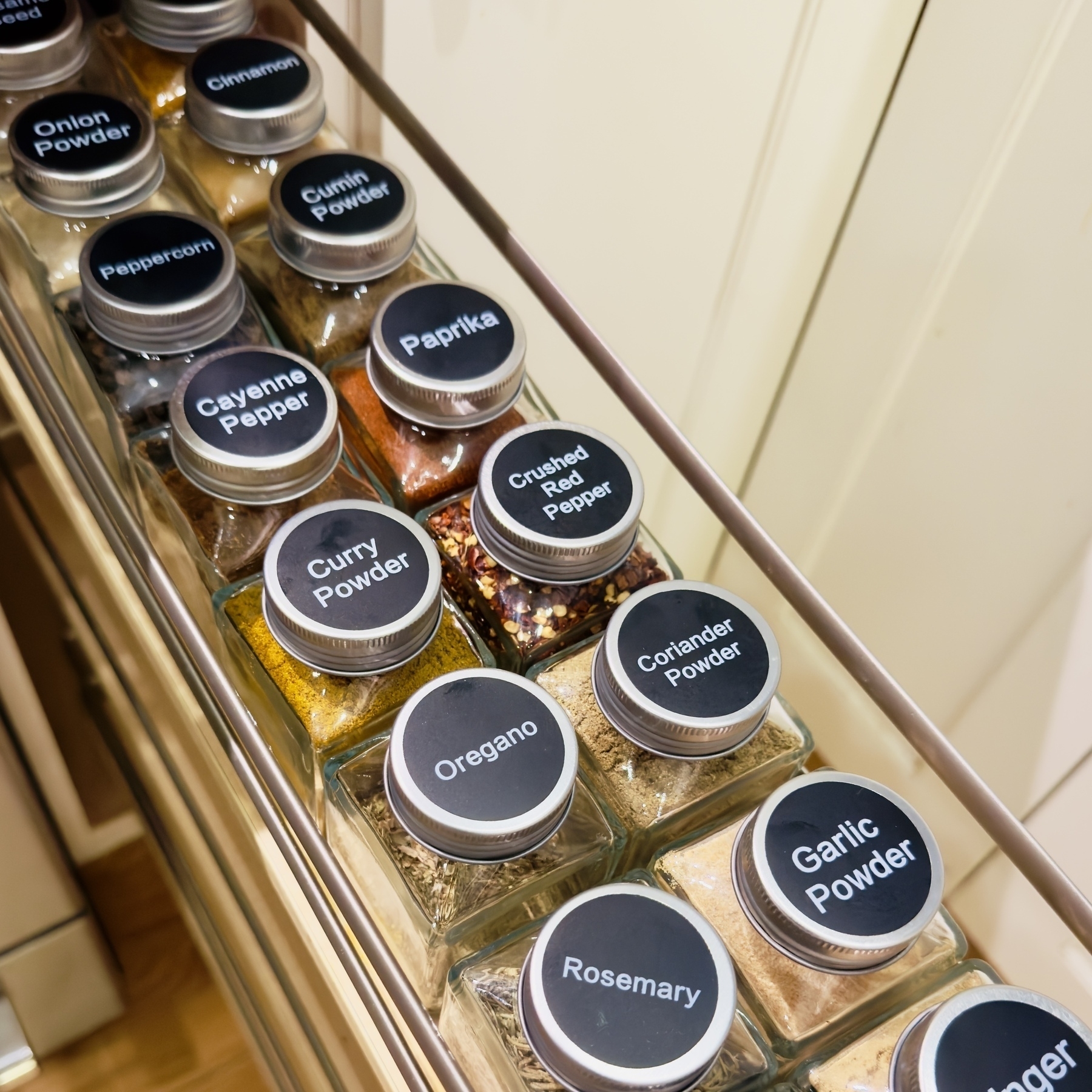
It’s a Turkish cooking kinda weekend I think.
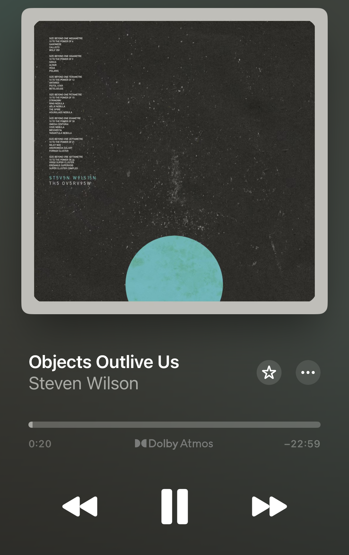
Here we go. New Steven Wilson.
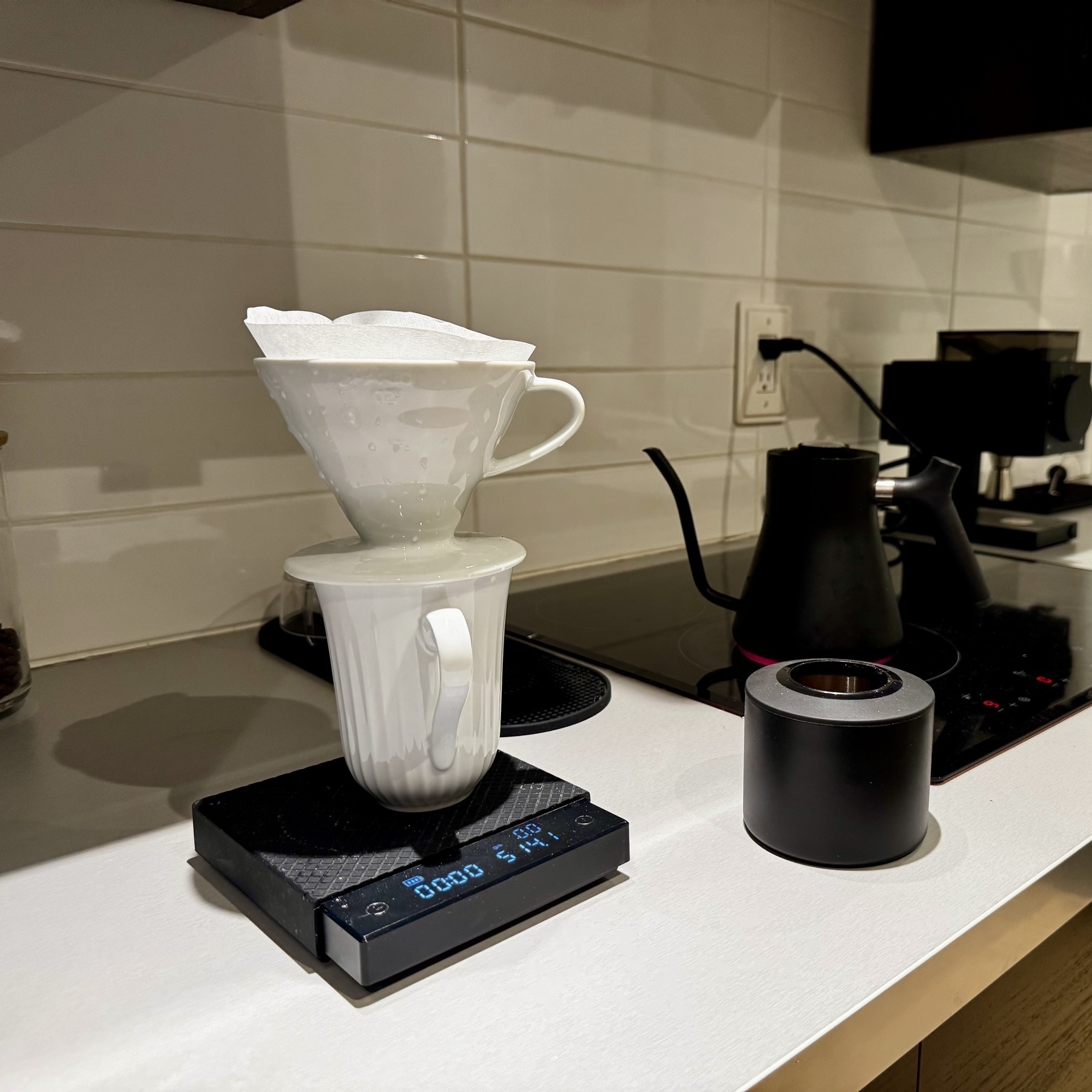
Morning coffee routine is now locked in.
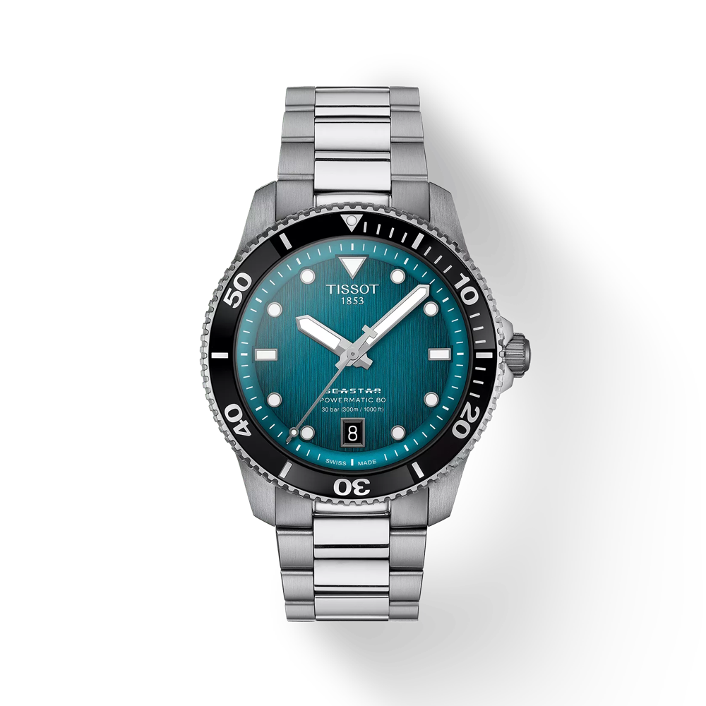
I don’t always do this but I think I’ve decided on my 2025 watch. First dive watch and only my second Swiss watch. Usually a summer purchase.
Something tells me I’m not getting the car out of the driveway. Oh, Canada.
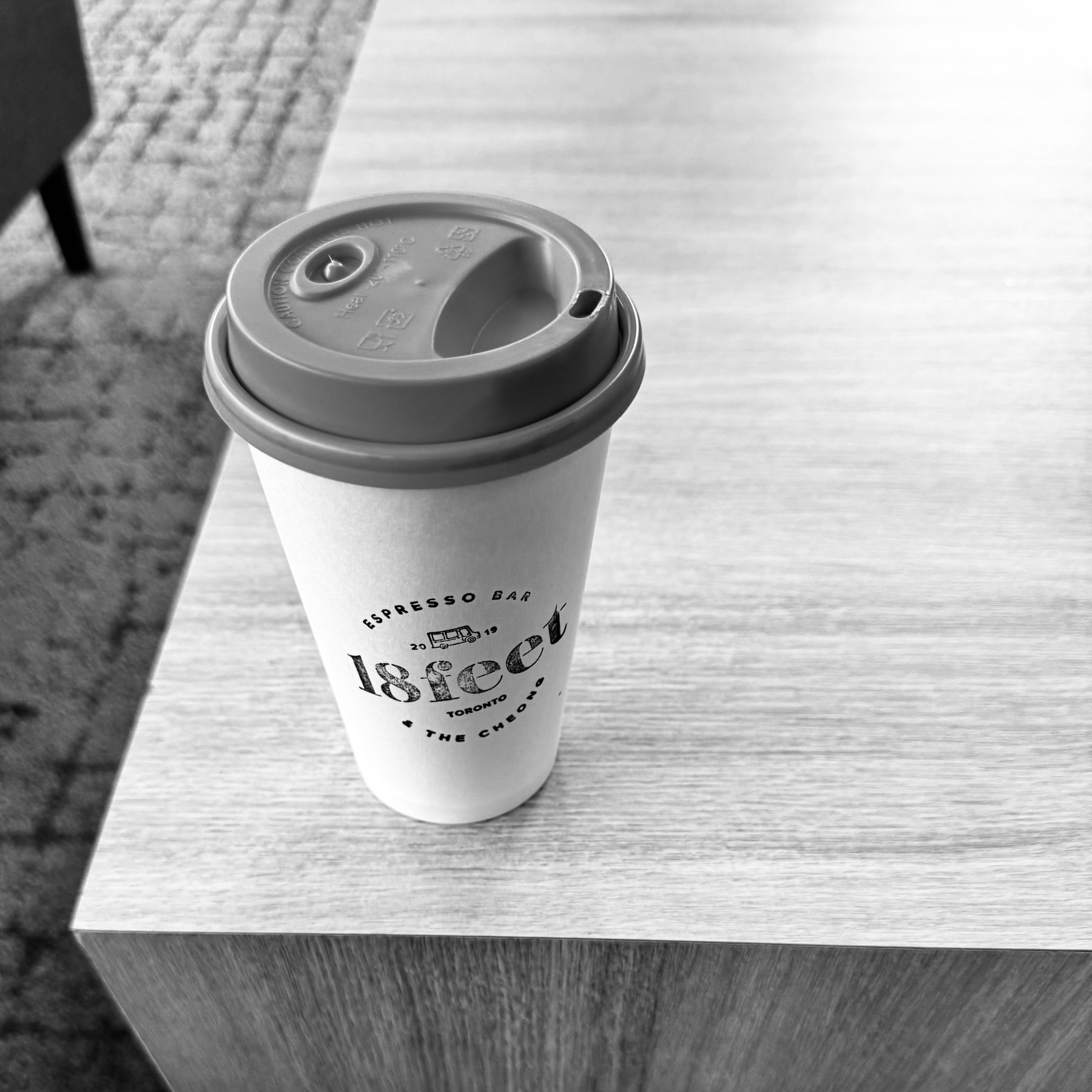
Always a good time when you discover a nice little coffee place within a decent setting.
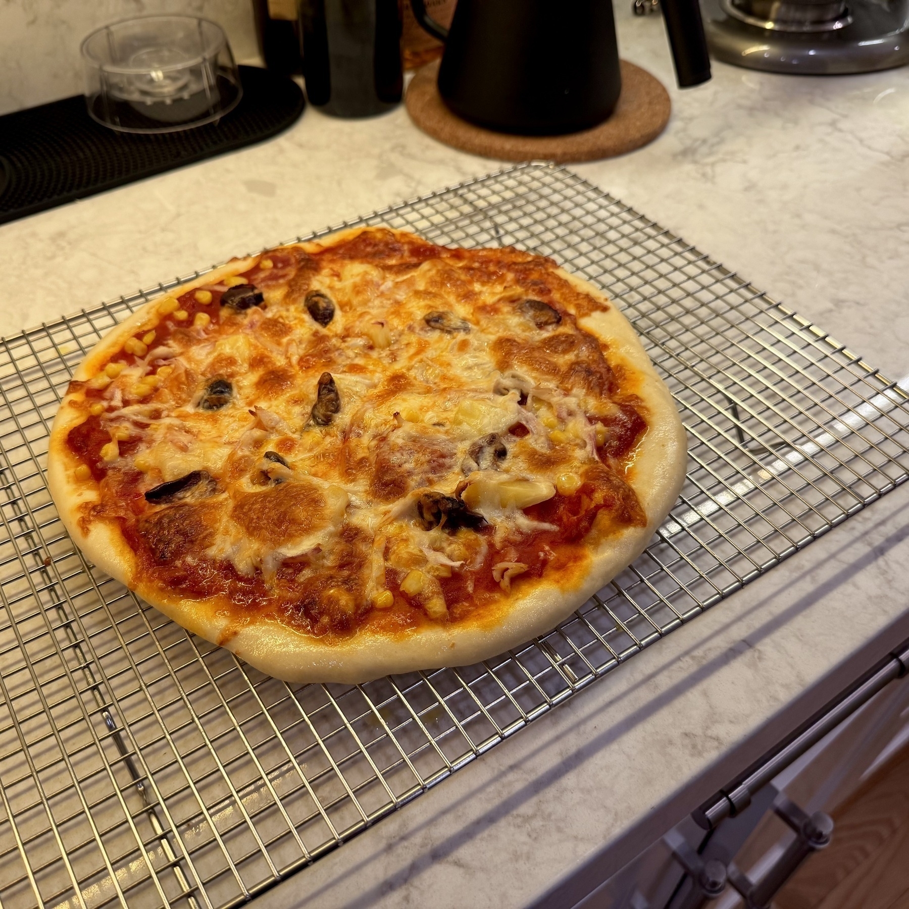
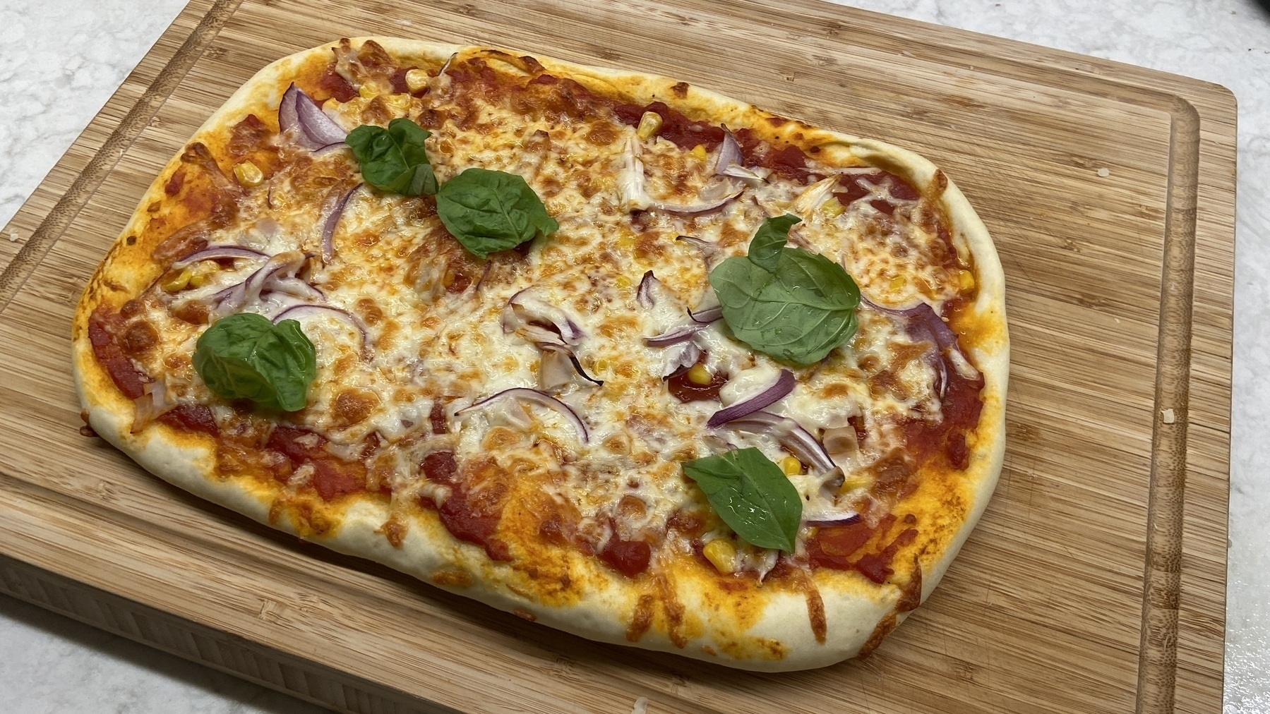
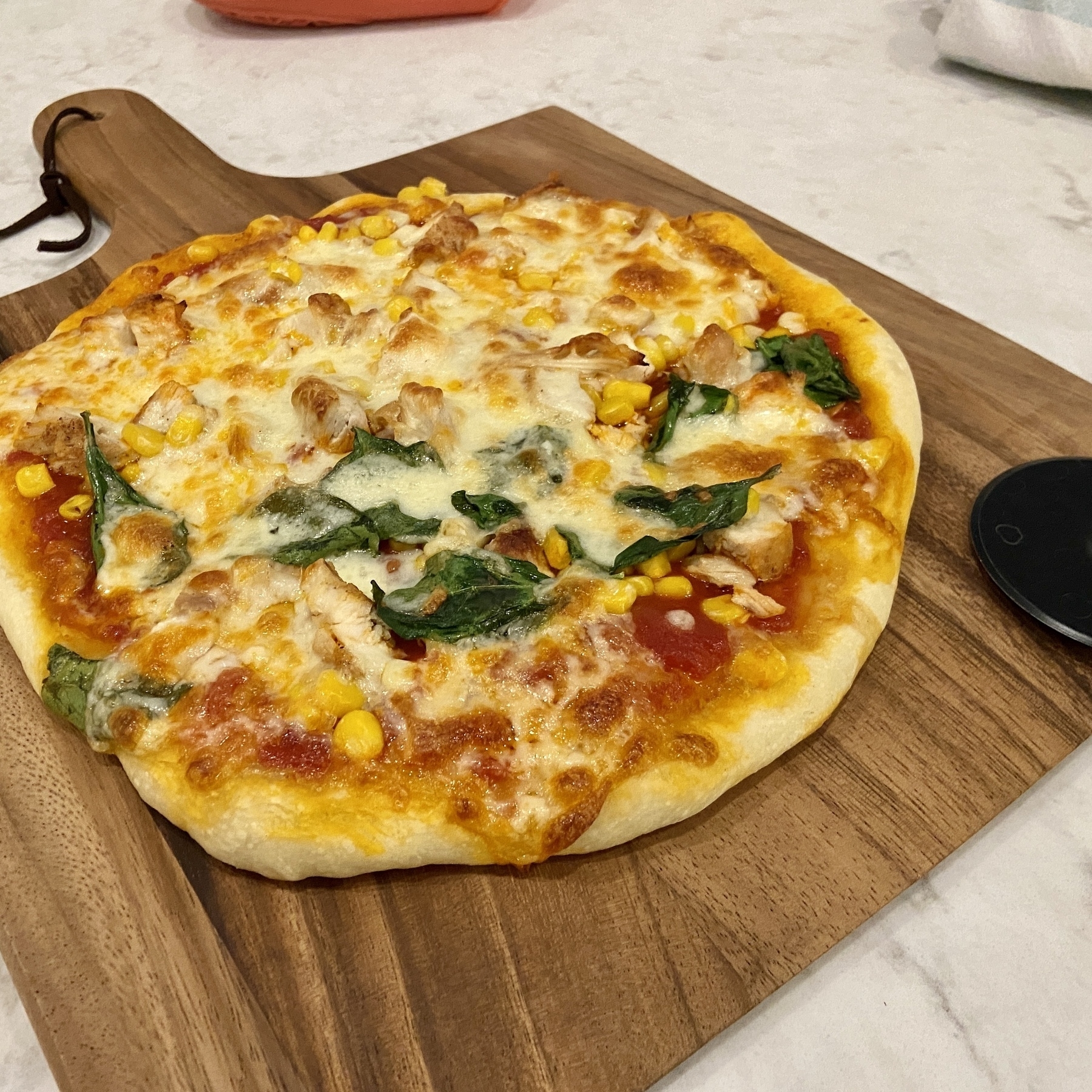
After a decade of playing around with pizza making, I think I’ve finally dialed it in to my ideal combination. 250g dough and grate the cheese on top (sprinkles more evenly that way).
Here are my stats for 2024. Mega year for publishing on my site. No idea what happened in March but clearly I went turbo.
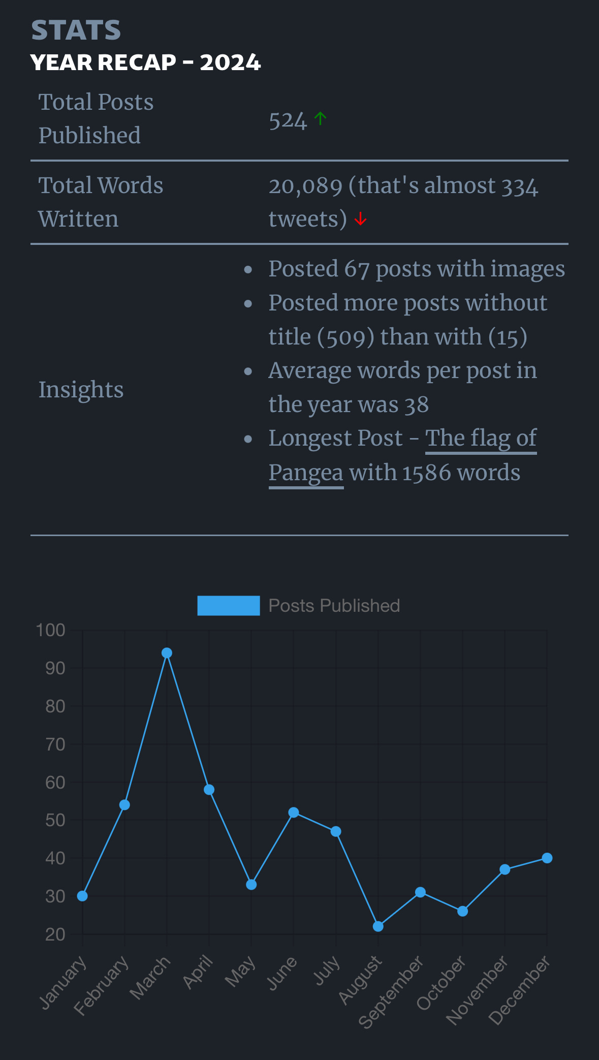
I missed posting one for 2024, but alas it was a bit of a strange year for the design of the website (went a little maximalist for a while there), back to clean lines that have defined this site for 7 years (?!) now.
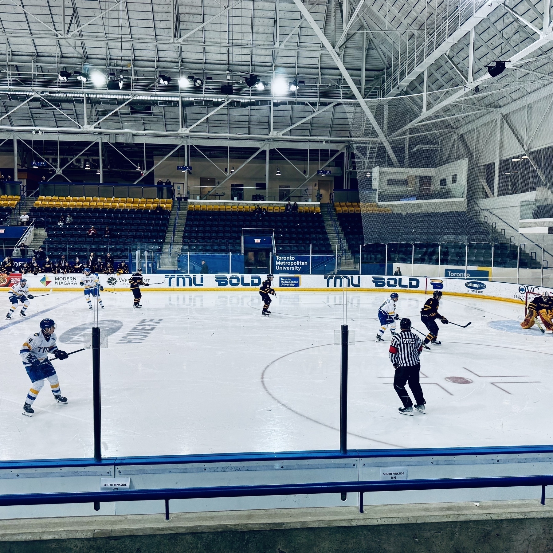
Also my first view of a Zamboni.
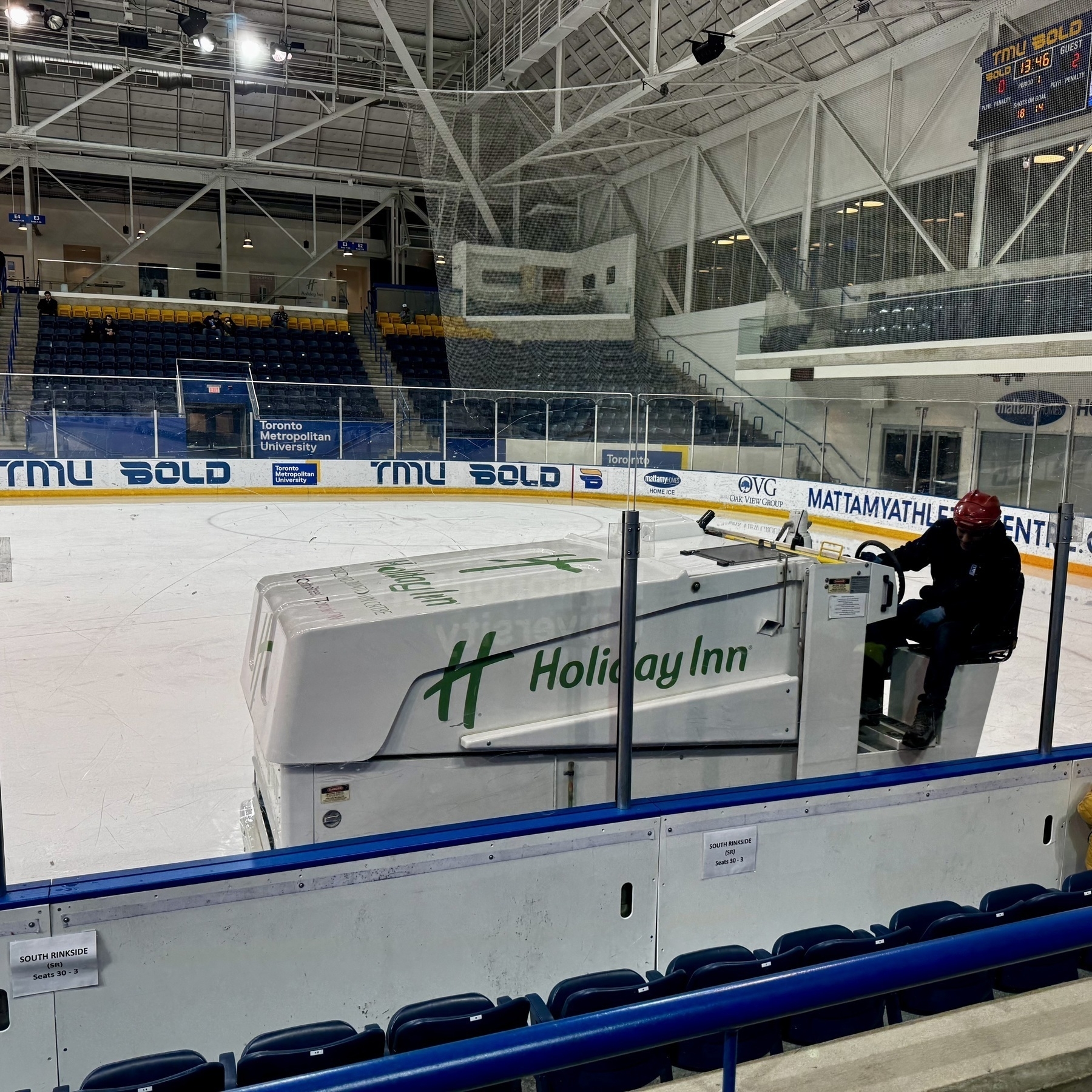
First hockey experience in Canada. I know long time coming but worth it.
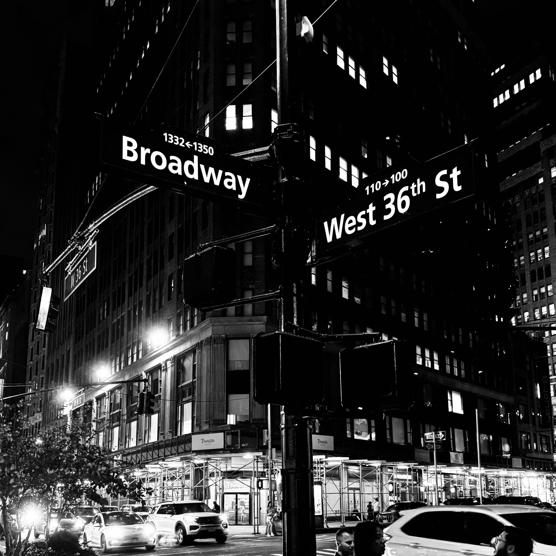
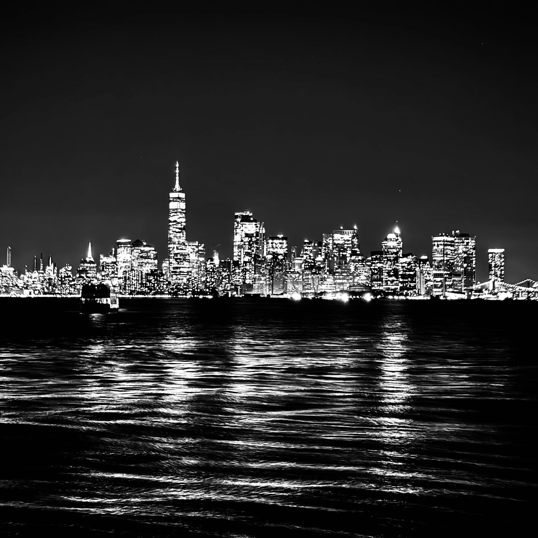
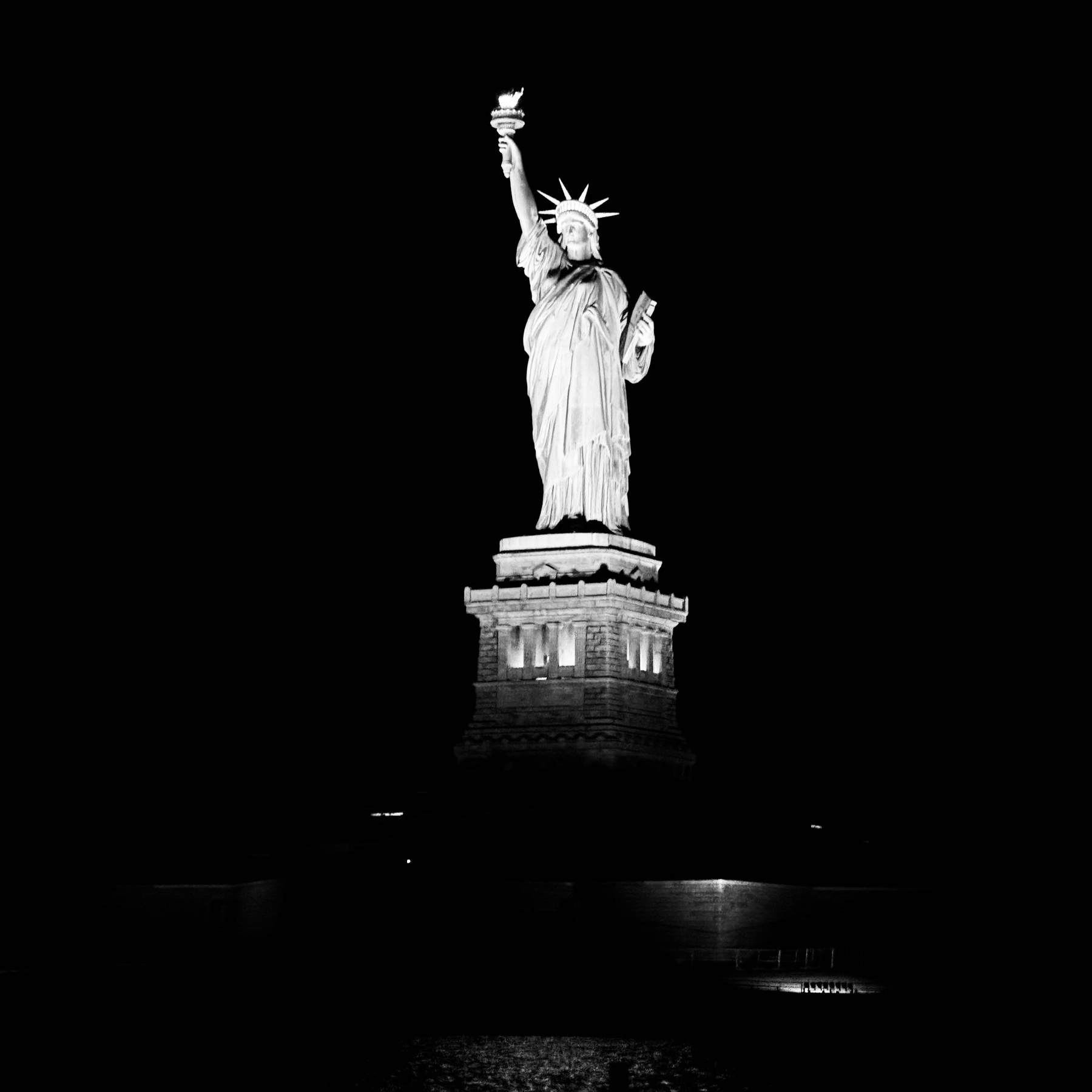
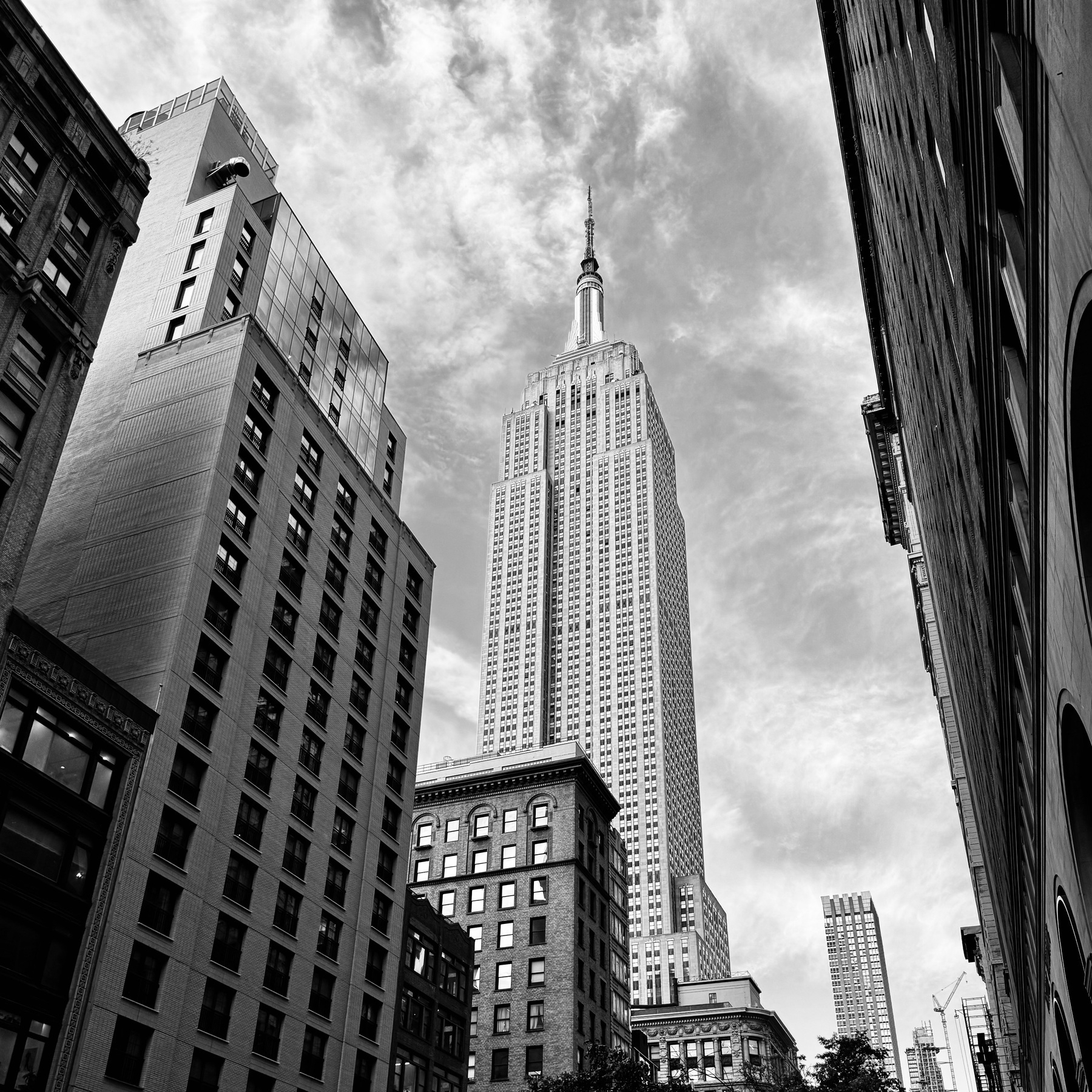
New York. New York.
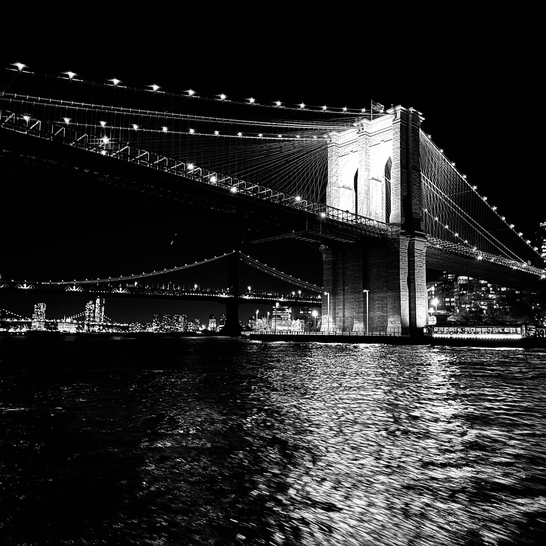
I just got back from New York and still letting the whole experience unpack itself out of my brain. I’ve flown into Newark airport countless times but we would then head in the other direction towards Princeton. This time was different, we landed in Newark and headed east. As we approached the Manhattan Island, the landscape was a very familiar American highways construction. Looping freeways, lawyer billboards hugged the edges of the roads. The road twisted inbetween trees, that felt different to the ones we have in Canada, these were shorter in stature.
The first real signs of what was to come unveiled itself as we took the bend just before entering the Lincoln tunnel. I caught a glimpse of Bjarke Ingel’s VIA 57 West building (I had no idea what the thing was called but knew of the building). What I didn’t realise was that I was also looking at Hell’s Kitchen1. The view lasted a split second. I tried to grab my phone and take a pick, but the moment was over as we quickly turned into the Lincoln tunnel.
When we emerged on the other side, the transition to a startling density came almost instantly. Looking outside the car window it took my eyes a little while to fully grasp what we were driving through. A hyper dense city where every block is fully occupied by a building structure from edge to edge. In front of the buildings a slender pavement wraps around the structure. The biggest shock however was the limited space between the roads. The streets could barely fit one car down the centre, with another car width on either side for drop offs and pick ups - or as was exceedingly common, construction.
As we made our way through the chaos, the logistics of making this place function in a reasonable manner began to present themselves in real time. Life here would require an understanding of consequences and compromises. We were instantly given a demonstration. Traffic was bumper to bumper, blocked on all sides. And then an ambulance siren was heard behind us. There was literally nowhere to go. Intersection crossings had to be respected but there was no flexibility to allow emergency vehicles to pass.
The Grid
What totally captured my imagination was the grid. Not only the audacity to create something like this, but also the ability to implement and maintain this grid. It created a space unlike anything I have ever seen. My mind has accepted that cities were messy, organic constructions. Roads wind around as we built things sometimes around the natural world that existed. Sometimes we would tame the land to suit our very specific needs. The common element was that there was no consistent order within them.
Here however was an island that seemed completely flat and where there was a complete embodiment of a grid that was then turned up to the max by building straight up. I have lived in dense areas in my life, but this order to density to scale was a unique combination.
Someone had to wrangle this defining city element into existence. I had to find out more. Thankfully The Museum of the City of New York has collected all this information to celebrate and educate on this very unique city design aspect.
General Observations
- Another defining element of what I imagined New York to be are all the elements that define a city. The yellow cabs were still there, but they did not occupy the same vibrancy I had previously imagined.
- The entrances to the subway stations were inconspicuous, and was missing it’s own identity. Unlike the Metros in Europe there was no unifying sign that invited you in and announced itself. Rather New York has green railing with signs attached to the railings. To my mind this was a missed opportunity.
- New York is a very live musical city. In the lobby of the hotel, on the short cruise boat that took us around, across Broadway avenue leading up to Time Square. Live music was everywhere.
- It’s very difficult to truly appreciate massive structures from up close. So in NY your viewing angles are limited.
- The body traffic was something I had not experienced since I was last in Asia.
- Walking north/south (so crossing streets) became a little annoying. It felt like I was always walking and hitting a red light. Every. Single. Time. Maybe that’s just being in New York for the first time and it feels like that for everyone?
- Its hard to explain, but this density and complete use of every portion of the available grid made it feel less real, made it feel like a theme park.
- There was a little bit of self-importance on display by the locals. ‘Greatest City on Earth’. ‘Mega exclusive club’. ‘Insanely expensive apartment’. This is the kind of language that I have experienced in nearly every city I have been to (apart from the greatest city on earth moniker, that is reserved for American arrogance).
-
A familiar name because of all the Daredevil comics I’ve read of the years. ↩︎
The last time I bought Field Notes was 7 years ago. While I’ve been stocked up nicely, I have been hankering for a restock for a while. Should be good for another 2 years. See you in 2026.
I mean honestly, look at those colours.
It continues.
It’s begun.
Finally getting back to writing about the built environment.
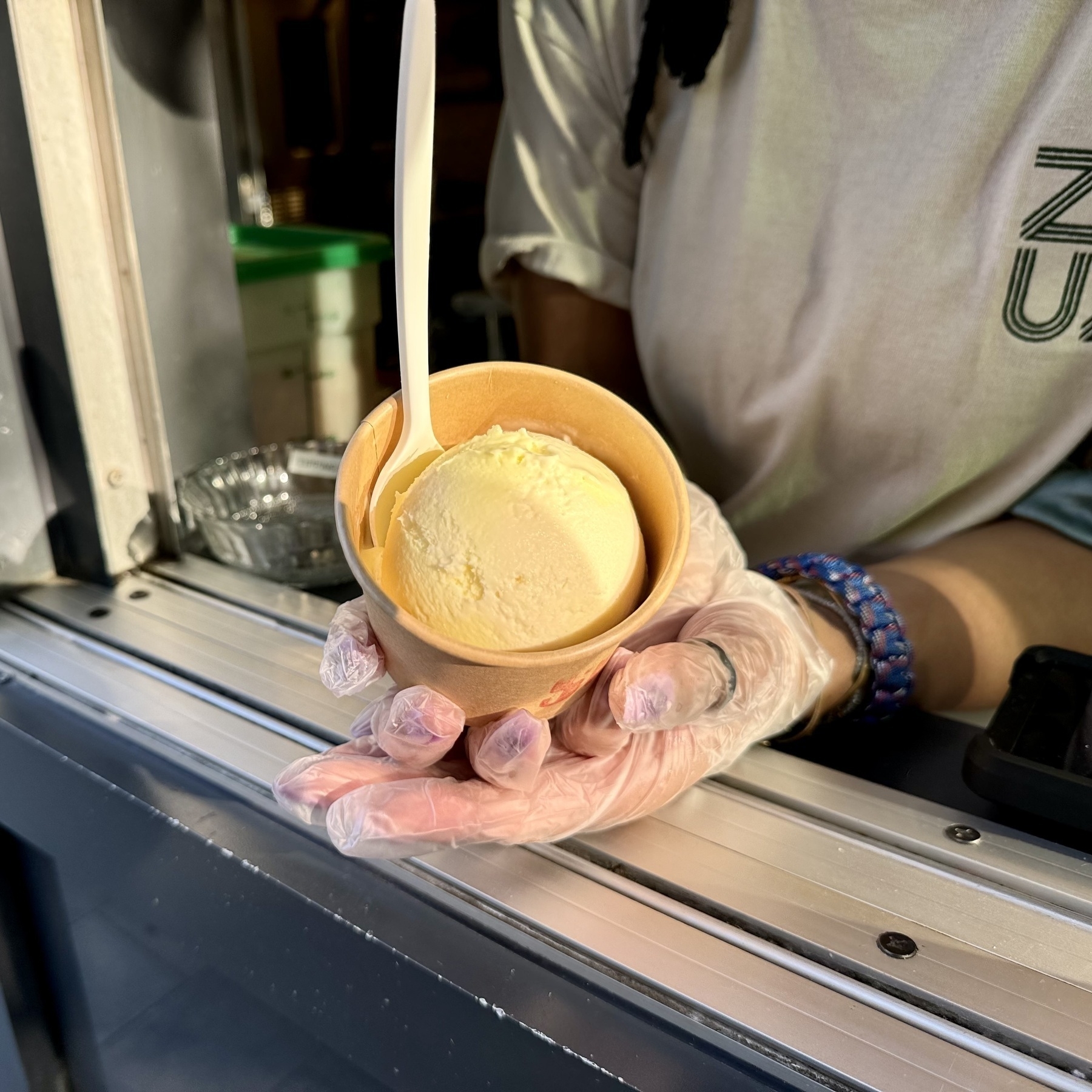
The perfect scoop. Lemon meringue from Zuzus.
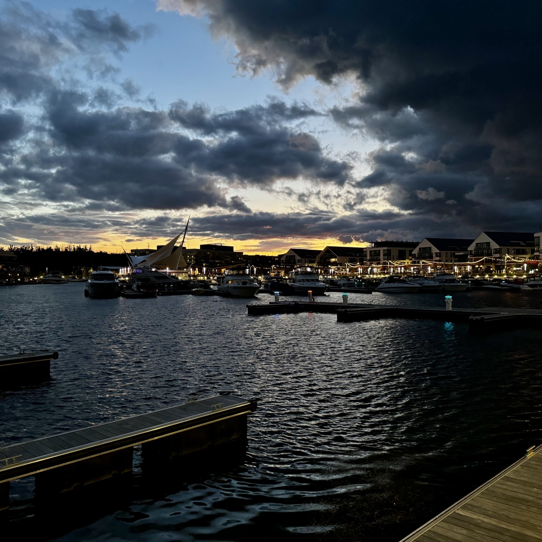
Last days of summer.
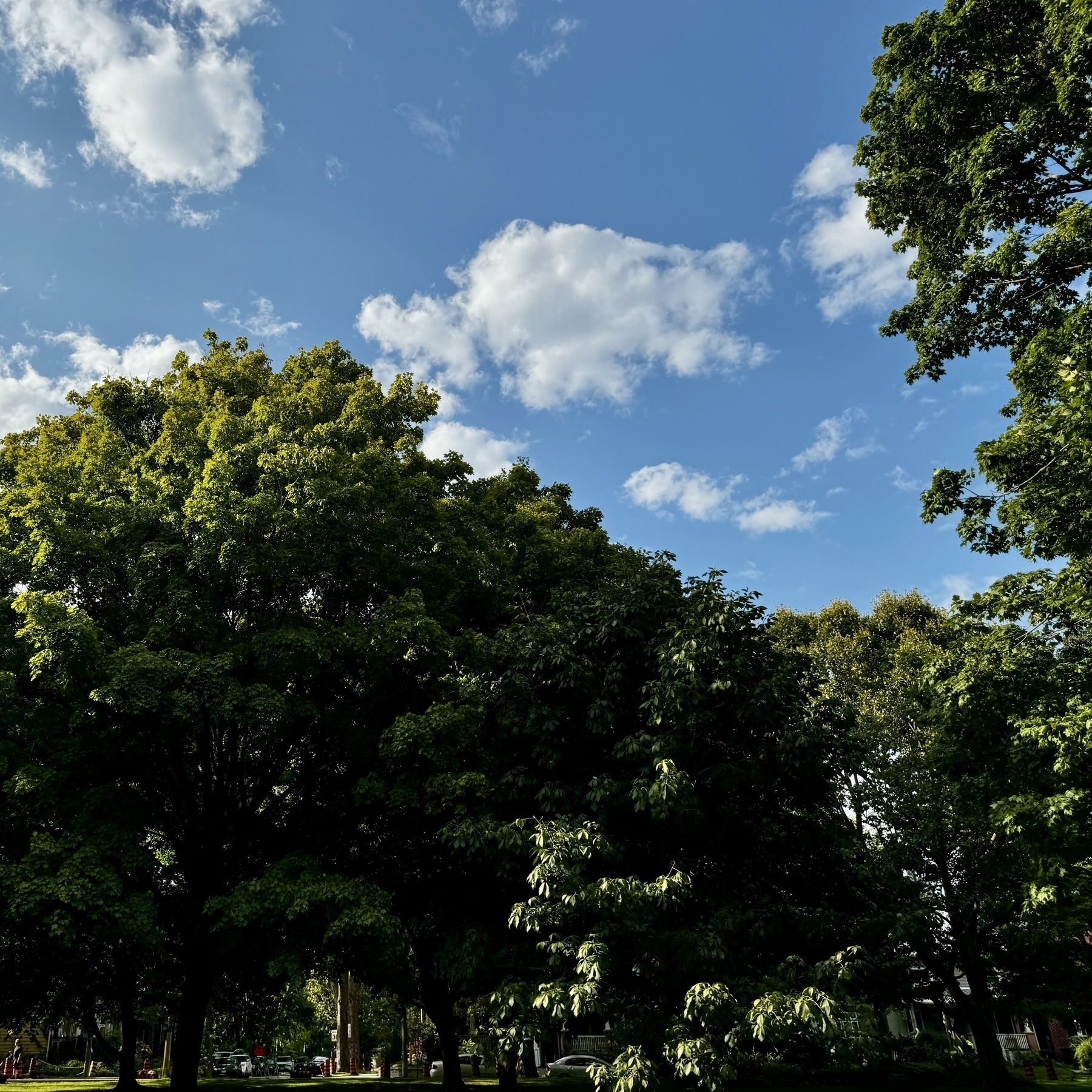

Summer in Ontario.
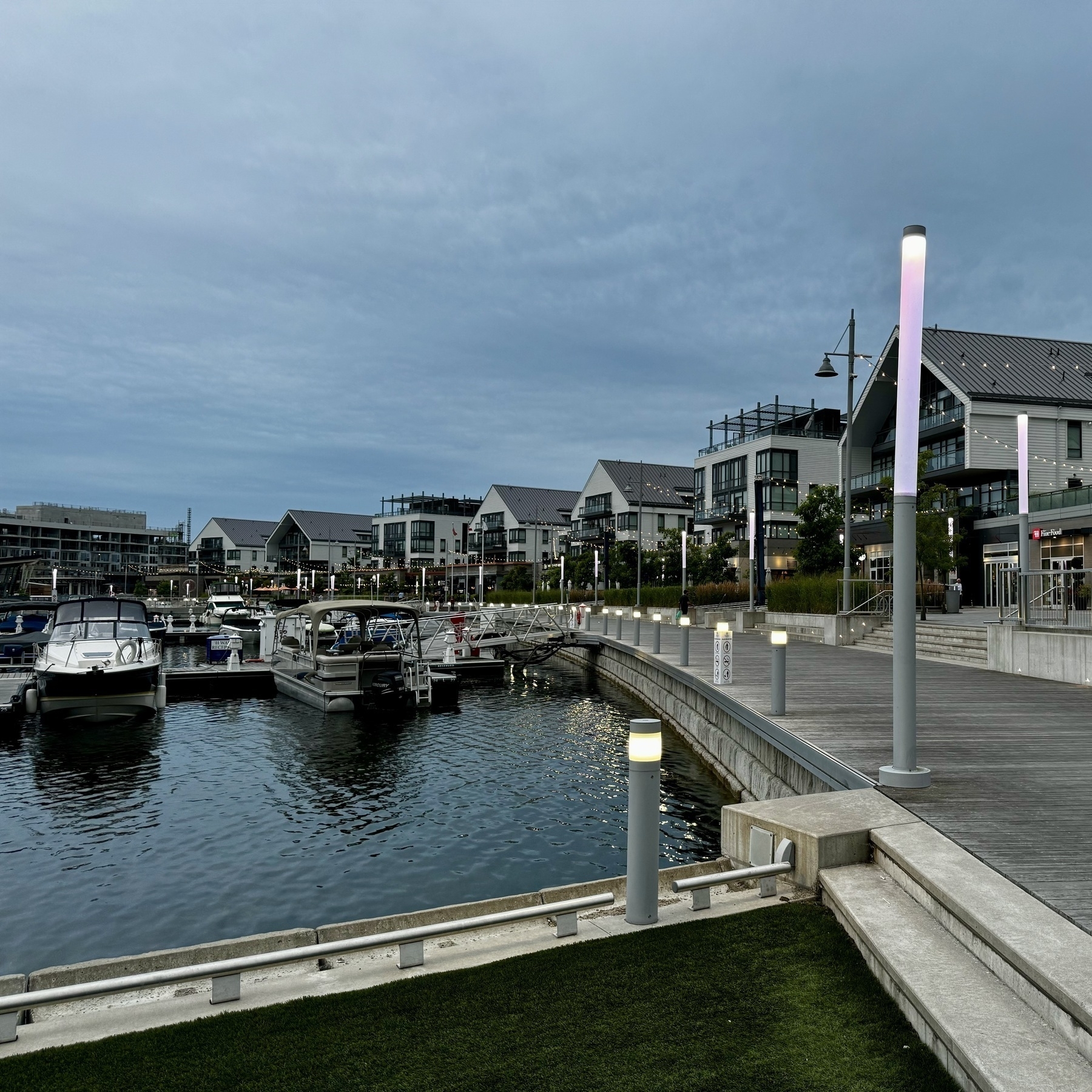
3 min from our house.
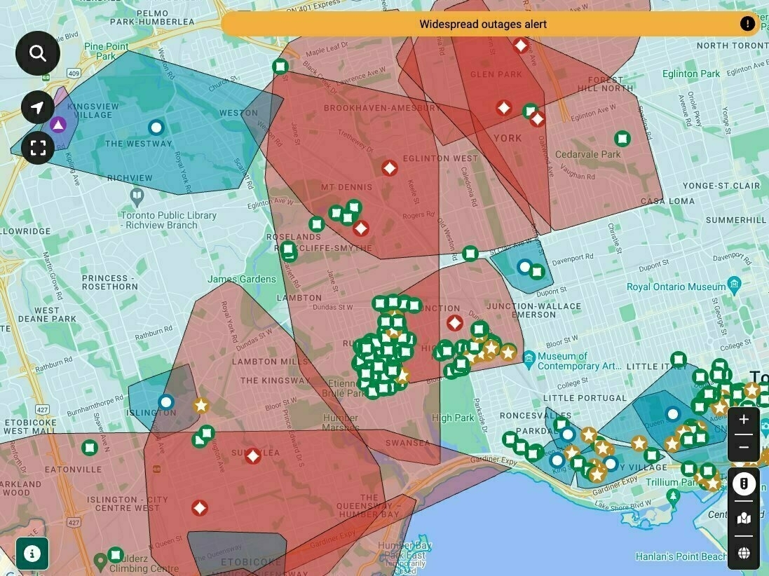
Power outage map for Toronto today was insane.
Not a bad way to start my Sunday.
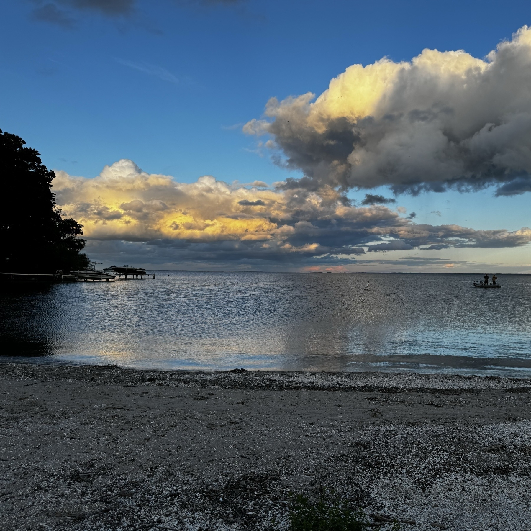
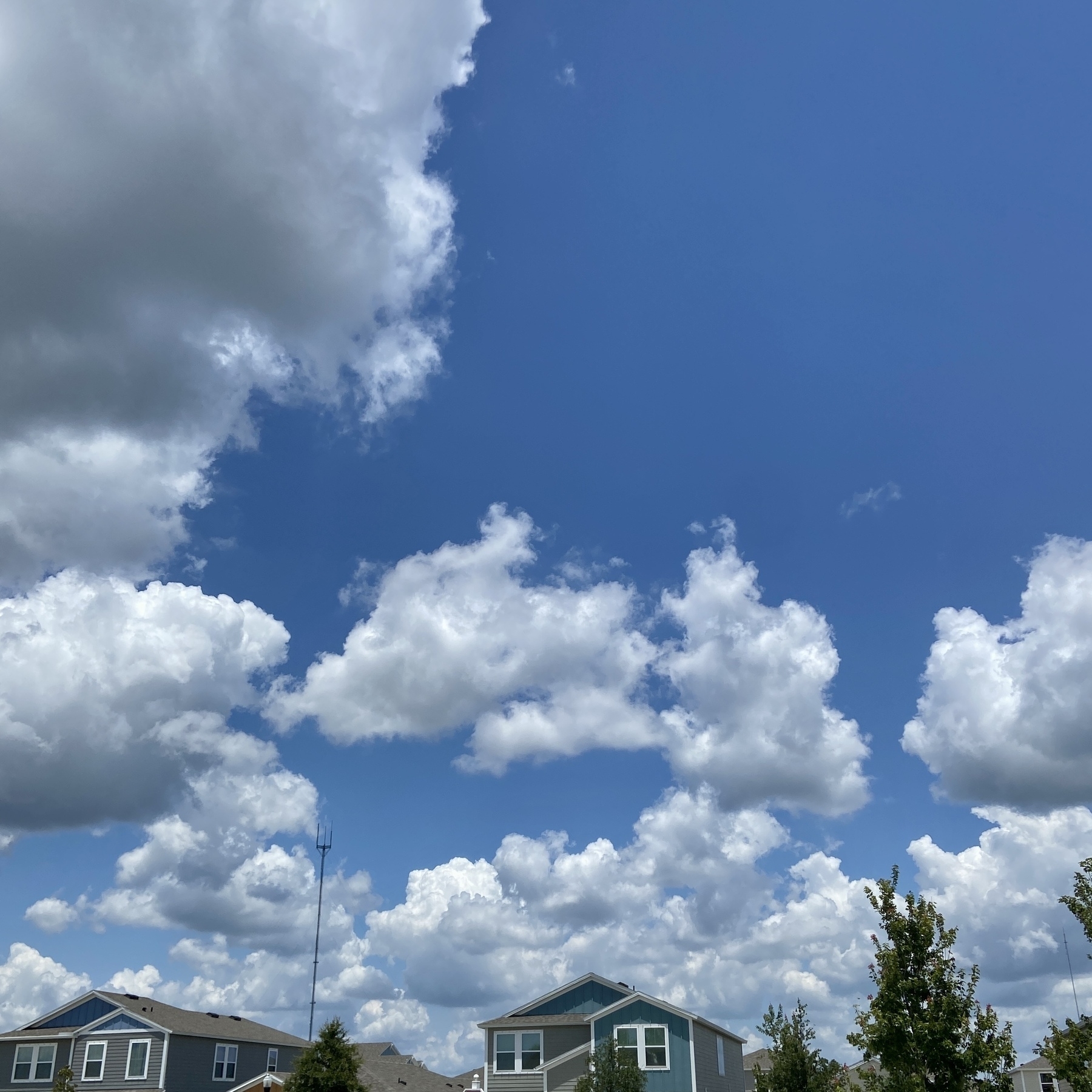
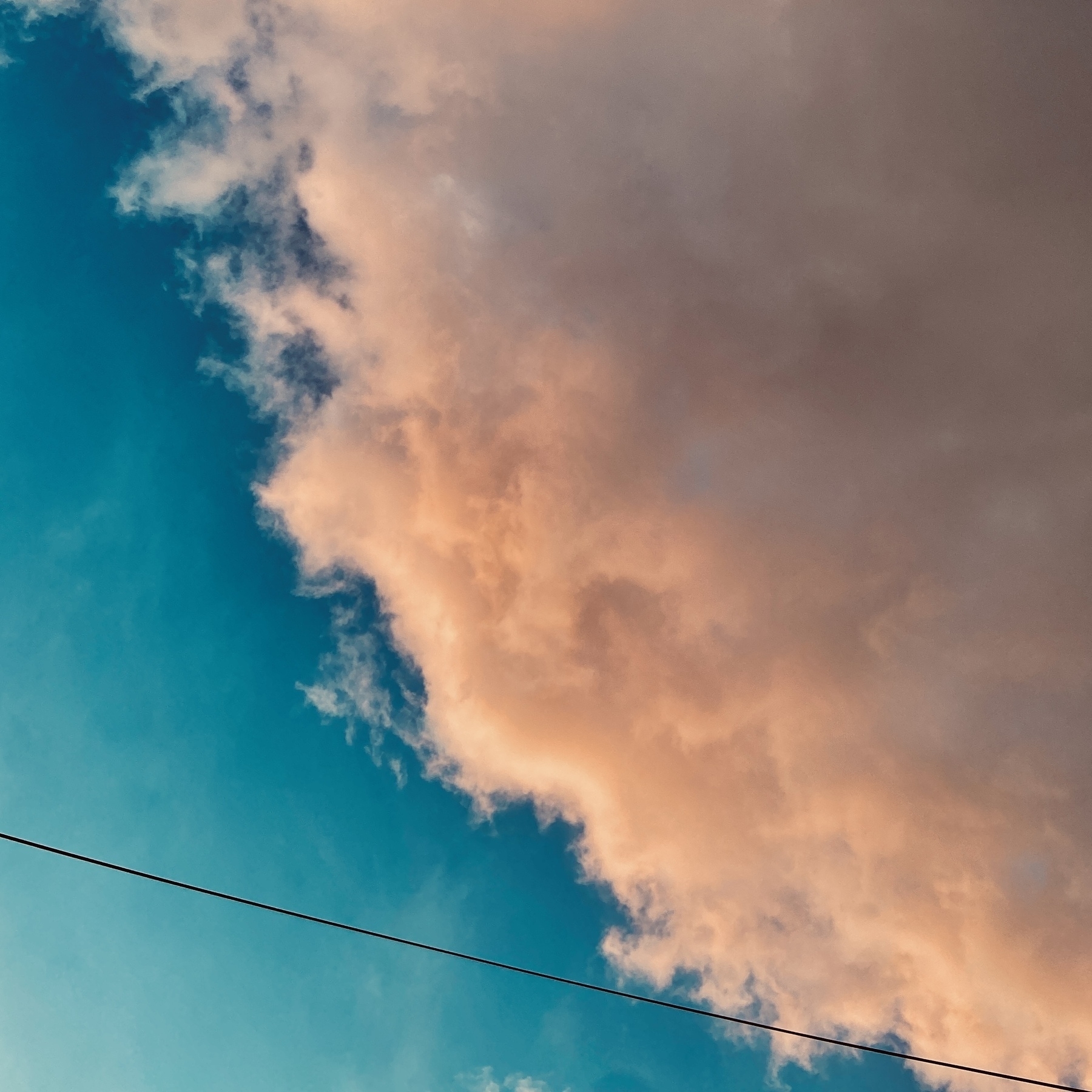
Humidity brings out the best clouds.
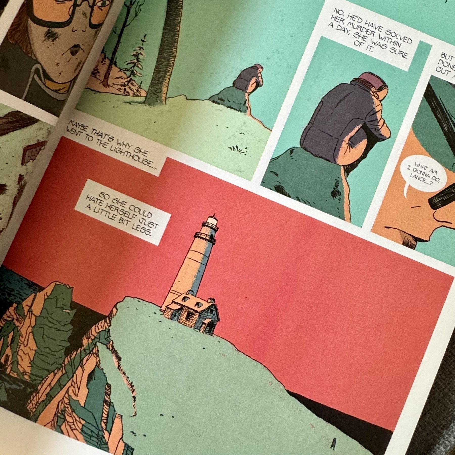
Absolutely love the colours in Friday. There is a quiet elegance to the palette used that suits the story perfectly.
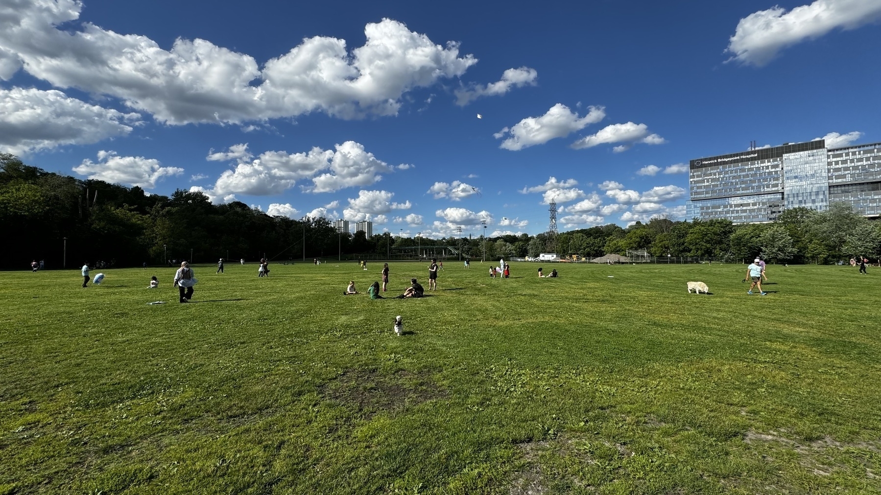
🪁 Kite flying.
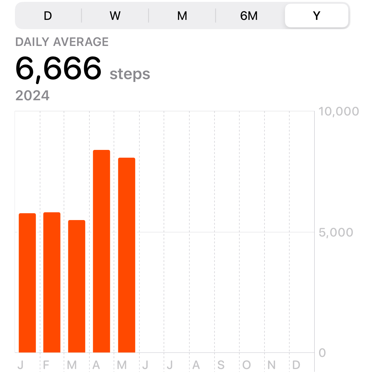
Somehow, 6,666.
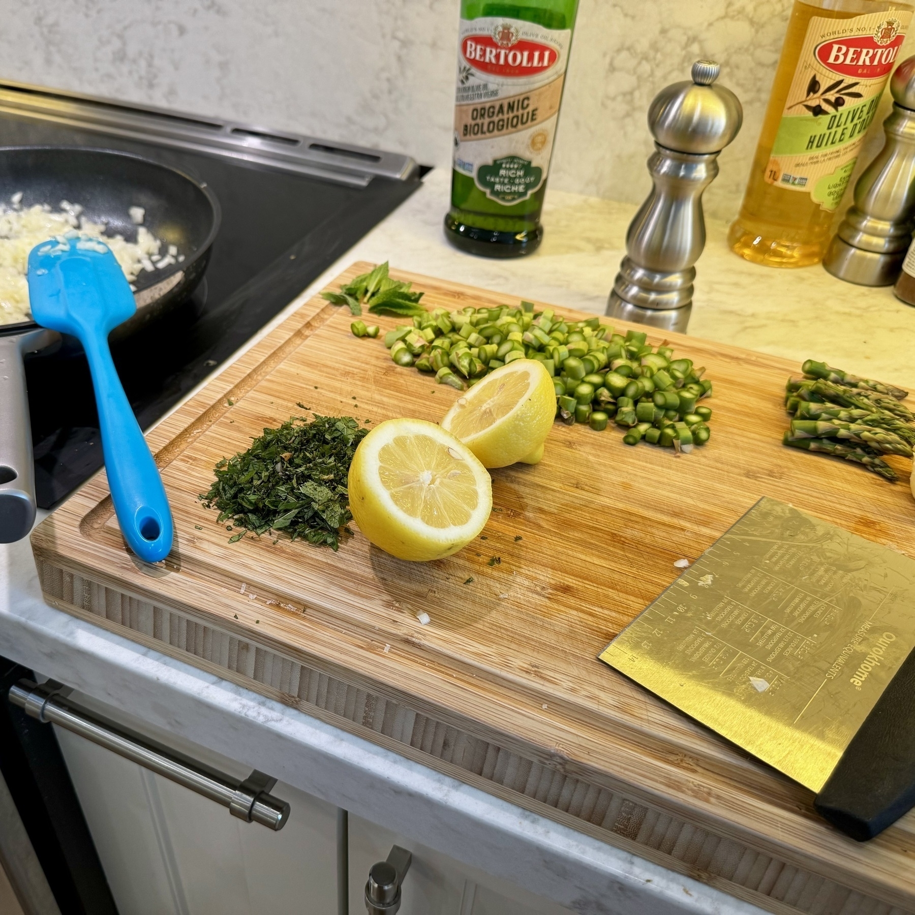
Today was all about the spring asparagus risotto.
Wish I had something like this growing up!
All the flowers.
I may have gone a little bit overboard at the library this week, but OMG, I am absolutely loving this!
Took 6 kids to the library and got them all excited about books. One of my favourite Saturday evenings in a long time.
I have two setups. One for the workweek and one for the weekend.
Action shot!
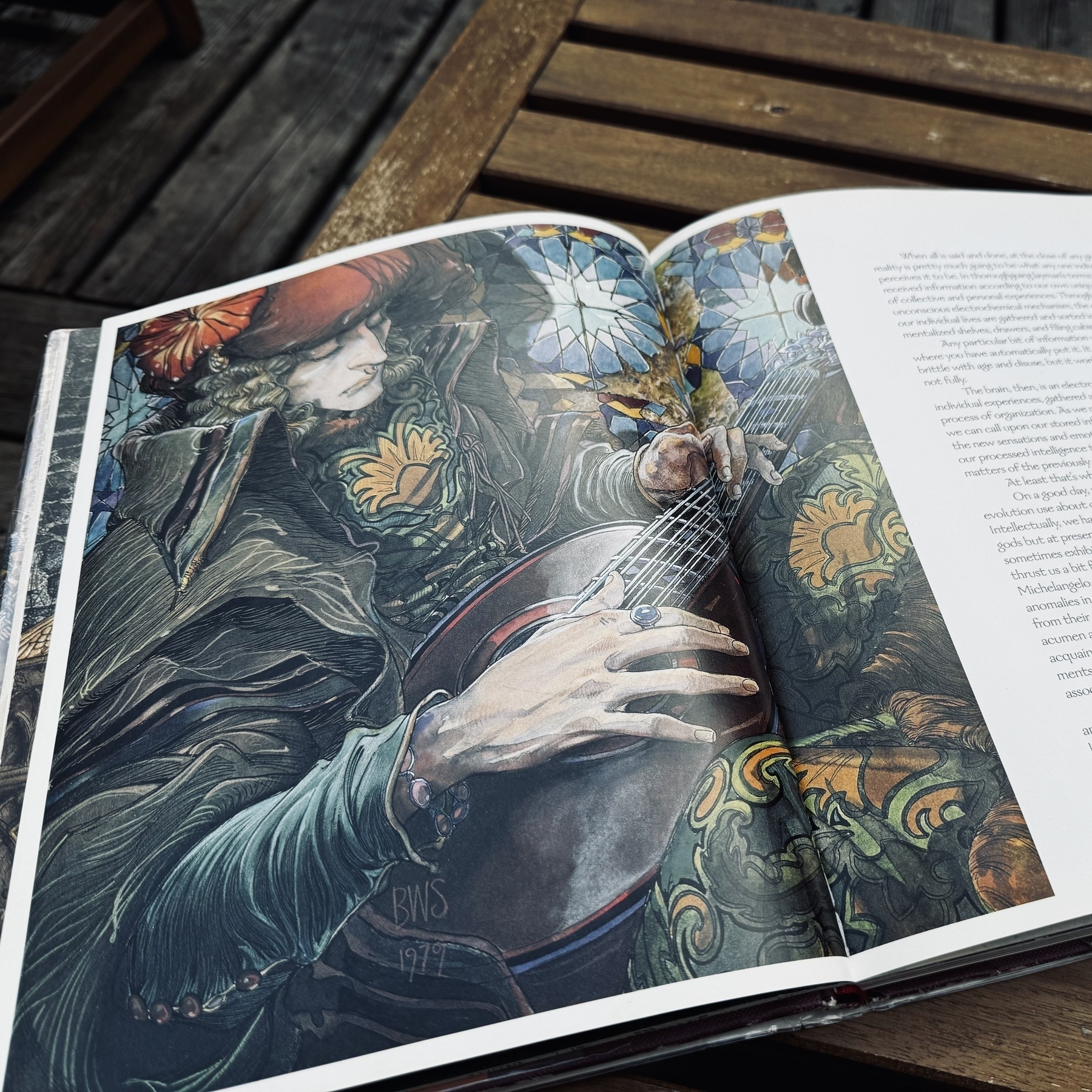
An easy example of what makes me in awe of the work of BWS. His narratives however are harder to align with (sometimes).
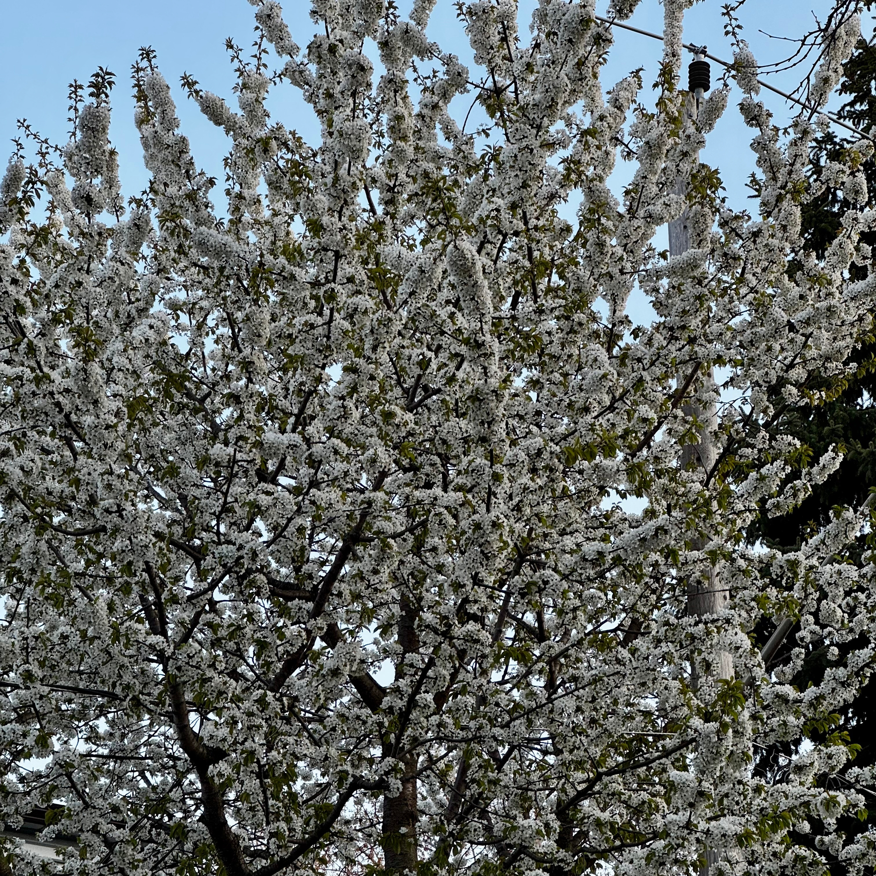
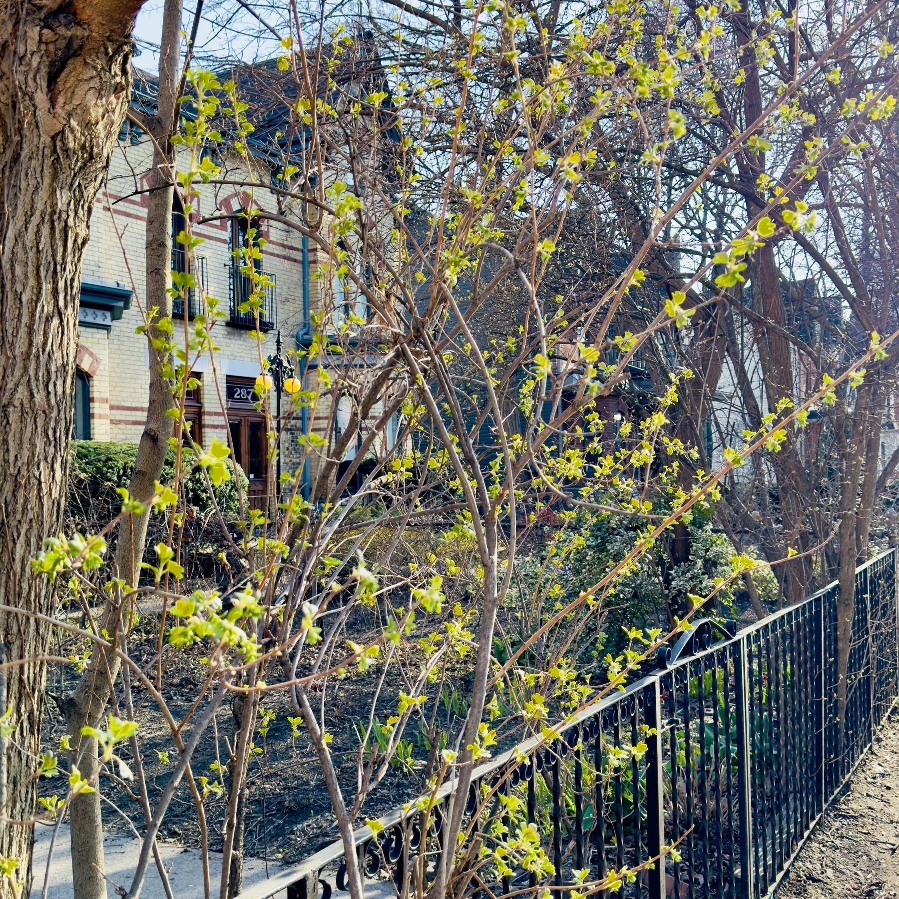
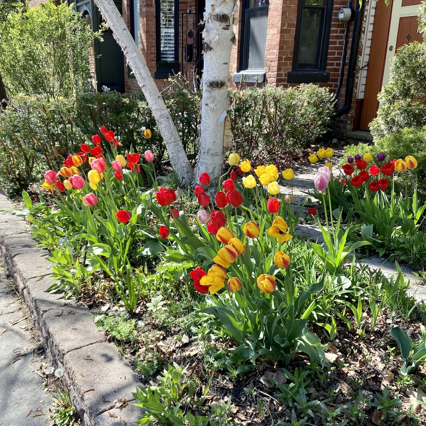
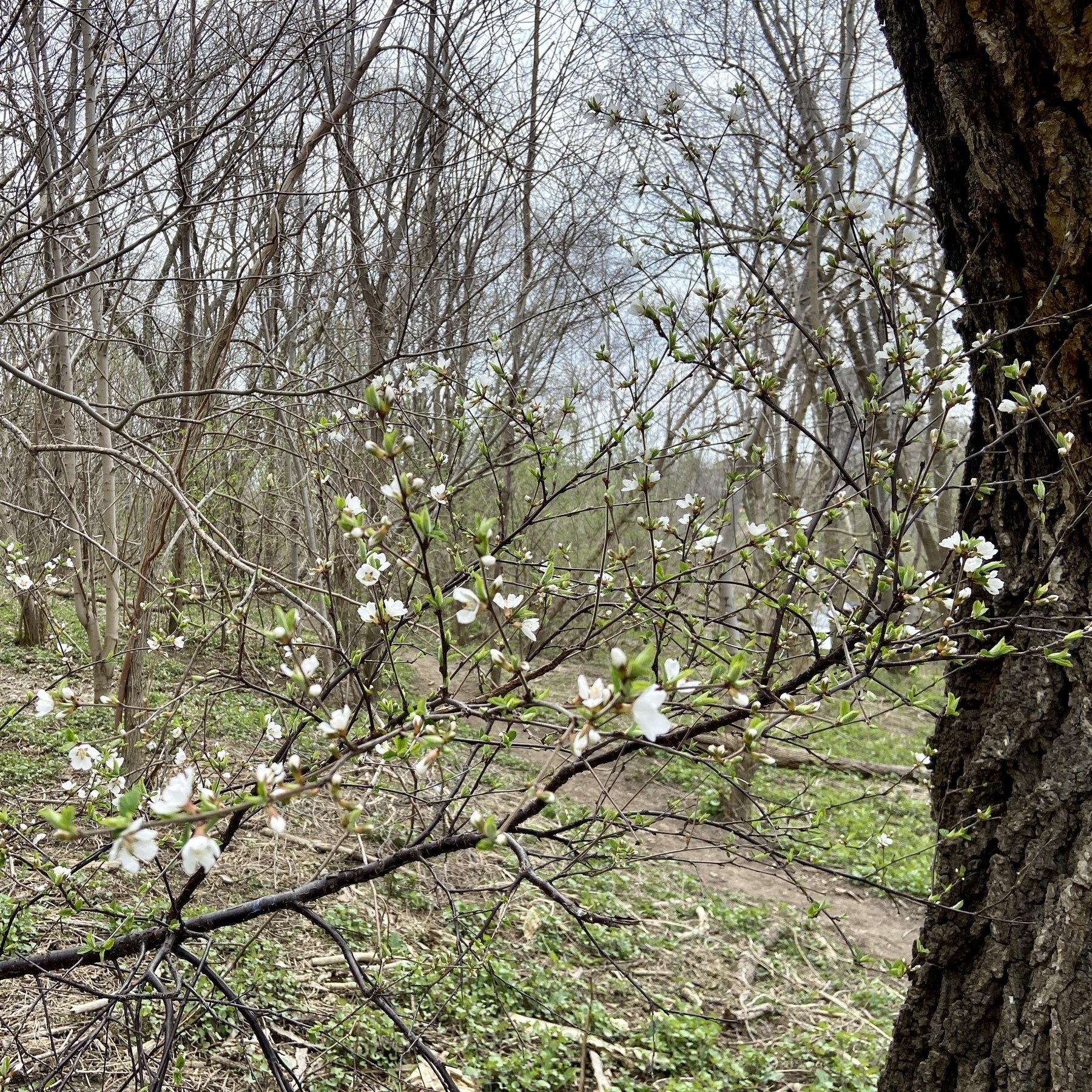
First signs of spring are beginning to sprout.
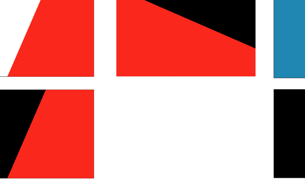
The flag of Pangea
A Flag for Me
Emigrant: a person who leaves their own country in order to settle permanently in another.
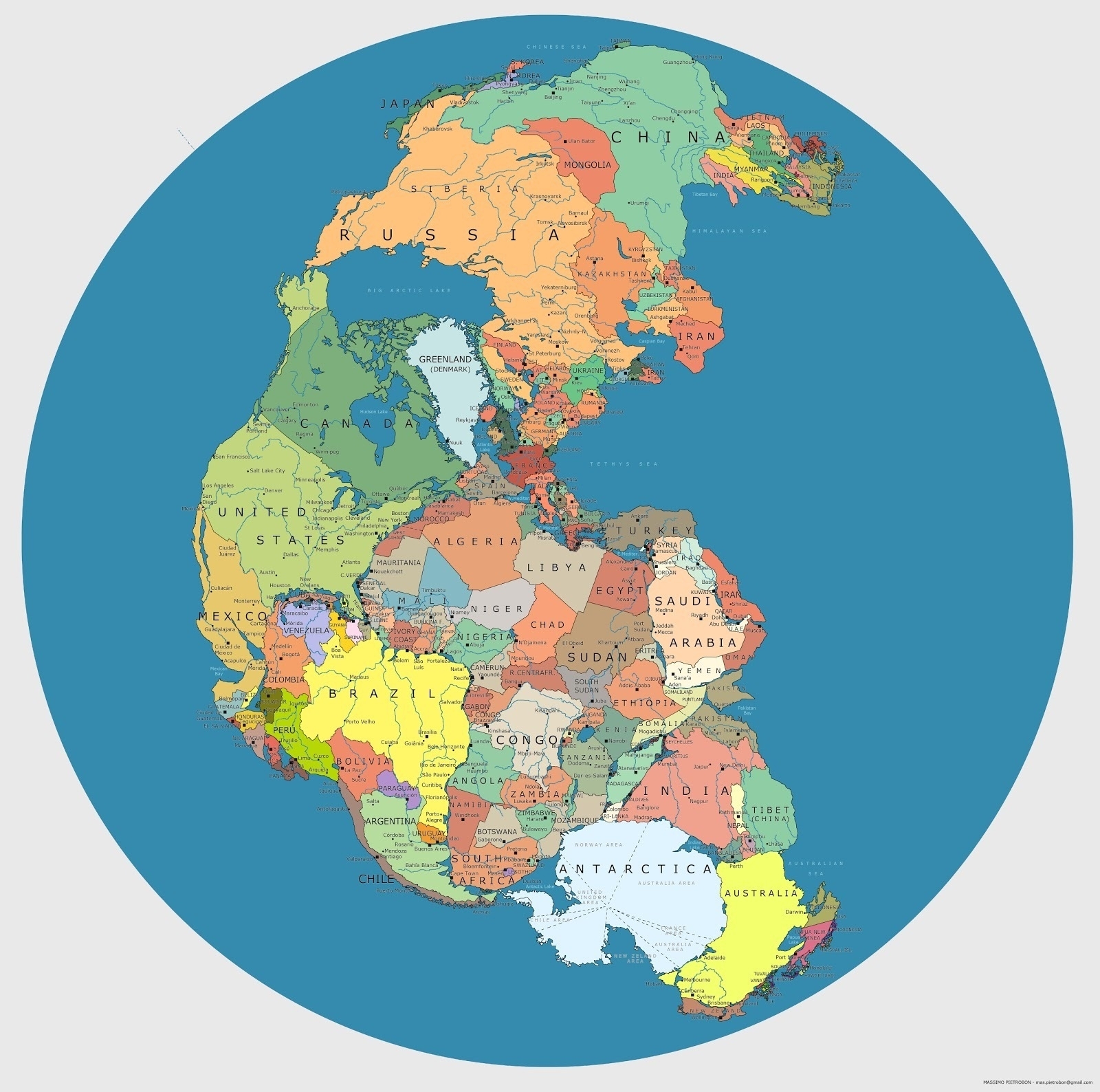
This particular image of Pangea1 image made the rounds over a decade ago and has always stuck with me as a powerful idea given form. A world that is seemingly freed from natural borders. Squint a little and you can almost completely imagine the manmade borders blending away into nothingness. This is the world that I wished existed with respect to allowing people a way to roam and discover and make better lives for themselves.
When everything is interconnected, there is no possible way for you to be able to patrol or even try and control borders. It would be a completely useless exercise, in the way that Europe discovered back in 2015.
How would this world have developed differently with these new proximities and new borders. Imagine having the opportunity to travel across Pangea. What an incredible tapestry of human discovery that would allow. Then imagine the connectivity that would be possible. Would the world feel smaller or larger? Would we feel more connected or distant to each other?
At this moment in our collective existence, Earth does not resemble Pangea. Earth is separated by oceans, rivers and mountains. Humanity broke through these barriers, first across the sea and then in the air. Sadly humanity then decided to build other barriers in their place. First in the form of barricades walls and more recently in the form of paperwork and immigration laws.
To create a sense of unity for a collection of people, boundaries were drawn on a map and a flag is drawn high in the air to help those feel further connected. It’s a strong and emotive piece of design that connects a culture and represents ideologies and shared histories. People rally around the flag because it helps them visualise something otherwise nebulous and difficult to explain. Us. This flag represents Us, not them.
As I have travelled the world, I have tried to experience Pangea in my own way. It’s seemingly not as smooth if all the bodies of water were connected but I have been allowed to roam. In that movement I have strayed increasingly further away from the flags (and cultures) of my childhood. For a while I hoped to adopt a flag from any one of the countries I have lived in, only to realise that this was ultimately a futile effort. As my time in each country drew to an end so did the flags glow in my life.
For years I have wanted a flag to rally around that I can take with me wherever I went. A flag for emigrants like myself. During the last decade, a couple of new flag designs have been released to great fanfare that ultimately did not fulfil this gap for me.
The Refugee Nation Flag
When it was released a few years ago, I thought that the refugee flag perfectly captured the essence of something that anyone escaping their country on a boat would forever relate to. Clearly however this particular flag was not something that really represented my pampered emigration lifestyle.
As much as I love this design and what it means, it is not my flag.
The International Flag of Planet Earth (IFPE)
I was excited for a while to see the International Flag for Planet Earth making the rounds several years ago. However the purpose of the flag, while novel and awesome, addressed a purpose I was not looking for. This is for a future Star Trek world that has moved beyond some of the very basic issues that we are currently grappling with back here on Earth.
I love the deep blue colour. The symbology in the middle however is a little lost on me. It’s not emotive enough to capture my imagination (in say the same way that the Olympic rings definitely do, although I certainly prefer the monochrome rings rather than the original coloured version).
This flag was also something that didn’t address my needs either.
The Flag of Pangea

From my own perspective, I have settled on the fact that I am a proud serial emigrant. A subtle nuance that likely nobody really cares about but one that I am more than happy to make and shout about.
And so, I challenged myself to create a flag that represents people like me. People who look to break through both natural and manmade boundaries and barriers that have been erected. A flag that represents people that move from one country boundary to the next. A flag that represents emigrants and those travelling the world as though it were Pangea.
This flag is not intended for a state with borders. This flag is meant to be flown by those of us who travel the Earth, emigrating from one place to another.
What does the flag stand for?
The flag itself is represented by 3 specific design elements:
- The Colour
- The Compass
- The Angle
The Colour Blue
The colour blue signifies freedom. The freedom to move and the freedom to travel across the world.
The colour blue also signifies our planet. It signifies the blue seas and blue skies of travel that allow you to make significant moves as an emigrant.
Going for a blue colour was not a difficult decision. While I did play around with a few colour ideas, the only question in my mind was what shade of blue I would decide upon. I did consider playing around with gradients, but that would likely break a few vexillological rules. It’s not the first blue coloured flag in the world, and certainly not the first with white accents on it. I did flirt with the idea of having it a darker blue but felt it gave off too much of a Scotland vibe which is not what I was looking for.
In the end I decided to concentrate on the colours that calms me the most. The blue you see on a clear day. Not a cloud in the sky. The future beckoning you to explore the world that you live in.
The Compass
The pointed cross symbolises the 4 points on a compass, North, East, South and West, signifying the ability to choose your path and overall destinations.
An important consideration for the design was replicating iconic flags like the Swiss flag. It has a design element that is bold, strong and easy to identify from far away. Contrast plays an important role in helping define the design. The key element on the flag went through several iterations. Originally I was considering using a circle to identify the Earth itself with the angle (more on this in a bit) creating an interesting juxtaposition of shapes and colours.
The issue was this it just was not iconic in any way. It did not offer the same level of contrast. I quickly settled onto adding a compass element. Testing this out with an 8 point star, this felt busy. Keeping it to 4 points felt right, but at the same time, too simple. It did not bring with it enough of a story. This is where I combined the best of the original ideas with the new compass element and put the compass at an angle (I promise I’m getting there).
The final piece was moving away from an abstract compass, into something that was a little more explicit. Adding the internal elements of a compass was something that was subtle enough but provided the right amount of character to make it crystal clear what the design was representing.
The final piece of the puzzle was deciding on the size of the compass itself. My original thought was to split the entire flag in half, thus accentuating the angle itself. Making this smaller looked better, as it better expressed that the world can stretch in all directions.
23.4°
How do you encompass everyone on the planet and their cultures that differ to vastly? By including a 23.4° angle. This angle mirrors the Earth’s axial tilt. One of the most important elements of science in our world that gives us our seasons and many (most?) of our cultural ideas. The angle is a celebration of our Earth and importantly the culture that we have created based on the gifts that it has provided.
Use and Licenses
Ultimately I want this symbol to be used by a community of Emigrants, like myself. I imagine a time when I will be able to offer physical representations of this design that can be used proudly.
My intention is to release this under a Creative Commons license, Attribution-NonCommercial-ShareAlike 4.0 International.
I will be sharing all the files soon with a set of ways to use it proudly and spark the conversation.
My ultimate wish is that maybe sometime in the future we can live in a world that while does not represent Pangea physically, at least is open for people to travel freely. A place that represents the ideals of this flag. A place where I can finally answer the question, ‘Where are you from?’, with the simple answer, ‘I’m from here. I’m from Earth.’
-
Pangaea means ‘all the lands’. ↩︎
The best camera is the one you have on you.
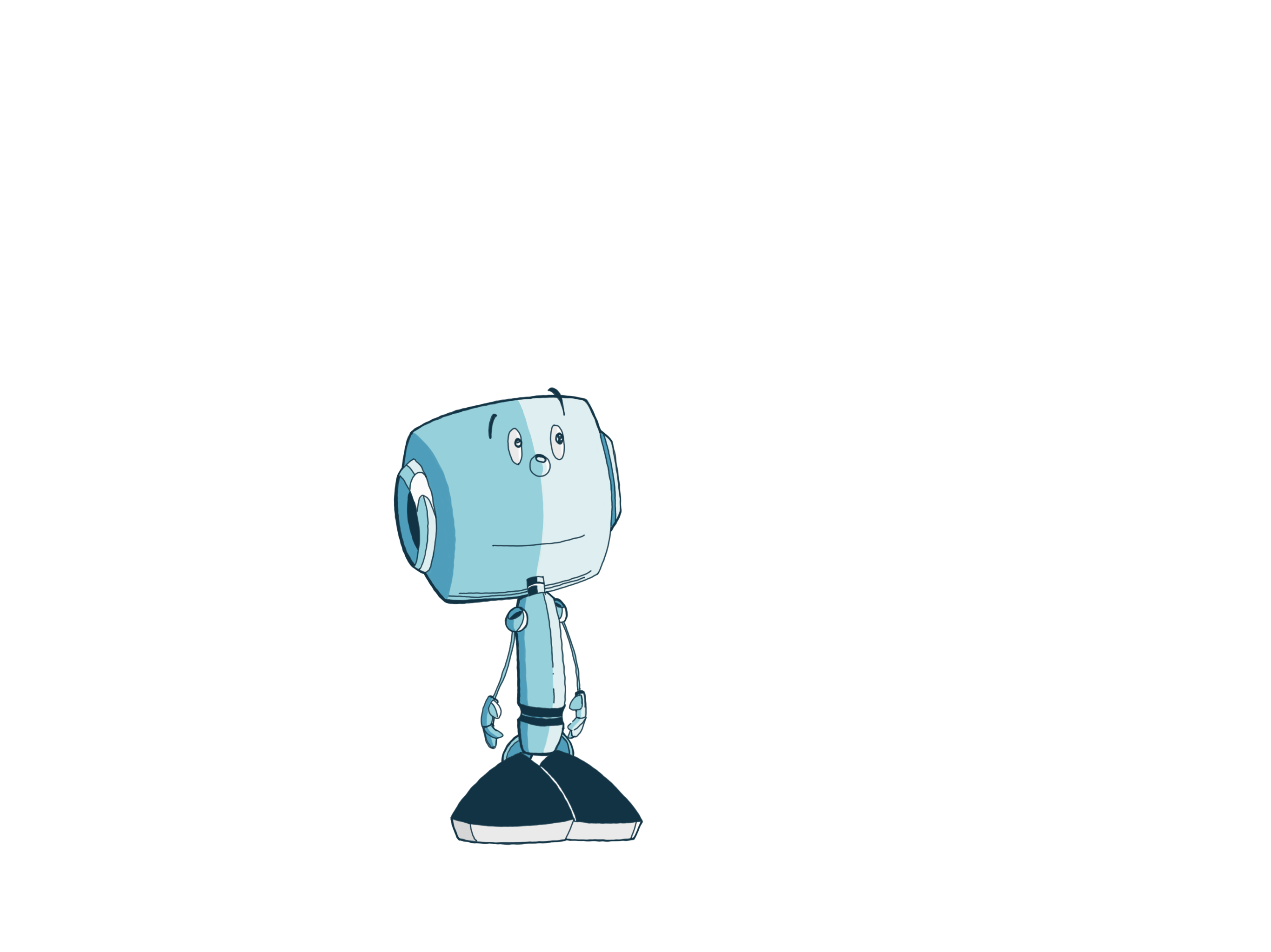
Slow evolution of the flag. I put this one through the kids filter and seeing the compass was an important distinction that it just clicked (while the previous abstract version did not).

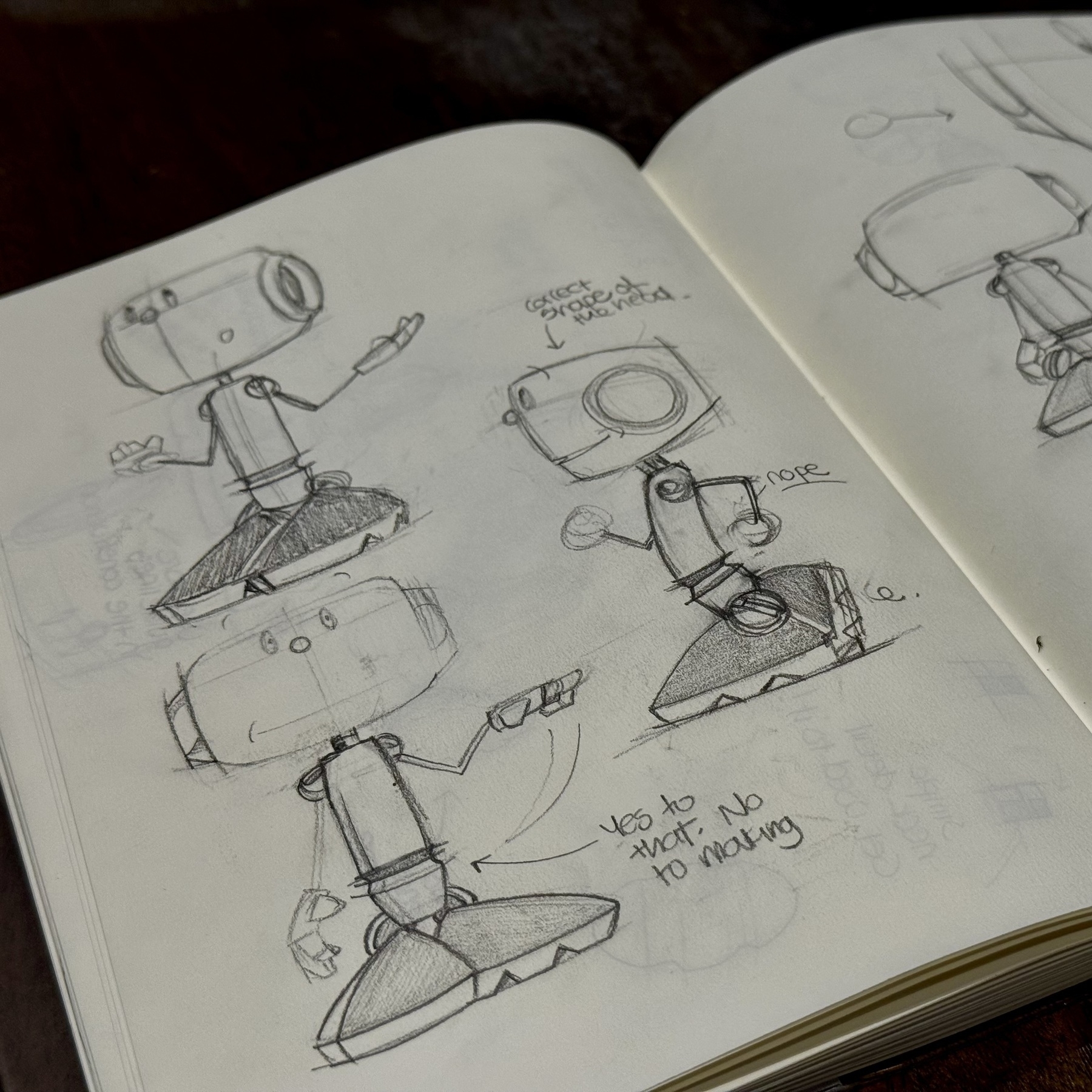
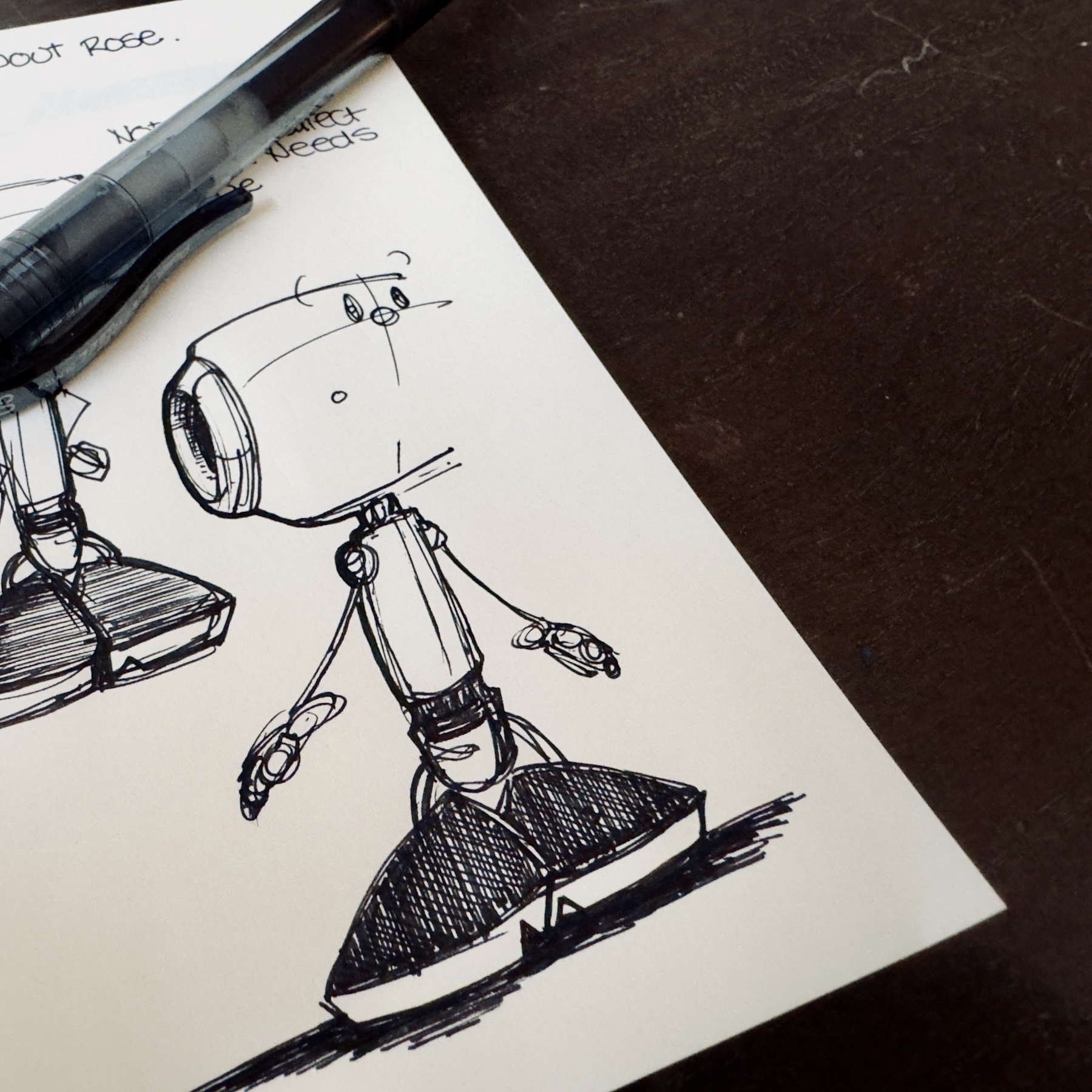
Working on something that’s been on my mind for years now.
Using the Astropad setup for the first time. One of the nice things is that there is an element of natural wriggle in the line. It is different.
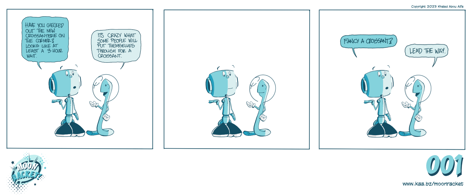
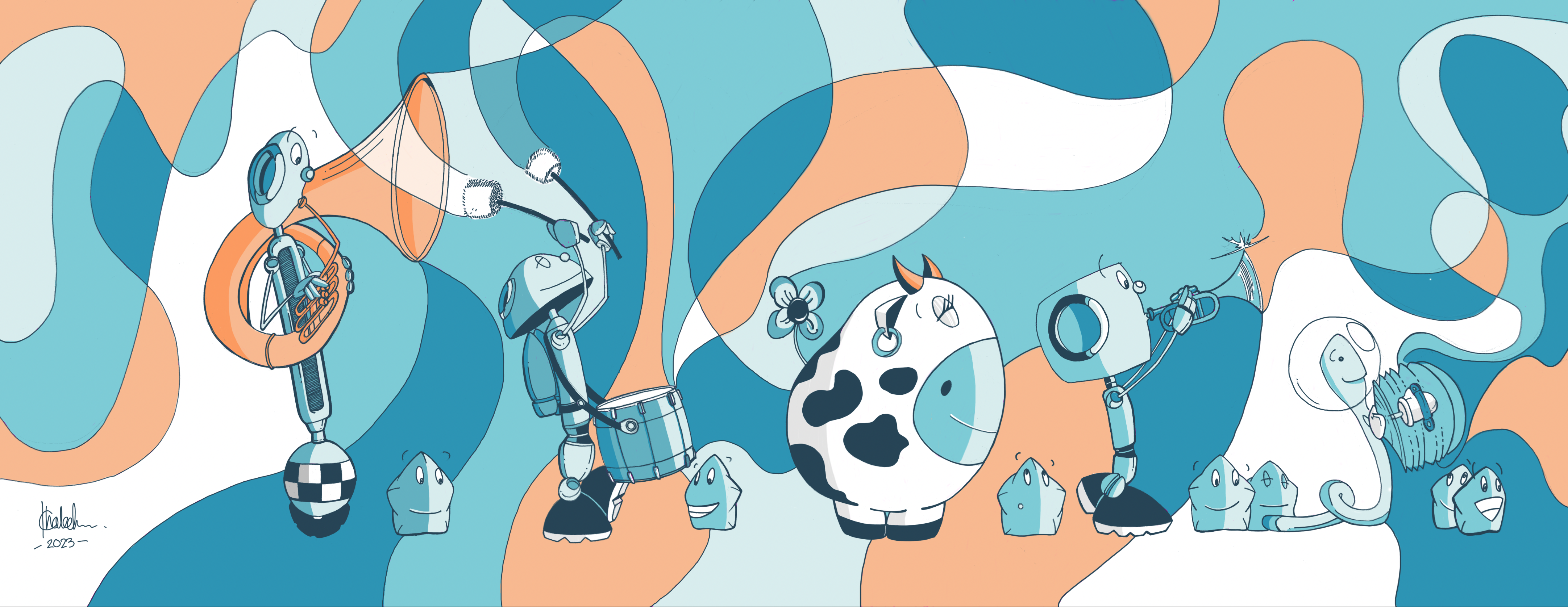
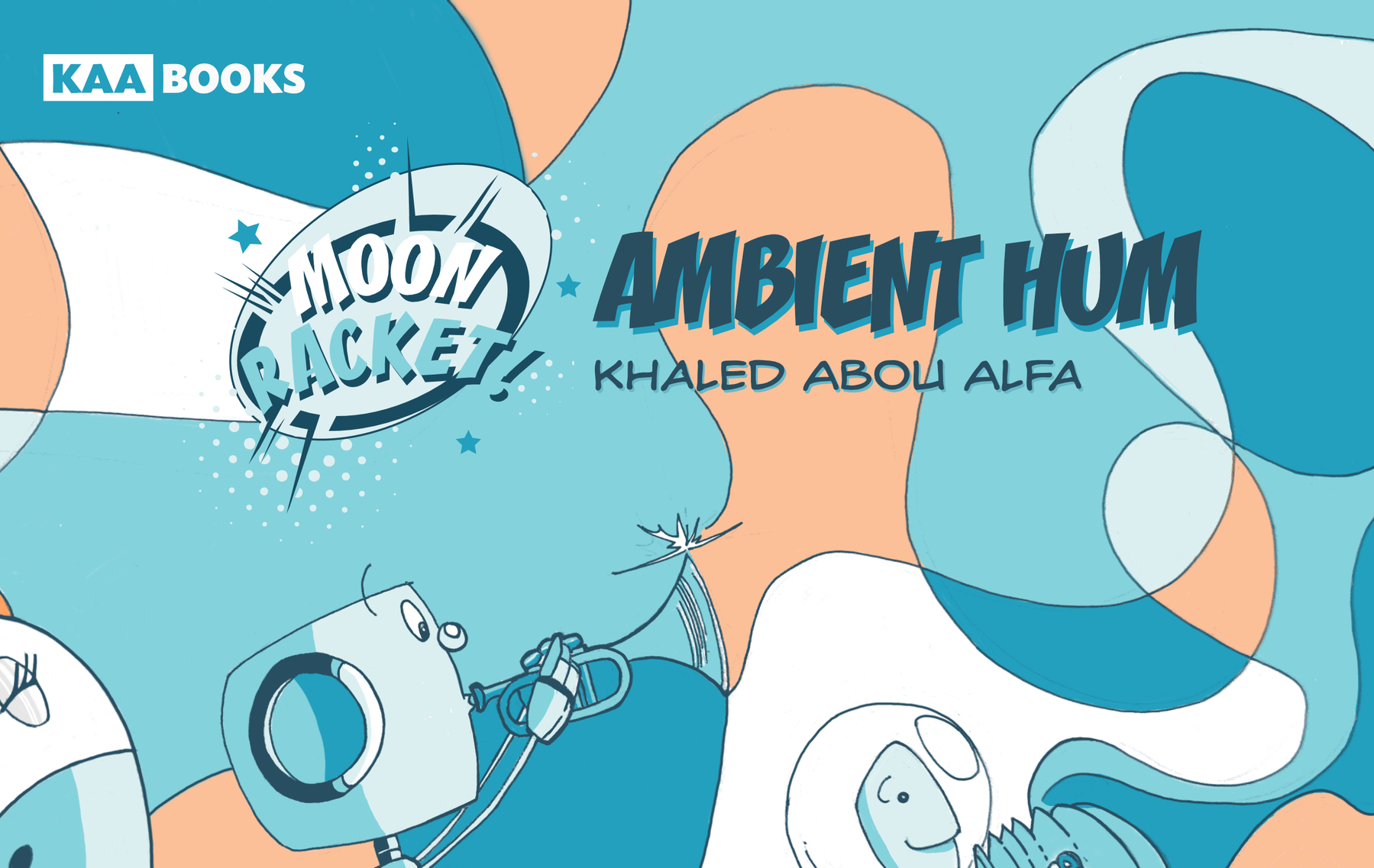
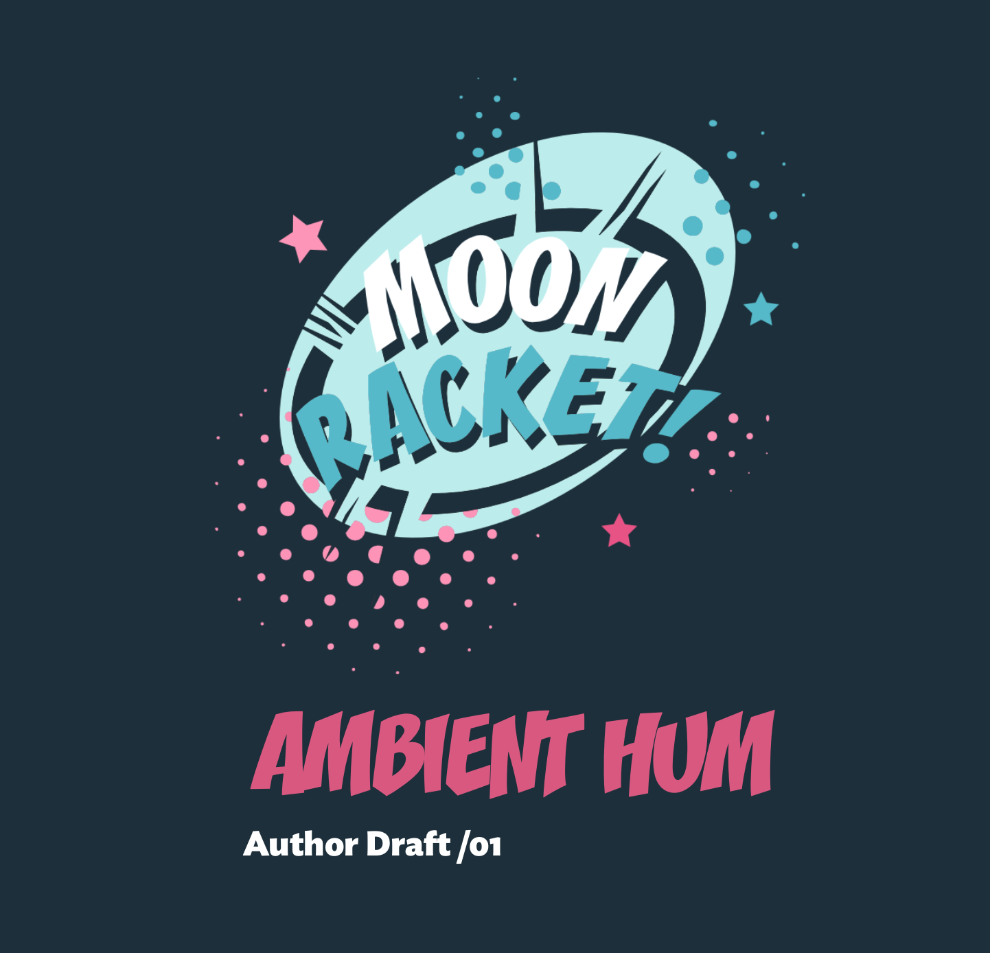
Moon Racket! February 2024.
Working on the February strip. I am looking to add some backgrounds, so will try a few options to see what some regular elements might be.
Cooking points unlocked. Took me all week.
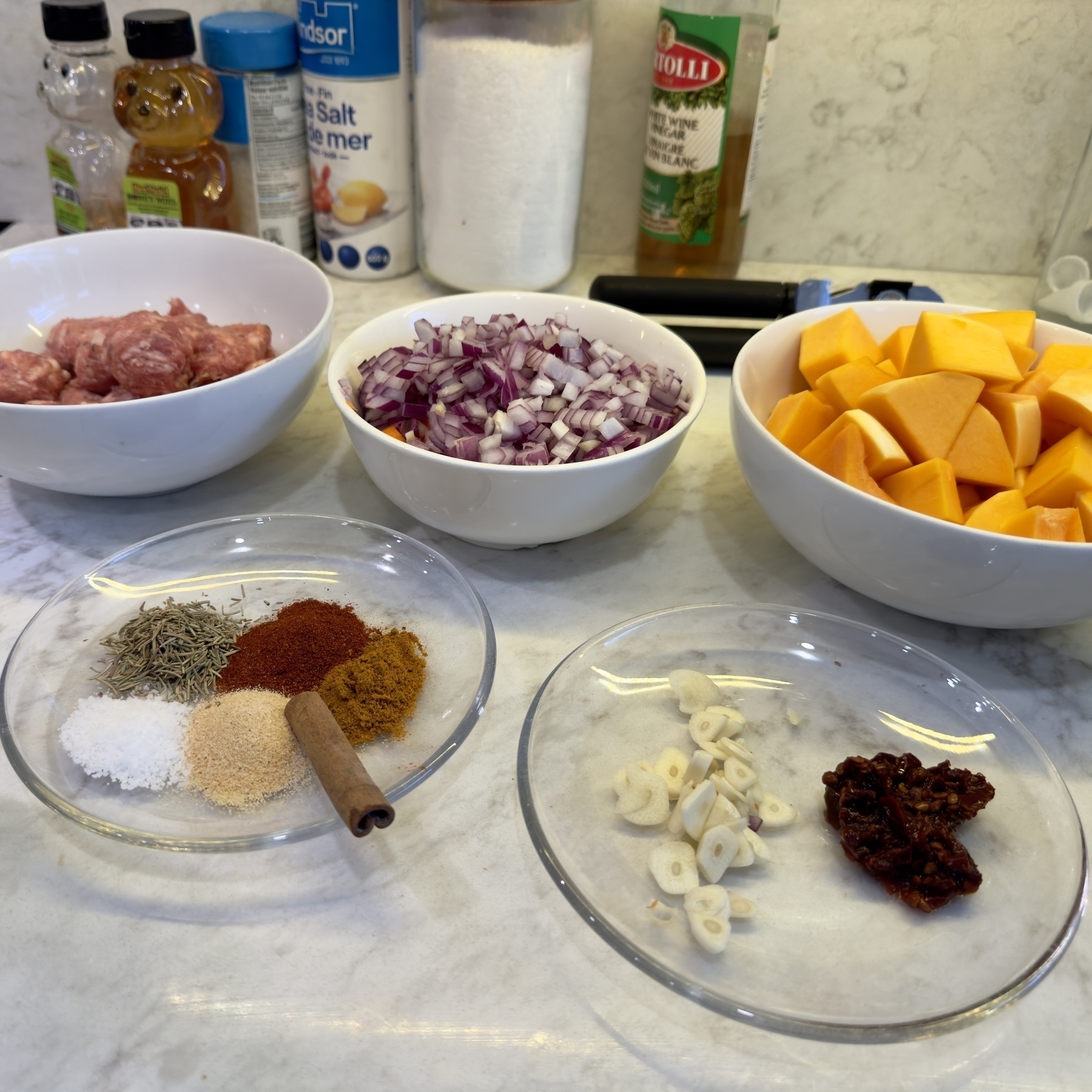
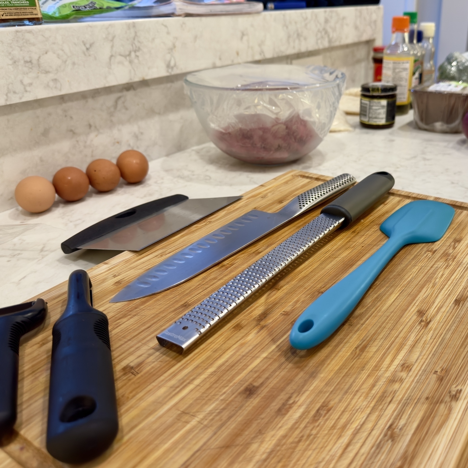
Meal prep for the week. I’m really loving creating a whole slew of dishes and sneaking a few portions as food for another time. The freezer has 4 different dishes ready to go. This is No.5 and I have another veggie dish tomorrow (soaking the lentils today).
Ready Chef!
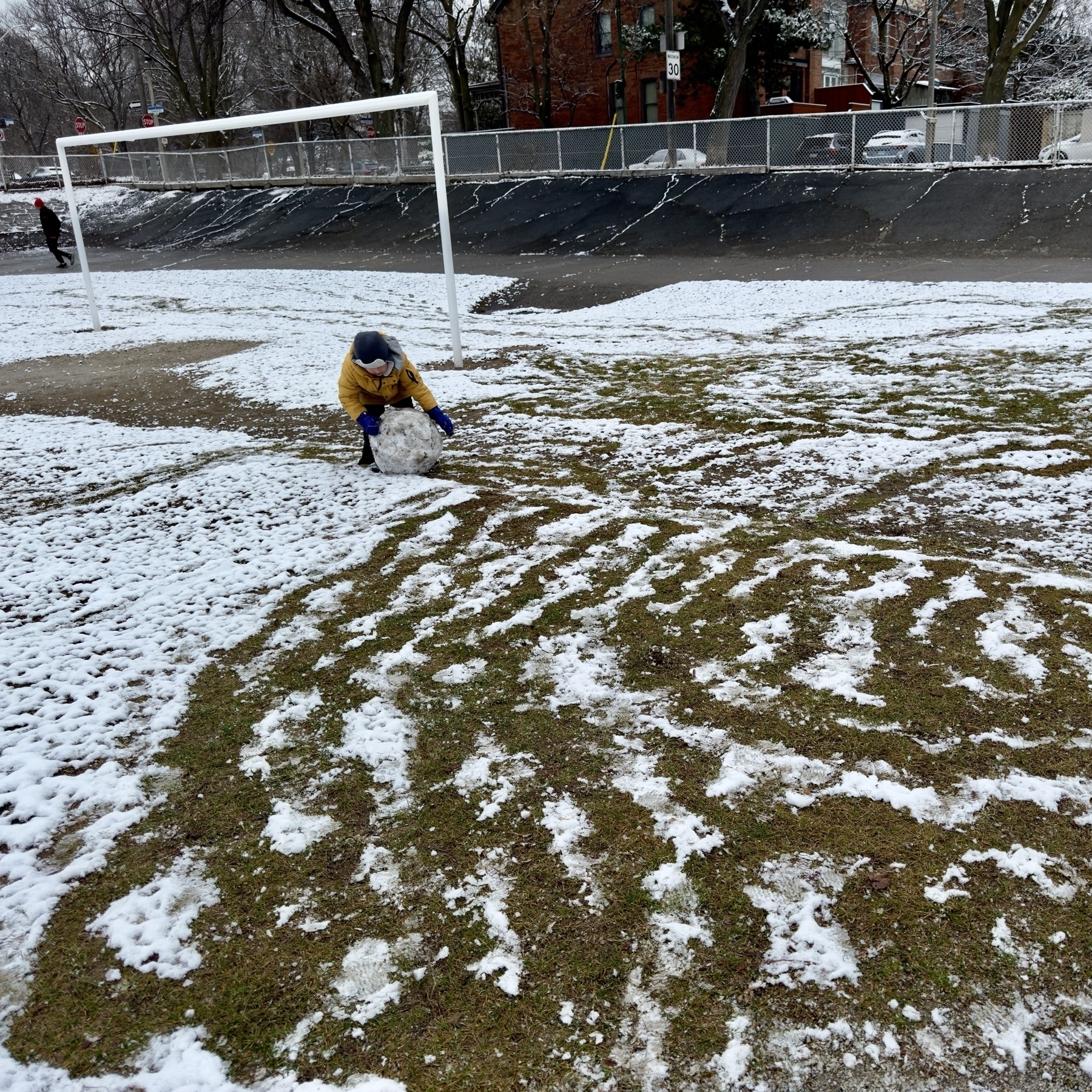
There was diligence to his method, which resulted in a pretty uniform shaped sphere.
Testing digital inking only.
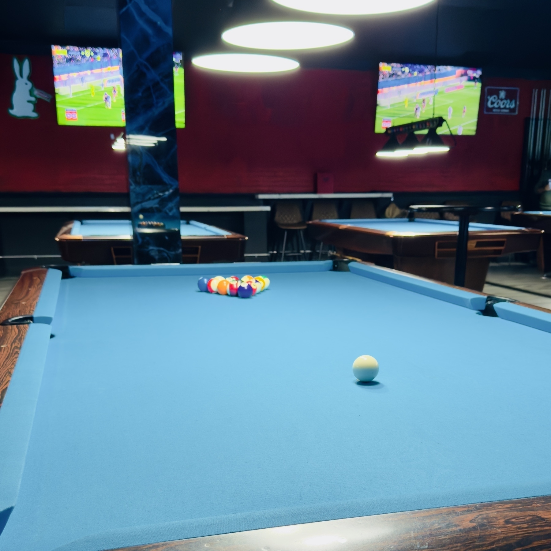
It’s been a while since I last played.

I think those geniuses at IKEA have finally cracked the loose tea steeper puzzle. How to make one that does not suck and is easy to clean. But wait, there’s more. The website reveals that it also it acts as a drip catcher! $3.99 (Canadian) for 2.
N.Cortolezzis & R.Giesen please take a bow. Well done.
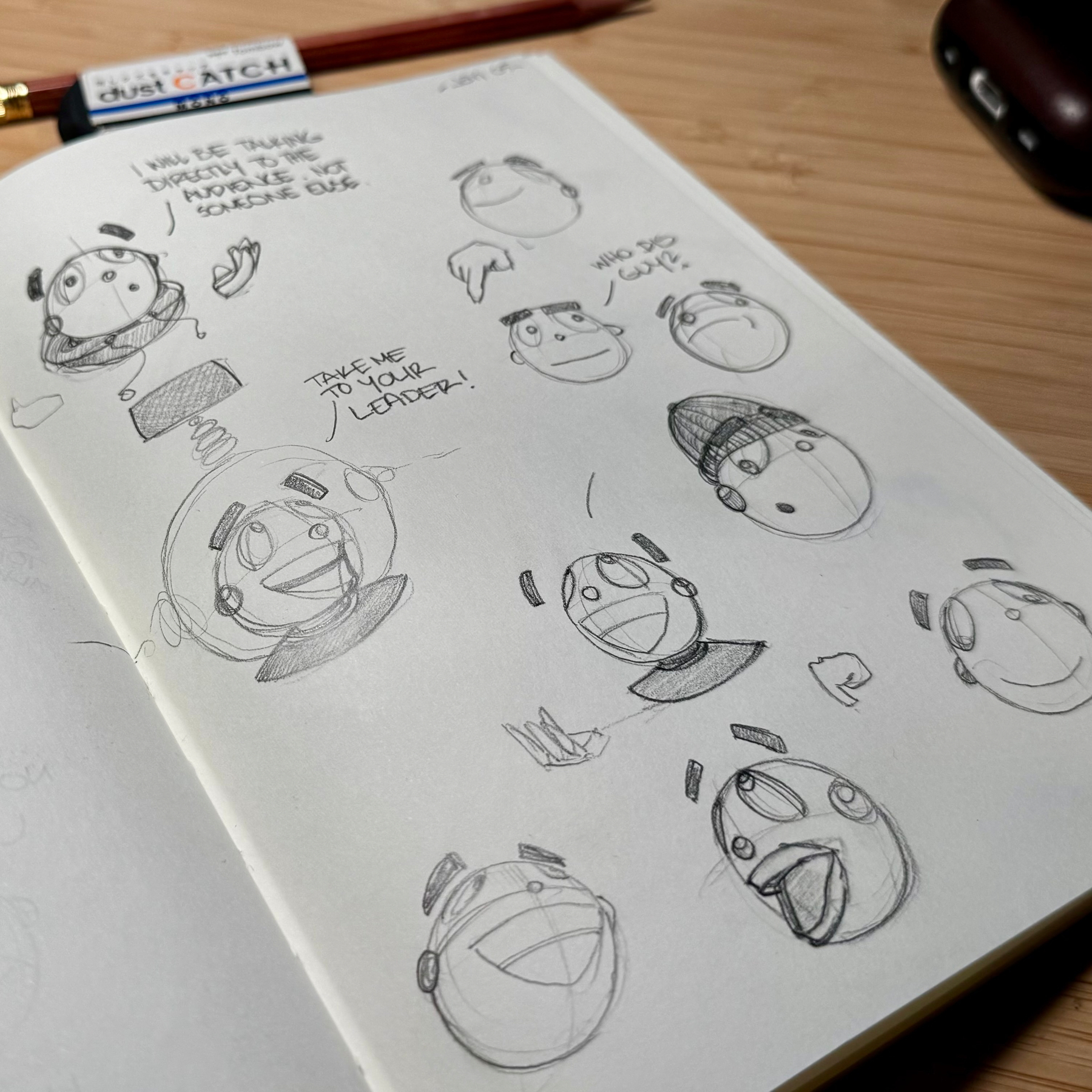
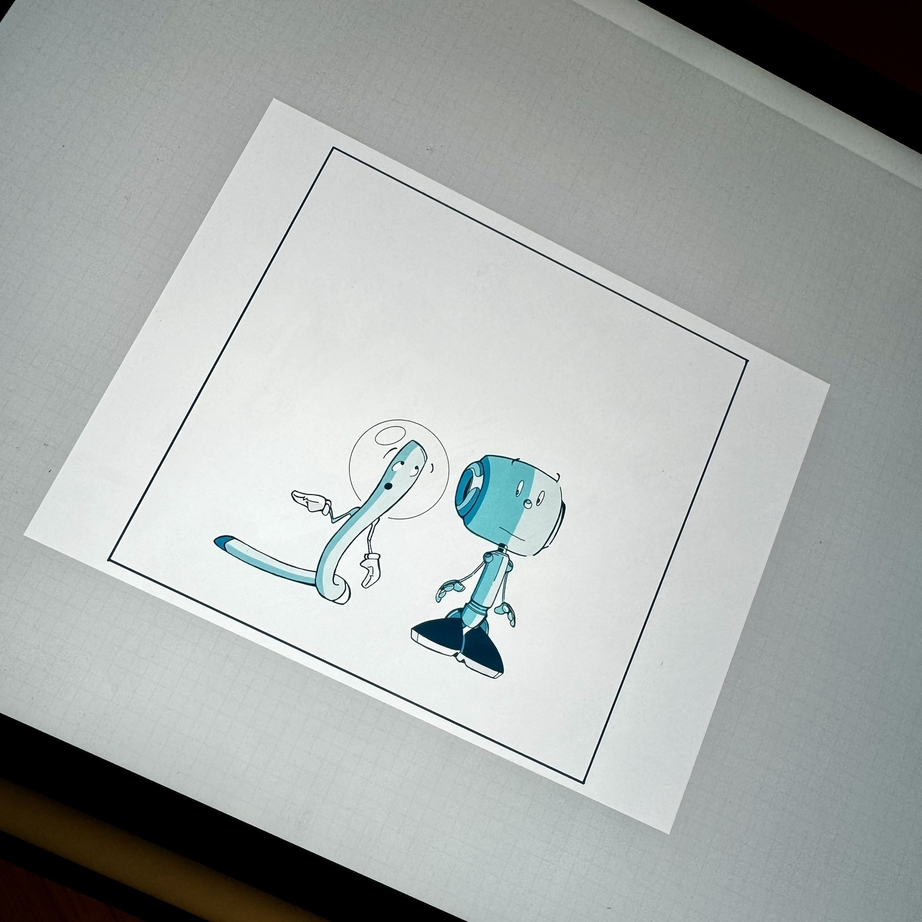
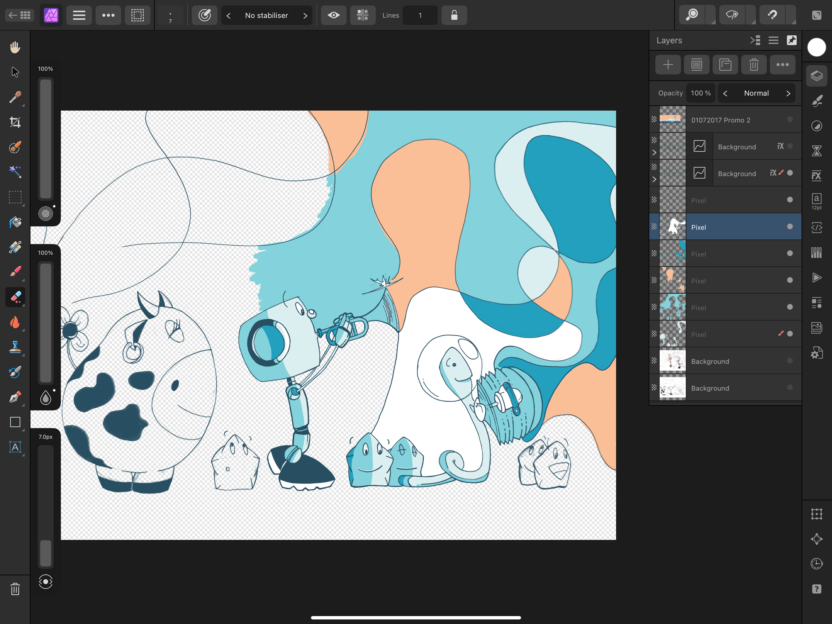
First strip in 6 years maybe? Experimenting with a bunch of stuff at the moment, including hand lettering.
Trying something different. Digital ink. A completely stress free way of moving from my pencils into the final piece. Sure something might be lost, but actually a whole lot more is gained.
Ambient Hum Introduction
I wrote this introduction while in Tampa this summer and its great to finally share it because it captures my thoughts on this world I’ve created.
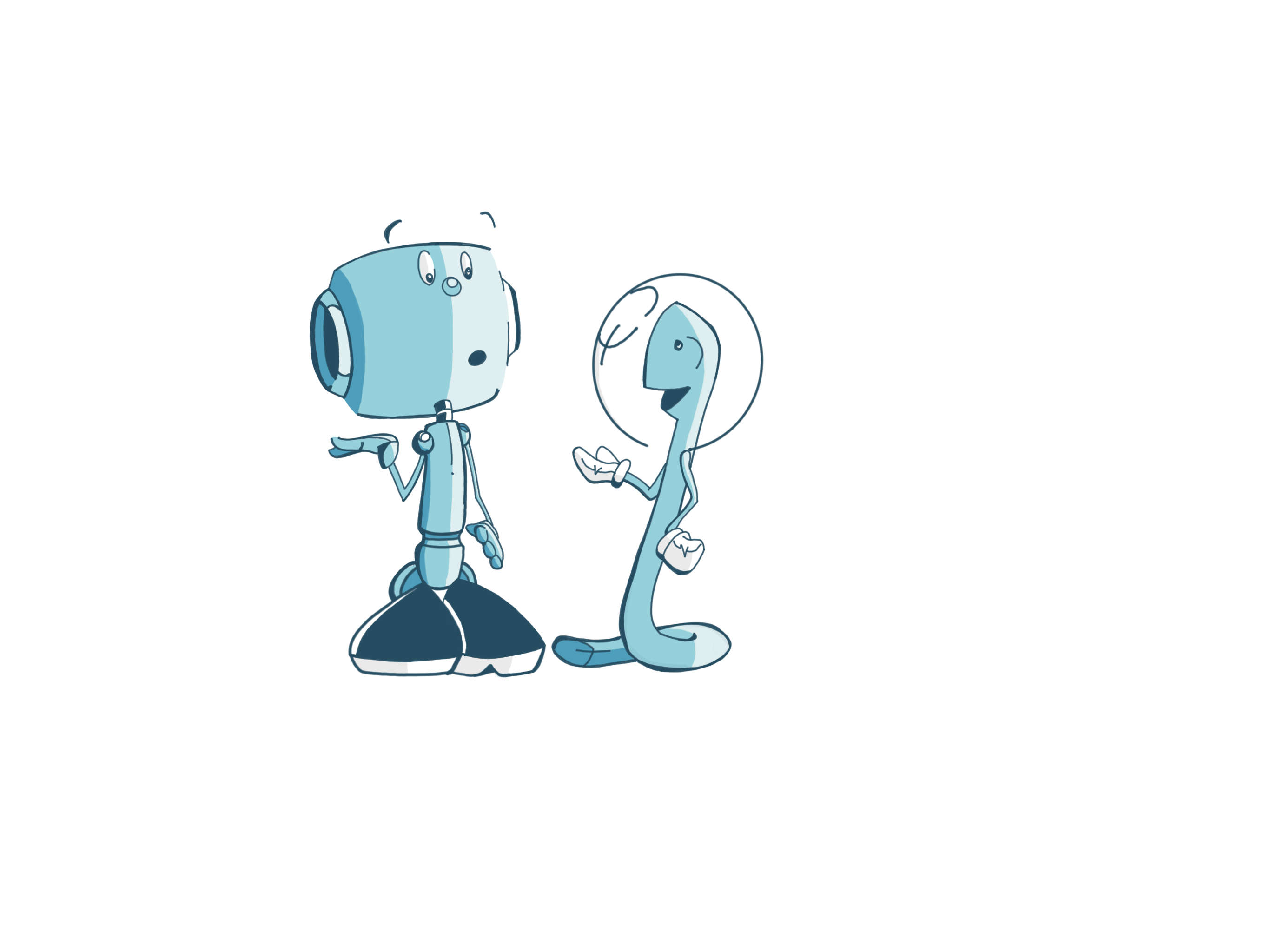
Moon Racket! is the story of two buddies living on the moon, making noise and eating cheese. It is also the story of my attempts at learning how to draw and write a comic series.
Comics as a medium has been a passion of mine since my early teens. Sadly I never really got around to the actual act of writing and drawing comics, rather spent time circling around the activity itself. And so it was that all of my previous attempts never amounted to any completed comic work - save a four page story for a Guardian/Observer newspaper comic competition called Coffee Beans. To help me fight through this inherent procrastination, the barrier for Moon Racket! was purposely set very low. The result was that for nearly a decade this world and it’s characters would be my main creative outlet. But lets start at the beginning.
At the start of 2010, I had a serious case of brain crack. Brain crack is a term coined by CGP Grey in an episode of the excellent podcast, Hello Internet, ‘…the longer we procrastinate on something we want to do, the more our brains build up expectations of how amazing it’s going to be. It’s like crack for your brain’. The project was based on an idea I had, after a hazy summer evening out in Athens when I was 21. I couldn’t let this idea go but I also couldn’t move it forward in a meaningful way either. Two events would enable me to break my brain free and allowed me to create my first real body of comic work.
Throughout the 2000s, my creative adventures had been spent developing and honing my web and graphic design skills. I had started life on the internet to help me publish my comic work, the issue was that I fell in love with the web itself. The web combined a lot of what I loved about comics in the first place, but in a vastly different format. The web in the early 2000s was an exciting place. I swam in this space for years until the internet landscape changed (which I attribute to Twitter and Facebook) and it stopped being exciting. Another piece of technology would also come out around this time that offered another creative avenue to explore, the iPhone. With the introduction of the iPhone 4, what was possible on this mini computer in your pocket was starting to expand. I decided that I would try and use this this $880 (the going rate with taxes) device to create a comic, each panel would be the size of the phone screen. While the idea was well conceived, it was beyond ambitious.
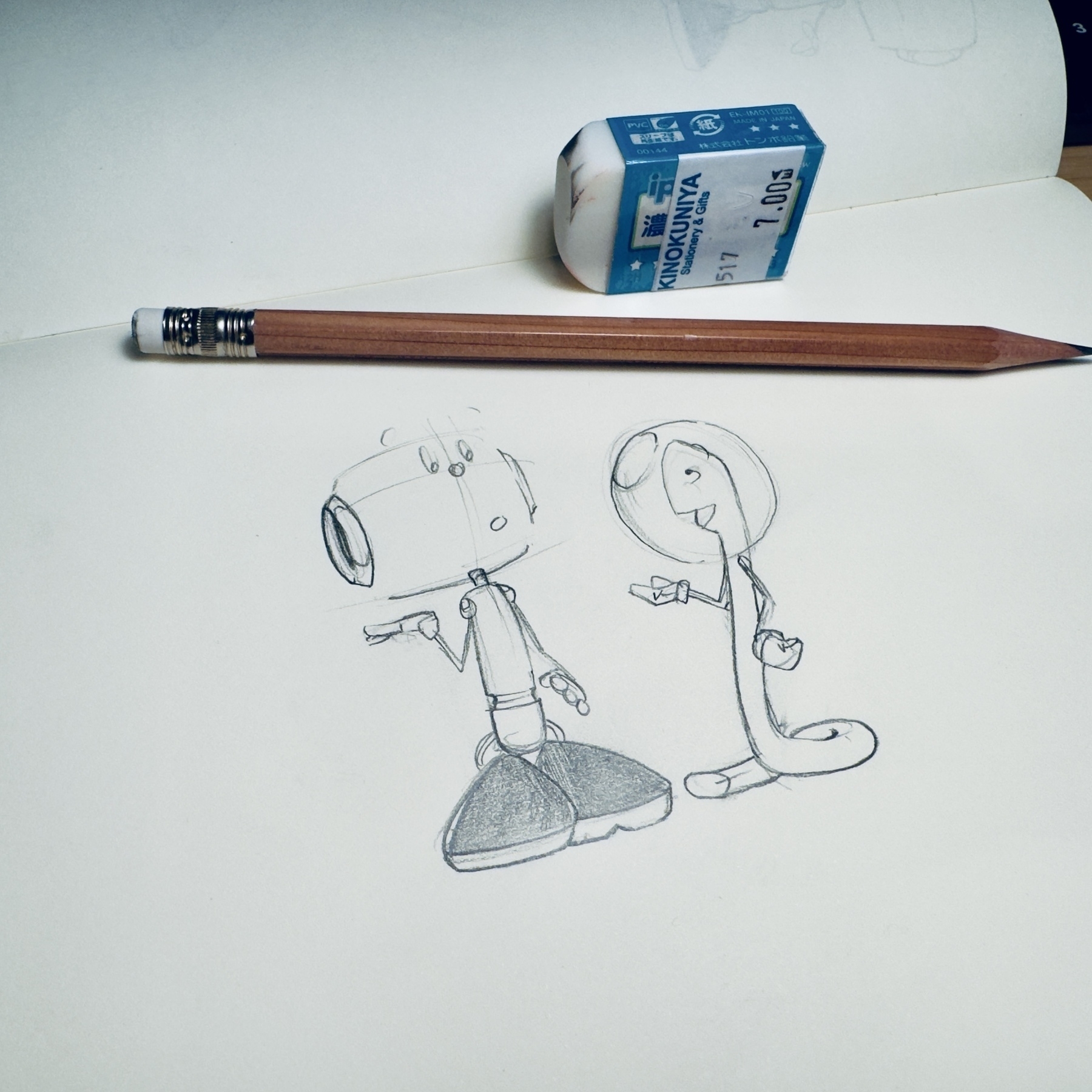
This entire series of characters was borne from a few images drawn on an iPhone 4 back in 2012. These were done using the crudest of styluses available at the time, which was a thin aluminium tube with a soft sponge attached to the end of it. The key elements of Corgan were there, the booties, long eyes and circles at all the joints. As I drew these characters, their world started to come into view for me. They lived on the moon. The moon was ostensibly made of cheese (and that would never run out of course). After realising that the little moon worm I had drawn was an organic being, he would need some form of air bubble around him to breathe (please don’t argue with my logic, it’s fragile). Very quickly however I hit technological limits. The combination of the crude stylus, the tiny screen and the poor feedback they both provided (when compared to my trusted Muji 0.38mm blank ink pen and Midori paper notebooks), would mean that I would stop this experiment early on. I count the experiment as a success, because it allowed me to create a new world to get lost in and finally shifted my attention to something different, setting my brain free.
In the early 2010s, my life was transitioning from being a single man, to a fiancé, then husband and finally a father. I was living in the Middle East during this time, which was also going through its own transition as a region, as part of the Arab Spring. The Arab Spring started of as a series of anti-government protests and uprisings that started off in Tunisia and would quickly spread to Libya, Egypt, Yemen, Syria and Bahrain. Nearly a decade late, the chars of that movement are being felt in Syria which erupted into a civil war shortly after. I felt powerless to stop the strong humanitarian disaster that was unfolding around me, culminating in the image of Alan Kurdi washed up on the shore. An image which still haunts me to this day. My brain would retreat and search for a creative outlet to help me manage through this time.
I can’t even remember how or why I would end up calling the entire series Moon Racket!. What I do remember is that the form of logo was crystal clear in my head once I had settled on the name. From this word mark, I originally intended for the series to be filled with onomatopoeia (which is the formation of a word from a sound associated with what is named). I don’t think it happened as often as I would have wanted, but that is certainly something I am looking to lean into more in the future.
Many decisions, that defined the Moon Racket! world would also arrive in a completely organic manner. It felt appropriate that the technology used throughout the series would be locked in the 1980s, while the architecture that was on display would be of the future. Strangely (even to me), the Moon and surrounding planets are characters themselves, complete with eyes, arms and hands.
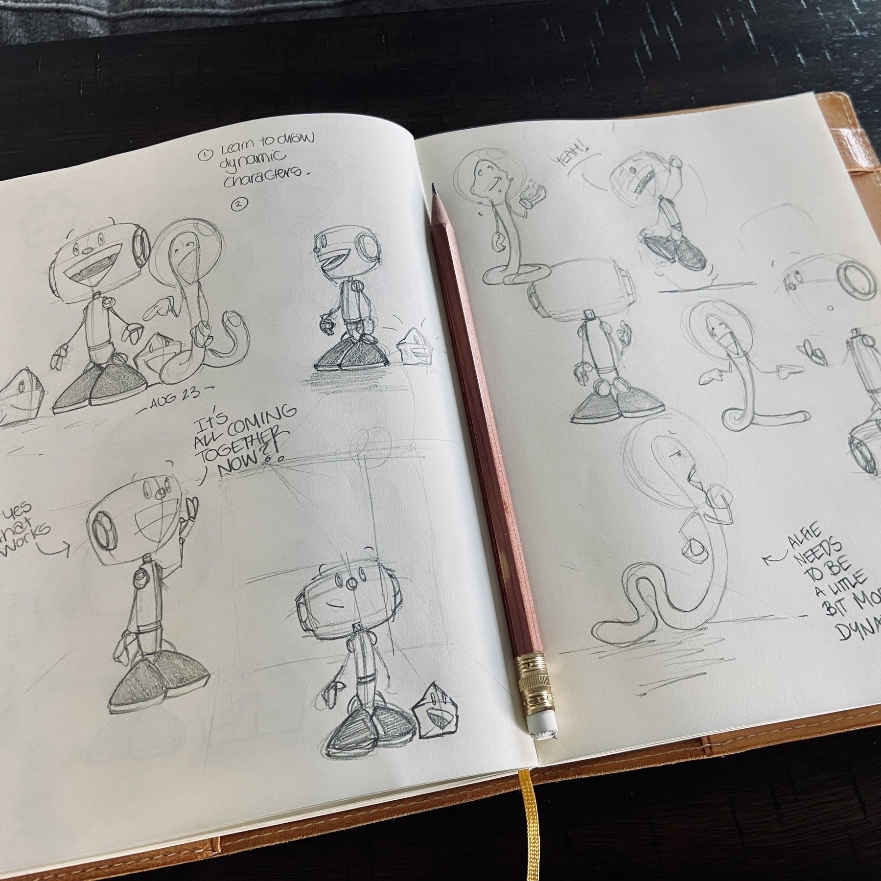
In developing the the style of art, I went off what I felt looked right, a tactic laced with struggle and self doubt. It took a while to kick my propensity of cross-hatching and tried to create a vernacular that was is my own continues. Having never previously really spent any time developing a dynamic cartoony style of art before, the art would evolve the more I drew. My annoying perfectionism would take a back seat as I kept reminding myself that nobody was paying any attention, so it didn’t really matter. Keep moving. Keep drawing one strip after the other.
Even though he was the basis of the entire series, I struggled a great deal with the design of the Corgan character. In developing the shape of his body I would struggle with shape and form. I would keep adding new elements to his body, but would never feel truly comfortable in his depiction, until recently. By contrast Corgan’s third iteration, which has arrived years after I stopped drawing him in the manner he is presented in the this volume, now practically draws himself and rolls off my pencil.
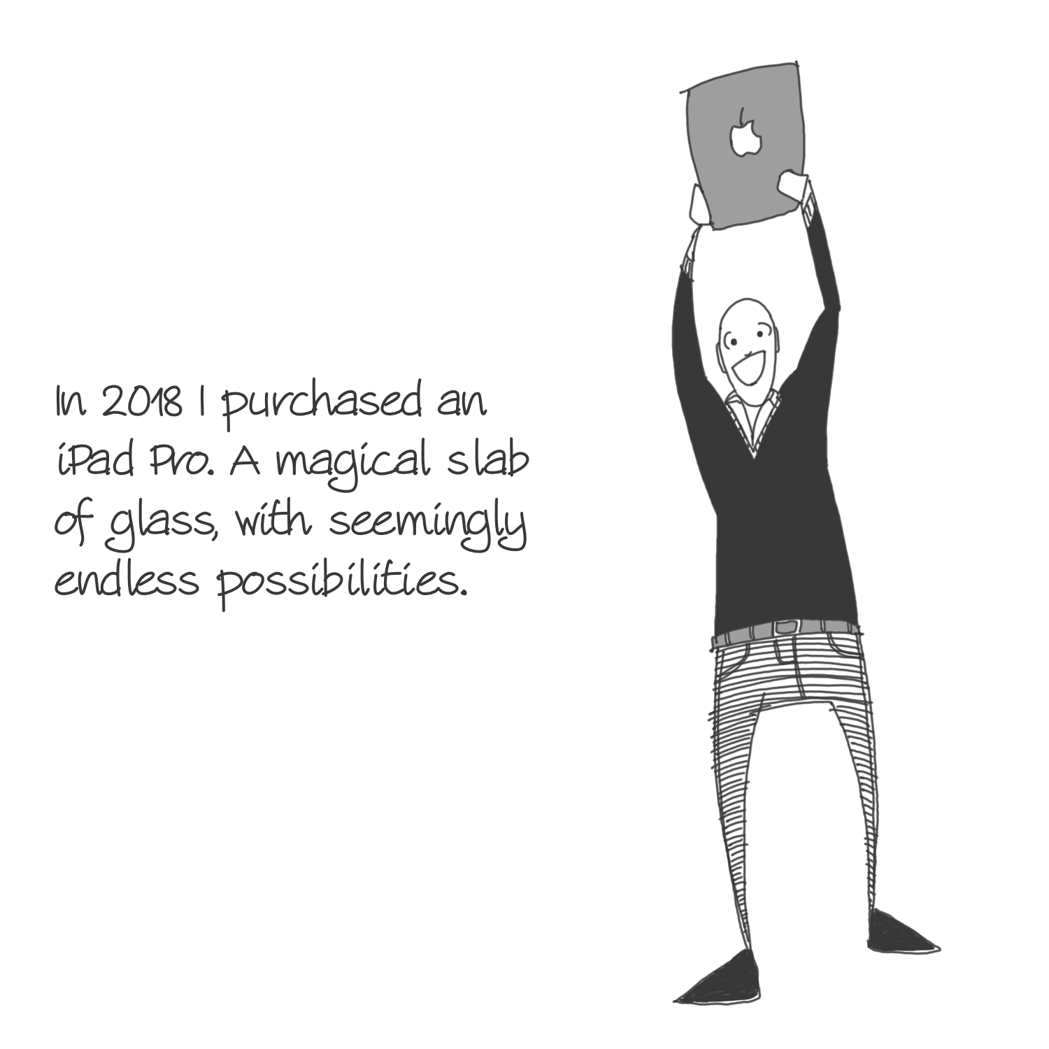
Unsurprisingly the characters and this world, never really took off beyond a limited number of readers. This was expected, considering it would take me over a year to write and draw 20 strips. I didn’t publish nearly enough to build a habit with anyone, but mainly with myself. I ran out of energy, as things in my professional life started to take over and I need to focus a lot more on that side of my life. I decided to put the series on hiatus and capped it creatively, published in March 2017, with a movie poster style image capturing all the characters. The characters would come out of retirement briefly in 2021. I finally was able to fulfil my original vision of creating these on an electronic device. This time it was a 12.9” iPad Pro with an actual stylus (the Apple pencil). After I finally learnt how to draw and colour these characters, I ended up taking an extended break from them.
I could not imagine that these characters would stay with me as long as they have, but maybe that is down to the fact that I have not said all that I wanted to say. The next evolution of the Moon Racket! world is not in the artwork, rather it will be found in the type of topics that I would like to discuss. In defining the direction I want to take these characters in, I am reminded of my mother’s admiration for the political fables presented in Kalīla wa-Dimna, and using it as inspiration for future stories.
For now however, it feels good that the original groundwork for these characters and their world is collected in a single place.
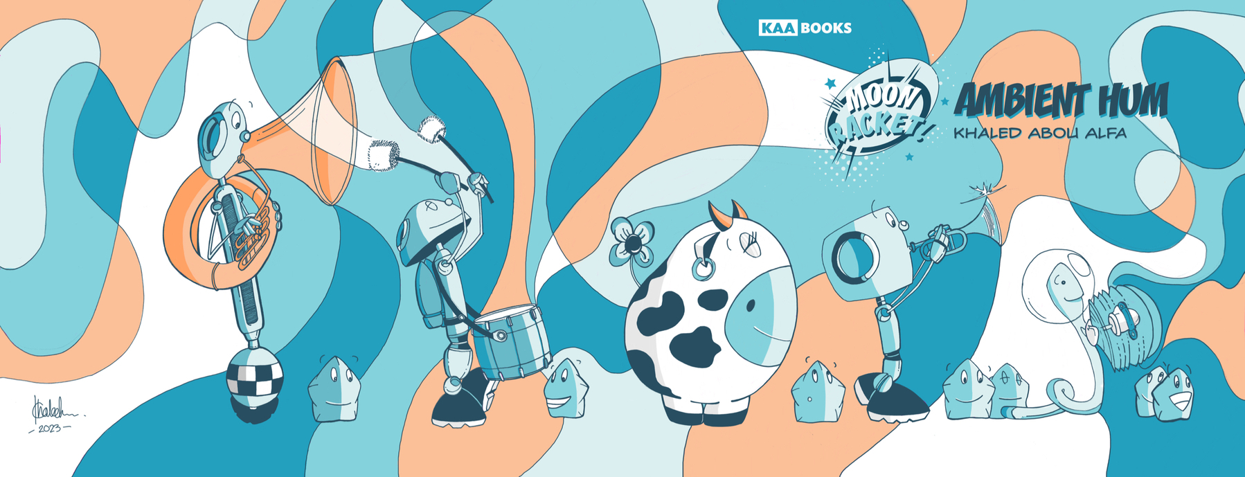
Moon Racket! Ambient Hum is available to buy as a paperback.
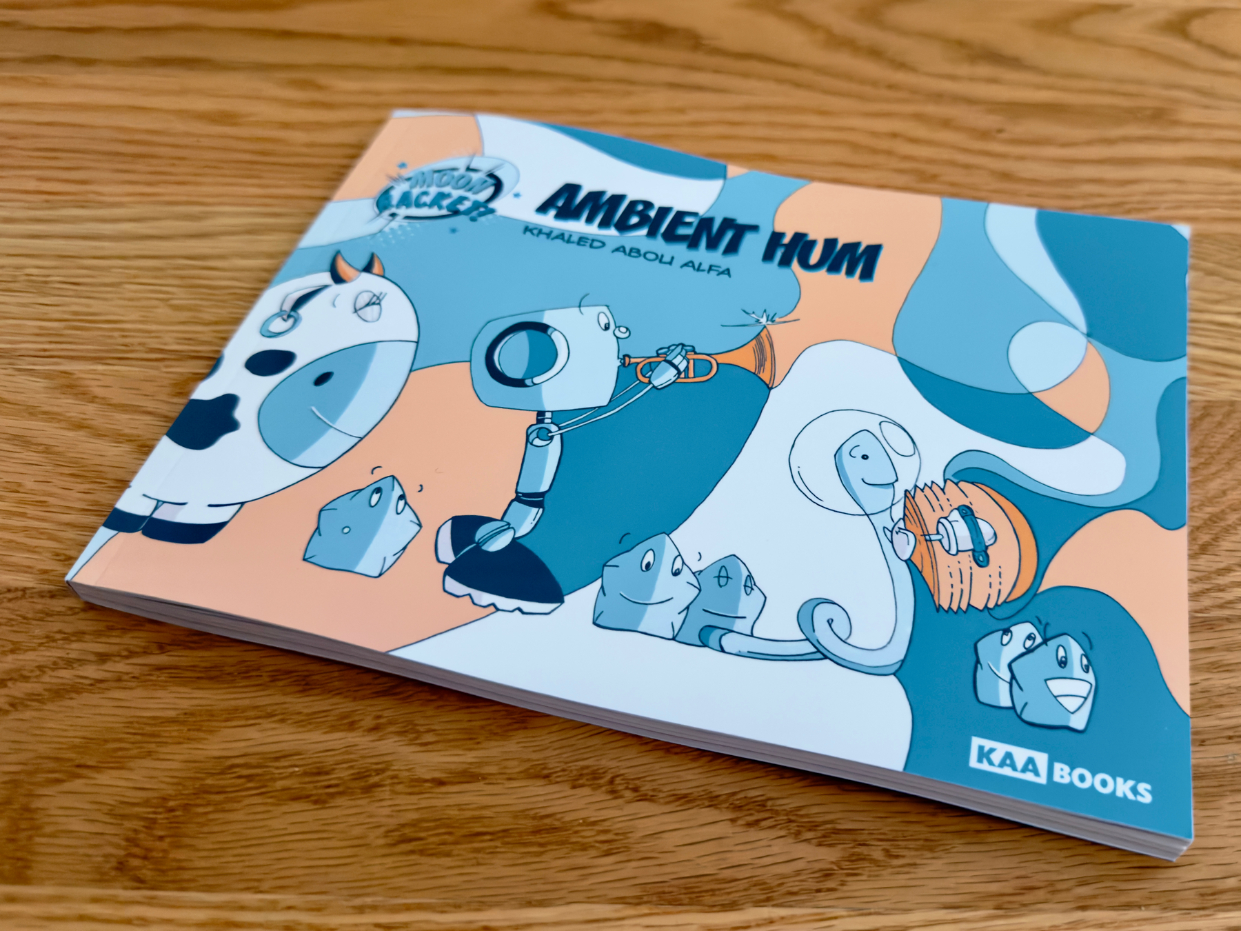
The project for 2023 was the Moon Racket! collection, Ambient Hum. This one has been long in production. It’s nice to have a single place with all these stories collected.
Things have to move around a little once the final trade dress constraints come in. Book has been ready for several months, but needed to get this cover sorted first. Now time to pull it all together.
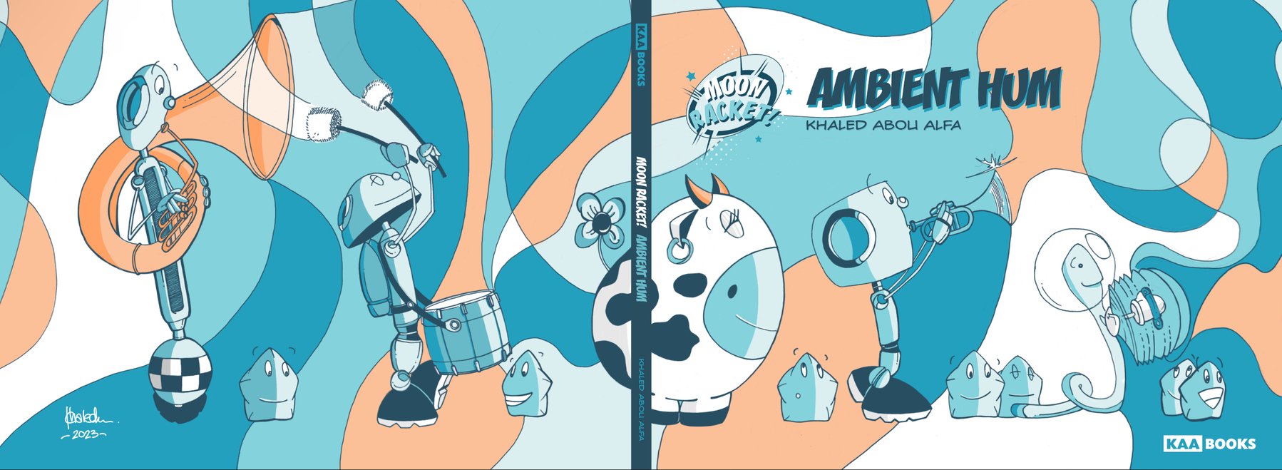
The cover is finally done! Lots to talk about, but just super happy that all the pieces of the book are now complete.
Trade dress coming along…
Cover is coming together.
So Zane did this yesterday and I am absolutely floored by what he’s created! The thing I am most impressed by is the storytelling. An essential part to any comic narrative and he’s done so well here.
First proper trick or treating since Dubai?!
Love this photo!
Lock Screen for autumn 2023.
Let the festivities begin.
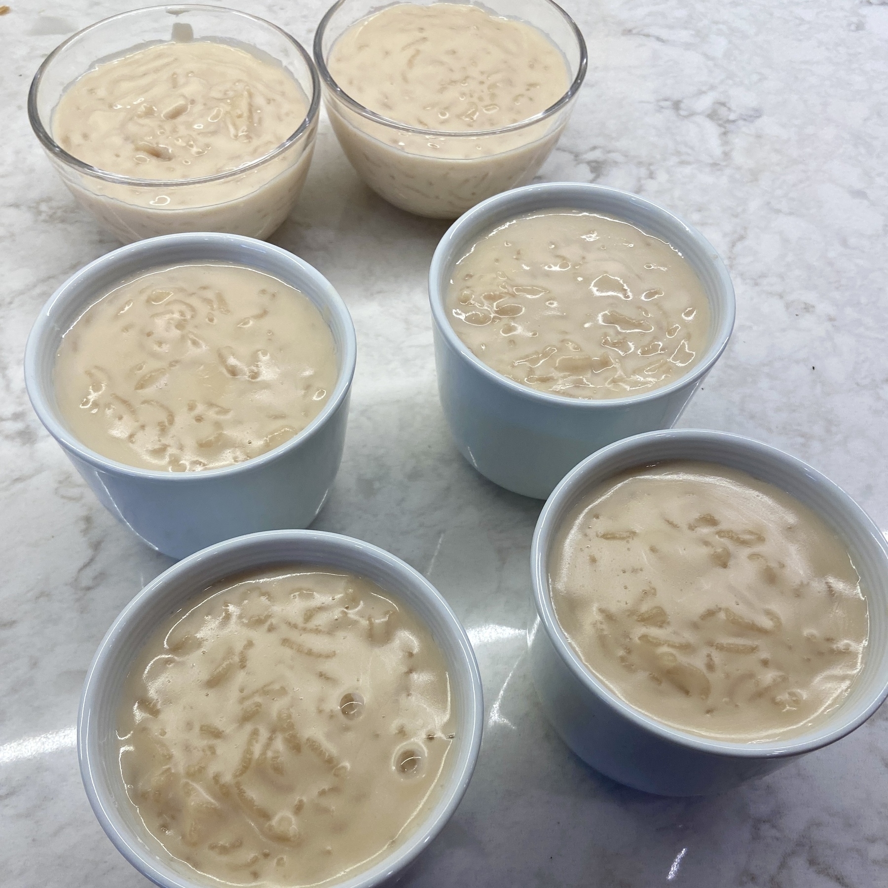
I’ve been on a serious food nostalgia trip this weekend. Made Lebanese rice pudding. The only missing ingredient was mastic (which I’m sure I can find somewhere in Toronto, just haven’t found the place yet).
When shit gets bad, I tend to fall back onto these characters for support. The process is key.
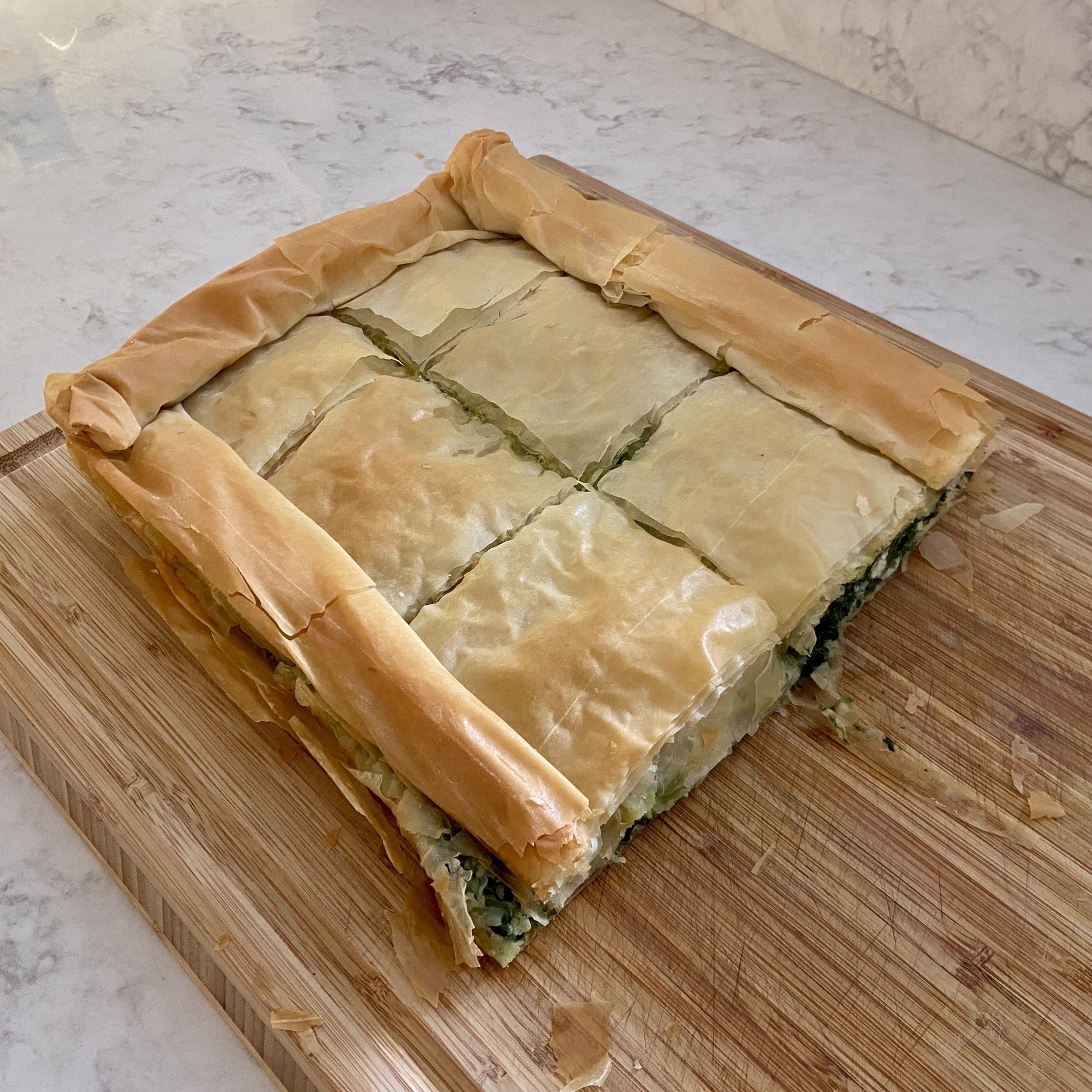
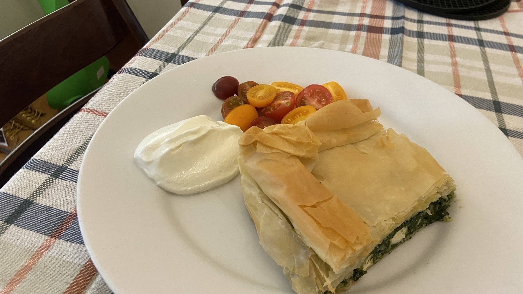
Spanakopita turned out pretty good.
Saturday afternoon studio.
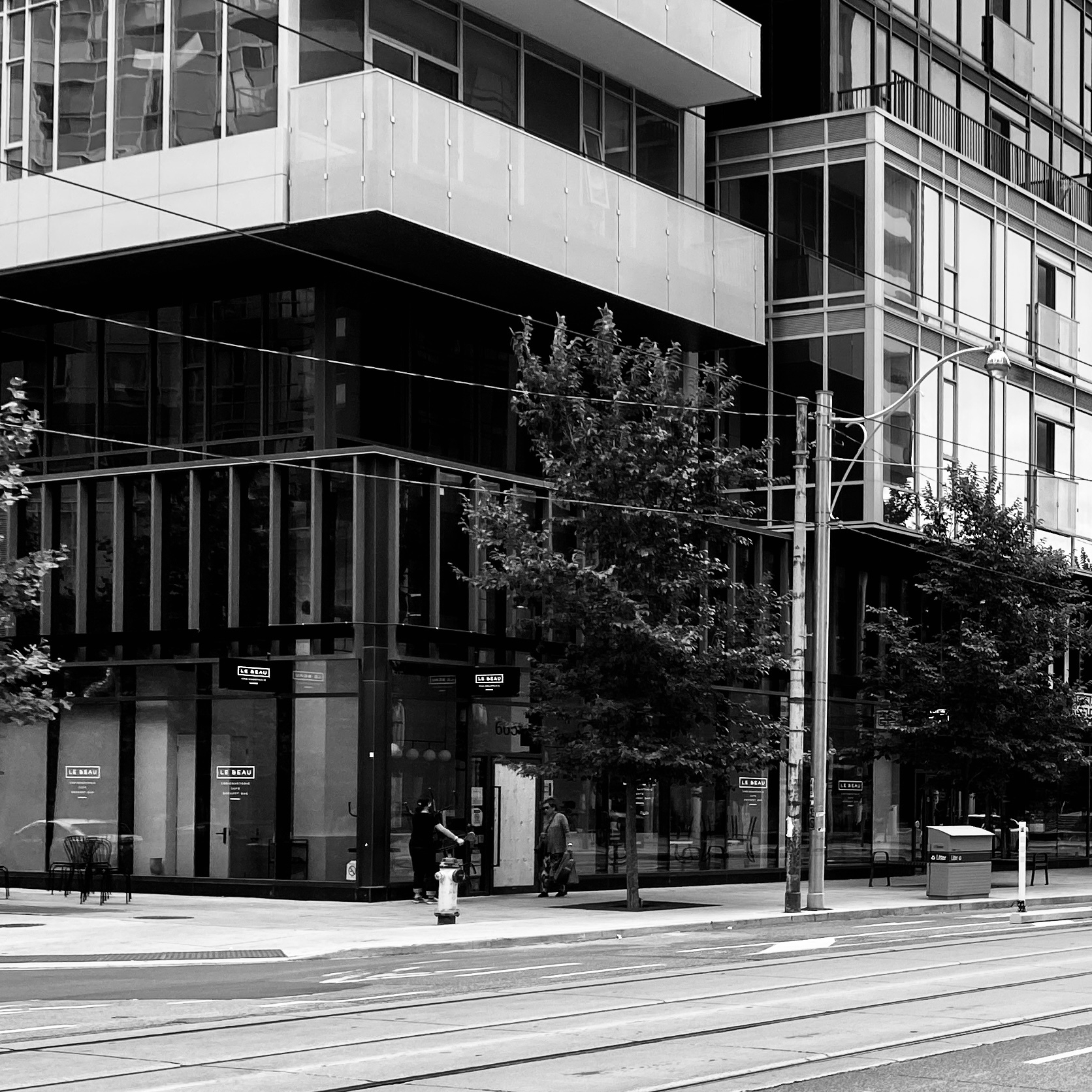
Ah, Le Beau!
36 Click Pen

Over the last year I have really leaned into the Pentel Energel as my go to pen of choice. As was inevitable, I started looking around to see the best option for a machined pen for this refill. The 36 Click Pen by Autmog is that pen (when Brian makes it into a 0.5mm version), but getting something bespoke for this refill on such an elegant looking pen has now gone top of my list.
Summer is nearly and truly over.
Onomatopia
I’m really loving how these chapter break pages came together for the Moon Racket! collection. I have been struggling with how to make these pages more visually interesting.
I tried using inverted images, but they just looked odd. Sometimes an idea just pops into your head and it just works.


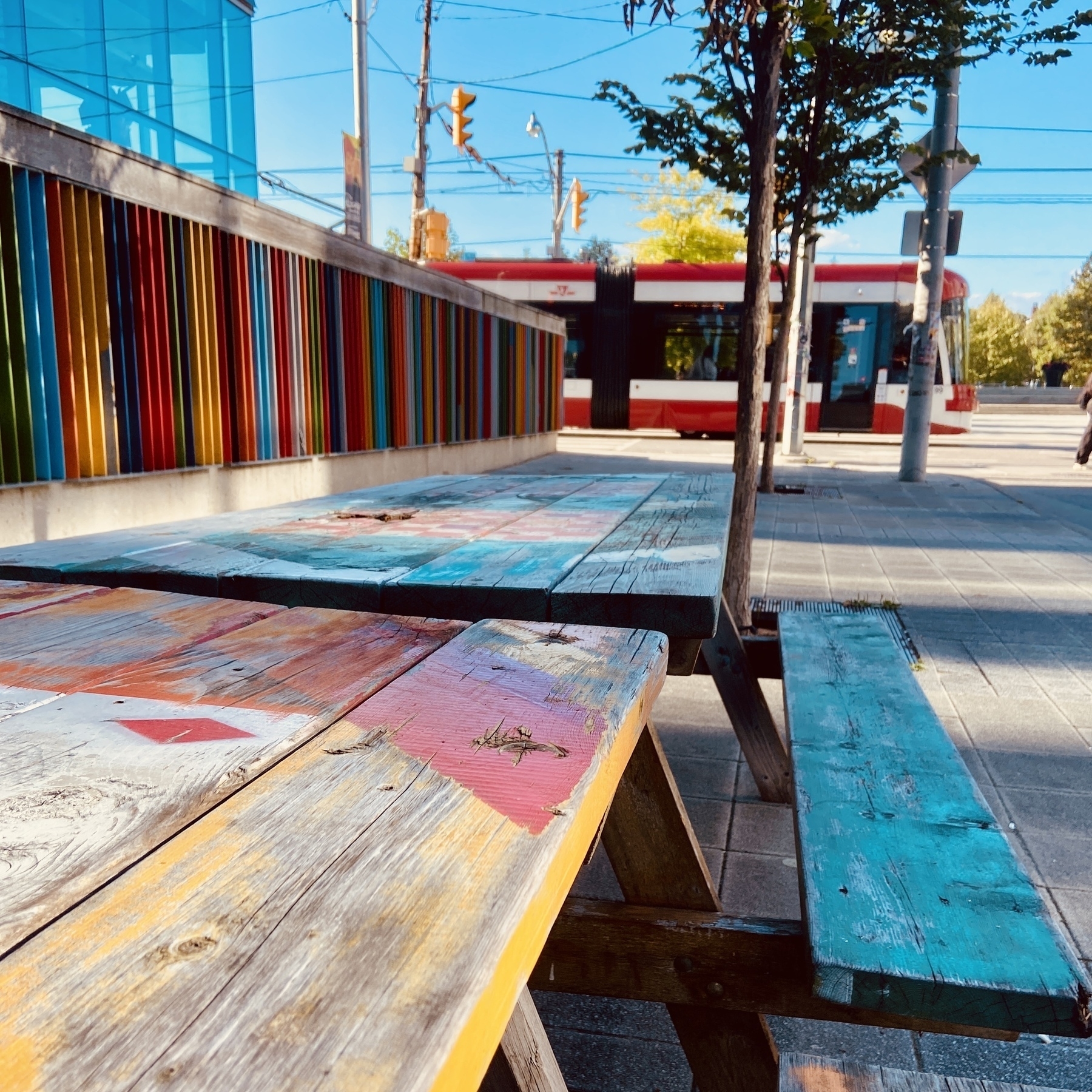
The most Toronto picture I could take.
Ordered the copy today. The cover needs to be sorted but great to see 120 pages of Moon Racket! loveliness coming together.
It’s a Moon Racket! kinda morning.
My America haul so far.
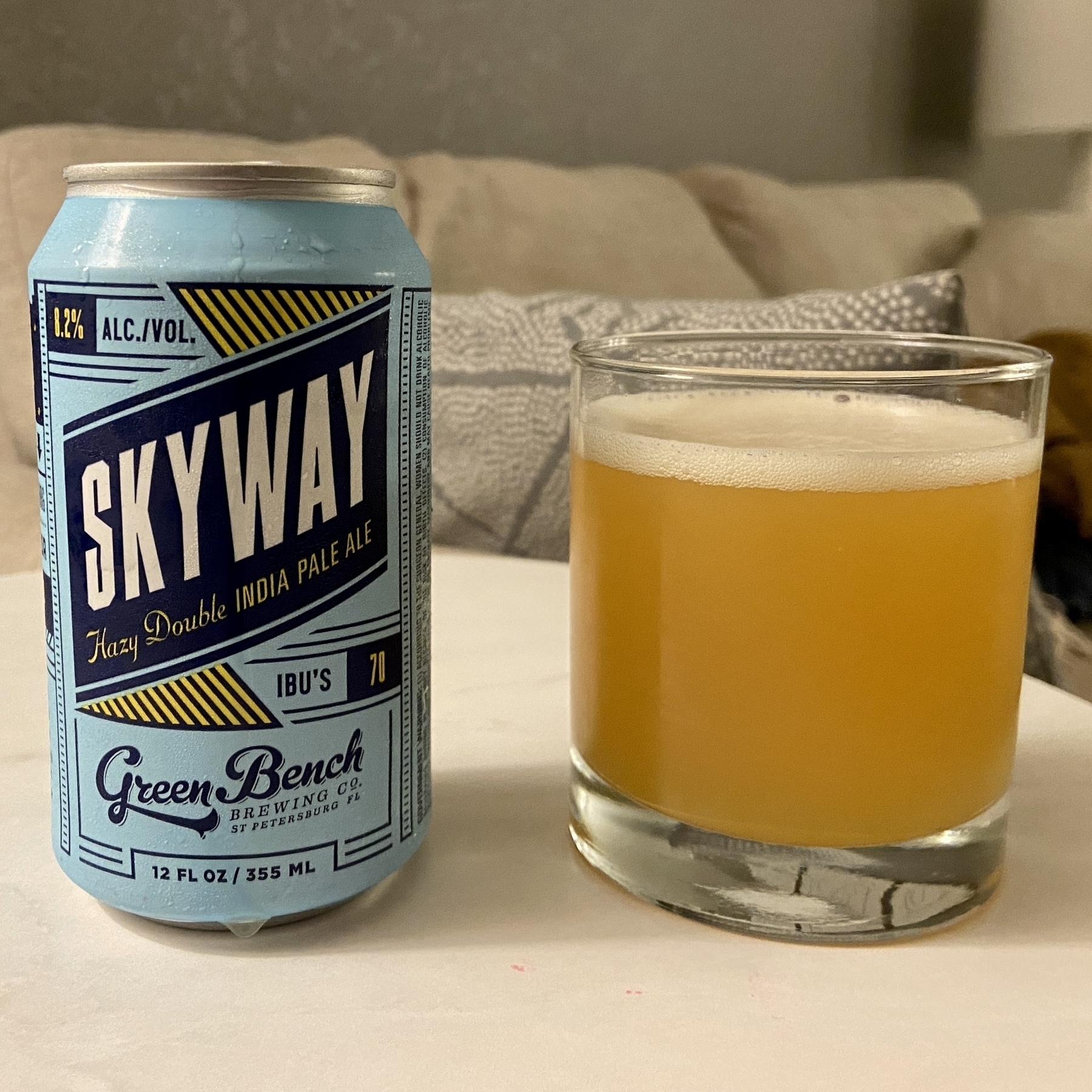
Alright. Found my Florida DIPA. Smooth, with the right amount of kick at the end.
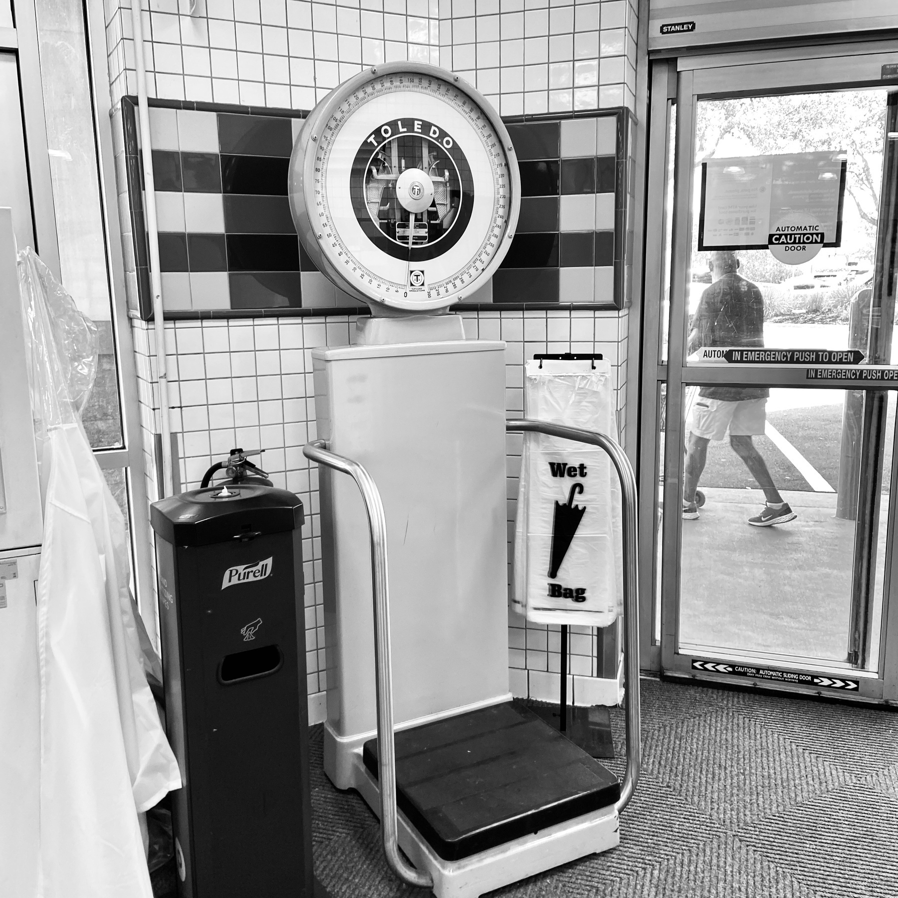
Someone from Florida has to explain this to me. What’s the deal with the scales as you enter and leave a supermarket?
That’s what I’m talking about.
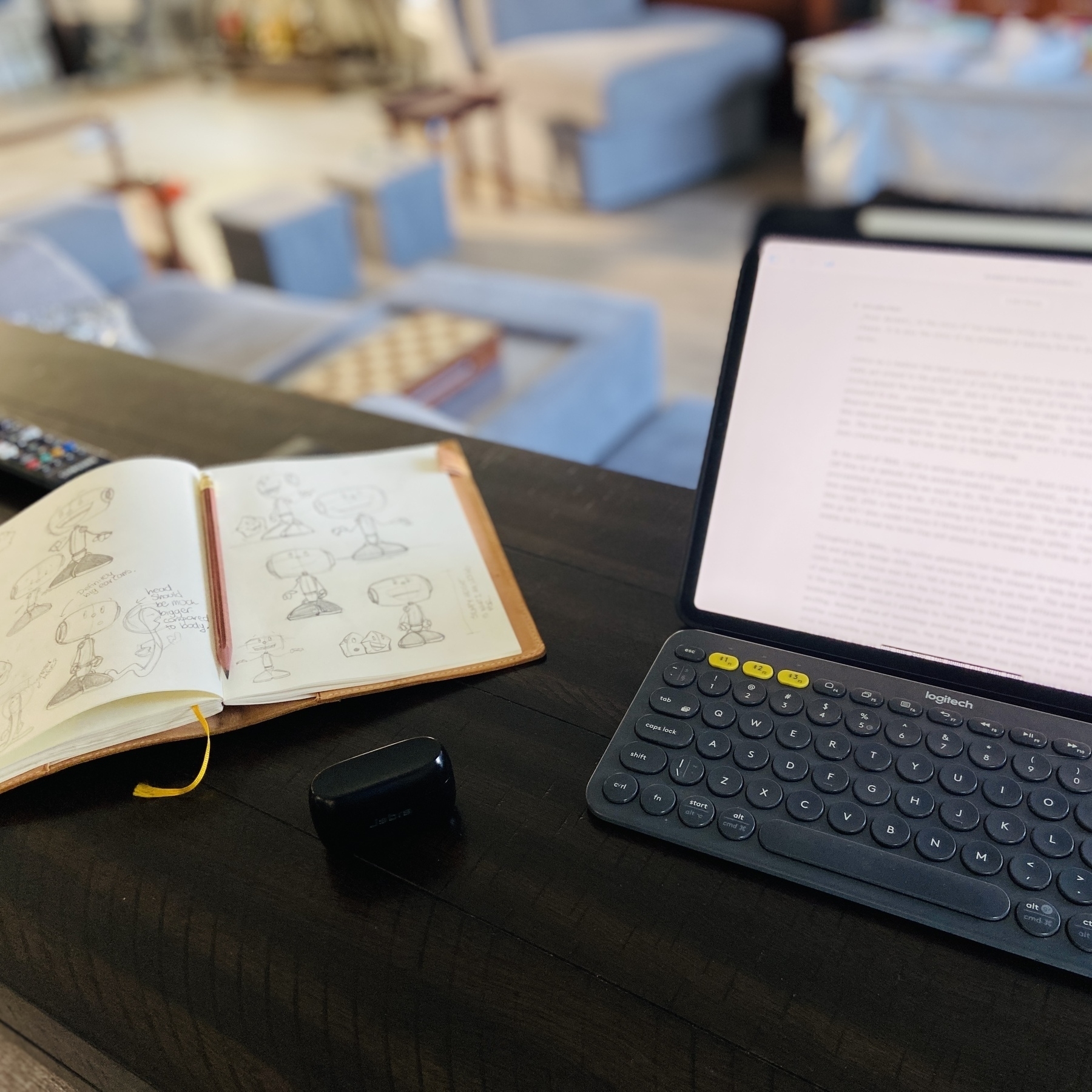
Editing mode.
Been practicing my chess using the wonderful Chessmate. It’s like the iA Writer of chess games.
It’s photos like this that make me lament not having a better camera on me. I am ‘due’ an upgrade this year as I’m on an iPhone 11.
But weirdly I don’t give a shit about the app ecosystem anymore. What I actually care about is whether I can get the best camera. Is that an iPhone Pro or is it a Sony something something…
Present from Peter and Carlos.
Two little dudes.
Basil grown by the kids. Oh yeah.
Hello old friend.
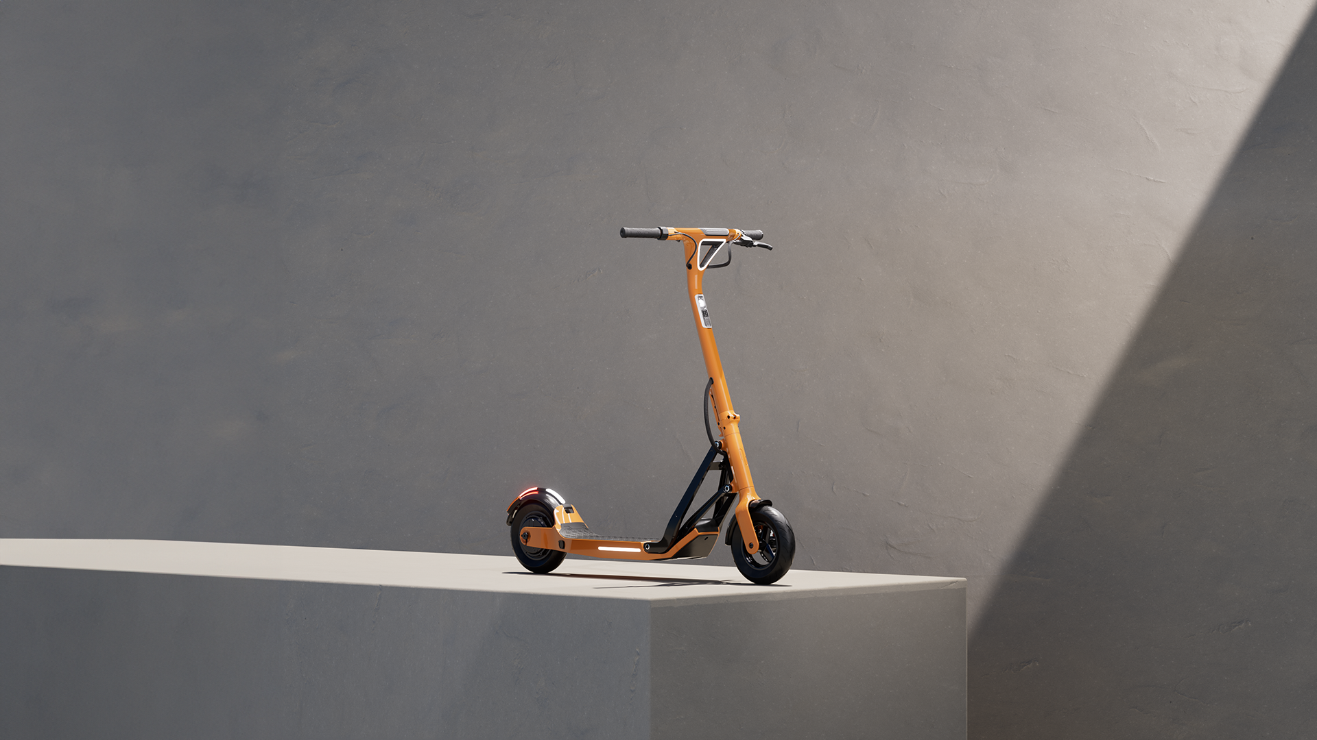
Mclaren are now into the scooter business? For $2000…steep for my liking, but it does look pretty good.
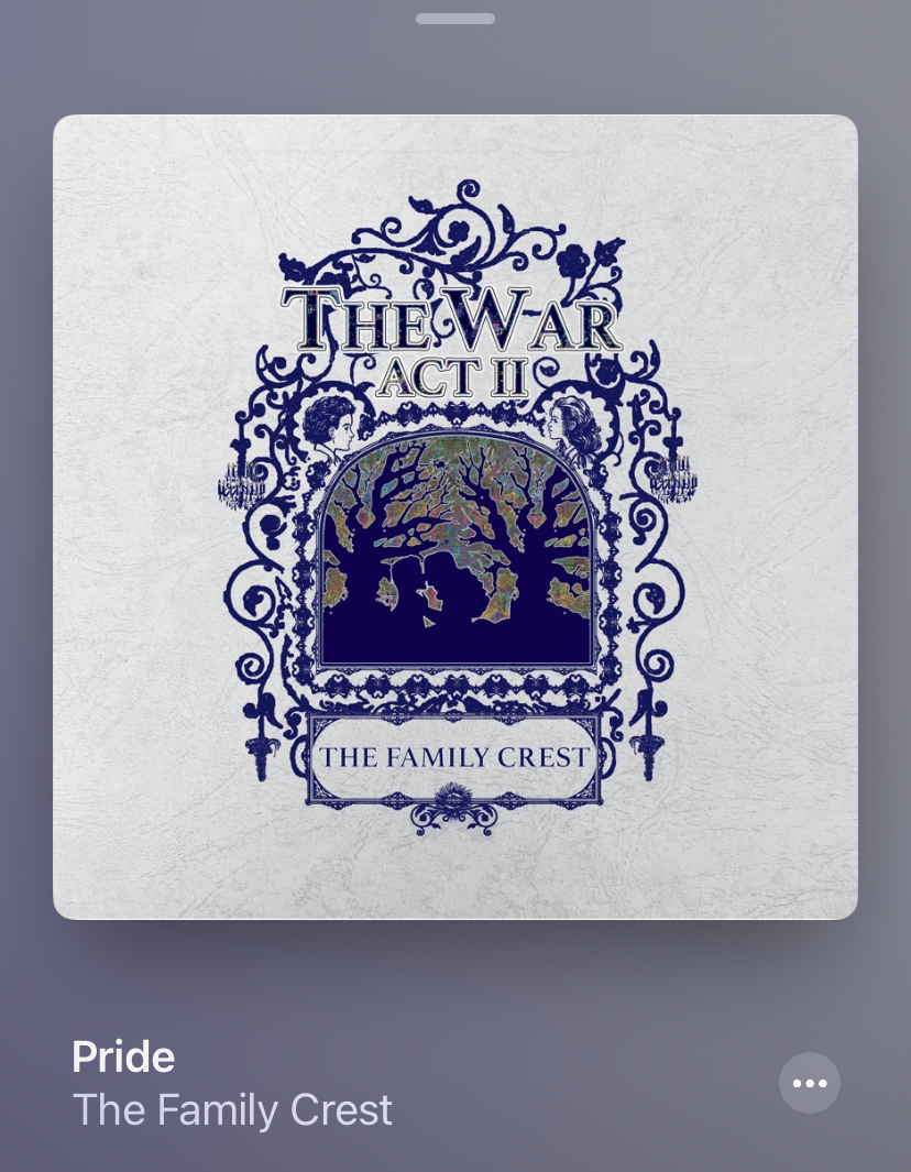
The Family Crest. My favourite ‘new’ band. A ‘new’ band being anything I discovered and loved post 1999.
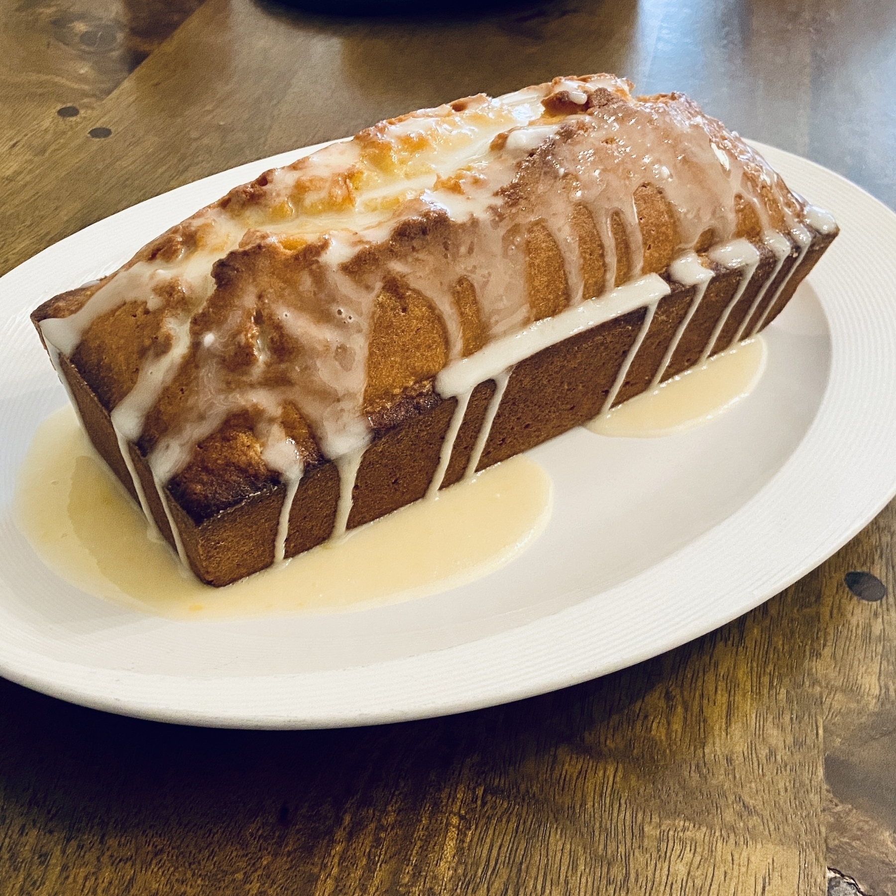
Too much juice in the glazing. Top tip next time is drizzle it in slowly.
Sunday evening Pimms. Can totally get used to that.
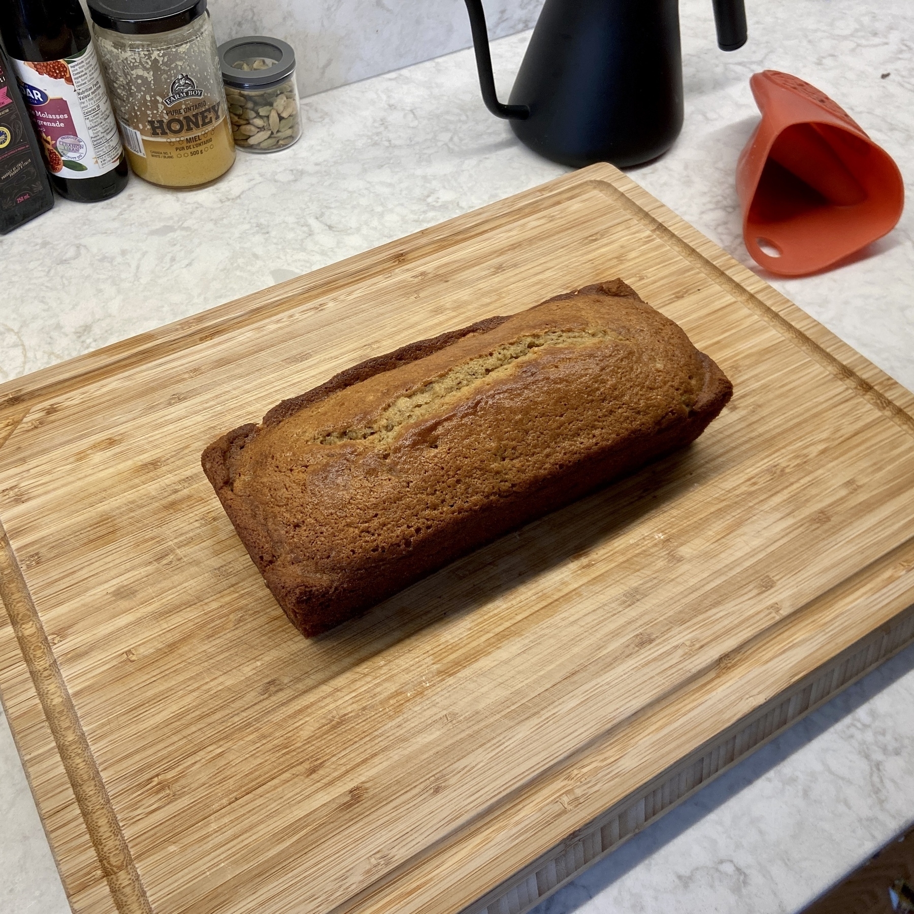
Father’s Day banana bread.
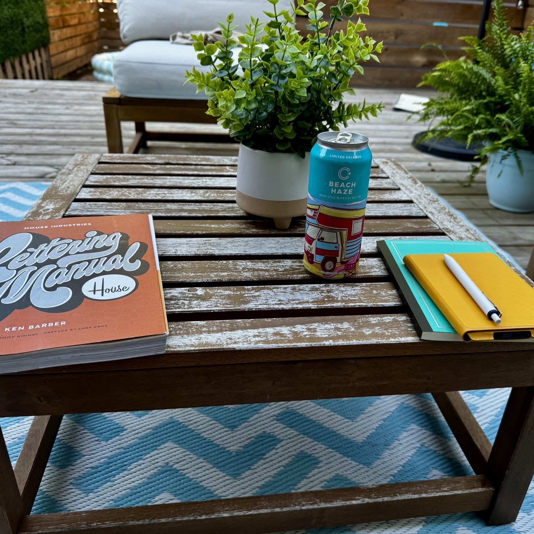
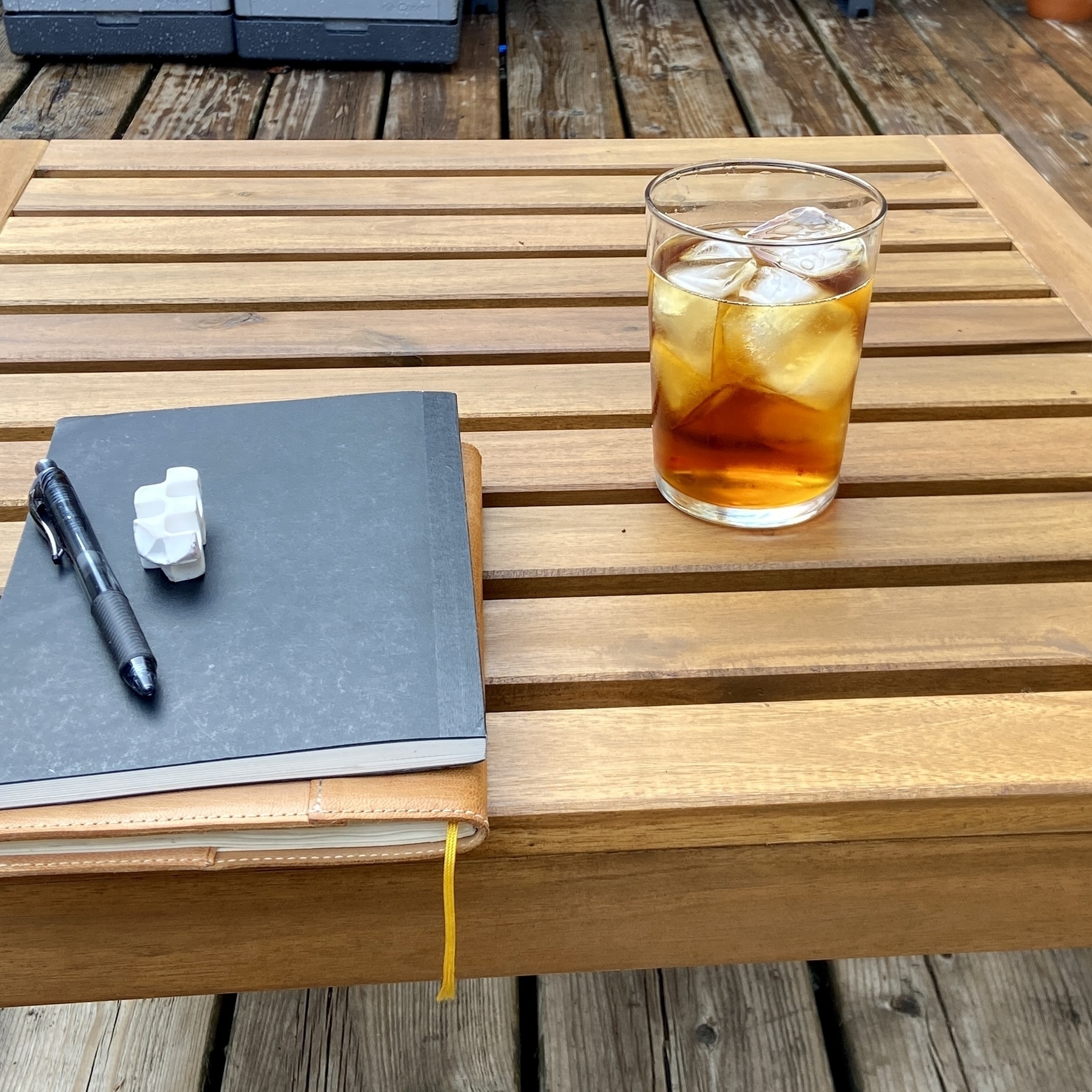
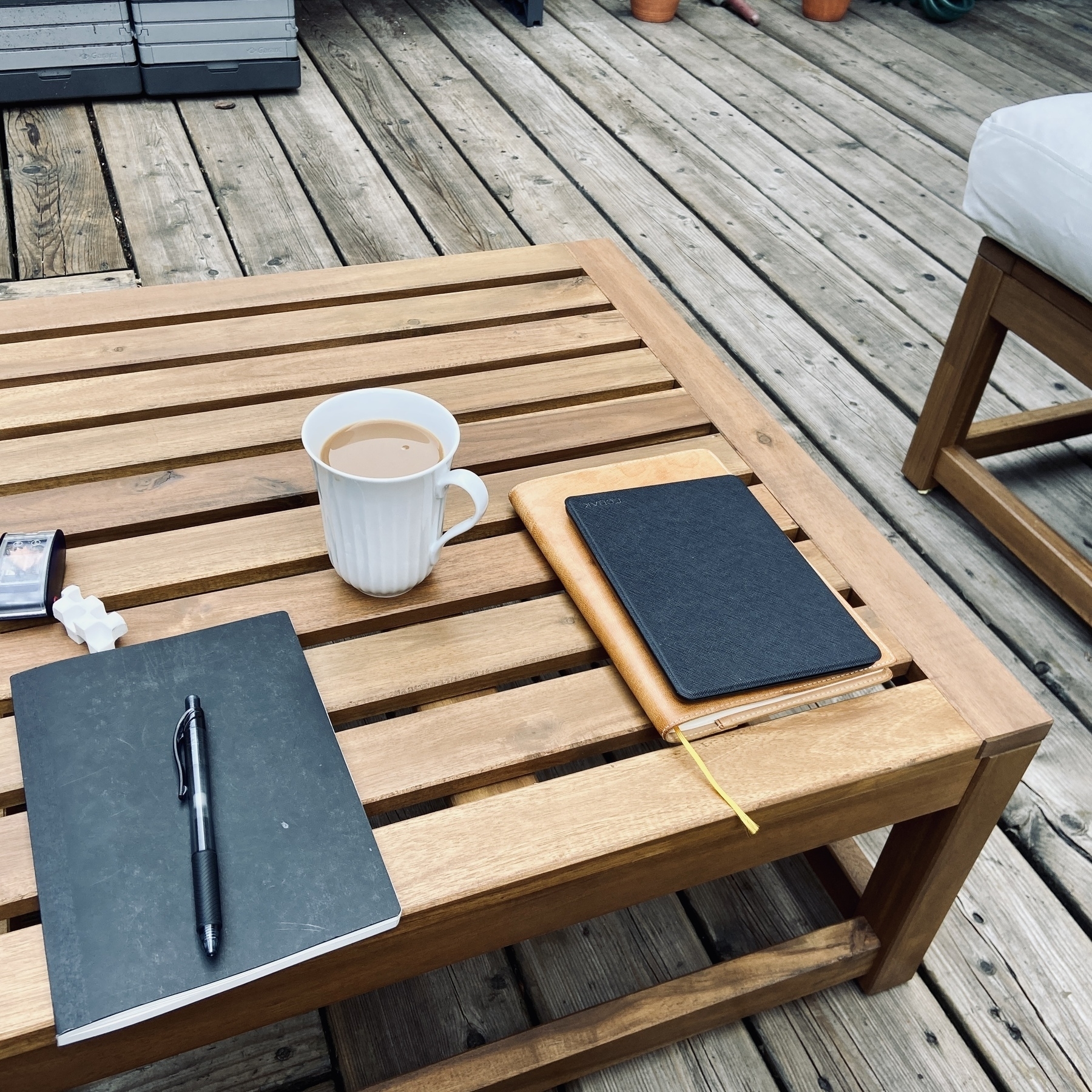
Patio coffee time.
The editing process begins.
Feeling inspired to revisit these characters. I’ve not drawn them in years.

I’ve always loved the sentiment.
Trying to explain the concept to the kids was fun.
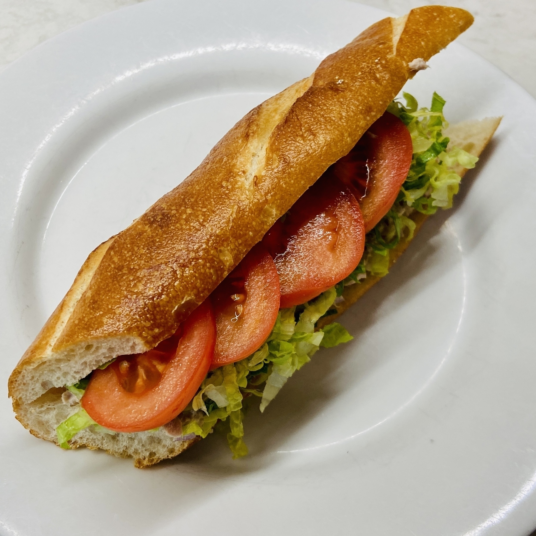
Tuna samich on a ridiculously fresh baguette.
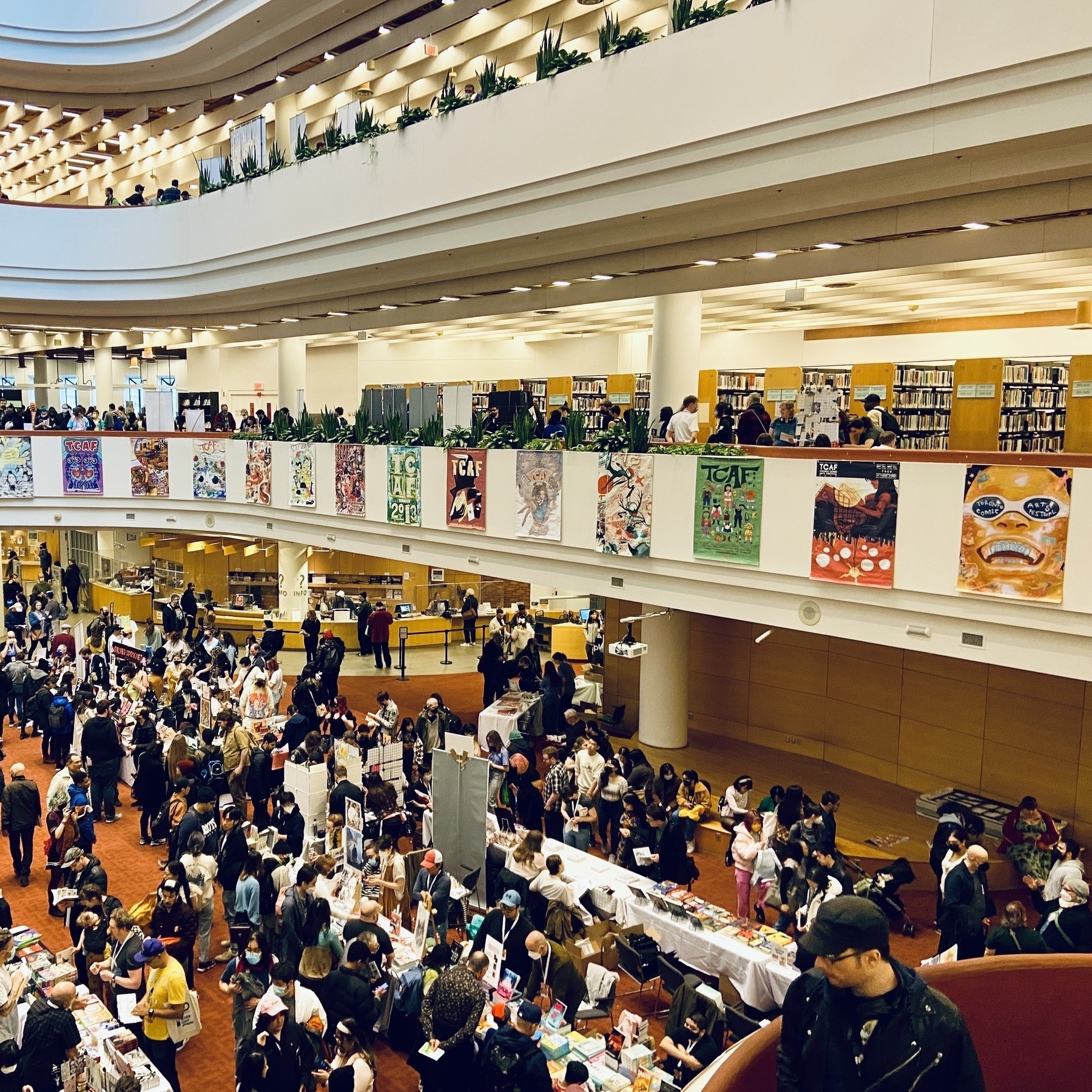
TCAF 2023. Soo packed. Can’t say it was an elegant experience (not that I was expecting one), but hoped for a little bit more…space. Having said that the Toronto Reference Library is a good venue, just too many people.

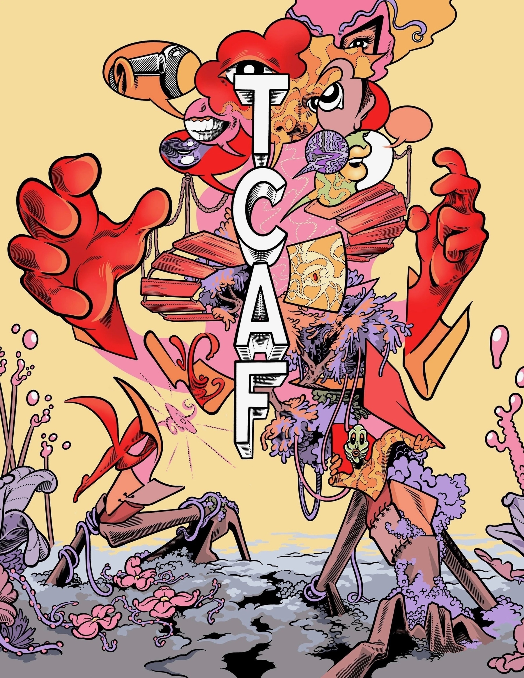
Really looking forward to my first TCAF this weekend.
Cluny at the Distillery District. Wonderful ambiance. Food was decidedly meh. Post pandemic I am increasingly more critical about restaurant food.
First signs.
🍕 Pizza night tonight. Nailed it!
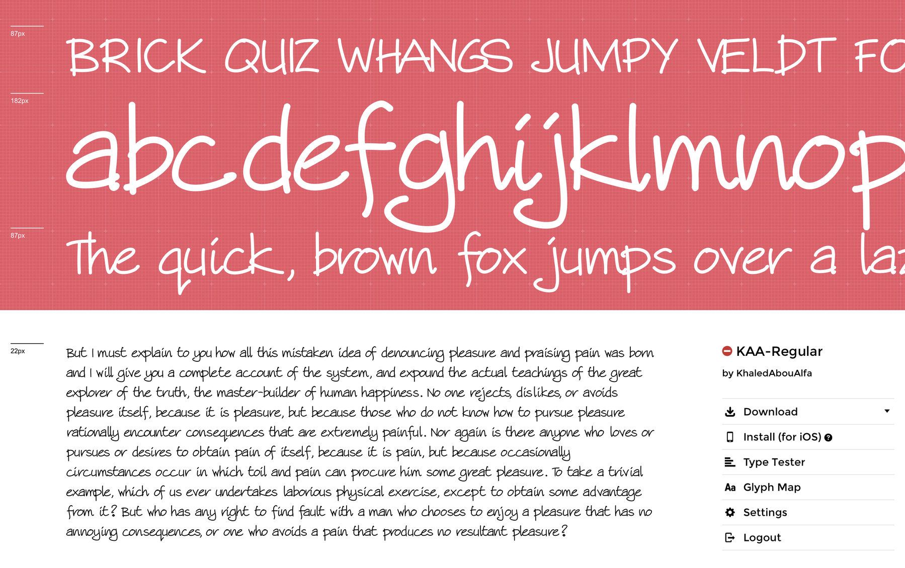
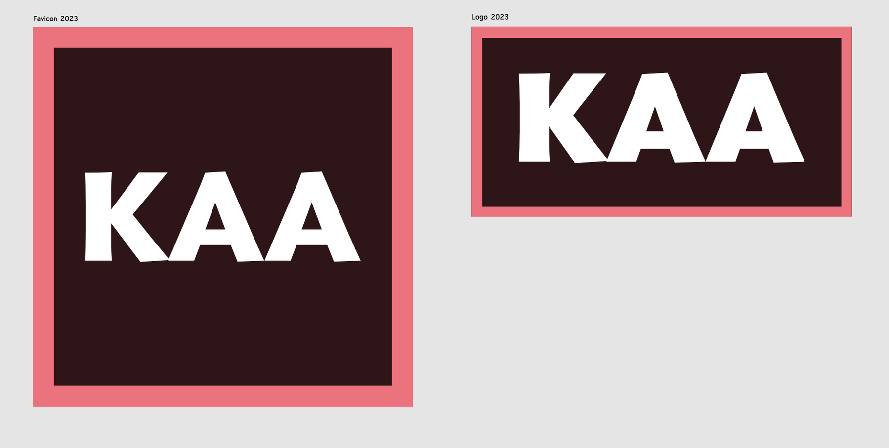
Totally inspired by Mendo’s post, finished off the KAA typeface and did a little comic about it.
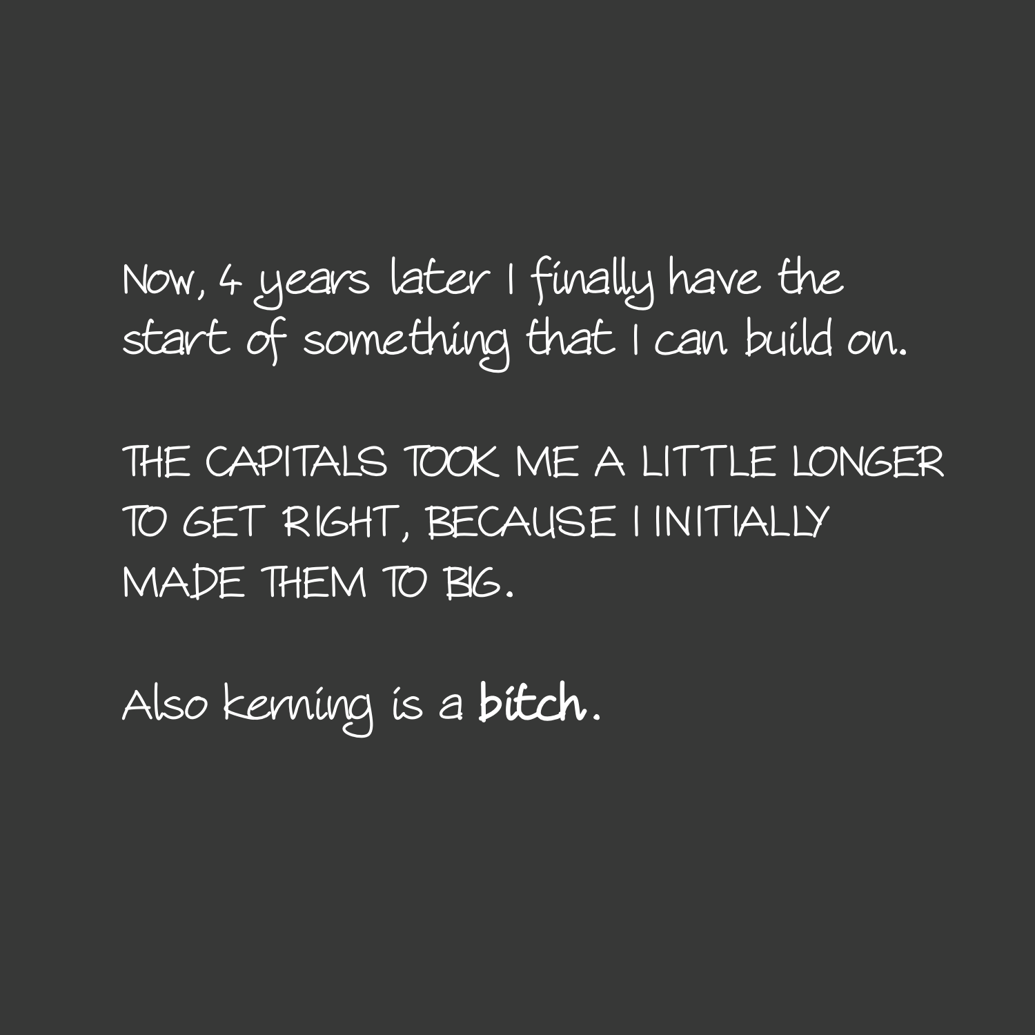
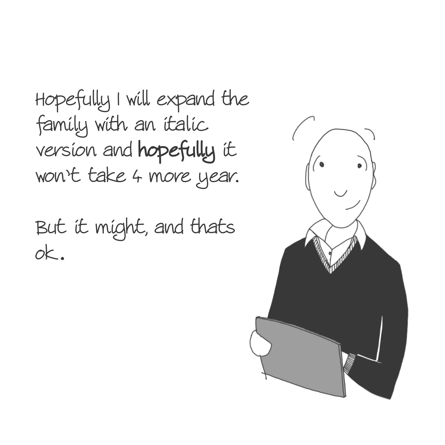
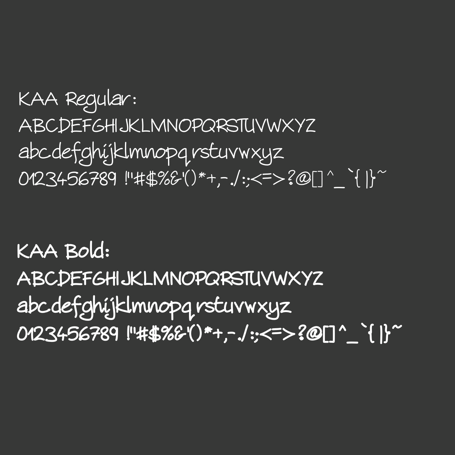
Its taken a really long time but very nearly there with KAA-regular (and KAA-bold).
Bye bye Florida.
An advise / idea for comic artists: make your handwriting and font.
I created my own font family based in my handwriting, with the invaluable help of Type-ø-tones heroes Laura Meseguer and Josema Urós. Some of you had already spotted the typeface use in my comics and asked, so here’s your answer.
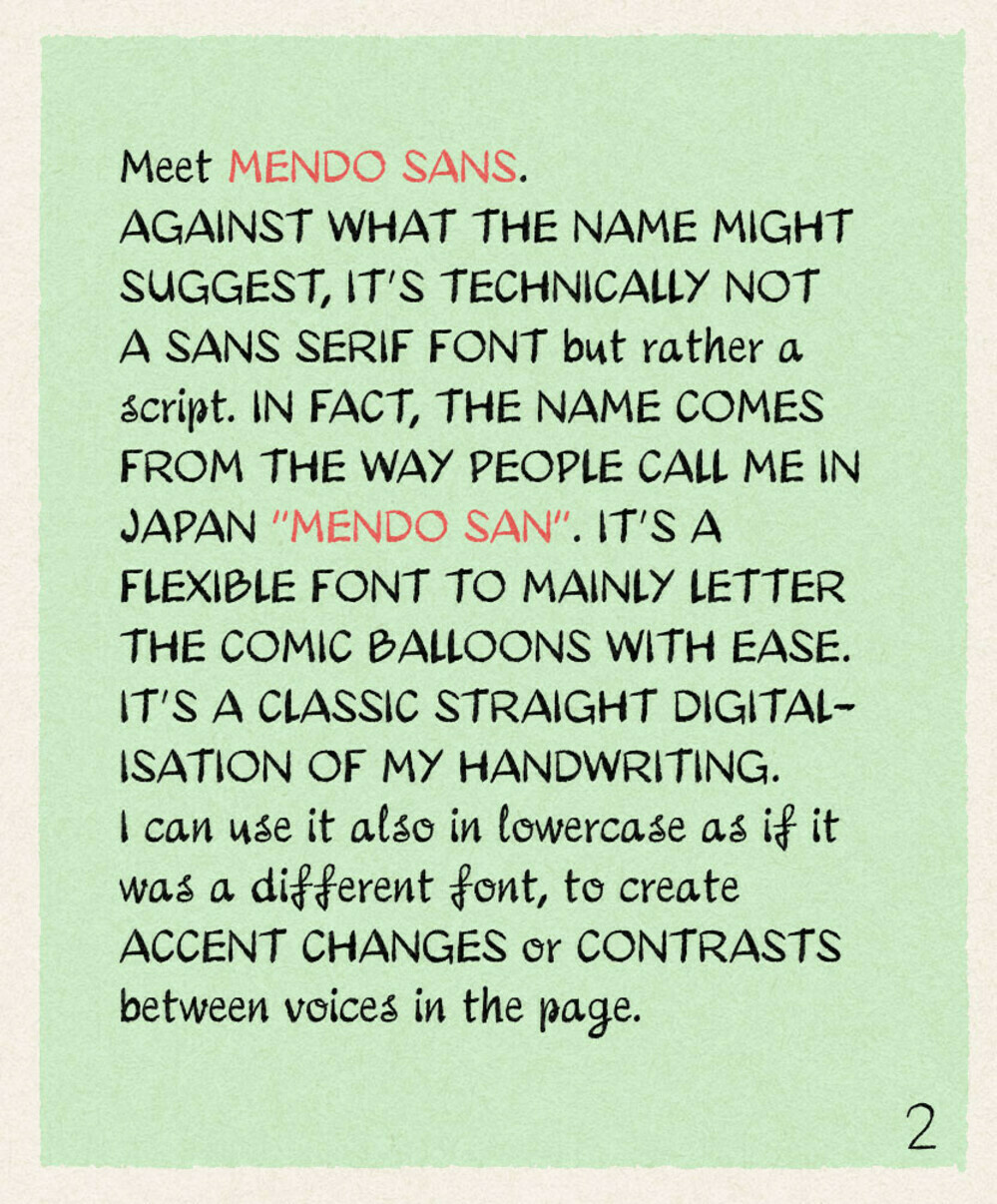
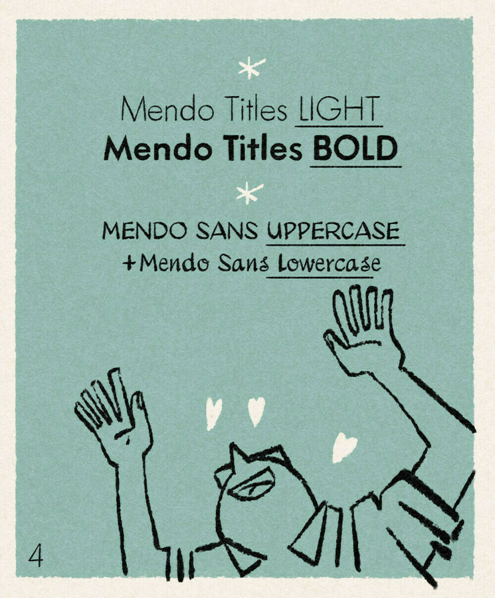
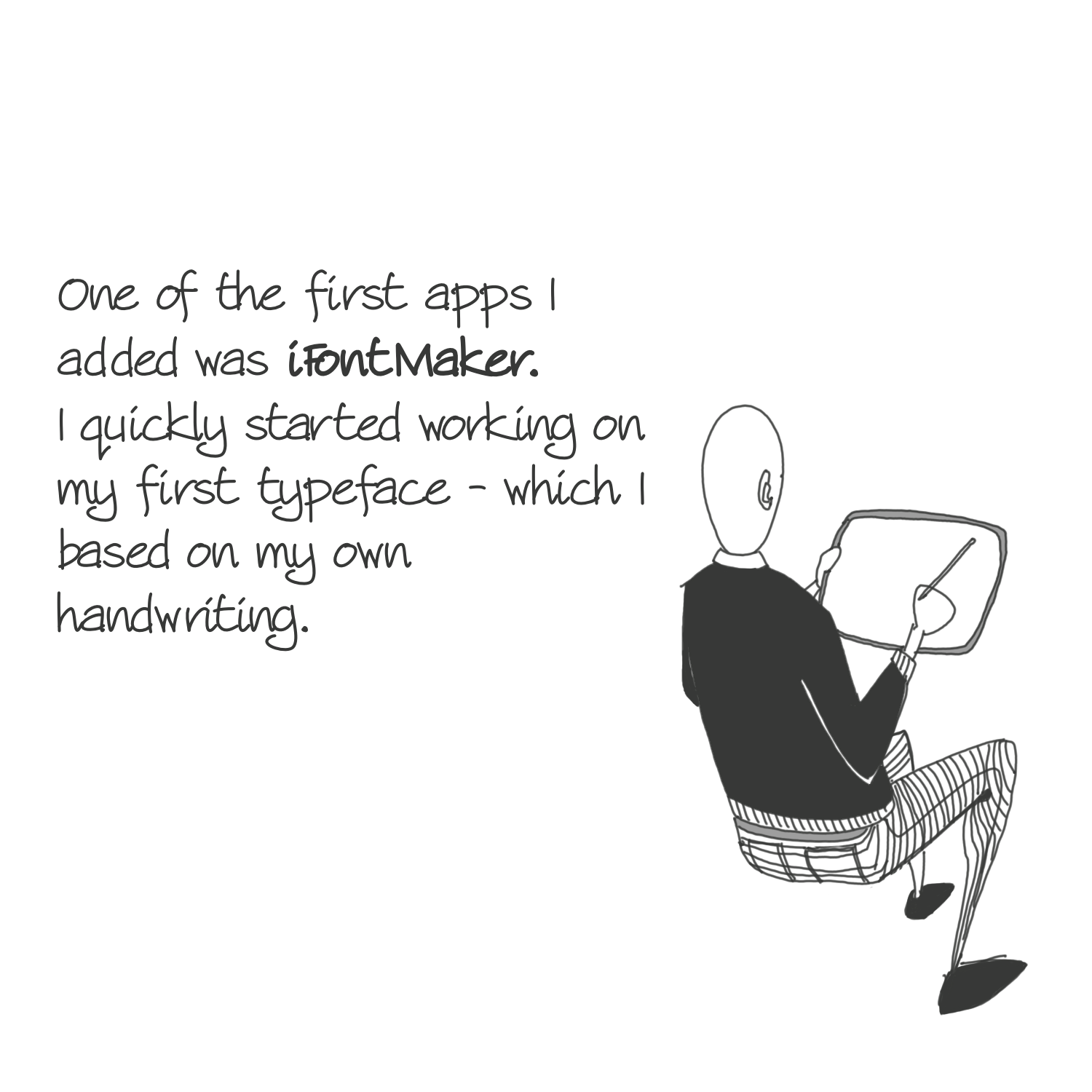
Wonderful post and idea. I would also add that you can do this yourself (I’m using ifontmaker on the iPad) but it takes time.
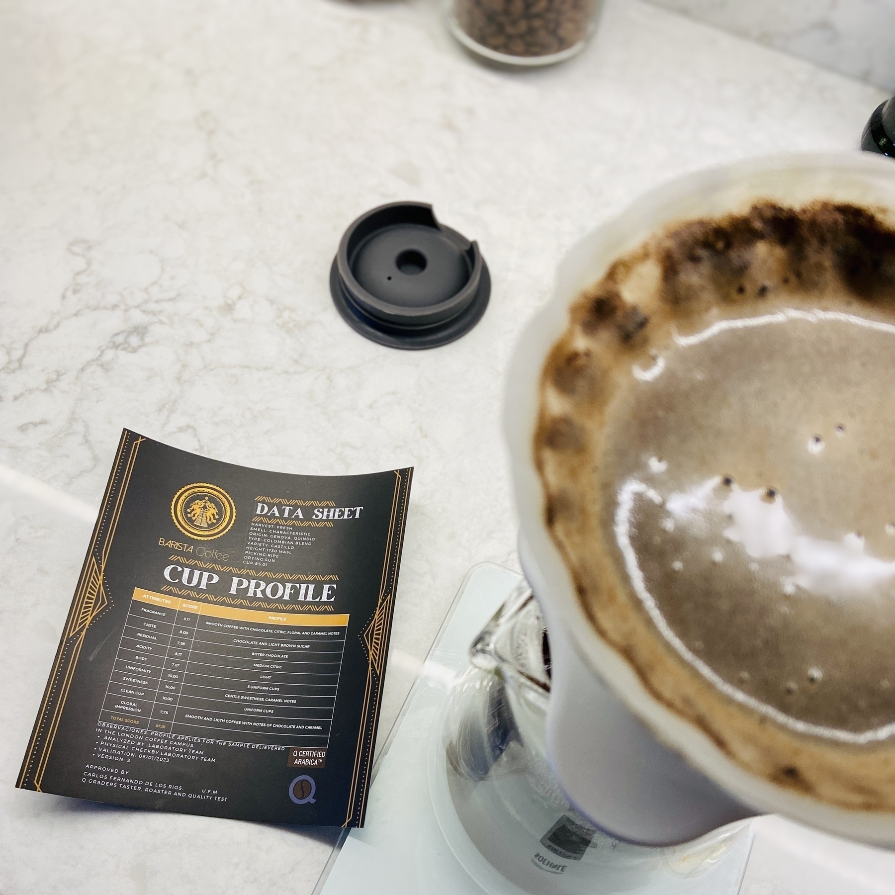
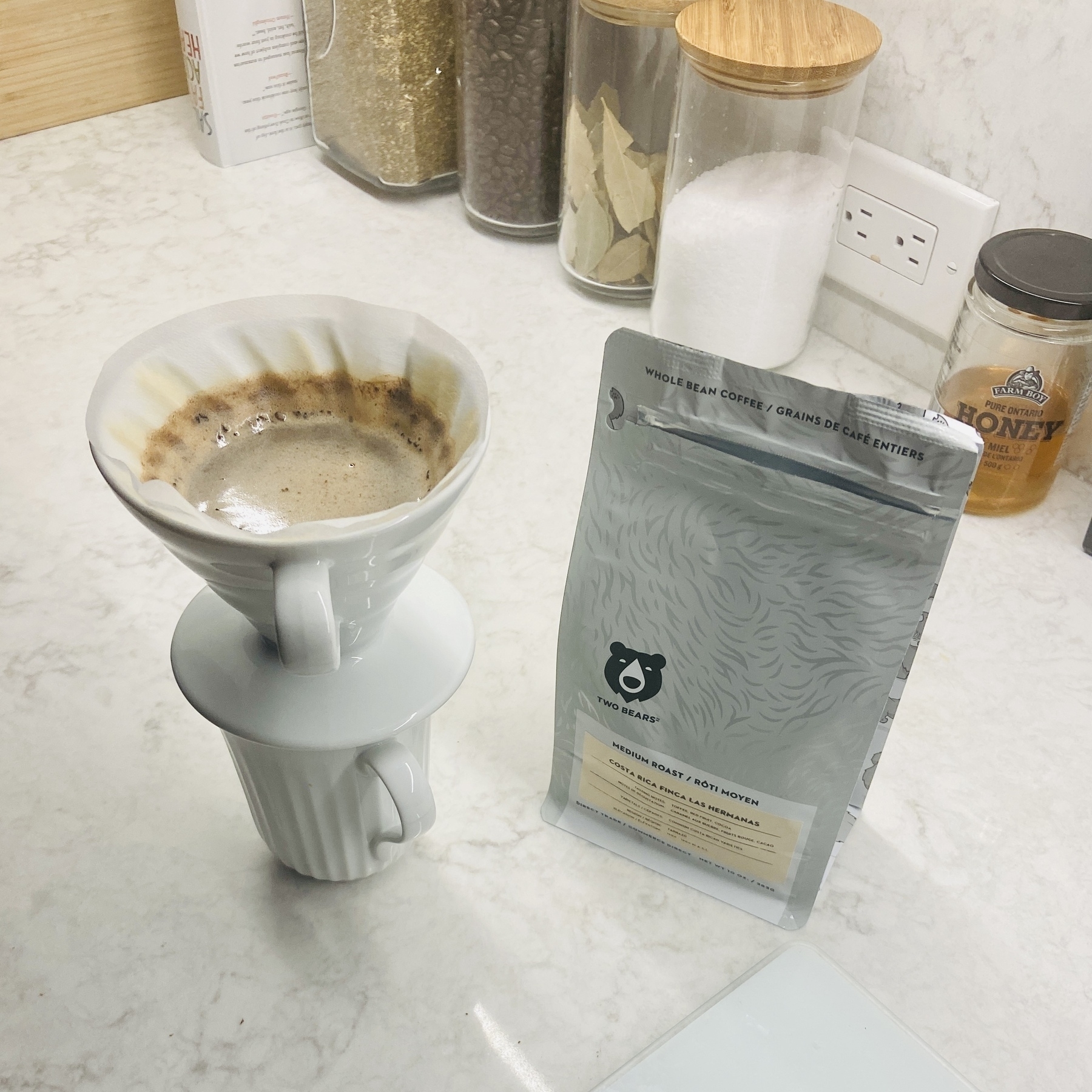
Something is very, very different with these beans. Good times ahead.
Working on something…
By far one of the most awesome displays at the match was the black and white flags from the Newcastle United fans.
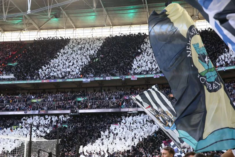
The kids absolutely loved it. Zane as the mega fan was soo happy.
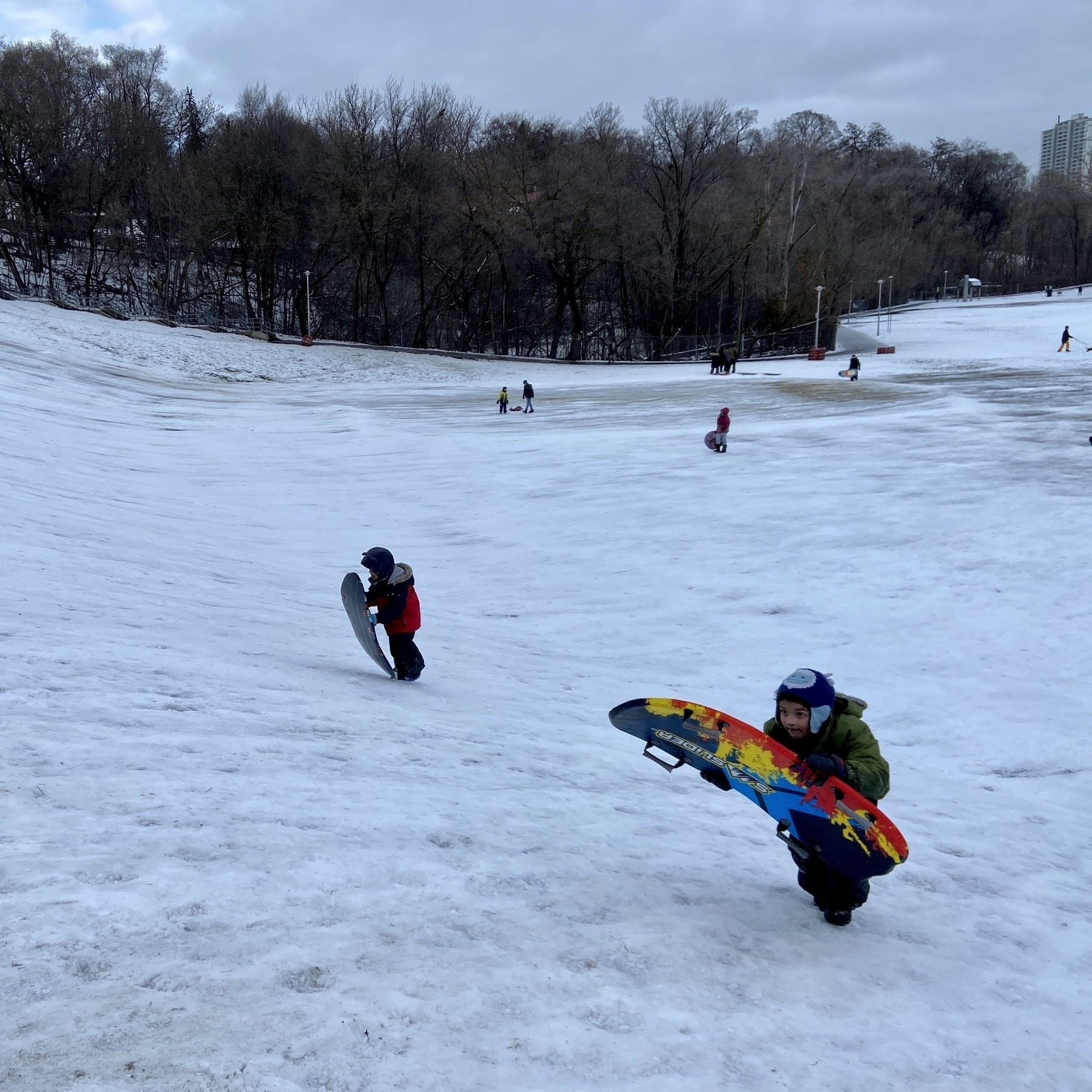
Kids going tobogganing for the first time.
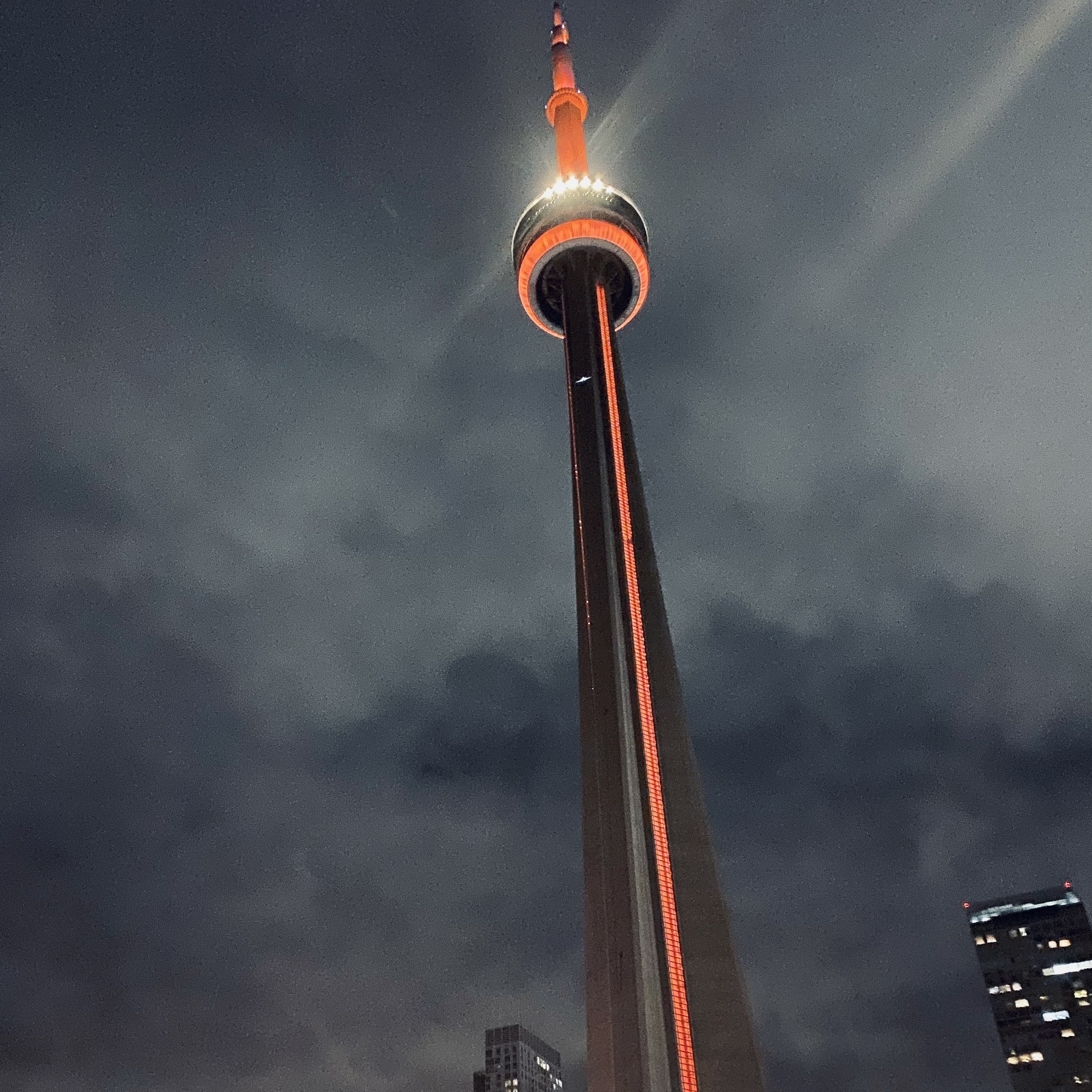
Toronto by night.
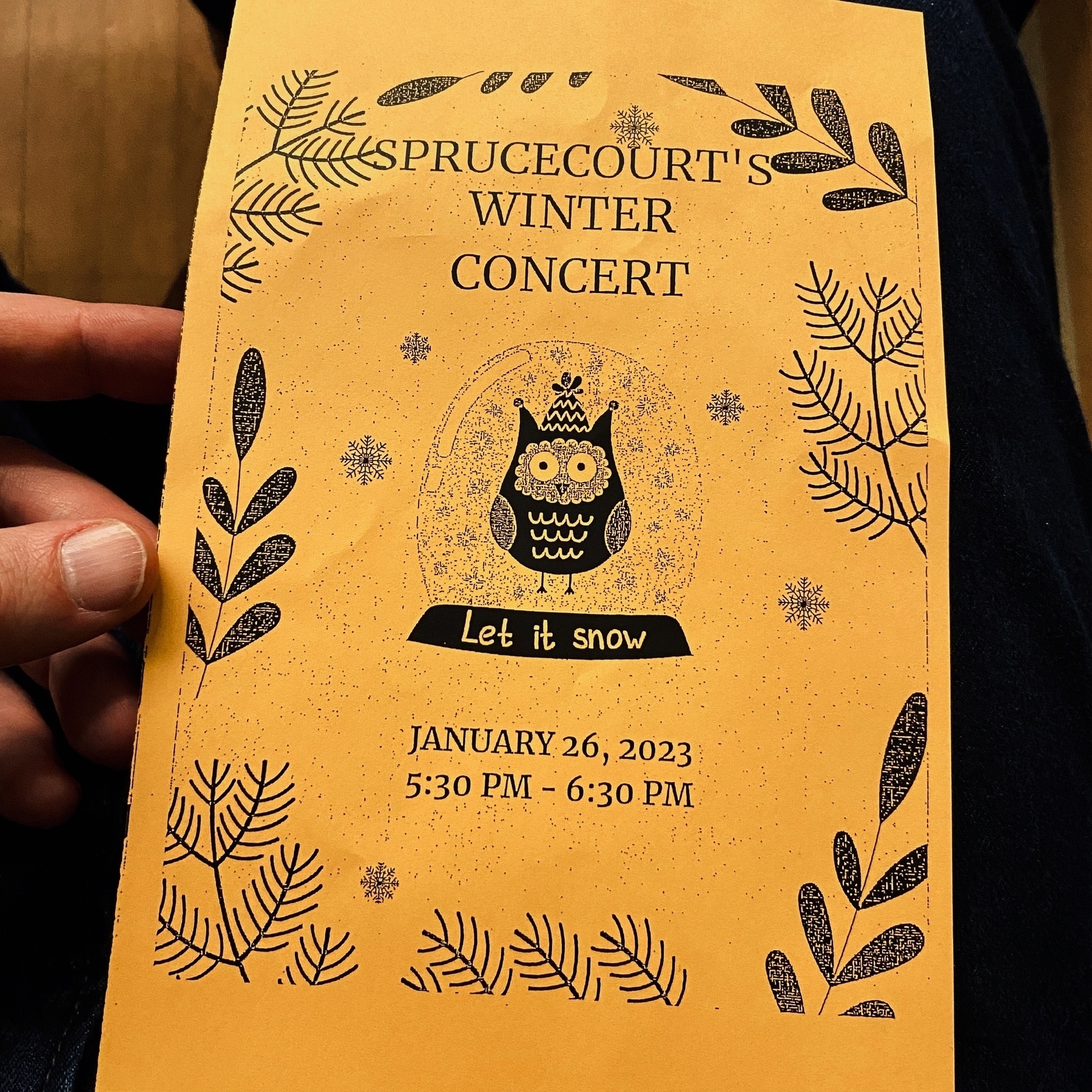
The boys had their first concert.
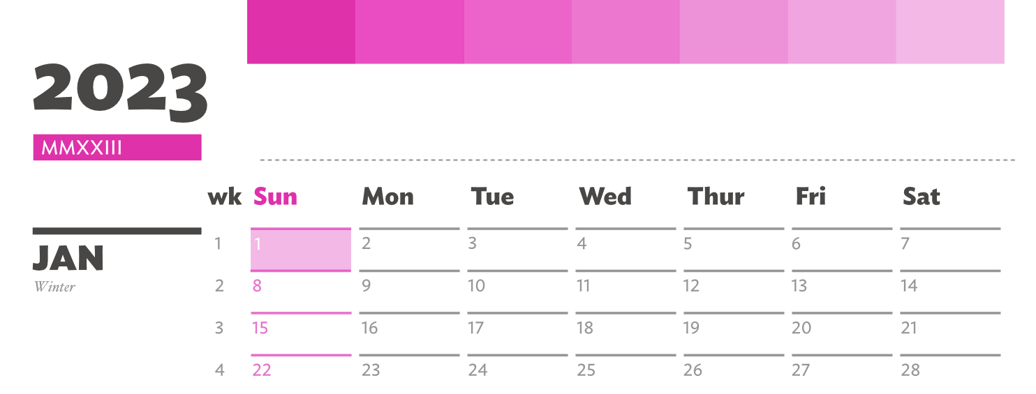
Actions Calendar 2023

This one is a little late but there is a story there.
I knew I needed to have something ready to go for this year. A way to track my No-S Diet and also how often I worked on all things Stet.Build. The aim being to rebuild habits that I developed several years ago and that have no fallen away from me because relocating your life to a whole new country is major disruption.
I did most of the design work, but then lost steam when I bought a bunch of calendars from Muji. My thought process was that I won’t need this particular calendar anymore. The Muji ones were more than enough. And yet I found out that they were not enough. They allow me to see the month, but this Actions Calendar gives me so much more information and appreciation of my goals across 12 months.
Available in 2 printer friendly configurations. The Letter edition (for all the North Americans) and the A4 edition (for the rest of the world?). I’ve included a small ‘manual’ in there to describe the design decisions behind the calendar.
I’m also using Gumroad to distribute all things digital come from the site.
So I ended up buying Toot! This little detail highlighting interactions is wonderful. If you replied and if you got replies. I honestly can’t wait to see what the developer community creates in the social space over the coming years.
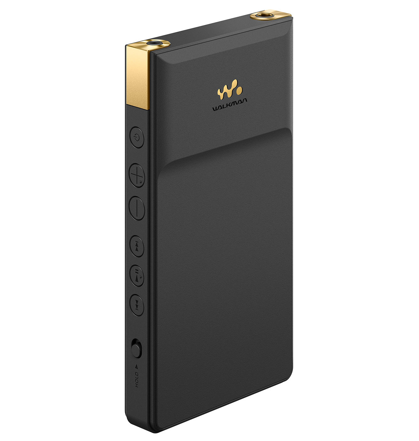
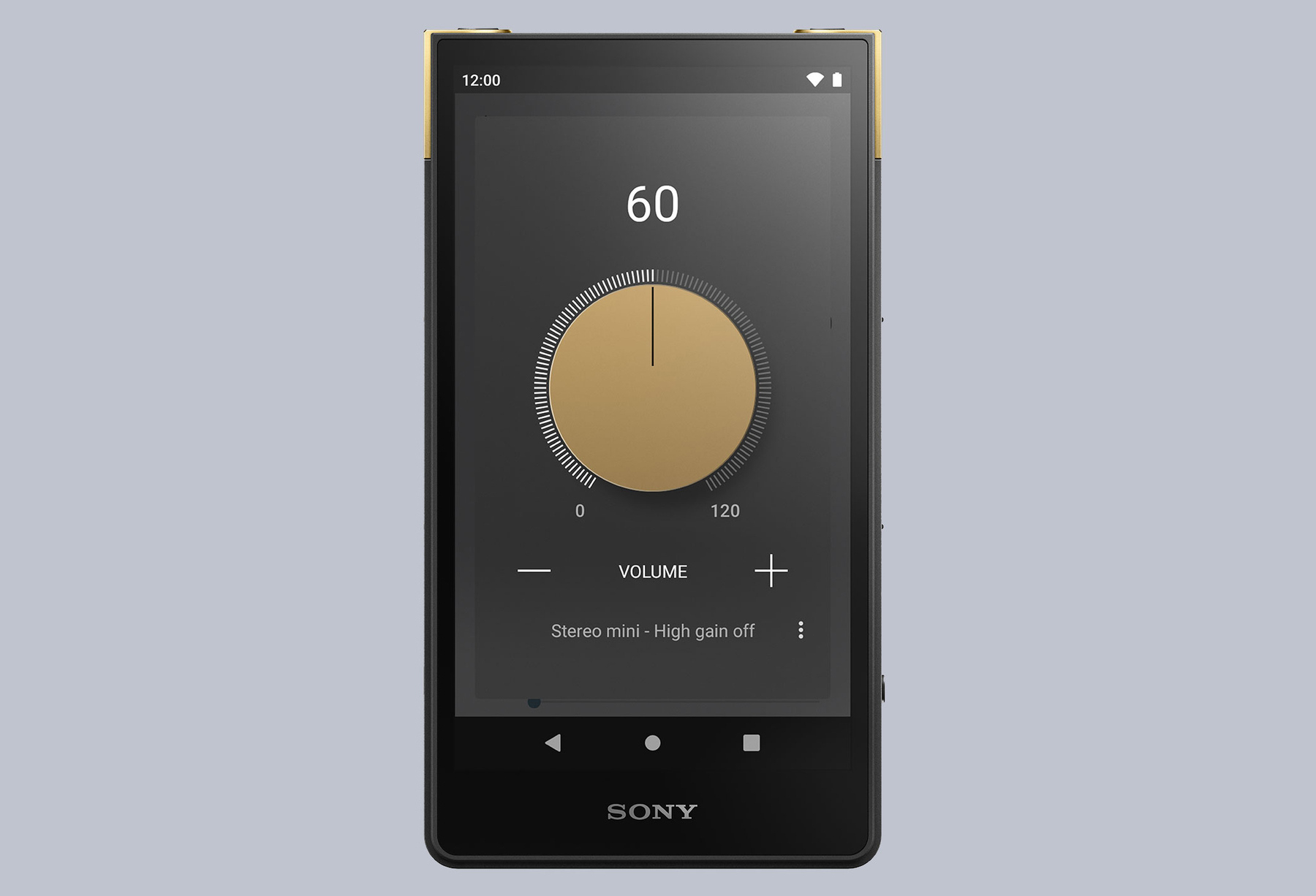
The new Sony Walkman music player looks amazing. Digital music has somewhat ruined my appreciation of albums. Maybe a dedicated player would help me on the road to recovery - music was always such a big part of my life, much less so for the last decade.
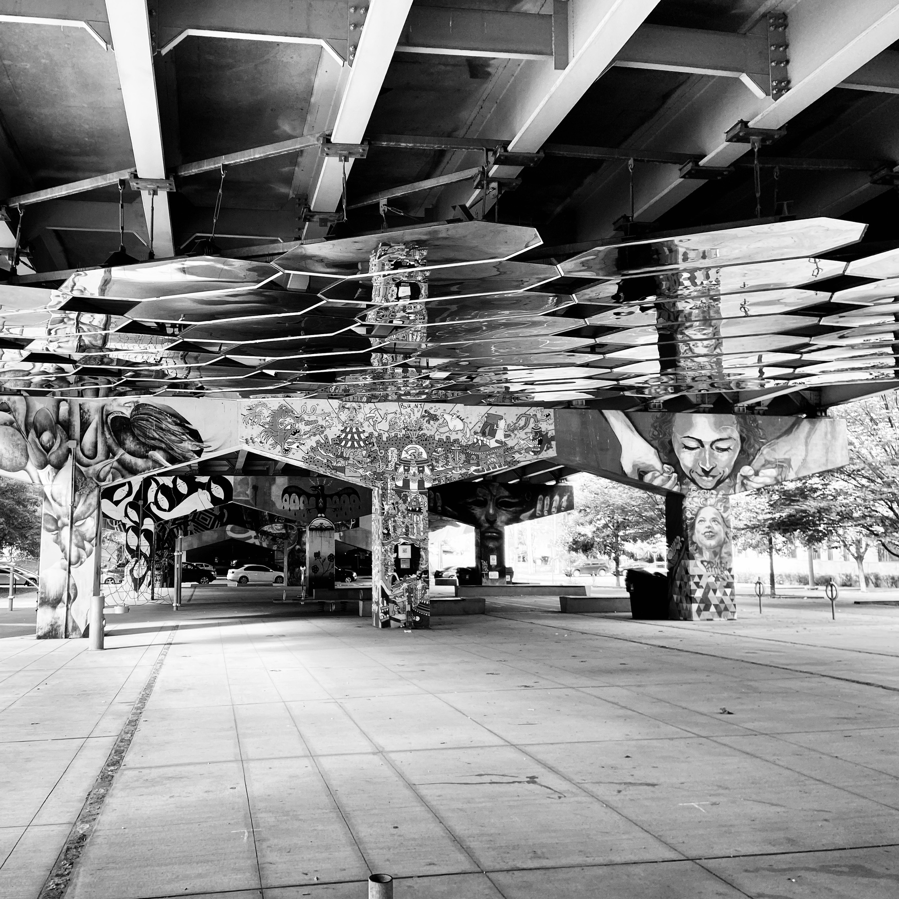
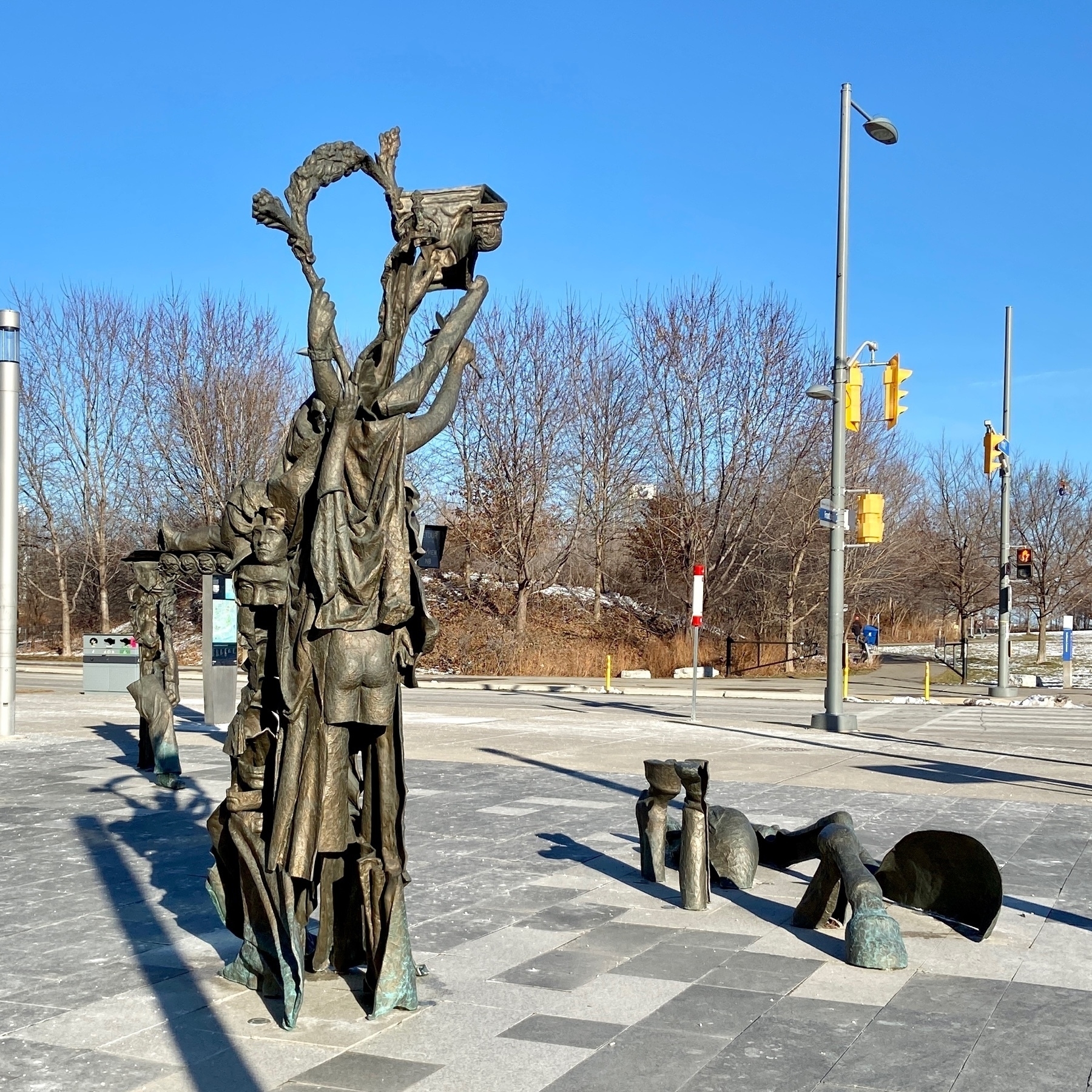
Some weird-ass sculptures here in Toronto. Ah-thank-you. I’m here all week.
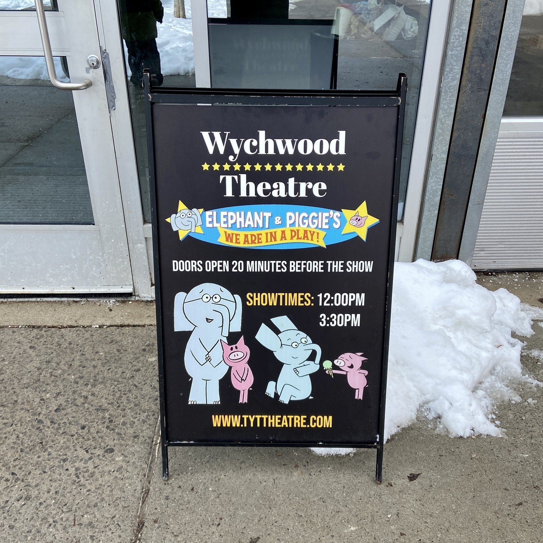
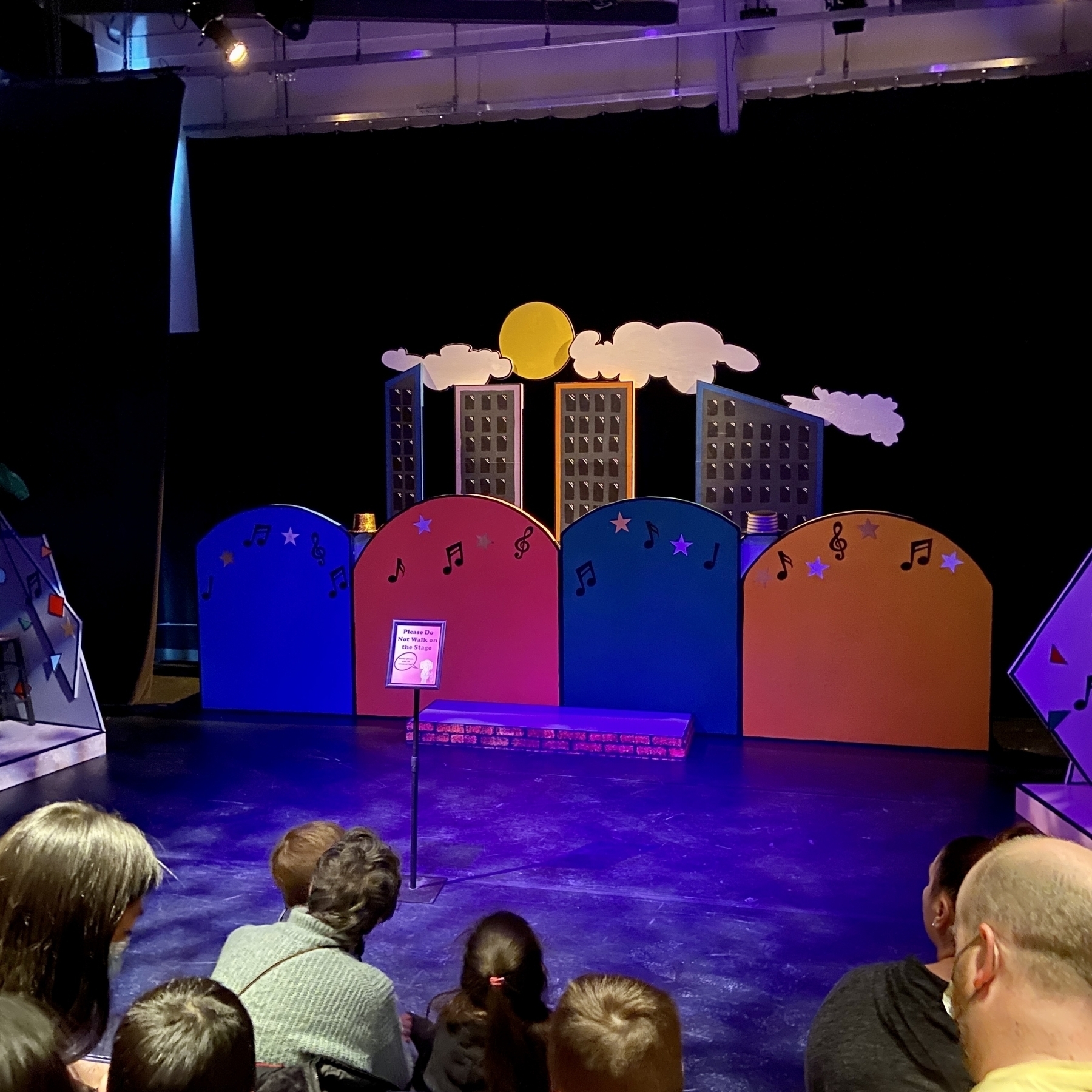
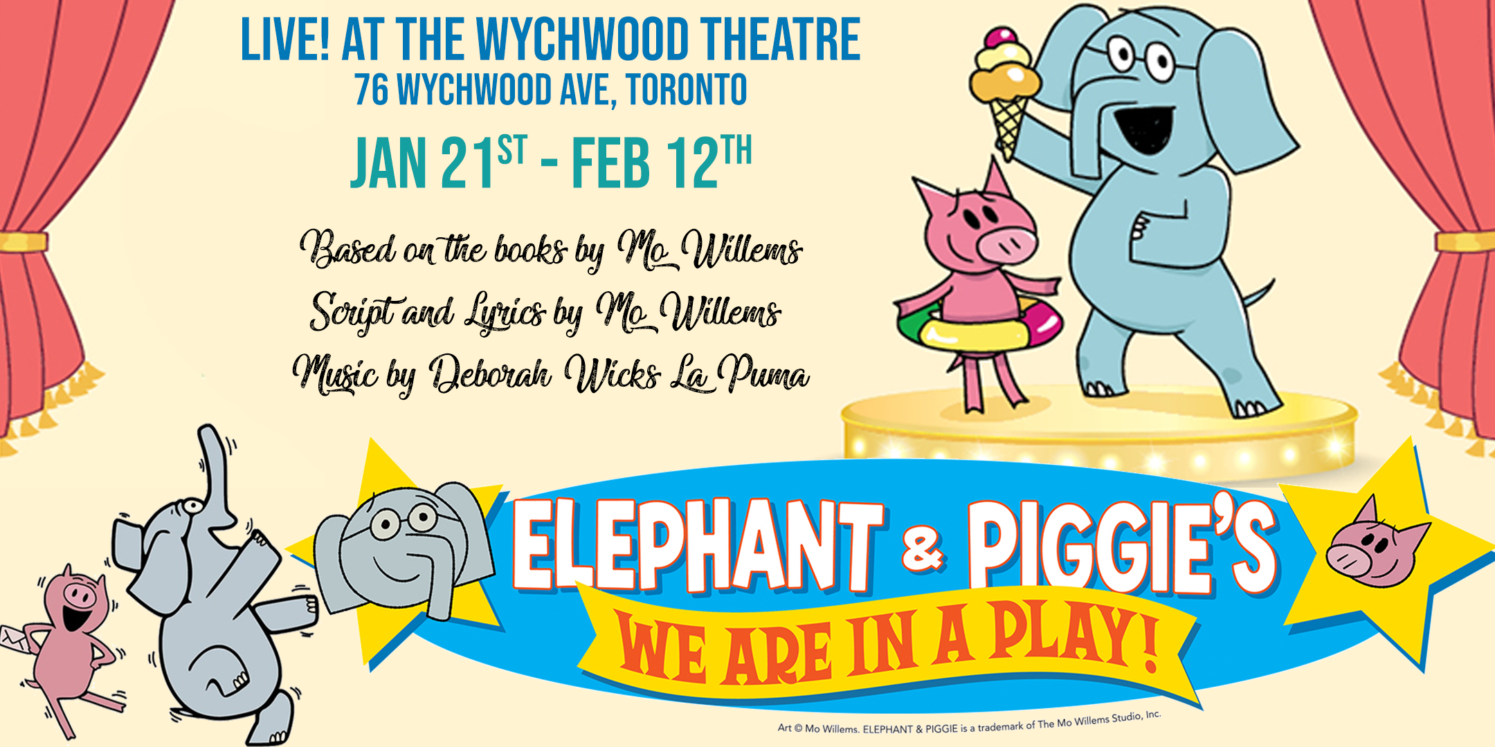
It’s been soo damn long that something in the theatre space has gotten through to me, but this Elephant and Piggie play is right up my alley. The Mo Willems books have been a revalation. Zane does the reading, with Ryan following intently along. And they both can’t stop laughing.
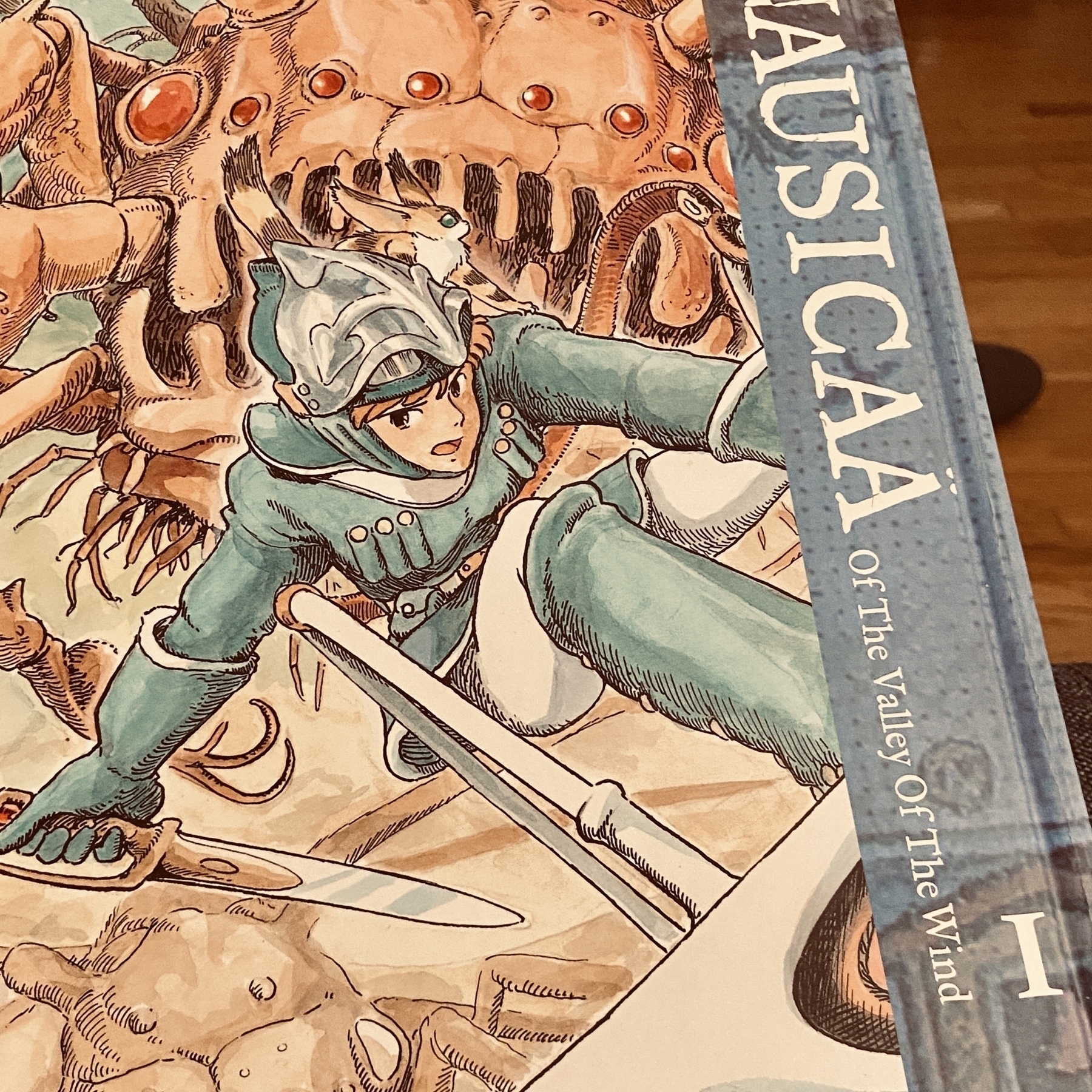
About to embark on some classic Miyazaki.
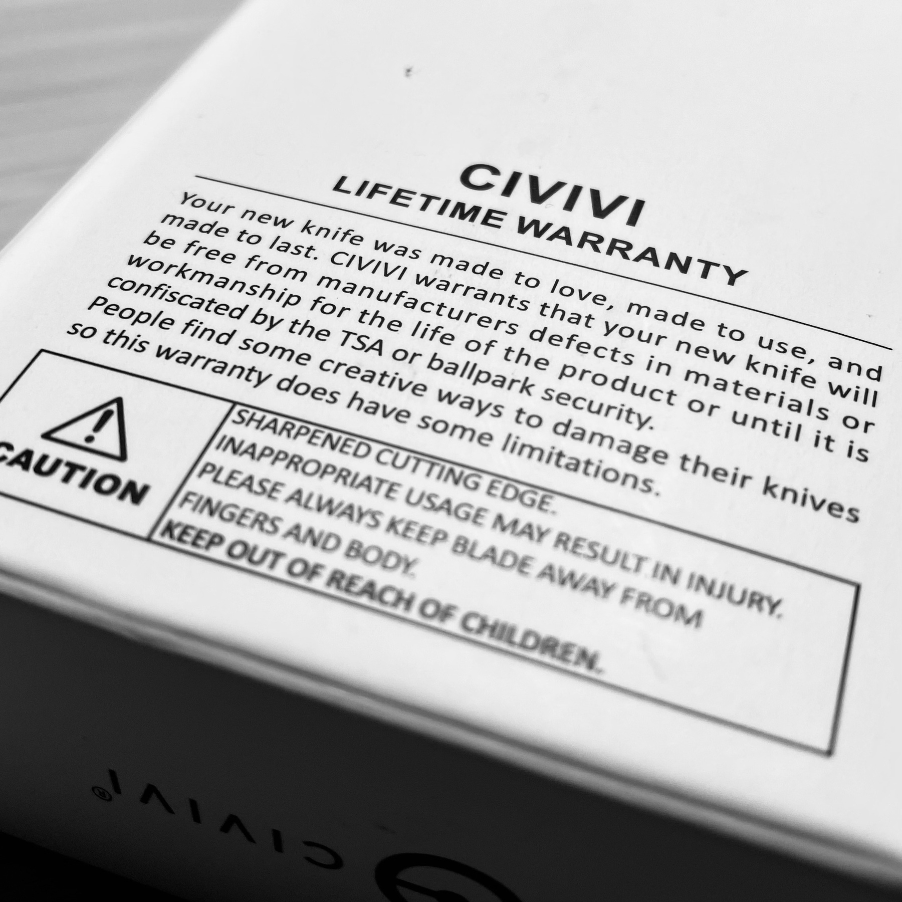
Love the humour in the Civivi lifetime warranty.
🎄End of the day detox.
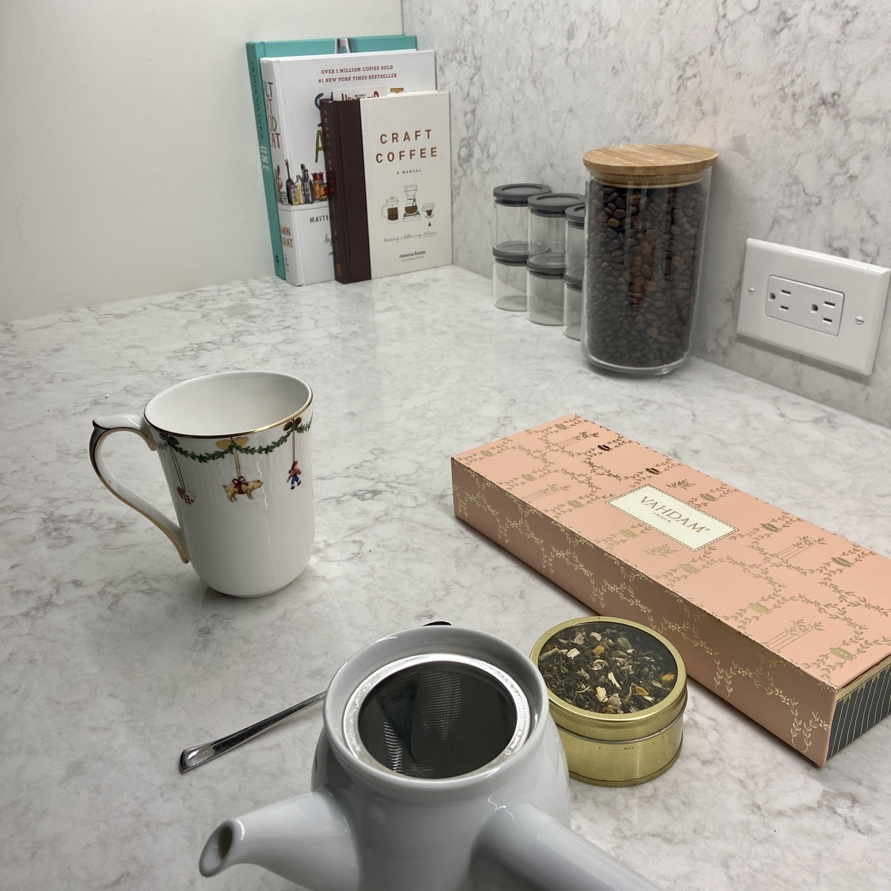
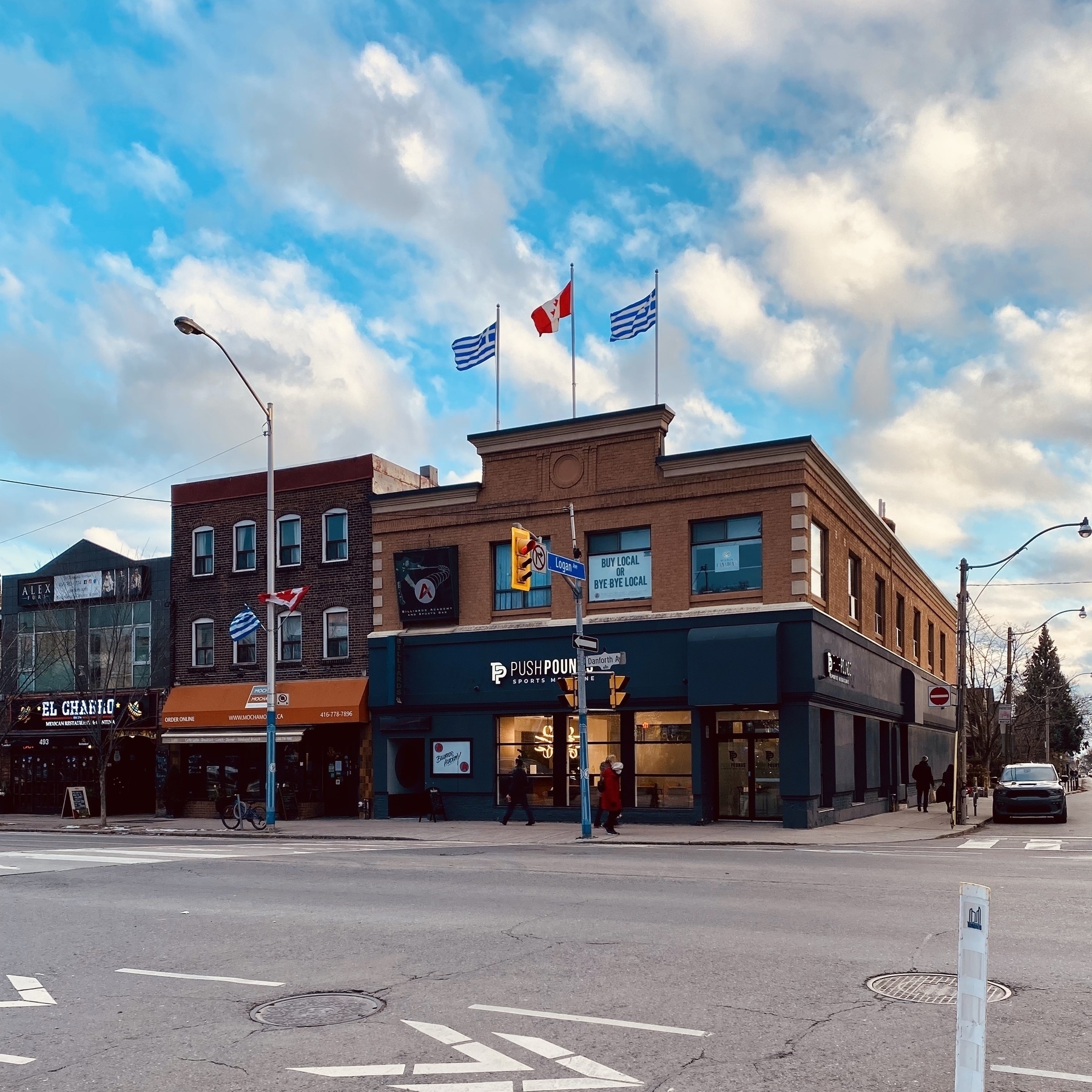
Greektown.
First update to the monogram in 5 years.
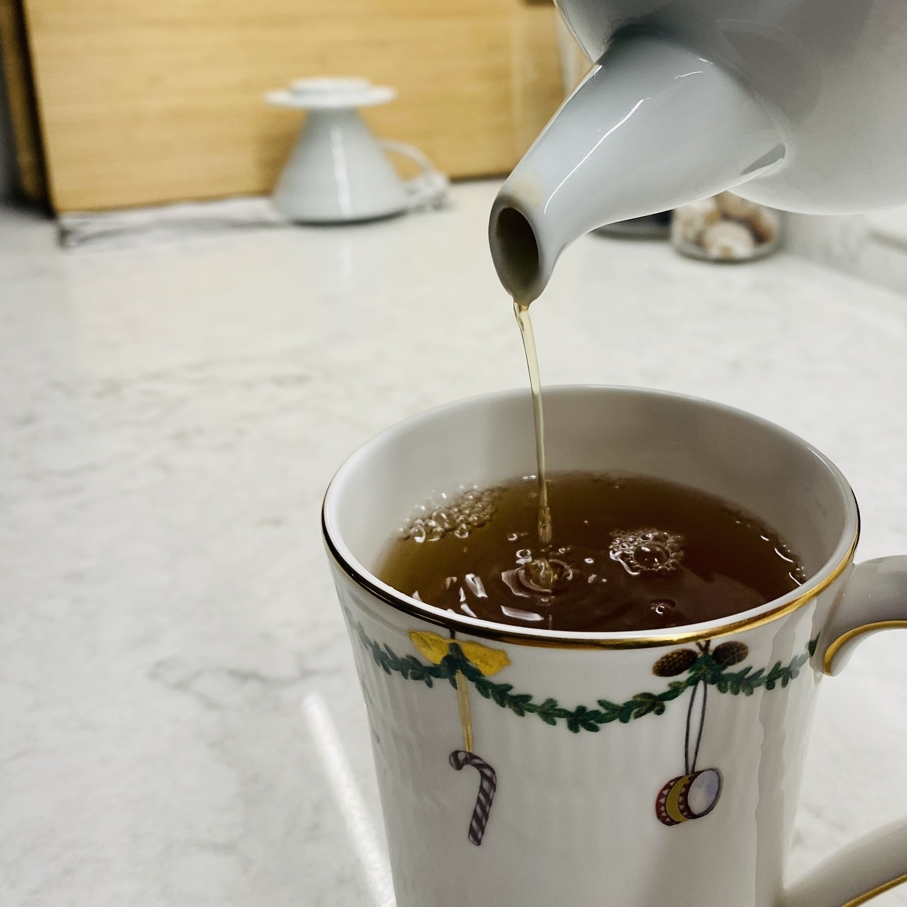
Christmas mug is out.
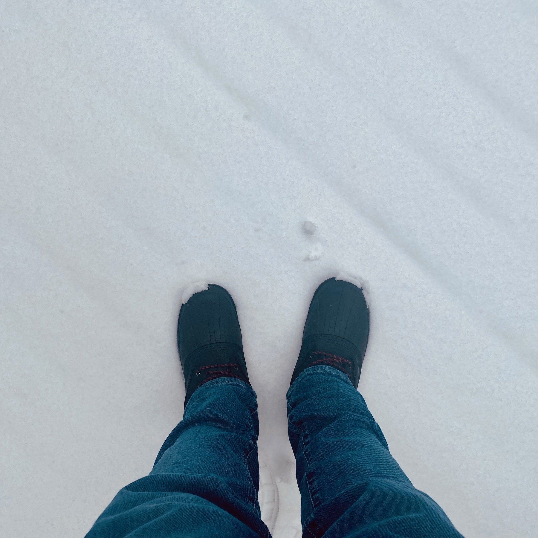
First time out with the winter boots. Novelty I’m sure will wear off, but there is something serene walking around on fresh snow. Love the quiet crunch.
Its coming back after a 4 year hiatus.
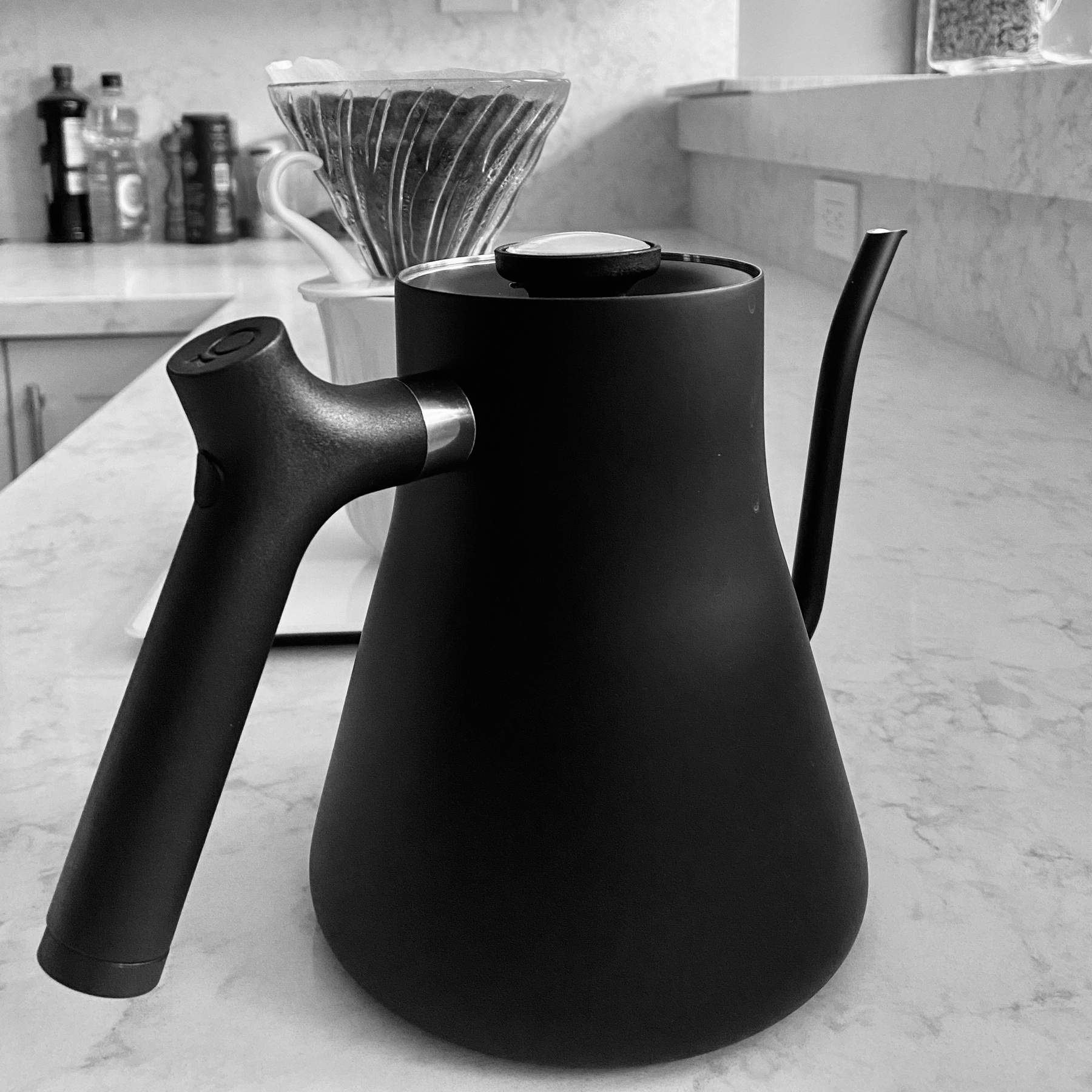
I totally procrastinated about getting a gooseneck kettle. Big mistake. Along with the scales an essential tool in your coffee making arsenal.