Branch and Medium
Branch and Medium - Good article on what these two new platforms are actually about.
Branch and Medium - Good article on what these two new platforms are actually about.
Distorted Lenses - is my latest site, best described as “Broken Kode for images”. Originally I used to use the excellent Asaph, but have transitioned over to Tumblr due to the lack of development on Asaph and the addition of a community via Tumblr.
I only got a chance to put this together over the weekend, so it’s still rough around the edges, but hopefully I’ll be sorting those edges out in due course. The design also gives a clear indication of what Broken Kode will be looking like in the not too distant future.
Humans TXT - Interesting initiative. I guess this is the equivalent of an artist signing their drawings, but since oftentimes a website is the work of several people, this is a nice way to give credit. Usually I include some of this information in my CSS file, but this is an interesting alternative.
I can’t get enough of Sandwich Video, which is the company run by Adam Lisagor. One of the things that I hate with a passion is a BAD advert, which is probably why I love a good ad so much. Adam has got one of those styles that you can easily distinguish recognise straight away. I suggest you have a look at the original Birdhouse video, followed by the Jawbox and finally the Square video as my top three favourites at the moment.
Teenage Mutant Ninja Noses - Probably the funniest shit I’ve seen on the net in a good long while. Honestly can’t stop laughing at this. (via kottke )
Sometimes there’s a Man - A rock opera for Back to Work . Love little side projects like this, that have such a nice polish to them
Webstock Past Talks - Heard enough about these talks. Will definitely be checking them all out at some point, once things have settled down here before the wedding.
Browserling - cross-browser testing in your browser. Finally a website that doesn’t suck for testing out what everything looks like on all browsers (via brett)
Read & Trust - Now see this is interesting. It’s basically a much better 9rules from way back. For those who don’t know what 9rules was, it was one of the original blogging networks. The great thing about Read & Trust is that it appears to be run by someone who appreciates and knows what they’re doing. One of my biggest online failures was Inksmith. I loved the idea and it’s a shame it never came to be as i originally envisioned it, but I guess having something like this is the next best thing.
So I've been on an iPhone for a little over 7 months, and I've kinda stumbled my way through most things on my first iDevice. As of late, I've decided to sort myself out and by extension sort my iPhone out as well.
The first thing that I sorted out was converting my email/calendar to a push notified Gmail account. The way you do that is not by using the Gmail option to creating an account, but rather using the Microsoft Exchange option on the iPhone which basically does that automatically. That I've found to be completely awesome as opposed to the Fetch protocol that I was using before, with my Mail app being updated every hour or something.
The next thing that I needed to sort out is my calendar options. I will use my Google Calendar on occasion, but will rarely use iCal really. In fact I probably use my office Outlook more than I've ever used my iCal application, it's just not something I'm used to doing at home. Calendars are definitely something I do throughout the day, rather than the evening.
The last part of the puzzle that needs to be sorted out is my photos. What a complete and utter mess these things are in at the moment. The thing is they're also taking a whole slew of space on my iPhone as well. Ever since I migrated over to my new macbook install I basically put aperture...big mistake. Thought I was doing something clever. As it turns out I screwed myself as Aperture doesn't allow for the files to be deleted from the iPhone when you're synching. There are other options, but honestly I'm not all that enamoured by Aperture and it's just as slow as iPhoto (so I've not gained much in way of performance).
I need to get a few older files from my previous back, get iPhoto up and running on my mac, migrate back to iPhoto completely and then clean up my photo folder.
Once that's done I just need to clean up my Files folder and also my Scanner Pro folder as it's got a bunch of additional stuff that doesn't need to be there, and I think my minimal setup is complete.
It's also probably time to purge a few applications off the phone as well, as the number of applications creeps back up to 45, which obviously I don't use all the time.
Also while I'm talking about iPhone applications, there are a couple of serious keepers for the forseeable future:
Anil Dash - See that’s what I’m talking about, a bit of good old fashioned blogging. Also I miss browsing blogs and getting design ideas or things that they’ve done. In this case, the ‘Read Later’ button which links to Instapaper. That’s pretty damn cool. For the longer posts, definitely a must, need to get onto that.
So, the first part of this experiment is complete. I’ve basically spent the last 3 weeks blogging solidly on the ‘Kode. It’s been a mixture of links and opinion columns and random thoughts. in that time I’ve not tweeted at all, in fact it’s all been on here. So the next step is to see which of the two platforms garners more attention in general. Obviously on Twitter it’s just going to be that, a whole bunch of links with very little commentary, but lets see if that platform is any good at generating traffic towards this site.
I’m just curious how powerful twitter is and if it has effectively killed blogging as I know it (I believe it has, but I’d like to make sure). So it might be a little quiet over here. If you are looking for the same type of content, then I’d suggest you head on over to @khaledaboualfa for a little bit of the same, although I’m sure I’ll post things on here as well (just no where as near the level of the past 3 weeks).
If you’ve not been to the Google Chrome Webstore, go have a wonder around there and come back. Interesting no? It’s basically a big place to find interesting things on the web that let you do stuff. Some stuff is optimised for the Google Chrome browser, others not so much.
One of the things I’ve found is that whenever you go to a new service there does seem to be the choice of signing in using your google account, which is INCREDIBLY useful and generally a major hurdle already passed to get to use something.
The first thing I’ve installed is the Graphic.ly application. What can I say, I’m a comic geek, so this seemed like the natural thing to do. I still don’t like reading comics on my computer (I’ve ever really done that for one thing, and that’s because it stopped being published in English, and so I was forced to find another method to finish off the story). The interesting thing here isn’t Graphic.ly itself, it’s the fact that I’m trying it in the first place.
The service has been online for like a year or something and this is the first time I’m actually using it. Why? Because it’s there and it was easy. In fact I’m already reading a comic with art by the great Rick Mays, whom I’ve not read anything of any substance since Kabuki Scarab (one of the best mini series you’ve probably never read).
It just kind of proves a point of what the store is meant to be about, slowly but surely letting you discover stuff that was already there, now it’s just a hell of a lot easier to access.
Facebook Visualizing Friendships - AMAZING visualisation of Facebook connections.

For all those wondering what the hell is going on the ‘Kode and this larger (than normal) number of posts in such a short time, it’s basically an experiment I’m going through for the month of December. Today was a bit of an off day, on account of me being out of the country so to speak and not having the time.
Ultimately my goal is to post about 3-4 posts a day and try and break my all time record of 51 posts in a single month. Yeah I know, it’s not quantity, it’s quality, well I’m striving for both. I’m striving for something fun and random, where the signal to noise ratio is decent.
I guess the reasons is because I’m actually enjoying blogging again. Not this limited 140 character BULLSHIT. Sorry but twitter has killed off any meaningful communication on the web as I used to once know it. There are some great sites out there, but by and large there is too much short spurts of noise. I was happy to acknowledge twitter killing the blog comments. You can see it all over, but what I am generally opposed to is the lack of creativity in people’s posts. It’s like all their energy has been devoted to something less meaningful.
I don’t care people communicating in the way they way, it’s just such a shame that it’s nearly killed the way that I used to like reading. So this is my attempt to rekindle the act of blogging for the sake of blogging. Putting an idea forward, and DEVELOPING it in more detail. There is limit in these things (at least for me) and I’ve spoken about this before. 4 paragraphs or thereabouts is about the correct size.
So join me on this journey to reclaiming the blogosphere. Cluster Fuck, Twitter Fuck.
The Web Designer’s Guide to iOS Apps - This should be an interesting read. Not heard much from anyone about this, but I’m sorting out my wishlist, so this is definitely on there.
Google Chrome Ad - Fun ad, but I still believe it going to mainly appeal to the enterprise user and not people like me…even if I am a Google fan.
Been thinking about this for a while now. When Facebook first came about, I loved everything about it. As time has gone by however I have been moving slowly away from the service. I’ve noticed this trend with other people as well. It’s one of those things where a lot of the shine has gone from the service and now you’re bombarded with utter crap in the news feed, about farmville and other shitty game applications.
The thing is though, that FB still provides these words with a decent viewership, ie all of my closer friends that have made it into my circle of friends on Facebook, as well as the like 40 people that read this blog regularly.
Which in a round about way kind of brings us to that thing that used to be an integral part of every blog, the comments.
The annoying thing? Some of the comments about these posts remain on FB and not on this site. I guess the nice thing is that you have a series of places to share communications with, rather than a single location, but alas I am a nostalgia freak. I like what is old, and normally go back to the old on occasion to drink from that well.
Communication is now scattered. It’s all over the place, because there are a million and one places that are vying for our attention. While that is good in general for people to have options to find the thing that they like the most, it’s also makes things a lot more … spread out.
It’s not that I like living in the past, but I like to relive times that were generally fun. The time where blog comments were common place and people interacted with more than 140 characters is long gone. There are specific havens on the net where this continues, but as a blogging community that has left us I believe.
One of the reasons that I’ve had less time to spend on the net. I spend a few minutes here, and hour there, but ultimately I no longer live on the net like I used to. I tend to spend a lot of free time drawing (which is great) and I end up trying to relax from the day I’ve had.
You choose your battlegrounds, you choose your poison. I am not 100% into Twitter, Facebook, Instagram. Was never really into Delicious or Flickr. Don’t really like Tumblr all that much either.
I know that’s where all the kids are these days, but I feel that I am happy with this unique little part of cyberspace. It’s all mine, I control it’s destiny, it’s in my hands to build it or break it or change it. It’s not a competition, it’s a manner of expression, and after all that’s why we’re all here right?
While on the subject of Five Simple Steps, I am really enjoying the creation of these web design book boutiques. Notably obviously the <a href’http://www.fivesimplesteps.com/books">Five Simple Steps boutique and the <a href=“http://books.alistapart.com/"A Book Apart boutique as well. Books that I am looking to buy at some point are:
I thought this was interesting. Just surfing away happily, writing support request emails on the habari mailing list (trying to sort things out - Colin has been great in helping things get sorted out on the site), but I noticed this little icon in the already minimal Chrome toolbar. After I clicked on it I realised it was telling me about an update and that I needed to restart the browser. How excellent is that. The Chrome team really are paying a lot of attention to the detail for their browser which is excellent.

Broken Kode, there’s an app for that - not really, it doesn’t exist but if you like having websites as icons on your Iphone (you known by making a bookmark in mobile safari and then saving it to your homepage), the ‘Kode now has a customised icon just for that.

The way to do it is pretty simple, here’s a couple of links to help you with the “technical bits”, templates you might want to use and how to hide the address bar in mobile safari to show more of the site straight away:
Biolab Disaster - Damn that boy is talented. From the creator of Asaph (which runs my the Elsewhere part of this website) comes this excellent platform game, done in HTML5, CSS, Javascript and Canvas. Look mum, no Flash required.
Coda Notes for Safari - Gotta love those Panic boys just for their sheer innovation in creation. This little add on is nothing but a great little addition to the web professional, no need for Adobe’s acrobat for this sort of thing.
Search Google - Truly amazing work from Philipp Antoni. I’ll definitely be using this in the future. It’s basically what google would have wanted to do, but didn’t know how.
You probably haven’t noticed but now the ‘Kode comes with a completely responsive shiney design, and by responsive design I mean it responds to the size of your screen, well by responds to the size of your screen, I mean if it’s less than 480px (size of your iphone/ipod/blackberry?) then you’ll still be able to read very clearly (without scrolling horizontally) my AMAZING writing, and the brilliant commentary that I provide to you on an extremely sporadic nature - what can I say I’m feeling in a sarcastic mood today.
So if you’re reading it on your feed reader, I guess you could visit the site properly to have a look. The main area i’m pretty happy with is the fact that even the images resize to accommodate (like in the illustration section).
The truth of the matter is, the current version of the ‘Kode is soo simple that doing this was pretty painless, and took an a few hours to read up on how to actually do it. The best resource as you would expect is found at these two A List Apart articles:
Then of course there are the prime examples to look at how this is achieved. Jonathan Hick’s for example has gone ALL out, with stylesheets for the iphone, ipad, 600px resolution, smaller, bigger whatever, it’s crazy - who the hell’s got the time? The general plan for the site is to keep doing general maintenance on the site and adding little things like this and generally bringing the design tighter together, trying to stay abreast with what’s going on the web (rather than being ahead of the curve).
Obviously, I could give a shit if it works in Internet Explorer.
So I’m there minding my own business, just checking my feeds and I see a familiar sight. Manji was mentioned on Devlounge as one of the single column themes of choice.
That’s pretty cool actually, seeing as it was designed over 4 years ago and hasn’t really been modified since. What’s interesting to me really is that there does seem a severe lack of super simple themes out there. Super simple is fucking hard to do and make stick - but that’s a topic for another time, which I fully intend on exploring.
Oh and btw, this is officially Broken Kode’s 1500th post.
Less Framework - Interesting experiment to quickly sort out your site to ‘fit’ into smaller screens.
Redesigned Wikipedia - Honestly I hadn’t noticed until today. I instantly look at the content, as for years I’ve ignored everything around it. This, the latest ‘Vector’ theme is actually extremely elegant and a great transition for the site.
Facebook Facelift - Have you noticed how Facebook always seems to be changing it’s look every 6 months? This would have been one of those welcome changes. Having said that, being away from my friends during this sabbatical, I’m actually very thankful for Facebook.
Movie Mr Men - This made me smile a lot. Love how he’s just constantly building this flickr set. Here are some of my favourites:


Chrome Pointer Ad - One of the cutest adverts to hit the web in a while. I think it’s down to the music and the sound effects which really bring it to life.
Overcoming Creative Block - Some excellent ideas in there. One of my favourites (which I’ve not tried yet, but was actually thinking about that today) was the idea of going to a local university art library and just snapping or photocopying things from old journals to get inspiration and creating a physical drawer or scrapbook with ideas in there. I know I’ll be requiring a lot of inspiration in the coming months.
Google Buzz in Gmail - Nice little addition to Gmail.
dabbl - the radio station where your votes decide the music they play. I think I’ve FINALLY found my find new music solution that has been evading me for YEARS. This station is brilliant. I’ve been using this along with Snowtape (the internet radio station recorder I never knew I needed until now).
Panic Blog - Just wanted to say that the Panic Blog (like most things related to Panic) is pure genius. Simple, but extremely clever with loads of thought put into it. I’m surprised this hasn’t been featured on design websites…probably because most of them are attracted to shiney things rather than subtle.
The Gates Notes - Excellent looking site from Bill. Is it me, or does it feel as though he’s generally distancing himself from both MS and Fester (Steve Balmer).
N.Design Studio - Nick La’s new website. Seriously I don’t even know where to start. The attention to detail is mind boggling. It’s the sort of shit I wish I could have pulled off like 4 years ago. The write up is also just as impressive.
Times Skimmer - Great idea and implementation of digesting the top news stories according to categories etc. This is what Google News should be like.
So Owen’s responded to a few things that I’d written. I knew it was coming, and I knew it would be a big one, so true to form the man’s gotten back to me.
To be clear, although I didn’t voice it at the time, one of the reasons why I actually decided to move over to WordPress a while back was in fact when it transpired that Owen might leave the project (I don’t know the exact details, but it seems a community member was maybe hurting more than helping). In any case, Habari without Owen is a much poorer place. Not to take anything away from others who tirelessly contributed to the code, but he’s amassed probably three times as much commits as the next guy (roughly speaking) and generally leads the way - so I listen when he’s got something to say because I respect him enough because he spends the time to explain himself properly. Forget the fact that we don’t agree on everything, I think it’s clear we both want the software to move in the right direction.
I would love to replace the logo with something better. But something decidedly, unarguably better.
That’s the biggest problem. Who’s deciding which is unarguably better. I can argue that the question mark is brilliant and the non-descript H is rubbish till the cows come in, as I’m sure others can argue the direct opposite. The point is, it’s your opinion against someone elses. The frame work is not there for moving it forward either. We’re not going to strike lightning in a bottle, nor do I think that I can make something that is universally liked by everyone. Fuck me, that’s pretty much impossible to do. For everyone that thinks the Nike swoosh is an icon, you’ve got others proclaiming that it’s completely pointless.
The point is taking where we currently are and moving forward. Otherwise we end up hurting things more and ultimately not achieving anything.
My suggestion? Elect a sub-group of people to huddle somewhere, create a plan, build something usable in a staging place, and then report back to the community for review. They take comments, re-huddle, and iterate until either everyone loves it, or there's no budging by one side or another. And at that point, the community defaults and uses what they've built.
I’ve created my logo. So if anything, I’m happy if I was the one making the decisions. My thought process is clear to me. The logo is out there for anyone to pick at as they please. I had an idea, I put it forward. It didn’t take me too long, hell writing up the previous 5 Habari posts probably took me longer to be honest. Like I said, if anything, I’ve got a nice t-shirt design.
I’m not adverse to exploring the issue further with a task force, hell I think it’s a great idea but ultimately I want to know that our work will be accepted, or voted upon. I want to know the structure, because the exercise will take more time out of me and honestly I don’t want to waste my time - which I’m sure you can appreciate.
The next question that should be raised is, does that then get used instantly? According to Owen, that shouldn’t be the case. It should be reviewed by the rest of the community, lather rinse repeat. This can work, after a fashion. I propose that this is done in a finite number of stages. When we design a building (I’m a building services engineer), the design process is broken down into 4 distinct stages (at least from an engineering POV). Concept, Scheme, Tender, Construction. In a similar fashion, we can also break it down into a few stages.
Concept - Ideas about what it could be are thrown on the table. The question mark, the capital H, the doorbell etc. At this stage it is important NOT to rubbish any ideas. This is to create as many ideas as is possible. No idea is off limits.
Scheme - The ideas with more legs are weeded out. This is going to be time consuming, because ultimately it is important to come up with one or two ideas options which can be further pursued. The point here is reduce the number of options to a manageable few that can be detailed further.
Tender - The few options that are thought to be in contention are whittled down to one. Maybe the execution isn't perfect but ultimately it's an idea that everyone is behind. The general thought process is there.
Construction - We build the logo based on the finally selected option. The detail is put in here, and the various elements are presented to be used. In the software, on the website, as badges etc. Used in 'press' releases. Whatever.
We report back at every stage. Any thoughts are processed then and then we move on. The other thing that is important is to have a proper timeline for all of this. Otherwise it’ll meander endlessly. Therefore I propose 1 month for each stage. Gives people enough time to consider, think about things, review, reflect, write emails/responses/posts if they have an issues concerns ideas.
We don’t jump back several stages. The rest of the community had the opportunity to review and present their ideas in the given timeframe. Inaction is not allowing progress which as I’ve explained has a negative affect on the software base itself.
If anything it’ll be an interesting exercise to see if design by commitee works on the internet and in an open source project. Afterall, how do you think all those buildings that you live and work in were designed? By the choices of one person? Don’t be silly.
I get the feeling that when you're done tearing the thing down, assuming you have any energy left afterwards, you might actually do something. Am I right?
I hope so. Like I said, it’s not because I think this will raise my profile, or because I want to have the Habari logo as a notch in my design portfolio (I don’t even have one, although I keep meaning to create one). This is all being done to ensure the progression and future of the software (selfishly because I enjoy using it). I’m not going to let a few with myopic vision hinder PROGRESS dammit :).
So it seems I might have come across as being negative and I guess some have seen my last few posts as diatribes.
Just to be clear on something I’m genuinely not trying to be rude, I’m trying to build awareness because I can see a problem that I think will ultimately have an effect on the software and the developers themselves; which obviously I don’t want, because I enjoying using this software immensely and I want it to succeed. I don’t gain anything personally from doing this, except the satisfaction of giving something back.
I think the general consensus in Habariland is split with regards to my logo proposal:
Those who think the current logo is good and we don't need something new.
and those who like the 'idea' of the question mark, just not the current execution of the one I've presented.
Honestly, I can live with that; actually this can be considered as progress. Would it be useful to have a look at drawing a couple of other question marks? Would that be a rewarding or ultimately futile effort/exercise? Should i just carry on with the next task I’ve been working on (namely the website)? Would it actually be something to present for a vote by the community? Is there any point?
I ask only because I obviously want things to move in a positive direction to make the software better and to make the experience of using the software better.
You want to build a website? Go ahead. Any monkey with a computer connected to the internet and notepad can create a website. Everything else is a matter of scale.

Yesterday I had a conversation on IRC, which ultimately went nowhere (as a lot of these conversations have done in the past over there), so I thought I’d explain the reason for revisiting the branding, website, documentation aspects of the Habari project and why I feel that ultimately it’s hurting the development of the software.
Habari has been going on for nearly 3 years now and while it seemed ok in the first few years for the software to have a less than adequate branding, right now I think it’s hurting the exposure of the software to invite new people. Maybe I’m wrong, but from looking around in the community areas, forum, IRC and mailing list and how active those are, as opposed to how active they could be, I don’t think I’m far off.
The issue here is that critical mass hasn’t happened, nor is a uniform infrastructure in place to allow it to flourish. And while some might think that these things aren’t important, I beg to differ. If you’re happy with the software doing what it does right now, and don’t want it to improve, then fine, there’s version 0.63 blog off; those that want to enhance the software and the blogging experiences of Habari, read on.
It’s not like going Habari, means you get a cheaper product. You get other things with Habari, which unfortunately have not been flaunted properly, because well, they haven’t been flaunted at all. Again the devil is in the detail.
And you're solution is what? A new logo?It's the start of the solution. The actual solution requires attack from several different directions. The things that I think need to be considered are:
Branding
Website
Documentation
Branding isn’t only a logo. Thankfully the admin panel and the code itself has already defined these aspects. Elegance. Simplicity. Modern. Black. Grey. Inventive. ‘Out of the way’. All words to help better define the Habari branding. All elements which should be extended to the rest of the Habari presence online.
While you can’t be something to everyone, the website should at the very least try and address the various userbases: hobbyist, developer, designer.
The real shame of it (which is why I’m writing this) is that the site, does the software base a HUGE disfavour. The software and admin is better than that. It deserves better than that. Many times depending on how professionally put together a website appears it will attract or drive away potential users.
At the moment the page doesn’t do a good job of conveying what makes Habari special and better than the other solutions. It doesn’t distinguish itself.
I don’t have the power to enforce said changes, so I’ll talk and present my ideas on this site; if they’re employed, then that’s fantastic; but in a year’s time when we’re looking at the same general user base (having not gained much further traction) then maybe some of this will become more important. If not I’d happily eat some claim chowder.
So now that we’ve got ourselves a kick ass logo, now would be a good time to make some badges so that everyone can put them on their websites and you know, spread the word.
In this set you’ll also find a few with Habari written in them.
See how that logo gets integrated? The font used is Gill Sans, which is one of my favourite fonts - you can see it in use on this site. The reason I think it works here is because it’s rounded so it retains an element associated with the logo (the playful nature of the logo), and yet bold and modern (like the software). The package contains:
PNG - Light grey on white background
PNG - Dark grey on light grey background
PNG - White on dark grey background
EPS - Vector for you to customise as you wish
PNG - Dark grey on light grey background
PNG - Light grey on dark grey background
PNG - White on dark grey background
PNG - White on light grey background
These will also find a permenant home at www.brokenkode.com/habari .
Lets turn our attention to the main menu in Habari. As I mentioned before there has to be a better way than the current method. The reasoning for the current menu is simple, once you start adding all the menu items (including those provided by the various plugin) the list becoming very long indeed. Without any plugin menus this is what is currently there (including one of the expanded menu version):

And here’s that menu with one of the side menus popping out:

From my personal use, I only need 8 menu items in total:
New Entry
New Page
Manage
Comments
Dashboard
Plugins
Options
Logout
For me everything else is completely superflous, or at least it’s bloody rare for me to even go there, like once a year if that (I don’t think I’ve ever gone to the logs and groups menu for example). As I said that’s only because of the way I choose to use Habari. Other users might feel like they want something a bit different, and this type of functionality would allow
The other aspect of this Menu plugin that would also hopefully enhance the experience, would be bringing the shortcut numbers back. In the options menu we would also provide an option to assign the menu option with a keyboard shortcut to a menu item. This way we’d get back to a more streamlined workflow, which is slightly hindered by an additional keyboard stroke (at least in my eyes it is).

For those who know me from my professional life (I’m a Chartered Engineer), know what a complete filing freak I am. All graduates that have helped me out, or that I’ve had anything to do with their training have gone through an induction with regards to how to file things properly. It’s a MASSIVE bug bear with me.
When I had that moment of madness and I moved over to WordPress, what struck me was that Habari’s elegance doesn’t extend to just the admin panel. In Habari it extends to the filing structure, which I really want to shine a bit of a spotlight on, only because I think it’s not generally discussed and I think that the developers deserve mad props for building this elegance in.
When you download a copy of Habari and you open your folder, you’re presented with the following files and folders:

Let’s compare some of the other people:


There are a couple of things to take from the above. The first is the number of files without folders. In Habari, this is a total of 3, in WordPress it’s 23, in Textpattern it’s 4, while in Chyrp it’s 5.
The second thing to pay close attention to is the names chosen for these folders. I know which I feel is the clearest filing structure of those above.
Minimal Design - And here I thought the new ‘Kode was minimal. This site seriously takes it to the next level in certain ways. Might even use his minimal gallery solution.
After a moment of pure madness, I went back to WordPress, only to find that actually the creature comforts that I had become accustomed to in Habari were not present. It had such a detrimental effect on me that I could even post small links. The bookmarklets didn’t work, the thing felt heavy and I couldn’t wrap my head around the various elements of the code that had passed me by.
I’ll be writing more about Habari in the coming months as there definitely is a lot of work being done, but it just needs a bit of, consolidation of sorts.
If you’re reading this in your feed reader, then have a look at the site, which looks a little bit different, as I’ve also updated to version 9.
The Google Story - Great little animation detailing the past 11 years of Google. I still remember the first time I went to Google and who recommended it to me at the time, it was Richard (Burrows) sometime in 1998.
Extreme Makeover Craigslist - From the latest issue of Wired (USA version), Craiglist remade. The standout as you can imagine is KhoI Vinh’s version.
I Can’t Stop Thinking - Collection of appendix comics for Scott McCloud’s Reinventing Comics book. I’ve not read it, but these strips and his overall style of using the expanded canvas of the internet with a very very long page, is the only comics that I accept to read of the web. All other attempts fall short for me, because they’re basically recycled printed pages tried to be shoehorned into a website. Fail. All these years later, Scott’s work still stands out as the standard; I’ve not stumbled on anything that is as well put together as this.
Design Observer redesigns - This has always been an inspiration in terms of the sheer amount of links offered and the very simple but effective design.
Busiek.com - Beautiful website. Probably one of the best looking comic book creator websites I’ve seen in a really long time. Loads of attention to little details that will make you want to work on your own website.
OokahBlog - Pascale’s blog, who’s in my art class (which sadly ends tomorrow evening). So much work seems to go into any one post, but some how it’s a pretty engaging scroll. In a day and age where I can’t be bothered typing out more than a couple of lines, she’s creating montages and cartoons for her posts.
@font-face: The Potential of Web Typography - Great showcase of what’s to come by using the @font-face rule in CSS. Open this in Firefox 3.5 only. Tried a couple of times in Safari 4, only to have the browser crash on me twice in a row. (via Daring Fireball).
Scott McCloud Webcomics - It’s been a while since I visited Scott’s website. Not much has changed, but the great thing is the flipping through his online comics, still the ONLY comics that actually were created for the net that actually work for this medium. All alternatives are just trying to shoehorn the rectangular page into a screen, which I have always felt does the experience a great disservice. My favourite is ‘My Obsession with Chess’.
Native Google Chrome for Mac OS X - Still version 0.1, but you can definitely see that it’s still the fastest browser on the market; that and the Omnibar works so much better than anything Apple of Mozilla have created.
Visible Tweets - A Twitter visualisation website.
Here & There - A horizonless projection in Manhattan. I would really be interested in something like this for London as it really does provide a unique perspective of a city.
Tweetie for Mac - Another couple of hours, another twitter application for the Mac. Yeah, sorry Tweetie looks like it just took it all several steps further than everyone else. Check out the video and you’ll understand what I’m talking about. Coming out on Monday.
Bluebird - Yet another Twitter client. This however looks a little better than Twitterific, which has just stagnated, although not as good as my current twitter client of choice, Destroy Twitter.
MacHeist 09 - For those in the Mac community, you probably know about MacHeist. I bought last year’s bundle which I believe was a hell of a lot stronger offering than this year’s. Is it me, or is it not selling as quickly as the previous bundle did? I could be wrong, but it seems to be stuck under the $300,000 mark (for charities that is) for the last few days. From all the apps on offer, I only am interested in LittleSnapper and maybe iSale. Apart from that, the rest of the bundle doesn’t particularly interest me (Espresso would be nice, but I already own Coda).
Chrome Experiments - Crazy stuff that google’s V8 engine allows you to do in Chrome. Not sure how useful, but you know experimentation breeds creativity, which breeds innovation.
Switch Display Options - Added to my collection of options I might use for my eventual illustrations category on the site.
The Cult of Done Manifesto - Brilliant in every way. I also like the posters, which are under a creative commons license, so I might write a quick post of which printers to use to make posters out of these.
Excessive Celebration Fail - Via one of my favourite website (Failblog) watch this to the very end, there’s a point to his celebrations.
Readability - Move all the cruft from websites, so you can just read things. I like it but it’s not completely representative on what is on the page (try it on the ‘Kode to see what I mean).
Chevereto - Open Source Image hosting script. This looks like a pretty cool idea, however I haven’t had much love playing around with it, as the software hasn’t really been fully translated into English (I don’t know what the interface is like for accessing the uploaded images). Definitely one to watch.
feedly: a magazine-like start page - Easily my favourite Firefox plugin; so much so I’m considering using Firefox as my main browser because of this plugin.
Durex: Get it On! - Easily one of the rudest but also funniest things I’ve seen all year.
Carrot Creative - A bit jquery heavy (I don’t think I’ve ever seen that many transitions in one place, but it’s done relatively tactfully.
Pretty Loaded Museum - Flash animation preloader museum. I know my brother and I have spent AGES creating these things years ago. Not dabbled in Flash for years but it’s a great piece of software, when used correctly, which it seldom is.
JPG Magazine Archive - Never actually downloaded this magazine, and now it’s no more.
Explore interesting photos from the last 7 days on Flickr - Excellent site feature, don’t know why I’d not heard of this before. Shame I gave up on Flickr sometime last year.
Google Chrome is out of Beta - Gmail takes 5 years to come out of Beta and Chrome takes 100 days? Am I the only one that thinks that’s weird? Surely Chrome would come out of beta once it’s available on the other platforms and has progressed to a solid 1.0 release. Either way, I’m still waiting for this on my mac dammit.
Google Zeitgeist - Following the searching trends of the world.
Google Friend Connect - Interesting way to enhance blogs and websites to bring more people to interact with each other. Might give it a whirl at some point.
Sprint Widget Ad Page - Totally captivating page. The design is subtle and the information while not particularly useful, completely enthralling. You get sucked into looking at the various bits of information that is cleanly shown in front of you (via Kottle).
Shortwave is an extensible quick-search and shortcut bookmark - Not new on the web, but new to me.
Broken Kode has finally reached the 1000 posts milestone. It’s taken nearly 5 years to get to this stage (I’ll be celebrating 5 years of the ‘Kode in January) and honestly there have been several times when I’ve considered shutting the blog down and just keeping a few images and a brief note on here, but I just could never do it, it was like shutting down a part of me. One thousand posts, some good, some bad, some controversial, some stupid, some clever, some offensive, some thoughtful, but one thing I’ve always tried to be is honest.
As always thanks for both reading and providing your comments on the site.
Typeface.js - Great little alternative to sIFR (which I’ve never really used). The implementation on this seems very welcome and definitely something I’ll look into for use on the site.
KEXP Radio - I’ve been hunting for a radio network that actually caters to my tastes for years. These guys seem to have the right idea, especially love the ‘Song of the Day’ podcast. I only wish that their streaming radio also had the song information in itunes, that’s pretty annoying.
Or so Paul Boutin will lead you to believe from the latest issue of Wired. In what is clearly blog-bait, Paul does raise some interesting points although I don’t think his thoughts past the fact that blogging has had it’s heyday as we got to know them these last few years are all that poignant to be honest.
He is right that blogging isn't as prevalent now as it was 4 years ago, but then again, very few things on the internet has got that much of a shelf life. He sites Technorati as a source, to which I say, who the fuck searches Technorati anymore? I mean seriously? I've not visited Technorati in like over a year probably, that site died a slow a mostly deserved death years ago (we can talk about the fall of Technorati, but honestly I don't give a shit).
Which then leads me to his thoughts on what we should do. Go and tweet apparently; write stuff on Facebook and show my photos on Flickr. I think he's missing the point here. I do all of that (except Flickr, can't get into that site to be honest); the thing is all of my other outlets are connected to my blog. I post something here, it's shown on Twitter. My posts show up as notes in Facebook. All of these services have their reasons to exist and provide me with a specific service, but they could never replace my blog.
Many have sited Twitter as the blog assassin. I don't necessarily agree. It serves an excellent purpose, it really does. The thing is though that Twitter is filled with bollocks, but that's what it's meant to be. Intermingled within that bollocks are some pretty cool things for sure and he is right in that the vibrant feel of mirrors blogging four years ago, but its not the only method of expression, it's but one method.
Is blogging as relevant as it was 4 years ago? No it's not. Things have changed considerably, the blog isn't new and fresh, because now it's an established institution of the internet landscape. If you have a website then you have a blog. Some web magazines are now seen as blogs (like Treehugger), but blogs are the personal sites run by one man or woman, not a collection of writers churning out 30 posts a day.
In a perverse kind of way I am glad that the spotlight is off. It means that I can concentrate on all my thoughts and that eventually the people that comment on my site are either the ones that have been reading for a while and therefore have meaningful contributions or people that have found something useful in their search for other kinds of information.
Blogging was never about being the best and most popular voice on the internet, it’s about freedom of expression to the masses in a way that was never before possible. Saying that blogging is dead is like saying that the written word is dead; if you think like that then I have honestly nothing to say to you.
The New Adventures of Mr.Stephen Fry - awesome actor who clearly understands good internet marketing.
Web without words is an interesting experimental site. Block out all content form a site, so you can see what the layout looks like as a design exercise. So far it’s done CNN and Yahoo.
Wordpress users get treated to a whole new administration panel…again. How long has it been since Happy Cog’s redesign (wasn’t that in March)? The design definitely has a ‘jack of all trades, but master of none’ feel to it - hardly what I’d call elegant.
Fancy Zoom for jquery - will probably use this for the projects pages when I get a chance to complete them.
Cappuccino Web Framework - Interesting web based framework for developing applications online, one to a look out for in the future.
So Google is going to be releasing a browser later on today, called Google Chrome. You can also have a look at the comic book that Scott Mcloud did for them, that introduces the browser. And finally you can have a quick look at the first screenshot of the browser. The proof I guess will be in the pudding. Will it load quickly, will it look good on a mac, will it be extensible, will developers actually support it, will it be worth the effort of moving over? Will it, won’t it, guess we’ll find out part of that question in a couple of hours when it’s officially released.

I’ll be honest, it’s been a while since I was even remotely excited about a new application. Chrome definitely fit that bill. For some reason or another I really wanted to test this little application out. I wanted to see if Google had done anything worthy of their name.
I use Google for searching, I use Google as my RSS reader, to store my story online within Google Docs, and obviously I use Gmail and have done for many years now. These things I use on a nearly daily basis (except for Docs). So playing around with a browser from them obviously was somthing I had to try out. If you look around the blogosphere and the net, everyone’s got a friggin opinion about it. Some have decided to take extreme views on the subject, while others are all playing the waiting game to see what the deal actually was with the browser once they had it in their hands. Others still are pretty optimistic about the whole affair.
I’m not new to this new browser game. When Flock was announced a few years ago I was pretty excited about that…until they dropped the ball, added more cruft and shite to the actual browser and well to be honest made it ugly rather than this extremely slick entity that it could have been. With the exception of Safari usage every once in a while, Firefox has been my default browser for years. I used it originally because it was soo ahead of the game when compared to the available products on the market at the time, probably IE6.
So does Chrome give me that same leap? No, of course it doesn’t. It couldn’t because the idea behind Firefox revolutionised the net in many ways. The truth about Chrome is that it does what it says on the tin and it does it well.
The tabs - I thought these would be the biggest annoyance, having them at the top. Truth be told, after 5 minutes, I love them there. They sit perfectly and work great, because there is nothing above them. Effectively the browser uses all the screen real estate wisely. That is something that I really have to applaud Google on. They seem to have achieved this by actually making the rest of the browser minimal as well.
OS integration - Yeah, ok it's not OS integrated properly, but seriously for once I don't care. The additional stuff associated with the browser as soo small and unobtrusive that you don't really care that it doesn't have the Vista shite (I'm on holiday in Athens, thus using whatever is available, and this case it's shitty Vista). I can imagine that when the Mac version comes out, it'll be very nicely integrated with Leopard. Hell the icons are practically from Leaopard, but decidedly different at the same time so that it keeps it's own identity, that is if they keep these icons and give me the proper grey.
Front Page Tab - Love this. I didn't realise that this was a good idea, until it came as a default. In the same way for FF3 I didn't know what a great idea the star and you've bookmarked a site is (in the navigation bar) in the same way I didn't realise that this actually saves me a lot of time, by displaying the latest sites I've visited and the latest sites I've bookmarked.
Speed - Yes it's fast. Scrap that, it's FUCKING fast. I mean, seriously that's the fastest browser I've ever opened. Hell IE7 on Vista isn't this fast. There's got to be something going on here. Is everyone else seeing the same lightning speed at opening up that I've noticed?
Task Manager - Now that's a good idea. Much in the same vein as OSX, which allows you to kill any application that is giving you grief, so too does Chrome allow you to shut off any tab from the task manager. The task manager also allows you to have a look and see what amount of memory is being consumed by which application. Case in point Facebook is a power hungry bitch.
Looking forward, what do I want? Of course not everything is rosy and I want some things to be sorted out in future revisions of the software.
I want this on OSX. So it's really a matter of time I guess. Make sure it's got the same speed as the Windows version and make sure it's got the proper OS colours as opposed to this light blue. It's ok for Windows, it's not OK for OSX.
I want this to be open to plugins and extensions. This is the power of Firefox, that no other browser has ever had the chance of coming close to. You can find nice things you like about other browsers, but ultimately Firefox has got it all and then some. So unlike Safari which is a real pain in the ass to develop stuff for, and even then it's not a proper system, Google really should learn from that and have people develop extensions because that is what will make people take the leap.
Sort out that loading bar which is at the bottom of the page. Rubbish idea. Safari does it correctly by loading in the navigation bar. Use that idea instead, it's much more intuative; in the same way the tabs at the top of the page is a great idea.
Edit 1 - Seems they are serious about bringing in more developers to help out and extend Chrome, there is also the Chromium project which has been set up for this purpose. It's going to be pretty interesting to see where this browser will be in a year's time, damn interesting.
Hilarious Wiifit parody. Couldn’t stop laughing when I saw this.
The Slip by NIN. Even better than the Coldplay gesture from last week, NIN release the whole album under a creative commons license. Good days. (via binary bonsai)
Apparently it’s RSS Day. For all those people who don’t know what RSS is, it’s the internet’s best kept secret (still amazes me how many people don’t know about this). Go the site and change your internet habits forever.
Frakking toasters by Jeanette Atwood is in many ways the best commentary on Battlestar Galactica I’ve ever read (the fact it’s a comic is just icing on the cake for me). Shame there is no RSS link. C’mon Jeanette, sort it out.
Nothing new to add to the general conversation of redesigned website to be honest just that this is what has been going on with my thought process lately (ok from yesterday). I’ve been sitting on a redesign for the ‘Kode for many months now. It’s been going on for so long that it’s kind of embarrassing to talk about. So much so that I kept flitting back and forth between designs last year in an attempt to get my act together.
However what I’ve gone and done now is gone back to the design I’m most proud of, from both a functional point of view but also from a code base. It’s a solid and relatively light code base which I’m pretty happy with. There are somethings that I know I can do better with however I don’t have the energy to start from scratch and don’t want to dive into someone else’s code really, especially as I want to be able to tweak this to suit my own needs completely.
So I’m going to be tweaking and adding something new to this site every day. Some of the tweaks may be pretty drastic to be honest, while others will be less than obvious. I’ll bring the copy in my static pages up to speed. I’ll sort out some links that are dead. I’ll start to sort out my categories properly and generally bring the design in an evolutionary method to where I want it to be.
I’m through with these drastic redesigns, maybe a slow burn approach will present me with something that I find more enjoyable to use, as my enthusiasm for writing is directly linked to the look of my site. So if you’re reading this on your feed reader, you might want to check the site from time to time to try and spot the differences.
It’s not a question of getting everything right the first time out, it’s a question of slowly evolving and adding and tweaking in a methodical and periodic fashion.
To the internet. So last week we were offline at casa Khaled. Yes, that’s right, no net access whatsoever. At first I’ve got to admit that I was REALLY angry. Not at anyone but at the situation itself. I mean seriously, my computer felt like it was neutered. I felt completely cut off from the world and all because as it turns out one of the cables coming into the house decided to collapse on itself. Maybe because it finally decided to give up the good fight because of the cold weather? Maybe it was because the workers outside moved it a fraction and it was to frail to deal with it, either way I was cut off.
This has happened before to be honest, however this one I was a bit more composed with the whole thing. I was actually able to deal with a few things that I’ve been meaning to deal with for a while; like do a bit of writing, do a little bit of drawing and generally do a couple of things that I’ve been meaning to do for a while. One thing I did miss was this site. I realised that I need this place for venting, something which i’ve been doing a lot less of in recent times. One of the main reasons I continued to blog was because I liked the cathartic process associated with brain dumping, because after all that ALL I’m doing here. Sometimes I rattled a few cages, sometimes I make a couple of people smile, so I think I’ve found that spark that I need to really start making the words on this site start coming alive. So as of tomorrow, you can expect a lot more ‘Kode action coming your way, daily even.
It’s also time I kicked WordPress like a bad habit. Seriously, this shit takes FOREVER to log in. Once you’re in it’s kind of OK, but honestly SLOW as a fat man in water. Some things in 2.5 are nice, but alas I’m thinking too damn little, too damn late, I guess I will write something about it at some point.
Elsewhere.brokenkode.com (powered by Asaph) is a an images dumping ground for things that inspire me and has been up and running for a week or so. I’ll hopefully get around to skinning this as well, but I’ve got to say that Dominic really did a good job on this little application and can’t wait to see future iterations.
Late last year I made the move to a mac and while there was a bit of getting used to certain things I’ve been really very happy with everything that it’s offered me in terms of getting on with computing in general. However the thing that I’ve missed the most is Firefox with all of it’s plugins and general speed and open source goodness. I tried Camino and i’ve got to say it’s good in some respects but trying to get any of the blasted plugins to work was a mission in and of itself. It just seemed to me like it wasn’t really there in terms of both backing and development as Firefox, which is just as well. So for the last couple of months I’ve been using Safari, and while I like a lot of stuff in Safari, I think there is room for improvement.
Enter Firefox 3 Beta 4 which was released earlier this week. DAMN that’s MUCH better.
I’ve installed GRApple Yummy theme, which is basically a correct integration of the theme into Leopard and I’m away. Firefox 3 is faster than Safari at loading up, it’s slowly starting to get all the various plugins updated as well and crucially it now also looks the part as well. I’ve not really played around with the browser much yet but one of the more welcome additions is the fact that now I can look for plugins and themes from within Firefox itself rather than going to the mozilla website and searching. It’s inspired me so much so that I installed ScribeFire straight away and I’m writing this from within there which I’ve never done before, just because I can.
I’ve got a question which I was hoping somebody would help me with. I love Google Reader, I really do, loads of great things about this little application to like, in the same way that I like Gmail as well. My only problem with it right now is one function that is not present and I was wondering if others are having the same problem as well, and if there is any easy way to rectify this (like a greasemonkey script or something similar. Basically the way I read my feeds doesn’t allow me to read EVERYTHING in one go. Which is fine, no problem. Those items i’ve not read remain unread. The problem is that when i get back to reading things the newer feeds get placed at the top (which is fine and dandy) but all of the read items are mixed in with the unread ones. So what happens then is that I have to spend a long time scrolling down to the previous items.
Obviously sometimes (read: most times) i can’t be fucked and so i just ‘mark all as read’, which really defeats the object doesn’t it. Anyone have any ideas how to get around this, or is knows whether or not google might be looking to sort this out, or where I can send my email towards?
I thought this was pretty funny as a Flickr protest to the Microsoft/Yahoo merger.

Firefox 2 is slow as donkeys on a Mac. It’s true. Even with my 2Gs of RAM I can still notice the strain, that and it’s constantly crashing for some reason (usually whenever I use Gmail. Alas I’m eagerly waiting for Firefox3 to be released which is looking a lot better for everyone. In the meantime here are a couple of plugins I’ve found for Safari that I think are really useful: (I’ve updated it with a slew more cool little plugins, based on the comments)
And of course we shouldn't forget Pimpmysafari
Anyone got any other ones I should look at?
You Sucjk at Photoshop. You do, you’re awful, and that’s why you’re here. Absolutely brilliantly funny series of photoshop ‘tutorials’ from Donnie. There are 4 tutorials at the moment. Hopefully he’ll continue these because they are pretty good.
Fake Steve Jobs accepts one of those crunchie awards. Absoultely awesome video. The guy’s just as funny (probably more funny) in person than as a blogger to be honest, although I do read his stuff occasionally. And while he’s doing that thing he does so well, he also raises some really valid points as well.
A lot of people have been asking me about what I think about the new WordPress admin that’s coming for version 2.4. No actually I am telling big fat porkie lies. No one has asked me what I think, but I’m not going to let that stop me. Lets talk the new WordPress admin shall we.
Swiped directly from the demo site that can be found at hyper123, this is what the glorious new WordPress admin in version 2.4 is starting to look like. I say starting to look like, because you can see that they’ve got a while to go in sorting out all the breakages everywhere. In fact by Matt’s own addmission, it’s only 10-20% complete, which is why they’ve decided to wait until March to release this version, because obviously they’re not there yet.
Now obviously i’ve got a slight bit of interest in what’s going on in the admin, simply because I (and others, whom I really shouldn’t speak for) gave a year’s worth of our free time (more or less) to the creation of a revamped admin panel for WordPress. The powers that be, (well Matt actually) didn’t like it, which is why it never got included into the core.
So nearly 2 YEARS after the efforts that we did on that particular project, we are now finally getting a new administration panel design. Others seem to have tried and failed as well (the likes of Brian and i believe some other Automattic employee, I’m not into the WP community since they went commercial). Is this the thing that Happy Cogs have produced? I’m not sure.
Obviously they’ve decided to go away from the colour scheme that was introduced due to the Shuttle project. What you think the blue that you see came from somewhere else? Yeah no. The other thing that has changed, so far, is the dashboard. Last thing that I can see is the comments now have a number at the top to tell you how many comments in moderation or whatever. Apart from that nothing to report really.
For my money however, this is really like putting a bandaid onto a broken leg. Seriously. It’s past the time for this. This would have been bloody relevant several years ago, not now. Now, well it’s completely outdated and anything less of a complete and utter redesign (and that includes rethinking how your menu structure actually works) if you want it to be something relevant, fresh, exciting and ultimately usable by the widest range of people….but in that case you might as well start from the beginning and building something truly new and exciting…oh wait we’re already doing that.

It’s been a while since i’ve done something like this, but I can’t help myself, i’ve been sitting on this for months now.

Freakangles by Warren Ellis and Paul Duffield. Freakangel is a long form weekly comic (seems like 5 pages a week) that’s going to debut in February 2008. At some point I’m sure it’ll come out in print. This is pretty old news, but I only just noticed how good that bastard kid Paul Duffield. I know age shouldn’t matter much, but at 23 the little runt is far too good for his age. Go have a look at his stuff. The good news is that it seems that Paul will be doing some cover work for Ellis’s usually visually sub-par work published by Avatar (and also the reason I’ve only ever brought one Avatar book by Warren). It’s not that I think the art that’s published by Avatar is bad as such, it’s all technically adequate I guess, however it lacks a certain amount of finesse and class that Paul is bringing to the table, especially with his cover work for the new Ellis series, Anna Mercury.
Comics are just as much a visual medium as they are a written one; if the creators forget that, and see the art as something any monkey can contribute towards, they’ve missed the point COMPLETELY. It’s something I’ve noticed recently. When was the last time comic artwork truly inspired the reader? From my point of view, there are few artists that do that currently. Joshua Middleton is definitely one of them, as is James Jean, Tony Harris is always incredible to look at, Tomer Hanuka is another up and comer.
Wakerupper is a new internet service that you can schedule when to have a wake up call sent to a landline or your mobile. Traditionally I don’t get a good night’s sleep when I’ve got a really important the next morning, partly because I worry about missing it. Not available in the UK yet, but hopefully it will catch on and they’ll extend the service worldwide.

It’s been nearly 4 years since the last Radiohead album ‘Hail for the Thief’. While I enjoyed that album as I’ve generally enjoyed most of what they’ve produced, The Bends and Ok Computer being the zenith of their output as far as I’m concerned, their new album ‘In Rainbows’ is a completely different beast altogether.
The major difference here is the way in which they’ve decided to distribute their album. See they’ve decided not to go the traditional route and release the album via a label. Instead what they’ve decided to do is let you download it off their website. Nothing new there, right? Ah but here’s the catch. YOU decide how much you actually want to pay for it. You can either pay something, or download it for free.

This turns everything on it’s head as far as I’m concerned. I’ve always claimed that the price of music is completely and utterly extorionate. A tiny teeny fraction of the cost of what you pay actually goes to the creators themselves, instead the majority goes to everyone else around. £12 for an album is just too much. So download it you say and just keep the music? You obviously don’t know me very well. When it comes to music from my favourite bands I will buy the CD. It’s just the way it goes. For me it’s not just the music, it’s the package. It’s the entire experience. I’m also a collector of sorts. I like to have physical copies of material by certain bands. I own a proper CD player and Amp that I paid through my nose to get a better sound. If you think that you can’t tell the difference, then you’ve obviously not heard a proper system in action.
Sure, this might be something of a dinosaur mentality however it’s one of those thought processes that I honestly cannot get away from. The thing is Radiohead are known for the amount of effort and creativity that they put into their package as well. They obviously feel the same way about this sort of thing, otherwise we wouldn’t have the school library book for Amnesiac or the Map for Hail to the Thief. Case in point, in addition to the actual download option, there’s also the option to pre-order the physical edition of this album, which comes with 2 CDs with artwork, photographs, lyrics and 2 Vinyls of the material as well. All encased in a hardcover book and slipcase.

I’ve only just found out about all this, since I only found out yesterday that they’ve got a new album out. So I quickly downloaded the album (more on that in a little while). Is it any good? The short answer is that ‘In Rainbows’ is BRILLIANT. It’s one of the best things I’ve heard this year, and this is a year where the Smashing Pumpkins released their return to form album. It’s a mixture of ‘The Bends’, ‘Ok Computer’ and maybe even a little bit of ‘Pablo Honey’. It’s not this heavy rock album. It’s a glass of fine wine, where the drums and guitars are back. Yorke’s voice is crisp and clear over the music in this perfect mixture that only they can achieve. God it’s great to hear well produced music again.
So back to the download versus physical object question, what am I going to do? Well I’ve already downloaded the album for free, and have ordered the physical edition of the album as well.
A brieft message. Obviously I missed the launch of this little gem. It’s a website of 200 word essays and thoughts on design that are accompanied by illustrations that change the look of every post. Awesome execution. While it borrows heavily from Khoi’s own Subtraction (in the comments section), it is great and inspiring to see what they’ll come up with next.
VectorMagic is a free online application that turns your bitmaps into vectors. It’s the work of two students at Stanford and I’ve got to say that it really does work a charm. I’ll keep an eye on this just to see if there’s any legs in online photo editing tools.
So I had myself a bit of a Facebook purge today. As Facebook is becoming more and more part of the cultural landscape it’s become a bit more important to be a wee bit more careful regarding which people can actually see your details. Maybe I’m being a bit too cautious but the thing is I have been slapped once before regarding the ‘Kode at work. I know sounds strange since I’m extremely careful to make sure I don’t really say anything about what’s going on at work except regarding which projects I might be working on and having a picture taken off the architect’s website. The point is, you never know when certain information is going to come back and really bite you on the ass, and as such I’d really rather not get into too many of those situations in the future (hey I am a blogger and therefore I will no doubt get into trouble at some point down the line).
So I’m off any groups, won’t find me as part of any networks. The only people that can see me are the few that I allow in. Any photos I don’t like I take the tags off and hope they never get seen (exceptionally bad ones are asked to be removed).
The thing is I find Facebook as a concept to be awesome, and I love the implementation of it as well. I like it’s clean lines and distinct design. I like how functional it can be (although finding a decent Flickr plugin is like pulling teeth) I just want all my Flickr photos to be part of my photo albums and that’s it. However as with everything moderation is the best option.
Well, I have not been near a computer for about a week but it’s good to see that the internet doesn’t stay quiet. I am specifically referring to the exodus of members from the 9rules network. Now to all those out there scratching their heads and wondering why I am calling this an exodus, you’ll understand soon enough. A little history for those in the dark or who don’t actually care all that much about such things, 9rules is a blogging network that reached it’s zenith (at least in terms of popularity) about a year and a half ago…give or take a several months. It was an incredibly vibrant place, with a great website and really active members. This was back when bloggers were rock stars….erm you know what I am saying, back when blogging was fresh and new as opposed to the norm in the web landscape.
I have not had the time to formulate my reasons (in a proper post that is) for leaving the network and all my miscellaneous thoughts about the process and aftermath (as I am in Japan at the moment and can’t sleep), however what I would like to do is try and compile a list of all the 9rules members that did leave.
My reason for doing this is to address one of my main gripes about the way in which departures from the network have been handled, or as the case may be, not been handled. While a new site is celebrated, a departing site (or even original member departing) does not even warrent a small mention on the offical blog. While I can understand how the powers that be might feel like a failure that people would choose to leave, I personnally see this in another way.?This should really be a time to wish everyone well in all their future endevours and thank them for being a part of the network (as long as those members were not kicked out for shoddy conduct, which I don’t think any of the listed members were). In this particular case a least 16 sites have left the network, one of which was there from round one, I have been there from round two and several others have been extremely active members in the community (I doubt anyone will reach Paul’s forum count, ever).
So with that in mind I would like to start a little list of the 9rulers that have recently left the network, it was an honour being seen in such great company as yourselves (if you have left recently and I haven’t included you, please drop a comment and I will update this post):
You know what I find the absolute weirdest thing in the world? I’ve got this Canon LiDe scanner right, got it something like 5 years ago and has served me pretty well in all those years. It’s not the best scanner in the world, but to be honest, based on the fact that most of my stuff is put on the web rather than in print, it’s not exactly the end of the world. The weird thing is that my scanner works right out of the box in Ubuntu. Don’t need to download any drivers, don’t need to mess around with anything, and it works quickly and perfectly. Obviously it’s not all roses right, my Ipod shuffle obviously doesn’t want to play nice with Ubuntu, even though the latest version of Banshee is the music player that I’ve been waiting for all my life. So many great little features have been added to the latest couple of versions since I played last with it. Yeah like that’s any good to me as my fekkin sound card that doesn’t work for toffee and keeps giving me trouble all the time.
So I get back on Windows (because it’s got Photoshop) and fekkin Apache has decided to stop bloody working through XAMPP, so I can’t honestly get any work done for Habari as doing it on a live server takes forever.
I did download the latest and greatest Oxygen icons onto Ubuntu and I’ve got to say they are definitely some of the nicest things I’ve seen in a good long while…shame I couldn’t get the latest version of the Crystal icons to fekkin install (lovely redesign by Everaldo btw), as those look great as well.
Obviously I’ve upset someone in computerland and they’re trying to punish me in every painfully frustrating way. Seriously it’s times like this that I think the magic bullet is getting myself a Mac. But then again everyone says that when all manner of software decides not to work right?
So I finally got around to doing some work on Habari this weekend, which was awesome. First time I actually used SVN and the guys and gals on the channel gave me a right grilling. Obviously I fucked things up the first time around but alas that’s ok, it’s all part of the experience. Below is the screenshot of what the current dashboard is currently looking like. It’s currently employing Blueprint version 0.5 which honestly has made my life soo easy in that I can actually concentrate on designing rather than setting up grids etc. Still LOADS of work to be done, but steadily this little project is coming along pretty nicely.

One thing that has me kind of stumped however is why the hell the tables appear differently? For some reason the height attribute for td element doesn’t work in Firefox. Anyone got any ideas what can be done about this?
Awesome illustration from Christian Ward.
The Phiculator is a great little application, that you can download as a flash file as well (don’t know but I love applications that come as flash files). It calculates ? (phi), the golden ratio. To put things into a design perspective, if you’re trying to make a website that is 850px wide, it gives you the size of the column that splits this 850px line in an aesthetically pleasing way. So your main column would be 525px in that case. Also I really love James Mellers’s site as well.
So I’ve started looking at my blog feed reader and it hit me that I don’t really read all of my feeds as much as I skim them to see what new stuff might be happening in the world. The issue is though that I’m finding it harder and harder to find something that I must stop and read. I find that seriously strange. It’s not like I’ve got that much more blogs that I’m reading. I tend to add new blogs to my feed every so selectively.
Sure you have Khoi’s little commentary left and right, you have Paul’s exhaustive hardware reviews of consumer electronics I will never buy nor really care about. Michael’s blog is always an interesting collection of links (mainly movie related ones) from all over the place, Chris’s blog usually throws up some cool videos or interesting youtube snippets that I would never have the energy to look for, Journalista always gives me just about everything I could want in terms of comic book bytes and other assorted goodies (oftentimes more than I can possibly grasp). However one trend I’ve noticed is that the raw bloggers out there have reduced in number.
Oh but Khaled aren’t you part of the 9rules network? I’ve said this before (on another site) but I’ll say it again, 9rules is no longer the place it used to be. I’m not saying this is a bad thing, it’s just decidedly different. When I joined a couple of years ago it had something like 50 blogs in total. That’s 50 people I more or less knew from the forums. Knew and appreciated and liked and worked with and helped out etc. There are hunderds of memebers on there now, and honestly I don’t have the time to go through each one and vet each one.. I guess it was just more manageable in the past, for me at least, as I would add the ENTIRE feed for 9rules. Hell I wouldn’t know where to get it now if I tried. Anyone know where the feed for all the blogs from 9rules can be found? Shouldn’t that be a pretty prominent thing on this site? Shouldn’t you be able to taylor make your own RSS feed of all the various sites that are available to you? Kinda makes sense to me. Don’t know how easy it is to implement but I’m sure the guys are more than capable of doing something like that.
A couple of years ago it was this massive buzzing time, where we as bloggers (all of us, including you) ruled the net. Movies lived and died by our buzz (Snakes on a Plane), TV series got second leases on life (Serenity), well partly because of us.
Somedays I honestly feel like we’re not all that important anymore. Is it because all new fads become old quickly? Have we passed the ‘golden era’ of blogging? Is it that there is far too much noise on the net, and it’s becoming harder and harder to actually seperate the wheat from the chaff? Is blogging relevant nowadays or is it simply part of the general zeitgeist that is accepted and taken for granted?
The second official release of Habari, version 0.2 is out the door. Everyone has been working real hard, always with love, always with passion. One of the things that this release includes is the user manual which is included with the release. Yes, when you download the software, you’re downloading the manual as well. For the manual we’ve chosen to use the awesome Tiddlywiki for this purpose. Don’t be afraid get involved. Spread the Word!
Olav’s just released his Blueprint CSS framework. What I like about it is the overall idea and clever little things like how to implement the grid structure.
The first Dark Knight teaser is up and ready to be watched. I’ve just been watching Nolan’s Memento and I’ve got to say the guy has yet to disappoint me which is such a rare quality in any creative person.
Ars Technica has a great little article about Hack Week. Novell recently has a week where they freed their developers to stop work on their daily routine and work exclusively on an open source project of their choosing. Great little idea which seems to have spawned a lot of great contributions back to the open source community as a whole. Slowly but surely I guess we’ll get there, eventually.
Christian presents a great little list of things you didn’t know (or may not have known) about the Firefox web development toolbar. Anyone have something similiar for the Firebug plugin?
Amazing advert for Epuron, easily one of the smartest adverts I’ve seen in a really long time (via Frederik Samuel’s always excellent blog). As if that wasn’t enough in the comments someone pointed out another excellent advert for the Dove self esteem fund. Excellent viewing all around.
You know when you’re in the dark about something and then someone wakes you up and you get that realisation that things could have been better, you just didn’t know any better, because nobody bothered to tell you about it?
What am I talking about? I’m making less sense than normal? I’ll tell you what I’m blathering about. I’m talking about how fonts are displayed on the four major web browsers, Internet Explorer 7, Firefox 2, Safari 3 and Opera 9.
If you’ve visited the ‘kode in the last week, you’ll have seen some more changes in my every evolving design process. Currently I’ve given up altogether with putting a design mockups and opting for the completely different approach of throwing shit at the wall and seeing what sticks. Subsequently I’ve decided to do things in glorious black and white and start thinking about colours and design elements once I’ve got the basic structure and functionality working as I actually want it. However what I have done is use fonts as big bold elements in the design, going above 16px font-size to bring things to the forefront.
Fortunately for me (as this is what actually opened my eyes) was that this effectively brings out the font rendering inadequacies in my favourite (and de facto) browser, Firefox.
Obviously all development occurs in this browser. Everything from the web developer plugin, to ruler, to Colorzilla to Firebug all live on this browser. You’d be taking a huge step backwards if you thought to design in another browser. However the font rendering is actually the worst of the entire lot. Notice the ‘o’s in the main title, completely pixerlised monstrosities. Have a look at the sidebar list of links. Those are meant to be bolder. The letter spacing however is in tack and is looks as it’s intended.
I’ve tried in the past to use this browser, but to be honest there wasn’t anything there that was bigger than Firefox which has been my de facto browser for many years now. Predictably this little browser renders the fonts in a very similar fashion to Firefox proper. It’s still choppy, no font smoothing at all. Surprisingly however it does provide a very slightly better rendering. The best place to notice this difference is if you take a look at the ‘a’s in Javascript.
What the Deuce? This is actually where all of this started. I inadvertedly launched IE7 and the fonts had rendered oh so much better. I was genuinely surprised. I consider this machine (my dad’s) as the vanilla machine. This is what the majority of people have, with respect to fonts, setting etc, in that they remain exactly the same. So imagine my surprise when the fonts were actually smoothed. Of course it wasn’t perfect in that it hadn’t picked up my letter-spacing which is annoying but alas at least they were doing something more right than Firefox, which I’ve got to say I did not expect to say. IE is one up on Firefox.
Which brings us to Safari. Oh dear. Remember that scene in the first ‘Matrix’ where Cypher is eating the meat and make a deal with Agent Smith and he goes “Ignorance is bliss” taking a big bite out of the steak? Man, that’s exactly how I felt after I had the fucking red pill. Seriously you need to have a look at this to believe it. The difference in rendering is unbelievable. Even though the design is as simple as milk, it actually looks half decent. There are different weights to different types of text.
The fonts are all smoothed (the only part that I felt was a bit off, but that’s only because I’ve been staring at this for a while trying to find faults) is the bottom of rounded characters which become slightly more blurred. I haven’t checked to see what other things this browser has to offer because I’m still a bit gobsmacked by the way it rendered a simple page. I understand that Safari is based on the same framework as Konquerer, is that correct?
While Safari doesn’t have the development community that Firefox has, it completely and UTTERLY trounces on it when rendering text. I think this should be the first thing that the Mozilla team address for the forthcoming Firefox 3. Forget all the other bullshit guys, this should be priority number 1 because you guys are trailing EVERYONE.
I’m looking at javascript libraries and it’s honestly proving a bit of an arduous task. We’ve got Moo.fx and Moo.fx2. The first has been superceeded by the second (obviously). Both it would seem can be used with prototype.js (or the lite version), however Moo.fx2 can be used as part of Mootools, and this is where things become more complicated.
Ok so you go over to Mootools and when you go to download the library, you get like 40 options (most of which I honestly don’t understand in the first place so you end up with something that is 42k rather than 3k).
It also seems less friendly than moo.fx on it’s own, but it does definitely look a hell of a lot more slick and polished and you can see a lot of time and effort has been placed into the overall setup of the information and the site itself.
However for a complete noob like me, it’s a bit overwhelming. So I decide, maybe it would be better to use JQuery. From first glance it doesn’t look as ‘polished’ in it’s overall slickness as the moo.fx but I know that WordPress, Habari and Drupal are going down this particular route in terms of their preferred library of choice.
Finally we’ve also got script.aculo.us as well, just so that we’ve got all our options in front of us.
Honestly I’m a bit perplexed as to what to go for. It seems that for a site, Mootools will provide all the kinds of animated effects that I could possibly want and the community behind this one is pretty strong with loads of documents and tutorials all over the place. However something tells me that jquery is the way to go, even though it’s not as flash. What’s a guy to do?
I honestly have no idea how I happened to get this togglegoogle on a couple of my machines (well not my machines but random machines at work, on my dad’s PC etc) but it’s a great little tweak to google which I actually honestly thought was part of their constant updates. For some reason it just organises everything very nicely. Also can someone please explain to me how to change the background in igoogle, because I was able to change the theme once and then the link that says ‘select theme’ is no longer a link.
In Greece for a little while. I’ve not been on any sort of break since November (even Christmas was a limited affair as I didn’t travel anywhere). I was kinda reminded why the hell I don’t like to travel, it’s all the airport hassle.
Get to the actual checking and I had the woman my passport and ticket and I’m just playing around with my phone while she checks the validity of all my information and whatever, so I take out my phone and start playing, to which she asks me to stop pointing my phone in her face, sorry what? That was weird.
Then I get to security check in:
You’re carrying two bags sir.
One is a bag the other one simple holds a laptop, nothing else.
Ok, put the laptop carrier in your other bag and hold the laptop.
Do you have any aerosol cans (which oddly enough you could buy within the airport terminal in any case). Taking off my shoes was something I’ve not had to do; I started thinking about how much more stringent things are becoming with respect to flying places and how much more of a fucking hassle the whole tedious process actually is.
Get on the plane, plastic food, rude air stewards, babies crying, shitty inflight entertainment, 1 hour waiting for you bags at the end.
God, it’s like pulling teeth. I’m only writing this for prosperity sake and to read back in a couple of years when flying will become even more unbearable as they being to anally probe you and make sure that you are completely and utterly incapacitated throughout the entire journey, and think about the good old days when all I had to do was take my shoes off.
Oh Brave New World.
Great little homebrew video of the Daft Punk song “Harder, Better, Faster, Stronger” (via Chris Diclerico)
Kyle’s just launched his Organix redesign of Warpspire. It’s easily one of the most comprehensive redesigns I’ve seen in a really good long while. Great attention to detail and some very nice implementations of using javascript to bring content to the foreground without the initial clutter.
Just sorting out the html and slowly hacking the css file. The idea is to slowly chip away at the actual code slowly but surely. I’m not in much of a hurry as I’ve got SOO much stuff left but I find that I enjoy writing more by actually having this new evolving design live.
It’s a funny thing about how much information your brain can actually hope to take in a single moment, a single day, or a single experience. For me this is made clearest when I go to Fopp. For those in the dark, Fopp is a store in Britain, which I believe (but this could be COMPLETE bollocks as Kevin told me this) started off in the back of this guy’s car in Glasgow selling music and other assorted greatness a reasonable, stable prices, without the stupid .99 bullshit. Yeah like 11.99 will make me think it’s £11 rather than £12 I mean seriously stop insulting my intelligence you asshats. Anyway, Fopp’s opened this massive megastore on Tottenham Court Road. This place is pretty huge. Originally I thought that was great. Bigger is better right? Wrong.
It’s completely overwhelming. I go in there and I’m completely lost in a sea of music and books that I have no hope of trying to whittle down myself. I end up actually buying nothing because I’m completely at a loss as to what seems like a good deal and what I feel I’d get just because it’s at a decent price. Also I don’t want to think about the range of stuff that I don’t get because I don’t actually see it.
Back to the original topic though, I’m glad when I found out that I’m not the only weird person out there that has people in his MSN contacts list. They’ve been sitting there for years and I’ve never once had the inclination to use the function to contact these people. I can’t explain it, they sit there and part of me would like to know what they’re up to but at the same time another part of me feels a certain comfort that they’re there anyway. It does sound strange and maybe a bit anti-social but like I said, your brain can only take on so much information, before it’s on complete overload.
By now you’ve seen the latest news about the modifications to the Batsuit which looks brilliant and makes sense at the same time (to do with the cowl and the rest of the costume being seperate elements that overlap). The latest news that has come out from the upcoming Nolan sequel is the batpod. Now Michael’s not digging this and if you go down further neither is Joen, must be a Danish thing, nooch. The guys are missing the point here BIG STYLE. Nolan is a Brit. So what is the best selling British comic book? 2000AD. Who’s the star of that little weekly magazine? None other than Judge Dredd. And I believe that is where the mystery of this whole design lies.
The design is most blatantly inspired by Judge Dredd. Where the 1995 Sylvester Stallone movie made a complete farce of the hog (they made it fly for the love of god), this design is wearing it’s inspiration on it’s sleeve and for my money (as a comic book fan) it’s a great little nod to a character that has crossed over with Batman on NUMEROUS occasions, most notably in the excellent Judgement on Gotham with art by Simon Bisley.
The difference between the first Batman movies (which I actually rate) and the Nolan movie is that one is trying hard to be as realistic as possible, while the other is trying to be as stylish as possible. Each have their own place and I bet the affinity for the Burton stuff is because we all watched it when we were 10-12 years and Batmania was in full throttle during that year, but as movies stand, the Nolan movie stands WAAAY far above the rest of the Batman movies (we don’t mention Batman and Robin…..EVER). A huge amount of thought always goes into his movies and just because it’s a massive blockbuster doesn’t mean he doesn’t stay focused to make the ultimate Batman flick. That and I believe Bale is a much better suited Batman (and Bruce Wayne) than Michael Keaton.
Dimension, the latest iteration in Opera’s incredibly cool mobile browser will be released on the 19th of June. For all those who are somewhat in the dark about this browser it’s one of the essential downloads for anyone’s mobile phone. The thing is the Opera guys and gals have been incredibly tight lipped about what the new features of the latest version is actually going to be. Personally I would like to have the option to see the ENTIRE webpage and then zoom into specific areas. Would DEFINITELY make my browsing experience that much better.
Also as I’m browsing on a phone, what I would also like is the option to SAVE things so that I can read them once I’m in a tunnel or something. It just kinda seems that much more logical. Cache has never been as important I don’t think.
Geeze that took a long time but I can finally report that I’ve actually sorted out the Kode’s version 6 mockup. Now you might say:
"How the hell is this relevant you lazy fuck? Sort out the full implementation of the site instead of telling us about the damn mockup".
Ah patience young Padawin one, the significance here you see is the fact that this final mockup has only come after 21 FAILED attempts. 21 attempts, and iterations and tweaks and modifications. That’s an insane amount of time spent on designs that are not going to be used….EVER. Some of the ideas where pretty nice but the overall package lacked a je ne sais quoi.
So how is this interesting to you? Easy, I actually realised what I was doing wrong and to be honest it’s a fundamental element that I employ in all of my works that seemed lacking in this instance and I decided to go down a completely different route, one that was more clinical rather than conceptual as I usually do. I’ll try and elaborate. When I design or draw something, I usually think of a concept and run with it. I may be trying to emulate a specific feel or idea. Version 4 for example was influenced by my rereading Akira at the time. I loved the cables and the detail which is where that particular design came from.
For this one, I just wandered aimlessly. Moving from one idea that I thought was killer to the next. Sadly only some ideas were any good. In general I was missing the overall picture that combined the design.
A new Broken Kode will be appearing shortly.
Interesting developments over at Six Apart. Lets dig up some of the things I said back in the day about this shall we. For all those in the dark, MT was the defacto CMS you would choose if you were in the market to get yourself a blog with comments setup on your server back in 2003-2004. Of course what happened was the Six Apart crew got a bit greedy at the time and all this free effort by the community was kind of slapped in their collective faces when they introduced the updated version 3.0 which was built off the backs of the community and sold back to them. The original pricing scheme was a complete farce but they revised it when they got the unexpected (erm yeah) response.
What this did was move all those people who were originally using MT to convert to an alternative. Some went to Textpattern, most went to WordPress.
3 years on, SA are now doing what they should have done way back for version 3 and maybe have kept some form of dominance. Currently however I feel it’s far too little too late. Do I give a shit about MT? Not really. I’m not interested in remembering how to write templates using MT-Tags and other bullshit. I’m not interested in revisiting the past. I will say however that the admin looks nice, and it’s also very cool that the actual engine dealing with that is the same as the one dealing with the blog itself, so I’m definitely going to bring that up with the Habari folk.
Ah yes, Habari, whatever happened to that initiative you might ask? Loads have been happening in the background but nothing massive for me to personally talk about. I’m sure once I get some more free time I’ll return to more active contribution and discussion, but I’ll leave that post for another day.
The new London 2012 branding was unveiled today and seriously, it’s very funny how the organisers have got this soo spectacularly wrong. I don’t even know what the fuck this piece of shit is actually meant to be (also check out the absolutely heinous website) .
Update: Seems they’ve launched the site 4 days early since they saw what an absolute pile of shit their ‘placeholder’ actually was. I mean my placeholder is not better but at least you can read the text and it doesn’t hurt your eyes from the sheer stupid colour choices.
I’m to understand that it says 2012 but I mean seriously, what the hell were they thinking.
What I find really ironic is how the British design press (Creative Review, I’m looking at you) kept harping on how the Athens Olympics logo just wasn’t all that great. Personally and I’ll admit that my opinion on the subject may be slightly biased but I thought the Athens Olympic logo was miles better, miles and miles better.
So I’ve decided on the final design (after something like 19 iterations all of which I will show everyone in due course) but I feel some of the html that I have been using on my site is slightly out dated since to be honest I have definitely not been keeping track of the comings and goings of the wordpress software and a lot of that code was based on practices of version 1.5 and before.
So the question I pose to everyone is what is the most up to date theme that has super simple html markup and most importantly doesn’t try to do too much. What I mean by that is a theme that has not been designed with additional cruft to include for an admin options panel, hooks for widgets that fit within wordpress.com etc. I’m not looking for a mod like K2, although I’ll be sure to have a look at some of the things done on K2 for inspiration. I’m looking for something that I can use and modify myself. The look is completely irrelevant as I’ll be dumping the css file straight away anyway and starting fresh.
Any recommendations ?
So I’m reading the Eddie Campbell interview on CBR and he’s talking about his recent love for blogging. As such he’s still got that amazing enthusiasm for the whole experience that I feel, over 750 posts and three and a half years of doing this, I might have lost a little bit of it. I can’t imagine Broken Kode not existing in one form or another but it’s definitely not as regular as it used to be. However one part of the interview that got to me was when he says:
I feel exhilarated by the challenge of writing something interesting every day of my life.
See that is a challenge isn’t it. Every day; something interesting. I’ve not had that sort of thinking in ages. Back in the day I used to wake up early blog for like 15minutes or something. Now instead I wake up in the morning and read my feeds. Expect a little bit more traffic from the Kode.
So a couple of weeks back (maybe it’s more, I’ve got far more annoying things in my life at the moment to really remember the time lines for shit like this) Bryan’s girlfriend Jen posted on his website (that was taken offline at the time) that things were not going well with him at the moment and that Avalonstar might continue and it might not, and it was all terribly cryptic and oh so very very O_o.
What many of those outside didn’t see was what went on behind the scenes, on the 9rules member’s message board and obviously in many people’s email boxes. Scrivs is a bit pissed off at Bryan for many reasons and I got to thinking about this very slightly and I think there’s really two sides to this story with some leeway afforded to both parties, all depending on your perspective I guess.
So what’s the deal you ask? In a nutshell, we’ve got Bryan’s girlfriend posted that he (Bryan) was taking the site down for reasons undisclosed. Didn’t really say why or what the actual reasons were but I guess if you always have the worst thing on your mind you might be forgiven to think that there was some SERIOUS shit going down. Subsequently what happened, IMHO was COMPLETELY over the top. When people tried to contact him, they got no response, which perpetuated the worry/curiosity . Presents were discussed, wallpapers, cards, a website was built to make sure he understood that he had support. Does that sound a little overboard to everyone? I thought so too. I’ve got to say though it’s a terribly nice gesture and it shows that a community does exist for those in 9rules and that they are willing to support one another, which is kinda where some of the resentment is coming from I guess. All this support for false pretences of the equivalent of a bad hairday.
The thing is though, Bryan didn’t actually ask for any of this. Bryan didn’t say “Hey guys, see you later, shit has hit the fan, but if you feel the need to ask what’s going on, don’t email me because I’m not going to be discussing it at all, but email Scrivs, Tyme and Mike over at the 9rules network, or Jon Snook while you’re at it, since I’m part of that company, or Matt Mullenweg since I used to work for him.”
He didn’t ask for people to react in the way that they did. He didn’t ask for all of love that was sent his way (some would now argue that he doesn’t deserve that love anymore). I guess he couldn’t really predict what would happen or how things would shape out. Did he mitigate that? He did eventually but I guess based on the original reaction I guess he might have been feeling a bit like people were going to rip him a new asshole for being so melodramatic about the whole thing and therefore thought it best to keep shut and let people try and forget about the whole thing. Yes, he could have been a lot less cryptic in the first place and decided to take the site down and put it on hold and tell everyone that this is what he wanted to do for a little while because the design of the site was giving him some serious issues that he needed to sort out or whatever. He didn’t for whatever reason. It’s his site, he’s free to do whatever he wants. I mean Oxton did something similar a year ago or whatever.
The thing is that if you reacted to the message in any way, you reacted of your own accord. What I mean by that is that you chose to give this your time, effort and energy to whatever this situation. I personally chose to ignore it and I guess that’s why I don’t feel like my emotions have been cheated. I’ve been on the net a while and have read loads of things. Some nice things, some not so nice things. I’ve read about people’s mother dying, their wife having a miscarriage, loosing their jobs, divorcing one another and the list goes on. People sometime write about these things because it helps them get things clearer in their minds. Maybe helps them get over things. That’s part of what blogging is all about. I feel that when people are ready to talk about things on their sites they will do so (or not) in their own time. Once those things are open for discussion by the person that originated them then it’s an incredible boost if there is additional support from strangers on the net.
Having said all that, I can definitely count at least 5 people on the net that I’ve never met, and whom I may never meet (although it would be damn cool if we did in the future) whom I would really go out of my way to help them out if they so much as whispered it in my direction. These people I consider my friends, but I haven’t placed that level of trust with anyone. Like I said I’ve been reading and doing this for a while now that I know it’s a bit of a waste of time and effort to place that emotion for everyone and anyone, it can be misguided at best or make you feel cheated in the worst case.
So I picked up the Guardian today, mainly for a CD which has excerpts of the ‘Great Speeches of the 20th Century’. They’ve posted those on their website, definitely worth a read (or a listening if you can) as there were a couple there that I’d never actually heard, just heard of.
Is it just me, or has the yearly ‘reboot’ phase kinda gone down like a bit of a whipper this year? I’ve read one website that I actually read participate in this year’s event. No the ‘Kode hasn’t really jumped into it this year, although I’ve been working on a redesign for a little while. The problem is actually two-fold. One is that I’m not feeling as creative as I have been in years past, and secondly I’m failing to see the point in doing this anymore as most people who read this don’t visit the site. They read it via their RSS aggregator. It’s only those crazy souls that come via search engines and actually typing a comment in here (I love you both, although those that leave a comment even more).
Does it matter anymore what my site looks like? I’m finding it hard to convince myself at the moment, and I’m lacking that dramatic flair and energy that is needed for a proper redesign.
I really don’t understand why it is that all Google applications are soo bloody fugly. I mean seriously. Joen recently blogged about being a Google boy and I was thinking the same thing, that I do actually use a lot of Google products. I’m using Google Calendar, Gmail, Google Reader, Google Maps, Sketchup (at work), Google Docs (not the spreadsheets part, although I’m not using it all that much recently) and I don’t know how many times I go to the Google home page on a daily basis. The thing that I’m definitely starting to get annoyed with however is the bloody ugly interface that they insist on presenting for all their applications.
Making these things nicer to look at will most definitely make them more enjoyable to use. What’s mind boggling to me is that not enough people are talking about this. Some people have even taken matters into their own hands and actually tweaked the design interface using greasemonkey and Firefox. It does the job for sure, but you’ve got to wonder what is actually holding these guys back from actually employing 15 Jon Hickes for like 6 months and making them work full time on revamping the interfaces so they’re actually properly designed.
You actually want to take on the big boys like all these people are hinting that you are left right and centre, you’ve got to be dressed for the part. What’s even more interesting to me is the fact that Google has got the money, they’ve got the bloody resource, they’ve got the knowledge. I’m not talking complicated code restructuring here (after all they’ve got the functionality down to a bloody art form); I’m talking about the CSS and the little jpgs, you know simple, basic, shit.
So what is it they’re afraid of I wonder? Every once in a while they’ll change something (like the recent Google images) and then change it back again, so it’s not like they’re afraid of rocking the boat. The thing is though I’m talking about rocking the boat significantly.
The more I write the more I start thinking about this, they’re not changing things because they feel they’re doing well with the ugly interface as it is. That can be seen (although I might be jumping the gun here) as a sign of complacency. Something that an IT company should NEVER, EVER do, is sit on their laurels and pat themselves on the back for a job well done, because guess what, someone else is trying to be one step ahead of them.
Case in point, Facebook. Now here’s a website that is designed VERY well. It’s simple and it’s friendly and is updated and new features are constantly added and the interface is tweaked and icons are designed. The site has a distinct look about it, that’s not in your face, much like Google. All of these ideas all definitely contribute to it’s increasing success.
So my request from Google is to listen to their designers, I know you have them, but at the same time I’m sure the ones that are employed have got their nuts neutered and have to design things to a stupid house style, with no clear reason why, which is a real shame for all of us.
I’m going to post a collection of one liners that are rattling in my head, probably going to make it into a regular sunday evening thing:
The Offspring Greatest hits album dualdisc is pretty damn good listening. Reminds me back to when I was 13 and was about to take on the world. 30 was a lifetime away.
So we're talking with Rosie and Dom about ethnic minorities and how it's actually a lot less than you might expect. I know that statistics are made on the spot in general, but the one quoted seemed a bit low, which lead to us talking about the first wave of the black community into Britain in the 50s and 60s and how people of a certain age who had not seen black people until that stage felt/dealt/reacted with the new world order. Which then triggered the memory of me meeting my first black man, must have been 12 years old or something; I honestly can't remember his name, but he was from Mauritius. I remember he was a very softly spoken guy and very very gentle in nature. The only thing that made an impression on me was his hands and how the palms were slightly coarser than mine. Such a strange thing to take back.
Lewis Hamilton is a great little rookie, however I'm really not liking the shitty HYPE that British media seems intent on throwing his way. I mean seriously you see this shit year after year. They build them up just so that they can slap them down when they put a foot wrong. Really shitty as far as I'm concerned, and I don't blame Ron Dennis trying to shield his driver from all that bullshit.
Clerks II is how a DVD should be made. It's got about 6hours of extra material and Kevin Smith and Scott Mosier have seriously spent a lot of time to make it a special experience. You're not buying the DVD just to watch the movie a couple of times. It's really about the DVD experience and really using it, with multiple commentaries, bloopers, interviews, behind the scene footage and the list goes on. I put this up as one of the great DVDs of last year, easily.
Just watched Christopher Nolan's first movie, Following. Seriously, it's one of the better indie films I've seen in a really long time. Black and white, shot in various locations in and around London, check it out, great little twist at the end.
Diet is going well. I must have had a serious fat day last Sunday because I'm about 2kg less this week. Part of that I guess is the running, part is the diet changes, part is the psychology as well I guess. I'll keep the updates on this going.
I bought an ipod shuffle last week, first Apple product I've ever bought myself, and I've got to say I'm loving the size. It's like part of my clothing now. It never runs out of juice and it stores enough music to last me my runs, my trips to work and around the place. It would be nice to have a display but when it comes right down to it I don't think it's completely necessary for the function that I am using it in. Does this mean an Apple mac isn't far behind,...hmm probably not.
So Ubuntu Feisty Fawn came out this week. I downloaded it for my laptop. They still hadn't sorted out the bugs that I had reported that I had confirmed that had tried to help solve, that worked in 2 previous versions. I'm talking my laptop into the office to get Windows installed on the machine. I want to swear at Canonical, but alas it's not completely their fault, although it's really annoying not to have this sorted. Renders my laptop really annoying to use to be honest, so much so that I haven't been using it for the past couple of months properly.
SMODCAST (love that name as well, especially how Kevin introduces it and everything). Easily one of the best podcast's I've heard in a really long time (thanks for the heads up Michael). I've gotten into listening to dvd commentary while working on something as I can actually get through a lot of things, and listen the plethora of commentaries that I generally have no real time to listen to.
Better Gmail. Ok so it’s not as cool looking as the Google Reader theme, but it’s a definite step in the right direction. My favourite part and something I really wonder why google hasn’t sorted out instead of just giving us more and more space is icons for the attachments. Such a simple thing and yet so essential to searching for things in a human fashion.
Let me start off by saying that Inksmith is what I view as my biggest online failure, after a fashion and this is what this particular post is about. Whenever I announce a project or something I usually deliver, notice I said whenever I announce a project. I may be a blabber mouth an I do get excited about things and have the urge to talk about them, however I never announce until I’m 100% certain I’m going to follow through (seriously if I didn’t do that I’d be writing this sort of shit all the time).
I might take some time to bring it forward (usually I take a lot longer that I could possibly want) however the fact of the matter remains that I will see things through. It seems that ever since the ‘announcement’ of Habari a few moons ago, some have brought up Inksmith as a way to bring discredit to Habari (at least the negative connotations that Inksmith is presented in infers this). It’s as though the fact that nothing moving forward on Inksmith is telling of stuff that might not happen on Habari, which honestly is the single most preposterous idea I’ve ever heard. These are two very very different things and I find those that mention them as though they’re linked in the same way done so as an act of ignorance/stupidity/lack of understanding etc. Here’s why.
The first fact brought forward is to understand what the two things actually were. Inksmith simply was an idea to create a community for bloggers. No this wasn’t a rip off on 9rules. I wasn’t creating a blog network but rather an area for bloggers to get around and be themselves. Oh sure there wasn’t really a central theme for us to bandy around, but what I wanted was a nice buzzing community that helped each other out and was open for people to get to know each other re our love for blogging. It wasn’t ground breaking and it wasn’t anything crazy, but it would have been fun and loads of the guys where well up for it. The best part of it all was the pictures on the coming soon site. I really liked the fact that we were all pissed off in those photos. It delivered what Inksmith was all about, angry people on the internet venting :).
 Habari on the other hand is blogging software.
So where does the similarities lie you ask? As far as I can tell it’s the fact that some of the names attached to one project are now attached to another. So does this mean I’ve tarnished the credibility of the others on that list (since it was my idea)? Maybe and I guess they are the only ones I owe an apology to, because I didn’t deliver on my part of the bargain, so to everyone that was attached to the Inksmith project I apologise profusely. Let’s get something clear here, if I ask someone to be part of something I take their commitment seriously. I generally don’t like to waste ANYONE’S time as time for me is the most important commodity. So I genuinely feel bad about wasting those people’s time. We had some great discussions and it did prompt a lot of people on the internet to discuss the deal with being anonymous on the internet and using handles.
Why didn’t Inksmith take off? Because I didn’t have the energy to kick it off. 2006 was one of the toughest years on me from many many respects. In fact from May onwards I can definitely consider 2006 as one of the darkest times in my life from many angles. Which is actually reflected in my blog. What, you think that the dark motif was because I was joining in with the trend for darker sites at the time? No, Broken Kode is an extension of me and it reflects my mood in many cases. When my mood changes so to does the colours on my site, and the design itself in many respects.
So why didn’t I get Inksmith started? Honestly it came down to the amount of energy and enthusiasm I had to provide for the project, which after completing FOFR and Shuttle and 2 websites for clients and my on website and a bunch of illustrations I just didn’t have any more to give, until I was in Greece in October/November. At that point I had charged my batteries and I had decided that it was time for me to pull my finger out and build Inksmith all over again. For all the negative assholes that don’t believe me here’s the logo I created on the plane back to the UK:
So why did I stop that momentum? Simply put because the day I got back from the UK Chris had emailed me about Habari. In Habari I basically found another way to solve the problem that I wanted Inksmith to solve in the first place; the difference of course is that we’d have a central idea to gather around and that would be the software.
The community coming together around Habari is one I’m very proud to be a part of in the first instance. Final word to those that decide to put Inksmith in my face one more time, seriously try and do something constructive with your time, I know I am.

It’s been a truly exciting time for Habari on the design front (not that it’s not been exciting on the code front, but I can only really properly comment on all things design to be honest). Since the last time we talked, Michael has been a busy boy with absolutely everything under the sun. All these ideas have been filtering through the designs as we build towards a unified look for the administration panel.
Remember these mockups are just that mockups, we’re still meandering trying to sort things out, this is an open design process so things are going to change. Don’t think that what you see here is gospel and how it’s going to be, don’t be quoting me fekking Jakob in my face about usability and whatnot. These are the formation months, trust me we’re going through MANY MANY loops and discussions. So with that in mind let’s begin shall we.
Stage One:

Final Stage:

We’re still playing around with loads of things here. The header and footer are still up for discussion but the main ideas are there. We’re definitely going for the easiest installer award with this release.


Michael’s been pretty busy and he’s got his ideas regarding the media browser on ‘paper’. Once we’ve ironed out all the kinks and how it’s going to work I think it’ll be the most special media browser on any blogging platform.

We did have a great deal of interation of ideas between us on the logo. Work is still ongoing in this area and probably will be for a little while longer as we try and find ourselves the best fit for what the logo means to the community and how people will view us effectively.
Remember nothing is set, everything’s up for discussion. As always Spread the news!
This is the first (hopefully) weekly instalment of the comings and goings on in the Habari Design Community. As this was our first week ‘out’ it was obviously a pretty wild and exciting ride with an immense amount of interest from all people around the world. What’s fascinating to me is that the people at the table currently trying to shape the design aspect of Habari. We’ve got Michael and myself working on all things admin at the moment, with comments from the entire community. Bryan Veloso has joined the team and he’s going to be handling all the website related stuff (from main site to wiki design to whatever the hell else we can keep him busy with) and we have the truly talented Yoram who’s kindly offered to do the icons, so as far as I’m concerned we’re in pretty good shape regarding the graphical direction the project is going to have.
A great deal of work has been done in the logo department. However we're still not really decided on the direction we want to take as the current options on the table haven't been a unanimous 'HELL YES'. There are merits to all of them but I think with respect to the logo it's better to just wait for that one idea that jumps out at us and really makes us all smile rather than settling for a right here and right now solution. Here's a few examples of what are on the table:


A lot of work has gone into the installer as well. I'm not going to comment on the design of the installers, because that's out in the wild going through the motions.

We’re still hammering through these back and forth, but the idea is there, one click install, degradable JS that makes parts of the install appear as and when the previous section has been completed and verified.

Very minor tweaks going on here, except of course the colours. The pink is displayed for when you hover over the log out button.

More work going on this part. We've been having a lot of discussions regarding the number of buttons we should have. The subtle addition to these mockups is the slider for the tags (think increasing/decreasing the tags on display).

Remember nothing is set, everything’s up for discussion. As always Spread the news!
It’s been one hell of a couple of days since we first talked about the Habari project. There’s been a slew of reaction to the news all over the internet (go to the pingback section of that post) and to be honest it’s far exceeded all expectations I could have had because I honestly don’t have any. See I wasn’t completely sure how everyone would react over the news and therefore I was preparing myself for a little bit of a fight, in so much that we would have to prove the meritts of the software before we got people actually wanting to join and help build the community.
This in turn got me thinking to what all this meant and so I’m writing this post for several reasons. A couple of them is to dispell any rumours, a few others is to point everyone in the right direction should they want any more information, while others is to address concerns I’ve heard from people over the last couple of days.
There's been a lot of speculation as to why we're doing this. I'm not going to speak for the others (because they're doing a pretty good job of it themselves to be honest) but I'll tell you why I'm doing this. I've been talking to (read: boring) many of my offline friends with just how cool this is going to be. The first thing that they ask me is "Why the hell are you doing this to yourself? Why are you working for free again? Why are you spending your free time doing this?" I can only answer by saying that it's incredible fun to be part of an online community of like minded people who are trying to make one of my favourite pastimes (ie blogging and tinkering with my website) a more enjoyable experience. I love being involved in open source projects and this is without a doubt one of the biggest things I've ever been involved with.
When I first started looking for an alternative to Movable Type I had two options. The first was WordPress the other was Textpattern. I chose WordPress for the community. That community however has changed. It’s core has shifted into something different. The thing is though I can’t really say that this is the community’s fault. This shift actually can be attributed to something else. The fact of the matter is that WordPress developement has stagnated as far as the .org user is concerned.
The only explanation I can give is that this is because the WordPress development shifted it’s attention. Shifted from the .org section to the .com section. I’m not going to condem the guys for doing this, in fact in most cases I understand them doing this. However this move and shift hasn’t gone unnoticed and obviously a lot of energy flying about the WordPress community has either gone into the ether, ignored or shrugged aside. All these thousands of people out there that have contributed in the past feel as though they have been forsaken. That could be part of the reason why a great number of people genuinely got excited about the prospect of a new system, written from the ground up that might address questions. It’s all about the community. It’s all about the people that you interact with and that help you along your way.
What you think the latest release of ‘features’ on WordPress.org is a coincidence. It’s obvious (to me at least and this feature could have been in development for months, in which case I apologise) that this is a knee-jerk reaction to a situation that obviously has made them sit up and think about the situation. It’s not every day that several prominent developers (Robert, Owen, Michael), at the very least in the past otherwise they would not be in the credit box on wordpress.org, decide to leave and start something on their own; it’s a sign that something isn’t exactly right in the community. My absolute favourite one however is this one (I only saw this because it was lying in my referrer log), so yeah go and hammer that link and lets get it up there at the top :) lol.
Don't be silly. Nobody is trying to kill WP. We're not aiming to make software that is better than WordPress, we're trying to make software that is better than ALL blogging software out there. Lets be clear about this there are quite a large number of open source projects that allow you to do essentially the same thing. Their degree of complication obviously varies, however the fact remains that there are many alternatives. As it stands it's considered that WordPress is the best alternative that's available on the market. So it's obvious that people would think that we are in fact trying to create something that out does WP. Also many of us have come from a WordPress user base, however that doesn't mean other people from other backgrounds cannot join the fun. But would we really be getting involved and doing something if we didn't feel like there was a void to be filled? Room for one more solution that offered an alternative way of doing things? We're ultimately here because we feel that we can contribute back and put our efforts into something that can aid people and can provide a fun platform to share their thoughts, photos and media.
We don't even have a developer's pre-release. The reason it was announced in any fashion was because one of the core developers moved his site over and was the first person to actively use the code for his site. That's a MAJOR success, one that deserved to be celebrated. In a weird twist of fate, outing slightly earlier than anticipated was actually an incredible great thing. Why? Because people that were on the fringes, thinking that this was just all wishful thinking might actually hold some legs. As such this little buzz has gotten several people wanting to contribute, and here's one reason why:
Habari is a fresh start. We’re all in the unique position that we’ve been blogging for several years now. We’ve all had our share of experiences with open source and we’ve all seen several different packages in our time. We’re at the stage now that if we had a fresh start we’d do things slightly differently and hopefully better. And that’s what we’re aiming to do.
I guess that might be the greatest draw to the Habari project. We're pretty open for people who want to contribute to the project, in fact the way that this project has been set up, it's ideal for people wanting to contribute as it's got a completely different structure in it's development, in that it's a meritocracy. It's a great way to make sure that the software comes first and that there is no one person who veto's everything or has final say in everything.
So were do we go from here? Well one of the things that I shall be doing as I'm coordinating the designers on this team is to give a recap every Sunday of this week's activities on the design front. What we finished off and what we've got to look forward towards. I'll be including pics and so everyone is always welcome to chime in and add their two cents to the design either here or in the dev mailing list.
Well Chris broke the news about, Habari, a new open source blogging CMS platform. While he didn’t want feel it correct to mention in the post who was involved, I’m going to step forward and put my hand up as the designated pixel pushing monkey of this motley crew.
What I find amusing is that as this news was released by Chris, I read this post about how any new blogging software would not stand a chance because of WordPress. Man I love a fucking challenge. I mean reading that post you’d think we’d be fools to even consider making a WordPress alternative. I guess all I can say to that is: Colour us DAMN foolish.
Back in November Chris approached a few of us to see who would be up for helping design for the new project he was working on. His timing couldn't have been better to be honest with you. See I had a MASSIVE itch that just needed to be scratched. I had definitely not said everything that needed to be said about blogging administration panels, especially since the last one I was actively involved with didn't exactly go exactly the way it should have.
I felt pretty burnt the last time round to be honest, so much so that I really thought it was best for me to steer well clear of any open source involvement in the future. However like I said in that post the most important thing that I got out of the online experience was the collaboration with the guys. If it was anyone else asking me to do something apart from Michael, Joen and Chris I’d have probably declined there and then. I didn’t join the team because I didn’t have anything better to do (as it will become clear in the coming months), but alas because I really want to create something that I can be proud to have been involved with and that I will find a joy to use. Something that I can contribute towards and that others can contribute towards as well in an open fashion.
So when Chris came forward I was all too happy to say yes. Considering that I had actually contacted another developer (I’m not going to mention him by name but needless to say he was also having a similar itch which says a lot about how things stand in the current open source blogging world) about starting our own blogging CMS, it was interesting that others around me felt the need for an alternative as well.
The great thing about the Habari project is the fact that it's a clean slate. Imagine starting on the ground floor. There were no presidencies, no set stringent codebase that couldn't be altered, no existing userbase that might be confused and the list goes on. This is a decidedly different beast than Shuttle.
Those who don’t learn from the past end up repeating the mistakes again and again. So my approach to the graphical development of Habari is slightly different. Simply put, I’m going to be as transparent about the design process as you can imagine. I’ve seen several times in the past couple of months on the project, that through being open about the design I’ve been able to seriously move it forward in ways that I very well might not have considered. Ideas are what will make things move forward. At the same time it’s important that one person takes the bull by the horns and really goes to town on the design. Others should jump in with as many suggestions as possible, all the time because that’s how the innovation will continue and the project will not stagnate.
I will be going into a lot more detail in future posts regarding all the design decisions and what everything does and how it all fits together, so be patient, it'll all pay off in the long run I promise. As we've only recently kind of decided about colours (although knowing me I will probably tweak them, but I'm trying to be very good about this and sticking with this colour scheme), posting this will give people a feel of the quality of final product we're going for (and I'm not going to even talk about the code, the others are more than capable of that).

The following jpg is but a mockup, however Chris has implemented a fair chunk of this believe it or not (with probably like a 2 week old mock up), I’m telling you the man is a machine that will not be stopped. His dedication has forced me to make sure that I bring my very best to the table. It’s a bit of pressure that I’m actually relishing. Keeps me honest about things.

Easily one of the coolest gadgets I got this year was the Blackberry Pearl (or 8100 model). I’ve been playing with it for like a day now and I know it’s going to be something really special to use for a good long while. Although it’s a nice site, the images really don’t do it much justice. It’s honestly a thing of beauty in design if you have it infront of you. It’s only slightly larger than my previous Ericsson and packs a serious punch with respect to the number of features it’s got in it.
The only annoying thing I found was the flap you put the SIM card in doesn’t stay set, but opens until you put the battery in there. Minor annoyance but it’s a real shame as this could have scored some more points of rock solid construction. Another thing that is really starting to PISS me off, is the fact that none of these phone manufacturers have clocked onto the fact that it would be nice to have a normal earphone jack as opposed to some piece of shit they’ve concocted for you to plug in your earphones.
What’s interesting is that I was able to get the phone and a whole new package that suits me down to a T while paying less. The issue with a lot of these packages that many operators provide is that they’re honestly not tailored very well for the average user. They either give you an immense amount of time in “off-peak” hours that are not always useful, so you end up not using all of them, or they give you too little minutes during normal times. The good thing however is that after a year and a bit of using my phone regularly I’ve got enough bills to know exactly how much a use and of what. No need to guess these things (as I’ve had to in the past).
hmm got to check how much that costs on the internet to see if it's cheaper.In the end T-mobile based on their Flext system which effectively gives you a pot of money every month that you can use for either calls or texts all from the same pot. Obviously I've opted for the unlimited internet service on there which is brilliant to be surfing the web while waiting on the train platform or even walking to and from places. You know when you're in any store and you think to yourself:
Well now it’s just a few clicks to check the net there and then.
Seems that Opera is definitely the little browser that could. Seems that this little browser is a hit on the Nintendo market. I’ve got to say that Opera Mini (opera for mobile devices) is MILES better than the standard BlackBerry browser. For a start they’ve cut away a lot of the clutter that the BB browser has when the menu is pressed. People on that size of screen don’t want to scroll FOREVER. We want something quick and to the point. Sure the browser is being updated pretty regularly as far as I can tell. It’s got RSS integration which is essential for all mobile devices as far as I’m concerned.
The Home page is EXACTLY what you want to see when you first log into the browser. Oh sure I’m as self obsessed as the next guy, but having BK as my home page on my BB seems a bit of a waste of space, although it’s definitely interesting to see how the site renders on a mobile phone (I’ll be sorting out a seperate mobile spreadsheet in the not too distant future).
The Application Opera Mini has attempted to access the network. Would you like to allow this?The only annoying thing for me at the moment (which I'm not sure if it's got something to do with the actual browser or t-mobile's settings) but effectively every time you use Opera it asks you:
If anyone’s got a way of stopping this fekking annoying message coming up everytime Opera is used please, pretty please with a cherry on top drop something in the comments and I’ll update this post accordingly.
For those in the T-mobile camp wondering how to sort this out onto your Pearl, here’s the steps I took:
From your Pearl go to http://mini.opera.com and follow the instructions.
<li><p>Chance are after you've tried to connect it'll fail on your ass (it did on mine). Thankfully Opera have already forseen this problem and posted <a href="http://www.operamini.com/help/connect/?provider=T-Mobile®ion=UK">this page</a>. Note that this is for the UK market, although as you can see they've sorted everyone out for the rest of the world as well.</p></li>
<li><p>Go to Options > Advanced Options > TCP and then put the information you got from that page.
Turn off, remove battery, turn on and it should all work.
I started writing a best of 2006 about a week ago, however I’ve had to break that down into several posts because it got far too large and I didn’t feel that I would be doing each topic justice, if I bulked all of them into one post. So for the first topic of conversation I’ll talk about the best of the Net for 2006. This is mainly about design on the net, internet applications, websites that caught my attention on the net for one reason or another. So without further adieu here’s the Squeaky Kode Trophies for the year of 2006.
It’s taken me a long while but I finally bit the Flickr bug as well and got myself an pro account as well. I’ve got to say that I don’t use it as much as I should do but that will be changing in the not to distant future.
For my feed reading I’ve jumped on the Newsgator bandwagon. I’ve got a lot to write about with respect to FOFRedux and will hopefully go to using that application in the not too distant future sometime next year, but in the meanwhile I’ve found the Newsgator service to be exactly what I was looking for.
So I guess it’s not so much that I had a specific internet application, but rather the fact that I actually decided to use several of the plethora of applications out there for use in the first place.
If you think I’ve missed something pretty fundamental just drop a comment and I’ll be sure to add it into the list or create a whole new category for it.
 Over a month ago I was on the hunt for a laptop. In my quest for a small laptop I actually looked at the Fujitsu-Seimens model and the Sony Vaio, and hell I even looked into getting myself an ibook or whatever it is they call themselves nowadays (the cheaper kind not the medal ones). Alas none of them really floated my boat, because they were either too thick, or too heavy. I wanted something far more portable than any of those models could provide me with.
In the end I settled on a Toshiba R100. I got this particular model for a couple of reasons. The first was because I’d actually seen the model in question as all the directors in the company got these things as standard issue earlier this year. The beauty of these particular laptops are that due to the fact that they don’t have a CD player makes them incredible light and super small.
As you can imagine, the standards Windows install lasted a total of like 5 hours on my machine as I quickly found a way to install dapper drake straight away. Once I’d done that I decided that it would be a good idea to try installing beryl on there, bad idea. For all those thinking that you can get all the funky 3D effects on this machine, you can’t. The computer has a Trident graphics card, and as such this extra layer it would seem is not possible. You could try but what happened with me is that it basically screwed up Sudo for me and things were not installing and a whole slew of other rubbish came of it. So word to the wise just avoid it on this machine.
I’m writing my findings down here in the hopes of a couple of things. I can’t be the only person to have Ubuntu installed on this machine, or even the only one that wants to have Ubuntu installed on this machine, so I’ll going to chronicle my findings here and fill it up as a resource for other helpless souls that are tearing their hair out as well, and hopefully I might get some answers to some of the bugs that can be found on this machine.
The problem is that Vesa doesn’t work, and the trident driver is just not good enough. There’s a bit of a bug involved here that I don’t know what the deal is. When you log in you’ll only see a quarter of the desktop. You’ve got to CTRL-ALT-F1 to restart xorg quickly, log back in and it’s all working nicely. Fekking annoying bug if you ask me. So I reported the bug on Launchpad, and someone got back to me less than 24hours later. Still hoping for a resolution to this, but it’s great to have someone get back to me directly and so quickly to try and solve my issue.
The next problem I had was in the keyboard (in fact I still have this problem, which is a real pain in the ass to be honest. Basically, when I log in, the keyboard letters are recognised, however the rest of the keyboard, and I’m talking about the symbols buttons, come up with some utter giberish. Selecting another generic keyboard solves the problem. If anyone has got a solution to this stupid bug I’d really be grateful (once again I’ve logged a report in as well about this).
So is Edgy worth it. It’s a more polished graphically at least distribution to Dapper. The login screen isn’t as scary as Dapper. The icons have been polished and look a lot more professional to be honest. Things like he new help icon and the new login screen are all great little additions that basically make the package look more professional. The new chocolate background is also pretty cool. I am glad that they didn’t go for the community created screenshots that we previewed. I’m with Mark Shuttleworth on this particular subject. It just wasn’t right.
One thing I have noticed (and maybe that’s because the harddisc is smaller and less complicated than on my desktop machine,) but Nautalis is actually faster on this install. It’s changed ever so slightly with the latest addition of gnome.
XFCE I thought I’d try another windows manager instead of gnome. XFCE was the obvious one. I’ve got to say that while it does seem lighter, it’s definitely not as polished as gnome. There are certain things in it that really do need some work. Some pretty fundamental things. I’ll definitely have a look at it in a few months/years to come, but for the moment I think it’s got a way before it’s as solid as gnome.
Thunar One of the great additions however is Thunar, which I think is a fantastic little application, very light and gets me to where I want to be straight away. I’m using a completely different icon to be honest, mainly because I love the screen with the stars, after all I am attracted to the stars.
Abiword Another great little find is Abiword. It’s got a pretty rubbish splash screen, but it is supremely lightweight Word replacement. It looks exactly like word, only slightly more slimmed down. For the type of documentation I require however it’s absolutely brilliant. So much so that I’m thinking about making it my default word processing tool of choice on my desktop machine as well. Hopefully the same developers can have a look at making an Excel alternative as well using the same ideologies, it just works really well and has got a very clean user interface.
This “little” Eboy poster is so apt for capturing what I’ve been experiencing for the past year and a half as I got more into the internet in general. What’s great about the poster is that you actually notice more and more stuff on second and third viewing.

It’s late. What’s definitely becoming endemic of my life in general (being late with projects), Broken Kode | Season One is roughly 8 months late. This book was meant to have been completed and at the printers end of February so that I could put it forward for the Blooker prize. Wasn’t for the prize to be honest, but so that I could at least adhere to a deadline and get the book finished. I remember pressuring Michael to sort out the introduction and then I subsequently missed the deadline (sorry Mike); who knows maybe I’ll put it forward for this year’s Blooker prize (although I seriously doubt it would stand much of a chance).
The first paper copy of the book sat on my desk (next to my mouse) for the past 6 months and hadn’t moved. It just sat there as a constant reminder to me that I had invest hundreds of hours in compiling and putting together that it wasn’t complete. I took it with me to America and completed reading it and annotating it on the plane there but couldn’t find the energy to sit down and correct everything.
If I get nothing else out of this vacation (which I actually have) I’ll know that I completed this book.
I'm happy to report that the copy has been sent to Lulu and is ready to be ordered.
The standard version is in glorious black and white, however I’ve included a colour version of the book as well for myself and to see what the colour printing of Lulu is like, as I intend to compile a design and illustration book in the not too distant future (yeah I know, but thankfully that’ll only be illustrations and a little commentary here and there). For all intents and purposes that’s all the tweaking I’ll be doing. I’ve gone through the original book soo many times, I’ve still got that feeling that I’ve missed something; maybe that’s because I’m soo close to this book that I feel as though I’m never going to really finish the book and that there’s always something to do.
The original book came in at over 285 pages long. After sitting down and thinking about it, I felt that a lot of the posts really didn’t deserve a whole page dedicated to them. So part of the exercise was to cut down the number of pages. The current page count is a more manageable 195 pages.
I’ll be providing a decent page for the book and sorting out my Lulu store front as well, until then the dead tree version provides a little bang for your buck, as it’s got the following goodies:
As this is one big experiment, I’m going to write down some of my reasoning behind the layout and design of the book itself and other things I’ve learnt about the Lulu process. Hopefully these might enlighten those brave souls that are considering jumping into the book based on blog field.

So here’s a layout of the pages themselves (click on the image for an expanded view). Now I’ve decided to put one blog post on every page. This allows you enough room to actually include a number of things, including the categories, the dates and other good stuff like commentary for the actual posts themselves.
 It's been a hell of a long journey, marred by the fact that it's taken as long, I've got no one to blame really but myself. The saving grace of course is the fact that the Lulu process is pretty painless. I was able to set everything up and have it all up and running in a very short while. The site has been slightly updated throughout this year and is slightly more polished, however there still is room for improvement I think (at least from a usability point of view). What's great is that the online help function is now working and I got a couple of questions I had answered straight away which was very satisfying.
For my latest redesign (and on the other sites and programmes I’m working on) I’ve structured the CSS file somewhat differently. Rather than having what has become CSS convention of having every element of each class, id or whatever on a separate line:
[css]h1{ padding: 0 0 35px 0; margin: 0 0 25px 0; font-size: 2.0em}[/css]
I’ve instead decided to put everything onto one line: [css]h1{ padding: 0; margin: 0 0 25px 0; font-size: 2.0em}[/css]
What does this do you ask? The single most important thing in a CSS file, it makes it manageable. It makes it easy for me to actually edit the damn thing a few months down the line, in a quick and easy way. Rather than scrolling down 500 lines of code, I’m scrolling down 150 lines. The main structure for me is done in programmes like Bluefish or CSSed, however a lot of the editing and tweaking is done within Firefox, so I need to have the easy for scrolling down quickly.
The added bonus of this method is that it reduces the size of my file at the same time. I honestly started thinking why the hell I didn’t do this earlier as it just makes oh so much more sense to condense the file.
I’m currently in Greece for a full 2 weeks. I’ve been looking forward to this break for well over a month now, hell I’ve been looking forward to this break for at least 3 months. I didn’t go anywhere during the summer period, which was probably the worst thing to do for my psyche to be honest. The summer was a very dark time for me with very little bright spots which was clearly reflected in my mood and how I dealt with those around me. Being a traditionally pretty patient person, I noticed myself getting more irate with things and situations that I would normally brush off, or at least see the funny side. Hasn’t been the case for at least 3 months now.
I guess I can attribute this to the situation in Lebanon which seriously hit me very hard. I can probably attribute it to work which has been very far from enjoyable these last few months, or I can attribute it to unfinished business from several areas that kept me down (my list of unfinished projects is pretty extensive). Needless to say, I need a break and a break I shall have. However I’m never happy until I’ve got things off my plate and I’ve been very good at not putting anything new on my plate but actually finishing those projects that I had opened/started/committed to first, after all I’m a finisher, not just an instigator.
Since it’s good to have a list I think I’ll make this list to remind myself what I have to look forward to in getting these monkeys off my back:
 Book's been done, edited by hand and just needs those tweaks to be put into the file and thrown out to lulu. This is probably 1 day's work or something like that so I think I might be doing something about this in the not too distant future. Just get another thing that I said I'd do off my plate.
Also on a completely different note, I really need to get myself a laptop (any recommendations for small dinky laptops, like the Fujitsu Lifebook or a Vaio would be welcome) as I’m currently using my dad’s windowz install using an ADSL connection that might be a little difficult to sort out on Ubuntu and it’s seriously painful to get anything done (which isn’t helped by the fact that it’s a shitty CRT screen that’s got a tinge of purple going through,…nice), the ‘Kode has never looked this bad.
Democrcy Internet TV Platform - in all it’s open sourcy goodness. Just in time for the new Battlestar Galactica series (how the hell did so many months go by since season 2 ended, it really does seem like an eternity), the new My Name is Earl series and the new Lost series (still need to finish watching the rest of Season 2).
I’ve been trying to find ways to increase my productivity and effectively take my life back by the horns, which for the past couple of months has spiralled out of control.
Gmail is a staple in my life. I use it and don’t think about it. I’ve not gotten to the stage where I really use the folders as I can, however that might be about to change. So I’ve been looking into other online solutions that might be able to reach that status. Traditionally I’ve tried my very best to shy away from online services except those that are backed by one of the major players, mainly because they’re not going to be charging me cash to provide a task that while isn’t necessary to have online is nice to have. You could say it’s a bit of an antithesis to Web 2.0, and in a way it actually is. You’d also expect someone like me to jump for this sort of thing, however I don’t move into this arena without a little bit of caution, simply because I don’t like to be dependant on others that can pull the plug on me at any time or worse, decide to change the terms and conditions.


I think I’m becoming a life hacker, hopefully the next couple of weeks will see a bit of this hectic lifestyle that I’ve been living cool down a little bit and I can actually get back to finishing off some of these projects that have been on my plate for months, some even a year.
Seems like the pay for model didn’t work? Can’t really say why the guys over at 21 Degrees have gone the route of giving Symphony away, but having done this blogging thing for a while, I can’t help but remember distinctly the outrage the blogosphere went through when Six Apart went and made the free Moveable Type into a pay for model. This is interesting in that it’s really going in the completely opposite direction. First come out with a pay for model, then give it away. The cynical side of me thinks that this means they’re trying to get people to jump on the Symphony bandwagon and then slap the price tag back on it once people have developed and spread the word about it, and therefore made a connection with it and invested their time into the product because it’s ‘free’.

Don’t get me wrong I think it’s great to give it away (because it really is a beautiful system), however I couldn’t find anywhere on their site the license information about the terms and conditions to downloading and using Symphony 21, and more importantly why and where they think they’re going with this free model. What can I say, the guys are fighting a hard battle and if they want to win the blogger market, they’ve got to be transparent themselves, they’ve got to blog about their system themselves. They’ve got to keep their users informed.
You have to download an installer which is directly linked to your Symphony account (is this a legacy thing from when it wasn’t free?) and then have to go through the motions. I’m quietly wary about where this is all going to be honest with you, simply because we’ve kind of been down this road before and I decided that I wasn’t going to be putting my eggs in one basket that wasn’t open source so I wouldn’t be rammed again.
There seems to be a bit of resurgence in the design and web development UK market. This is a very good thing as it’s been pretty poor the last year or so. When I cleaned up my room a couple of weeks ago I kept looking at my old magazines like I do and there seriously is a great deal of inspiration to still be gleamed from them. For web development I highly recommend .net. The magazine had a makeover a couple of months ago (including their website, which has a lot of great stuff on there) and has a great deal of good people working for them.
Unfortunately for the more artwork/design inclined, the available mags out there are slightly more hit and miss. While I do love the class that emanates from Digit, it does lack a certain amount of fun in their features. It seems less made to showcase designers and their work, and more inclined to actually provide information on what’s going on. Now that Computer Arts has gotten rid of the previous editor-in-chief and promoted Paul Newman into that position the magazine is definitely more readable. The problem is that they still continue to make the majority of the magazine tutorial heavy. Yeah guys move on already. There is a lot more to talk about than how to use photoshop and illustrator to do stuff. You might think I’m just jaded because I don’t use either, however the fact remains that rather than providing tutorials about design and how to development your skills, and more interviews with design firms and creatives, it’s all about filters and put this layer here etc, which in my mind is a complete and utter waste of space that could be used for something more useful.
As a sidenote, the recent Jason Arber (a man whom I have a lot of respect for) article on typography and fonts was completely wrong, which I have no doubt is going to spawn some serious amounts of letters being sent to CA. Basically (and I’m completely paraphrasing, except where I’m going to be quoting the man), he said that he doesn’t understand why there is a need for font designers anymore. We’ve got enough fonts, and here’s the kicker, which is I guess meant tongue in cheek, but he still said it:
In time, and with enough re-training, these poor creatures could become normal members of society.
Oh, dear, he didn’t just say that did he? As if that wasn’t bad he then gives the following as well:
Do you think these sick font designers will be happy when they've created a million fonts? Two million? A billion?
Oh dear again. You might as well call all those writers and tell them we’ve got enough books in this world, all the directors we’ve got enough movies in this world, all the musicians that we’ve got enough music in this world and to all artists that we’ve got enough art in this world. This is what is known in the industry as letterbait (read it in the recent Wired). This has got letterbait written all over it.
We definitely need better font management systems (I’ve been using Character map for Gnome and absolutely loving it), but saying we don’t need any more fonts and then insulting the font designers is just plain wrong.
When it comes to doing things in WordPress, any idea I come up with has usually been implemented several times over, however I think (and I really hope someone has actually done this and I simply can’t find it) but the idea for this plugin came about after talking with several of my friends who ‘read’ the site. A number of them have actually complained that whenever they come to my site, they don’t understand what the hell it is I’m talking about. For example I’d say half of them are completely lost by mentioning WordPress.
Basically it’s a very simple idea, which makes me wonder that I can’t possibly be the first to voice my thoughts about it, and to be honest I can’t see the reason why it can’t be implemented by persons more talented at this than I am. Basically the idea is that you let the user take control of what he views or subscribes from your site. So the person comes to your site goes to a “user preference section” where they choose which categories they would like to subscribe to and then the front page shows posts only from those particular categories (latest being shown on top of course).
That way the user takes control of what they want to read.
It’s all about making sure the type of information you are interested in gets delivered to you in the correct way. It’s an extension of the RSS feed. It’s no longer acceptable to just provide me with an RSS feed. I want to choose the categories I’d like to hear from you, or allow you to choose what you view when you visit my site. That way you’re guaranteed to read things that actually are of some interest to you.
Anyone up for writing a plugin for me? I’ll send you white chocolate.
It’s been one of the longest summers that I can remember, which definitely followed one of the longest winter’s I can remember in a really long time. As I looked around me I saw more and more of my blogging friends slowly start to blog less. It’s not that we have less to talk about it’s just that blogging is bloody hard work. Oftentimes I do feel as though running Broken Kode is a full time job.
The past month has definitely felt the pangs of blogger burn. I’ve got less energy to blog about things that I feel passionate about. For some reason I seemed to have lost a bit of the way regarding what it is that made me blog in the first place. I started blogging to get all the floating ideas and thoughts in my head, out of there to free the clutter. It’s my therapy. Sadly I’ve not been using it as much as I wanted to, which can be attributed to a number of reasons.
<li>I've been currently designing not one, not two but 5 websites. All in various stages of development, I should have two out in the next couple of weeks.</li>
<li>
Work has been seriously wearing me down slowly but surely. I hate going into work. Not because of the place, not because of the company, but because of the projects and the external people I have to interact with every single day. Some I find great to work with, others I find myself finding some SERIOUS contempt towards. Their entire existence at this moment in times seems to be only to make my life a living misery. I have started taking certain steps to distance myself, sadly some of these won’t come to bear fruit for many months to come, which obviously isn’t doing my psyche much good to be honest.
So hopefully with these few elements getting crossed off my list I should be back to blogging with a vengeance in the near future. July and August accounted for the single worst months for blogging since I started blogging in January 2004, hopefully I can pull the rest of this god forsaken year from the doldrums and finish it off with a bit of a bang, after all I am a natural born optimist.
Another element of my life that I have seriously neglected were my expenses. It’s not that I’m short of cash or anything, it’s just that I’ve really not been making my money work for me in the right way. I hadn’t sorted out my expenses for the past year or so and the list goes on. It’s another fantastic thing to have ticked off the list of things to do, which allows me to continue doing things that I really actually enjoy doing.
Once I’ve removed the clutter in my life I should be able to reclaim my life back and sort myself out.
Mapmyrun, one of the best use of the Google Maps API, I’ve seen so far on the net. My estimate of 5km for my runs wasn’t that far off, I run 4.8km.
“Bitch I’ll pull out all your blonde extensions from their big black roots”. That’s what I heard when I saw Stathis on Saturday as he was watching You Tube videos. Seems that several people have been forming a YouTube community, essentially creating video blogs. I saw a clip a couple of months ago with the infamous ‘Cowboy’ and didn’t really think much of the format to be honest. For some strange reason I found myself watching Loca though. What makes this girl (from New York, I take it by the accent?) slightly more interesting is the format she’s gone for in presenting her videoblog. Black and white video, no cutting, complete close up on the face, keep eye contact, use the camera space as much as you can. From an idea and execution pov I think it works; not terribly sure about the actual content itself, some things I found pretty amusing. It seems she’s a pretty popular girl, as her video blog has spawned imitators and parodies all for good measure.
I definitely noticed spamming coming through, which left me scratching my head (50 in like a few hours). I guess those spammers are seriously getting their ass kicked by Akismet, easily the only ESSENTIAL plugin you want to have as a blogger of any description. Damn, was it really that bad before this plugin? The answer I guess, it was worse, because there was no solution.
Quick thoughts on the new online service provided by Crazy Egg. I’ve been using it for about a week now. It’s another way of looking at how users interact with your site. I use Mint for my stats package; Crazyegg provides three levels of visualisation of where the majority of visitors click on your site. It’s got a great ‘killer’ feature in the heatmaps, however it definitely falls in the nice to have category, and at $19/month, it’s definitely not that nice to have. See I would actually pay money for Akismet, because it provides me with what I see as an essential service, one that would drive me insane if I didn’t have it implemented, Crazyegg doesn’t.
Why can’t people who have a killer idea and have done their jobs correctly, pay some more attention to the pricing. I do believe that it’s got some great features and it looks great, but ultimately I feel it might suffer the same problems as Feedlounge did, overestimating what the majority userbase will fork cash for.
The last week has seen some movement on a couple of the open source projects I’ve been involved with in the past couple of years. I’ve already spoken about the first one but now I’m going to talk about the other project that I had such high hopes for which have been washed away and effectively thrown back into the faces of those that actually devoted their time into producing the goods, I am of course talking about Shuttle.
For those in the dark I’ll give a brief history of the WordPress Shuttle project. The idea first came to me after I had just finished my work on the Manji theme. I had so much fun collaborating with people online and producing something that could be used by other people (and thus giving back to the software that runs my site), that I really wanted to get back into the game straight away. I talked to Joshua and the Chris, both of whom I have the greatest amount of respect for, both of which were completely up for the project. By sheer luck Michael was having thoughts about this of his own as well. He was more than happy to join the team and in doing so brought Matt’s (Lead WordPress developer and Automattic head honcho) attention. The endeavour was now considered more than just hot air. In a very shrewd move Michael brought in Joen and thus the initial Shuttle team began work. Because a picture paints a thousand words, this is the screen shot of what we had to work with when we first started:

If you’re interested to see more, you can have a look at a Carthik’s screenshots for WordPress version 1.5.
We started work in earnest and the emails began flying between us. We were talking about everything and anything that came to our minds. We did research of all the existing blogging software tools (and the time those that hadn’t been released yet). We talked about usability, advanced users, novice users how things should work, how things should not work, what areas we should concentrate on. Seeing as we’re all bloggers we decided to give the call out to people to find out what they thought as well:
My initial thinking was heading towards something completely radical to what we had. Just strip the walls down and start implementing things in a completely different way. I don’t know if I can find the very initial mockups I started flirting with but you can check out the image set to show a lot of the initial design development. This is where working in a team is paramount. I remember Joen distinctly pointing out that the fundamental structure of WordPress was fine and that we shouldn’t be rocking the boat for the sake of it but rather finding what works and what doesn’t. Making things simple for the user. I’m completely paraphrasing probably a couple of weeks worth emails beings fired between the ENTIRE design team, which of course included Matt at every step of the way (we didn’t have a mailing list until Matt set one up for us). It was agreed that we wouldn’t move to anything radical unless we felt it served a specific purpose.
I should have seen the writing on the wall to be honest. As the design went forward Matt seemed to implement things he liked and not bother with things he didn’t. So the blue hues made it into the design, as did the pods on the side, but little else. To be fair to him at this stage we really hadn’t moved every single aspect forward as you see it in the final mock ups.
The days went by and action on Shuttle was sporadic at best. We’d go through these massive bursts of creativity and energy and information sharing. Every once in a while one of us would prod the team to get it’s finger out and continue with this project. You might think it should be easy but people have lives and many things to do get in the way and it’s not like any of us didn’t have other projects on at the time.
Lets make one thing clear here. I am a finisher. I complete the projects I’ve actively put my name down for. I’m not in the business of making a claim for something and not going through with it. I’ve proven this time and time again. Even when things get tough, even when it seems like it’s not even worth it, I will continue to plough forward even if it’s only me, with the hopes that those around me will feel good enough for them to contribute as and when they seem fit. Contributing to Open Source should never feel like a chore. It should be fun, it should be something you actually want to contribute towards.
So in a last attempt before I completely gave up on the project I dived into the designs. For two weeks straight I would come in from work and spend 4-5 hours implementing the designs. I tried hard to keep with EVERYTHING we’d discussed in the past. The dos and dont. I tried to find solutions to design aspects we hadn’t really covered. I’ve not had that massive creative burst of energy in years (and this was done on the back end of creating the FOFRedux redesigned UI). I tried taking into consideration things that although I didn’t agree with I had to make concessions to allow for.
A prime example is the dashboard. We were told not to go too far with this because lots of discussions were going on in the hackers mailing list and it would probably be the one place that we didn’t have much say in. This is all well and good, so I tried to come up with a solution I could at least stomach. It’s easily my least favourite page of the entire design.
Once the mock ups had been completed I left them with the rest of the team for comments to be put on the table for them to change whatever everyone felt worked and didn’t work. We then proceeded to discuss how we were going to implement the designs. Matt was NEVER truly forthcoming about how this was all going to be implemented. We discussed the issue further, but once again he was as elusive as ever. When a response finally came back I didn’t know how to react. Thankfully other members of the team did. The designs were not some chicken to pick and choose at what you like and what you don’t like. They present a certain level of uniformity across the pages. They follow a specific design thought, and a great deal of thought and attention to detail has gone into them.
After we talked about it a bit more, and we were promised by Matt that things would get incorporated into the WordPress core, however it would take some time and it was mainly to make sure that people didn’t get jarred with the changes in one go, this was a solution I could honestly live with. The design wouldn’t be hacked but implemented gradually. So I went forward and released the mockups because they were the culmination of our active involvement in the project as things would now begin to get integrated into the core code. Of course things would change or be tweaked as the design was implemented but by and large it would remain the same.
Any which way you cut it that’s why Shuttle never made it into the design of WordPress. It has nothing to do with us being lazy or that we couldn’t be bothered to do anything but the photoshop files. Joshua had begun implementing the design on his own machine, we were discussing the logistics of how this project would be implemented into the code. However as it turns out there doesn’t seem like there was/is any commitment from the WordPress Dev team to incorporate these designs. If there was a commitment it would take 3 guys 4 weeks TOPS to deal with it all. There are well over 100,000 WordPress users, many of which are pretty capable with both CSS/PHP/JS. Hell there are people out there that are already implementing this off their own backs.
It doesn’t seem like the WordPress development team (and by definition Automattic team) are keeping to their word because the latest addition to the Automattic team is now going back to square one to start over, asking people the same questions we did when we first started the project.
Bryan joined the shuttle team late in the game and in some ways I think he didn’t feel as comfortable jumping into the design. He’s a fine addition to the Automattic team, and more importantly I like the guy, so none of this is aimed at him. He has been given new directions by the powers that be. Strip it down, build it up again from the ground if we have to. Why is it called Shuttle:Atlantis? Maybe because Matt didn’t like the first one? That’s what it boils down to to be honest. The alarm bells started going off when I read the first things to come from Bryan over of the WordPress.com blog.
... see that Shuttle finally makes its debut in whatever form we as a team see fit.
So I’d like to address those that didn’t like the Shuttle mockups. You (the collective you) got 5 people (plus 1) devoting a massive amount of their time to make your blogging experience more enjoyable; more usable; more fun. We didn’t ask for compensation and we didn’t ask for anything in return. We didn’t rush into this and we certainly didn’t hack through the designs. We did this because we believed in the sotfware. We believed in the people behind it and the people using it. None of us on the team are new to open source contribution. Michael’s contribution doesn’t need much introduction (Kubrick and K2), similarly with Chris (whose contributions extend far into the past of WordPress, Persian, plugins galore, K2), Joen does this for a living and has contributed for the admin panel on Zenphoto (including the default theme) and his wordpress theme Fauna. I have given the open source world Manji & Rin and contributed in the redesign of the FOFRedux UI. Joshua has answered enough support questions to make my head dizzy. Bryan has contributed to the world ChaoticSoul.
Open source is great because you can contribute to the source in a positive way, otherwise none of us would be actively giving to it so freely. That however is not the universal truth. At least that doesn’t seem to be the case in the WordPress world. This is a shame because part of WordPress’s success is the people involved with the world it surrounds. I have said many times before that is one of the things that elevates it above other open source initiatives.
It’s a shame really. Has WordPress really gotten so big that those in charge of implementing it no longer care for those that devote their time? As long as you’re creating a theme or a plugin that’s great, just don’t even bother thinking about contributing to the final product in any way. That kind of contribution is obviously not welcomed. There was a time when the Shuttle mockups, created exclusively for making WordPress prettier, would have been taken in with grateful arms. It seems that time for WordPress has passed.
Compare the current admin panel with those presented in the Shuttle mockups. Once you’ve done that go back to the top and compare it with Version 1.5.


Do you see something different. One was designed and thought through. The other is an ad hoc implementation of core ideas. I could go on at length to discuss the design decisions to be honest with you however I tend to allow the work speak for itself.
Ultimately I’m extremely proud of the work we did in TRYING to make the WordPress admin a better looking more usable place. The online friendships I’ve forged with the Shuttle team are thanks enough, even though the work we did was ultimately not appreciated. This is probably the very last time that I talk about Shuttle, unless of course someone implements the design aspects of the work we created as a plugin or in another way.
This is what I’ve been reading my feeds from for the past couple of days :).

I promised the guys on the dev team I’d keep it quiet until we had more kinks ironed out, but I’ve got to say that I’m so excited and over the moon that the new FOFRedux UI is now a part of the trunk code and looking SUPREME, that I had to share that bit of news with everyone. If you’re asking yourself what FOFRedux actually is, then I suggest you go over to the project page to find out a bit more about it all.
If you’re interested in actually trying it then I suggest you DOWNLOAD the latest snapshot. Remember this is NOT the latest STABLE version. This is STILL in development, so things can still go wrong. There are still loads more work to be done, but it’s still better than 50% of the other feed readers out there. Give it a few more versions and it’ll the best feed reader on the net.
One thing that I’ve definitely noticed is that after using it for a couple of days it’s made reading my feeds that much more enjoyable, which to my mind was/is the whole point of the redesign. Make the programme more fun and more intuative to actually use. I feel extremely proud to be a part of this team and supremely overjoyed with the overall results. In my mind this is a fantastic example of how great things can be achieved in an open source project and I’d really like to thank the team for accepting me into the group and allowing me to contribute to the project.
Have you picked a friends for Firefox Day? I’m stumped as I’ve been shouting about Firefox from the top of my lungs for the past couple of years…
One of the nicest adverts I’ve seen since the Sony Bravia advert. This is for Sky’s new HD service. Also on the Bravia advert, did you know they’re prepping up a brand new one as well? This kind of reminds me of the mid/early 90s when Levis held the fort for adverts that were more art than just promotion of the products.
I’ve been pretty quiet this last week and there’s actually two main reasons for that. The first one is due to the fact that I’ve been extremely busy at work. Every summer it happens to me and this one is no different. I’ve been landed with far too much work to handle in an exceptionally small amount of time. I’ve had it bad before which is why I’m actually completely calm because I’m also a lot more confident with my abilities to handle said work and present it to the usual anal retentive standards that I demand. That I guess is part of my problem. I actually tried to deal with issues in a more relaxed manner and have found that the problem with this approach is that things come back and bite you squarely in the ass.
The other major problem on my plate is my current computer setup. I’ve talked about my thoughts on moving over to Linux once and for all. In fact I actually installed Linux Suse Enterprise Edition earlier this week. However I have no idea what I’m doing and this has reflected in me fucking up my hardisk royally. So what’s a man to do, when there’s trouble in the neighbourhood? He calls on Franchesco (the PC doctor) to sort the mess I created like a 4 year old in the kitchen. I should hopefully be running SUSE and Ubuntu and a small section for me to migrate all my files over from Windows sometime tomorrow. I’ll definitely be talking about my thoughts on the entire system and how it can be improved and how it’s better than Windows and where it falters.
My deadlines at work should come to a close sometime around Thursday, where life on the net will resume back to normal and I can start hammering all those pesky little project that I’ve got in mid development that just need that final push to complete. I’ll list through them for completeness sake:
I’ve got a mini update that I really want to make on the site and just close out all those areas that I said I’d complete in due time once I settled into my new design. So I’ll hopefully be bringing out that update in the not too distant future. This site design is here to stay for a good while, however I do fully intend to keep tweaking and adding and enhancing, this is one design that I feel completely comfortable doing this as it’s super light and super simple.
Major things will start happening over at Splash Panel. I’ve not been very good in keeping up the reviews in the past couple of months. That’s mainly due to my world turning over around me. I’m not going to say much other than it’s great news that I’m hoping to really build on as it’s given me a great buzz and a renewed enthusiasm for the site which, I hadn’t so much lost, as I’d just had to take a break. Writing those reviews and commentary does take time and I’m really not in the mood to hack any reviews out for the sake of writing something.
When people come to Splash Panel I want them to be ready with their credit card in hand to go and plonk some money down for the book I’ve just reviewed. You see I don’t intend any bad reviews of books to be posted on the site. Life’s far too short for that and there are far too many great graphic novels to read that deserve my (and your) attention more.
The delayed first season of Broken Kode in dead tree format will come out at the end of July. I’ve fully edited the book. I’m still however on the fence regarding whether or not I should publish the ENTIRE book, including those post I really didn’t think much of, or to make it a more compact and consise book with the best of posts? The current edited book actually has posts identified as interesting or boring reads (i.e posts you really shouldn’t bother reading). Any thoughts on this subject would be well appreciated.
I’ll probably do a more proper review of the latest version of Flock at some point when it’s slightly more mature, but v0.7 Beta is a good stage to look at it more seriously. Also mad props to my boy Veloso for a really nice implementation of the new Flock website, very cool.
So I met up with Chris and co on Friday. What’s cool about Chris is that he’s one of the few remaining friends of mine that is a TOTAL and UBER geek. He’s not only a geek, but he’s pretty damn proud of it. Damn right as well. The way you should be. Wear your geekiness on your sleeve. Anyway he turns around to me and tells me:
So erm what did you think of the Nintendo E3 conference?
Completely BLANK face from me.
This kinda disappointed him for like 2 seconds as he LAUNCHED into this massive rant about how SHIT the Sony PS3 presentation looked and how on the ball Nintendo seemed to be with the Wii. So here’s a few movies I was able to grab off Youtube for those interested in what all the fuss was about (it’s apparently the future of gaming, which to be honest I can actually see). The closest approximation I can come up with is a movie with an exceptional story. The audience will seriously forgive a lot of things (like slightly dodgy acting or whatever). Substitute story with GAMEPLAY. It’s an interesting concept no :).
After he was done going on about the Wii he then looked at me again and said:
You do have a Nintendo DS right?
Once again I disappointed him to inform him that in fact I didn’t. He claims it’s the best thing since sliced cheese and that it’s easily the most playable console he’s ever had. I’ve always been a Sega boy to be honest. Nintendo always seemed too Vanilla for my liking to be honest. When Sega died, Sony seemed like a good extention of that market ethic. Then Sony showed it’s PSP, to Nintendo’s DS, which looks like crap right? Nothing on the PSP right?
Apparently I’m completely off base here; It’s not about the looks, the gameplay is the real focus for this system. Nintendo seem to have seen the errors of their way with that as well which is why they’ve released the DS lite, which is smaller, lighter and slightly more stylish, thus addressing my FUGLY comment about the original DS.
See what’s interesting is that I’m not a gamer at all and yet this push Nintendo are doing is actually pushing the right buttons for me, so they must be doing something correctly right?
 Been meaning to write a proper review about this book for a good long while. Due to many commitments it’s not been possible to really get into the book until now. “Blog Design Solutions” is a book that was released earlier this year (from Friends Of Ed) and was written by 8 guys from around the world; you might recognise a couple of the wee rascles, Chris J Davis, Michael Heilemann, John Oxton, Andy Budd and several others (I appologise I’m not terribly familiar with their work/sites but I’m definitely going to check them out from now on). The common link between these gents is that they’re all bloggers. The difference is that they use different software to run their sites.
There are numerous sites around the place that highlight the differences between the major blogging software packages available to run your blog sites on. What this book does is give a taster, a morsel, a sampler of the major ones. The book is seperated into 7 Chapters. The first two chapters cover general information about blogging and the world of blogging. While the second chapter tackles how to set things up to test and run a blog on you machine locally. It’s a nice reference guide to have to be honest. I personnally use XAMMP, but it would be good at some point when I’ve got a bit more time to set things up in a less lazy manner :).
The next 5 chapters are where things get interesting. Each chapter addresses the ins and outs of a particular blogging engine. Movable Type, WordPress, Expression Engine, TextPattern are all covered. The final chapter is very interesting because it tackles the subject of building your own blogging engine from scratch and how you go about it.
Movable Type is covered (including the history that Mena probably tends to like to forget, ie when MT3.0 was released and there was this massive jump away from the MT solution to the WordPress solution). I was intrigued to read this chapter because honestly I think to myself what the hell is the point of using MT? It seems to me like it’s lagging behind most of the other internet blogging solutions? The answer to two fold I guess. Part of it is the fact that it’s pretty old (in internet terms) and has a loyal base of users; in addition to that it’s also the fact that there is a core base of developers that are accountable to you if in case you want something done, or sorted out. Some users want that level of support, especially if we’re talking about commercial corporate users of some description.
The WordPress chapter is special to me, because it’s the WordPress chapter (in case you didn’t realise the ‘Kode currently runs on WordPress) but more importantly it was written by my two buddies Michael and Chris, so obviously I’ll be paying more attention to this chapter than the rest of the book (hey at least I’m honest about these things). So how did the boys do? Not too bad. What’s great about this particular chapter is that their characters come throughout the entire chapter. Blogging is about interating and reading other people’s thoughts. It’s about communication and expression. They’re the only guys that spend a bit of time telling you about themselves and what their knowledge levels are. It’s a great way to ease the user into a comfort zone. Michael (at the time) was still struggling with php (no problems now I’m sure as he’s decided to take on JS as well), to prove that you didn’t need to know PHP coding in order to design and play around with WP, all you need is the drive, patience and some time.
I’ve got to admit though that the most interesting chapter for me was the final chapter by Richard Rutter. Which walks you through the process of making your own blogging engine. Why is that interesting to me when someone else has already done most (if not all the hard work for me). To be honest it would just be fun to have everything running on something I designed and coded. The thing of course is that I’m not a coder and therefore won’t realistically be able to do something like that. Also the first thing that comes to my mind is how I don’t think I’d be able to deal with Spammers. I can’t do without Akismet to be honest and I don’t understand how other people can manage without this plugin.
The book targets 2 groups of people, those that want to start off blogging and what they’ll need to know; the second group of people are those that have passed that stage and would like to learn how to customising their blogs, and what to look out for. I don’t think I’m really the core target audience, but even I found several nuggets that were really worthwhile. It’s definitely a book I’d recommend giving to the newbie who’s interested but is also a bit overwhelmed by it all, because this book holds his hand in style. For the hardened blogger the book is interesting as an overview of other technologies so as to keep abreast of what’s going on, with a couple of areas that are definitely of interest, but then again that’s not who the book is targeted at, so it’s nice that the editor made sure there was something for that group of people as well.
To avoid any confusion and answer some questions that have been raised I’ve created this small FAQ (Frequently Asked Questions) to dispell any rumours and set the record as straight as I possibly can. If you’ve got any questions put them underneath and I’ll update the post accordingly.
However after much back and forth it was decided that this design would be better implemented as part of the core WP install. In many ways it was also impossible to implement this design in any way apart from altering the core code, so a plugin was not an option.
If Matt needs any help or wants some clarity on how certain parts of the design should work the Shuttle team is ready and waiting.
The idea of redesigning the WordPress administration panel began believe it or not in December 2004. For over a year and a half myself, Michael Heilemann, Joen Asmussen, Chris J Davis, Joshua Sigar (later joined by Bryan Veloso) exchanged countless emails and mockups and links and ideas regarding what we thought the WordPress administration panel should be. The project was called the Shuttle Project. I now have the pleasure of presenting what we came up with and explaining the future of the project.
The Shuttle project was without a doubt the single hardest thing I’ve ever been involved with. The only thing that made it easy for me was the fine and exceptional gentlemen on the Shuttle team itself. What made it so difficult is the fact that we were thinking of the thousands of WordPress users all over the world. We were thinking of usability, we were thinking of asthetics, we were thinking of the power user and the novice user. How do you get three headstrong (and passionate) designers to play nice with each other? I swear I have no idea but somehow it all actually worked out in the end. I owe Michael and Joen a great deal of thanks for helping me improve how I think about design.
However the greatest thing that I could have gotten from this project is the sense of collaboration that I felt throughout the project. We were all working towards making something we use on a daily basis that much better, it makes Open Source that much more enjoyable. Although it was tough going through this design process, I think we’ll all instantly forget everything once it’s part of the official install.
I can’t wait for the Shuttle designs to be incorporated into the WordPress install, as I do believe that once it’s done there will be only one choice in which platform you should be using.

So the first major change we made was give WordPress a colour and it’s own distinct identity. We had to make sure that it didn’t mimic any of the other blogging tools out there, so we did a bit of research first. Textpattern has orange, Symphony is green, Moveable Type is grey/green, Expresion Engine is purple. We decided to go for blue. What does blue signify you ask? An easy link (and direct from Wikipedia) is that the colour blue:
...is considered a calming, soothing colour, perhaps related to its association with water and to the sky.
That was what I was hoping we’d get. The colour palette provides an atmosphere that is familiar and not harsh on the eyes. Seeing as a lot of people spend a great deal of time looking at the actual backend of WordPress a great deal throughout the day, it was very important to keep the visual impact of the administration panel to a minimum.
After a great deal of back and forth and loads of mockups and discussion the number of hues of blue was kept to a total of 3. These same blues would be used to distinguish links within the panel itself, as consistency is a major factor in keeping the user comfortable.
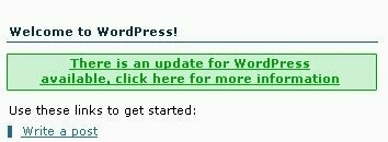 One idea that I really loved, however it didn't really fit in with the overall design was the error and sucess system messages. The original intent was that an error or warning would be given a red colour while a successful message be given a green colour. This would provide a great visual aid, and users would instantly know if something was wrong or right. However we decided that the light blue and yellow coloured icons could provide the same level of visual information with the addition that they tie into the design itself which is what we were here for in the first place.
Join me next time as I talk a bit about usability (or at least try and talk about the subject).
The real reason why I decided to reboot to something more simple this time round hopefully is becoming more obvious with the latest change in the background on the front page. As the section implies the background (which occupies the most real estate on the site) will be used to throw the spotlight on specific projects and completed artwork. Version 4 isn’t all that different (at least in structure) to what I have now, however it’s been adapted in such a way to allow me to play around more freely.
This week I’m throwing the spotlight on a little open source project I got involved with a couple of months ago. It’s an online feed aggregator and it’s allowed me to actually get up to speed and READ all the various sites that I’ve subscribed to. Traditionally most of my feeds were read from the Sage extension for Firefox, however I needed something a little bit more powerful FOFRedux provided me with what I was looking for.
The FOFR dev team is a great bunch of people. It’s a tight nit community of devs and users as the programme itself isn’t as widely used as it really deserves to be, however we’re hoping to change that with a number of great additions to the software. The major element being a complete overhaul of the UI admin section as you can see from the project page.
Anywho if you’re looking for an online open source aggregator that sits on your server, then you don’t have to look further. It’s still early days (version 0.3 was released a couple of weeks ago) but I have very high hopes for the software. Final word, I’m planning on spending a lot more time cleaning up my projects area over the coming weeks as I’ve got a great number of announcements to be making. Sometime over the weekend I should have some pretty exciting news about Shuttle to share with everyone and a page that mimics the FOFRedux page (it’s a lot bigger because I’ve got to upload over 29 images).
Might be old news (since I remember this being ‘released’ by google a couple of months ago), however I couldn’t find the free version of the software. I’ll give it a review once I’ve actually used it properly.
Looking at my archives April was the slowest month of blogging since I began over 2 years ago. 10 posts the entire month. Now I’m generally not for one regarding quantity as something I heed much as I blog whenever I feel like it. The curious thing about the whole situation is the fact that I didn’t feel like writing anything apart from those 10 times during the entire month.
Spring in England is the best time of the year. There’s that promise of good weather and a small cold bite in the air. The trees are changing and the flowers are blossoming, everywhere you look around you there’s a feeling of rebirth and restart. New Year’s day should most definitely NOT be held during the darkest, most depressing time of the year, it should be during the spring. The first days of spring signals new and fresh ideas and in many cases a much needed invigoration of everyone’s outlook on the year ahead.
Updates on the ‘Kode So the machine that is Broken Kode is slowly getting to where it’s meant to be. I’ve just put up the portfolio section along with cleaning up the shop area as well, both areas promise much more to come, but it’s just good to have these areas completed after a fashion. The mantra remains to keep things as simple and robust as possible that way all future changes will be done in a controlled manner than the usual ad hoc manner I’ve become accustomed to.
CSS Reboot Talking to Bryan yesterday, it’s amazing how this particular reboot is one of the best ones I can remember in a good long while. It’s a great time for feeding on the immense amount of creativity filling the internet landscape right now. Go and be inspired.
 A small part of creating the BK Logo was to have something to put on my business cards. As you’d imagine these things are not going to be your run of the mill cards, as I wanted to have some fun with them. So the mammoth task came down on me to actually do a bit of research on the net to see what is available and if they’re worthy of being my designated printers. I’m only half joking about the last part, I want them a certain way and am probably willing to pay the price to get them that way, so I expect to get quality for my cash.
Bearing in mind that I’ll be starting off with business cards now, the list of printed items will be ever increasing for sure. So in order to aid everyone and let you all benefit from the research that I’ve conducted into the matter, here’s a quick rundown of the various online printing services that I’ve uncovered, and how I rate them. At the end I’ve attached a pdf that you can download for your own reference (this being the first that I publish on the Kode, but hopefully not the last.) If you know of a better service that I should really check out, then by all means send the link to me and I’ll add it to the list. I am trying to make this as a bit of a resource page for all those looking for something similar, you might as well let some other smuck (ie me) do the hard work for you.
 In terms of the kind of cards that they can produce, it seems the cards themselves have got a base rate, which is as far as I can tell the cheapest on the market, ($30 for 300 double sided, full colour cards), but they also provide additional enhancements such as die cutting, UV Spot coating, rounded corners and hot stamping. The cost for these enhancements does not provide any problems whatsoever regarding price either. So you won’t break the bank if you want UV spot coating (which I actually do).
My only complaint is that I think the final thickness of the card will be too thin. 230gsm or 250gsm doesn’t seem thick enough for me. I want at least 300 dammit :). They have a sample pack which came thorough before my cards came through. To be fair, at that price I was going to be doing ordering from them for sure. They arrived a couple of days ago and I’ve got to say that it’s just good to finally have them in my hands. When I contacted them regarding getting a different cardstock, this is what they replied with:
At the stage, we ONLY can provide 2 type of papers which is 230gsm stock paper with matt lamination OR 250gsm super white card. We cannot provide a thicker paper at this time. Sorry about that.
The only other qualm is effectively with the website which has some stupid popup system going on if you want to enter your account area, rather than keeping it within the site itself, which I found slightly odd and dated. Additionally even though they have a referer’s program, the fact that it isn’t as simple as putting in a link on my site that is distinctly my link (like say for Dreamhost) it becomes fiddly and I doubt I’ll be gaining much benefit from it, so they should really sort that out. But in the meantime if I’ve introduced you to this website, do a brother a favour and put me as your referrer (brokenkode is the username).
The website is very slick and easy to navigate. It’s neither ugly or overbearing and does actually scream of a subdued quality. I’ve already received the sample pack and I can vouch for the quality, however the price point for this company is not exactly inviting. The price page is very simple to understand, £125 will get you 250 300gsm cards with UV spot coating. One additional disappointment is the fact that they don’t seem to offer die-cutting or foil stamping.
Again, this isn’t the list to end all lists, this is just what I found on my search. I’d be seriously interested in knowning about different online printers that provide for business cards, postcards, flyers and just about any other printed media. So if you’ve got a good one up your sleeve, share and I’ll be sure to include it into the pdf. Which reminds me. This is a first pass at the pdf. I will be editing it, just slapped this together quickly because it’s a good tool I think to have the comparisons in front of you. Even though you don’t need to buy 1000 cards as a minimum, I’ve done that it’s possible to compare the prices correctly. A few of these places offer 1000 as a minimum.
 Download the PDF
I’m giving a presentation on what everyone is missing out on the web to my group at work on Wednesday. 90% of the people that are going to be there have never heard of Firefox, don’t know what Gmail is and certainly don’t know what RSS is. I’ve got a load of topics I will be talking about in detail, however I’d like to ask everyone reading this what they believe are the most important contributions, sites, applications, technologies that have been released on or related to the the internet in the past 5 years.
Currently I’ve got the following headings I’m playing around with:
What do you think I’m missing, bearing in mind I’ve got only 50 minutes to play around with and I’ve got to condense everything in roughly 40minutes with 10 minutes for questions.
Some of the statements made in the descriptions often come across as pretty damn glossed over (also laughable in a few occasions), especially when tackling a subject such as this, but check out the Ten Most Harmful Books of the 19th and 20th Centuries.
HUMAN EVENTS asked a panel of 15 conservative scholars and public policy leaders to help us compile a list of the Ten Most Harmful Books of the 19th and 20th Centuries. Each panelist nominated a number of titles and then voted on a ballot including all books nominated.
(via pixelsurgeon)
If you’re interested in these things and would like to see what goes into making the administration panel of a programme, then I present the Feed on Feeds Redux Redesign mini-site. It’s just a quick install of the excellent Zenphoto which I’ll be skinning heavily in the coming days. I’ve got such a massive burst of creative energy right now. This project is very different to the Shuttle project because there are no expectations on us. This is trying to promote an open source application which is why I’m being so open about it. I hope that this will help build some form of awareness to the project and get some interested programmers on board.
Expect lots of changes and loads of images to be uploaded there until I’m completely done.
Honestly this sort of thing doesn’t happen to me very often. I subscribed to the FOFRedux mailing list and started talking interface design. Shortly after joining the list Joe Shaw gave this scathing review of the application:
I didn't even try this. It has the scariest user-interface I've ever seen in a feed reader. I'm a hacker, but these days I just don't want to deal with complicated software anymore.
See the problem with Joe is that he lacks vision ;) . I know a diamond in the rough when I see one. After all if I was quick to judge then I wouldn’t be using WordPress. However he is right in some ways. Traditionally open source applications are seriously FUGLY. It’s mainly due to the fact that coders don’t really care for what something looks like. So long as it works. Here is a screenshot of the current application in use:

Today I decided to sit down and have a crack at redesigning the interface. Now based on previous experience, this sort of thing takes months. I’ve been dealing with Shuttle for over a year and a half. Even though we’re getting closer it’s been very tough to keep the motivation of everyone in the group up. I’m going to see it through no matter what. I decided to play around with FOFRedux because I really want a good RSS aggregator that sits on my server and because I needed a bit of a break from Shuttle.
4 hours is all it took to come up with a design that I’m pretty happy with. That’s it. Sure there are several elements that could use some work but this is my first stab at it. I’ve never used the famfamfam icons in any of my projects so that scratches an itch I’ve had for a while. Here’s a screen shot of version 0.3 of the redesign:

You can see a larger version of that image right here.
So if you think you can or want to help out, do join the mailing list as this is going to be something you will be using in the near future.
Go get yourself and account at coComment. Not sure how they’re going to make money off this, but track all the comments you leave on different websites all over the blogosphere. You can even have an rss feed and you can get them integrated into your actual blog. The design and implementation of the service looks fantastic. I generally hate to host things off my server, however until now I never had the chance to track my comments. Which is probably why I don’t comment as much on websites as I would like to. Expect to see my ugly mug appear on a few more websites.
Definitely one to put into your RSS aggregator. UX magazine seems to be a pretty quality type of website. Slick design and seems to have a decent amount of good content in there as well. Not sure why it’s in beta, it’s not like it’s an application or anything. Must be a web 2.0 thing..ugg.
Who amongst us doesn’t like a good bit of soap opera? Ok, what about a bit of soap opera revolving around the world that you spend a couple of hours a day on? Yeah I’m talking about the shit storm that’s blown up with 9rules announcing that it would be removing a few blogs from the network. I actually heard about it from Bryan, who was calling out the Blog Network Watch and the snitch that broke the information to them.
All I’m just going to say that Blog Network Watch knew about this before I did and all this happened in the span of me going to bed. Hell I only slept 6 hours!!! Meanwhile everyone’s going, is it going to be me? Is it going to be him? I never liked her!
We then got the official word from the 9rules boys. Then Tyme goes and gives the explanation about the whys of this current situation. Seems it’s not Scrivs just thinking to be contraversial, very much the opposite. While I don’t want to take away ANYTHING of what Tyme says the real fun is found in the comments.
I couldn’t stop laughing when I was reading the comment banter between Mike Rundle and Chris P. The culmination was when Mike says:
Regardless of these inconsequential details, it was said and it cannot be taken back. You've got mail.
To which Chris comes back and clarifies what was actually in that email (yeah I know the tension the drama):
So we're all on the same page, "you've got mail" was a tidy reference to an email that I just received about being dismissed from the network.
Call me a caty bitch. Call me a flaming gossip but that was really fun reading. I’ve not read a good flame thread in a while. It’s not really a flame thread as the guys kiss and make up and agree to meet each other in SXSW (a blogging conference or something like that).
Yeah like that was the end of that, seems like the Deuce over at JOAB has written something on this and the Cowboy has written a little something as well.
I’m just enjoying this. I think the snitch is an asshole and should just leave the network of his/her own accord. I think Scrivs and Tyme had to make some tough decisions, and it seems everyone and their pony knows best. Me? I’ve always followed a simple mantra:
Opinions are like assholes, everyone's got one.
And for the first time I actually know how it feels to be Rich Johnston over at Lying in the Gutter (he writes a weekly column about the gossip of the comic book industry). I read the column religiously every week, which begs the question, who’s going to step up to the plate and start writing a gossip column/blog on bloggers and blogging, I know I’d subscribe to that feed…but like we established earlier I love the gossip.
I was recently reading Stathi's latest post and I could help but smile at just what a completely unique method of blogging he actually has. You see he doesn't ever write full posts, he only uploads his poems. To be completely honest I actually didn't think he was going to keep it going for longer than a couple of weeks, however he's proved me wrong and has been going strong since August.
In this particular post I actually understood exactly where he was coming from without him having to explain it to me. This poem came about from one of the Thursday basketball practices where he had stuff stolen from his jeans in the locker room. Credit cards, cash and his memory stick with several poems he was meaning to get onto the site.
See if I had my wallet stolen the post you'd be reading would go something like this:
MotherF$%er, wan$ing piece of sh*t that can't do anything but pry on other people, the parasitic a$$hole seriously needs to be taken out and f%£ed up the nose....I got my wallet stolen today....
Or something along those line. However this is how Stathi decided to talk about this subject:
Would it be six thirty? Would it be the five o' ones? Would it make a difference? Faded they were, worn out and dirty With six years of history
I left a piece of myself in them though In the frequent adolescent sweat rooms Where boys still burdened with abstract realizations Of welfare and the boogie man Have all become first class limping gangsters
Not their fault though Accidentally took a piece of mine From my overdrawn hole-full-hope-full pockets Left me change for a bitter ride home
Not too long ago I wrote a review about Feedlounge. Kyle came back and voiced his opinion about the price of the service, which to be fair was the only downside I could actually think of for the actual application myself.
I remember feeling the same way when the Mint price package was first released. At first I thought that $30 was far too pricey for what I was getting. It only took me a couple of weeks before I caved in and bought the package and do actually really like it. It provides me with all the information I need and much more in a fashion and designed in a way that I really like as well. So for me paying $30 for a set of code that I can sit on my site doesn’t feel like a cheat. Shaun’s provided me with both a service and a product, that in some ways is tangible in this crazy virtual world. It’s the same sort of precieved value one gets from fonts. If you’ve never paid for a font then you probably don’t understand where I’m coming with this.
Anyway, I’ve decided not to go for Feedlounge. The value I am getting from that programme doesn’t really inspire me to pay for it. See had the guys gone the Shaun route and actually let me host Feedlounge on my server, with the whole login system right there, for $35 I’d have not even thought twice about buying it. Something like that makes perfect sense to me. Hell I’d have gone and paid $50 for it.

Update: Yeah, when registering, don't untick the emails at the bottom, it doesn't like that, which is utter rubbish, why have them there in the first place???

I talked about Feedlounge a while ago. It was announced earlier this week that the application would be moving away from it’s Beta stage into a public release sometime next week. So I thought it’s might prudent that I give everyone a bit of a proper review for this little online application.
As you might or might not know Feedlounge is an application that allows you to read your RSS feeds. What’s an RSS feed you ask? In short it’s a link from a website. You download that specific link and paste it into your Feed reader. There are many feed readers all over the place. From desktop applications, to ones that intergrate with your browser, to ones that live online. These applications check the RSS feed, and if the website has been updated it actually returns all sorts of information (depending on how the owner of the website has decided to format his RSS feed).
So without ever having to visit a website you can keep up to date and maximise your reading experience.
I’ve been using Sage exclusively for about a year and a half or whatever. It’s been a great little addition to Firefox and has served me well. However the experience has been less than fun lately. Using Feedlounge I see that I’ve actually been missing out a great deal.


Features There have been a couple of new features since I last checked up on it. I’m not sure if they’ve been added since I first looked at it, or rather I just didn’t notice it the first time round.
Unread Items. Grouping the unread feeds is very cool (remember I’ve been using Sage).
Tags addition. All applications that store elements in anyway, SHOULD HAVE TAGS. They’re words you associate with a specific post of feed item. The tags can span different websites/blogs.
Flagging. I’ve actually wanted to be able to highlight things that I’ve enjoyed reading or provides some sort of link or whatever for a while now, so the fact that you can flag an item is something very very useful indeed.
History. That’s also a nice element that I’ve not been able to use due to using Sage. Scrolling through the last week’s worth of feeds, highlighting when I’ve read them is a great little addition to my reading experience.
The overlay menus. I actually like these because they don’t hinder your experience. There’s no clicking between pages as you do in most web-centered applications. Everything goes cloudy and the main element is brought to the forefront. I live that idea mainly because it doesn’t disrupt my experience which is what these guys are effectively selling…which nicely brings me to the bad.
The Price Everything has a price. Feedlounge is not free, which is a shame really because I would have liked to pay for it, however $5 a month seems a bit much for what I’m getting. If they’d come back and said to me it costs $3 a month (maximum I’d effectively pay for a service like this), I’d have signed up in an instant, now I’ve got to actually think about it.
I’ve got to think about it because it’s a really well put together program. The thing is though it’s not something that is helping me produce anything. It’s not something that is helping me collaborate on anything, store something. It’s effectively a program that helps me read stuff in a nicer way. I dunno part of me feels that my $5 a month should be spent on something else. I’ve honestly got to think about this further.
In a way it’s really important for me right now at this particular time in my life to seriously take a step back, reflect and look at what’s gone before. It’s posts like this that actually make my blog an extremely important part of my life. The sheer amount of information and experience one goes through in a year is amazing. Since I generally can’t remember what I ate yesterday it’s even more important for people like me.
I’m going to warn you however that this is the single longest post I’ve ever done in 2 YEARS of blogging now. I’m generally a verbose person anyway. You’ve been warned.
Manji and Rin Manji was released at the tail end of 2004, for Rin was released in March. I do want to thank two great personalities on the Broken Kode forums. James and Steph you guys are absolute gems and I thank you for all the help you’ve given to people throughout the year.
Alex King Theme Design Competition Coming second place in the Alex King WordPress Theme design competition was a great little boost for my thirst for creating better designed websites. I’ve still got a great deal to learn, however I’m a lot more confident than I was a whole year ago before the Manji and Rin. I’m only happy when I’m constantly learning and fighting to understand things, and these two themes gave me the necessary building foundations for the future.
Broken Kode Designs Which kind of leads to the fact that I designed this site 3 times this year. To me that implies that I seriously didn’t have much of a clue as to what I wanted, which isn’t completely true. It’s been a bit of a rollercoaster ride for this site as my needs and the reader’s needs has shifted. I had the idea for version 4 that I really wanted to implement. It’s been a very successful design and one that I’m very proud of and very humbled by all the nice comments people say about it.
Human? Based on a review of a book I did, I was invited to contribute to the book, which should get published sometime next year. I’ve included a double page spread and one of the playing cards. However due to my hard-drive crash, I actually lost that information, so I’ll get it like everyone else on the DVD that’s included with the book.
CoCo I introduced CoCo, which is actually not the first mascott I’ve ever created but definitely my favourite. All future BK designs will have the little guy in one form or another.
Emmortel I launched another website, Emmortel to coincide with May1st Reboot. I enjoyed doing it and I’m generally happy with the design, unfortunately I didn’t update it are regularly as I wanted to. This was also because I realised that I really should be putting all my efforts into Broken Kode, and that my portfolio section could be included into this site. That aspect of the site is still giving me some serious grief but it’s good that it’s on the main site as it motivates me even more to do something about it.
Broken Kode Originals A couple of weeks ago I introduced my first Broken Kode Original. One of many to come in the near future. I’ve got around 5 on my plate at the moment. I’d like to get to the stage where I’m commissioned for at least one of these a month. I think I could probably increase it to two a month but no more than that to be honest.
Broken Kode Shop This was something fun to do. I got a massive buzz getting those prints printed off. I didn’t do it for the money because if I did then I was going about it the wrong way that’s for sure. I’m just immensely grateful to all those people who have supported me in this whimsical idea of mine.
The second item to be offered from the shop is nearly completed and that’s my first blook. I’ve got some serious work to do before the 15th of January, however I’m excited about this package as it’ll be the first book I put on my shelf that has my name on the spine which alone gives me Goosebumps just thinking about it.
Introduction of Splash Panel I’m actually appalled at myself for taking this long to actually get this particular show on the road. I guess I was scared of the amount of time and dedication a site such as this would take. My ambitions for this site are very big. The plan is for Splash Panel to be the first destination people go to for news and reviews and information about the latest graphic novels. Fortunately for me (unfortunate for the industry) most comic book types are still in the dark ages with respect to the internet, as they honestly don’t know how to design a website or present the information for their sites. That’s an article I’ll be writing at some point to flesh things out more.
I believe the site will get a huge amount of momentum once I’ve done the design for it and had a couple of interviews under my belt.
Codename: Borg Borg has moved forward than just an idea and will hopefully be something I can be proud of in the near future. I don’t want to talk much about it just yet as we’ve still got a long road before we’re in Beta, but it’s going to be a really fun road I can tell you that much. Snook is a code-master. The guy’s sooo blasé about coding it’s unreal. Stuff that would make my head hurt he just shrugs it off and calls it easy, that bastard, lol.
9rules Network In July I was accepted into the 9rules network. While the added exposure has been great, honestly that’s the least important perk of being in the network. For me having gained several friends is worth more than 2 million hits a day. That’s what makes the network special, the people.
Inksmith In May I started thinking aloud. Seems I wasn’t alone in my line of thought. Others felt the same way. The project and idea lay dormant until I could actually give it the proper time it required and so Inksmith was born. The team behind the idea is top notch and is always and constantly expanding. We should be announcing something in the not to distant future regarding this little idea. I find it amazing how just the idea has sparked off loads of conversations but that’s a good sign as people have opinions, and once we’ve actually gotten the framework sorted out, people will appreciate what we’re doing that much more.
Internet Friendships One aspect of this year that I only really was able to put my finger on as I thought about this list more was the number of internet friendships I was able to build and nourish over the past year. It’s gotten to the stage where I don’t think too much about these things anymore but thinking back a year ago this wasn’t the case. I consider Phu Ly, Michael Heilemann, Joen Asmussen, Jon Snook, Bryan Veloso, Chris J Davis , Podz, Matt Mullenweg, Erik Sagen and all those crazy cats over at inksmith and 9rules as friends.
December also brought about the very first London WordPress meetup. I hope to repeat this in the near future as there are a couple of people that live in London that I would like to meet (yeah I’m looking at you Phu).
However this event spurred me into going back to Lebanon after 2 years. I was able to vote for the first time in my life. It was a bit of an anti-climax, although it was extremely important that I do that.
Basketball With the exception of the Corporate Games in Manchester, my basketball life this year was pretty weak. To substitute for my lack of basketball action I did take up running which I’ve been pretty lax on in recent months, however that’s more to do with work than anything else. The funny thing is I got a couple of nasty emails due to those posts.
London Attacks Went through a pretty tough time for the city of London during the month of July. Stathis of course went through worse, however I’m glad those around me got through this unscathed.
Top Movies I actually watched loads of movies, however I didn’t review half as many as I would have liked to. I might make a more concerted effort next year.
Top Books I didn’t read as many books as I would have liked to, but the few that I did I must say I enjoyed greatly.
Top Graphic Novels To be honest I’ve written a massive post about this over at Splash Panel where this sort of thing is meant to be.
Because it was too big for one post, here’s the continuation of my best of the net round-up.
Flock Love it or hate it this little application has definitely caused a bit of noise on the internet. Some say it was all hype and no substance. Some say that there’s no need for it. Some say the developers behind the browser are only interested in the money that is generated from the use of a the little google search at the top right hand corner. And still others don’t really give a shit because they’re still using IE and don’t know that there are alternatives out there.
I just like the fact that there’s development going on and competition in this field because it will help make browsing a better experience for everyone. Which is the direct opposite to what was one of the major points of this year…
Adobe buys Macromedia I felt really sad when Macromedia was bought buy Adobe, hell I didn’t even know that Macromedia was for sale in the first place. For me the biggest thing is the fact that I’ll be loosing Freehand, which is one of my favorite light-weight vector illustrator tools out there. I’ve written about this. As most websites are created using Macromedia products this is a major issue. The lack of competition in this field will be very much missed. This is one of the reasons I’ve been turning to Open Source software more and more. The people might change but the software will always be available for the next person to take it on and go off with it.
Best Websites This is just a list of websites that stuck out as being above exceptional for me at least and ones that I would make a concerted effort in reading everything they wrote. In no particular order.
<li><strong>Whitespace</strong>
I like Paul’s voice on this website. He writes a lot of stuff all over the place, but I read his words here and they sometimes make me smile sometimes make me roll my eyes, but generally speaking they nearly always make me think.
<li><strong>Avalonstar</strong>
Bryan’s a buddy, and I can say that with conviction. It’s actually crazy but our humours are very much alike, at least I’d like to think that way because when I read the man’s stuff I generally can see where he’s coming from and usually see the same funny side of things. There was a time when he was pumping out a lot of MASSIVE articles, one after the other. I like his enthusiasm and it’s brilliant we’re working on a couple of projects (3 of them to be exact which is the most from anyone person I believe) together.
Web 2.0 I really hate the fucking term. It’s just annoying, however sometimes when we’re trying to explain an online application we fall down to it for lack of better term. I for one have tried several applications which I’ve honestly thought very highly of. A few worth mentioning are
<li><a href="http://www.backpackit.com">Backpack</a> and Whiteboard - Seems like it was years ago that 37signals introduced these little web application to the world. They've been a success for them and their other suite of applications. They have made us think about the internet in another way and as such it's been good fun watching what this company has in store for the future.</li>
I’ve got my year in review post (which I’m still writing) however I can concentrate on the best of the ‘net 2005. It’s been a busy little year for cyber-space with a lot of crazy ideas. Seeing what sticks has been the name of the game. I’ve split it into a couple of posts because it was getting too big to digest.
Google vs Yahoo! Finally there seems to be a competitor to Google’s onslaught on world domination. Yahoo! used to be a big player back in the day, so it’s nice to see that they’re giving Google something to think about. While everyone is pitting Google against Microsoft, we’re slowly seeing another player that seems to be coming to focus as well. Yahoo! have sorted out their email app, and have added a few services to their roster that makes it slightly more interesting to watch than Google. Even though Google upped their storage indefinitely, introduced Gtalk and added things like rss feeds to their email accounts (Yahoo! came first with this), Yahoo!’s actions seemed more calculated. Although I don’t use Flickr or Delicious, but I know a lot of people do. It’s good for the netscape, so I want to see how Google counter attacks (and I don’t mean them buying something) but releasing something new.
Mint
 This was an interesting thing to watch. I’ve honestly not seen many applications that can match this sort of success, it’s nice for Shaun and it just proves that if you’ve got a good idea and you make it both functional as well as pretty to look at then you’re onto something. I personally believe that he could have made more money if he’d brought the entry price down slightly as it’s just a stats program, it’s still interesting to watch it’s popularity grow. Should be interesting to see if this will continue or not.
Blogging Networks Blogging networks were on EVERYONE’S keyboards (or lips whatever you want). Broken Kode joined 9rules, and something like 5 million blogging networks popped up around the place. The main reason is making some money from ads such as Google’s adsense or Yahoo’s equivalent. The big news was Weblogs Inc being sold to AOL for whatever number it actually was (what is it this week, $20 million?).
To be completely honest I actually shy away from networks except the 9rules because the actual model is very very different. It takes a specific voice for me to actually give it a go and something like Jack of All Blogs. The Cowboy has got some serious bile festering in his stomach and it’s seriously great to watch him unload it onto people. Notice the trend, I follow the person, not the blog. Which is why I don’t read Engadget anymore, but we’ll talk about the best websites of 2005 in part 2.
Treehouse
 Treehouse was released from the boys over at Particle Tree and I finally got an internet magazine that I could seriously get into the articles. It’s great looking package and well worth the price of admission. The topics range and you’re always going to gain a lot more knowledge than the price of an individual copy. Here’s hoping 2006 actually produces a print version of this excellent publication.
I was planning on keeping this quiet until I’d actually done the design for it and had a few posts under my belt, but alas it’s a good way to keep the interest in the project going, but SplashPanel marks my second blog. The content is VERY specific. It’s going to be about Graphic Novels and every once in a while I might talk about other comic book specific things. I’ve been thinking about this for a while so it’s nice to get going on it. Hopefully I’ll have a design for it in the not too distant future. I know what it needs, it’s just that it will take a good long while to get EVERYTHING on there. Definitely a work in progress but I’ve got very high hopes for it. So if sequential storytelling strikes your fancy mosey on down there.
If I didn’t read Business Logs I’d have completely missed this story. Just haven’t really noticed anyone I read actually talk about it. It would seem that the story of the week is the launch some blogging/advertising/network company called Open Source Media, no scratch that, it’s actually called Pajamas Media. Whatever not terribly interested in shoddy businesses, however what made me stop and truely think was the difference between my online collaborative efforts and that of Dennis.
I guess I’ve been truely fortunate in the online collaborations and the quality of people I’ve chosen to jump with head first into these collaborations. While people still fear anyone on the internet, blogging has effectively given people a new medium to both collaborate and help each other, while at the same time truely shaft each other in a spectacular fashion.
I think the only reason I’m enjoying using the internet as much as I am right now can be attributed to the collaborations on projects with various people from around the world. The internet has put me in touch with people that share the same passions and ideas that I would otherwise have not had the chance to experience and by extension been that much poorer.
Would things not go as smoothly if money was involved? I’d really like to think that would not be the case. However I’ve been burnt several times in the past to shoddy characters (wish I did blog back in University because that would have made a terribly interesting read right about now) that I can justify people/myself for being jadded about the whole thing; and yet I’m ALWAYS looking for the next collaboration.
I couldn’t have done any of these projects on my own and neither would I ever want to. I evolved greatly as a designer/coder with each project and more importantly I gained several friends along the way.
I’m not sure if this is just me, but I’ve been getting more and more frustrated with people in the real world not getting it! In this particular case it, being blogging and the internet community/world that has been building and growing for the last good few years. It’s like the general public around me is completely ignorant of everything and anything online. Still reserved to thinking that if you do anything internet related you’re considered a techy geek. Fuck that shit!
It’s a preconception based on ignorance. I know it’s harsh to use such words but it’s true. I still find it amazing when I mention the word blog and the person looks at me and doesn’t have a clue about what I’m talking about. It’s not like I’m asking them to tell me the difference between PHP and HTML or anything ‘technical’ like that. If I dare mention the internet in any capacity apart from amazon, google and hotmail I’m looked upon as I’m a dredge of society while Gmail and Firefox are effectively words I just made up.
Seriously, it’s the same shitty ignorant and stupid look I get when I mention that I read and love comics but that’s another post for another time. I guess part of the problem is that I’m in a completely different industry to the web development one and therefore we can consider these people as the general public. The thing is it’s not like I’m talking to my grandmother here who’s still in awe about the concept of the telephone, these are computer literate people, who get their news from the net, who buy stuff online, who surf and search the web EVERY single day.
It’s not all doom and gloom however, every once in a while I’ll meet someone who’s actually read the site and tell me they like it, or topics I’ve talked about here get further airtime in some conversations I have with a couple of friends. It’s a slow processes getting people to understand what the internet has to offer them apart from spam, buying shit and downloading porn.
The title of the post says it all, lots of little things I’ve got on mind I’d like to get out.
» We’ve upped the InkSmith founding contributors to a total of 10. The latest additions are the impeccable Jennifer and the sublime Becca. You all know who I’m talking about.
» Thank god this week is over. Just handed in a scheme report design for an Embassy building. I’s been a mad rush to get it sorted, what should ideally take us roughly 5 weeks or so was condensed to around 1 week. So, long hours in the office have been the order of the day. Mental note, I will only accept to do projects if I like the mechanical engineer. If they’re a dick streer the fuck away from it. Luckily I’ve been very lucky in this regard generally. The reason is simple, on long office nights that’s who you’ll be spending the most time with.
» I did one of those cool 5 Question interviews for Dave Kellam. I really love what he’s done hacking the site to fit in. Very cool stuff, going that extra step. Also pretty cool being the first of the “blue and orange” interviews.
»I’ve started wearing my scarf, just in case people where wondering when I’d give the OK to accessorize properly. Now is the time people.
I don’t want to say much about what we have planned because (to be honest) it’s still in the planning stages (so that answers everyone’s first question), however due to some confusion around the place, I think it’s prudent to address a couple of points and issues regarding InkSmith. Some common rumors making the mill.
Just so that we’re clear. It’s going to be a site focused on the blogger. It’s that simple a concept. This effectively explains why we’ve put our faces on there. What’s important here is not the site or the program running the site. It’s the person behind it. It’s the online blogging community. The plan is to take this virtual playground that we’re all in and making it slightly less electronic. Instill a bit of personality into it. I’m not interested in speaking with SpankMonkey and his ilk. Give me your name dammit, otherwise I’m not really interested in hearing what you have to say. It’s about making the blogging community less hostile to people.
Blogging has introduced me to a slew of people from around the globe, all with similar interests to me, all completely different to each other. People I would never have had a chance to talk to, I now consider my friends. There’s a barrier out there that many people don’t see. Inksmith hopefully will be a step to overcoming that barrier. Will it work? I’m trying very hard not to hype this thing up because it seems net users revel in failure, but I’m optimistic, then again I’m a natural optimist so maybe that’s just something I would say.
Just so as to discard another pre-conception, this isn’t an exclusive club. It’s got a small group of people that are going to build the framework that will hopefully benefit people but make no mistake, the true stars of the site will be the blogging community, both by being a part of the site and providing content for the site itself. So go over to the site and sign up for the newsletter.
Remember that you are an InkSmith.
A while back I talked about what the WordPress community was lacking. Upon reflection I’ve understood that in fact it’s not just the WordPress community that is lacking in a particular aspect, but in fact the blogging world in general.
All that matters is that you are blogging and by default part of movement that’s effectively changed the shape of the internet and how it’s used. You’re no longer just a consumer as many corporations would have you labelled as.
You are now a creator. You are an InkSmith.
Fruitcast has gone live. Mr.Kartooner himself and I helped out with the copy of the site. Hell I’m sold on the concept that it makes me actually think that I should give this podcasting thing a whirl, whereas before I had little interest. Sounds like pretty easy money.
Reyyy is an excellent example of why comic book art is well above and beyond the traditional art bandied about by graphic designers. Learn how to use a pencil people.
 It’s only natural for people to be getting sick of the term that’s plastered on the interent EVERY SINGLE DAY. Yes, this post in part will be about the crazy little buzz word, Web 2.0. I hate that term:"(So we’ll not use it again, in the future that word will be replaced with ***** [5 stars])":
It’s being thrown around the blogosphere like crazy. I guess I’m one of those crazy fools out there that believes in the future, that we won’t be paying for software. There will be an operating system that compliments everything we do, there will be software that will be far more advanced than anything you can buy, and the development will be ongoing, constant and open to everyone. I’m a firm believer in Open Source software.
At this particular moment in time we’ve been caught off guard. The Web applications are fresh and new now, so obviously they’re going to be gaining some momentum and money. In 5 years time (hopefully much less) all of the 37 Signals applications will be available to the end user in the form of an open source project. If people want to have those programs on their systems without paying a monthly fee, they’re more than welcome to do so, and can get at the code and do whatever they want as well. It’s only a matter of time. People will be paying for the work, the service rather than the software.
The reason I mention the 37 Signals programs in particular is because I started using Backpack this weekend. I’ve got an account from when it was first released, however I never really got into it. I’ve added yet another project to the stuff I’m working on. This one is with Bryan Veloso and we’re both thinking what the hell took us so long.
5 years ago this collaboration would have been possible, but it wouldn’t have been as easy and clear to follow as it is now, thanks to Backpack. I’m even considering buying a basic account. That’s pretty big thing since I just haven’t gotten into that whole ***** thing. If you’re collaborating on the interent (and you really should it’s an amazing resource to waste on porn) this application will make things more fun for sure.
Now I’m just waiting for the time when we actually can host this on my server. Anyone working on a Backpack alternative (with Whiteboard of course).
Think of this as a complete and UTTER bargain. This is your chance to own Broken Kode. Hell I’ll even throw in the hosting for the rest of the year. According to Central Scrutinize if you extrapolate all those crazy numbers that have been thrown around the internet after the AOL buy-out of Weblogs Inc, then this little url is the most expensive url in the 9rules network. So much like Phu, I’m calling in my chips, calling it a night, and putting the site up for sale. Even though it’s priced at $2M plus, I’m feeling happy this evening, so $1M should be ok. Anyone interested can just send me a check.
Most of those links are coming from Rin and Manji users. I’ve talked about this extensively before so once again, all those who have kept the link in there, thank you kindly. All those who have linked back to BK just because, again thanks guys. Which reminds me I’ve got to sort out my blogroll. It’s on my list of things to do, once I’ve got my complicator up and running again.
What’s really funny is I don’t even want to imagine what Binary Bonsai or Photomatt would go for. Yes they’re both linked like CRAZY.
 I’m really excited about Flock. For those in the dark it’s a new browser that’s intended for bloggers. The program is based off the Mozilla’s Gecko rendering engine, which is what Firefox is based on. In fact the guys and gals behind Flock were part of the development team behing Firefox. Since Firefox is an Open Source program, in the open source world this fork is not an uncommon thing. In fact in most cases it’s inevitable.
There are many examples. The simplest being the hundreds of Linux distros (ubuntu after Debian etc) showing how different people have different thoughts about doing something, and so they fork. Other examples include:
 Honestly I could go on. From the above examples what’s clear is that sometimes forks do provide a better product in the end. That’s the beauty of Open Source. I do find it crazy that this would happen so soon, however I can’t wait to see what this application can offer above Firefox. The ‘fox is easily my most used application. In fact when coming onto ANY new PC, the first thing that’s downloaded is Firefox, so it’s going to have to be something special for me to part ways and use the alternative. Any which way you cut it, this will be better for the end user, as the teams will no doubt be feeding off what each other are up to. Is the market oversaturated? Screw that, it’s all about freedom of choice.
On a completely different note, I’ve got to say that I’m seriously loving the Flock logo. I didn’t think anything could top the excellently designed Hick’s Firefox logo, by the Bryan Bell Flock logo is a good contender for the title.
There’s been a lot of noise about blogging networks around the place. People selling and buying them:
while others are launching them:
Personally all I see them as is another way to make money from adverts or more specifically, they’re sites set up to create revenue off advertising. They can try and make you believe that it’s all about the content. Erm yeah, bullshit. It’s about the money. If you really cared about that particular subject then you would simply create a blog or a site, as thousands do every day, and you’d start talking about it. You could build a following based on the quality of your posts.
You might get more exposure from posting on a blog that’s part of a network, yes, but it’s not yours. In my mind the generic blogs written by 30 people effectively eliminates the writer from being the important part and puts the blog itself as the thing in people’s mind. So you’re not effectively getting any accolade, or recognition since you’re not the star of the show, hell you’re not even the sidekick., you’re just a cog in the machine. I hear you say:
Oh but Khaled, you're part of a network!
Yes that’s right, a network which has absolutely no power over what I write, how often I write it, what I do with my content, and no copyright over anything I write. 9rules is a very very different model. It’s about the individual. Your words, your copyright, your content. What has 9rules done for me you ask? Well for a start it’s introduced me to a range of quality blogs that I otherwise would never read or visit. It’s put me in touch with a host of extremely talented people that help each other out whenever we can. It’s what the word network means when implemented. Has it made me rich beyond my wildest dreams? No, I’ve gotten absolutely no monetary compensation or revenue from being part of the network. Then again it never claimed it was going to give me any money, nor would I expect it to. Mike’s written about this as well.
So I’m sat hear thinking (amongst other things) why anyone would want to write for a blogging network. Seriously. What the hell are you getting from it? You don’t get to keep the content and use it later on or whatever as you please. You don’t own the site domain, you’re effectively working for someone who will then sell the damn network to AOL for $20 million. Oh and what do you get for helping to build this ‘empire’? 10 cents a post or whatever the numbers eventually come out as (it differs from network to network).
It takes a lot of time and effort to build a reputable site of any description talking about a specific topic. It takes hours of hard work and dedication, and crucially consistency.
The only way in my mind to make things better is to actually and that’s to pull away from the blog looking arrangement that these networks seem to be intent on, and actually showing either a picture or an avatar for the writer, as if he’s writing a column of some sort. Each contributor should have their own page that tells a bit about them and if they’ve got their own page a link back or something like that.
Which brings up the design of the blasted things. Why the hell are they all so god damn boring? I mean seriously, how can a site on diabetes have the same design as a site on night clubs? There’s little to NO character to these sites. The site have no face.
I don’t get it. Paul’s created a network and as he’s said anyone can do it, it’s not hard; but then again what the hell is the point, apart from the money. I can understand the need for people to talk about different subjects. I know for one I’d like to have a political blog, the previously mentioned WordPress portal, and a comic book site, but I’d rather invest the time and effort to nurture something of my own. If I find like minded people that want to contribute to the site, then that’s great, some form of compensation should be delivered (this could be monetary or otherwise). Not sure how to view Pauls' Network, as he’s thinking about writing 50 posts a day, across his entire network. It’s definitely one way of giving the sites some character, although I fear that momentum cannot possibly be maintained by one person without a complete breakdown in quality of content. Unless the posts are one liners with a couple of images and a link, in which case why would anyone read the sites?
This mentality to pump out content for sake of it really does degrade the reading experience, at least in my eyes. So no I don’t read any network blogs. I read WorkBoxers (but that’s Scriv’s thing really).