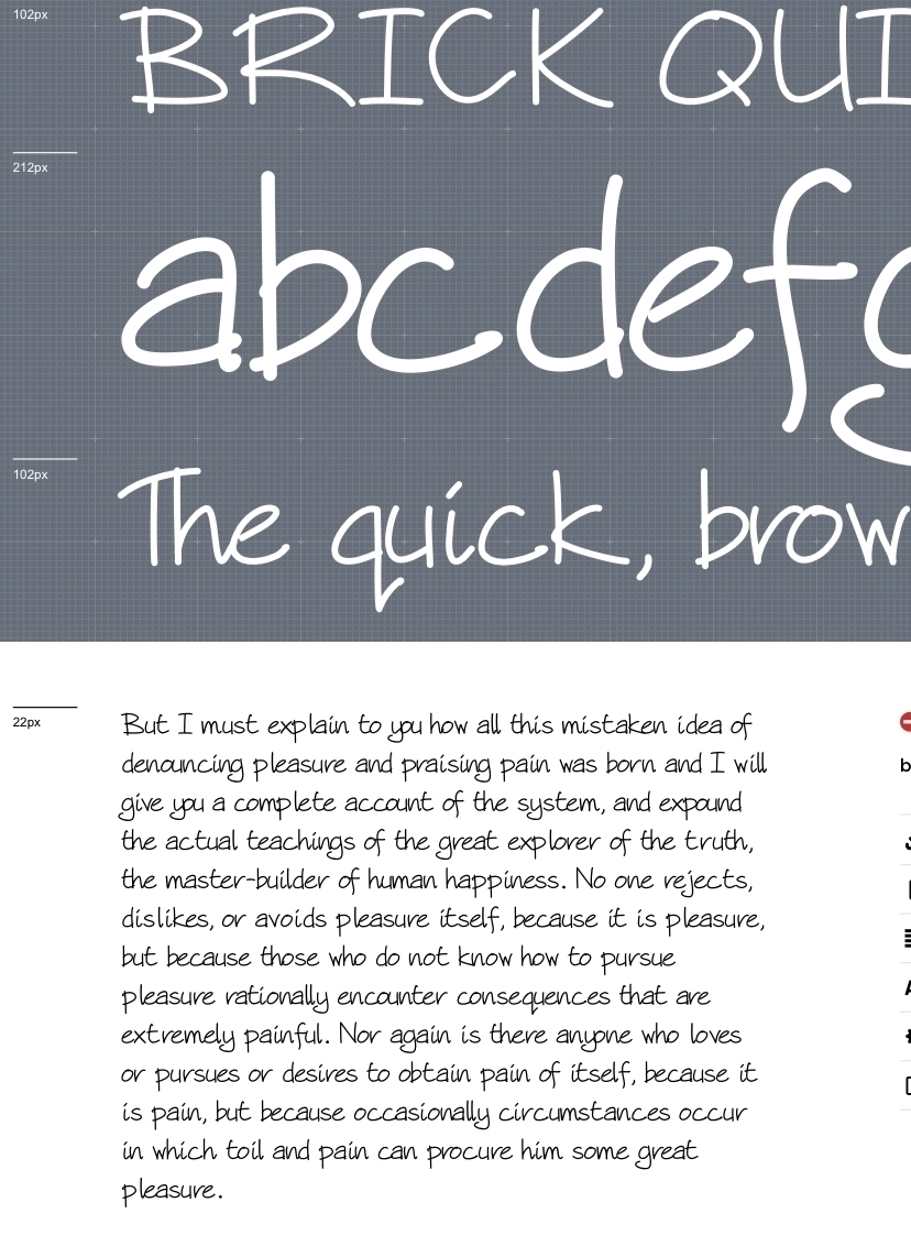
Chalet Book from House Industries is an insanely good looking typeface. I’m not usually into sans very much, but this thing might eventually get used on the site (getting away from Merriweather will be mega tough).
Typography
I recently visited Jason Santa Maria’s website. Couple of important points of note. You can download his book On Web Typography directly from the home page. It’s a timeless piece of writing if you’re interested making better websites. The other thing I wasn’t aware of was the fact that he is now creating his own typefaces. Citywide looks great.
Onomatopia
I’m really loving how these chapter break pages came together for the Moon Racket! collection. I have been struggling with how to make these pages more visually interesting.
I tried using inverted images, but they just looked odd. Sometimes an idea just pops into your head and it just works.


Stop Using Custom Web Fonts. Needless to say I don’t agree with Brian at all on this point. There are many reasons to use a custom web font and it has nothing to do with ‘brand’.
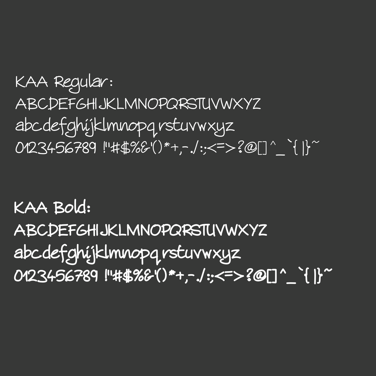
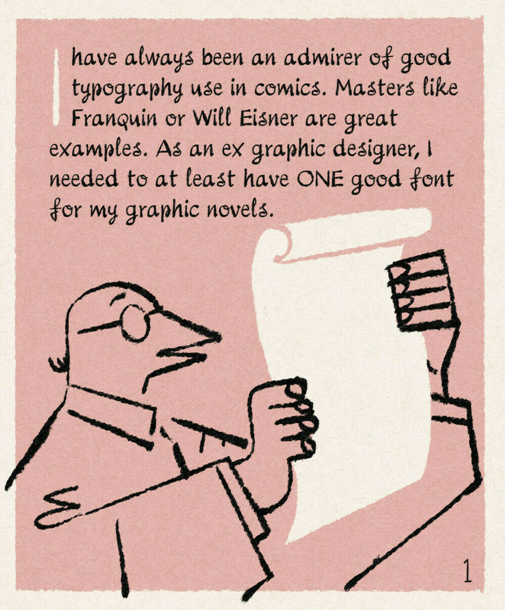
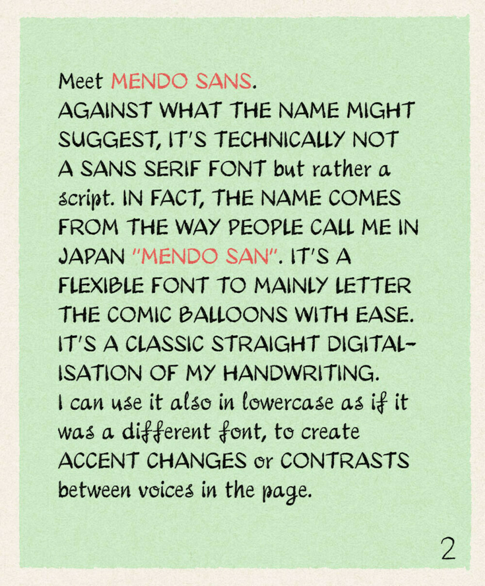
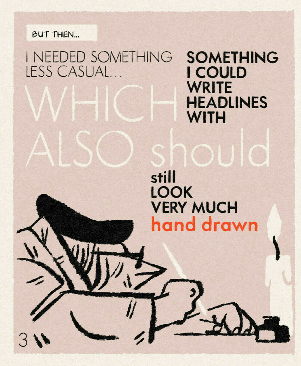
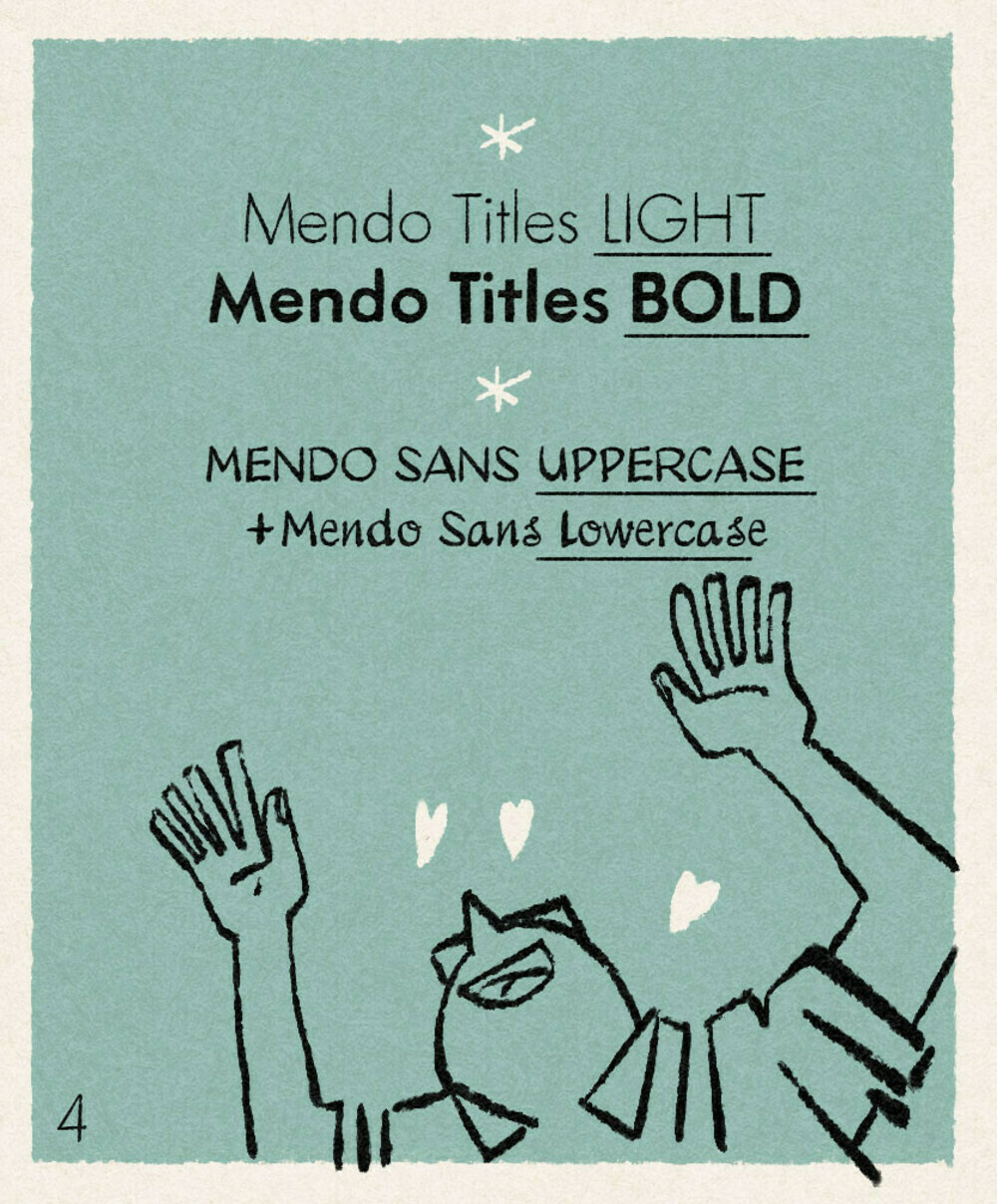
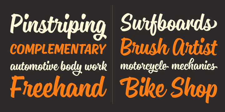
Totally inspired by Mendo’s post, finished off the KAA typeface and did a little comic about it.
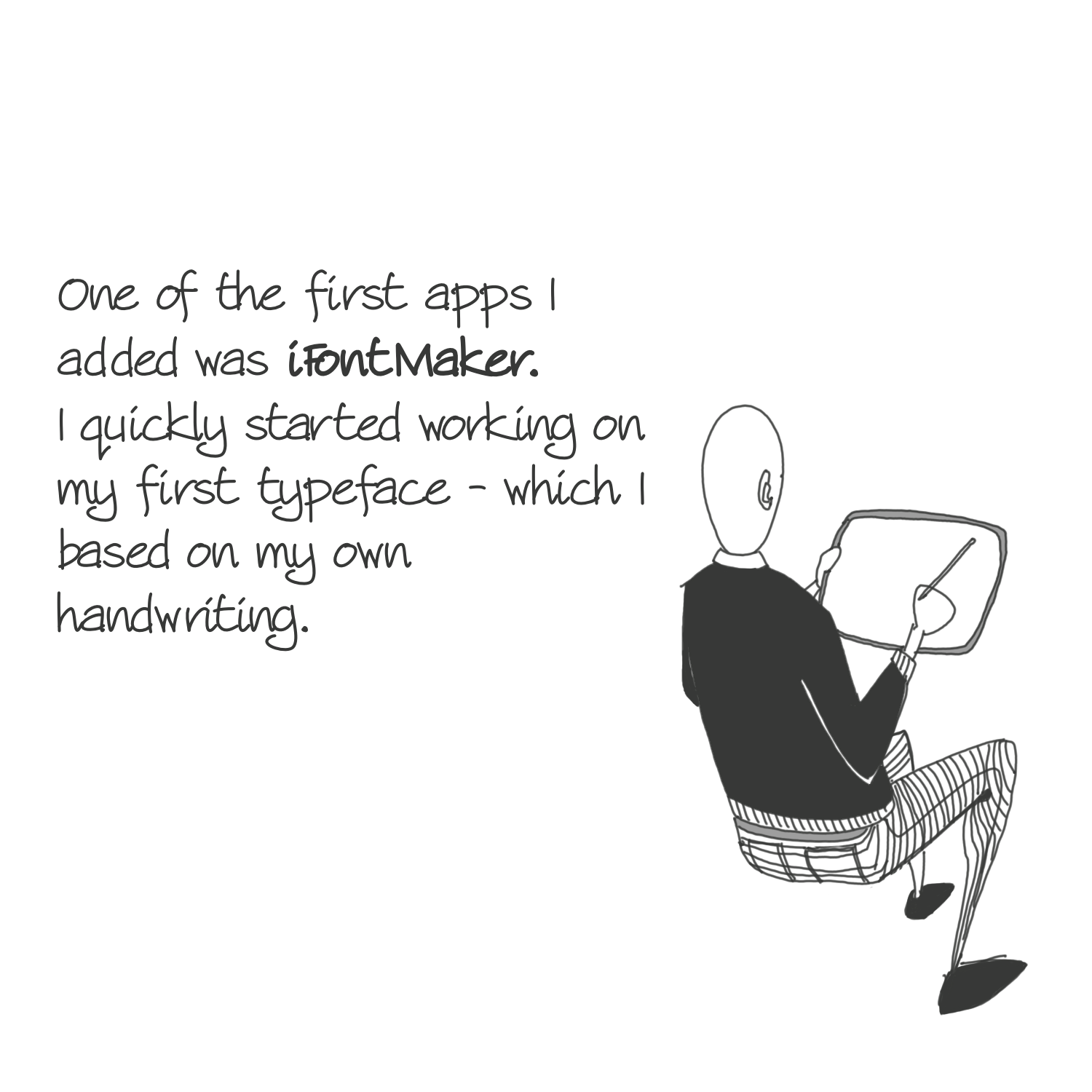
Importing SVG Files from Affinity Designer into iFontMaker. Yup will be using this at some point in the near future.
Following the last post, Calligraphr, let’s you create your font based on your handwriting with some easy to use tools. I prefer iFontmaker, however this allows you to use something like Procreate and it’s seemingly infinite brushes.
An advise / idea for comic artists: make your handwriting and font.
I created my own font family based in my handwriting, with the invaluable help of Type-ø-tones heroes Laura Meseguer and Josema Urós. Some of you had already spotted the typeface use in my comics and asked, so here’s your answer.
Wonderful post and idea. I would also add that you can do this yourself (I’m using ifontmaker on the iPad) but it takes time.
New typeface by TipoType Axios Pro looks amazing. I’m a real fan of their extras and their italics which so much identity. I just need to pick the right project for this.
Wish there was a super simple way to extract what I have posted across an entire year and printed into a simple paperback.
Make the interface so that I can remove posts if I don’t want them and automatically pull all the images into a separate photo section at the back (1 photo per page).
Let me choose the typeface and upload a cover. I know I can do all of that myself but that takes time…
Projects for 2023
I don’t tend to talk very much at what I am planning to do throughout the coming year, having said that this coming year appears to be a pretty busy time with the release of multiple projects that have been gestating for several years. Some will be brand new projects, while others will be putting together of material I have created in the past.
- Calendar ‘Bubblegum’ 2023 (kaa/002)
- Typeface 01 (kaa/003)
- Goodnotes Templates (kaa/004)
- Moon Racket! Collection. Will need a new cover. I might also add a few new one page ‘stories’. (kaa/005)
I also fully intend to write a short story in November as well and I would like to finish off the short story I started last year as well (but maybe I get to that this year).
Stet
Beyond that there will be three Stet.Build projects that I would like to tackle:
- BEC Vol.2 - The Purple Edition. This will need a new cover, a ton of editing and pulling the document together in pages. (SB/002).
- Automated Construction. Complete the draft, currently sitting at 75% complete. (SB/003).
- Season Four of In Abeyance. Six issues published bi-weekly.
Form Factor
Since my digital detox from 2 years ago, I have been looking for a good source of ‘news’. Most news websites don’t offer the type of coverage that I crave and never in the form that I want it. I subscribed to The Economist for a few months but the regularity meant I could read nothing more. What I wanted was a dense version published less frequently that let me get into a specific topic more than superficially. Turns out form factor and package matters.
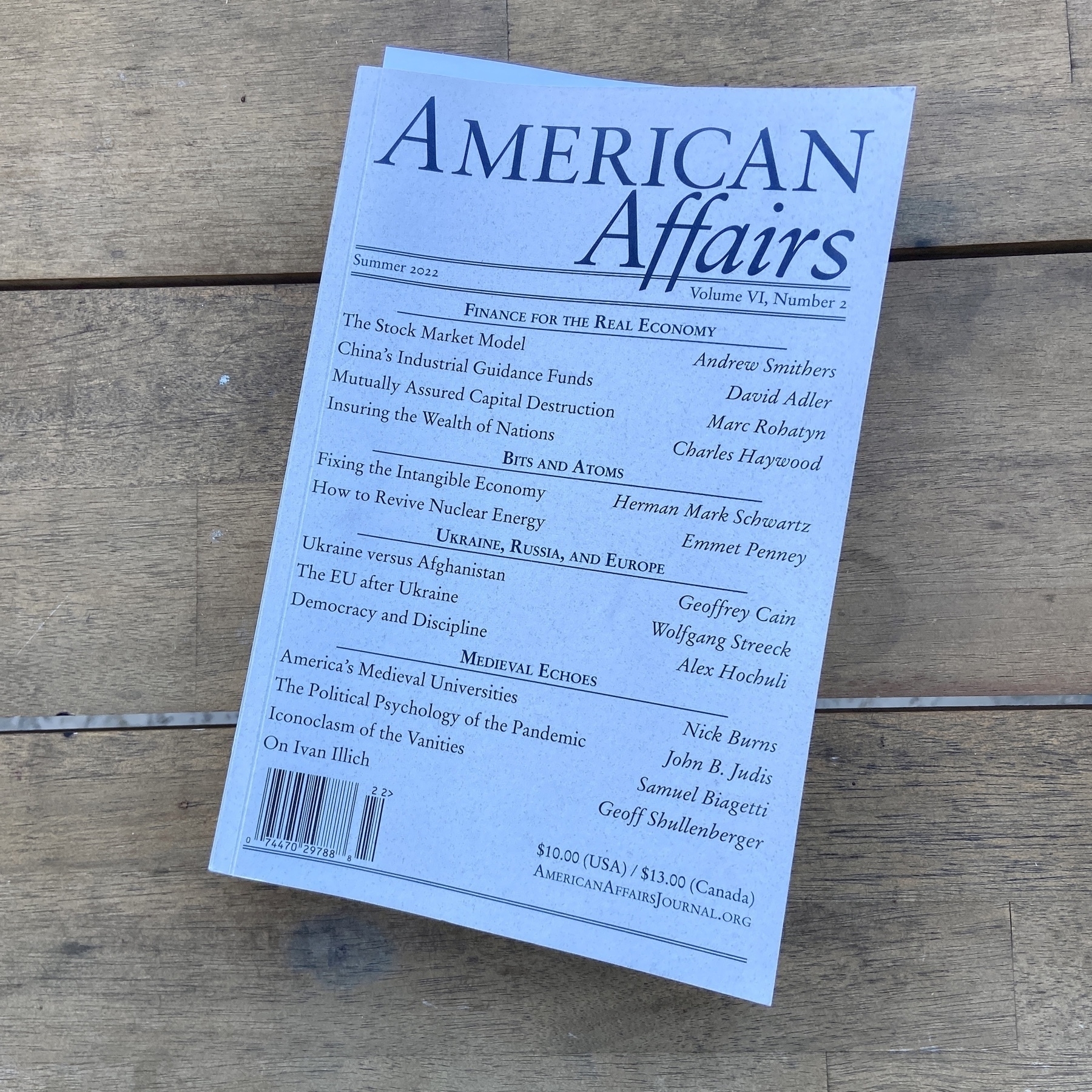
Yesterday we went to a bookstore. In this post pandemic world that is a novelty and something many members of the my family have not done. It wasn’t the largest bookstore I have been to but it was several orders bigger than anything in Copenhagen. I unabashedly fell in love. I could have spent the whole day there.
Because of our imminent move to Canada, I refrained from buying more than a single paperback tome of American Affairs, and with it I think I have found my source of ‘news’ and commentary in a vessel that I can absolutely get behind. Put together like a novel, the ‘magazine’ is 99.5% text (with the occasional graph or image). The articles are dense and let you delve into the subject. The paper is emasculate. The cover stock is sublime. The typography outstanding.
Best of all, it’s quarterly. One of the instant subscriptions when I get a permanent place in Canada.
Proxima Sera is the serif font pairing for Proxima Nova. That ‘x’ has got to be my favourite detail element.

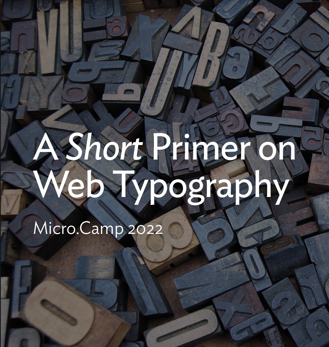
My presentation for Micro Camp is out and can be seen here. Thought it would be useful to share some links from the presentation:
Heliotrope is the latest release from one of my favourite type designers. While I am not in the market for something like this I love the name, the story and the italics. Concourse is my next purchase, once I have a project.
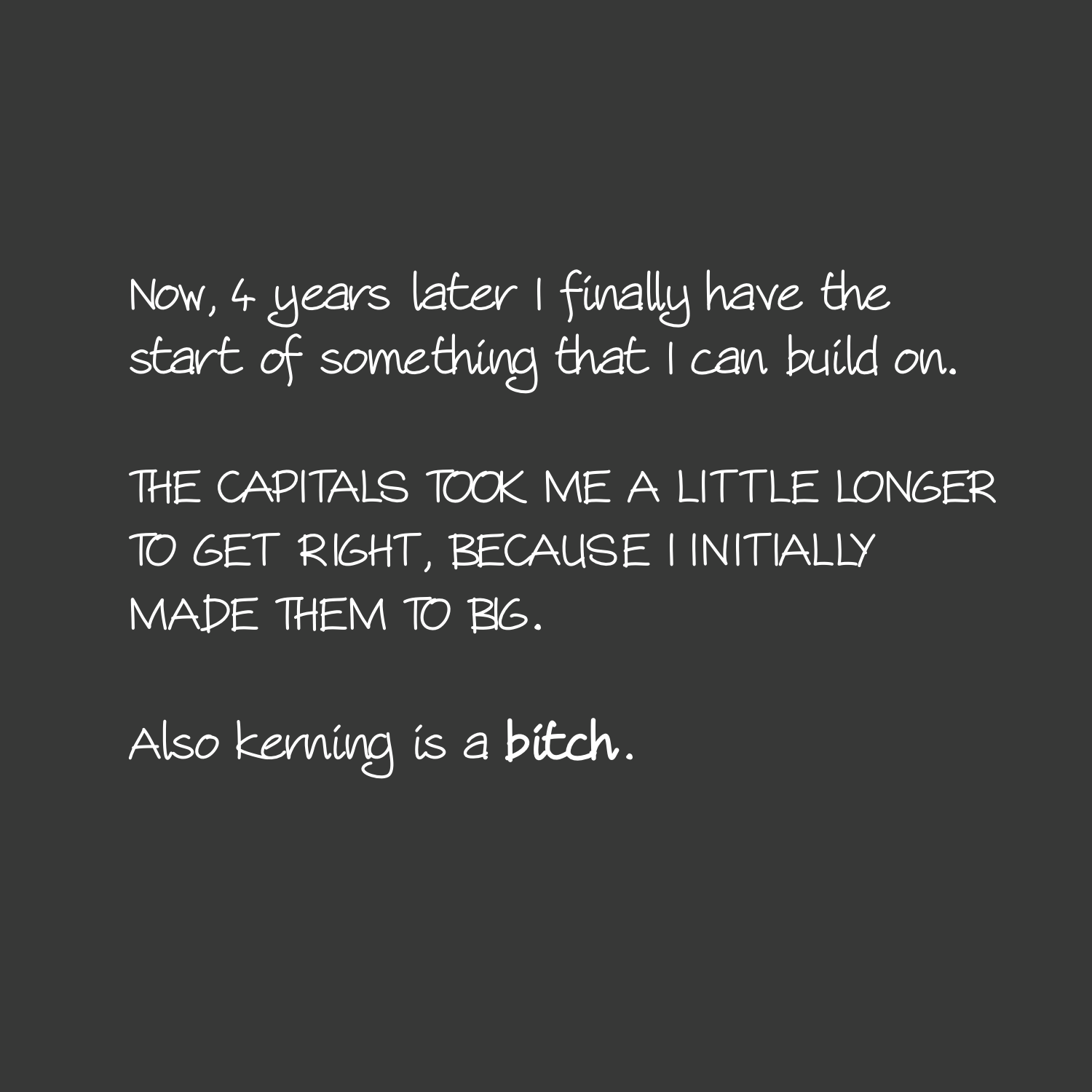
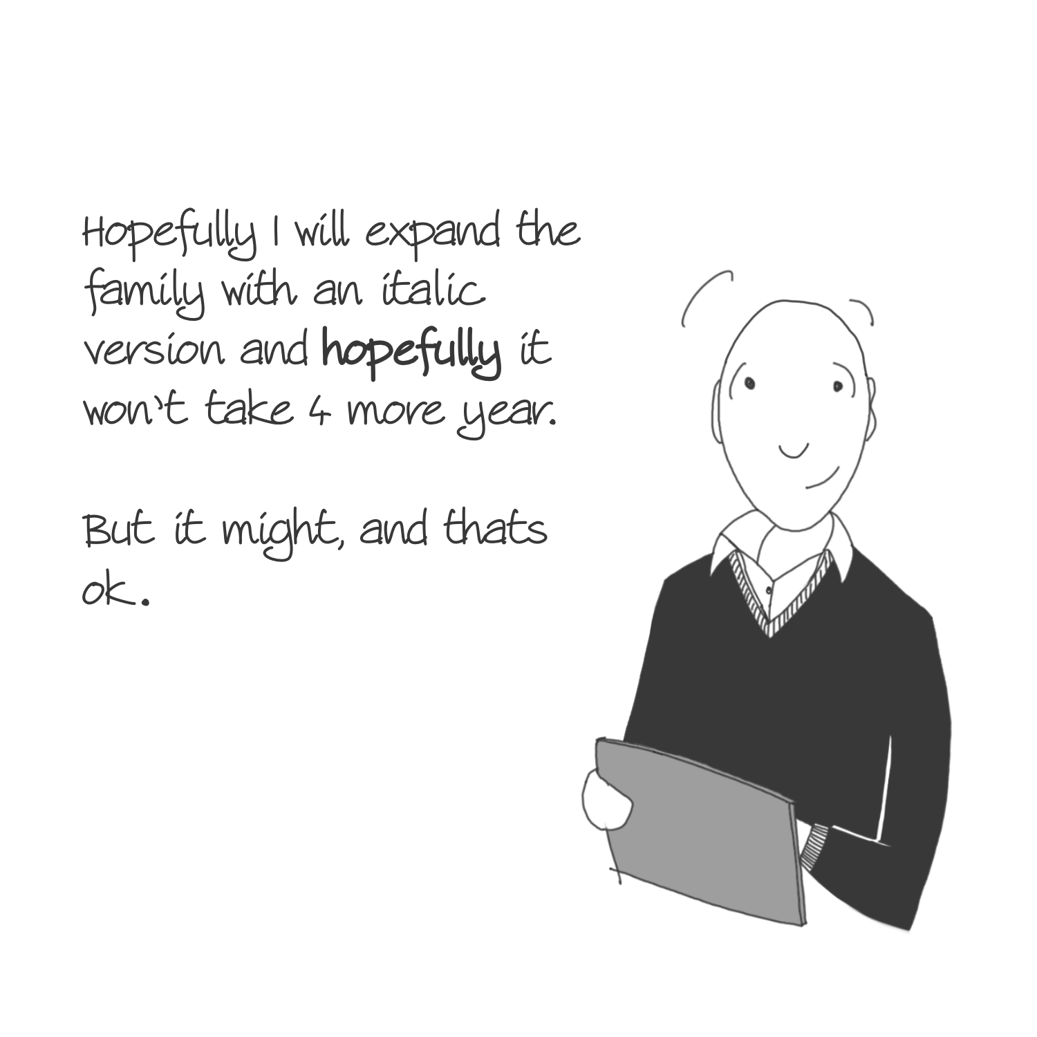
Started working on a typeface based on my handwriting 2 years ago. Its not baked yet - because it really isn’t a priority - but it was fun to remind myself where it stands right now.
Even though I follow Frere-Jones on Twitter, I completely missed that they worked on a new typeface. And what a typeface! Seaford is available now if you are on Windows (which I am at work). Not going to be able to use this for any of my official communication (we are bound to Times New Roman) but I can use it for just about anything else.
I’m sure this was on Ngoc’s list for a while however by chance I dropped him an email a few days ago asking for the opportunity to use my beloved Merriweather. He said it was coming in the latest iteration of 1writer - which just dropped. One of the new features is being able to pick any of your installed fonts. Oh and he also mentioned that he is hard at work on version 4. Super excited about that.
Although not always discussed but my favourite piece of software this year has been the Merriweather typeface.
- I type my notes in my Zettlekasten using it across multiple platforms and apps (Obsidian on Windows, 1Writer/iWriter Pro on iOS).
- All my posts to my site start their life in Drafts use it.
- My website uses it (and its Sans sibling).
- I get to use it at work on occasion as well (in an online format).
Easily my favourite live open source typographic projects on the net.
One of my favourite typefaces, Merriweather, has recently (3 months ago is recent in the typeface world) been updated with what appears to be display, wide, narrow and heading variants. Last year in April, small-caps were added as well (in case you missed that update).
What’s interesting is that Google now appears to be funding the efforts of future development - which was news to me. It’s not very well documented anywhere.
iPad Revelations & Misery
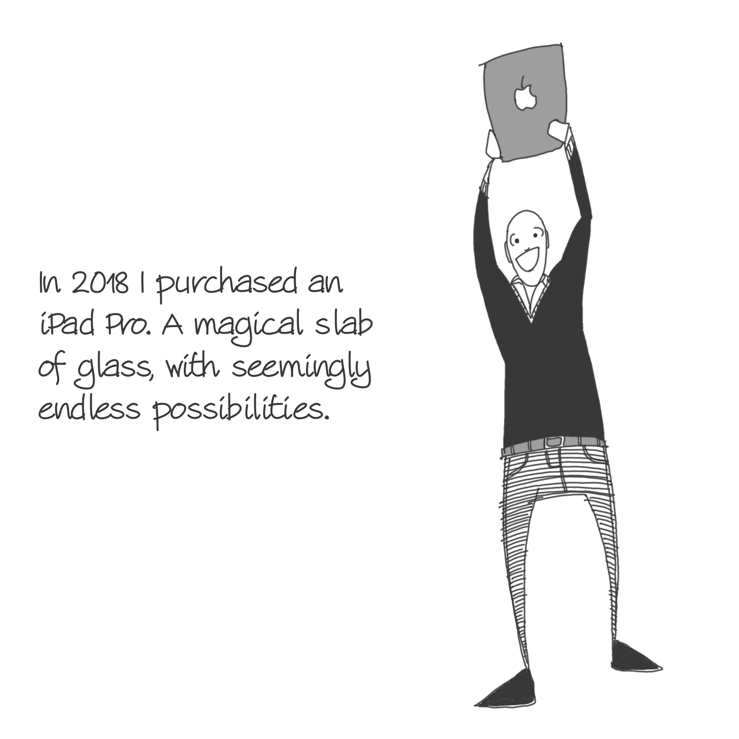
I really miss my MacBook. I’m a firm believer that using the right tool makes you happier and is therefore more sustainable in the long run. Since September, I have been relegated to using my iPad Pro exclusively for all my needs. In some ways, it has been both a revelation and joy to use. In other respects, it has been abject misery.
Protability
Where the iPad shines for me is it’s portability. This thing is incredibly light. Solidly built and has an incredible battery that keeps on going and going. The fact that the pencil is magnetically attached to the top means it’s always charged and ready to go. All in all, it is definitely the road warrior that I imagined it to be. I opted for the 12.9" version, which is right for me, in most cases. It gets a bit big when I write notes, but this is mainly a mindset thing that I need to get past and work into my routine.
Keyboard Support
While this isn’t perfect, I use this with two keyboards. One by Apple and it’s perfect and the other by Logitech and it works great at work as I need to flip between a Windows machine and my iPad. The only issue I’ve ever really had is that sometimes support across various apps has been pretty buggy recently. Most notably with iAWriter, the keyboard goes haywire if I switch between apps. Its restored only when I restart the app.
Apps
Apps like GoodNotes, Procreate, iFontMaker, Stop Motion Pro, and PDFExpert truly shine on this machine in a way that other apps cannot. There are the apps that have been adapted exceptionally well. iA Writer. Soulver. Drafts. Affinity’s Photos and Designer work surprisingly well but they falter by the limitations of the iPad’s poor support of a mouse which is where these types of apps shine.
Then there are the apps that don’t exist on the platform. The Archive. Affinity say that they are working on a version for their Publisher app, but until then, creating books isn’t really all that possible - sure there is Pages…but I mean, c’mon guys. It’s called an iPad Pro. No Web Developer tools of note. The ones available are barely ok, but certainly not as powerful as what already comes with desktop safari.
Buggy Software
This is something that I have noticed a sharp addition of bugs for iOS13. It’s not been great. Everything from dictionary support to weird and wonderful bugs with the keyboard support. As this is my main machine for production, it’s frustrating.
Fonts
Yes, you can have your own fonts installed, except for some reason, it’s only through third party apps (none of which are very good). Why the hell isn’t this baked into the OS?
Fixing It
I know it’s fashionable to pile onto the iPad at the moment. The truth is that it wouldn’t take very much for me not to pine over my macbook.
- Add the Safari Developer Tools.
- Give proper mouse support to the OS.
- Design a nice interface for font management.
- Sort out the bugs related to the keyboard support.
Moonshot
The thing that would be the real game changer for me is if the 3rd party developers are enticed to actually develop real productivity software for the platform. I’d love to see ports of Mac apps on iOS. Make it happen Apple. It’s the sort of crazy shit Steve Jobs would ask for. This would allow me to have The Archive, Hemingway, Highland, Marsedit and any number of other great Mac apps that I have already paid for and currently have no way to use.
The single biggest change anyone can make to their site is sorting out the typography. There are plenty of freely available typefaces out there. My favourites are IBM Plex (Sans Serif, Serif and Mono), Inter (Sans Serif), Merriweather (Sans Serif and Serif) and Source Sans and Source Serif, Charter (Serif) & Clear Sans (Sans Serif).
The issue is that because they are freely available, they offer little distinction as they can be used by everyone. Sometimes that’s what you want. Sometimes it’s not. If I was running an up and coming blogging platform (ahem @manton), I’d try and hook up with indie typographers. People like Matthew Butterick, Mika Melvas or even a foundary like TipoType. See if I can strike some kind of deal to allow everyone to use their fonts across my platform.
You had me at iPhone 11 Pro. I was honestly planning on getting a new camera, but the funds there will now go into this beast of a phone. It’s going to have to last me a good 5 years to make it worthwhile but I am pretty confident that won’t be a problem. Also Pro font!
Seriously useful set of tips and tricks of becoming a better writer. There is something for everyone looking to write things longer than a sentence or two. My favourite is bird by bird, switching the font and creating thoughtful headlines.
Looking to make a meaningful change to your website? Go and check out Beautiful Web Type. If I was in the market for new typefaces, I’d be checking out Vollkorn. And probably pair it with Cooper Hewitt.
This quote from Frank Chimero really resonated with me:
Art is anything that’s better than it needs to be.
— Frank Chimero
It feels in someway linked to another one of my favourite quote about what design is:
Design is the process of going from an existing condition to a preferred one. Observe that there is no relationship to art.
— Milton Glaser
Frank’s new website is definitely art. Love the typeface he’s gone for, Lector.
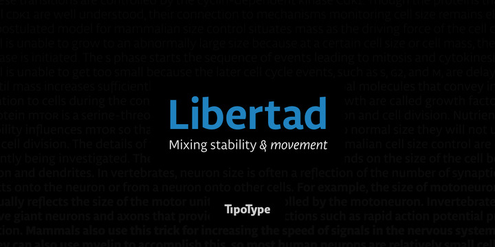
Last post about typefaces (at least for today). From one of my favourite type foundaries, TipoType (out of Uruguay no less) have a new slab serif, Aila. It’s on special offer for the same price I paid for their excellent typeface Libertad (which I use on this site). Be sure to check the pdf.
I stand corrected. Source Serif Pro does have old style figures & ligatures. Frank also says he’s got an update coming soon for Google fonts. Great news all around for a great typeface.
On a related note to my previous post, Source Serif Pro now also comes with italics. Only came out 7 months ago but I’d completely missed that announcement. 4 years in the making. Still hasn’t been updated on Google fonts and doesn’t seem to have old style numerals - once you see numbers in this way, you can’t unsee them presented differently.
Update — I stand corrected. Source Serif Pro does have old style figures & ligatures. Frank also says he’s got an update coming soon for Google fonts.
I’ve recently updated my websites, kaa.bz and stet.build with some proper typographic love and attention. Two things spring to mind. The first is that a professional typeface (read the last paragraph of that link) will totally elevate a design. The second is how far browsers have come with their support for all manner of great typographic features.
I’ve been spending way to much time looking at Matthew Butterick’s fonts. Valkyrie is perfect for running text on a site (works great on a phone size), but Equity and Concourse also look amazing.
New picture book, Tomorrow I’ll be brave, by Jessica Hische looks great (I’m in it for the typography). As always from the excellent Craig Mod and his On Margins podcast.
I have eyed iFontMaker with a considerable amount of envy over the years. I even considered buying an iPad just for it at one point. For font lovers out there, it really is a great app.
Awesome analysis of why tech companies are making custom typefaces.
Jan Middendorp’s Dutch Type is truly a magnificent book. I would go so far as to call it the best looking book on typography that I own. If you can get a copy, don’t hesitate. Gorgeous.
It’s always a joy when I receive an email from Matthew Butterick - go subscribe if type is your thing. His online book has been revised and I’m seriously considering using Equity for my next major project.
An Ode to iAWriter
Since April I have been working silently and diligently on my little project. I’ve still got a long while to go before I’m happy to share what’s been going on with me but I wanted to share my absolute recommendation for iAWriter as one of the best tools for writing projects ever made.
Of significant value to me is the ability to link in multiple text files into a single document. This has allowed me to reorganise the entire project several times over, as though it was a simple deck of cards.
This feature alone would be enough for me, but that is just the start of things. It’s super lightweight and opens instantly. It doesn’t have any font features (except choosing between a single font) and that helps me from wasting type. Although there arent' many templates to choose from, the basic ones included with the app do an amazing job of typesetting the work in a fashion that I can read/markup and edit freely.
Sure I would like a few features found in the Highland app, such as sprint timer, native fountain support, and actual comment support within the document, but this app provides me with so much and I highly recommend you consider it for your next project.
⌚ The latest iteration of Mondaine’s smart watch concept is a solid design iteration on the previous model (the dial at the bottom always looked cramped). Definitely goes onto the same wantlist as the Erik Spiekermann editions I have coveted for a while.
Kickstarter & Me
I thought it would be interesting to run some numbers on all the Kickstarter projects that I have backed over the years.
I started contributing to crowd funded projects back in October 2014. I’ve spent around $1300 over 3½ years and 19 Kickstarter projects.
Breaking all the projects down by loose categories, it’s clear I go through waves of interest. Currently I’m in a book and software buying phase and over the stationary phase.
| Category | No. |
|---|---|
| Accessory | 7 |
| Stationary | 5 |
| Books | 4 |
| Software | 2 |
| Video | 1 |
Diving a little deeper into each project:
| No. | Project Name | Type | Notes | Usefulness |
|---|---|---|---|---|
| 1 | Bullet Journal | Stationary | Still in the plastic bag. I’m happy to have helped Ryder on his journey and own a piece of ‘stationary history’ in the meantime. | ✓ |
| 2 | Takumi Pen | Stationary | This was the first version of this pen. I was disappointed. It was too light and overall the execution was flawed. Some of these flaws were rectified in the new version. | ✗ |
| 3 | A leather belt to last a lifetime | Accessory | I grew fatter and never wore the belt. It’s not the product’s fault, I’ve just never used it…yet. | ✗ |
| 4 | Memobottle | Accessory | I live in the Middle East. I need cold water. This is a plastic bottle, doesn’t keep the water cool enough. Maybe I will get some use out of it in the future. Well executed project. | ✗ |
| 5 | Bomber Duffle Bag | Accessory | Use it when necessary. Excellent product. Highly recommended. | ✓ |
| 6 | Precision Coffee Grinder | Accessory | Took years to get to me. Then I learnt how to make cold brew and this was too much effort. Useful to have in the house, but not essential. | ✗ |
| 7 | PENXO | Stationary | Love the design. Doesn’t get as much use as I’d like. | ✓ |
| 8 | TIO | Accessory | Nice concept. Too difficult to re-order in the UAE. Used for 6 months and that was it. | ✗ |
| 9 | Tactile Turn Slider & Glider | Stationary | Loved the design. Totally disappointed by the fact that it’s too thick and the nipple falls off regularly. | ✗ |
| 10 | Sento Towel | Accessory | Does what it says on the tin. I love these towels and use the every day. | ✓ |
| 11 | The Pen Addict Live 2017 | Video | Video was fine, except it didn’t really add very much to the overall experience. I would have wanted more stuff around the actual convention itself, and maybe some interviews. Alas the boys limit it to the actual show itself only. | ✓ |
| 12 | Indie Microblogging | Software | Can’t believe how little I paid for this initially, but it’s been great value for money, as all of my writing is being filtered through Micro.blog. | ✓ |
| 13 | Illustrated Classics by Pope, Shimizu & Sienkiewicz | Book | Still waiting. | - |
| 14 | Single Edge Razor 2.0 | Accessory | Use this every other day. It’s not transformed the way I shave, but it’s provided me with a nice alternative. | ✓ |
| 15 | The Electric State | Book | Great looking book, but I’ve not read it yet. | ✓ |
| 16 | Change Is Good | Book | Still waiting. | - |
| 17 | Krama Pens & Pencil | Stationary | The metal version arrived, and it’s excellent. Still waiting for the plastic version. | ✓ |
| 18 | Inspire | Book | Still waiting. | - |
| 19 | iA Writer for Windows | Software | Very useful. Use it in work nearly every day. | ✓ |
What’s not on this list is the plethora of projects that I did not end up backing and a couple of projects that I ended up buying things directly after the kickstarter project was already over.
Taking the last column and summarising it a little shows me that it’s generally been a positive experience and I’m either using the products or aim to use them in the future:
| No Regret | Some Regret | Jury’s Out |
|---|---|---|
| 10 | 6 | 3 |
Going forward my plan is, with regards to Kickstarter, to be a lot more discerning and selective in the projects that I back. Where I see something truly unique and special, that is where I should concentrate my efforts.
These yellow Kaweco special editions (Sunrise and Sunset) are pretty amazing. Just as good looking as the Red version of the AL Sport (which is a North American exclusive?)
Do yourself a favour and listen to the first episode of Craig Mod’s On Margins podcast with Jan Chipchase. Apart from a great conversation, I also learnt about the font Fedra.
My current reading pile:
- Letters from a Stoic — Seneca
- Ego is the Enemy — Ryan Holiday
- Ikigai — Hector Garcia & Francesc Miralles
- On Web Typography — Jason Santa Maria
- Manhood for Amateurs — Michael Chabon
- The Mote in God’s Eye - Larry Niven & Jerry Pournelle
Down a Rabbit Hole
Seriously fell down a rabbit hole yesterday.
- First was buying FlowState.
- This then led me to discovering The Most Dangerous Writing App, and I loved the font.
- Which turned out to be Merriweather.
- Once I realised it was on Google Fonts I then went and spent 5 hours putting it to good use on the site.
- Hopefully I’ll keep these transgressions down to a minimum in the coming future.
Published nearly 3 1/2 years ago, Jason Santa Maria’s On Web Typography has been sitting on my shelf the entire time. Only really started digging into this over the weekend.
This is the download of the San Francisco font from Apple. Didn’t realise you could download it!
I knew of the Courier Prime font, as all my comic work is written in the Highland app. What I didn’t know about were the sans serif and code versions. Nice additions to the library.
Range of tiny pixel fonts that can be used.
Then and Now
The truth is that I can’t help myself and keep coming back to these characters. I’ve honestly tried to get into another project, but it’s clear that there is a whole world that needs to be explored, developed and discovered.
This process is both therapy for me and I see it as a way to hone some of my skills to tell a story, develop a world before I take my mediocre skills into something more serious or demanding.
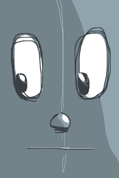
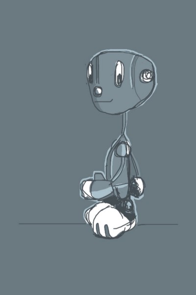
What’s also clear to me, is that there is really no rush with these characters. This August marks 5 years since I first started working on Moon Racket! The below three images were created on an iPhone 4 as a way to use the Brushes app along with a really shitty stylus.
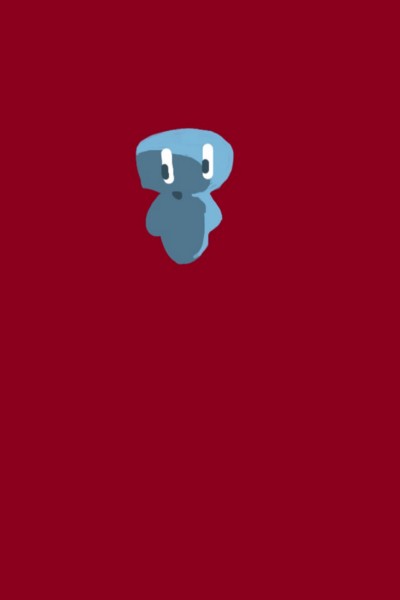
Evolution of Corgan — Created on an iPhone 4
Over time the characters have evolved significantly. The general ideas remain, however the details have changed and hopefully will continue to evolve.
Cast of Characters
This crept up on me to be honest. I started off with a grand total of 2 characters and little else. Over the course of the 5 years I’m now the proud owner of 10 characters and counting (I actually have a further 8 characters that I’ll be showing off sooner or later, but more on that in a bit).
Continuous Change
What I continue to be surprised by, is the fact that every time I create a new image, it adds something new and interesting to this world. I’ve only created two full images this year, but they basically added the orange colour which ties the art together, a new character (in Ison the rocket) and established a new vernacular for the type of buildings that I’d like to see throughout the Moon Racket! world (till now, I’d not shown the guys in the context of an actual physical place). Not bad for two images.
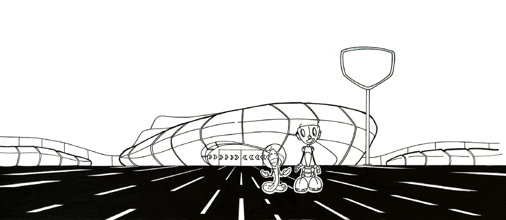
Black & White artwork for header
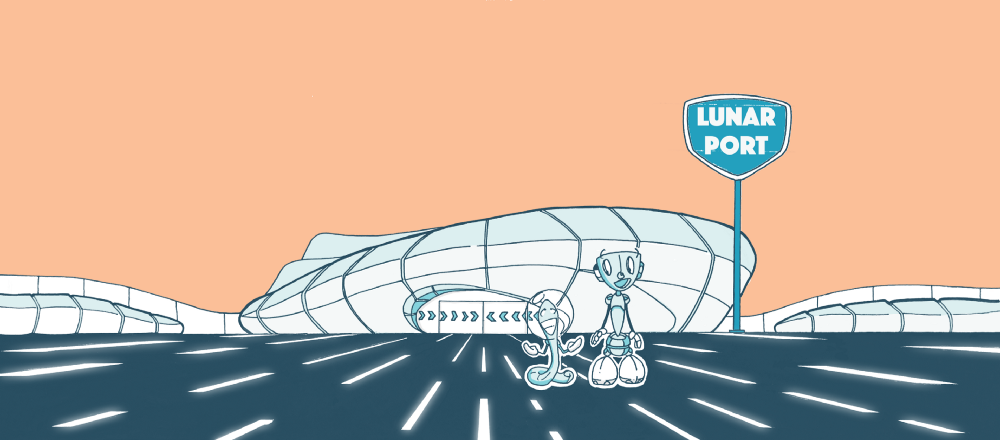
Completed colour artwork for header
Onomatopoeia
I’ve always felt that one of the main ‘characters’ in Moon Racket! should be the onomatopoeia. I’ve not really utilised this very much and kept the general use of the text and fonts to a minimum. That’s one aspect that I would like to explore a little further in future iterations of these characters.
This is also the first time that I use a new font for signage. I’ve chosen ‘Phosphate’ as one option at the moment, although I also recognise that something more stylised might be necessary down the line.
The Future
Moving into the future, there is a children’s book that I am writing now — probably why I’ve not been drawing very much. It’s certainly taken a lot more out of me than I would have wanted. The concept is simple, but having read a considerable amount of children’s books over the last year, I would say that doing it in an exciting and fun way is a real challenge.
In an attempt at creating a new story, what I am looking into is to try and find a way to slowly create a story that is developed 1 panel at a time. The intention is to continue to draw on a regular basis and just build the story slowly and organically. I’m reasonably comfortable with the art side of things, that I’d like to flesh out these characters a little bit more and start to explore ideas and thoughts that I wonder about on a regular basis.
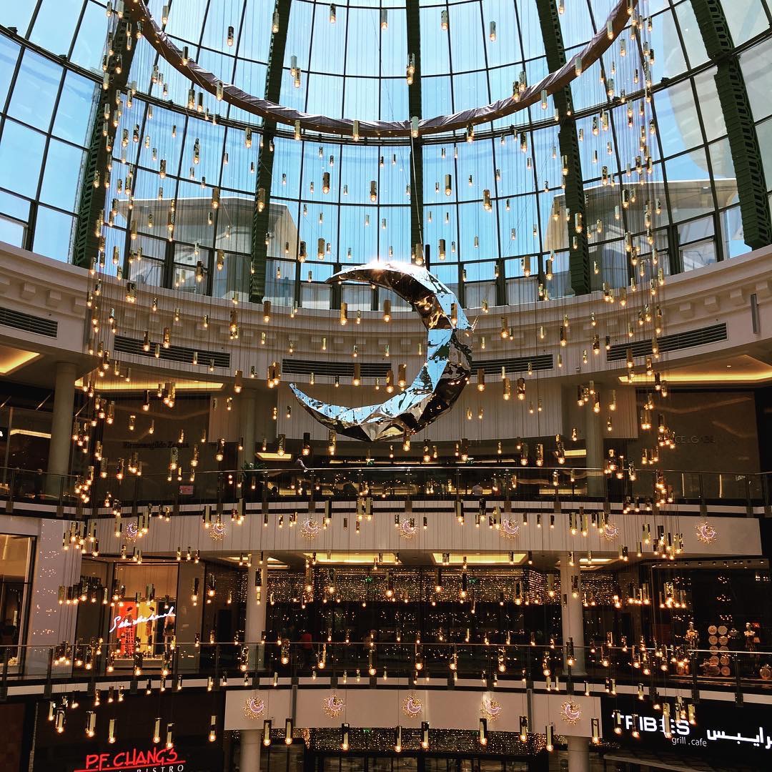
Notable part of this installation is the use of the newly minted #Philips #DubaiLamps - along with the new #Microsoft Dubai font you can see the city trying to increase its soft power
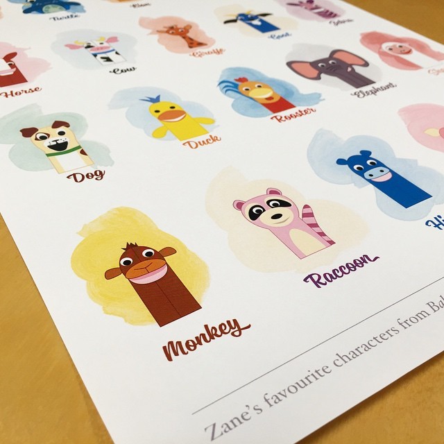 It’s been a while since I’ve done some digital artwork. This is a work in progress shot of a print I’m making for my boy Zane. The only thing that will calm him down is Baby Einstein, so this felt like the right kind of thing to put up on his wall.
Made using Sanelma, Hoefler Text and Affinity Designer.
Typography
Although many will claim that there is still a great deal of work to be done to bring the level of typography in the graphic design and online world forward (and in many respects I agree), I honestly do believe that we live in the start of a golden era for type and the fonts that enable it.
Over the weekend I bought the sublime new font Sanelma from Finnish designer Mika Melvas. The font itself inspired me to start actual work on a little project I’ve had brewing for a while - which is all you can ask from a font before you’ve begun using it really.
This led me down a rabbit hole on all things typography. I realised that a lot of what I enjoy doing and creating relates back to typography in one way or another. My website work is mainly typography, my comic work hangs on the frames created by typography, my day job is revolved around drawings and design which also is very closely related to typography.
Although I was extensively using Source Sans Pro on all of my three websites, I’ve since transitioned things over to Libertad, as I felt it gave my sites enough of a unique feel to warrent this transition. The main problem has been in how these fonts are delivered to my Tumblr powered websites (as Myfonts doesn’t provide a hosting service like Typekit or Typography do).
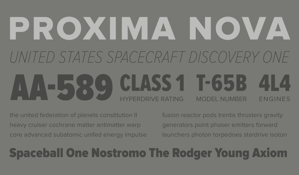
That’s the one gripe I have with Myfonts. If you’re going to make me pay you for a license to use an online font, then provide a service with the cost/overhead of that font. Typekit I believe has the right model, with the basic paid version coming in at a very reasonable $25/year. The main font that I would consider using is Proxima Nova. Without fail, every time I see a site using the font, I always instantly go, wait, what’s that font? Of course it’s Proxima Nova. Just because I don’t use it right now, doesn’t mean I won’t in the future. It is ubiquitous for a reason, it’s that good onscreen.
The thing with Typekit however, is that you don’t get any of the Hoefler (& Frere-Jones) fonts, which I would love. Their fonts are much more expensive to license at $100/year. If I was making $100/year off my websites I would consider it, but alas that’s an additional cost I’m not that comfortable paying. However I would love to use Ideal Sans.
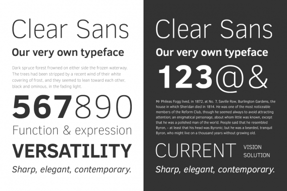
Take heart, there is now a growing collection of fonts that are amazing to use and either at great prices or for the great price of Free. On my windows machine, Clear Sans from Intel has honestly been an eye opening experience. With no retina-type displays at work, typography is more painful to appreciate. I’ve found that Clear Sans helps in a lot of ways.
And I haven’t even touched upon the great work that is carried out by Comicraft. Most of my comic work uses their fonts, although I do dip my toe into Blambot territory as well.
2013 in Review
When you reflect back on a year, the hope is always to find a number of moments that put a smile on your face - thankfully these last 12 months have given me with a lot to smile about.
Getting the news that I am going to become a father was the definite highlight - a fact which I’ve honestly not wrapped my head completely around, but I’ve started preparing1.
Creatively this year is one of my strongest in recent memory. I drew an entire season of Moon Racket, a slew of additional promotional images and designed the website - although it’s going to get some redesign love in the new year. Surprisingly the comic work didn’t end there as I completely rewrote the script for Chroma (my upcoming comics project) that has been many years in the making.
I redesigned this here site for the umpteenth time, however I do believe that this iteration is by far my most mature attempt and probably one that I will likely not change fundamentally for many years to come. The aspects of the site that I am most happy with are the colours and the typography, which is the first time in many years that I am ahead of the curve in certain respects (small caps only valid in certain browsers, surprisingly not Safari/Webkit proper).
Finally I started work on two iOS apps. The first one, we’ve scrapped and shelved, the other I hope we get some traction in the new year and we finally ship something, because as we all know:
Real Artists Ship. — Steve Jobs
Here’s wishing everyone a great 2014.
- This year I started getting into photography a little bit more. I want to make sure that I am capable of capturing my son or daughter’s life in the most beautiful way - like every self respecting geek father should. ↩︎
In creating Moon Racket, it was very clear to me early on that the lettering would have to be a character in itself. My initial attempts at lettering involved hand lettering, in the end I opted for some great fonts from the Comicraft library.
The Black Beetle, Anatomy of a Font. I love Nate Piekos and his Blambot website has always been a great resource of comic book fonts and instructions. This feature on the Dark Horse website shows just how much work and effort goes into a comic page from a letter’s point of view.
Cerebral Interviews
Issue 04 - Vol 01 - April 2012
Cerebral Interviews attempts to capture the pop culture zeitgeist throughout the month. Published at the end of every month. 12 newsletters in 2012. No more, no less.
I was hoping to get more done for this edition, however I’m in the process of relocating countries, so this one is a bit of a short one.
If you’ve got any comments or want to share, you can contact me via twitter or by replying directly to this email. You can also continue the discussion of any of the points below on the dedicated Facebook page.
Finally, if you liked what you saw, why not forward this to others who might like it or send them to the signup page.
Thanks for reading,
Khaled Abou Alfa
April 2012
App of the Month
Figure by Propellerheads is easily one of the coolest looking apps you’ll find for the iPhone. You now have a drum machine in your pocket.
Art
Fascinating work by Gabriel Moreno - damn you and your talented left hand.
Comics
The 2012 Eisner Awards nominations are out. The clear winners are Daredevil and Tale of Sand (which deserves the amount of attention it’s gotten). Craig Thomson’s Habibi got a couple of nods as well. However for those that didn’t get nominated but should have been, there is this list.
Great sneek peek into the DC Comics offices.
Robot 6 has a comprehensive (and the most exhaustive) preview of the upcoming Watchmen event. I am torn about this. I respect Alan Moore so much, but the talent involved is so great that I can’t help but want to see what’s going on. Part of me wishes that these same creators went and did something else. This wasn’t really necessary.
One of my favourite graphic designers (Rhian Hughes), redesigns on one my favourite comic company logos, Valiant. Such amazing early 90s summer memories from stories by that company. I will say that I love the old logo too much, but if ever there was a clever way to keep the old but update it.
Football
Against all odd, Chelsea made it through past Barcelona into the final of the Champions League.
Funniest Website of the Month
Gadgets
This keyboard from Logitech is probably the single greatest accessory for an iPad
One of the slickest and smartest wall clocks, now comes as a wrist watch (or will come soon).
Formula 1
Nico Rosberg wins his first grand prix, after 111 attempts. One of the best drivers to never have won a GP has now removed that monkey of his back.
Movies
Pixar finally creates a new property in Brave. The latest trailer looks fantastic, and recaptures that Pixar magic.
Music
Smashing Pumpkin’s 7th studio album will be released this summer, Oceania.
Technology
Google Multitask video made me laugh (note the date it was posted).
Google Drive is finally a reality. Not that I care too much since I’m completely taken by Dropbox.
Brett has compiled a comprehensive table of all the available iOS text editors. I own most of these.
Google Glass was finally unveiled by Google X (the skunkworks section of Google). It’s an interesting concept, and it’s definitely pushing things in a completely different direction and as others have mentioned it’s fun to see Google throwing interesting stuff at the wall and seeing what sticks.
Geomancy Typeface
Geomancy Typeface - Free typeface that’s worth having downloading. Easily of the same quality as all the excellent free fonts found at Exljbris Font Foundry.
Jonathan Hoefler poster
While we’re on the topic of Obama, great little poster by Jonathan Hoefler - unfortunately only available in the US, as you would expect.
Manji Update - WordPress 1.5 Version
Manji is finally prepped and ready for WordPress Version 1.5.
First of all I’d like to thank everyone who’s taken an interest in Manji. It’s been an absolute joy watching all you wonderful people who have taken the code made it your own and come up with some fantastic designs. I’ve got to setup a gallery to set up to showcase all your wonderful designs, it’s on my to-do list I promise you.
It’s taken me 3 months to finally reach this stage where I can leave the code in peace knowning all the fixes that I wanted to get done have been completed and it’s finally the way I want it. This is in no small part thanks to everyone who downloaded it and commented on the theme. (BTW the theme has been downloaded over 4000 times since it was launched on the 5th of December 2004, so again thanks for all the kind words and support).
Changes since Version 1.1
- I’ve tweaked the general font from Arial to Verdana. I’m in that mood right now so I’ve decided to go with that.
- The top navigation bar now automatically pics up the pages created. All you have to do now is create them and they’ll pop up in your navigation menu. This is using WordPress’s wp_list_pages tag.
- The template now remembers who visited and commented previously. It’s the same little javascript found in action on BK. I like this little script so I’ve included it in here.
- WP’s nextpage function now works for the individual pages as well. It was just a missing tag really, so can’t really consider that a bug.
Manual Version 0.2
Apart from the above the major change for me is that the help manual has gone up to version 0.2. I’ve added 2 more pages and one thing I’m really happy about finally getting done is the structure mockup. For all those of you out there that are having trouble understanding the structure of CSS, this should help you understand everything very clearly. I’ve not actually made it look pretty, that’ll come in future editions. This was one of my original ideas and I’m really glad to be able to offer it to people, with the promise that one for the typography will come as well. I think this is something that theme developers should spend some time on, because I remember what it was like to start off with this CSS stuff and be completely overwhelmed by what was going on. This little jpg should help you all in your question for CSS knowledge.
I don’t think I’ll be editing the code any more. The only reason the code is ever going to change from my POV is if Root wants to revisit the code and sort it out, in the only way he knows how. Otherwise all my attention (with respect to Manji that is) is going to be focused on the manual, Manji2 and other flavours, oh yes ^_^.
Building Letters - Tsunami Relief Update
About 2 months ago I sent out my flower for the Building Letters edition for the Tsunami Relief effort.
Seems the flower was accepted which is nice, because I’ve given money and this is something I actually did that I’m proud of giving, since nothing I create is lost, just archived waiting to be used later on.
My flower is part of the Fleurons of Hope font set. It can be found here: MyFonts website
Now I can understand they took liberties with how this is shown, but I wish they’d just contacted me to ask me if it’s ok the way it was presented. It would have been nice to have recieved an e-mail saying ‘Yeah thanks it’ll be included in the set’. I found out via Typographica and had to scroll through all the fonts.
I only hope they get the colour version correctly in the magazine and that the mag sells lots and lots. Just in case people are wondering what the original looks like.
Progress on all fronts
I turn around for like one minute and bam, everyone’s been busy with all sorts of things left right and centre. I feel like I didn’t achieve much this Christmas while everyone else was hard at work on various projects here and there.
Don’t believe me, let’s start with Matt, man’s just released bbPress. This is a forum system that runs the Wordpress Support forums. Hmm interesting, only because it seems like it can be integrated into Wordpress directly. I do like phpbb, and I love how much progress they guys and gals have made since the last time I used this package. So although I’d like to support your Matty, I’m going to have to wait and play around before the verdict can truly be out on that one.
Erm, we’re now running Wordpress 1.5 Beta? Damn man, I was running 1.3 Alpha not that long ago, how did this all happen? Oh and Kubrick is now the default, comes straight out the box. Is this a good thing? I’d like to think so, as it’s a tad(understatement) bit better in terms of design to original design. I think it’s a good move for the Wordpress community at large. So congrats to Micheal.
Scott’s been busy as well. I think I’m going to go for his gallery solution as well for the Manji Gallery. Glad to see he’s reverted back to his red masthead as well. I’ve been thinking about the wp 1.2 version Manji (since his site is running manji with wp 1.2.2) , and can’t help but feel it would be a waste of time, since we’re so close to WP 1.5 or whatever we’ll end up with. We’re in Beta peeps, it’s close I can feel it. To be honest I’d rather sort out bugs and tweaks for Manji 1.3 than go back; Lava Flavoured Manji and Like Manji: Loaded.
Manji: Loaded what’s that? Heh, wait for it baby, wait for it.
Which reminds me, for all those experiencing a bit of Peek-a-boo rubbish in IE (that is the comment information sometimes shows up and sometimes disappears, again only appears for IE), please modify your Manji code with the following
p.instructions {

 margin: 14px 0 0 200px;

 color: #7b7b7b;

 font-size: 0.9em;

 text-align: justify;

 border-left-width: 1px;

 border-left-style: solid;

 border-left-color: #d5d7db;

 padding-left: 15px;

position: relative;

}
And a semi-colon after, somehow it got missed out in the last iteration.
Version 1.02 has already been uploaded. Oh yeah just wanted to thank all the kind kids on the Manji boards that are helping each other, thanks for caring enough to point things out to me as well, much appreciated.
My buddy Franchesco has released the very first iteration of his B/rad program. When I get a change I’m going to help him tart up his website to make it slightly more fun to look at. Open Source doesn’t have to be ugly.