Then and Now
The truth is that I can’t help myself and keep coming back to these characters. I’ve honestly tried to get into another project, but it’s clear that there is a whole world that needs to be explored, developed and discovered.
This process is both therapy for me and I see it as a way to hone some of my skills to tell a story, develop a world before I take my mediocre skills into something more serious or demanding.
What’s also clear to me, is that there is really no rush with these characters. This August marks 5 years since I first started working on Moon Racket! The below three images were created on an iPhone 4 as a way to use the Brushes app along with a really shitty stylus.
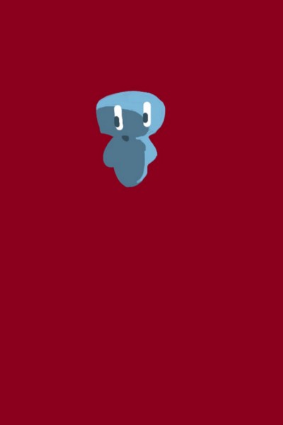
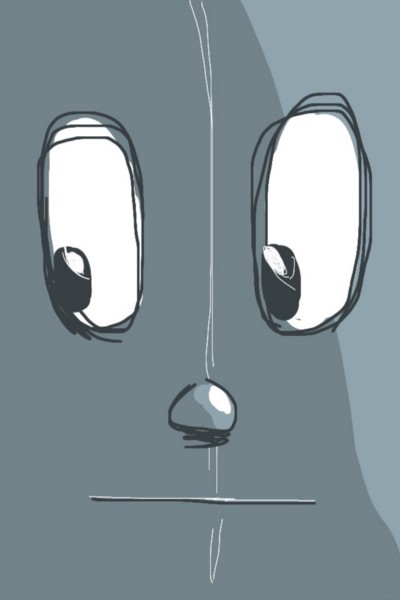
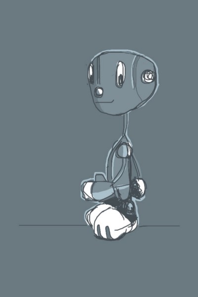
Evolution of Corgan — Created on an iPhone 4
Over time the characters have evolved significantly. The general ideas remain, however the details have changed and hopefully will continue to evolve.
Cast of Characters
This crept up on me to be honest. I started off with a grand total of 2 characters and little else. Over the course of the 5 years I’m now the proud owner of 10 characters and counting (I actually have a further 8 characters that I’ll be showing off sooner or later, but more on that in a bit).
Continuous Change
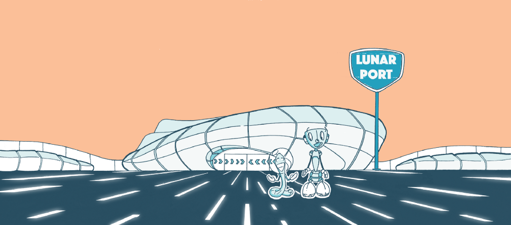
What I continue to be surprised by, is the fact that every time I create a new image, it adds something new and interesting to this world. I’ve only created two full images this year, but they basically added the orange colour which ties the art together, a new character (in Ison the rocket) and established a new vernacular for the type of buildings that I’d like to see throughout the Moon Racket! world (till now, I’d not shown the guys in the context of an actual physical place). Not bad for two images.
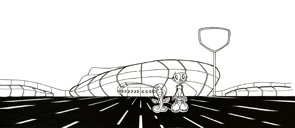
Black & White artwork for header
Completed colour artwork for header
Onomatopoeia
I’ve always felt that one of the main ‘characters’ in Moon Racket! should be the onomatopoeia. I’ve not really utilised this very much and kept the general use of the text and fonts to a minimum. That’s one aspect that I would like to explore a little further in future iterations of these characters.
This is also the first time that I use a new font for signage. I’ve chosen ‘Phosphate’ as one option at the moment, although I also recognise that something more stylised might be necessary down the line.
The Future
Moving into the future, there is a children’s book that I am writing now — probably why I’ve not been drawing very much. It’s certainly taken a lot more out of me than I would have wanted. The concept is simple, but having read a considerable amount of children’s books over the last year, I would say that doing it in an exciting and fun way is a real challenge.
In an attempt at creating a new story, what I am looking into is to try and find a way to slowly create a story that is developed 1 panel at a time. The intention is to continue to draw on a regular basis and just build the story slowly and organically. I’m reasonably comfortable with the art side of things, that I’d like to flesh out these characters a little bit more and start to explore ideas and thoughts that I wonder about on a regular basis.