Typography
Although many will claim that there is still a great deal of work to be done to bring the level of typography in the graphic design and online world forward (and in many respects I agree), I honestly do believe that we live in the start of a golden era for type and the fonts that enable it.
Over the weekend I bought the sublime new font Sanelma from Finnish designer Mika Melvas. The font itself inspired me to start actual work on a little project I’ve had brewing for a while - which is all you can ask from a font before you’ve begun using it really.
This led me down a rabbit hole on all things typography. I realised that a lot of what I enjoy doing and creating relates back to typography in one way or another. My website work is mainly typography, my comic work hangs on the frames created by typography, my day job is revolved around drawings and design which also is very closely related to typography.
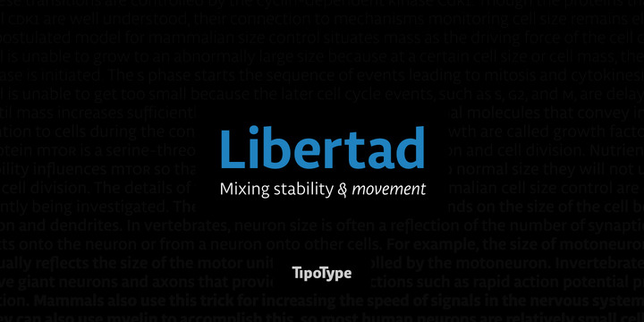
Although I was extensively using Source Sans Pro on all of my three websites, I’ve since transitioned things over to Libertad, as I felt it gave my sites enough of a unique feel to warrent this transition. The main problem has been in how these fonts are delivered to my Tumblr powered websites (as Myfonts doesn’t provide a hosting service like Typekit or Typography do).
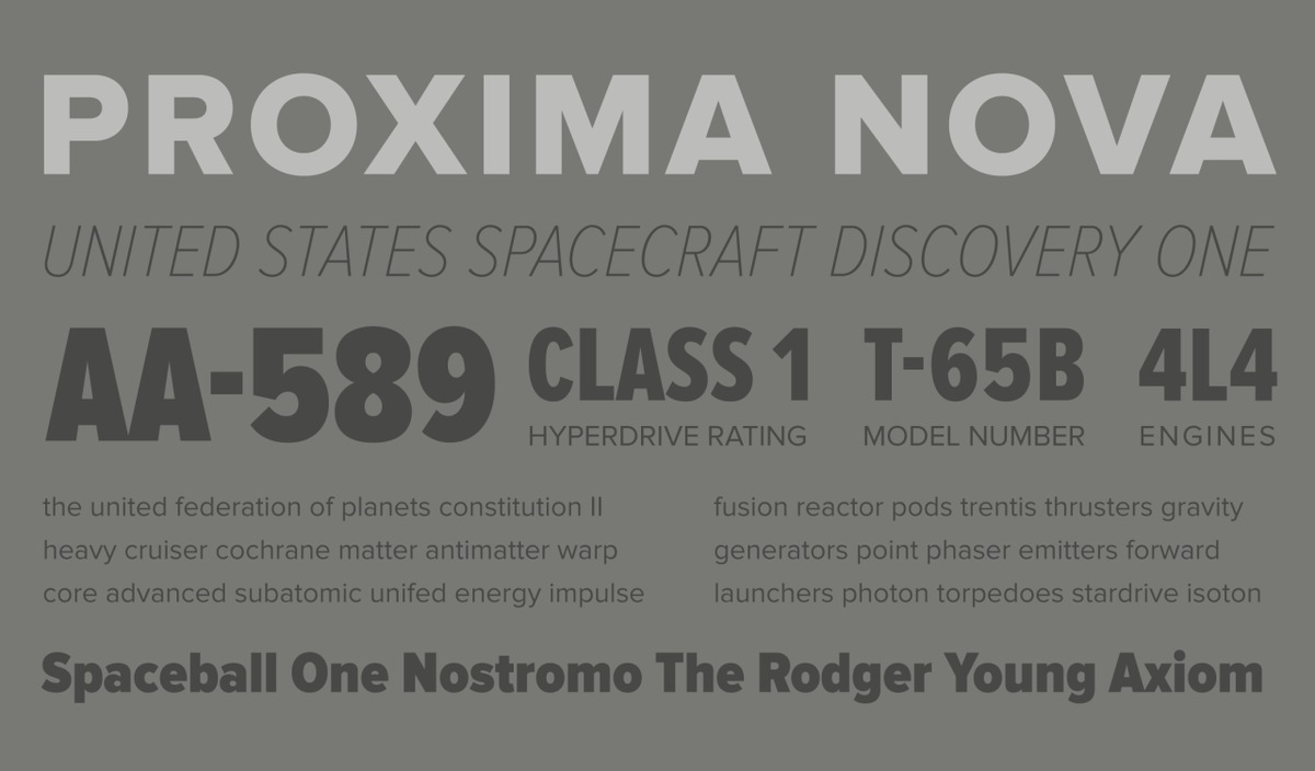
That’s the one gripe I have with Myfonts. If you’re going to make me pay you for a license to use an online font, then provide a service with the cost/overhead of that font. Typekit I believe has the right model, with the basic paid version coming in at a very reasonable $25/year. The main font that I would consider using is Proxima Nova. Without fail, every time I see a site using the font, I always instantly go, wait, what’s that font? Of course it’s Proxima Nova. Just because I don’t use it right now, doesn’t mean I won’t in the future. It is ubiquitous for a reason, it’s that good onscreen.
The thing with Typekit however, is that you don’t get any of the Hoefler (& Frere-Jones) fonts, which I would love. Their fonts are much more expensive to license at $100/year. If I was making $100/year off my websites I would consider it, but alas that’s an additional cost I’m not that comfortable paying. However I would love to use Ideal Sans.
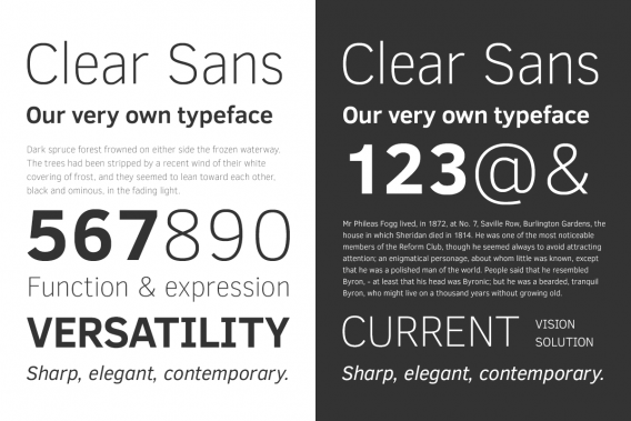
Take heart, there is now a growing collection of fonts that are amazing to use and either at great prices or for the great price of Free. On my windows machine, Clear Sans from Intel has honestly been an eye opening experience. With no retina-type displays at work, typography is more painful to appreciate. I’ve found that Clear Sans helps in a lot of ways.
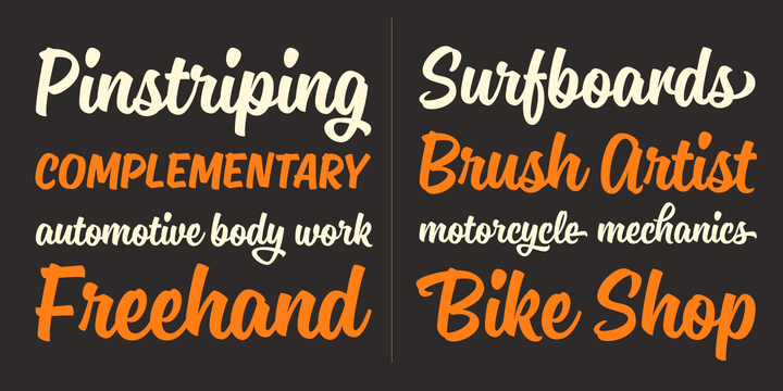
And I haven’t even touched upon the great work that is carried out by Comicraft. Most of my comic work uses their fonts, although I do dip my toe into Blambot territory as well.